I’ve noticed that bathroom walls catch light differently throughout the day, especially when the paint sits next to glossy tile and metal fixtures.
Undertones become obvious once the color covers more than a small patch, and they can clash with existing flooring or cabinetry.
Samples on the wall reveal the truth.
I always check how a neutral reads against both the trim and any stone surfaces before committing to a full gallon.
Over the years certain balanced shades have stayed reliable even after humidity and repeated cleaning.
Creamy White Bathroom Walls
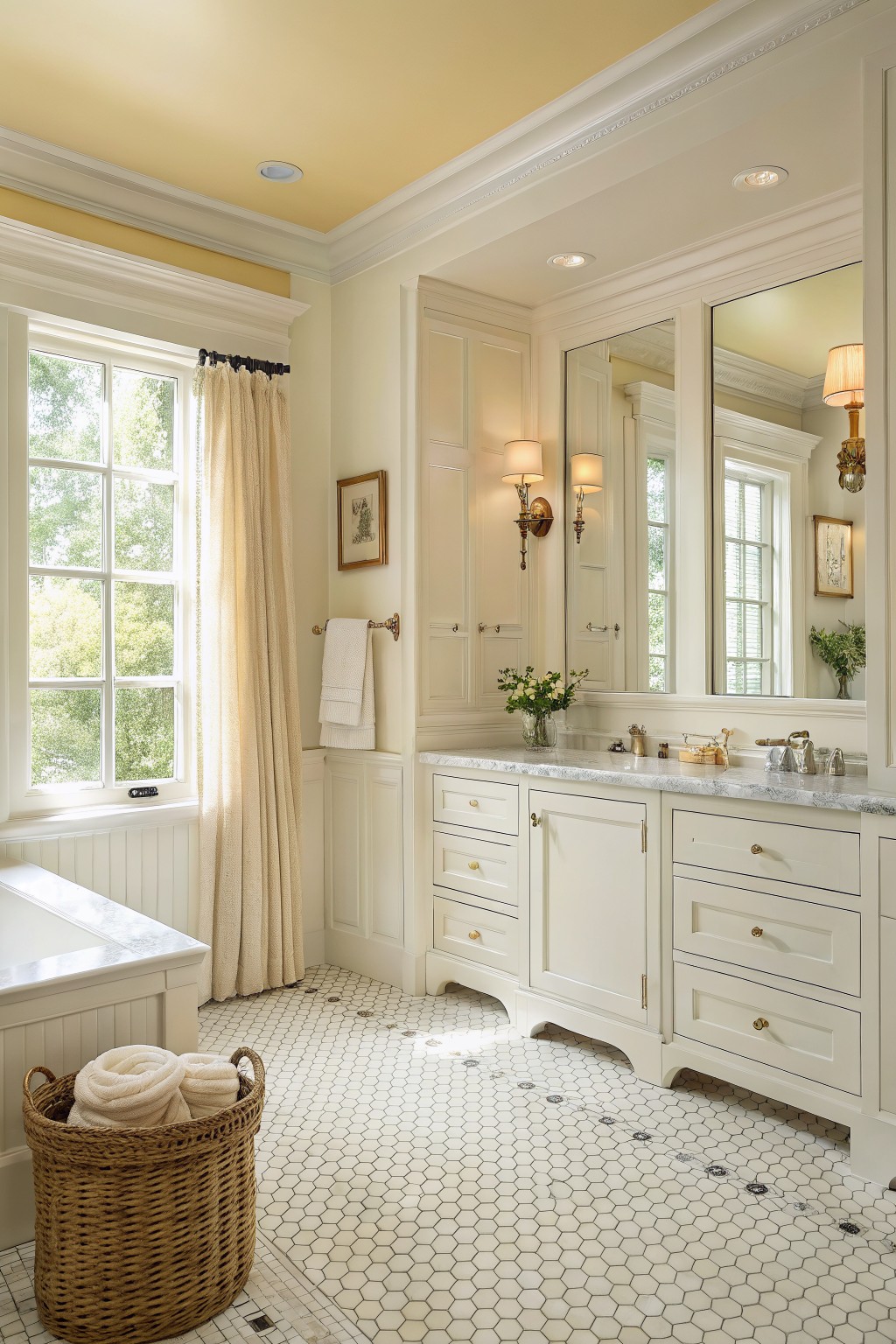
This bathroom uses a warm creamy white on the walls and cabinets. It is a soft neutral that feels clean without looking too stark or cold. The color sits comfortably between white and a very pale beige.
It works especially well with marble counters and white tile because the slight warmth keeps everything from feeling flat. Colors like Benjamin Moore Cloud White, Sherwin Williams Creamy, Behr Swiss Coffee, or Farrow & Ball Pointing all give a similar effect.
Soft Greige Walls
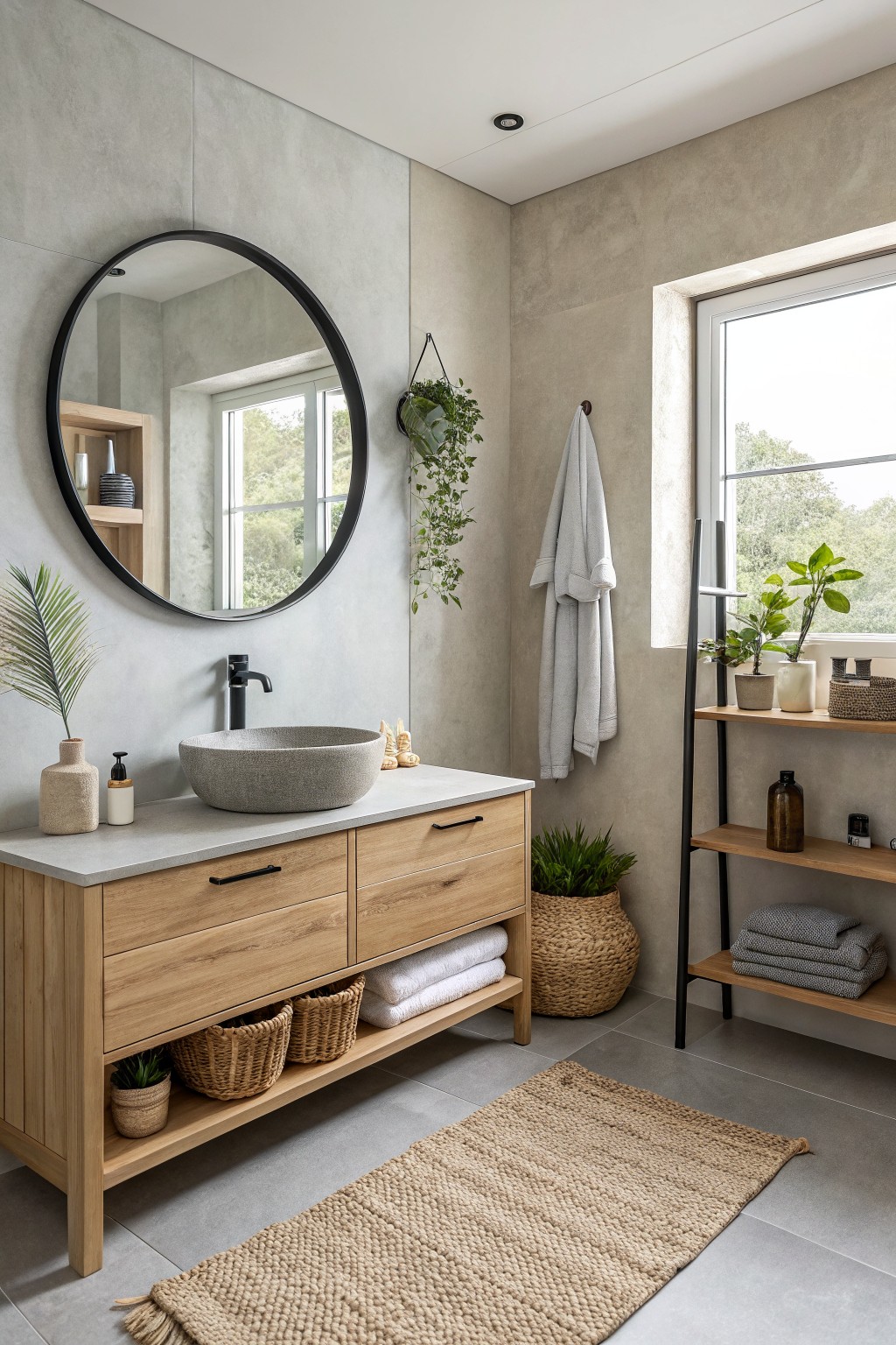
This bathroom uses a soft greige on the walls. It is a light gray with just enough warmth to keep it from feeling cold, and it pairs easily with wood and stone.
The color has a slight beige undertone that shows up more in warmer light. It works well here with the wood vanity and concrete-style surfaces, and it stays looking clean without needing much contrast.
Balanced Greige Bathroom Walls
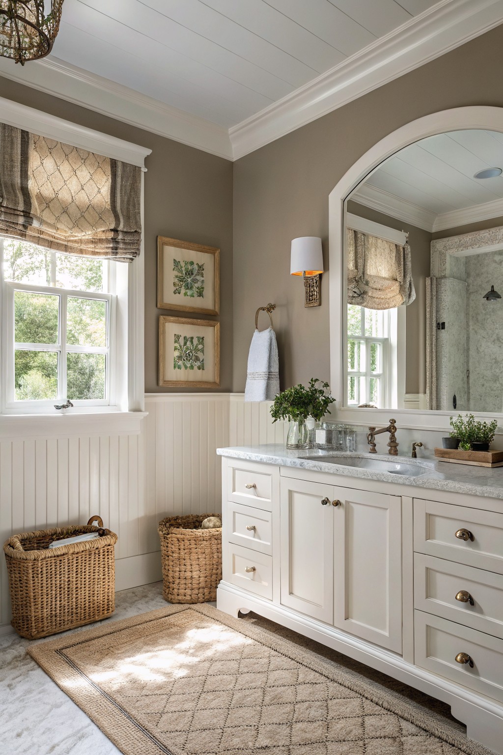
This bathroom uses a warm greige that blends gray and beige without leaning too far in either direction. It feels calm and steady on the walls, and colors like Benjamin Moore Edgecomb Gray or Sherwin Williams Worldly Gray come close to the tone shown here.
The slight warmth helps it sit well with white trim and marble. It works best in rooms with decent natural light, and it holds up nicely against wood tones or stone without turning dull or flat over time.
Warm Greige Bathroom Walls

This bathroom uses a warm greige on the walls. It is a soft gray with brown undertones that keeps the space feeling grounded and calm rather than stark.
The color works well with the wood vanity and white tile. It pairs nicely with black fixtures too, though it can start to feel heavy if the room gets little natural light.
Light Blue Gray Bathroom Walls
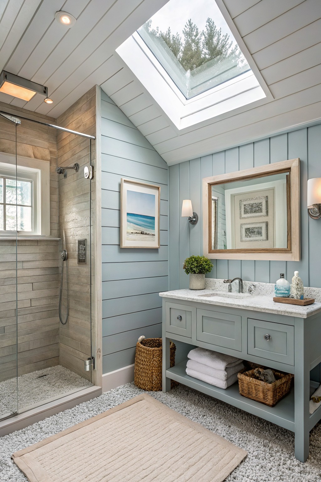
This light blue gray on the walls gives the bathroom a calm, quiet feel that still feels neutral. It sits somewhere between gray and blue, with a cool undertone that keeps the space from looking too stark or too warm.
The color works especially well with wood tones on the shower surround and the light stone on the vanity. It can look a bit flat if the lighting is very dim, so it does best in rooms with decent natural light or white trim to keep it lifted.
Soft Sage Green Walls
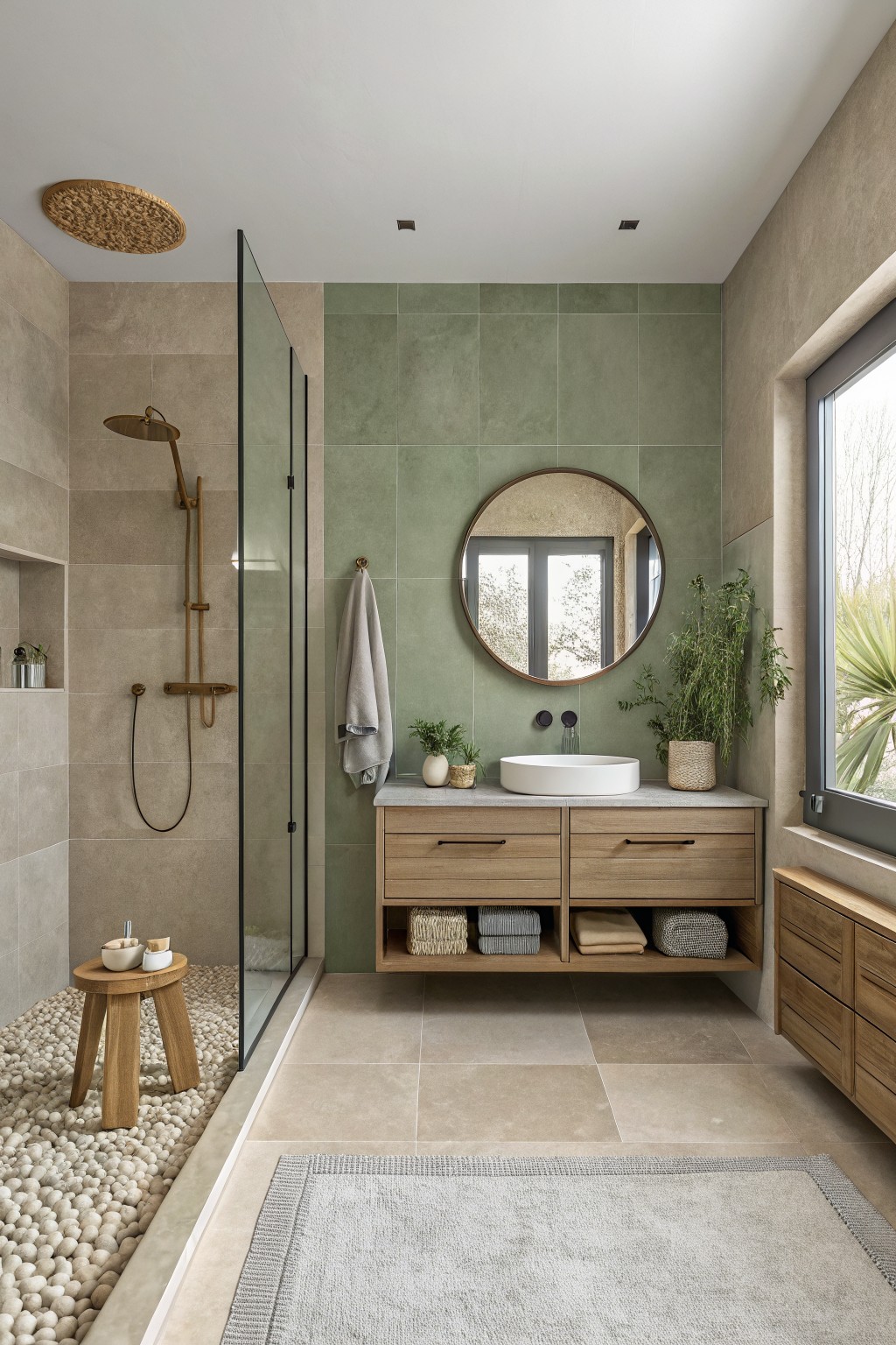
A soft sage green works well in bathrooms because it stays calm without feeling cold. This muted green sits somewhere between gray and green, so it reads as a neutral that still brings a little life to the space. It pairs nicely with wood tones and stone, which keeps the room from looking too flat or clinical.
The color has a gentle gray undertone that helps it work in both natural and artificial light. It looks good with warm wood vanities and simple tile, though it can start to feel dull if the room has no wood or texture to balance it. Popular matches include Benjamin Moore Saybrook Sage, Sherwin Williams Evergreen Fog, Farrow & Ball Lichen, and Behr Aged Olive.
Warm Beige Bathroom Walls
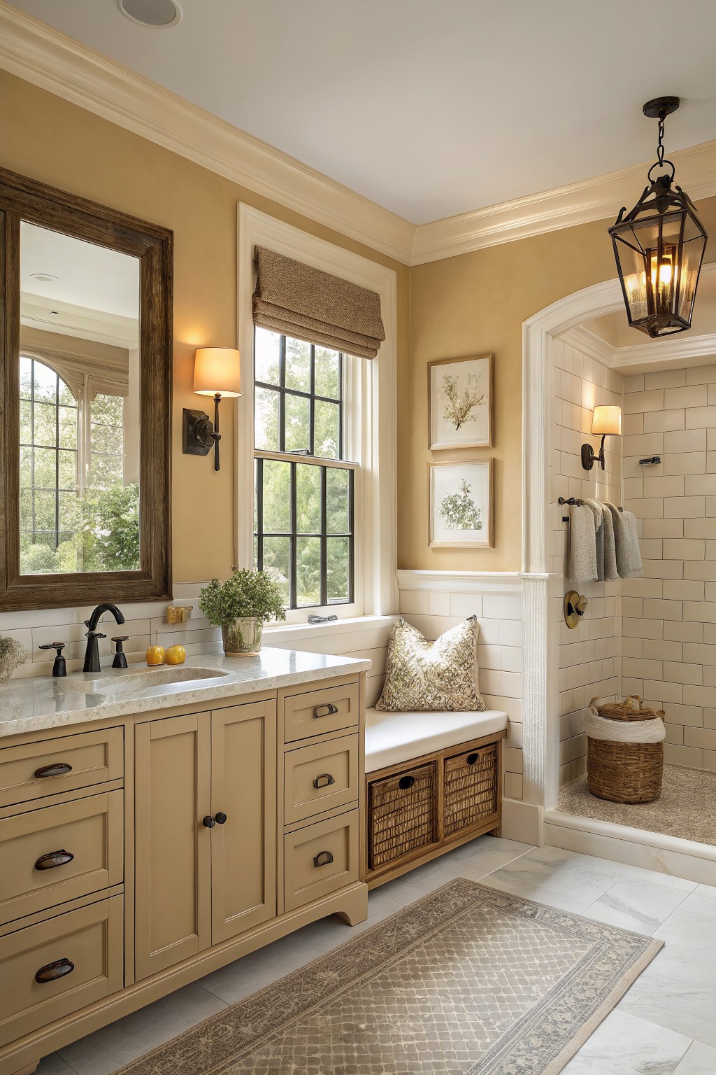
This warm beige on the walls gives the bathroom a soft, steady look that feels easy to live with. It sits right in the middle of neutral territory, with a gentle yellow undertone that keeps the space from feeling too cool or flat next to the wood cabinetry.
It works well in rooms that get a mix of natural light and artificial light, and it pairs nicely with white trim and simple tile. Just watch that it does not pull too yellow in very warm lighting.
Soft Sage Green With Marble Accents

A soft sage green works nicely in bathrooms because it brings a gentle touch of color without feeling too strong. This muted green-gray reads calm and slightly earthy, which helps the room feel balanced rather than stark.
It sits comfortably next to white trim and marble surfaces, and the color holds up well in both natural and artificial light. Pair it with warm wood accents or simple white fixtures to keep the look clean and timeless.
Soft Greige Bathroom Walls
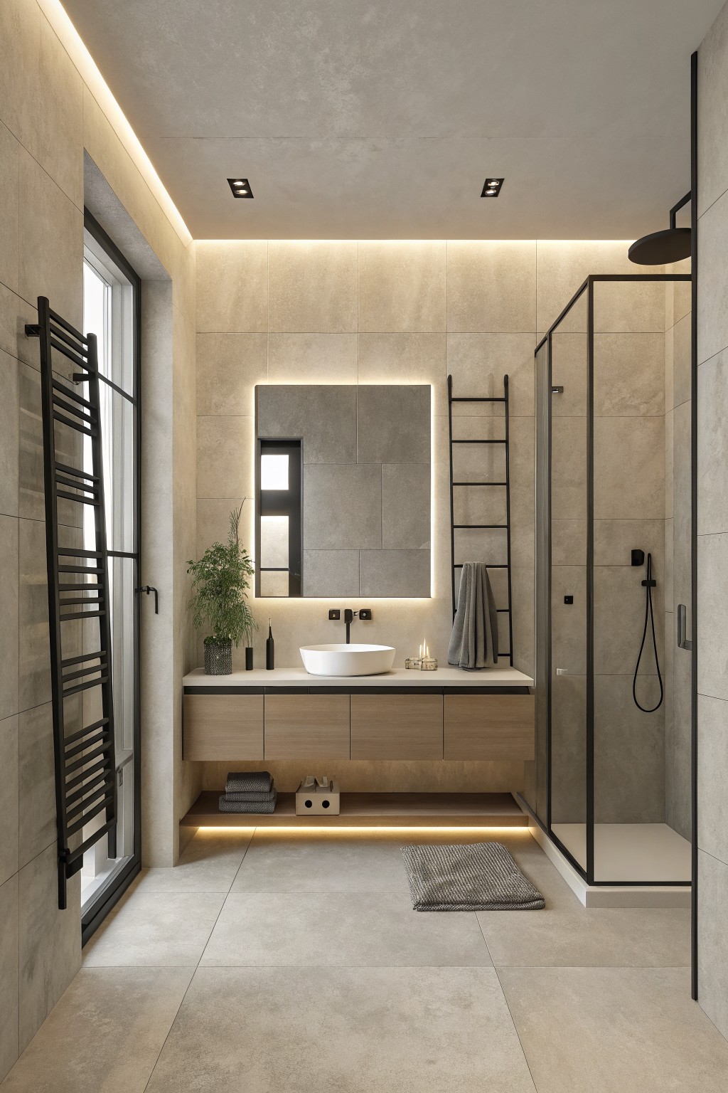
A soft greige like this keeps the bathroom feeling calm and balanced. It sits right between beige and gray with just enough warmth to avoid looking cold or flat. Colors in this range work well when you want something neutral that still feels a little lived in.
It has a light warm undertone that pairs easily with wood vanities and stone tiles. Try it with black hardware or simple white fixtures. It can look a bit flat in very low light, so it does best in bathrooms that get some natural light during the day.
Warm Yellow Walls
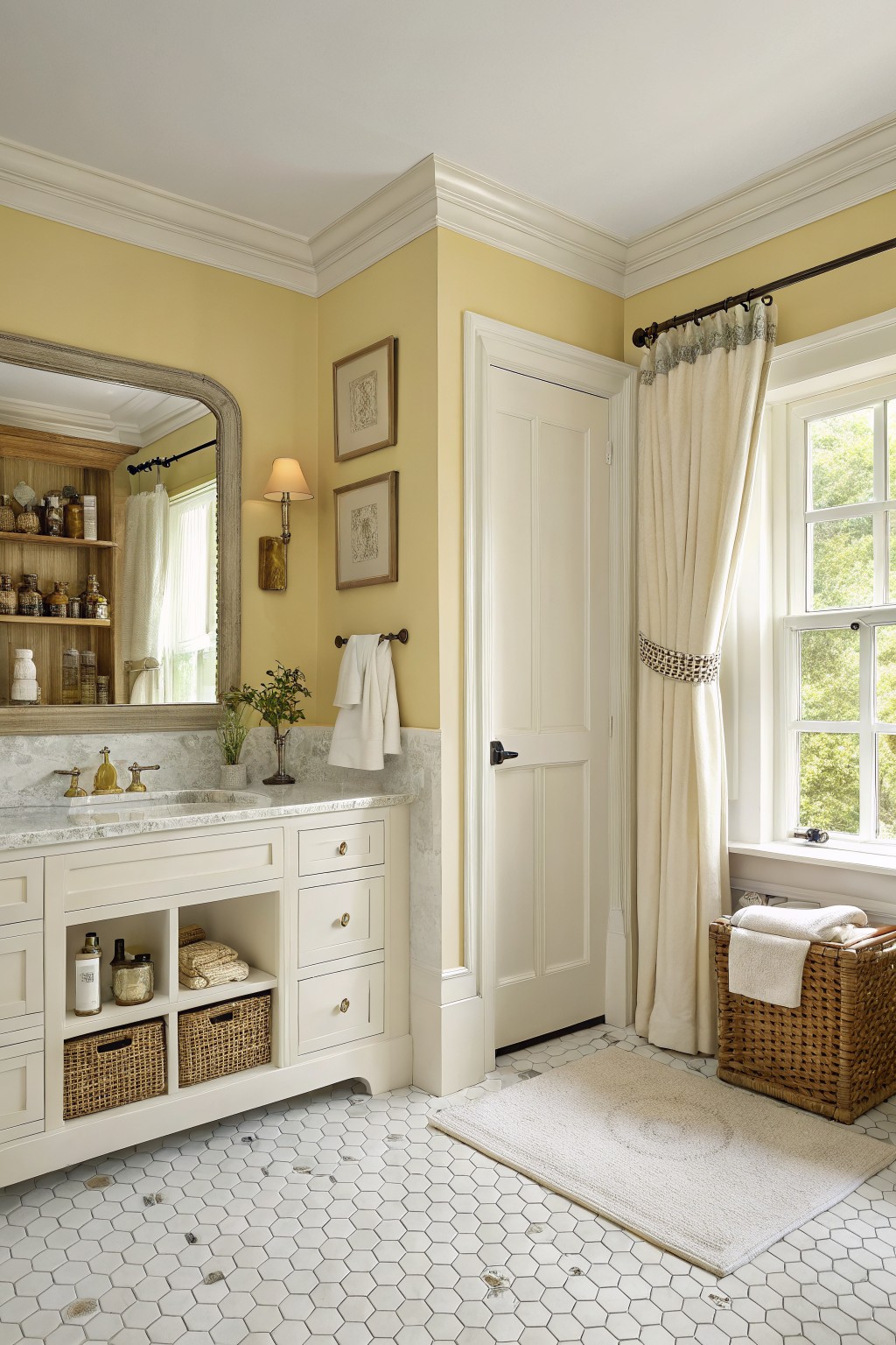
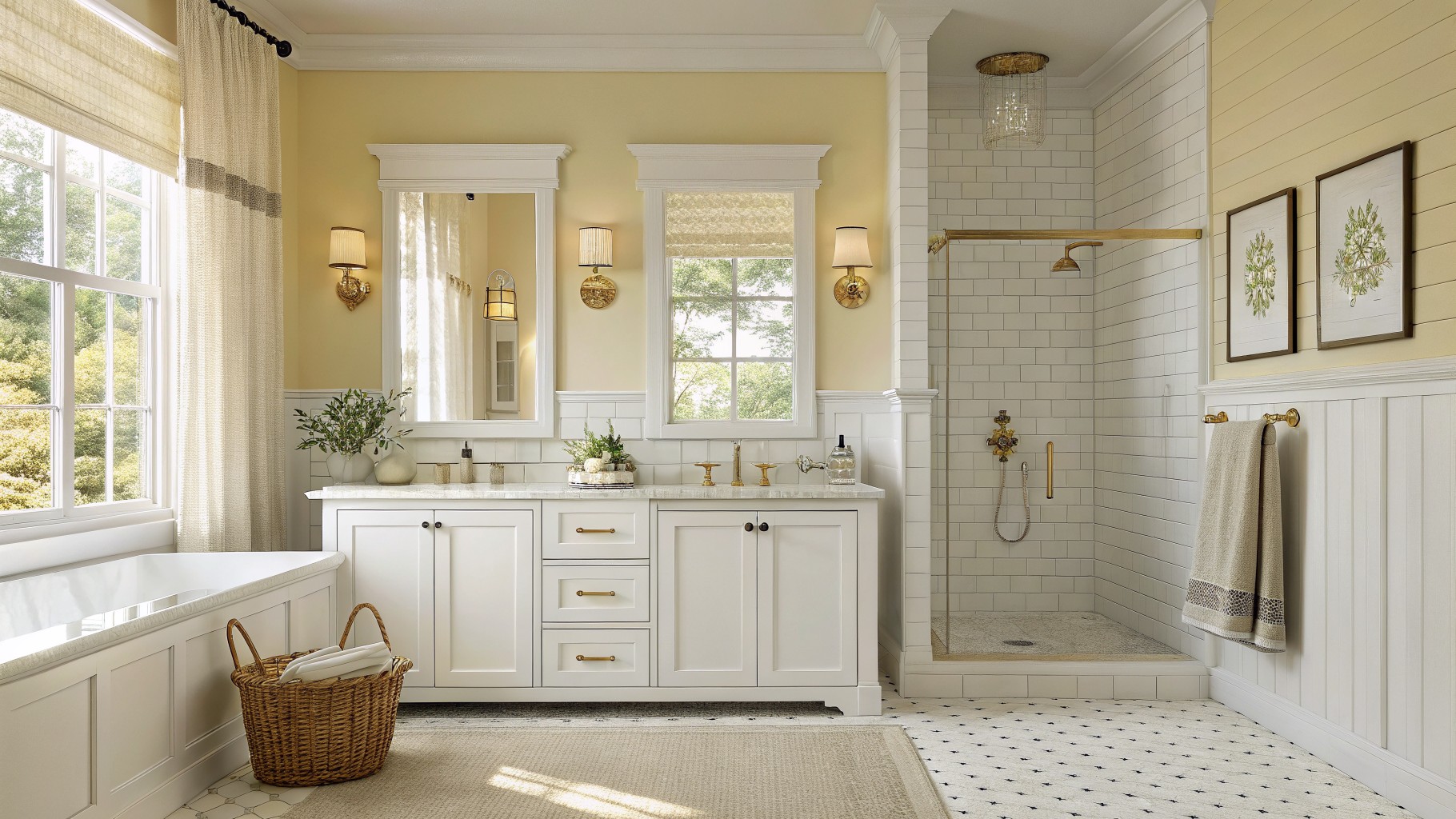
A soft yellow brings gentle warmth to a bathroom without overpowering it. This pale shade feels calm and light, and it works especially well with white trim and marble. It falls into the warm yellow family and reads closest to Benjamin Moore Pale Yellow, Sherwin Williams Mellow Yellow, or Behr Banana Cream.
The color has a slight creamy tone that keeps the room from feeling stark. It pairs nicely with wood tones and white fixtures, though it can shift a little greener in cooler light so a test patch helps before committing.
Soft Blue Gray Bathroom Walls

This bathroom uses a soft blue gray on the walls. It is a cool neutral that stays calm and simple while adding just enough color to keep the space from feeling flat.
The color sits well with warm wood tones and gray tile, and it works best in rooms with decent natural light. Try it with white trim or black hardware if you want a little contrast.
Soft Sage Green With Wood Vanity
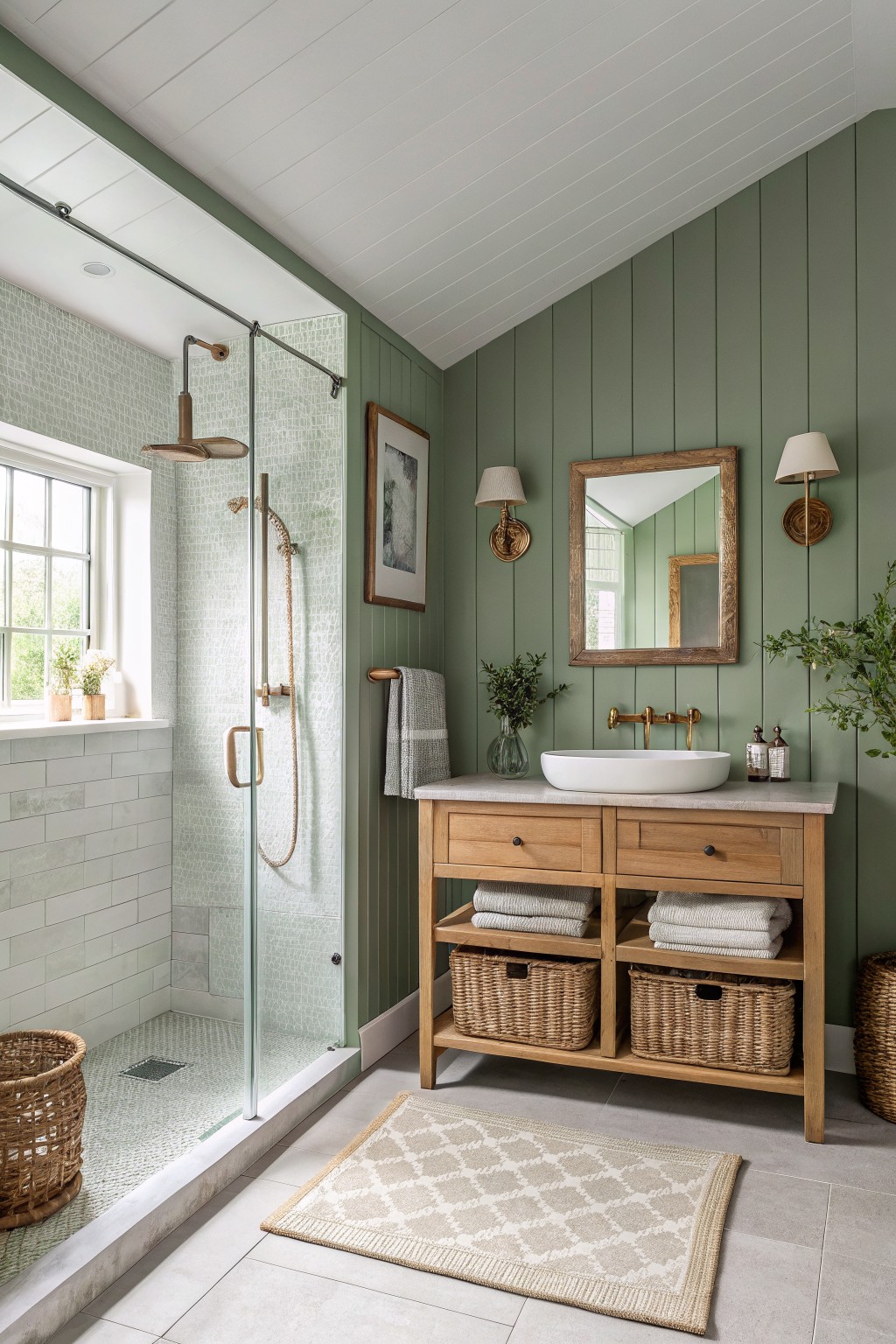
This bathroom uses a soft sage green that sits right in the middle of the neutral range. It has enough color to feel fresh but stays calm enough that it works with wood tones and stone without fighting them. Many people reach for shades like this because they hold up well over time and do not date quickly.
The color has a light gray undertone that keeps it from turning too yellow or too blue in different lights. It pairs easily with natural wood vanities and pale tile, though it can look a bit flat if the room has no warm wood or brass accents to balance it.
Deep Charcoal Bathroom Walls
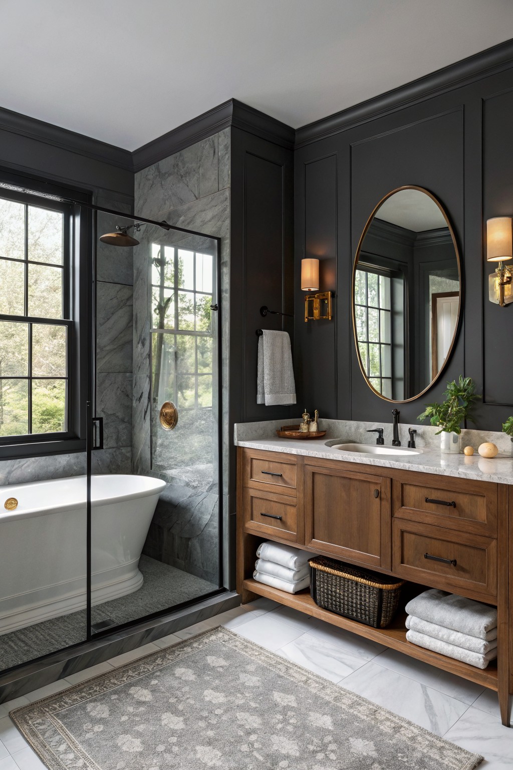
This deep charcoal gray gives a bathroom a grounded, moody feel that still reads as neutral. It has enough depth to make the space feel intentional rather than stark, especially when the walls are the main color in the room.
It sits close to Sherwin Williams Iron Ore, Benjamin Moore Kendall Charcoal, Behr Black Fox, and Farrow & Ball Railings. The color pairs well with warm wood vanities and white marble, but it needs decent light or it can feel heavy in smaller bathrooms.
Warm Beige On The Walls
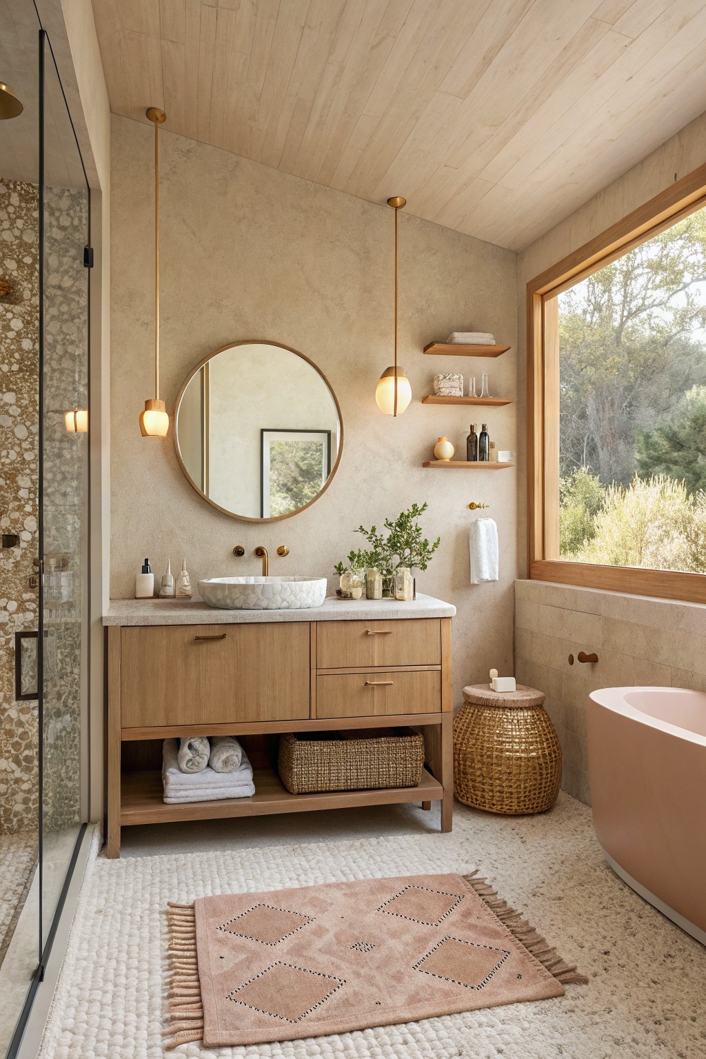
This bathroom uses a soft warm beige on the walls. It is a simple neutral that feels calm and easy, and it lets the wood and stone elements do most of the work.
The color has a light sandy undertone that stays gentle even with lots of daylight. It works best with natural wood cabinetry and pale stone, though it can look flat if the room gets very little natural light.
Soft Sage Green With Dark Wood

This muted sage green brings a calm, steady feel to a bathroom without making the space feel cold. It sits right in that soft gray-green family and reads close to Sherwin Williams Evergreen Fog, Benjamin Moore Saybrook Sage, Behr Aged Jade, or Farrow & Ball French Gray. The color works well because it stays neutral enough to pair with wood tones and stone while still giving the room a bit of life.
It has a light gray undertone that helps it look clean next to darker cabinetry or tile. Try it in bathrooms that get decent natural light, and keep the trim and ceiling light to let the walls breathe. Darker wood vanities and simple woven baskets sit nicely against it without competing.
Soft Greige With Stone Accents
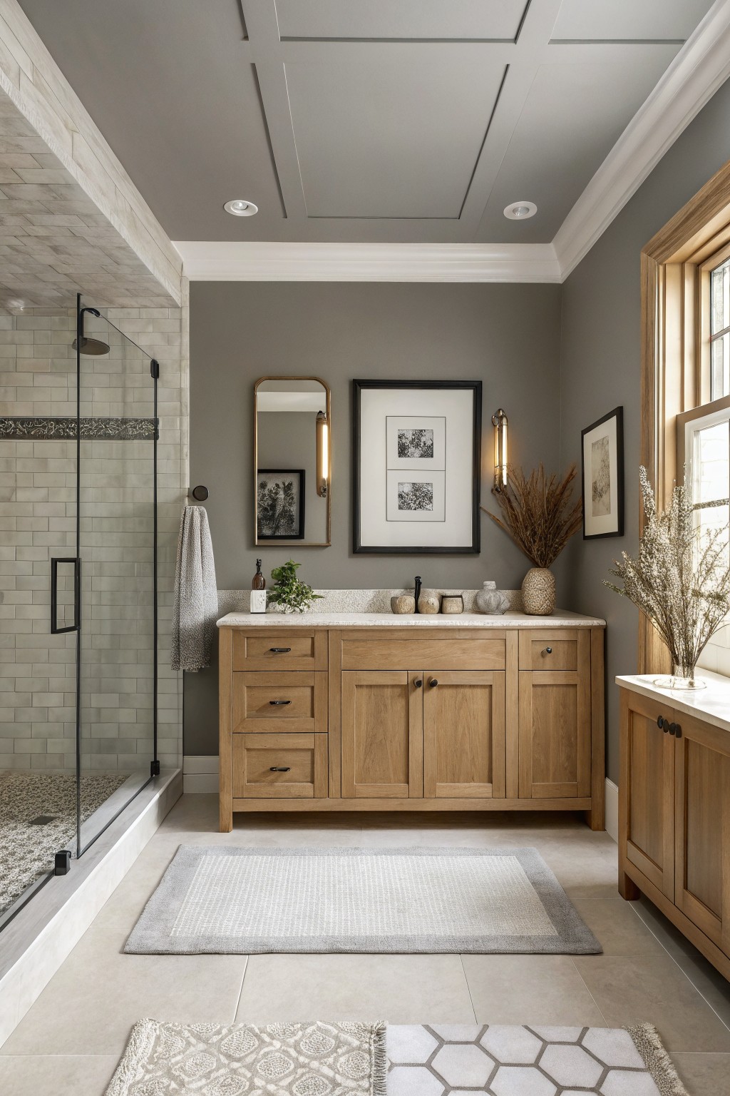
This bathroom uses a soft greige on the walls. The color sits right between gray and beige, so it feels warm without turning yellow and stays calm without going too cool.
It pairs easily with wood vanities and stone counters because the slight warmth keeps the room from feeling flat. The same shade works well in most bathrooms as long as there is decent natural light to keep it from looking dull.
Warm Greige With Natural Wood
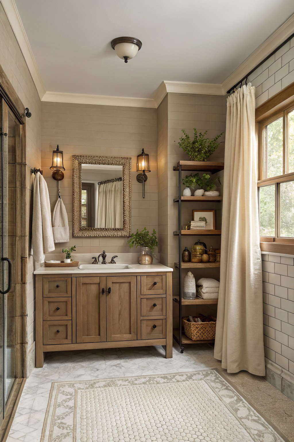
A warm greige like this one gives bathrooms a quiet, steady feel without leaning too gray or too beige. It reads as a soft neutral that works with both wood and tile, which is why it stays useful year after year.
It carries a light warm undertone that helps the space feel balanced next to the wooden vanity and pale tile. Try it with white trim or natural wood accents, and keep darker elements to a minimum so the color does not shift muddy in low light.
Soft Blue Gray With Coastal Touch
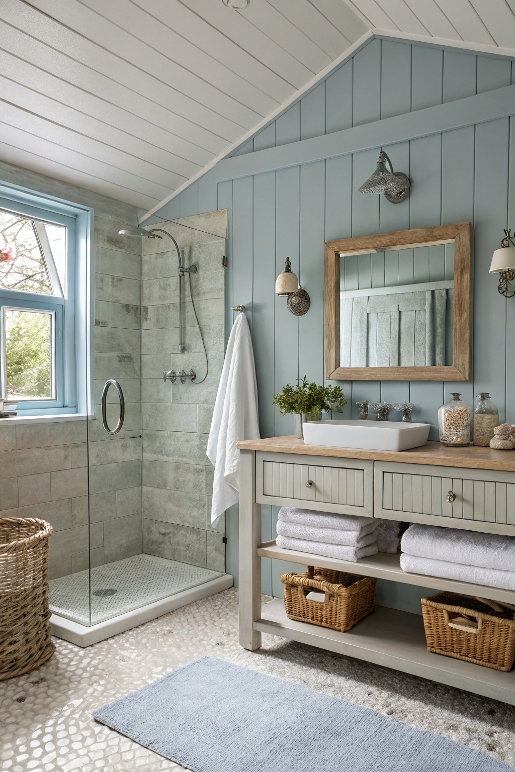
This soft blue gray gives bathrooms a calm, slightly coastal feel that stays neutral over time. It reads very close to Sherwin Williams Rainwashed, Benjamin Moore Palladian Blue, or Behr Ocean Air. The color sits nicely between gray and blue so it does not feel too cool or too washed out.
It has a quiet green undertone that helps it work with wood tones and stone tile. Try it on walls with white trim and natural wood vanities if you want the color to stay relaxed rather than stark.
Warm Greige Walls
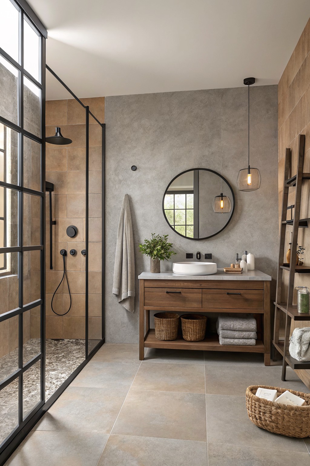
A warm greige works nicely on bathroom walls because it sits right between gray and beige. This shade feels soft but still has enough depth to hold its own next to wood vanities and stone counters.
It carries a light warm undertone that keeps the room from turning cold under most lighting. Try it with black hardware or natural wood tones, and watch how it shifts a bit depending on the time of day.
Frequently Asked Questions
Q: Which neutral works best in a small bathroom without making it feel closed in? A: Go with the lightest option on the list like a warm off-white. It bounces light around and keeps the room open. Paint the ceiling the same shade for an extra lift.
Q: How do I know if a color will match my white subway tiles? A: Hold paint samples right next to the tile in your actual bathroom. Warm neutrals blend in smoothly while cool ones can look off. One test patch saves a lot of regret later.
Q: Why does the paint color look off once I get it on the walls? A: Bathroom lights change everything from what you saw at the store. Brush on a big sample and check it morning and night. Adjust from there before committing to the whole room.









