I’ve painted more rooms than I can count, and every time a color looks nothing like the sample under my home’s lights.
Morning sun might warm a neutral into something cozy, but evening shadows can drag out unexpected cool undertones that throw everything off. I once went with a soft green for a bedroom that ended up feeling flat and dated by winter.
The best classics hold steady across those changes without pulling tricks. Test them in your real light.
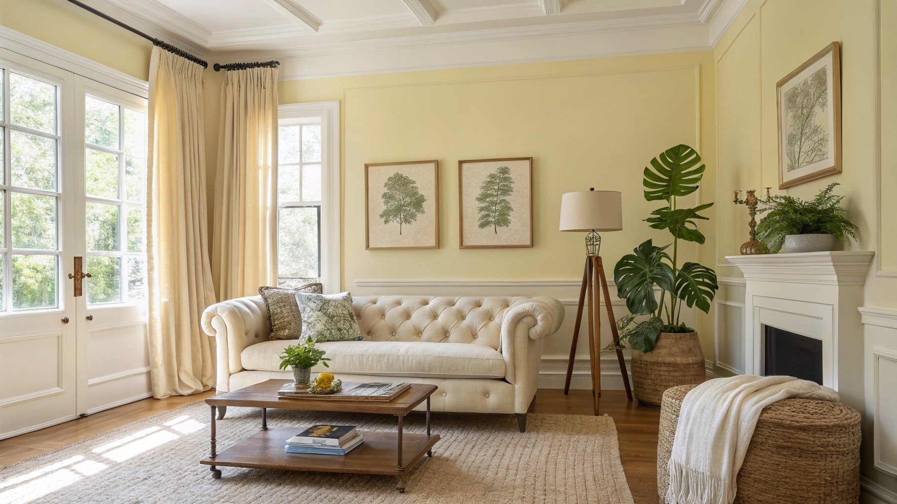
Sunny Pale Yellow Walls

Those walls show off a classic pale yellow. It’s soft and warm, the kind that brightens a space gently. Best matches would be Sherwin-Williams Greek Villa or Benjamin Moore Hawthorne Yellow. Folks like it because it feels fresh yet timeless, especially next to white trim.
The warm golden undertone keeps everything cozy, like with the cream sofa and wood table here. It shines in rooms with good natural light from big windows. Pair it with beiges and greens for balance. Watch that your bulbs aren’t too cool, though.
Pale Blue Walls
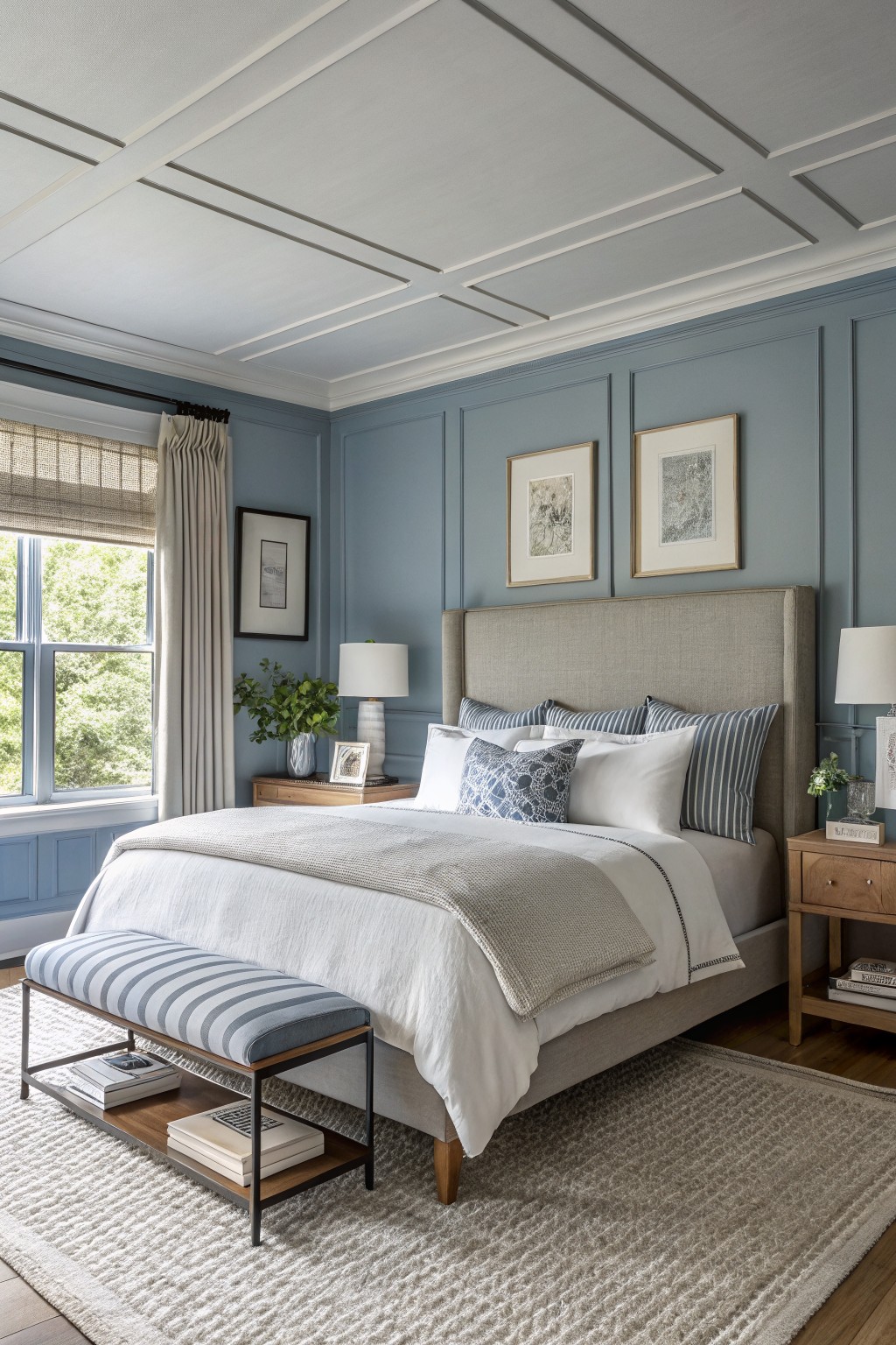
This bedroom shows off a pale blue on the walls that feels just right for everyday living. It looks closest to Benjamin Moore’s Palladian Blue or Sherwin-Williams Rain, with a nod to Farrow & Ball’s Borrowed Light. That soft tone keeps things calm and pairs easy with wood nightstands and white bedding. Folks like it because it brightens the room without overpowering.
The cool gray undertone shines best near windows with good light. It works in bedrooms or studies alongside natural wood or linen fabrics. In dimmer spots it can read grayer, so layer in lamps if needed.
Deep Green Walls
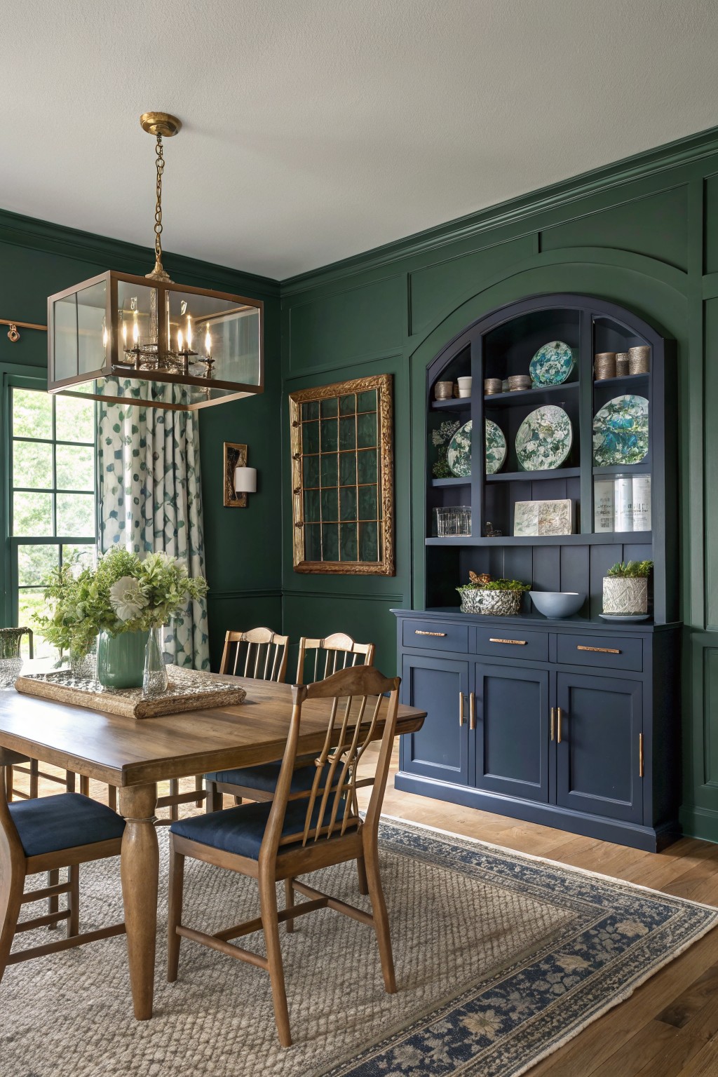
This room pulls off a deep hunter green on the walls that gives a nod to old-school style without feeling dated. It sits closest to Sherwin-Williams Pewter Green (SW 6208) or Benjamin Moore Hunter Green (HC-122), with Farrow & Ball Studio Green not far off. What stands out is how the color has enough depth to cozy up wood furniture but stays lively next to brass and navy pieces.
That warm undertone keeps it from turning muddy. It shines in dining spaces with window light, especially paired with oak floors or blue cabinets like the arched one here. Just test samples in your own lighting first.
Sage Green Cabinets
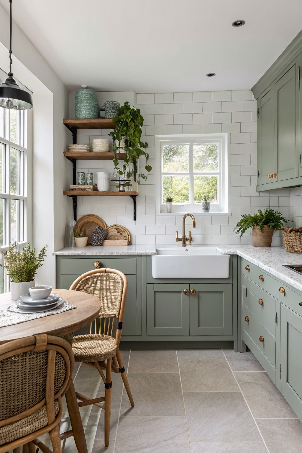
You see this soft sage green on the cabinets here. It looks closest to Sherwin-Williams Retreat or Benjamin Moore Saybrook Sage, maybe Farrow & Ball French Gray. It’s a muted green, gentle enough for everyday use. What stands out is how it stays calm and pretty over time, working well with plain white walls.
That grayish undertone keeps it from going too yellow. Bright kitchens like this one suit it best, especially paired with brass taps or rattan chairs. Watch for dim spots though. It can read flatter there.
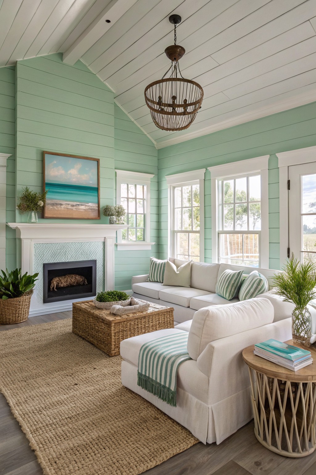
Pale Mint Walls
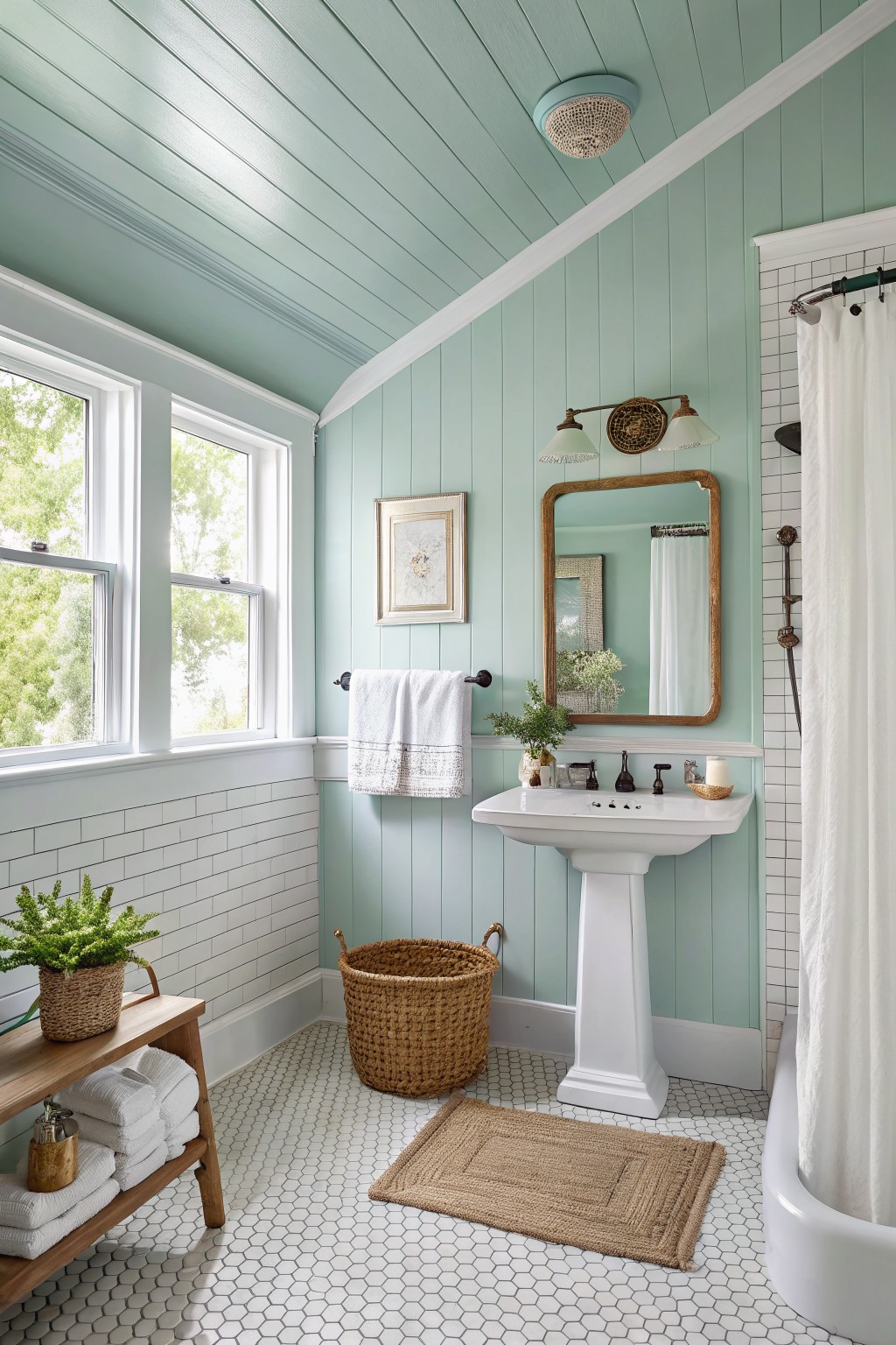
This pale mint green on the walls and ceiling reads very close to Sherwin-Williams Sea Salt (SW 6204) or Benjamin Moore’s Breath of Fresh Air (806). It’s a cool pastel in the blue-green family, light enough to keep things airy but with just enough color to feel intentional. Folks like it because it brings a fresh, spa-like calm without going too bold.
The cool undertones play nice next to white subway tile and wood tones here, especially with plenty of natural light from the windows. Pair it with crisp whites or natural baskets to keep it beachy and relaxed. Watch for north-facing rooms though, it might read a bit cooler there.
Deep Charcoal Walls
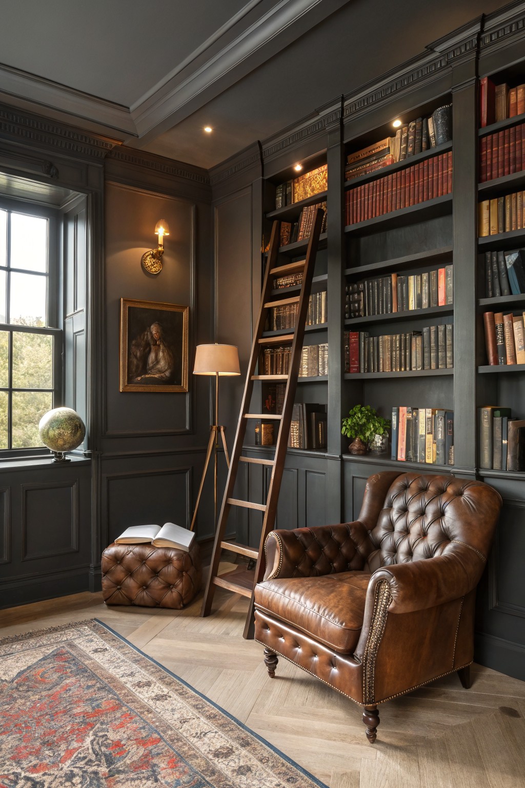
This room pulls off a deep charcoal gray on the walls and built-ins that feels rich and timeless. It reads very close to Farrow & Ball’s Down Pipe, or Sherwin-Williams Iron Ore, maybe Benjamin Moore’s Kendall Charcoal too. Folks like it because it wraps a space in quiet drama, letting wood furniture and books stand out nice and clear.
That warm undertone keeps it from going cold, especially next to oak floors or leather chairs like the one here. It works best in studies or dens with some ambient light. Watch for north-facing rooms though, they might need warmer accents to balance it.
Pale Yellow Window Seat Walls
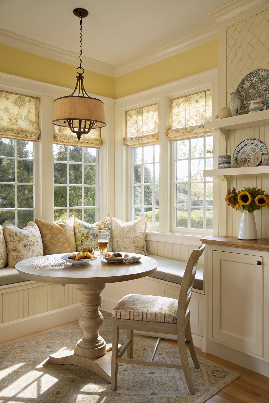
This soft pale yellow on the walls looks closest to Benjamin Moore Pale Yellow OC-3 or Sherwin-Williams Corn Silk. It’s that gentle warm yellow family, not screaming for attention but just bright enough to lift a room. You see it here wrapping around the window seat, making everything feel open and cheerful without going overboard.
The warm undertones play nice with creamy white trim and wood tones, especially in morning light from big windows. Try it in a breakfast nook or sunroom where you want coziness that lasts. Pair with natural fabrics and keep dark floors to balance it out. One thing, it can read a touch greener in fluorescent bulbs, so test samples.
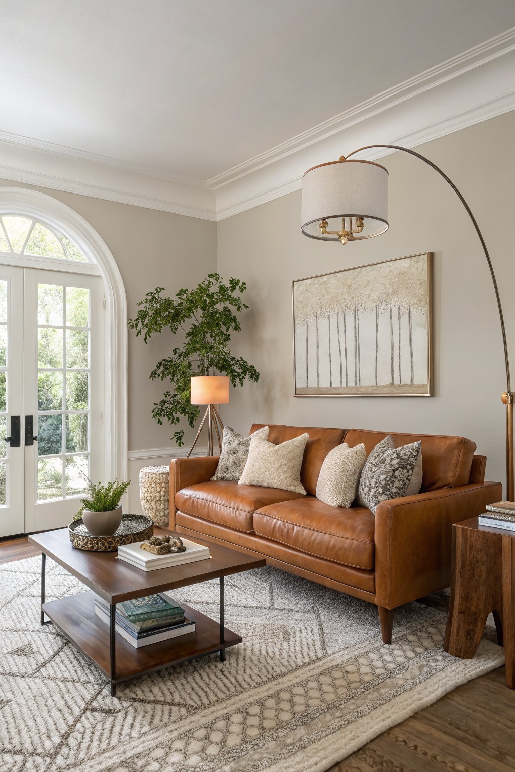
Warm Greige Walls
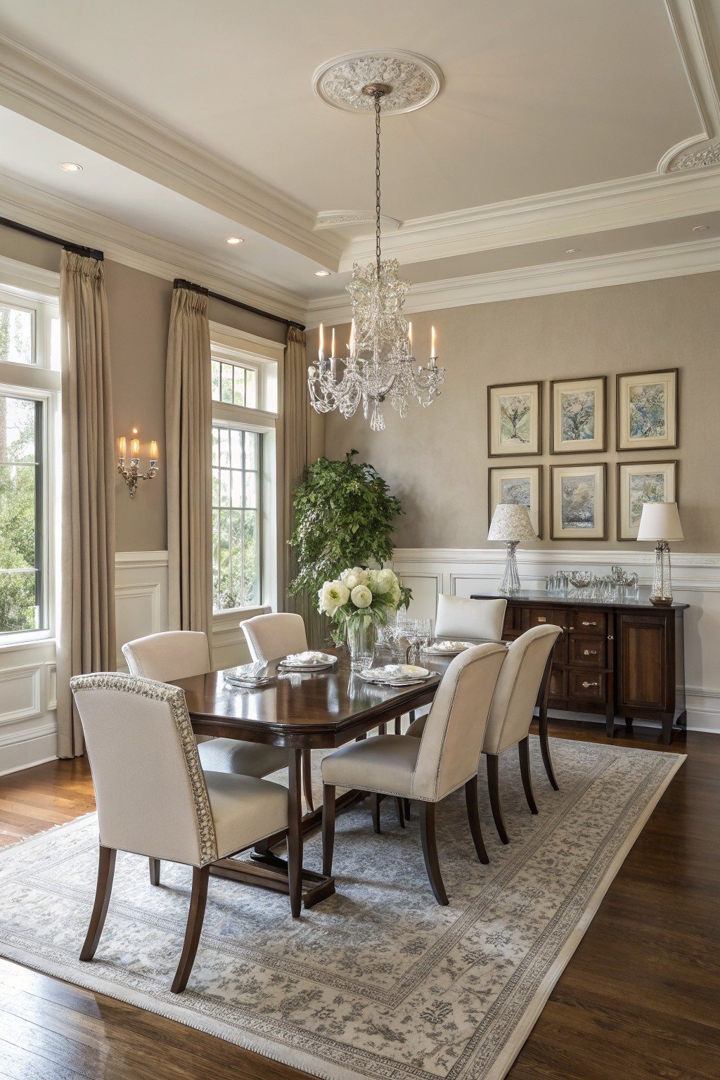
This warm greige on the walls looks closest to Sherwin-Williams Accessible Beige or Benjamin Moore Edgecomb Gray. It’s a soft neutral that sits just right between beige and gray, making rooms feel larger without going cold. Folks keep coming back to shades like this because they handle different lights so well.
The warm undertones keep it from looking flat next to wood furniture like that dining table. Pair it with creamy trim and you’ll see how it warms everything up. Best in dining or living areas where you want calm that lasts.
Pale Sage Walls
This soft pale sage green on the walls reads very close to Farrow & Ball’s French Gray. Or you might find a good match in Benjamin Moore’s Saybrook Sage or Sherwin-Williams Contented. It’s that easy green-gray mix with a warm undertone that feels fresh but not too bold. Folks like it because it lets wood furniture and brass details stand out without overpowering the space.
It picks up light nicely in hallways like this one, especially next to oak floors. Pair it with creamy trim or plants for balance. Just test in your lighting first. Greens can shift cooler in north-facing rooms.
Soft Sage Green Walls
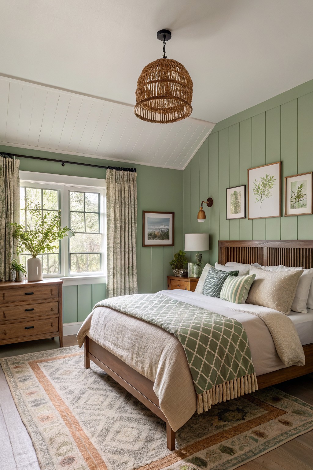
This pale sage green on the walls looks closest to Sherwin-Williams Clary Sage SW 6178 or Benjamin Moore Saybrook Sage HC-114. It’s a muted green with soft gray undertones that feels fresh without being too bold. Folks like it because it brings a bit of outdoors in, especially next to wood tones like the bed frame here.
The gray keeps it from going too yellow in warm light, making it great for bedrooms or any cozy spot. Pair it with white trim, natural fabrics, and plants. Just watch it in low light, where it might read a touch cooler.
Deep Green Cabinets
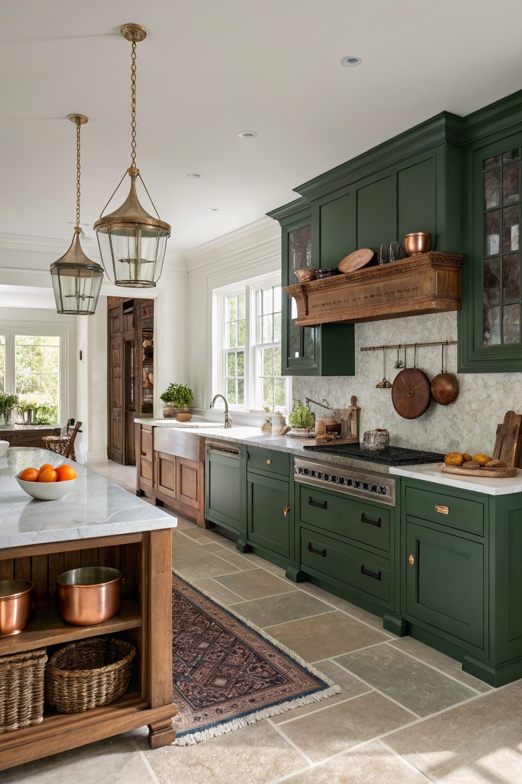
This kitchen pulls off a deep green on the cabinets that feels just right for classic style. It reads close to Sherwin-Williams Pewter Green or Benjamin Moore Caldwell Green, maybe even Farrow & Ball Studio Green. That rich tone works because it holds its own next to warm woods and brass without overwhelming the room.
The color picks up subtle warm undertones from the nearby copper pots and wood trim. It shines best in kitchens with good window light and pale floors or counters to balance it out. Skip it in super small spaces unless you want a cozy mood.
Soft Blush Pink Walls
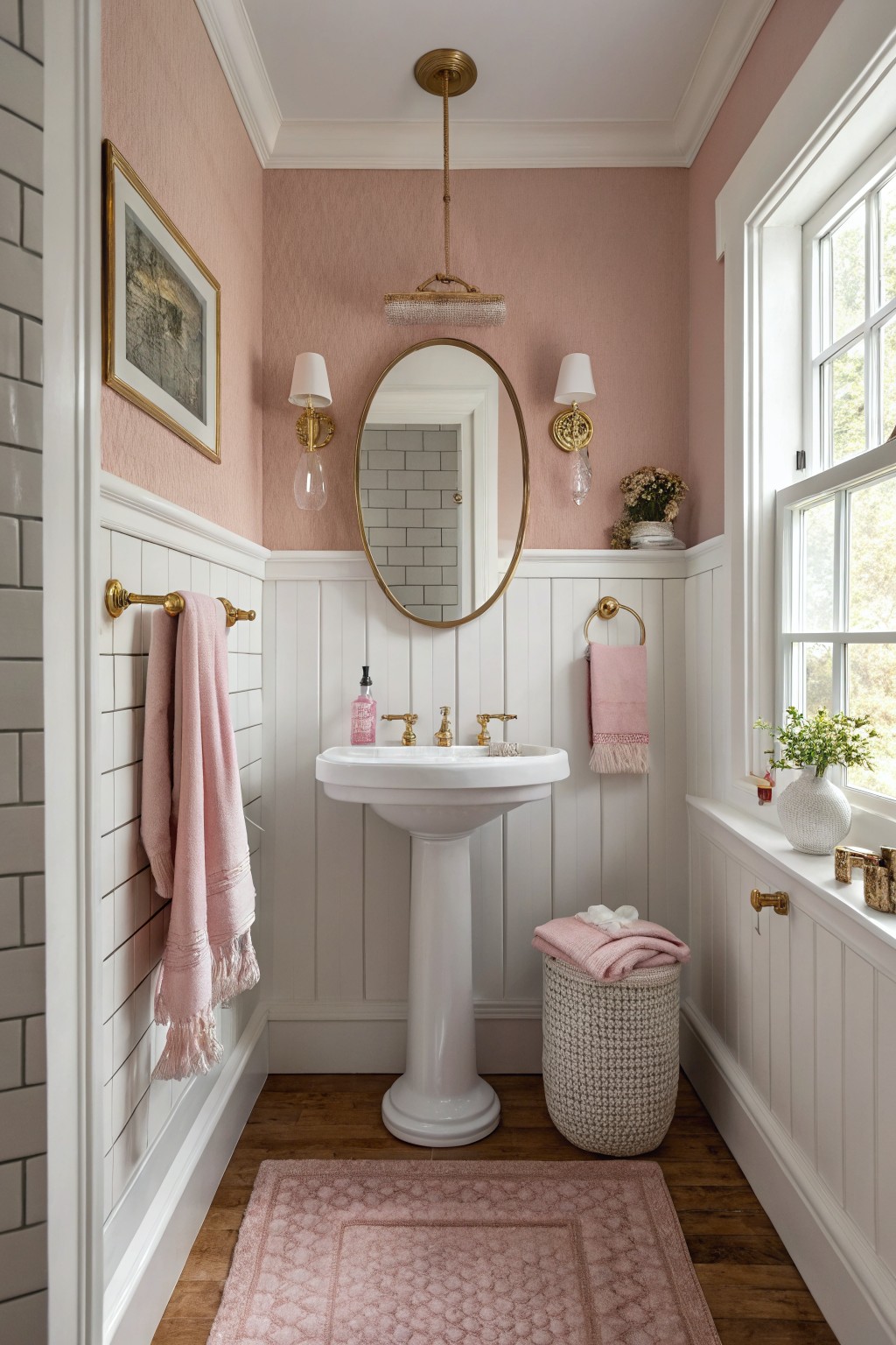
This soft blush pink on the upper walls pulls off that classic look without going too bold. It sits close to Benjamin Moore First Light or Sherwin-Williams Rosé, maybe Farrow & Ball Pink Ground too. People like how it warms up a small space like this powder room, keeping things fresh next to all the white trim and subway tile.
The warm undertone plays nice with gold fixtures and wood floors, making the room feel cozy but not heavy. It works best in good natural light, where it stays lively. Pair it with whites below the chair rail, and skip cooler grays that might dull it.
Soft Greige Living Room Walls
This soft greige on the walls looks closest to Sherwin-Williams Accessible Beige or Benjamin Moore Edgecomb Gray, maybe Behr’s Wheat Bread too. It’s a warm neutral that sits just right between gray and beige. Folks keep coming back to shades like these because they feel steady and let furniture and wood tones shine without competing.
Warm undertones give it life next to tan leather or oak. Brightens up in natural light from big windows. Stick to crisp white trim so it doesn’t go muddy… and test samples in your own room first.
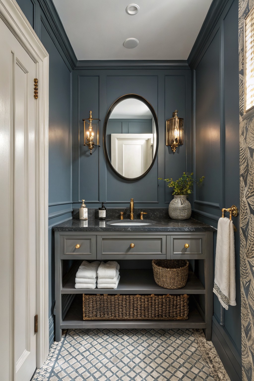
This powder room shows off a deep navy paint on the paneled walls that feels classic and grounded. It sits in that rich navy family, looking closest to Sherwin-Williams Naval, Benjamin Moore Hale Navy, or Farrow & Ball Hague Blue. Folks keep coming back to shades like these because they add real depth without overwhelming a small spot.
The cool gray undertone helps it read softer next to the white trim and gold fixtures. It works best in bathrooms or studies with good lighting. Stick to black counters or wood tones to balance it… just watch it doesn’t pull too dark in north-facing rooms.
This deep navy blue on the doors stands out nicely against white cabinets and wood tones. It has that rich, classic feel people keep coming back to in kitchens. Looks closest to Sherwin-Williams Naval, or maybe Benjamin Moore’s Hale Navy, with Farrow & Ball’s Hague Blue not far off either.
The color leans cool with a bit of gray undertone, so it keeps things crisp instead of too bold. Pairs well with creamy whites and warm woods like on the island here. Works best in rooms with good light, where it adds some weight without overwhelming.
Powder Blue Walls
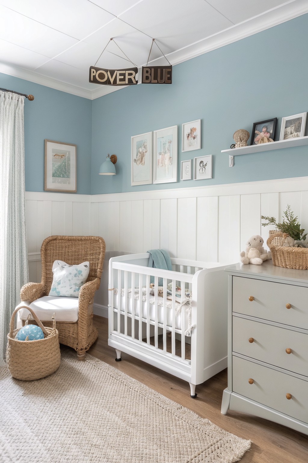
This powder blue on the nursery walls reads very close to Sherwin-Williams Rain or Benjamin Moore Breath of Fresh Air. It’s a soft pastel blue that’s light and airy without going too gray. Folks like it because it keeps a small room feeling open, and that classic sign overhead spells it out perfectly.
Pair it with white wainscoting like here, and it stays crisp next to wood floors or a changing table. The cool undertone works best in spaces with good natural light. Avoid dark furniture that might muddy it up.
Soft Greige Office Walls
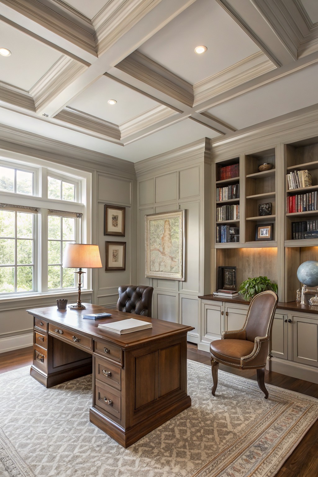
This greige on the walls looks closest to Sherwin-Williams Agreeable Gray. Benjamin Moore Edgecomb Gray comes pretty near too. It’s a warm neutral that sits right between gray and beige. Folks like it because it feels calm and pulls wood furniture forward, like the desk here.
Warm undertones keep it from looking stark. It shines in spaces with good window light. Go for it around built-ins or offices, paired with brown leathers and brass. North light might need a test sample first.
Soft Mint Green Walls
This pale mint green covers the shiplap walls in a fresh, easy way. It looks closest to Sherwin-Williams Sea Salt or Benjamin Moore Saybrook Sage, maybe even Behr’s Back to Nature. Folks like it because it brings a coastal feel without overpowering the room. Keeps everything light.
The cool blue undertone makes it pop near white trim and wood accents. It works best in sunny spots with big windows. Pair with beiges or soft pillows. Just test it first, north light can make it read grayer.
Pale Blue-Gray Walls
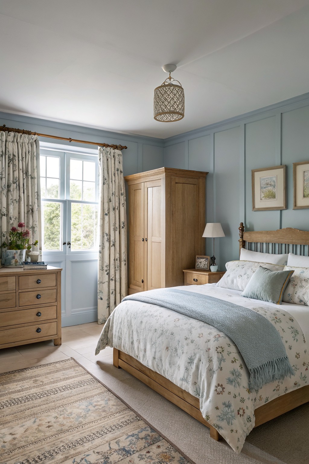
This pale blue-gray paint on the walls reads very close to Farrow & Ball’s Skylight or Benjamin Moore’s Palladian Blue. It’s a cool, understated blue in the gray family that feels fresh without being too bold. Folks like it because it keeps a room calm and pairs so well with natural wood tones.
The gray undertone keeps it from going too icy, especially in north-facing light. It works great in bedrooms like this one, with oak furniture and soft florals. Just watch it next to stark white trim, it can look a touch cooler there.
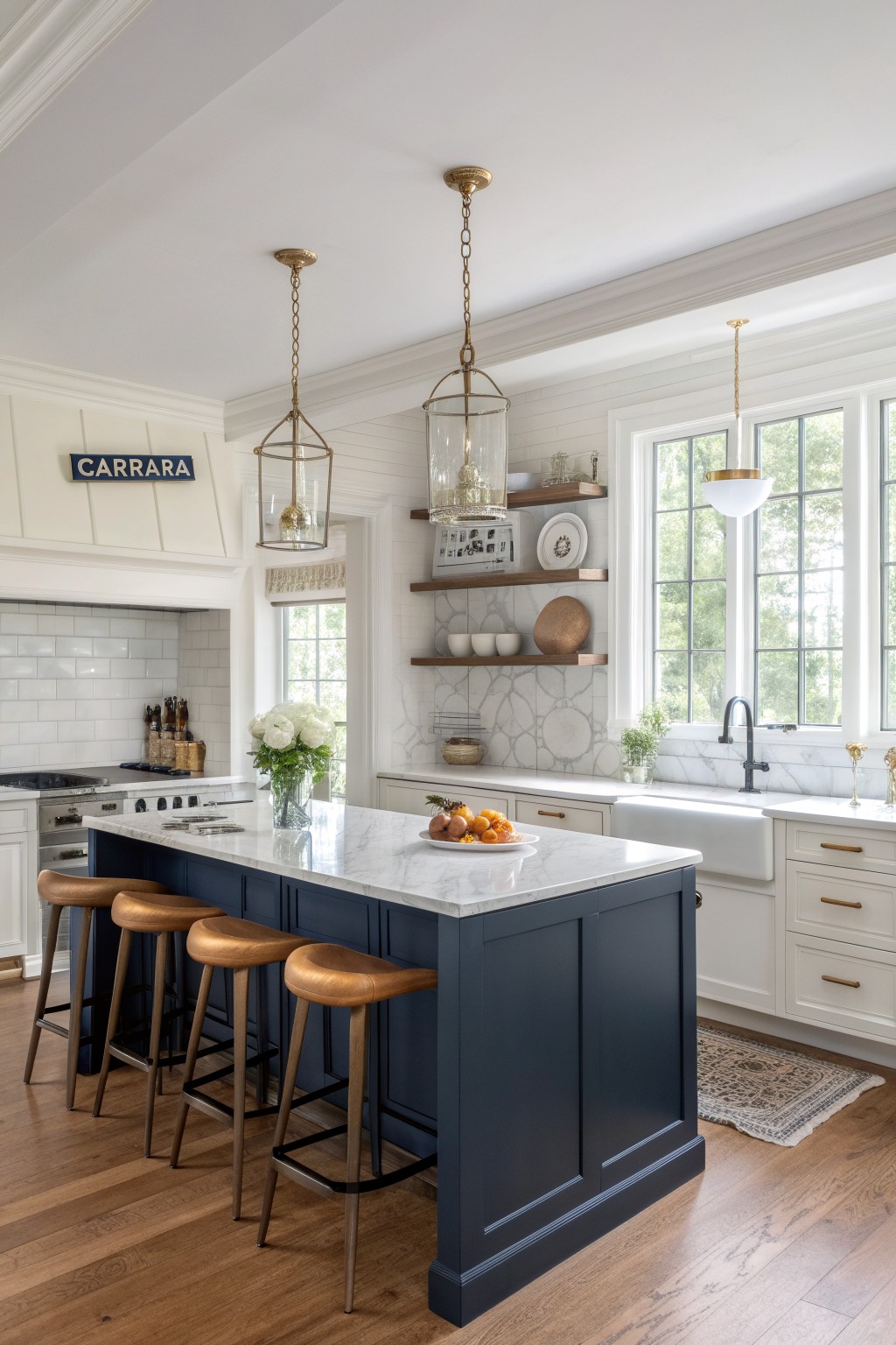
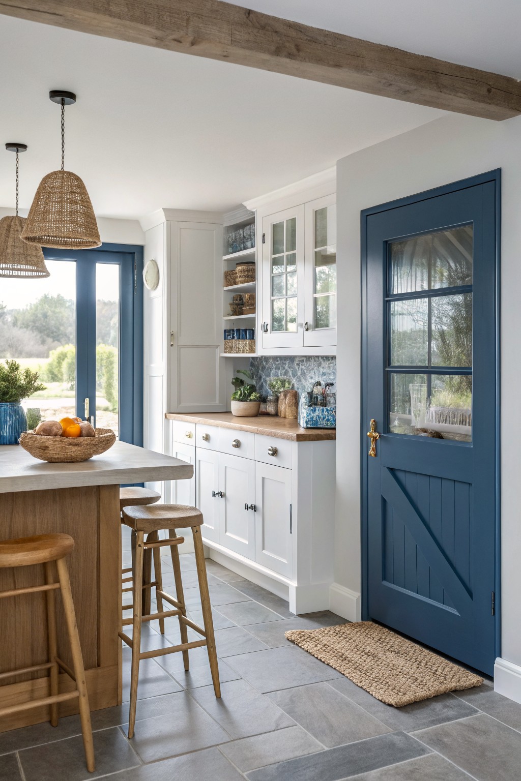
That deep navy on the kitchen island pulls the whole room together in a classic way. It’s a true navy blue family shade, closest to Sherwin Williams Naval or Benjamin Moore Hale Navy, maybe even Farrow & Ball Hague Blue. What makes it work so well is how it adds real weight next to all the white cabinets and marble without overwhelming things.
The undertone leans a touch gray in bright light, which keeps it fresh. It pairs nicely with warm wood floors and brass hardware like you see here. Stick to kitchens or spaces with good windows, though. In dimmer spots it might read too dark.
Matte Black Cabinetry
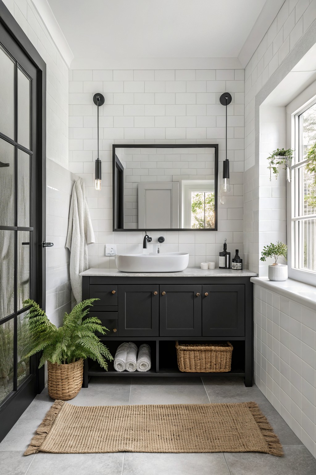
This bathroom pulls off a deep matte black on the cabinets that feels solid and classic. It looks closest to Sherwin-Williams Tricorn Black or Benjamin Moore Onyx, with maybe a nod to Farrow & Ball’s Off-Black. Black paint like this anchors everything without fuss, especially in a tiled space where it stays crisp.
No pink or green undertones to worry about. Just straight-up neutral black that holds up next to white tiles and brass pulls. Try it in bathrooms or kitchens with good light. It hides smudges better than glossy finishes too.
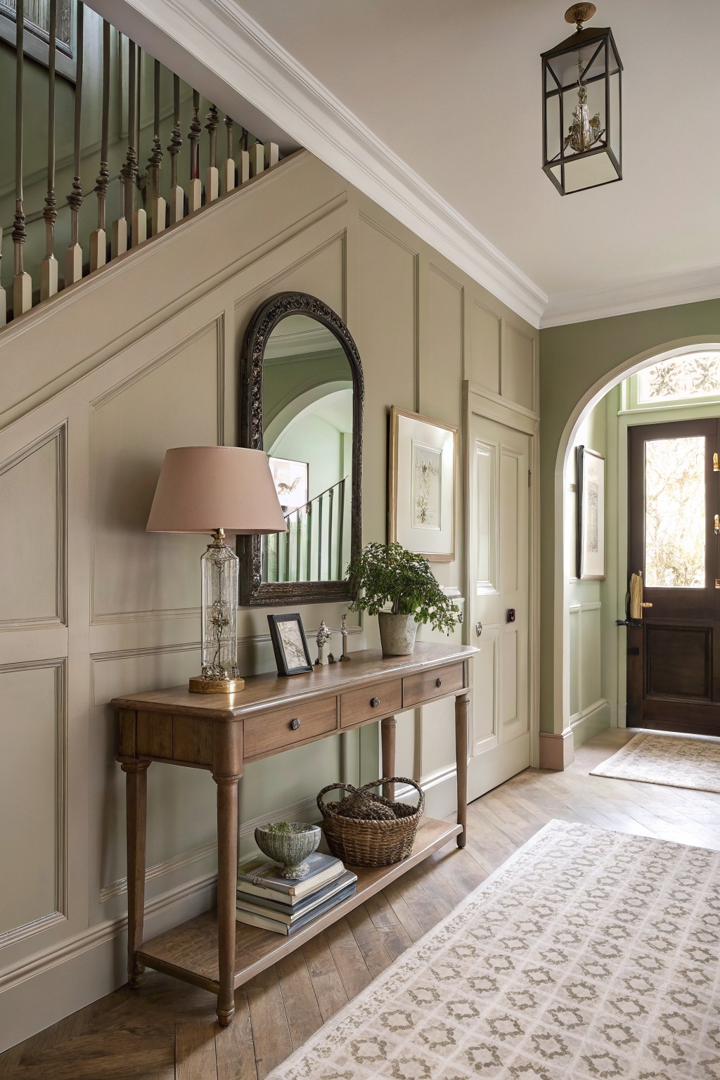
Soft Greige Entryway Walls
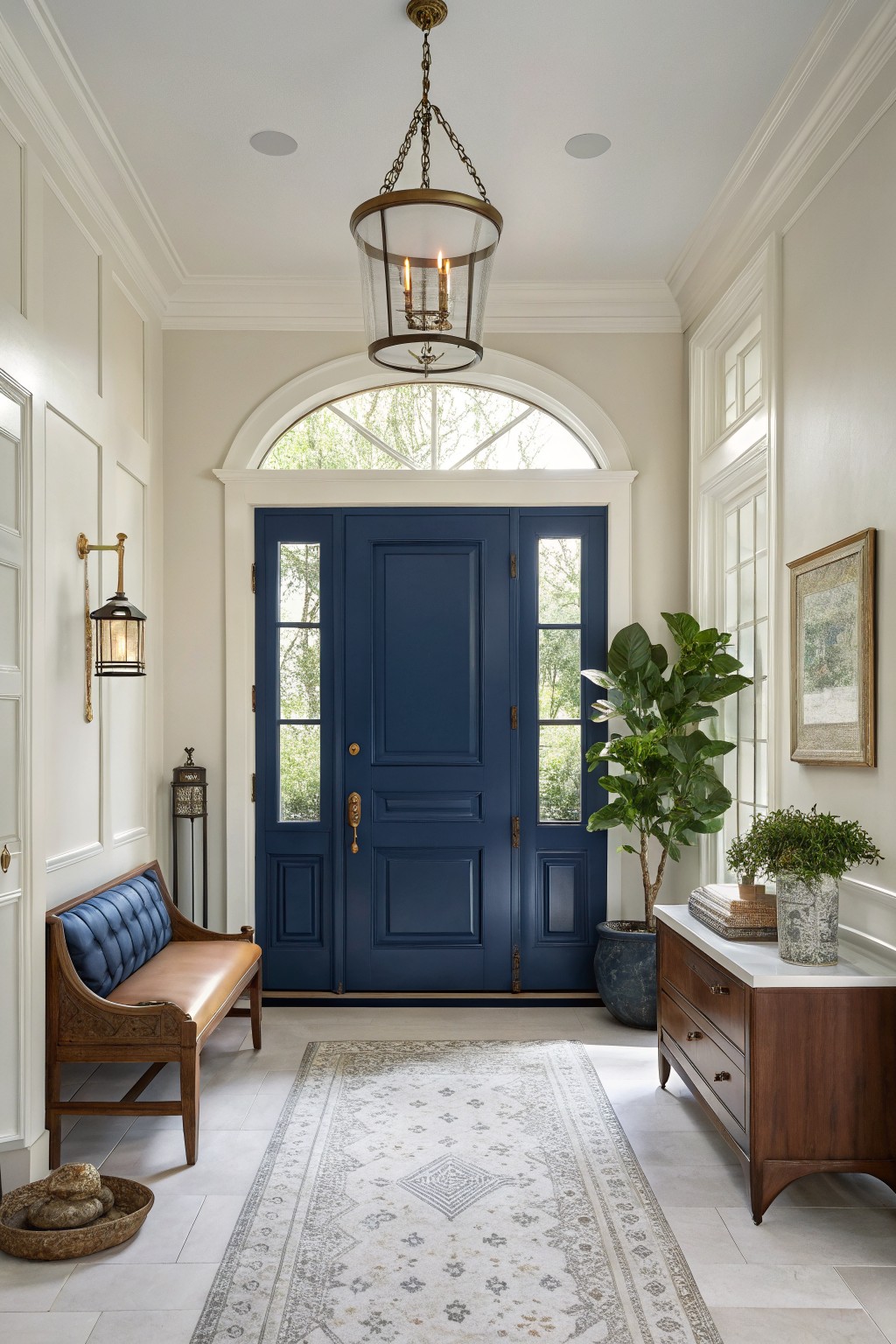
Those walls show a soft greige that’s warm and easygoing. It reads closest to Sherwin-Williams Alabaster or Benjamin Moore White Dove. People go for this kind of color because it brightens a space without feeling stark, and it lets wood and brass details stand out nice.
The warm undertone keeps it from looking cold under entry lighting. Try it in foyers or hallways where you pair it with deeper accents like navy doors. Just test samples, since it can shift a bit with the floor tile.
Frequently Asked Questions
Q: Will these classic colors work in a small room without making it feel cramped?
A: Go for softer neutrals like pale greige or creamy off-white. They reflect light and open up the space naturally.
Q: How do I test a paint color before painting the whole room?
A: Grab large sample cards from the store and tape them to your walls at eye level. Live with them for a few days through different times of light. That shows the true color shift you won’t get from a tiny chip.
Q: What if my room has lots of natural light—will bold classics still look good?
A: Bright light tempers bold colors like deep navy or hunter green. They stay rich without overwhelming the room. Pair with sheer curtains to soften the glow.
Q: Can I use the same classic color throughout my open-plan home?
A: And here’s a tip: pick one versatile shade like warm taupe as your base. It flows seamlessly from kitchen to living area. Accent with bolder picks from the list in focal spots.