I’ve spent enough time with moody paints to know they transform a room’s mood in ways that feel almost alive.
They pull you in during golden hour but can turn flat or muddy if the light shifts wrong or the walls face north all day.
I tried a smoky eggplant once on a sample board, and it only revealed its real depth when evening shadows hit.
Colors like these succeed when they lean into your home’s natural light instead of battling it.
Test a couple in your space before committing.
Dark Charcoal Gray Walls
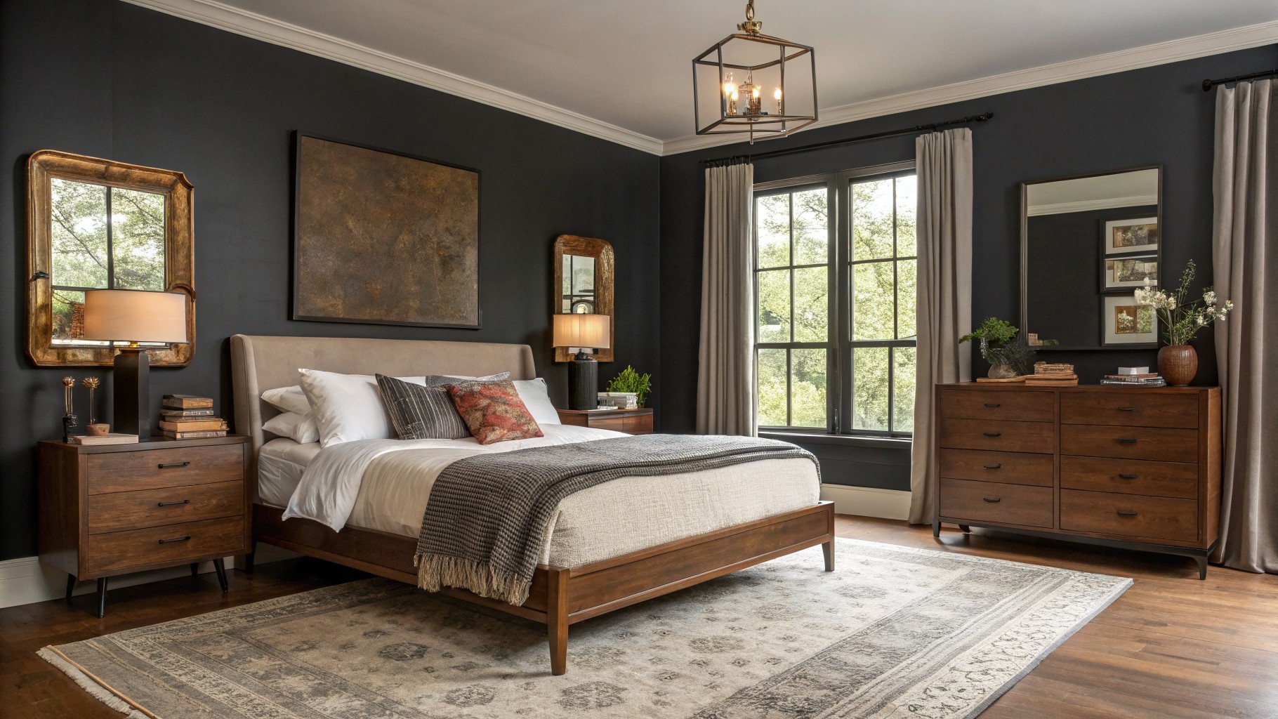
Those walls are a deep charcoal gray, close to Sherwin-Williams Iron Ore or Benjamin Moore Kendall Charcoal. It’s got that rich, almost black feel but stays in the gray family for a moody punch. Folks pick it because it makes wood furniture pop without overwhelming the room.
The undertone leans warm, especially next to the oak bed and rattan lamp. It works best in spaces with some natural light, like this bedroom setup. Pair it with beiges and soft throws to keep it cozy. Just test samples first, north light can pull it cooler.
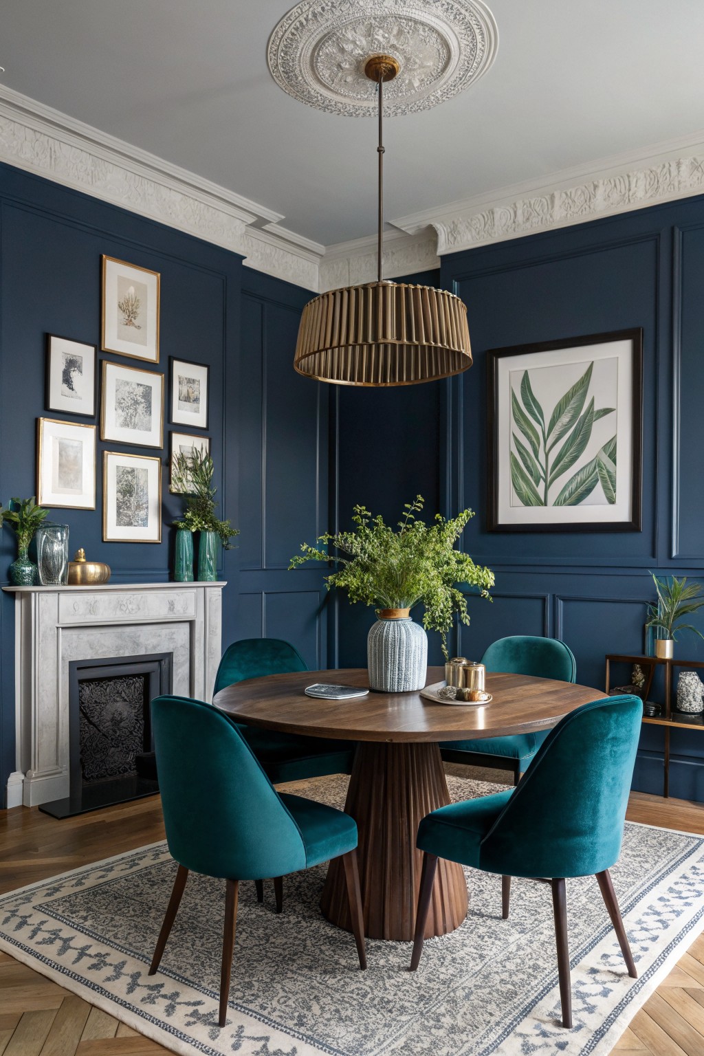
This deep navy on the paneled walls looks closest to Sherwin Williams Naval or Benjamin Moore Hale Navy, maybe even Farrow & Ball Hague Blue. It’s a moody blue in that rich, almost inky family that packs a punch. What stands out is how it turns a simple dining corner into something special, with the white trim keeping things crisp.
The color pulls a bit cool but warms up next to the wood table and parquet floor. It works best in rooms with decent light, paired with greens or brass like you see here by the fireplace. Skip it if your space stays dim… could get heavy fast.
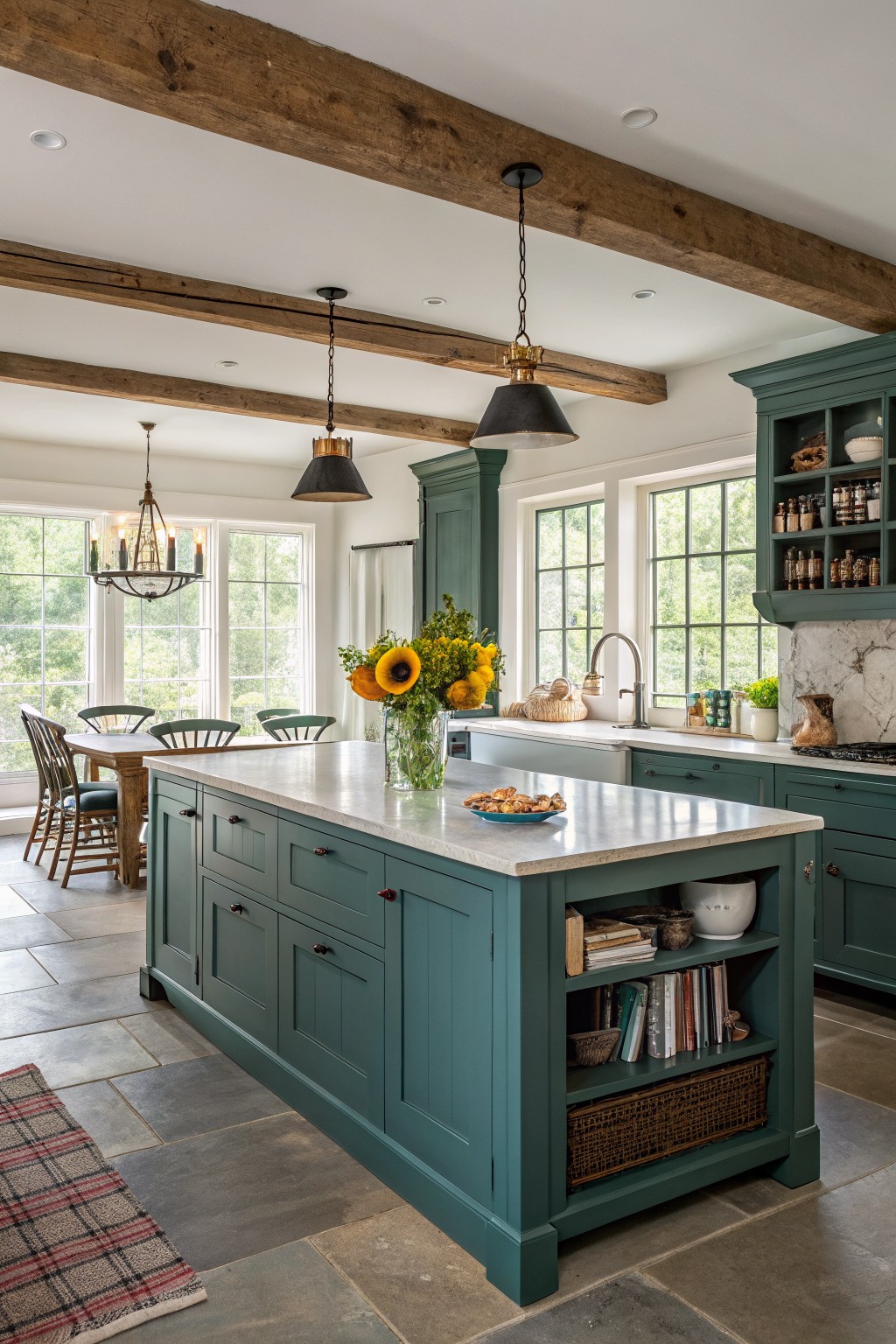
Deep Green Cabinets
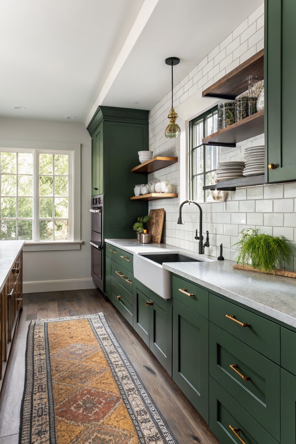
Those deep green cabinets make this kitchen feel moody and strong. It’s a rich hunter green with some warmth to it. This shade reads very close to Sherwin-Williams Pewter Green or Benjamin Moore Essex Green, maybe Farrow & Ball Green Smoke too. Folks pick it because it stands out but stays cozy next to wood and white tile.
The warm undertones keep it from going cold, especially with brass pulls and natural light from the window. It suits kitchens best where you want lower cabinets to anchor the room. Go with light quartz tops so the green doesn’t overwhelm.
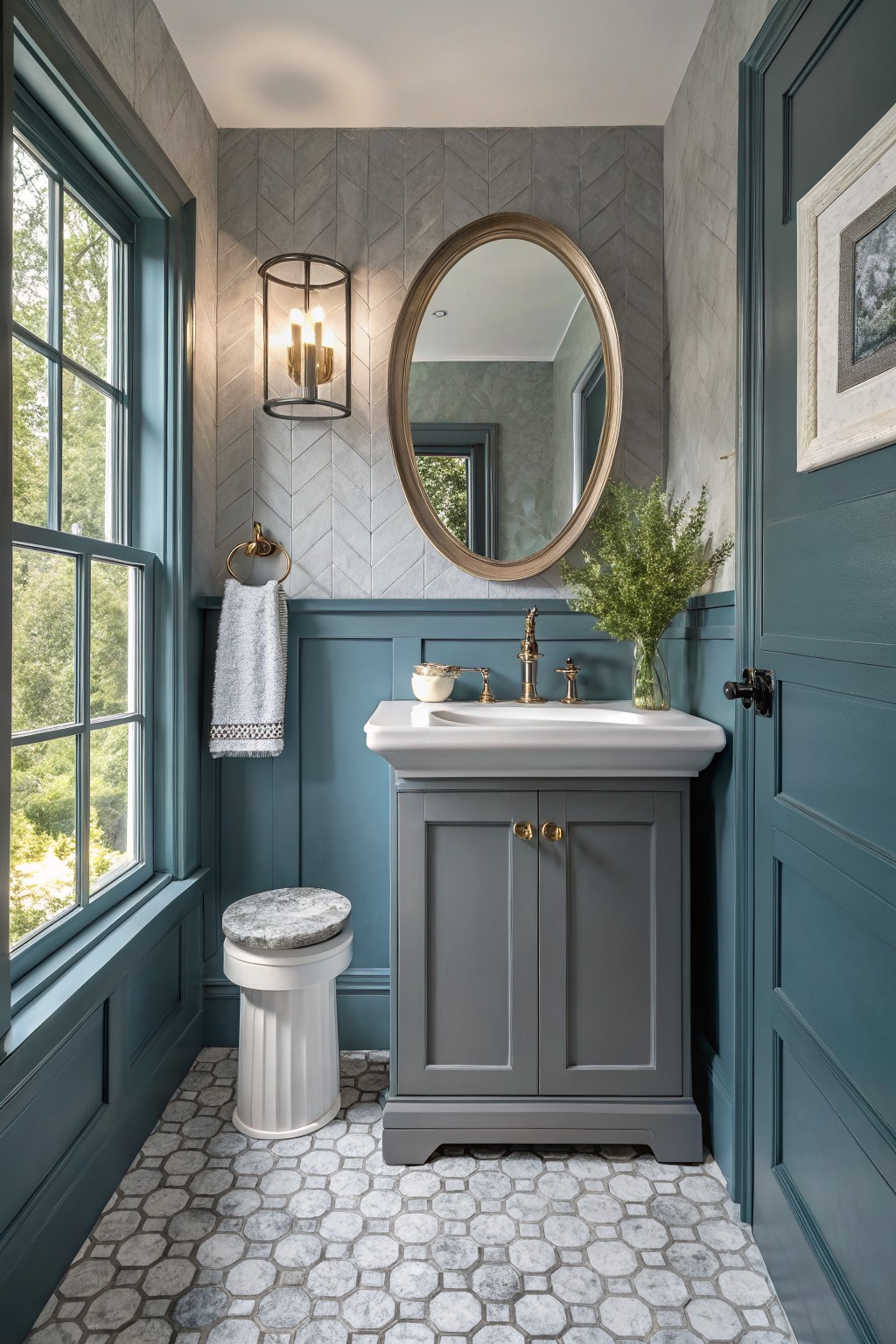
Deep Purple Walls
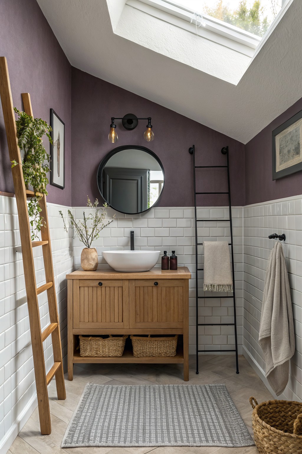
This deep purple on the upper walls pulls off a moody look that’s close to Farrow & Ball Brinjal. You could also match it with Sherwin-Williams Ironweed or Benjamin Moore Black Plum. It’s the kind of rich purple that feels cozy without overwhelming a small bathroom. The color sits right against the white subway tile below and makes the oak vanity stand out nice.
That warm gray undertone keeps it grounded, especially under skylight. It works best in spaces with some natural wood or black accents to balance things. Watch for low light though. It can read darker there.
Deep Burgundy Walls
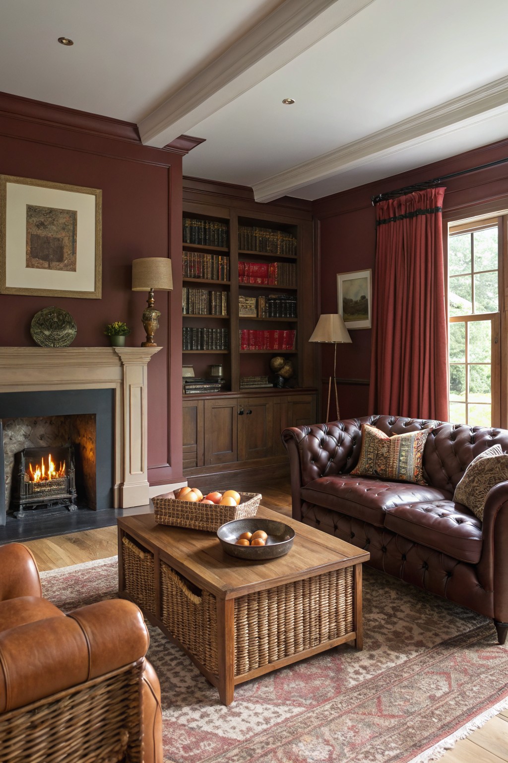
The walls in this living room show off a deep burgundy paint that seems closest to Sherwin-Williams Rookwood Red, Farrow & Ball Picture Gallery Red, or Benjamin Moore Black Raspberry. It’s a moody red in that rich, warm family, the kind that makes a room feel cozy and wrapped up. People like it because it stands strong next to wood trim and leather without washing out.
That warm undertone keeps it from going too purple or flat. It works best in spaces with some natural light, like near these big windows, and pairs easy with oak shelves or a stone fireplace. Just test it first if your room is mostly north-facing.
Deep Charcoal Walls
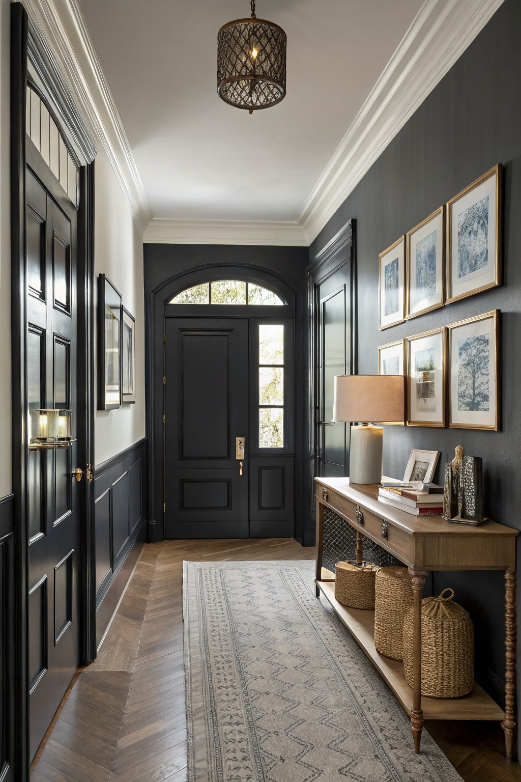
This hallway pulls off a deep charcoal gray on the walls that feels moody and strong. It sits close to Sherwin-Williams Iron Ore or Benjamin Moore Onyx, maybe even Farrow & Ball Railings. That near-black depth makes the space feel wrapped up and important right from the front door.
With wood floors running underfoot and brass lights nearby, the color picks up a slight warm undertone. It works best in spots with some natural light, like an entry that gets afternoon sun. Keep trim white or add wood pieces to balance it out.
Deep Teal Walls
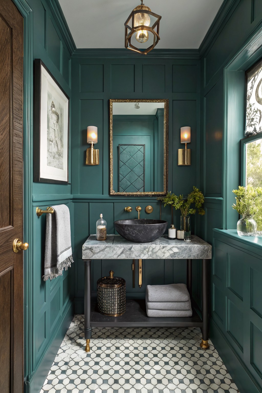
This deep teal shows up bold on the paneled walls in this little powder room. It looks closest to Sherwin-Williams Black Lagoon or Farrow & Ball Hague Blue, maybe Benjamin Moore Borrowed Blue too. That moody blue-green family just wraps the space up nice, turning a tiny bathroom into something special. Brass lights and the marble vanity top play right off it.
The cool undertone gives it depth without going flat. It works great in rooms with a bit of natural light from a window. Go for black stone sinks or gray towels to pair with it… and that geometric tile floor underneath keeps things crisp. In dimmer spots it can read almost navy, so test a sample first.
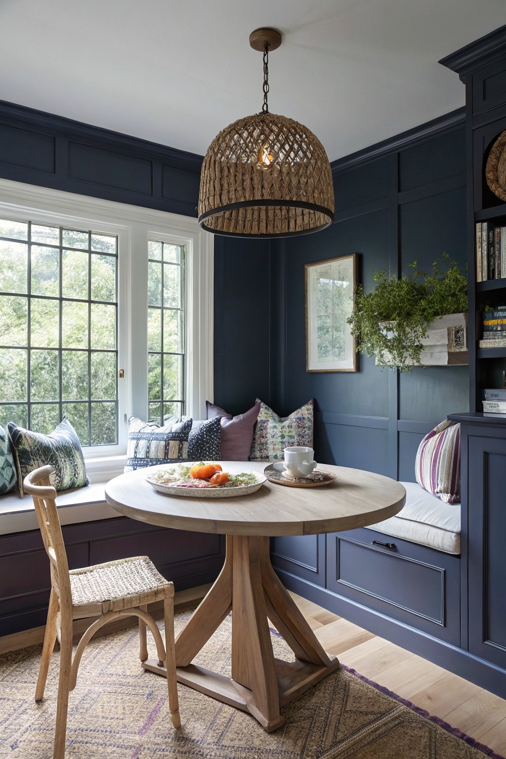
This setup uses a deep navy blue on the paneled walls and cabinets. It looks closest to Sherwin-Williams Naval, Benjamin Moore Hale Navy, or Farrow & Ball Hague Blue. That kind of moody navy pulls a room together fast. It makes everything else pop without overwhelming the space.
The color has a cool undertone that stays blue in decent light from windows like these. Warm wood tones on the table and rattan chair keep it from feeling cold. Try it in a breakfast nook or reading corner. Just make sure there’s some natural light or it might read too heavy.
Deep Green Ceiling
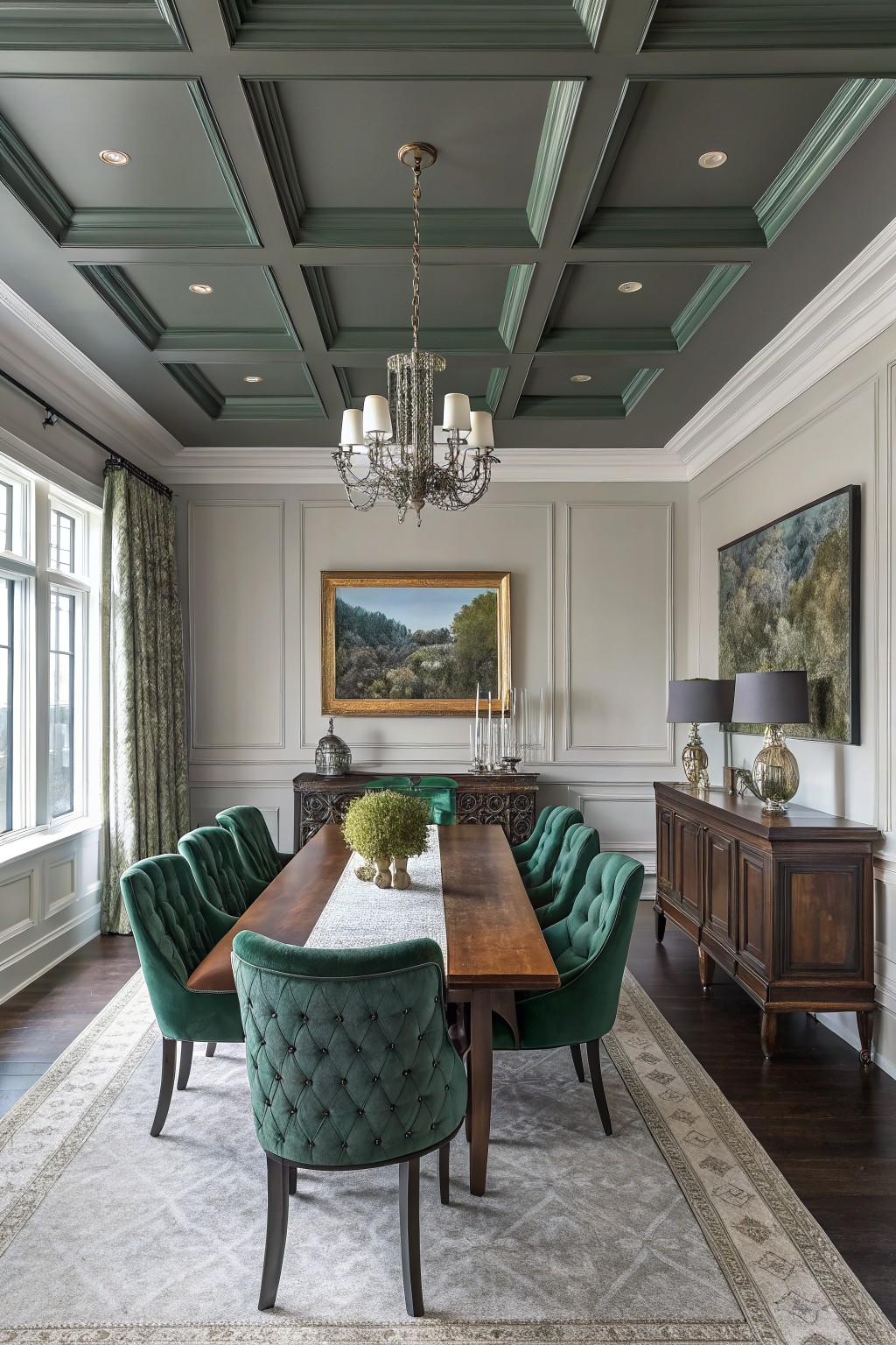
This dining room pulls off a deep green ceiling that feels moody and grounded right away. It reads very close to Sherwin-Williams Pewter Green or Benjamin Moore Guilford Green, with Farrow & Ball Studio Green not far off either. What stands out is how that rich tone adds height and drama up top without stealing from the table below.
The cool gray undertone plays well against wood floors and cabinets, keeping things balanced instead of too forest-like. It shines in spaces with plenty of window light like this one. Just pair with warm neutrals on the walls and maybe green accents in the upholstery to tie it in.
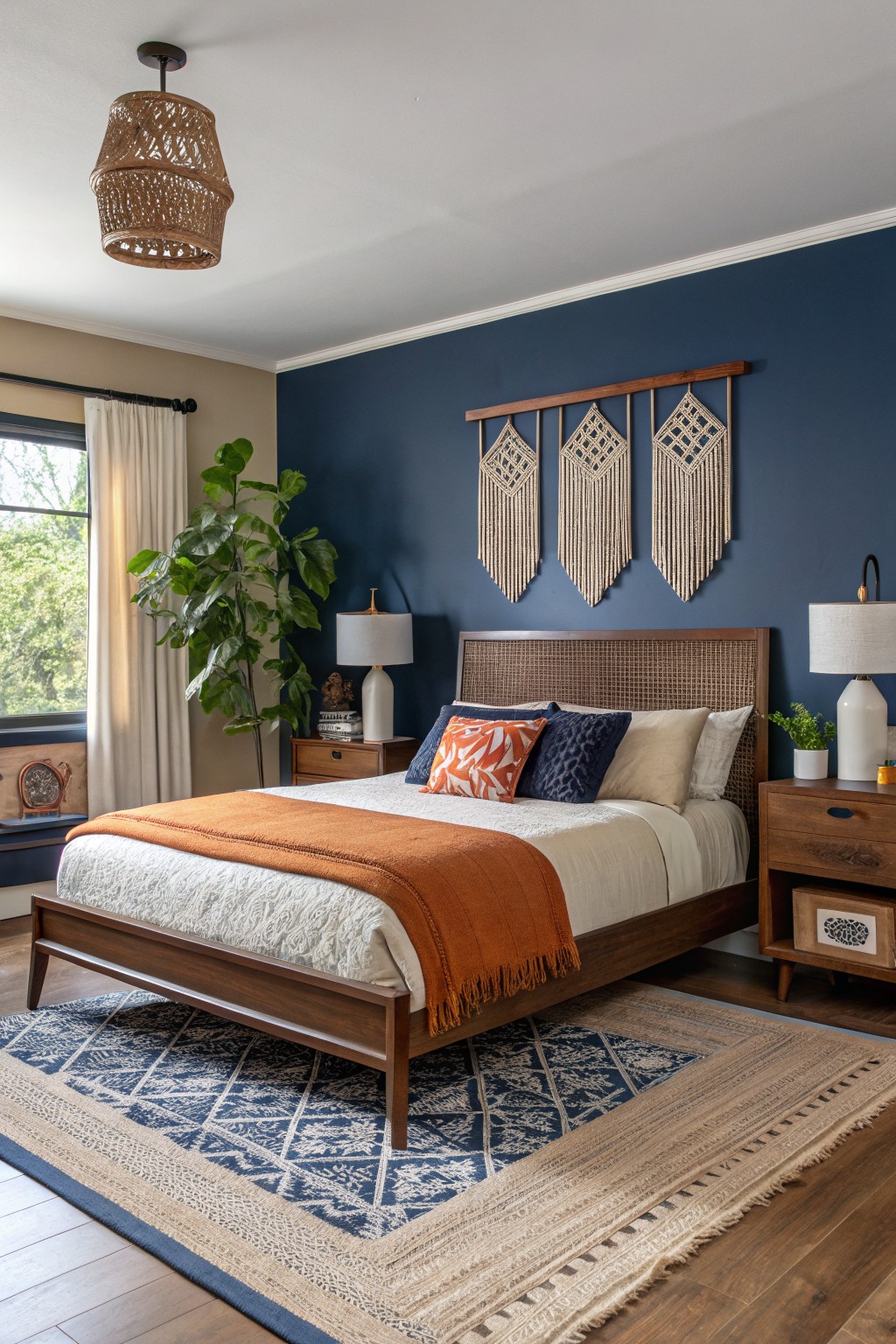
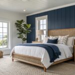
This bedroom wall paint is a deep navy that seems closest to Sherwin-Williams Naval or Benjamin Moore Hale Navy. It’s the kind of moody blue that brings real drama to a room, but stays livable with its subtle richness. Folks like it because it makes wood furniture pop without stealing the show.
That navy has cool undertones that lean a bit gray in natural light. It shines in spaces with some sun, like next to a window, and pairs easy with warm oranges or tans. Just watch it doesn’t feel too heavy in a north-facing room.
Deep Blue Walls
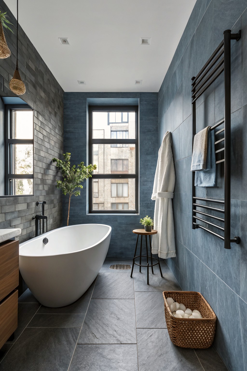
This bathroom pulls off a deep moody blue on the walls that feels like a classic navy with cool gray undertones. It comes across closest to Sherwin-Williams Naval or Benjamin Moore Hale Navy, maybe even Farrow & Ball’s Hague Blue. What stands out is how it makes the space feel cozy and put-together, especially around a white tub like this one.
That cool edge keeps it from going too bright, and it plays nice with natural light coming through the windows. Go for warm wood cabinets or black fixtures to balance it out. In smaller baths, test a sample first. It can shrink the room if the light’s not right.
Deep Teal Kitchen Cabinets
This moody teal on the cabinets reads very close to Farrow & Ball’s Inchyra Blue. Or you might find a good match in Sherwin-Williams Jasper or Benjamin Moore Saybrook Sage. It’s a deep blue-green shade that feels rich without going full navy. Folks like it because it stands up to wood beams and white counters. Makes the whole kitchen look pulled together.
That blue undertone keeps it from feeling too earthy. It works best in rooms with good natural light, like near those big windows here. Pair it with brass fixtures and light stone. Just test samples first. Teal can shift in dimmer spots.
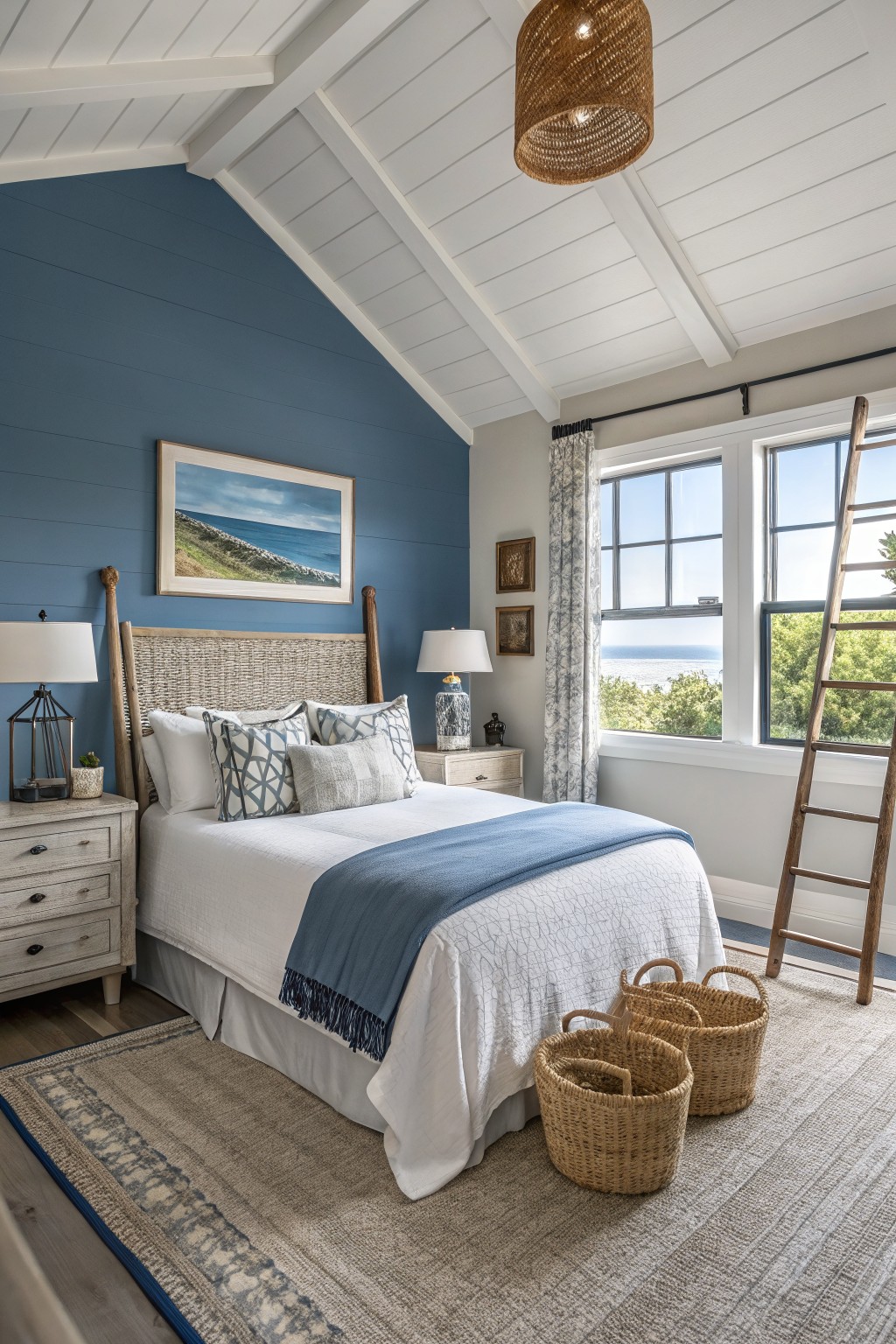
This bedroom wall paint is a moody navy blue that sits on shiplap boards. It reads very close to Sherwin-Williams Naval or Benjamin Moore Hale Navy, maybe even Farrow & Ball Hague Blue. It’s the kind of deep blue that feels dramatic but still livable in a bedroom.
That cool gray undertone keeps it from looking too heavy. Pairs well with white bedding and natural wood tones like the rattan headboard. Bright windows help it stay balanced. Just test it in your space first, since navies can shift in low light.
Deep Green Walls
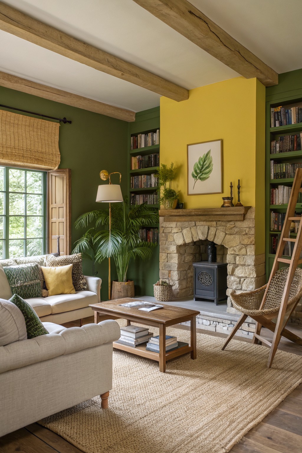
This deep green on the walls looks closest to Farrow & Ball’s Studio Green. Or maybe Sherwin-Williams Pewter Green or Benjamin Moore’s Black Forest. It’s a moody green with warm yellow undertones that gives the room a cozy, wrapped-up feel. Not too bright, but it holds its own next to wood and stone.
That warmth keeps it from going cold in lower light. Works best in living rooms with big windows or mixed with yellow accents like you see here. Stick to light woods, creams, and plants to keep things lively. Avoid cool grays, though. They fight it.
Deep Charcoal Gray Walls
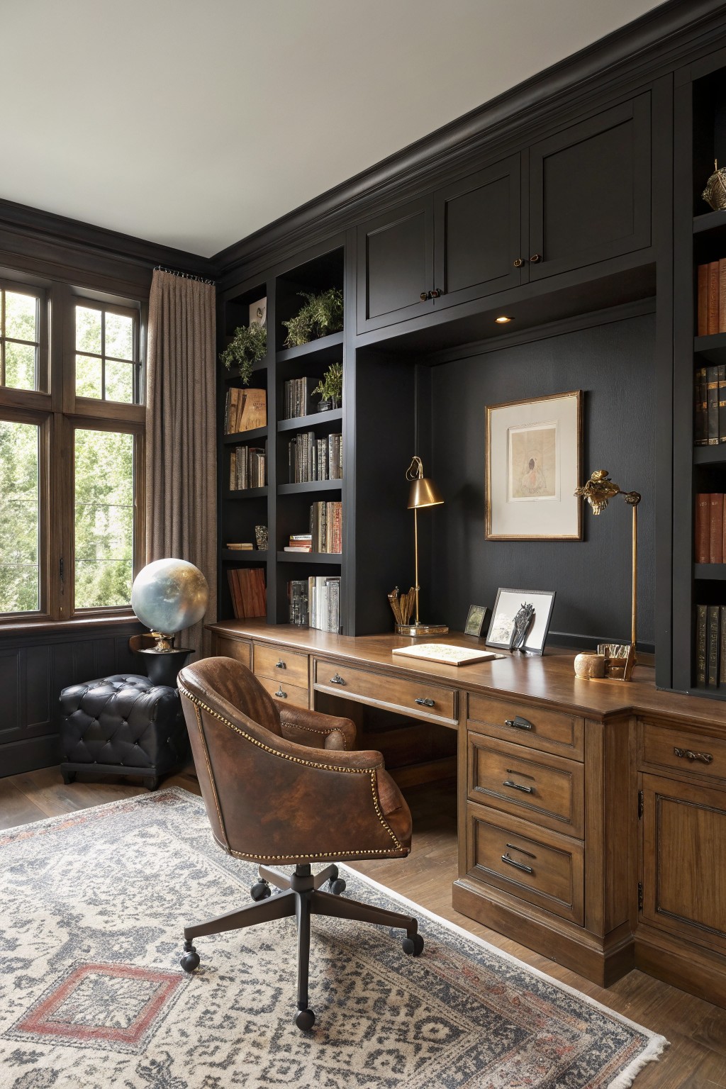
This office pulls off a deep charcoal gray on the walls. It looks closest to Sherwin-Williams Iron Ore or Benjamin Moore Kendall Charcoal, maybe even Farrow & Ball Off-Black. That moody nearly-black tone has a subtle warm undertone. Folks go for it when they want drama that still lets wood furniture shine.
The gray sits warm next to oak desks and leather seating like you see here. Good in spaces with window light to balance it out. Brass lamps and greenery keep things lively. Watch the lighting though. Too dim and it might swallow the room.
Deep Teal Wainscoting
This deep teal on the lower walls and door looks closest to Sherwin-Williams Naval. Or maybe Benjamin Moore Hale Navy, Farrow & Ball Inchyra Blue. It’s a moody blue-green shade that gives a small powder room real presence. People like it because it wraps the space nicely, especially with that window letting in green views.
The undertone stays cool, not too green, which keeps it from feeling heavy. It works best in spots with some daylight, paired with gray cabinets and white sinks. Avoid pairing with warm woods unless you want more contrast.
Deep Burgundy Cabinets
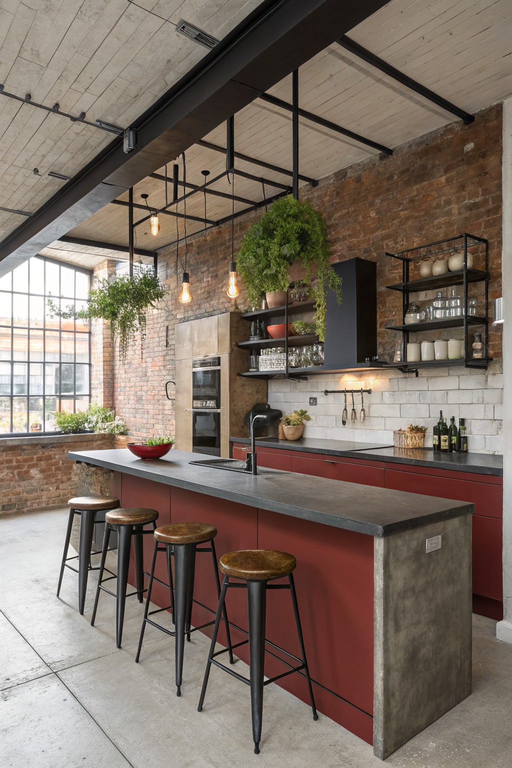
Those lower cabinets show a deep burgundy red paint that’s got a moody vibe. It looks closest to Sherwin-Williams Rookwood Red or Benjamin Moore Tole Wine, maybe Behr’s Cordovan Leather too. What stands out is how this color adds real punch without clashing in a big open kitchen.
Warm undertones keep it from feeling cold next to all that brick and concrete. It works best where there’s plenty of window light. Pair with black metal and wood stools like here, but check samples at different times of day.
Deep Green Staircase Walls
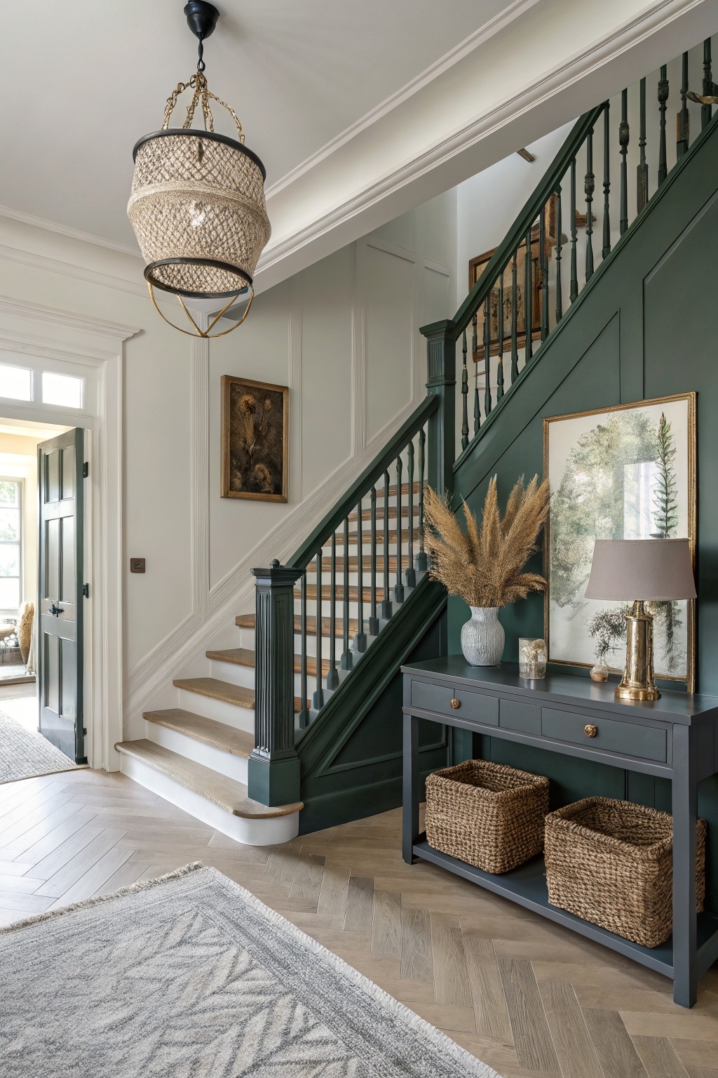
That deep green covering the staircase walls and trim stands out right away. It looks closest to Farrow & Ball’s Studio Green, with Sherwin-Williams Pewter Green or Benjamin Moore Guilford Green reading very similar. This moody green has real presence. It’s rich enough to handle wood tones without clashing, and it turns a simple hallway into something memorable.
The undertone leans a bit blue, which helps it stay lively in lower light. You’ll want natural light nearby, like from a front door, to let it breathe. It pairs nicely with soft whites on other walls and oak steps. Just keep metallics warm, brass maybe, to avoid anything too stark.
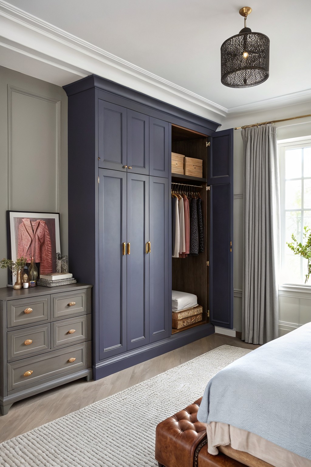
This deep navy blue on the fitted wardrobe seems closest to Sherwin-Williams Naval or Benjamin Moore Hale Navy, maybe even Farrow & Ball Hague Blue. It’s a moody, substantial color that turns everyday storage into something with real presence. You notice how it holds its own against the lighter walls.
The cool undertones keep it from going too black. It plays nice with oak floors and gray dressers like this setup. Try it in a bedroom where daylight bounces off white trim. Just test samples first, since navies can shift in low light.
Frequently Asked Questions
Q: Can moody dark paint work in my tiny apartment living room? A: Pick a soft charcoal with blue undertones. It adds drama without closing in the space. Toss in a tall floor lamp to open things up.
Q: How do I test these colors before committing to a full room? A: Snag sample pots from the store. Paint huge swatches on foam board and shift them around your room all day. You’ll catch how lighting flips the shade from morning… to evening glow.
Q: What pulls me back if the room ends up too dark? A: Layer warm recessed lights overhead. They carve out cozy pockets and lift the mood instantly.
Q: Should I swap my furniture for these bold walls? A: Keep what you love. But crisp linens or pale woods make the paint pop hard. Dark moody walls demand that contrast to shine.