I have a soft spot for paint colors that instantly change the mood of a home. Over the past year I kept noticing certain Benjamin Moore shades popping up everywhere, and honestly I started saving them on my phone like little design treasures.
Some colors feel calm and classic, while others have a little more personality. I love that mix. A fresh white here, a deep navy there, maybe a bold green that makes the front door feel brand new.
This list is full of shades I keep seeing in homes that look current without feeling trendy in a fleeting way. If you are thinking about updating a room or even your exterior, these Benjamin Moore colors are the ones I would happily try in my own home.
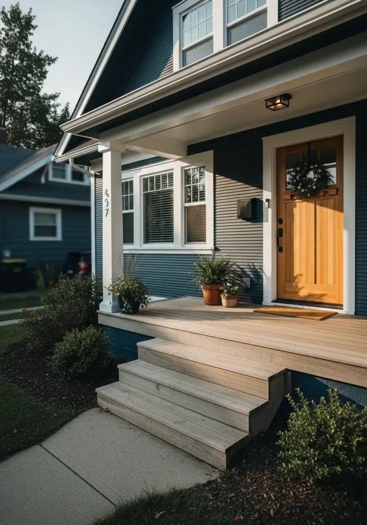
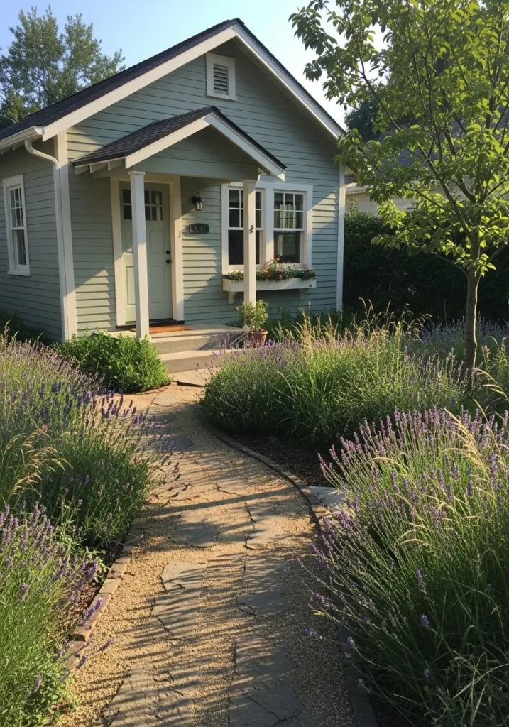
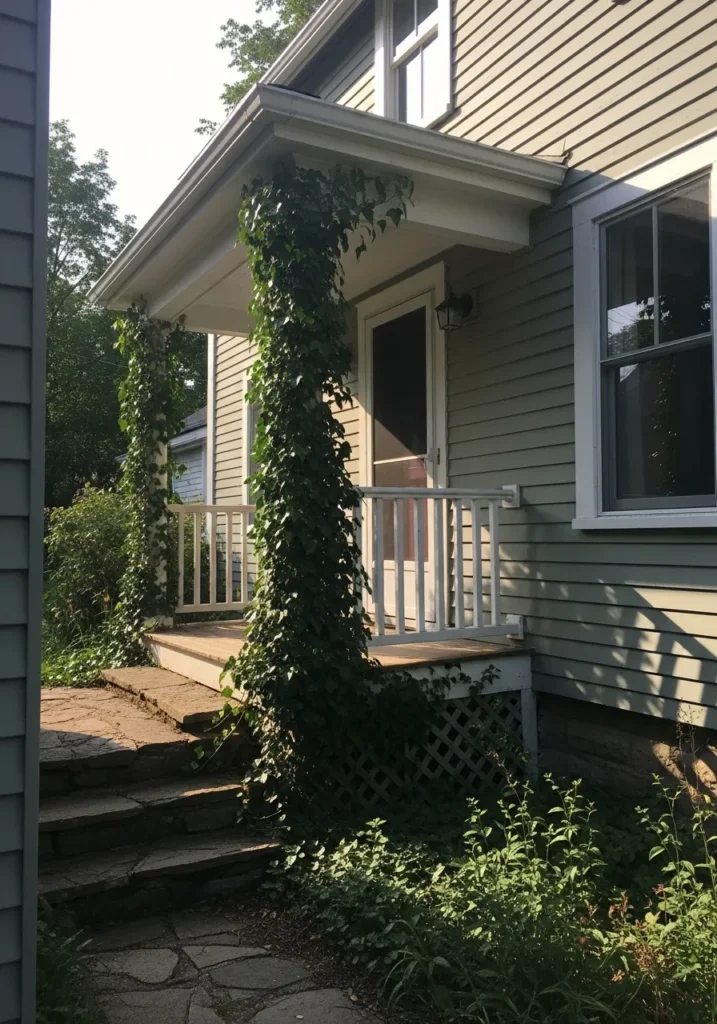
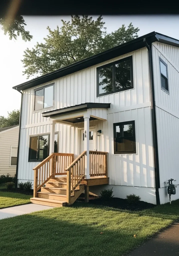
This exterior paint reads very close to Benjamin Moore Hale Navy. It is a deep navy blue that sits right between blue and charcoal, which makes it feel strong without looking overly bright. You see this color a lot on updated craftsman and modern farmhouse homes. The navy siding next to the white trim and natural wood front door shows why people keep coming back to it.
Hale Navy has a cool base but it still works nicely with warm materials. Wood doors, cedar posts, and even brick tend to look richer next to it. It usually performs best on full exteriors, shutters, or front doors where the depth can really show. In shaded areas it may read almost charcoal blue, while brighter light brings out more of the blue tone. White trim like the one around these windows helps keep it looking crisp instead of too dark.
Clean Bright White Exteriors
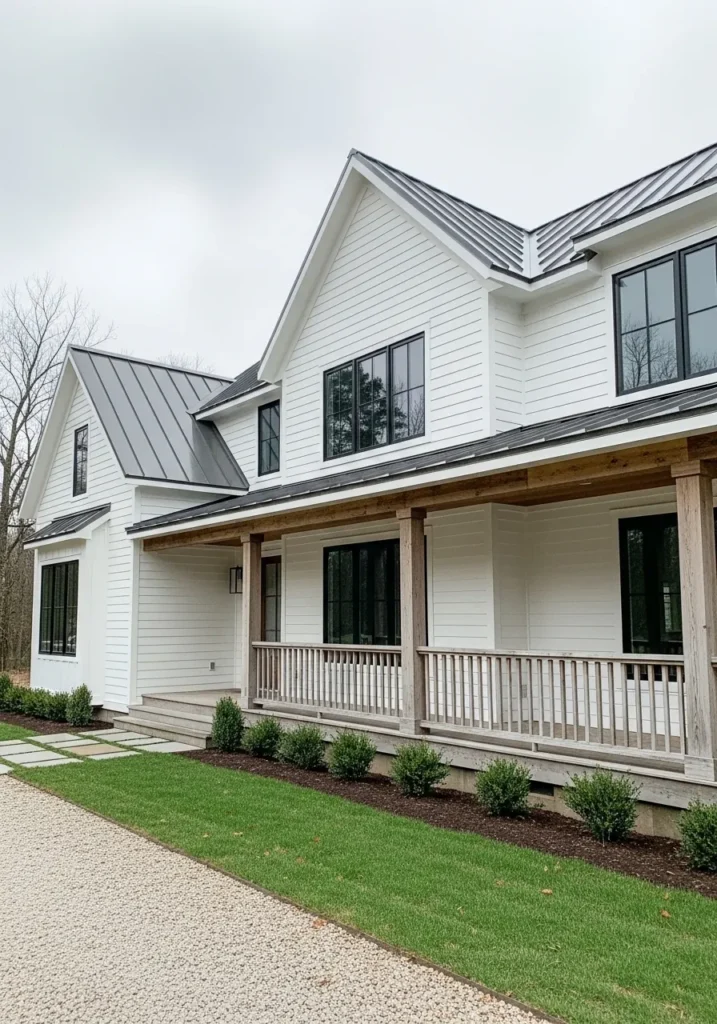
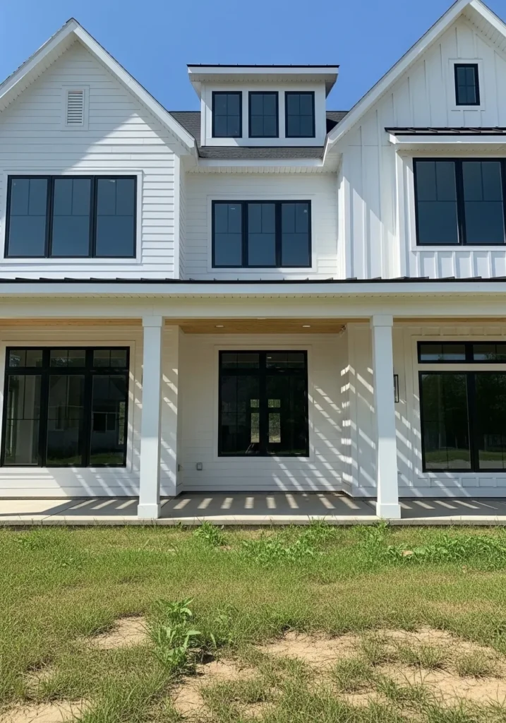
This exterior reads very close to Benjamin Moore Chantilly Lace. It is a crisp, bright white that leans slightly cool, which helps it look clean rather than creamy. Many homeowners choose this shade when they want a white house that feels sharp and modern. On siding like this, the color stays clear and bright without drifting into beige.
Chantilly Lace works especially well when there are darker details nearby. The black window frames here show the contrast nicely, and the natural wood porch posts keep the white from feeling too stark. In strong light it stays very true white, while in softer light it can take on a faint cool gray edge. It tends to look best on modern farmhouses, coastal homes, and simple traditional exteriors where the goal is a fresh, uncomplicated white.
Deep Charcoal For Modern Exteriors
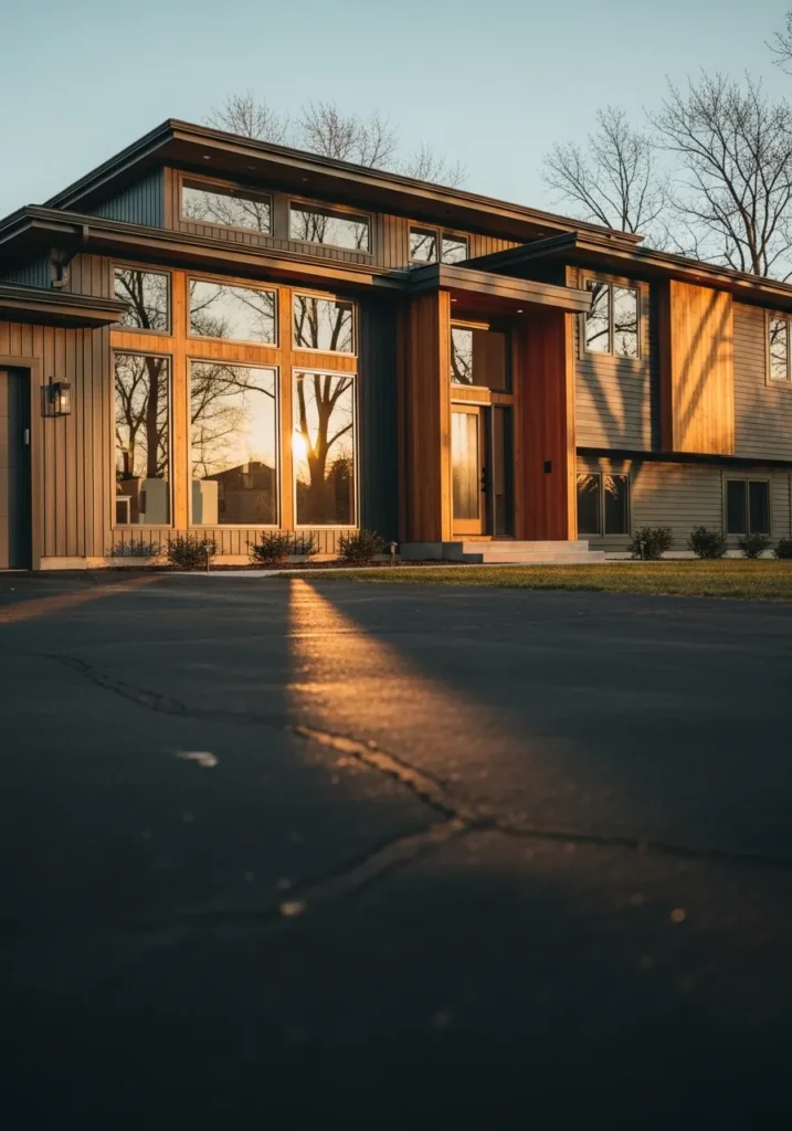
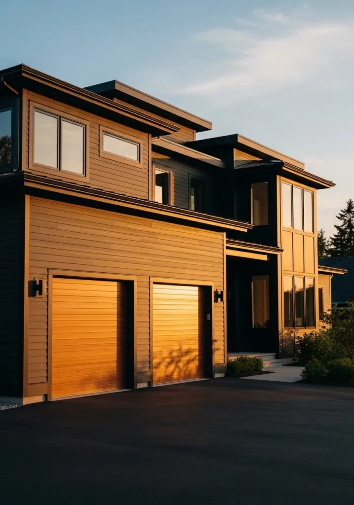
This siding reads very close to Benjamin Moore Kendall Charcoal. It is a deep charcoal gray that sits right between gray and soft black. Many people use this color when they want something darker than a typical gray but not as stark as true black. On modern homes it tends to feel calm and solid, especially next to large windows and natural wood trim like you see here.
Kendall Charcoal has a fairly neutral base, though it can lean slightly warm depending on the light. That is why it works so well beside wood siding or cedar details. The contrast helps the darker paint look intentional rather than heavy. It is a good option for modern builds, contemporary cabins, or updated mid century homes where darker siding helps the architecture stand out a bit.
Soft Sage Green Exteriors
This exterior color reads very close to Benjamin Moore October Mist. It is a muted sage green that sits somewhere between green and gray, which keeps it calm and easy to live with. Colors like this have become popular for smaller homes and cottages because they feel natural without being dull. The green siding next to the white trim makes the shade easier to see.
October Mist carries a soft gray undertone, so it usually stays gentle rather than bright. That helps it work well with gardens, stone paths, and natural landscaping. Lavender and leafy plants nearby tend to bring out the green a bit more. It is a good choice for cottages, bungalows, and farmhouse style homes where you want color, just not something loud.
Coastal Blue Exterior Siding
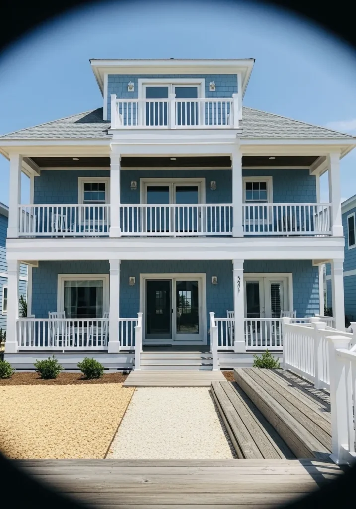
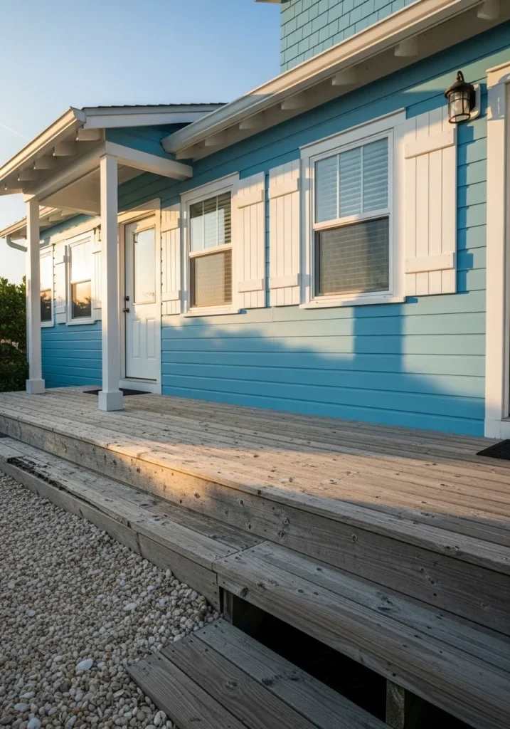
This siding reads very close to Benjamin Moore Wythe Blue. It is a soft coastal blue that sits between blue and green, which gives it that relaxed seaside look many people like for beach houses. The color feels light but still has enough pigment to show up clearly against the white railings and trim.
Wythe Blue usually carries a gentle gray undertone, which keeps it from looking too bright or baby blue. That is why it works well on larger exteriors and porch-heavy homes like this one. White trim tends to sharpen the color a bit, while natural wood decks and sandy landscaping make it feel more casual. It is a good choice for coastal homes, but it also works inland when you want a blue that feels calm rather than bold.
Soft Olive Green For Doors And Shutters
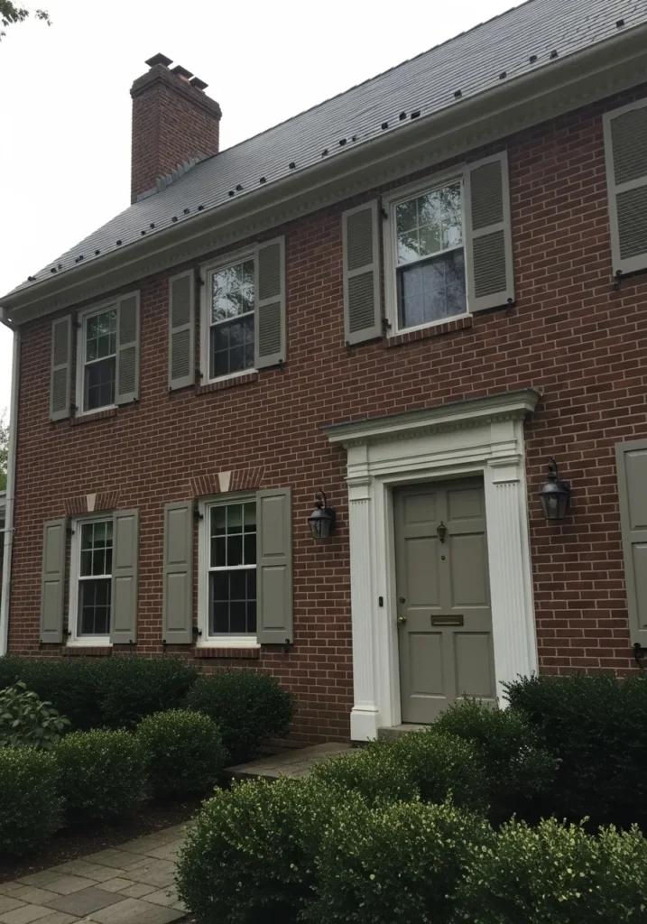
The painted shutters and front door read very close to Benjamin Moore Saybrook Sage. It is a muted olive green that sits between green and gray, which makes it easy to use on traditional homes. Colors like this have been around for a long time because they look natural next to brick. The soft green here works nicely against the red brick and white trim.
Saybrook Sage has a slightly earthy undertone that keeps it from looking too bright. That is why it often shows up on shutters, doors, and trim rather than whole exteriors. It pairs especially well with brick homes, stone, and older colonial style houses. In brighter light the green becomes a little clearer, while softer light can make it read more gray. Quiet, but very dependable.
Deep Black Modern Exteriors
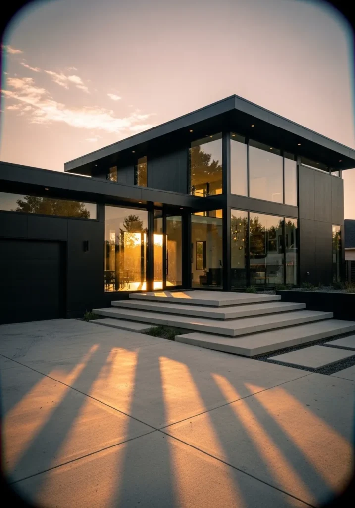
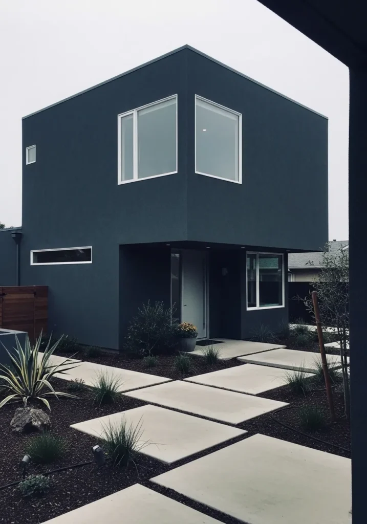
This exterior color looks very close to Benjamin Moore Black Beauty. It is a rich soft black that leans slightly charcoal rather than jet black. That small shift makes it easier to use on full exteriors. On modern homes like this one, the color gives the structure a clean, architectural look while letting the large glass windows stand out.
Black Beauty has a subtle warm undertone, which keeps it from feeling too cold or flat. It often pairs well with concrete steps, metal trim, and big window walls. In brighter light the color can read like a deep charcoal, while in lower light it settles into a fuller black. Many people use it on modern builds or contemporary renovations where darker siding helps highlight the simple lines of the house.
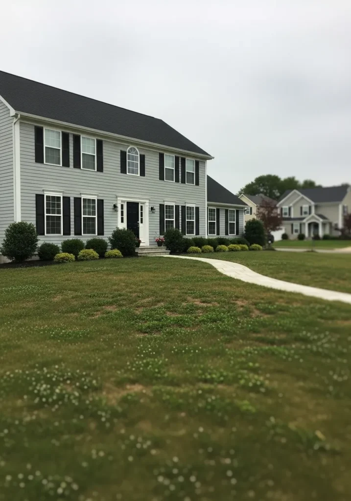
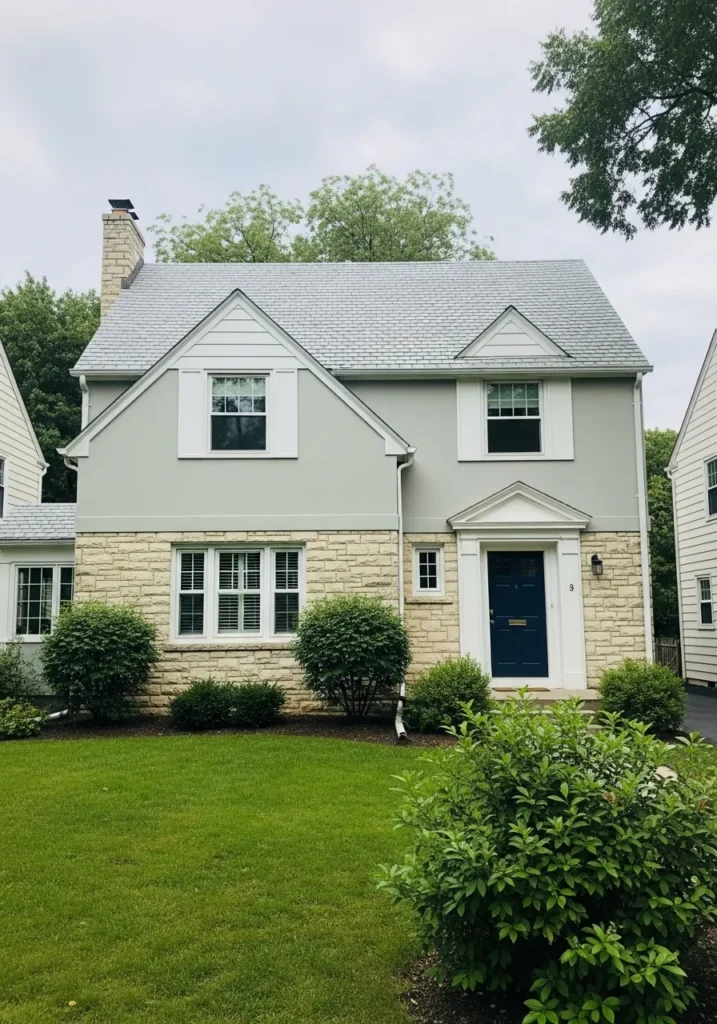
Soft Greige For Classic Siding
The siding color here reads very close to Benjamin Moore Revere Pewter. It sits in that comfortable space between gray and beige, which is why people often call it a greige. This kind of color has been popular for years because it feels calm but still has enough color to show up on a full exterior.
Revere Pewter has a gentle warm undertone that helps it sit nicely next to natural materials. The stone steps and greenery around the porch bring out that warmth a little more. In brighter light it can lean slightly beige, while softer light makes the gray side more noticeable. It tends to work well on traditional homes where you want something neutral that still feels a bit richer than plain gray.
Light Gray Siding That Feels Clean
The siding here reads very close to Benjamin Moore Gray Owl. It is a soft light gray that sits on the cooler side, which helps it feel crisp without turning stark. Many suburban homes use a color like this because it keeps the exterior looking fresh while still feeling neutral. The gray siding next to the black shutters shows the contrast nicely.
Gray Owl has a gentle cool undertone that can lean slightly blue in some light. That cooler edge is what keeps it from looking beige or muddy. It works especially well with white trim and darker accents like shutters or doors. On larger homes like this, the lighter gray keeps the whole exterior from feeling too heavy. Quiet, but very easy to live with.
Bold Red Accent Exteriors
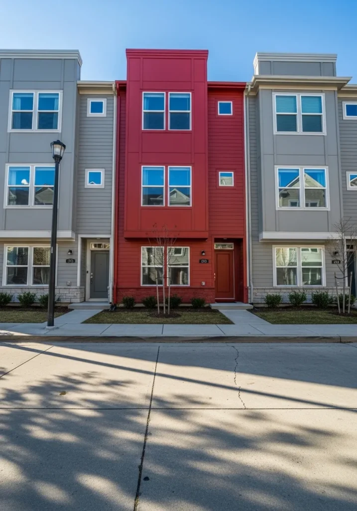
The bright center section here reads very close to Benjamin Moore Caliente. It is a strong red with a little warmth in it, which keeps it from feeling too sharp. Reds like this are not used on every home, but they can work really well as an accent on townhouses or modern row homes. The color stands out against the softer gray siding on the neighboring units.
Caliente has a warm undertone that keeps the red looking lively instead of flat. On large areas it feels energetic, so many people prefer using it as one section of a facade rather than the whole house. Neutral grays and whites around it help the color feel intentional and balanced. When used this way, the red becomes a focal point without overwhelming the entire street.
Crisp White Painted Brick
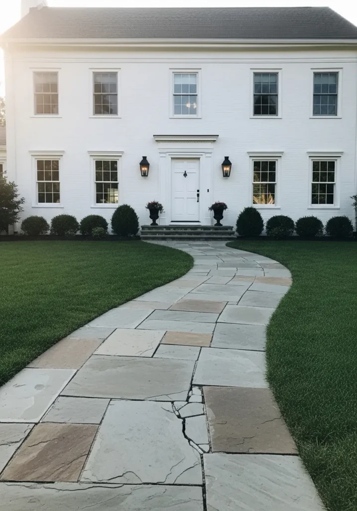
The exterior here looks very close to Benjamin Moore Simply White. It is a clean white that leans just slightly warm, which keeps it from feeling harsh on large surfaces like painted brick. Many homeowners choose a shade like this when they want a bright white house that still feels comfortable and classic.
Simply White tends to stay soft rather than icy, especially next to darker details like the black lanterns and the roof. Painted brick also helps the color read a little richer than it would on smooth siding. In bright light it looks clearly white, while softer light can show a faint creamy undertone. It is a reliable choice for traditional homes where the goal is a fresh white that does not feel too cold.
Bright White Modern Farmhouse
The exterior siding here looks very close to Benjamin Moore Chantilly Lace. It is a crisp, clean white that leans slightly cool, which is why it works so well on modern farmhouse style homes. This type of white keeps the exterior looking sharp instead of creamy. The contrast with the black window frames makes the color read even brighter.
Chantilly Lace tends to stay very true white in most lighting, though the cool base can give it a faint gray edge on cloudy days. That cooler tone pairs nicely with black trim and simple architectural lines. Natural wood, like the porch steps here, also helps soften the look a little. It is often chosen when the goal is a clear, bright white that does not drift into beige.
Deep Green Farmhouse Siding
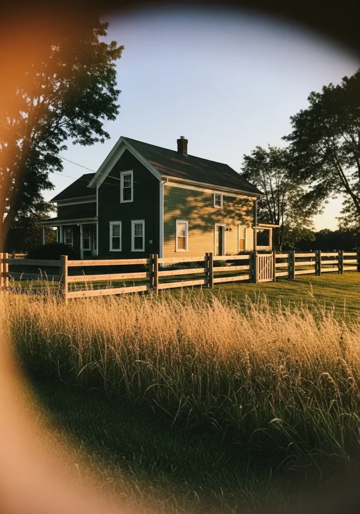
The exterior color here reads very close to Benjamin Moore Narragansett Green. It is a deep green with a strong gray base, which keeps it looking grounded rather than bright. Colors like this have become popular for farmhouse style homes because they feel connected to the landscape. The white trim around the windows helps the darker green stand out clearly.
Narragansett Green carries a cool undertone that can shift depending on the light. In brighter conditions the green becomes easier to see, while softer light can make it lean closer to charcoal. It works especially well on rural homes or farmhouse settings where wood fencing, fields, or trees surround the house. A darker green like this tends to age well too, which is one reason people keep coming back to it.
Soft Gray For Contemporary Siding
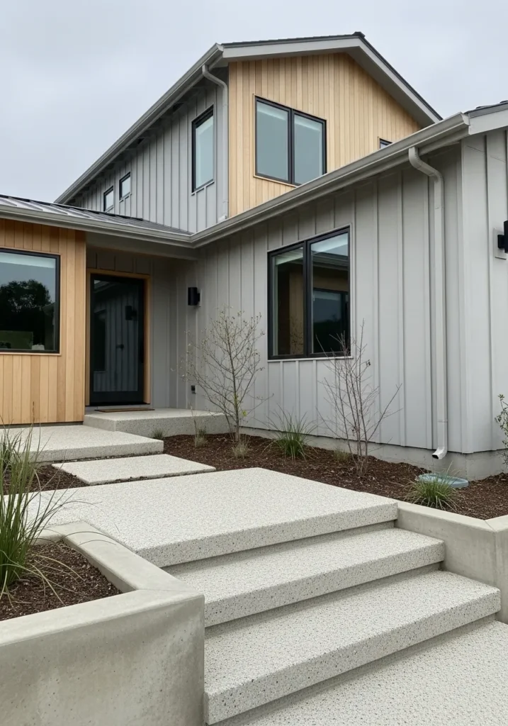
The siding here reads very close to Benjamin Moore Balboa Mist. It is a light greige that sits between gray and beige, which is why it works so easily on modern homes. This kind of color feels neutral but still has enough depth to show up clearly on larger exteriors. The soft gray siding next to the natural wood panels makes the contrast feel calm rather than sharp.
Balboa Mist usually carries a gentle warm undertone. That warmth helps it sit nicely beside materials like wood, concrete, and stone. In brighter light it can look like a pale gray, while softer light brings out a faint beige edge. It tends to work well on contemporary homes where the goal is a quiet neutral that still feels a little warmer than plain gray.
Soft Blue Green Mid Century Exterior
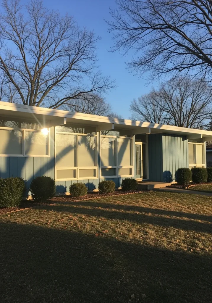
The siding here reads very close to Benjamin Moore Palladian Blue. It is a light blue green that sits right between the two colors, which gives it that relaxed mid century look. Shades like this were common on ranch homes because they add color without feeling too strong. The pale tone keeps the house looking light even with larger wall surfaces.
Palladian Blue has a soft gray undertone that keeps the blue and green balanced. Sometimes it reads a little more blue, other times a bit greener depending on the light. It pairs nicely with white trim and simple landscaping like the low shrubs along the front. This type of color tends to work well on mid century homes where the goal is a calm, slightly vintage exterior.
Cheerful Yellow Cottage Exterior
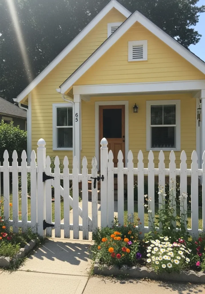
The siding here looks very close to Benjamin Moore Hawthorne Yellow. It is a warm, sunny yellow that leans slightly golden rather than pale. Colors like this tend to work well on small cottages and older homes because they bring a bit of life to simple architecture. The white trim around the windows and roofline keeps the yellow looking crisp.
Hawthorne Yellow carries a gentle warmth that becomes more noticeable in bright daylight. That warmth helps it pair nicely with natural wood doors and garden spaces around the house. It is usually best on smaller homes or accent areas since stronger yellows can feel overwhelming on very large exteriors. On a cottage like this, though, it feels friendly and easygoing.
Warm Tan Modern Exterior
The siding on this home reads very close to Benjamin Moore Alexandria Beige. It is a warm tan that sits right between beige and light brown, which makes it a comfortable choice for larger modern exteriors. Colors like this feel grounded without going dark. On a house with wide siding and large windows, a warm neutral like this keeps everything looking cohesive.
Alexandria Beige has a soft golden undertone that becomes more noticeable in direct light. That warmth works well with darker trim and simple landscaping around the home. It also pairs nicely with wood garage doors and black window frames, which helps modern homes feel a little less stark. A balanced beige like this often works best when the goal is a calm exterior that still has some warmth.
Light Greige Traditional Exterior
The siding here reads very close to Benjamin Moore Edgecomb Gray. It is a light greige that blends gray and beige in a very balanced way. That mix is why this color shows up on so many traditional homes. It feels soft and neutral but still noticeable on a full exterior. Next to the pale stone along the lower wall, the color looks calm and natural.
Edgecomb Gray carries a gentle warm undertone that helps it sit comfortably with stone, brick, or cream trim. In brighter daylight it leans a bit more gray, while softer light can bring out the beige side. It works well on classic homes where you want a neutral exterior that still feels a little warmer than standard gray.
Bright Coastal Blue Exterior
The siding here looks very close to Benjamin Moore Caribbean Blue Water. It is a cheerful blue that leans slightly turquoise, which gives it that easy coastal feel. Colors like this work well on smaller beach houses because they bring a bit of color without feeling heavy. Paired with the white trim around the windows and porch, the blue feels clean and relaxed.
Caribbean Blue Water carries a soft green undertone, which is why it reads more tropical than a typical sky blue. In strong daylight the color looks brighter, while softer light makes it appear a little calmer. It pairs naturally with white shutters, simple wood decking, and light gravel around the home. On a coastal style house like this, a lively blue keeps the whole place feeling casual and welcoming.
Crisp White Modern Farmhouse Exterior
The siding here looks very close to Benjamin Moore Chantilly Lace. It is a clean white that leans neutral rather than creamy, which is why it shows up so often on modern farmhouse homes. Whites like this keep large exteriors looking sharp and bright. Against the black window frames on this house, the contrast feels simple and very clear.
Chantilly Lace does not carry much warmth, so it tends to read as a true white in most lighting. That makes it a good choice when the goal is a fresh exterior that stays consistent from shade to full sun. It pairs especially well with black trim, metal roofing, or natural wood porch ceilings. A straightforward white like this keeps the architecture doing most of the talking.
Deep Blue Gray Modern Exterior
The exterior color here reads very close to Benjamin Moore Hale Navy. It is a deep blue that carries enough gray to feel calm instead of bright. On modern homes with simple shapes like this one, darker colors can make the architecture look sharp and intentional. The white window trim helps the darker siding stand out clearly.
Hale Navy usually leans slightly cool, though the gray in it keeps the color from feeling too bold. In softer daylight it can look almost charcoal blue, while brighter light reveals more of the navy tone. It tends to work well on modern homes, especially when paired with simple landscaping and light concrete paths. Dark exteriors like this can feel surprisingly clean when the lines of the house stay simple.
Warm Tan Ranch Style Exterior
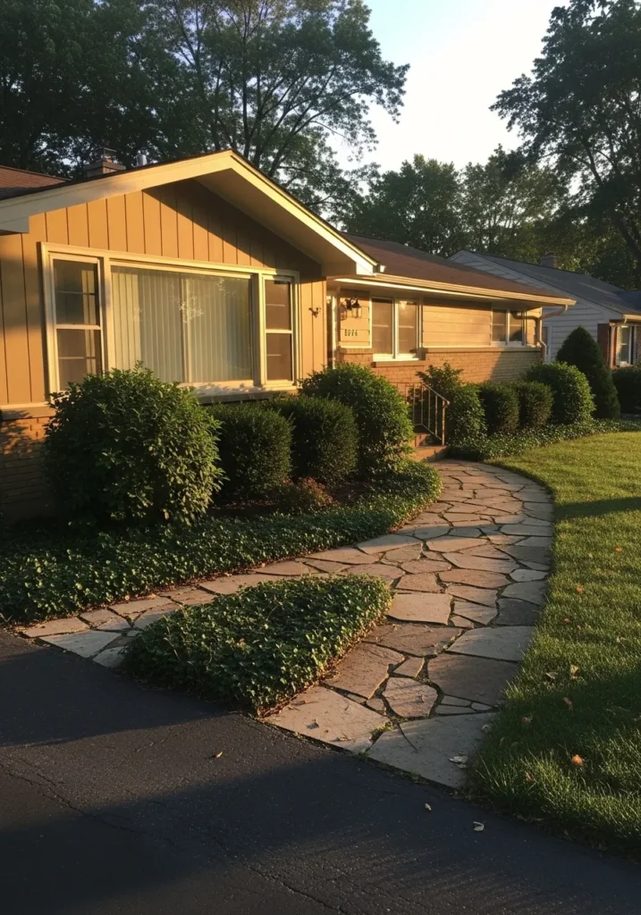
The siding here reads very close to Benjamin Moore Lenox Tan. It is a warm beige with a soft golden undertone, which is why it works so naturally on mid century and ranch style homes. Colors like this have a quiet warmth that feels comfortable without looking too dark. Next to the brick along the lower wall, the tan siding blends nicely instead of competing with it.
Lenox Tan usually leans warm in most lighting. In bright daylight the beige looks a little lighter, while softer light brings out more of the golden tone. It tends to pair well with brick, stone paths, and simple landscaping around the house. A warm neutral like this is often chosen when the goal is an easy exterior color that feels familiar and relaxed.