I have always loved how a fresh coat of paint can completely change the personality of a house.
My front yard feels more inviting when the colors pop in the sunlight and make people notice even the tiniest details.
I’ve spent hours picking colors that feel bold but still welcoming, and I’m excited to share some of my favorites with you.
No matter my mood, seeing a cheerful or striking exterior always sparks ideas for my own little projects.
Some people love subtle shades, but I have a soft spot for colors that make a statement while still feeling warm and lived-in.
These 24 Sherwin Williams exterior paints are the ones I’ve been dreaming about, and I can’t wait to show you how they look in real neighborhoods.
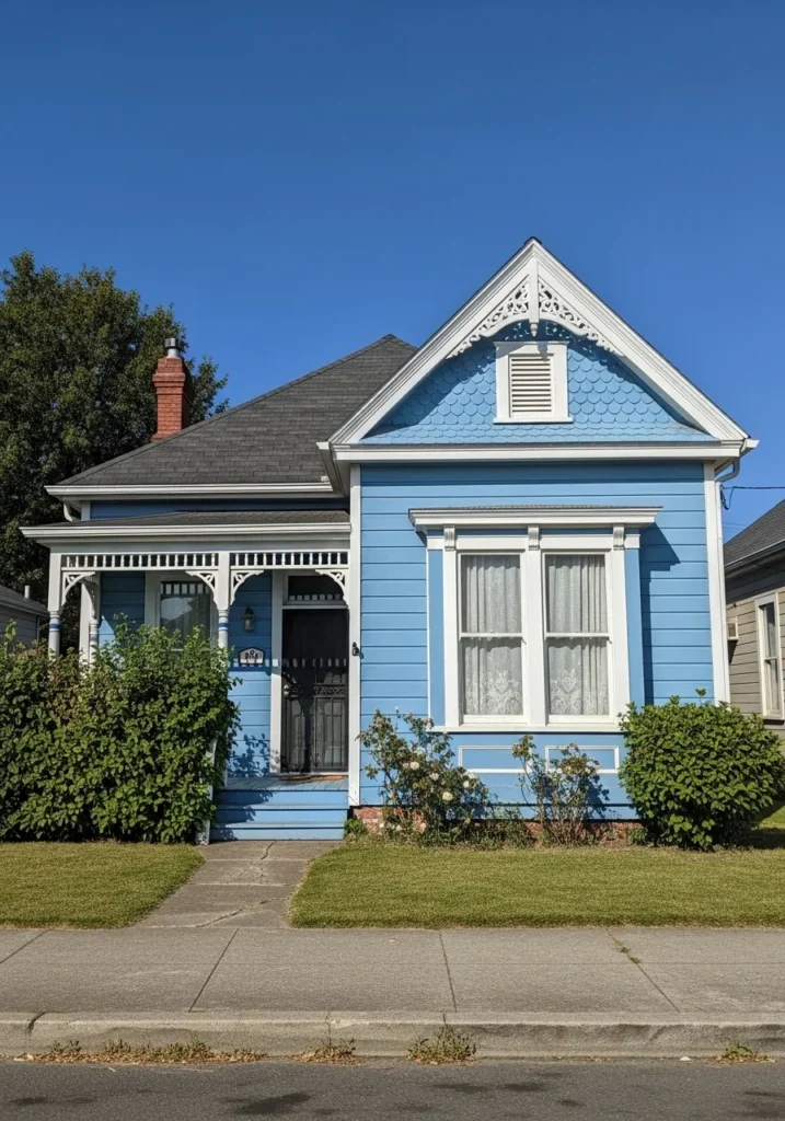
Sherwin Williams Charcoal Blue for a Sophisticated Coastal Vibe
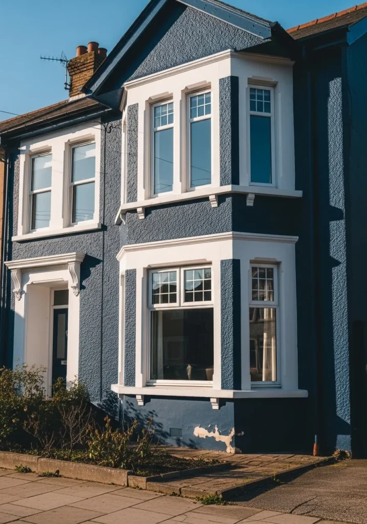
This Victorian-style home features a textured stucco exterior that looks absolutely stunning in a deep navy shade. The architectural details are highlighted by crisp white window frames and a matching white bay window structure that really pops against the moody backdrop. Those classic sash windows and the elegant corbels above the door add a vintage charm that feels both timeless and trendy for a modern neighborhood. It is the kind of house that stops people in their tracks during a morning walk.
I am completely head over heels for how this rich blue transforms a traditional facade into a major style statement. The contrast between the dark walls and the bright trim creates such a clean and polished look that feels incredibly high-end. It takes a lot of guts to go this dark on a textured surface, but the payoff is a home with massive personality and undeniable curb appeal. This color choice proves that you can be bold while staying totally classy.
Sherwin Williams Svelte Sage for a Charming Storybook Forest Look
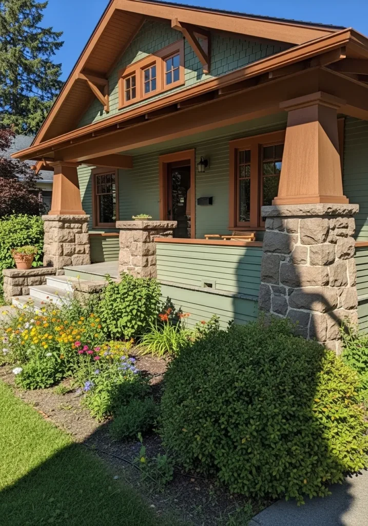
This Craftsman bungalow is a total dream with its mix of horizontal siding and shingle accents that give it so much visual interest. The soft sage green body is paired beautifully with warm wood tones on the window frames and those chunky porch columns. Massive stone pedestals ground the entire design, while the wide front porch invites you to sit down with a glass of lemonade and enjoy the lush garden. It is a perfect example of how a home can feel tucked away in nature, even if it is right in the middle of a neighborhood.
I find this color palette incredibly soothing because it mimics the natural tones of a sunlit woodland. The way the muted green plays off the earthy browns and the rugged texture of the stonework creates an atmosphere that is both cozy and grounded. It feels like a warm hug in house form. If you want a home that looks like a peaceful retreat from the busy world, this organic combination is definitely the way to go.
Sherwin Williams Iron Ore for a Timeless and Regal Red Brick Accent
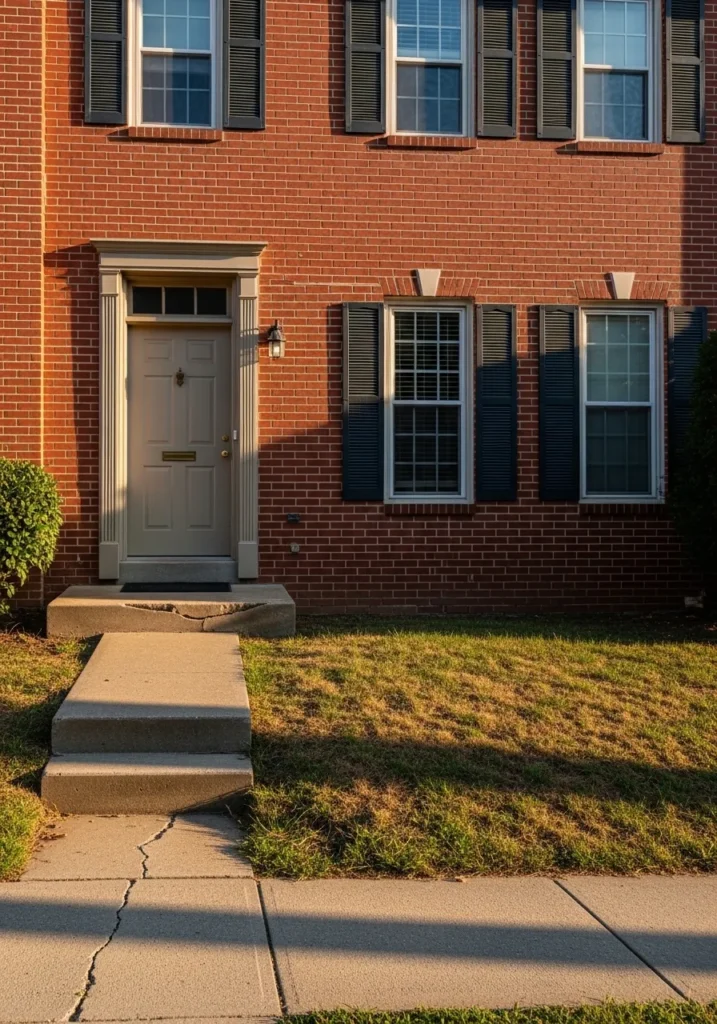
This classic two-story brick townhouse showcases a traditional symmetrical layout with beautiful red masonry as the star of the show. The deep charcoal shutters provide a sharp architectural definition to the multi-pane windows, while the fluted trim around the doorway adds a touch of historical grandeur. A neutral beige front door keeps the entryway looking soft and approachable, which balances out the darker elements perfectly. It represents that quintessential suburban elegance that never goes out of style.
I am absolutely enamored with how a dark, moody shade can make standard red brick look so intentional and high-end. The contrast is just delicious, and it gives the whole facade a grounded, expensive feel without being too overwhelming. Choosing a near black for the shutters is such a smart move because it highlights the windows and makes them look larger and more framed. This specific pairing is a total winner for anyone wanting to give their traditional home a sophisticated facelift that feels fresh yet historic.
Sherwin Williams City Loft for a Sleek, Modern, Minimalist Statement
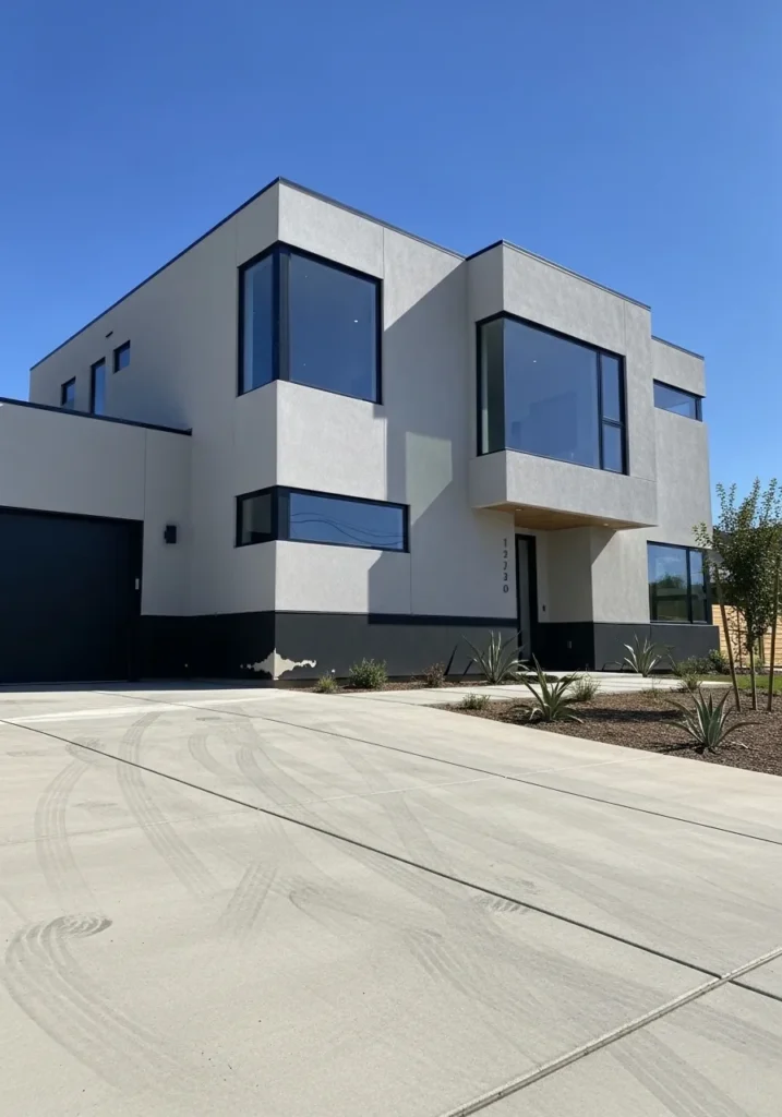
This striking contemporary home is all about clean lines and geometric perfection. The upper levels are wrapped in a soft, airy greige that feels incredibly fresh against the bright blue sky. To ground all that lightness, the architect chose a bold black foundation and a matching garage door, which adds a sharp, graphic punch to the overall silhouette. Massive floor-to-ceiling windows reflect the surroundings and give the house an open, high-tech feel, while the blonde wood accents under the overhangs add a tiny hint of organic warmth to the entryway.
I am smitten with how this color palette highlights the home’s unique boxy architecture without looking too cold or industrial. The choice of a pale, stony neutral keeps the large flat surfaces from feeling heavy, while the black trim acts like the perfect eyeliner for those gorgeous windows. It is a masterclass in using contrast to create a home that looks like a piece of modern art. If you want a property that feels cutting-edge and effortlessly cool, this sophisticated neutral combo is your best friend.
Sherwin Williams Billiard Green for a Stately Historic Presence
This stunning New England-style colonial home uses horizontal lap siding to create a textured and traditional feel. The deep jewel-toned green is beautifully balanced by thick white columns and a formal pediment over the entryway, which adds a touch of architectural drama. Small details like the classic black metal railings and the warm glow from the wall lanterns make the porch look incredibly welcoming as the sun goes down. A cobblestone path leads right up to the front door, giving the whole property a sense of established history and old-world charm.
I find this specific shade of forest green provides such a rich and expensive atmosphere that many lighter colors just can’t achieve. It manages to look both moody and vibrant at the same time, which is a total win for anyone wanting their house to stand out on a leafy street. The way the bright white trim slices through the deep color gives the facade a crisp and organized appearance that I honestly can’t get enough of. It is an impressive choice for a homeowner who wants to embrace a bold color while keeping things completely sophisticated and elegant.
Sherwin Williams Revere Pewter for an Airy Modern Farmhouse Feel
This contemporary farmhouse design is a masterclass in balance with its twin gables and vertical board and batten siding. The warm greige exterior sets a peaceful tone that feels much more inviting than a flat white, while the bold black window frames provide a sharp, graphic edge. A light wood front door serves as the perfect organic centerpiece, and the minimalist concrete path keeps the focus entirely on the clean architectural lines of the home. It is exactly the kind of house that looks like a high-end custom build without trying too hard.
My heart is doing a little happy dance over how sophisticated this palette looks under a clear blue sky. The way the neutral siding plays with the natural wood accents creates a vibe that is super fresh and current but still feels like a cozy sanctuary. Some people worry that neutrals can be boring, but this design proves that the right shade of pewter adds a ton of depth and character. I find the whole look incredibly chic and perfectly suited for a modern family who loves a bit of understated luxury.
Sherwin Williams Hubbard Squash for a Sunny and Nostalgic Victorian Glow
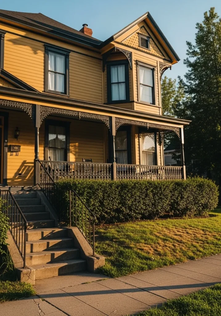
This sprawling Victorian beauty is a masterclass in historical charm with its golden yellow horizontal siding and intricate gingerbread trim. The architecture is full of life, featuring a prominent bay window and a gorgeous wraparound porch adorned with delicate, dark-painted woodwork that looks like iron lace. Concrete steps lead up from a neatly trimmed lawn, while a perfectly manicured hedge provides a bit of privacy for those relaxing on the veranda. It feels like the kind of home that has a thousand stories to tell and plenty of room for a large, happy family.
I’m captivated by how this warm, buttery yellow catches the late afternoon sun and makes the whole property radiate cheerfulness. Pairing such a bright, optimistic body color with nearly black architectural accents is a stroke of genius because it keeps the house looking grounded rather than overly sweet. It reminds me of a classic summer afternoon and feels so incredibly welcoming to anyone walking by. This design is proof that you can use bold, sunny colors on a large scale and still achieve a look that is totally sophisticated and timeless.
Sherwin Williams Vining Ivy for a Playful Mid-Century Modern Pop
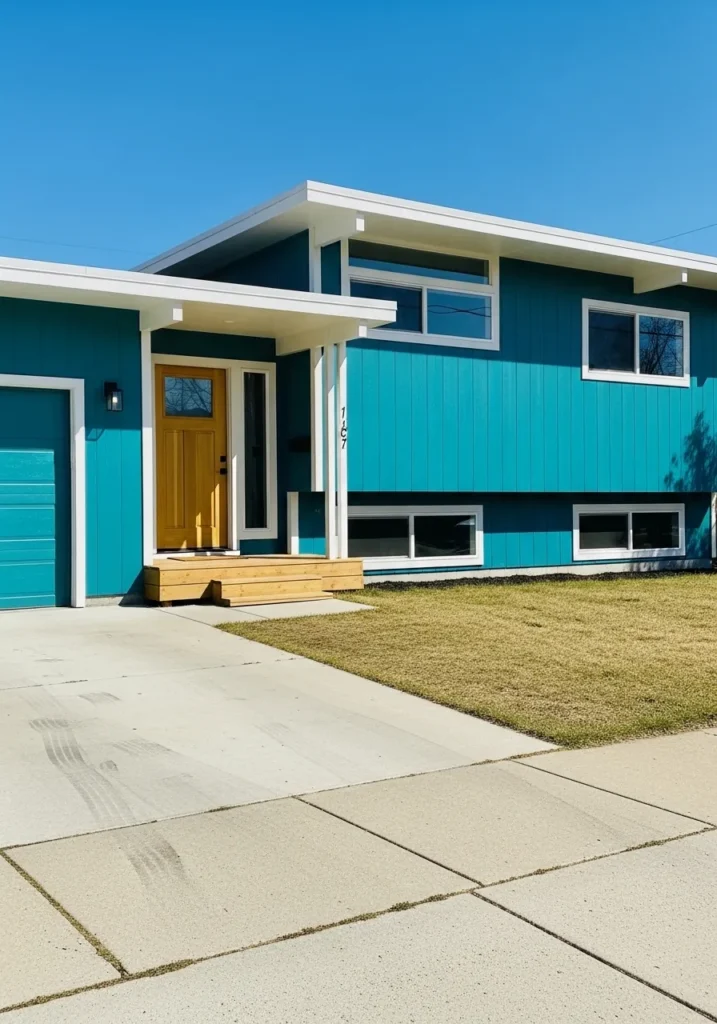
This mid-century modern split-level home is a total retro dream with its bold vertical siding and flat rooflines. The vibrant teal body is paired with crisp white trim that outlines the overhangs and window frames, creating a sharp and energetic silhouette. A warm mustard yellow front door serves as the ultimate focal point, while the natural wood steps and clean concrete driveway keep the look feeling grounded and intentional. It is the perfect example of how to use high-contrast colors to give a vintage structure a fresh and funky lease on life.
I am obsessed with how this turquoise shade brings so much personality and joy to the neighborhood. The way it interacts with the sunny yellow door is just pure design magic and feels like a nod to a cool Palm Springs getaway. Some people might play it safe with beige, but this homeowner chose to be fearless, and the result is a facade that feels incredibly happy and unique. It is a fantastic choice if you want your house to be the most memorable and stylish one on the block.
Sherwin Williams Cavern Clay for a Warm Earthy Craftsman Appeal
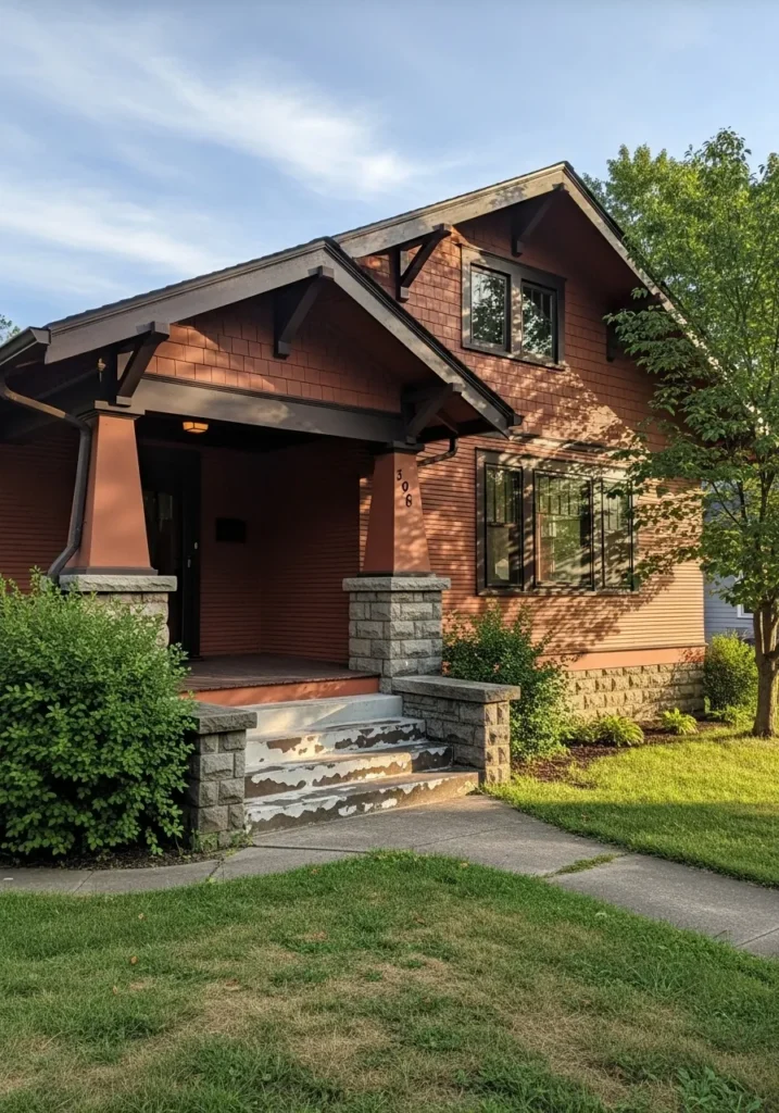
This charming Craftsman bungalow really leans into its woodsy roots with a mix of horizontal lap siding and textured cedar shingles on the upper gable. The deep terracotta body is framed by heavy dark chocolate trim on the eaves and window casings, which gives the structure a very grounded and sturdy appearance. Those iconic tapered porch columns sit on rugged stone piers, leading the eye up to the exposed rafter tails that define this architectural style. It looks like the ultimate cozy hideaway nestled right into a leafy suburban lot.
I find this sunset-inspired palette incredibly inviting because it feels so connected to the natural landscape. The way the rusty orange tones play against the gray stonework creates a rich and layered look that is hard to ignore. It is a fantastic example of how to use a bold, saturated color while still keeping a home feeling warm and unpretentious. This specific combination is a total winner for anyone who wants their house to feel like a permanent autumn retreat.
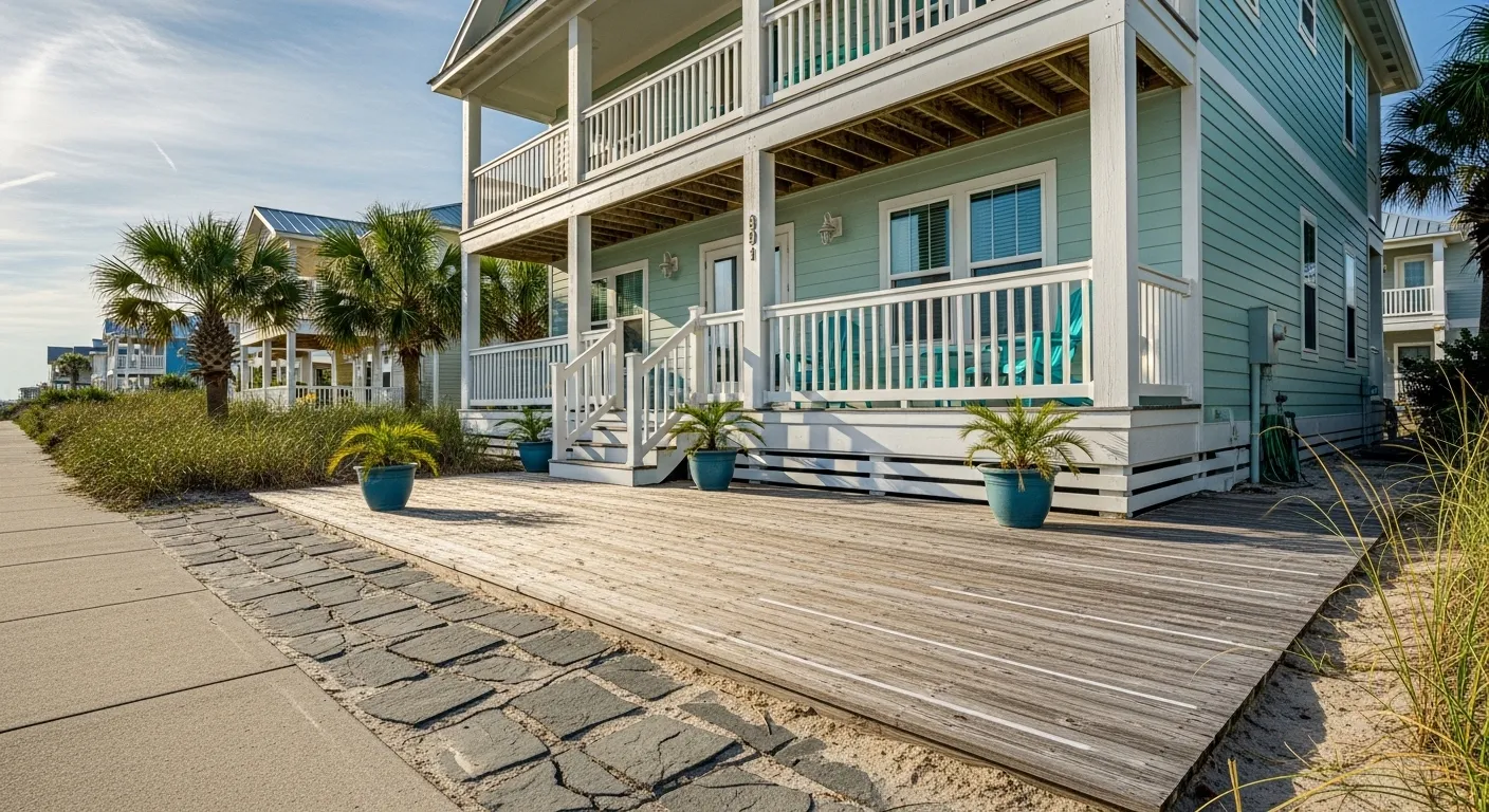
Sherwin Williams Sea Salt for a Breezy and Coastal Beach House Retreat
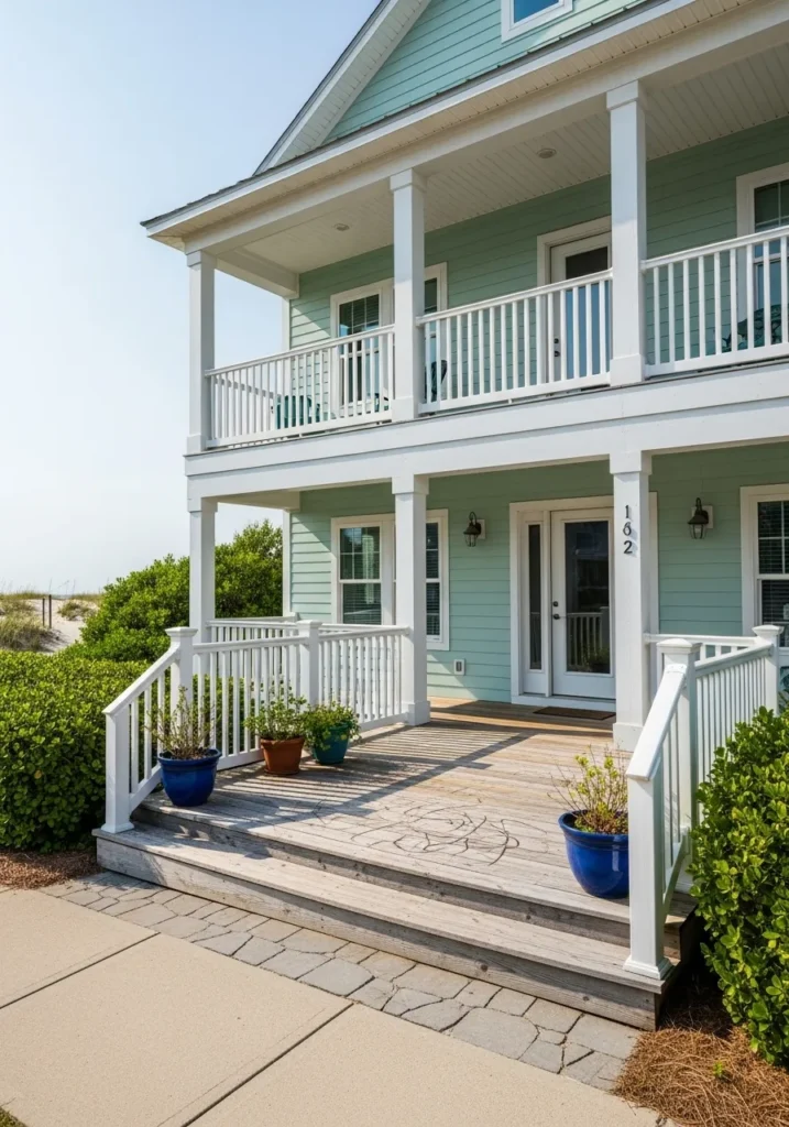
This two-story coastal home is the definition of seaside serenity with its light aqua horizontal siding and expansive double-decker porches. The crisp white railings and thick support columns provide a structured, clean frame that makes the soft pastel color truly sing against the sandy backdrop. Natural wood decking adds a touch of organic texture underfoot, while those vibrant cobalt blue planters offer a punchy contrast that ties the whole porch together. It feels like the kind of place where the only thing on your to-do list is watching the tide come in.
To me, this design is absolutely refreshing because it captures that “vacation mode” feeling perfectly without being too literal or cheesy. The pale minty green is so light and airy that it almost glows in the sunlight, making the entire house look like a peaceful oasis. It takes a certain eye for detail to balance such a soft hue with stark white trim, but the result is a facade that feels incredibly polished and high-end. If you want your home to be the ultimate breath of fresh air on the block, this dreamy beachy palette is definitely the winner.
Sherwin Williams Tricorn Black for a Bold and Urban Modern Vibe
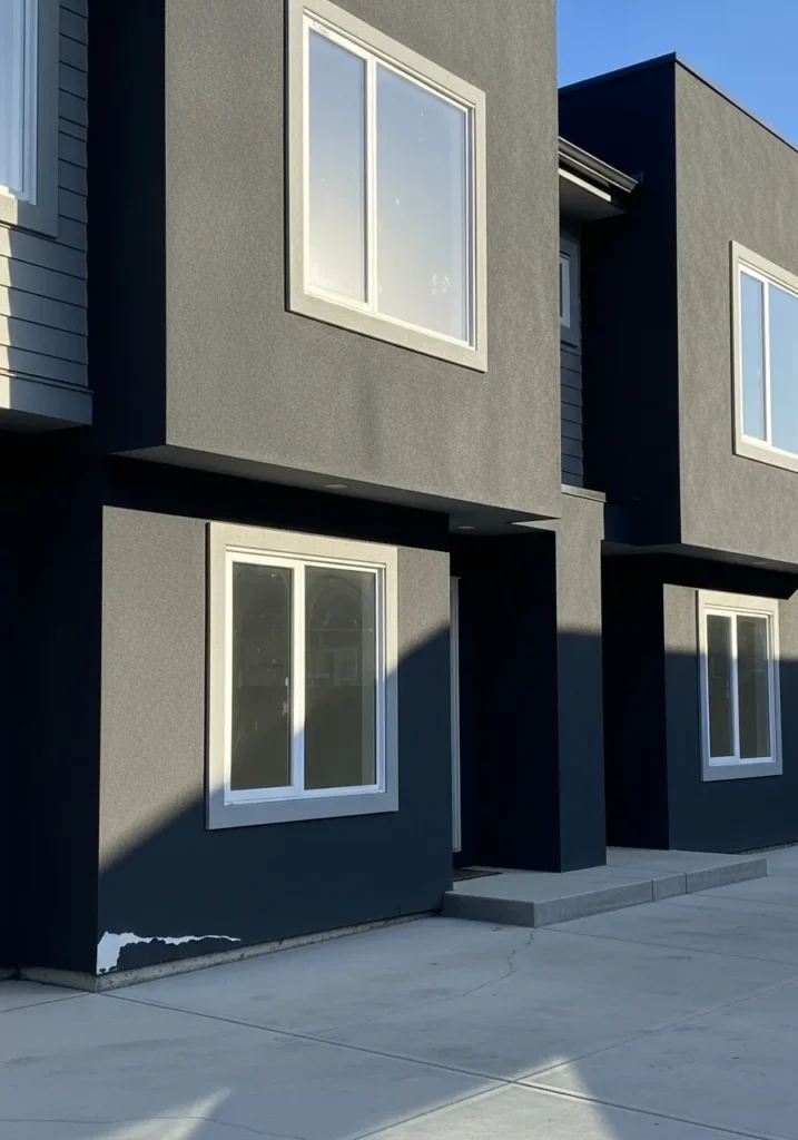
This ultra-modern townhouse features a striking geometric design with smooth stucco surfaces that look incredibly sharp in a deep charcoal finish. The architectural layout uses cantilevered upper floors to create depth and shadows, which adds a high-end designer feel to the entire structure. Simple white window casings provide a thin and elegant frame for the large glass panes, while the clean concrete entryway keeps the focus on the home’s bold silhouette. It is a fantastic example of how minimal details and a powerful color choice can make a massive impact in an urban setting.
I am genuinely impressed by how this dark and moody palette makes a relatively compact space feel so expansive and expensive. The way the sunlight hits the different planes of the house creates various shades of gray and black that keep the flat surfaces from looking one-dimensional. Some people might find such a dark color intimidating for a full exterior, but this design proves it can look completely sophisticated and welcoming. It is the perfect choice if you want to give your home a sleek and mysterious edge that really stands out from the neighbors.
Sherwin Williams Barn Red for a Classic and Energetic Cottage Feel
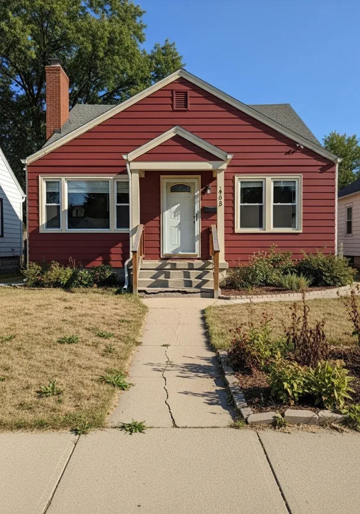
This adorable single-story cottage features horizontal lap siding in a deep wine-inspired red that feels both traditional and incredibly bold. The architecture is wonderfully simple with a prominent front gable and a cozy entryway porch supported by cream colored pillars. Large double windows on either side of the front door are framed in a matching light tan trim, which helps break up the saturated color of the walls. A tall brick chimney peeks out from the side, adding a touch of rustic texture to the overall silhouette.
I believe this design is absolutely charming because it takes a standard suburban layout and gives it so much life through color. Red is such a courageous choice, but it works here because the creamy accents keep the vibe soft and welcoming rather than aggressive. It feels like a home that has a lot of heart and soul. No matter your style preference, there is something so nostalgic and sweet about a red house with a tidy garden path.
Sherwin Williams Messenger Bag for a Bold Modern Organic Aesthetic
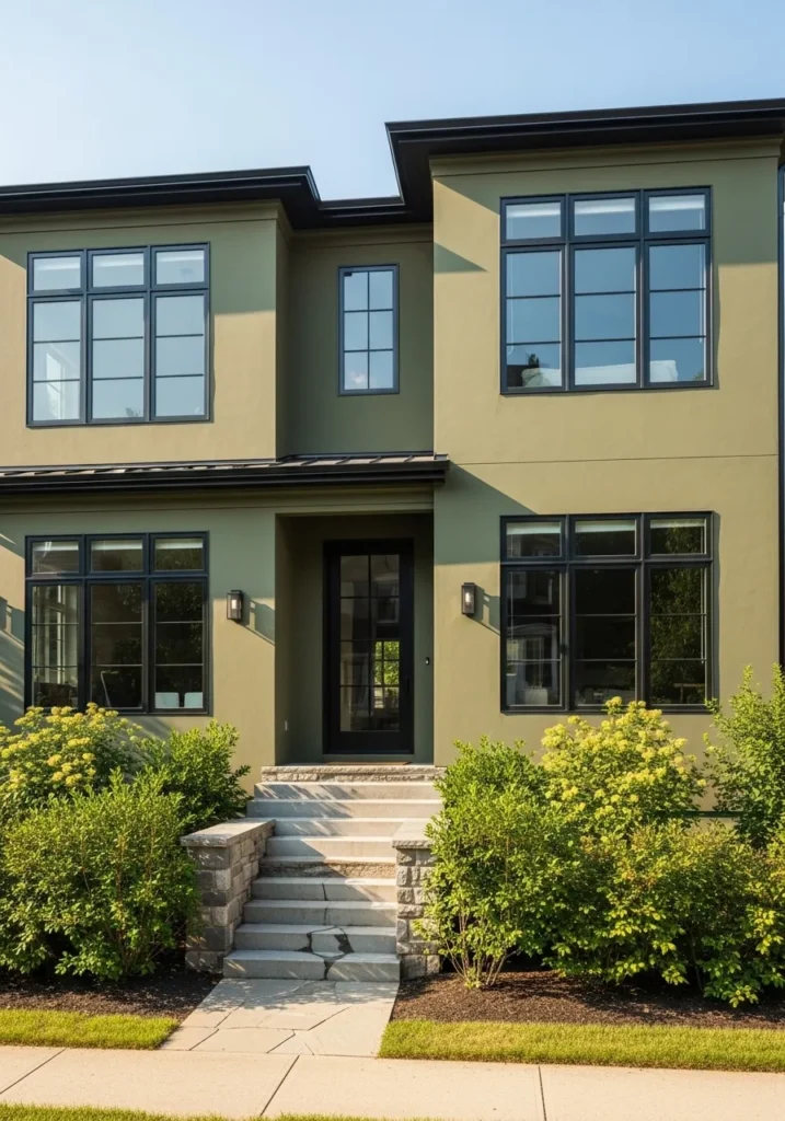
This contemporary two-story home is a total showstopper with its smooth olive green stucco and sharp architectural lines. The design feels incredibly balanced thanks to the oversized black-framed windows that reflect the surrounding greenery and let in tons of natural light. A set of wide concrete steps leads up to a minimalist glass front door, while the stone-clad retaining walls add a touch of rugged texture that grounds the entire look. It is a fantastic example of how an earthy, olive tone can make a modern structure feel warm and sophisticated rather than cold or industrial.
In my opinion, this specific shade of green is so compelling because it feels like a high-fashion neutral that perfectly bridges the gap between nature and city life. The way the deep black trim and roofline slice through the muted green creates a graphic, high-contrast look that I just can’t stop staring at. It takes a lot of confidence to go with such a unique, swampy-chic color, but the result is a home that looks like it belongs on the cover of a luxury design magazine. If you are looking to create a facade that feels established, expensive, and unique, this olive and black combo is the way to go.
Sherwin Williams Aleutian for a Whimsical and Airy Fairy Tale Facade
This adorable single-story cottage is a total dream with its sky-blue horizontal siding and decorative fish-scale shingles in the front gable. The architecture is just bursting with personality, from the intricate white gingerbread trim on the porch to the classic crown molding above the large double windows. A bright white fence-like railing and a sturdy brick chimney add those perfect traditional touches that make the house feel established and loved. It is the kind of home that looks like it stepped right out of a storybook and onto a sunny neighborhood street.
I love how this soft, powdery blue makes all the delicate white woodwork really shine. It is such a refreshing and happy choice that feels light-hearted without being too sugary sweet. Some people stick to safe neutrals, but choosing a dreamy pastel like this creates a house that feels like a permanent sunny day. The way the blue interacts with the crisp white accents is purely magical and gives the whole property a clean, polished, and totally inviting vibe.
Sherwin Williams Coral Reef for a High Energy Urban Statement
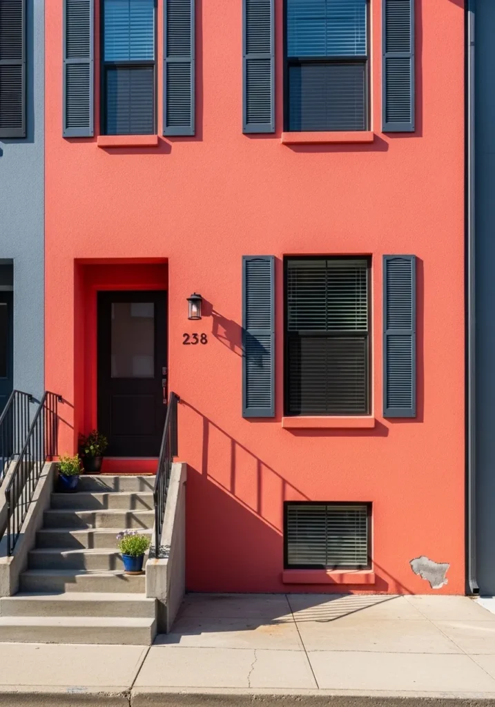
This striking city row house features a smooth stucco exterior in a vibrant, sun-drenched coral that absolutely demands attention. The architectural rhythm is created by rows of classic sash windows, each flanked by deep charcoal shutters that offer a sharp, sophisticated contrast. A black paneled front door sits at the top of a clean concrete staircase, while simple wrought iron railings add a touch of traditional security to the modern color palette. It is a brilliant example of how a bold, tropical-inspired hue can breathe new life into a dense urban streetscape.
I admire how this daring pinkish-orange shade turns a standard facade into a total landmark. Using such a saturated color is a brave move that pays off by making the home feel warm, artistic, and incredibly full of life. The way the dark shutters ground the brightness is just perfect, ensuring the house looks expensive rather than overwhelming. If you want your home to be the talk of the town for all the right reasons, this energetic and cheerful combination is the ultimate way to go.
Sherwin Williams Waterloo for a Grand and Historic Brick Transformation
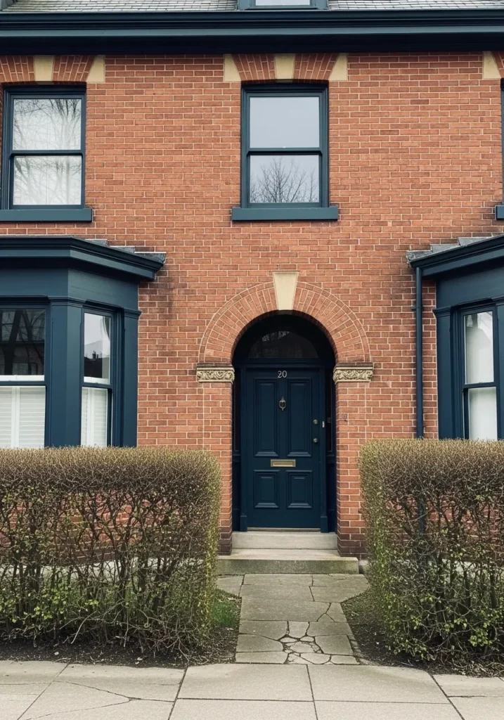
This gorgeous red brick townhouse features a stunning arched entryway that serves as the ultimate focal point of the design. The architectural woodwork around the door and the matching window sills are finished in a deep, oceanic teal that adds a layer of modern mystery to the traditional masonry. Neatly trimmed boxwood hedges create a crisp green border along the stone walkway, while the classic brass hardware on the navy door provides a tiny spark of luxury. It is a brilliant example of how playing with cool-toned trim can make a historic home feel refreshed and incredibly high-end.
I can’t get over how this specific shade of blue-green adds such a regal weight to the facade without feeling too heavy. The way the cool paint temperature balances the fiery warmth of the bricks is just pure design harmony. It feels like the kind of home owned by someone with impeccable taste who isn’t afraid to break away from standard black or white accents. Choosing a saturated, moody hue for the architectural “bones” of the house creates a look that is both deeply sophisticated and wonderfully unique.
Sherwin Williams Wisteria for a Dreamy Desert Sunset Aesthetic
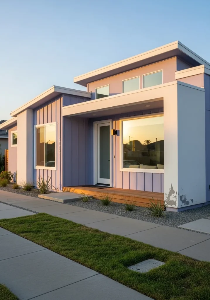
This ultra-modern desert home plays with height and layers using vertical board and batten siding in a stunning lavender-blue. The architecture is defined by sharp white structural beams and massive picture windows that reflect the golden hour glow of the surrounding landscape. A warm wood porch deck and a manicured gravel garden with ornamental grasses ground the ethereal color palette, creating a clean and minimalist look that feels incredibly peaceful. It is a fantastic example of how to use a non-traditional “candy” color in a way that looks sophisticated and high-end rather than youthful.
I like how this soft purple-periwinkle shade shifts in the light to mimic the exact colors of a twilight sky. Pairing such a whimsical wall color with chunky white architectural frames is a stroke of genius because it gives the house a graphic, modern edge that keeps it looking very cool and current. If you’re into a home that feels like a total escape from the ordinary, this dreamy pastel combo is your absolute best bet. I love seeing homeowners take a risk with a color like this because it proves that “pretty” can also be incredibly powerful and stylish.
Sherwin Williams Cheerful for a Sunny and Energetic Colonial Greeting

This traditional two-story colonial home features classic horizontal lap siding in a vibrant and punchy mustard yellow. The symmetrical design is beautifully organized with crisp white trim around the windows and a formal white portico that frames the black front door. Dark shutters provide a sophisticated and grounding element to each window, while a neat stone walkway leads guests through a tidy mulch bed toward the inviting entrance. It is a fantastic example of how a bold primary-adjacent color can make a large home feel both historic and incredibly full of life.
I adore how this optimistic yellow makes the entire property feel like it is radiating sunshine even on a cloudy day. The way the dark shutters and white trim act as visual bookends for such a saturated color is just brilliant design work. Some people might shy away from such a loud hue for a full exterior, but I find it creates a home that is impossible to ignore and feels wonderfully unique. It proves that you can embrace a joyful and energetic palette while still maintaining that stately and polished curb appeal we all crave.
Sherwin Williams Iron Ore for a Sophisticated Modern Minimalist Edge
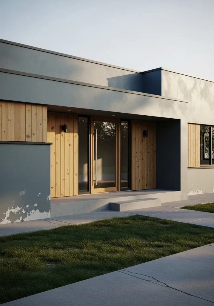
This sleek, single-story modern home is a masterclass in texture and tonal contrast. The smooth stucco exterior is painted in a deep, moody charcoal that serves as a powerful backdrop for the warm, vertical wood plank accents. The architectural design features a recessed entryway with a massive glass pivot door, creating a seamless transition between the interior and the clean concrete exterior. Minimalist black outdoor sconces and a perfectly level lawn keep the focus on the home’s sharp, geometric silhouette and expensive-looking materials.
The way the late afternoon sun hits the dark surfaces highlights the subtle variations in the stucco, preventing the monochrome palette from feeling flat or heavy. It is a brilliant choice for a homeowner who wants to achieve a high-end, gallery-like feel that looks both grounded and incredibly current. The combination of industrial dark tones with organic wood elements is an absolute win, offering a look that is undeniably bold yet completely serene.
Sherwin Williams River’s Edge for a Stately Victorian Row House
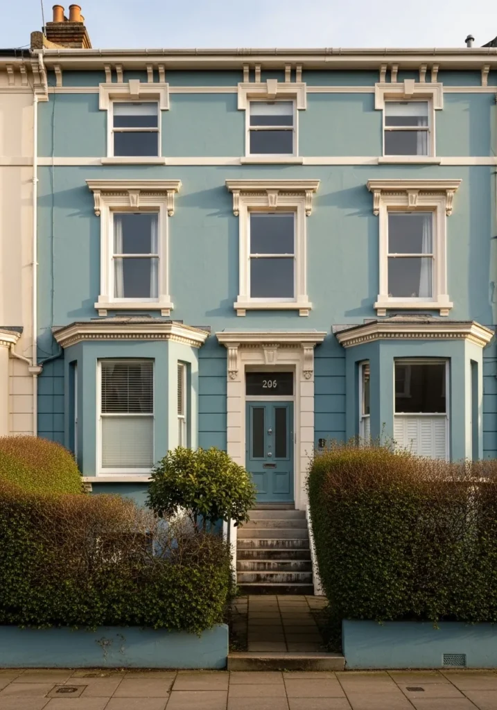
This impressive three-story Victorian row house features a complex architectural facade that is beautifully unified by a soft, mid-tone blue-green. The design is characterized by its rhythmic verticality, showcasing a pair of prominent bay windows on the ground floor and two rows of classic sash windows above. Every window is framed by intricate, cream-colored ornamental molding and pediments that add a sense of historical grandeur to the property. A central concrete staircase leads up to a formal teal front door, while the low retaining walls and dense, manicured hedges provide a structured and private garden border.
The choice of such a cool, tranquil body color allows the elaborate architectural details to stand out without feeling visually cluttered. By using a creamy off-white for the trim instead of a stark pure white, the overall aesthetic remains warm and inviting rather than clinical. It is an excellent example of how to treat a large, multi-unit structure with a single bold color to create a cohesive and high-end street presence. The entire look feels timelessly elegant and perfectly suited for a sophisticated urban neighborhood.
Sherwin Williams Kilim Beige for a Warm and Welcoming Traditional Porch
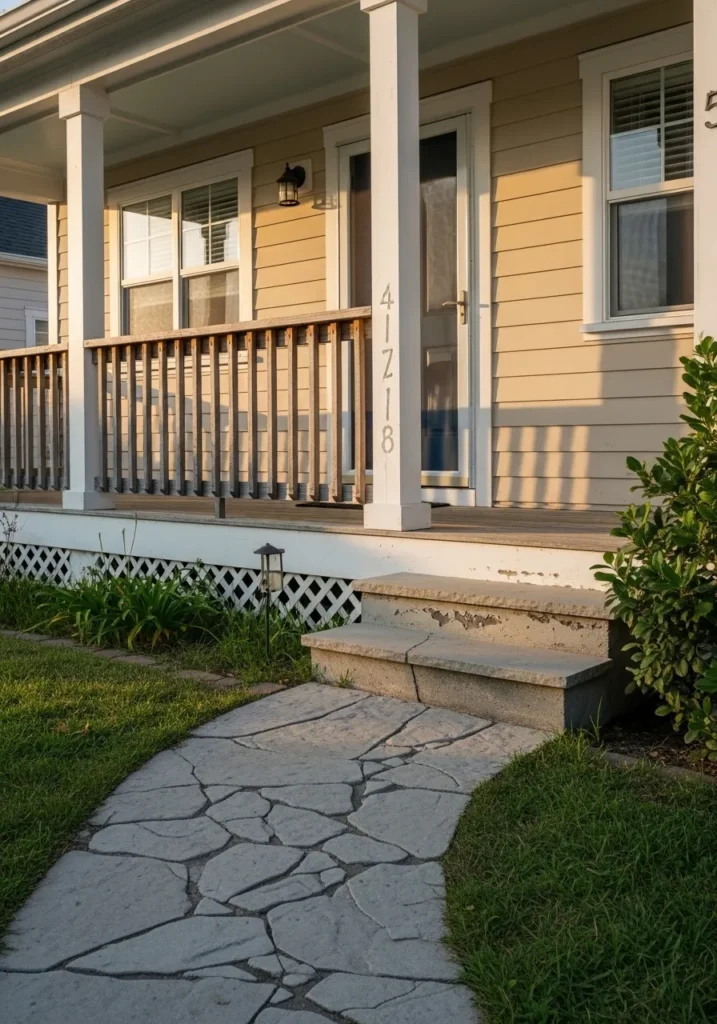
This inviting close-up captures a classic suburban porch featuring horizontal lap siding in a soft, creamy beige. The architectural design is clean and balanced, highlighted by thick white square columns and a matching white door frame that creates a crisp, layered look. A natural wood railing adds a touch of organic texture, while the white lattice skirting below the porch deck keeps the foundation looking tidy and traditional. A flagstone-style concrete path leads directly to the steps, flanked by a lush green lawn and healthy foundation plantings that complete this timeless entryway.
The golden hour sunlight hitting the siding emphasizes the warmth of the palette, making the entire home feel incredibly cozy and lived-in. Choosing a reliable neutral like this is a smart way to ensure a house feels bright and spacious without being as high-maintenance as a pure white. The contrast between the light walls and the dark metal of the wall lantern provides just enough visual interest to keep the design feeling polished and intentional. It is the perfect choice for a homeowner who wants a classic, approachable exterior that radiates effortless charm.
Sherwin Williams Cyberspace for a Dramatic and Grounded Modern Farmhouse
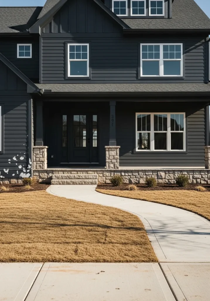
This large, multi-story modern farmhouse makes a powerful statement with its horizontal lap siding finished in a deep, near-black navy. The architecture features a welcoming front porch with a stone-clad base and matching stone piers that support the dark square columns. A curved concrete walkway cuts through the golden-brown lawn, leading visitors toward the grand black front door flanked by large windows with crisp white frames. The mix of dark siding, warm stone, and white accents creates a high-contrast look that is both incredibly bold and perfectly balanced.
The way this moody, saturated hue interacts with the natural light brings out its subtle blue undertones, preventing the large surface area from looking flat. It is an inspired choice for a contemporary build because it adds an immediate sense of weight and luxury to the structure. By grounding the dark walls with a rugged stone foundation, the home feels firmly rooted in its landscape while maintaining a very sleek and urban edge. This palette is a total winner if you want to combine traditional farmhouse warmth with a sharp, designer-forward personality.
Sherwin Williams Fireweed for a Warm and Rustic Sunset Glow
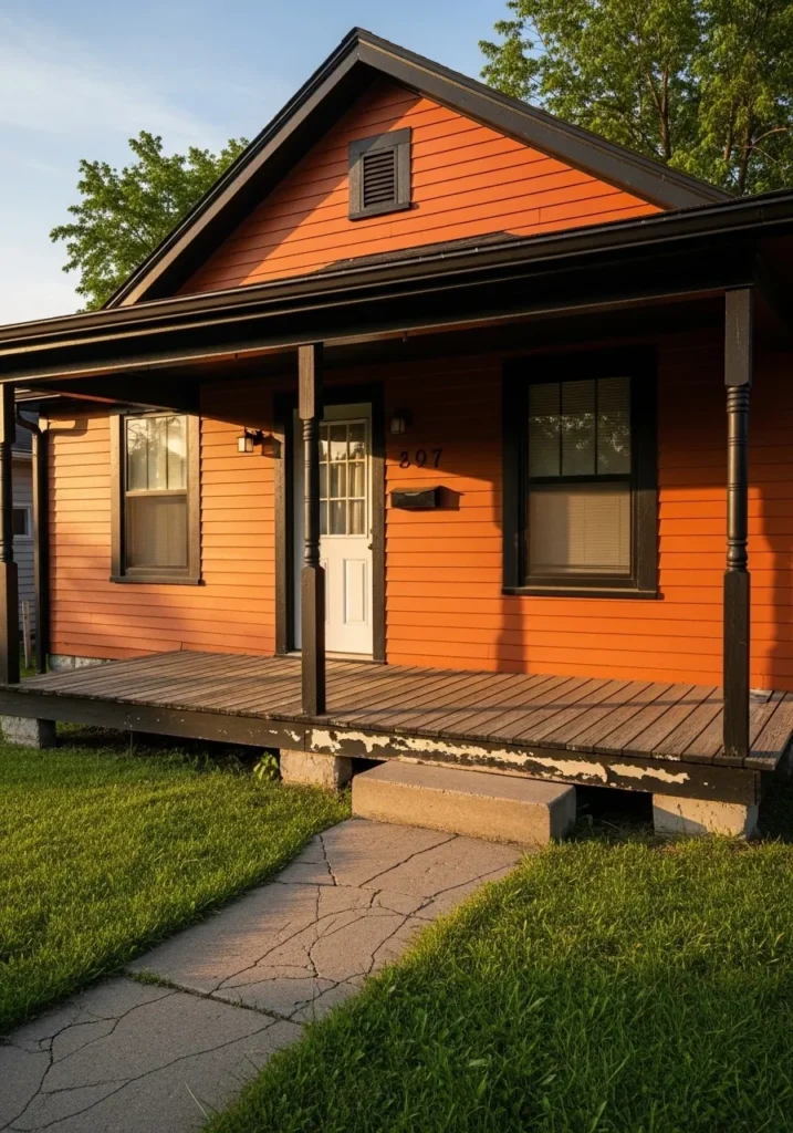
This charming single-story cottage radiates warmth with its horizontal lap siding in a deep, burnt orange. The home features a welcoming front porch supported by dark, slender columns that match the thick black trim around the windows and the roofline. A simple white front door provides a clean point of contrast, while the weathered wood porch floor and concrete steps add a touch of rustic, lived-in character. Set against a lush green lawn, the vibrant siding catches the late afternoon sun, creating a cozy and inviting atmosphere.
The use of a rich, earthy orange is a brilliant way to give a modest structure a massive personality without feeling out of place in a natural setting. By pairing this bold hue with heavy black accents, the design achieves a grounded, modern-rustic look that feels both trendy and timeless. It is a perfect example of how the right color choice can make a simple facade feel incredibly intentional and full of heart.
Sherwin Williams Mint Condition for a Crisp and Zesty Modern Exterior
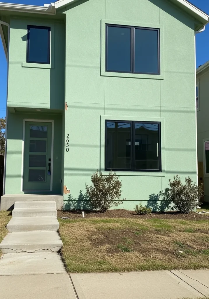
This two-story modern home makes a fresh architectural statement with its textured green stucco and clean, geometric lines. The design is anchored by black-framed windows that offer a sharp, high-contrast border against the minty-sage walls. A minimalist concrete staircase leads to a contemporary front door featuring frosted glass panels, while the simple mulch beds and small shrubs keep the focus entirely on the building’s vibrant silhouette.
The choice of such a bright, citrus-inspired green gives this urban structure an incredible amount of energy and “pop” against the clear blue sky. It is a fantastic example of how a singular, daring color can define a modern home’s identity without the need for complex ornamentation. By keeping the trim and hardware a uniform black, the zesty wall color feels sophisticated and intentional rather than overwhelming.