I have always loved how a few well-chosen colors can completely transform a room.
My favorite part of painting is watching how shades flow together and make a space feel cozy and intentional.
I’ve spent hours experimenting with wall colors, trim, and accent pieces to find combinations that just click.
Some people love bold contrasts, but I tend to lean toward schemes that feel effortless and harmonious.
I wanted to create a list of color combinations that make every corner of your home feel connected and beautiful.
These 23 Sherwin Williams color schemes are my go-to picks for spaces that feel fresh, inviting, and completely in sync.
Each one is full of personality but still easy to live with every day.
I can’t wait to show you my favorite combos and how they bring a little magic to any room.
Sherwin Williams Upward for a Breezy and Peaceful Living Room
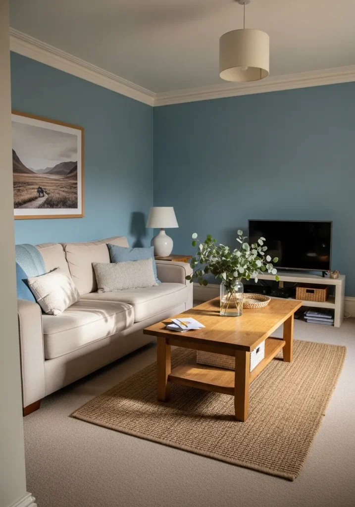
This living space features a stunning dusty blue wall color that pairs perfectly with warm wood accents and cream upholstery. The room feels incredibly balanced with a natural jute rug grounding the seating area and a light oak coffee table bringing a touch of organic texture. A soft beige sofa sits against the cool walls, while crisp white crown molding adds a sophisticated finish to the top of the room. Large landscape art and fresh greenery in a glass vase pull the whole outdoor-in aesthetic together.
I am completely smitten with how this color makes the entire room feel like a deep breath of fresh air. It is the kind of space where you can actually imagine yourself curled up with a good book and a cup of tea while the afternoon sun hits those pillows. The way the blue shifts in the light creates such a serene atmosphere that isn’t too cold or too dark. This design proves that you can use a bold color and still keep things feeling totally light and airy.
Sherwin Williams Svelte Sage for a Charming and Inviting Exterior
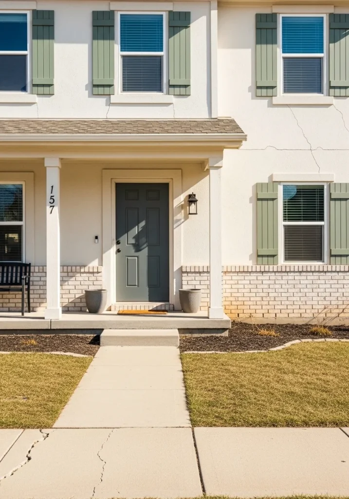
This home exterior showcases a delightful combination of soft sage green shutters against a warm, creamy white facade. The muted green tones provide a subtle pop of color that feels perfectly at home with the natural landscaping and the light brick accents along the base. A deep slate gray front door anchors the entryway, creating a sophisticated focal point that balances the lighter shades of the walls and porch columns. Simple black hardware and a classic lantern light add just the right amount of contrast to this clean and welcoming traditional design.
I absolutely adore how these earthy tones make the house feel established and cozy right from the curb. There is something so incredibly soothing about a sage green that doesn’t scream for attention but instead whispers elegance. It reminds me of a quiet morning in a garden where everything feels fresh and full of life. This palette is a total winner if you want your home to look timeless and high-end without being too stuffy or predictable.
Sherwin Williams Messenger Bag for a Fresh and Organic Kitchen
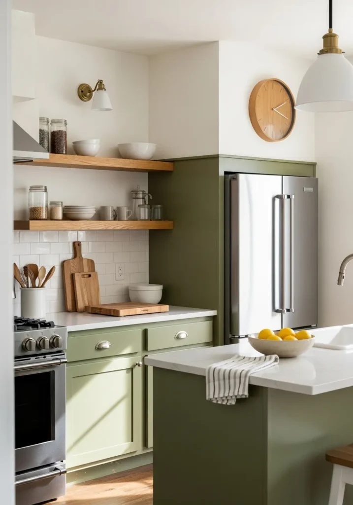
This kitchen setup features a stunning combination of olive green cabinetry and crisp white elements that make the whole room pop. The lower cabinets and refrigerator surround are drenched in a deep, earthy green, while the upper walls and subway tile backsplash stay bright and neutral. Natural wood floating shelves add a touch of warmth, perfectly holding glass jars and ceramic bowls for a functional yet stylish look. Stainless steel appliances and a white marble island countertop bring in a modern edge that keeps the traditional shaker-style cabinets feeling current and sleek.
I find this design absolutely breathtaking because it manages to be incredibly trendy while still feeling like a classic space you’d never get tired of. The way the golden morning light hits that green paint makes the kitchen feel so alive and energetic, which is exactly the vibe I want when I’m brewing my first pot of coffee. It really shows how a bolder color choice on the base cabinets can ground a room without making it feel small or dark. This look is a total dream for anyone wanting to bring a bit of the outdoors inside their home in a really sophisticated way.
Sherwin Williams Intimate White for a Sweet and Soothing Nursery
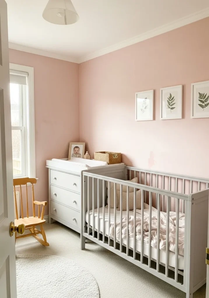
This darling nursery space uses a soft ballet-slipper pink on the walls to create the ultimate cozy retreat for a little one. The light gray crib and matching dresser offer a modern neutral balance that keeps the pink from feeling too sugary or overwhelming. A natural wood rocking chair in the corner adds a touch of vintage charm, while simple botanical prints in white frames keep the decor feeling fresh and intentional. Crisp white trim and a plush, round rug complete the look, making the room feel bright and airy even on cloudy days.
I am enchanted by how this delicate shade makes the entire room glow with such a gentle warmth. It is the perfect example of how a whisper of color can make a small space feel like a giant hug. The way the sunlight dances off the pale walls is just stunning and creates such a peaceful vibe for nap time. Some people worry about pink being too much, but this specific tone is so sophisticated and understated that it really just feels like a neutral with a big heart.
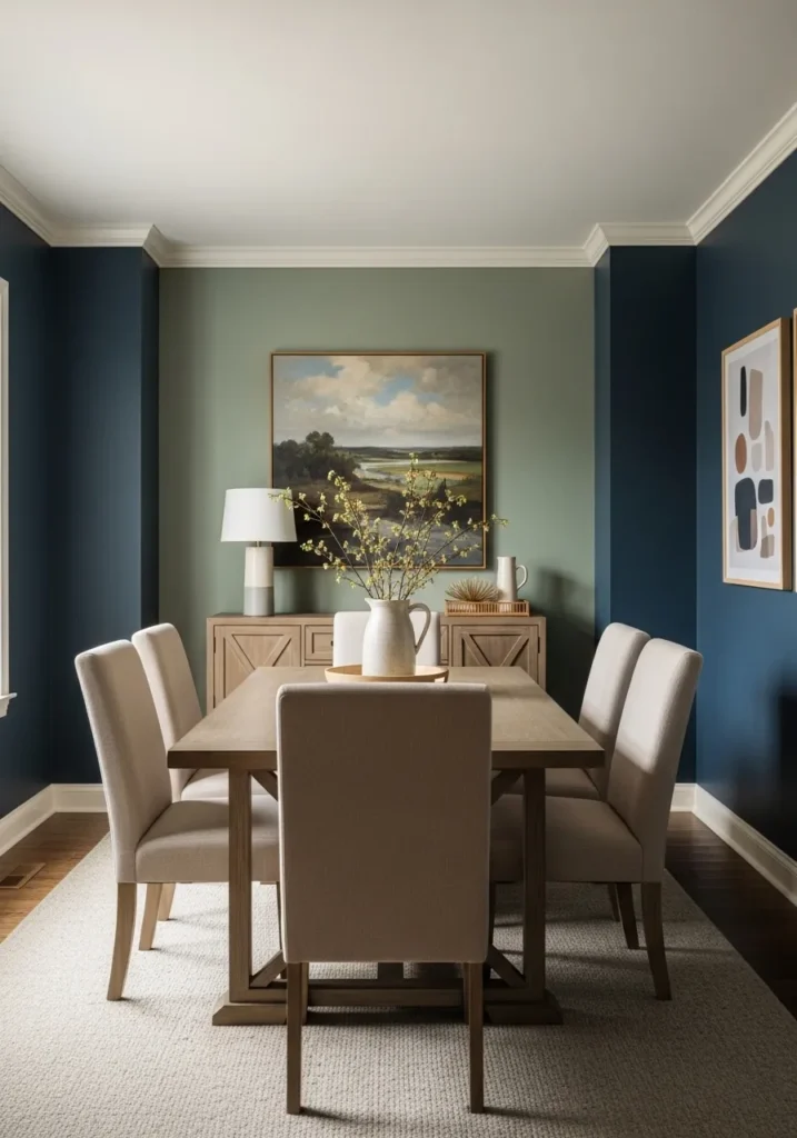
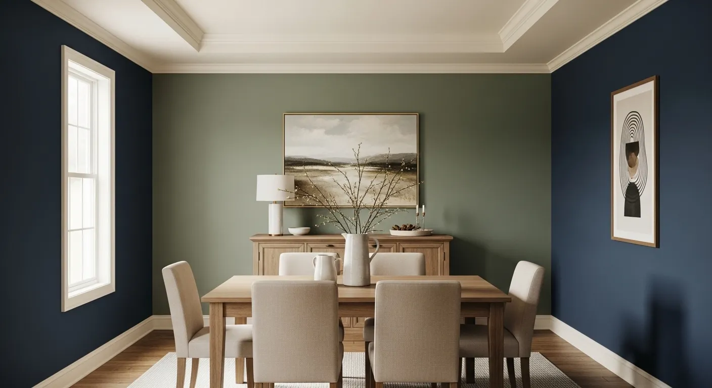
This dining room setup is a masterclass in using depth and contrast to create a high-end feel. Deep navy blue walls wrap the room in a cozy embrace, while a soft sage green accent wall behind the sideboard provides a sophisticated focal point for the large landscape painting. The light wood dining table and matching upholstered chairs pop beautifully against the dark backdrop, grounded by a large cream area rug that keeps the space from feeling too heavy. Crisp white crown molding and baseboards frame the entire look, ensuring the dark tones feel intentional and polished.
I truly feel that this color combination is the secret to a space that looks like a million bucks. The way the blue creates such a rich jewelry box effect makes every dinner party feel like a special occasion. It takes a lot of guts to go this dark, but the result is so incredibly rewarding and stylish. Seeing how the natural light catches the green accent makes me want to grab some paint and start a weekend project right now.
Sherwin Williams Dard Hunter Green for a Striking and Grounded Entrance
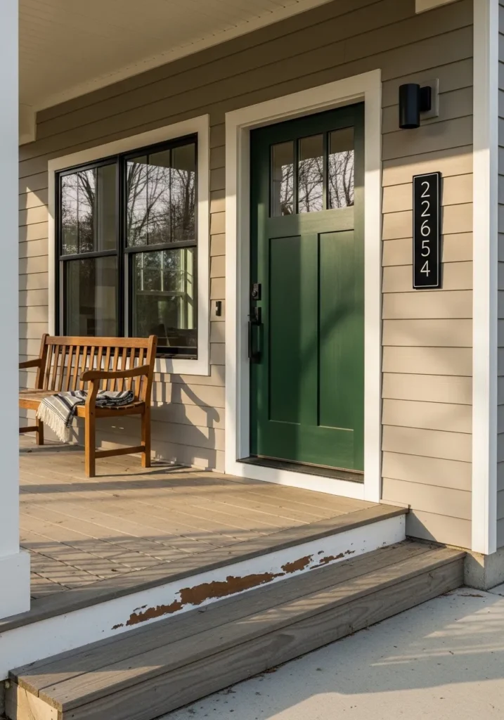
This porch setup features a rich forest green front door that instantly anchors the neutral exterior. The siding is a warm taupe shade that provides a soft backdrop for the bold entry color, while crisp white trim around the door and windows makes everything look sharp and tidy. A classic wooden bench sits off to the side, adding a cozy touch to the space along with a striped throw blanket for those chilly evenings. Black accents like the modern wall sconce and the vertical house number plaque tie the whole contemporary farmhouse aesthetic together beautifully.
I am impressed by how a simple door swap can completely transform a home’s curb appeal from basic to brilliant. There is something so incredibly luxe about this specific shade of green paired with the natural wood tones of the porch floor. It gives off such a confident and welcoming vibe that makes you want to walk right in and stay a while. To me, this design is the perfect example of using color to make a statement without losing that timeless and classic feeling we all want for our homes.
Sherwin Williams Sea Salt for a Refreshing and Spa-Like Bathroom
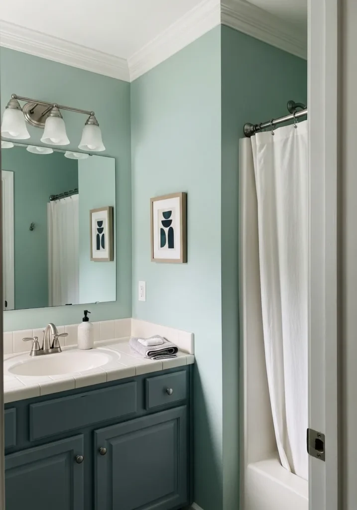
This bathroom design uses a breathtaking light aqua on the walls to create a space that feels instantly clean and restorative. The soft green-blue walls provide a beautiful backdrop for the crisp white tile countertop and the matching white shower curtain. To add some serious depth, the vanity is painted in a deep charcoal blue, which anchors the room and makes the hardware really shine. Simple geometric art and brushed nickel fixtures keep the aesthetic modern, while the white crown molding adds that classic touch we all love.
I am head over heels for how this color makes the entire room feel like a high-end hotel retreat. It is the kind of shade that looks good in any light and truly turns a standard morning routine into a relaxing self-care session. The way the dark vanity grounds the lighter wall color is genius because it adds a bit of moodiness without sacrificing that airy feel. If you want a bathroom that feels like a quiet escape from the world, then this palette is your new best friend.
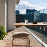
Sherwin Williams Morning Fog for a Chic and Minimalist Balcony
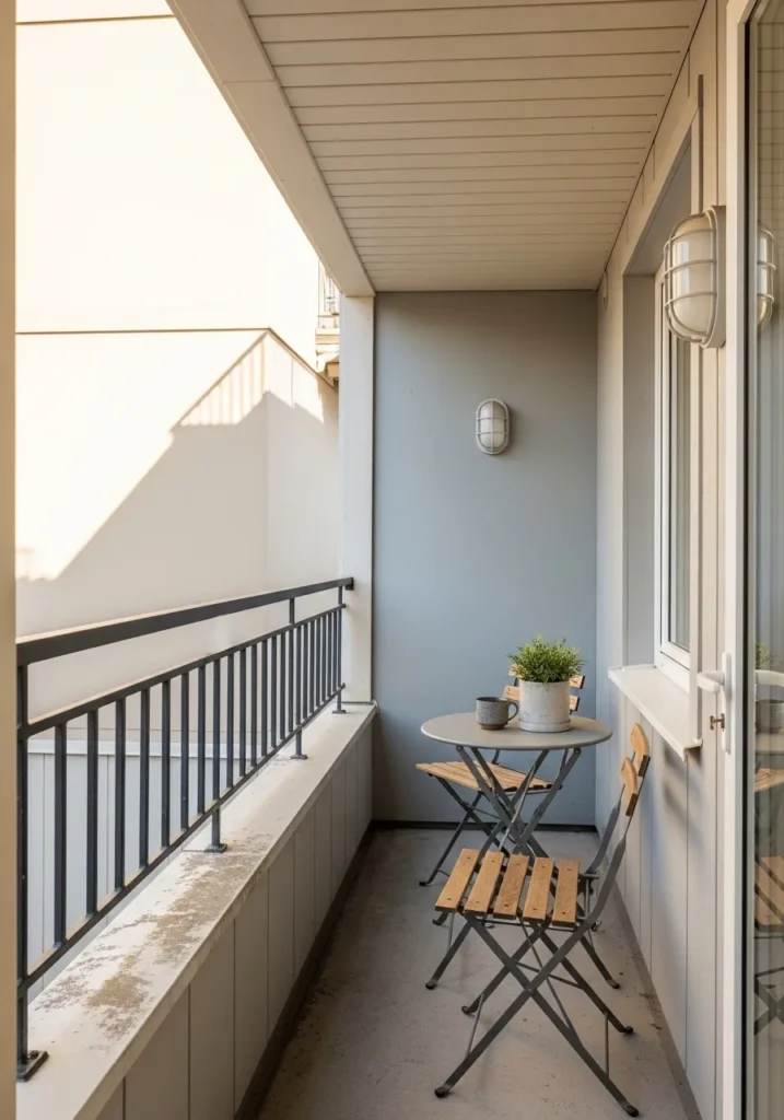
This narrow balcony design makes the most of a compact footprint by using a sophisticated cool gray on the main accent wall. The soft tone provides a sleek backdrop for a folding bistro set featuring gray metal frames and warm wood slats, which adds a touch of Scandinavian charm. A small potted plant and a ceramic mug sit atop the circular table, creating a lived-in feel that invites relaxation. White trim along the windows and a matching overhead light fixture keep the look crisp, while the black metal railing adds a final punch of modern contrast against the light gray and cream exterior.
I truly love how this tiny outdoor nook feels like a high-end city escape without needing a ton of square footage. The way the light bounces off that silky gray paint makes the whole area feel twice as large and incredibly polished. It is the perfect spot for a morning espresso or a glass of wine at sunset when you just need a little quiet time. Finding ways to make small balconies look this stylish is such a win for apartment living, and this color choice is exactly how you pull it off.
Sherwin Williams Honey Bees for a Playful and Energetic Kid Zone
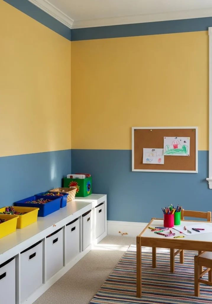
This vibrant playroom features a bold two-toned wall design that perfectly balances a sunny golden yellow with a grounded slate blue. The horizontal stripe pattern adds a sense of movement to the room, while the white crown molding and baseboards keep the look structured and clean. A long white storage unit sits against the wall, filled with colorful bins that mirror the room’s palette and keep toys neatly tucked away. In the center, a small wooden activity table and a striped rug pull together all the primary colors, creating a functional and cheerful environment for creativity.
I love how these contrasting stripes make the whole area feel like a spark of pure joy. It is such a clever way to use color to define a space meant for play without making it feel cluttered or chaotic. The way the warm yellow reflects the natural light just makes me want to grab some crayons and join in on the fun at that little table. Some people might play it safe with beige in a kid’s room, but this daring combo proves that going bold pays off in the biggest, most smile-inducing way possible.
Sherwin Williams Iron Ore for a Productive and Polished Home Office
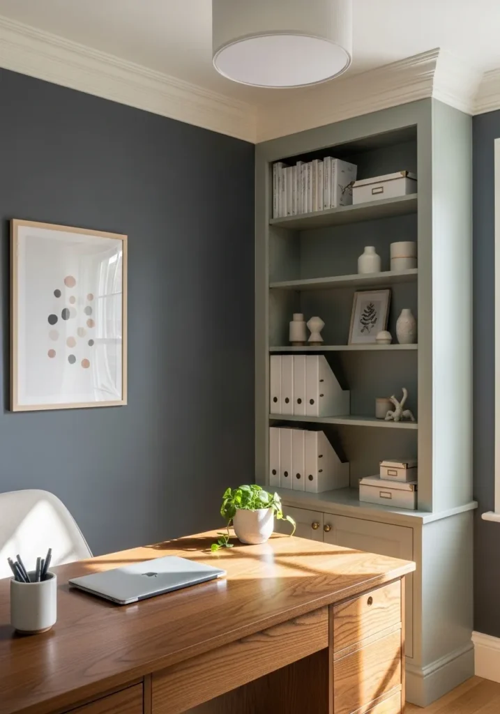
This workspace design highlights a gorgeous contrast between dark, moody walls and soft, muted cabinetry. The deep charcoal walls wrap the room in a professional yet cozy embrace, while the built-in bookshelves in a dusty sage green provide a breath of fresh air and a place to showcase favorite trinkets. A rich wood desk takes center stage, catching the afternoon sun and bringing a natural, organic warmth to the cool-toned palette. Simple white organizers and minimalist art keep the area feeling orderly and focused, making it the ultimate spot for getting things done in style.
I am totally obsessed with how this color combo makes a home office feel like a high-end executive suite without being cold. The way the dark grey makes the wood grain on the desk absolutely sing is just a chef’s kiss level of design. It feels so intentional and mature, yet that little pop of green on the shelves keeps it from taking itself too seriously. If you’re looking for a vibe that says you’re a total boss who also appreciates a good aesthetic, this is 100% the direction you should take.
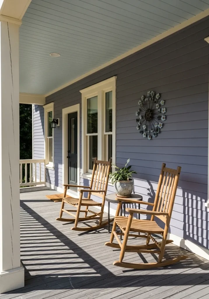
Sherwin Williams Languid Blue for a Relaxed and Coastal Front Porch
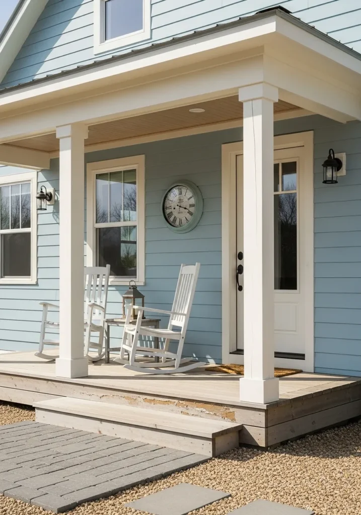
This dreamy porch setup features horizontal lap siding in a soft, misty blue that feels like a permanent vacation. The cool tones are beautifully framed by thick white columns and crisp window trim, giving the home a clean and structured look. Two classic white rocking chairs sit on the weathered wood decking, flanking a small side table with a vintage lantern for that perfect farmhouse touch. A matching blue clock and black colonial-style sconces add just the right amount of personality without cluttering the serene entryway.
Finding a blue that feels sophisticated instead of icy can be a real challenge, but this shade hits the mark perfectly. It creates such a breezy and welcoming first impression that makes me want to spend the entire afternoon sipping lemonade in those rockers. The way the white trim pops against the siding is so satisfying and gives the whole exterior a polished, coastal charm. This design is a total winner if you want your home to stand out in the neighborhood with a vibe that is purely peaceful and timeless.
Sherwin Williams Riverway for a Moody and Productive Laundry Room

This laundry space proves that utilitarian rooms can be just as stylish as a living area by pairing deep teal walls with bright white cabinetry. The rich wall color provides a dramatic backdrop for the clean lines of the upper cabinets, while a warm butcher block countertop adds a necessary touch of organic texture above the appliances. Below the counter, greige lower cabinets with silver hardware offer a soft transition between the dark walls and the light flooring. A small framed floral print and a glass jar of clothespins add those tiny curated details that make a chore-heavy space feel lived-in and loved.
Everything about this setup feels incredibly intentional and high-end without trying too hard. My favorite part has to be how the wood countertop brings so much life to the cool blue-green tones of the walls. It makes the whole room feel grounded and expensive, which is exactly the kind of motivation I need to actually finish a load of whites. This design is the ultimate proof that you should never play it safe in the smaller rooms of your home because a bold choice here creates such a stunning impact.
Sherwin Williams Reddened Earth for a Warm and Earthy Exterior
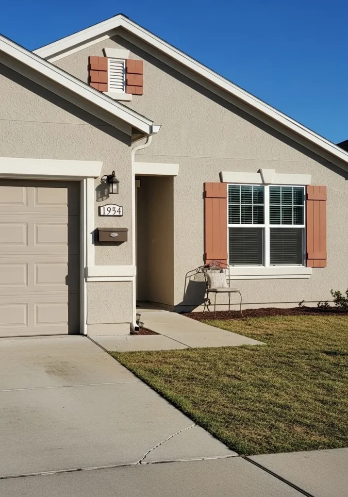
This charming suburban home features a beautiful balance of warm neutrals and sun-baked accents. The main body of the house is dressed in a soft taupe stucco that feels incredibly grounded against the bright blue sky. To add a splash of personality, the shutters are painted in a rich terracotta shade that pulls inspiration from natural clay and desert landscapes. Crisp white trim around the windows and garage door provides a sharp frame that makes the colors pop without feeling too busy. A simple metal chair and dark mulch in the garden beds complete this low-maintenance yet highly stylish curb appeal.
I am struck by how those reddish-orange shutters turn an ordinary exterior into something that feels like a cozy Mediterranean escape. It is such a clever way to add warmth to a neutral house without having to commit to a bold color on the entire facade. The way the late afternoon sun hits that earthy tone makes the whole front porch look so inviting and sun-drenched. This design is the perfect inspiration if you want your home to have a bit of a rustic or Southwestern flair while keeping things looking clean and modern for the neighborhood.
Sherwin Williams Clary Sage for a Relaxing and Nature-Inspired Sunroom
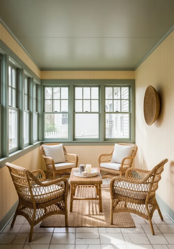
This sun-drenched enclosed porch is the ultimate lesson in using complementary earth tones to create a cohesive retreat. The vertical wall paneling is painted in a soft buttery cream, which provides a warm glow against the natural light streaming through the many windows. For a sophisticated touch of contrast, the window frames, ceiling, and baseboards are finished in a muted sage green that pulls the greenery from outside right into the room. Four woven wicker armchairs with white cushions surround a matching coffee table, creating a perfect conversation circle on top of a textured jute rug and neutral tile floor.
Some people might stick to all-white for a sunroom, but the choice to paint the ceiling and trim in that gorgeous green is such a brilliant move. It makes the whole space feel like a secret garden hideaway where you could spend hours chatting with your besties. I really love how the light yellow walls mimic the feeling of constant sunshine, even on a drizzly day. This design is just so incredibly cozy and proves that nature-inspired palettes are the way to go if you want a home that feels like a big warm hug.
Sherwin Williams Aleutian for a Dreamy and Artistic Attic Landing
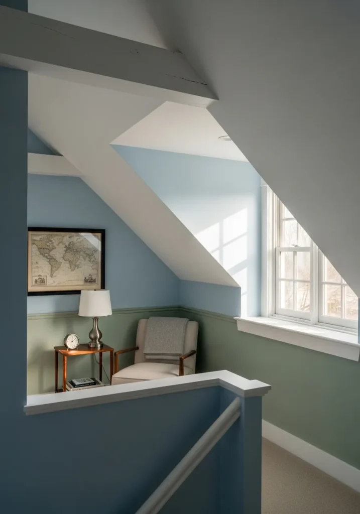
This unique attic space utilizes a clever two-tone wall strategy to define its interesting architectural angles. The upper portion of the walls is coated in a serene, airy blue that makes the sloped ceilings feel less imposing and more like an open sky. Below the chair rail, a muted sage green provides a grounded foundation that perfectly complements the vintage world map and the mid-century modern armchair. A small wooden side table with a classic silver lamp and alarm clock creates a cozy reading nook, while the crisp white trim and banister keep the transitions between these cool tones looking sharp and intentional.
My heart actually skipped a beat seeing how beautifully these colors play together in such a tricky architectural spot. It is quite impressive how the soft blue captures the natural light from the window and turns a simple hallway landing into a destination for quiet reflection. The combination feels incredibly curated and smart, almost like walking into a page of a high-end design magazine. If you have an odd corner or a sloped ceiling that feels a bit cramped, this palette is a total game-changer for making it feel spacious and full of character.
Sherwin Williams Hazy Lilac for a Sophisticated and Dreamy Breakfast Nook
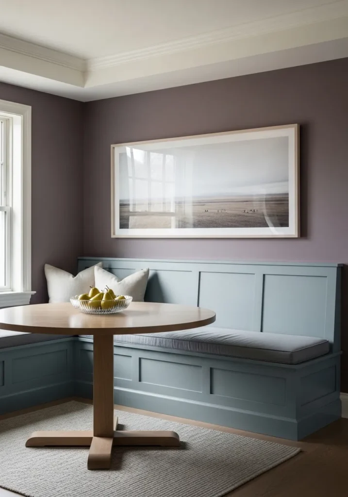
This breakfast nook is a masterclass in using unexpected colors to create a high-end, cozy corner. The walls are drenched in a muted, dusty purple that feels incredibly grown-up and peaceful, providing a rich backdrop for the large panoramic landscape art. A built-in corner banquet in a soft slate blue offers plenty of seating with plush gray cushions and cream throw pillows for extra comfort. The light oak pedestal table and matching neutral rug keep the space feeling organic and bright, while the crisp white window trim adds a necessary pop of brightness to frame the view.
I find this color combination absolutely genius because it takes a traditionally “girly” lilac and makes it feel totally chic and modern. It creates such a moody yet inviting atmosphere that I can easily see myself lingering here for hours over brunch and good conversation. The way the cool blue of the bench plays against the warm purple walls is just a dream for anyone who loves a bit of drama without sacrificing a serene vibe. If you want a dining space that feels unique and soulful, this palette is definitely the way to go.
Sherwin Williams Boothbay Gray for a Sleek Modern Townhome
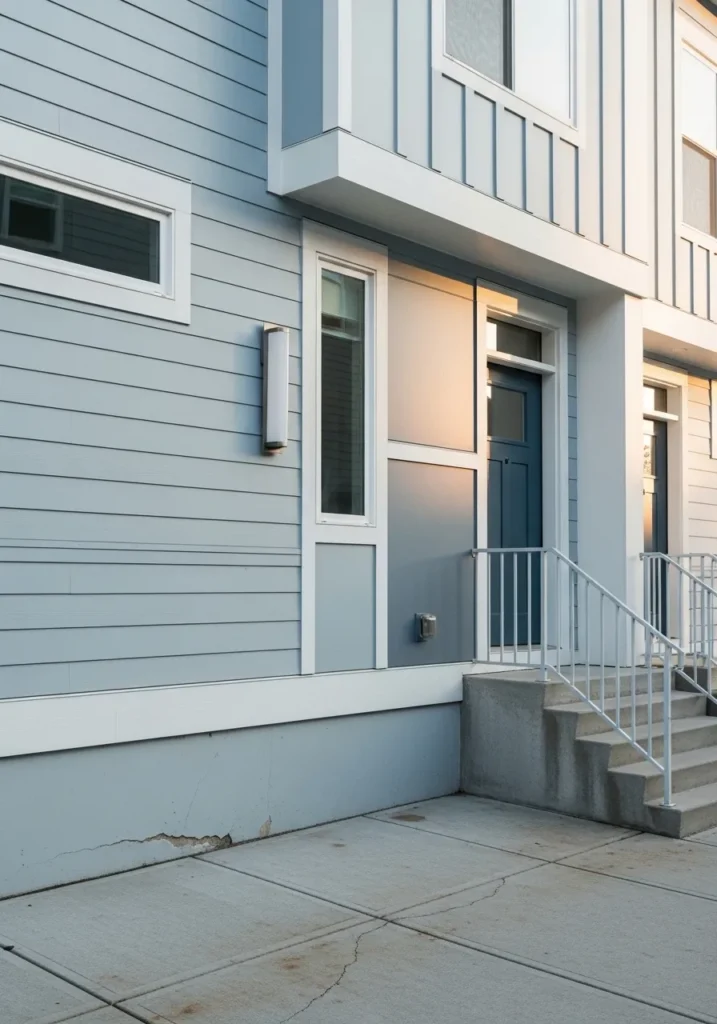
This exterior design shows off the power of a cool-toned palette on a modern multi-level townhome. The primary horizontal siding is a beautiful mid-tone blue-gray that shifts slightly with the light, paired with vertical board and batten accents in a crisp white. A deep navy front door provides a sophisticated anchor to the entryway, while the light gray concrete steps and minimalist white metal railing keep the transition feeling open and clean. The addition of a slim, contemporary silver wall light adds that final touch of urban polish to the overall facade.
I like how these different shades of blue and gray create such a high-end architectural look without feeling cold or uninviting. It is the perfect example of how to play with various textures and tones to make a modern building feel like a real home. The way the sunset glow hits that flat gray panel next to the door is just stunning and makes the whole entryway feel so warm and welcoming. If you live in a city or have a contemporary build, this color scheme is a total slam dunk for achieving that effortless curb appeal we all secretly crave.
Sherwin Williams Sea Salt for a Zen and Tidy Garage Workspace
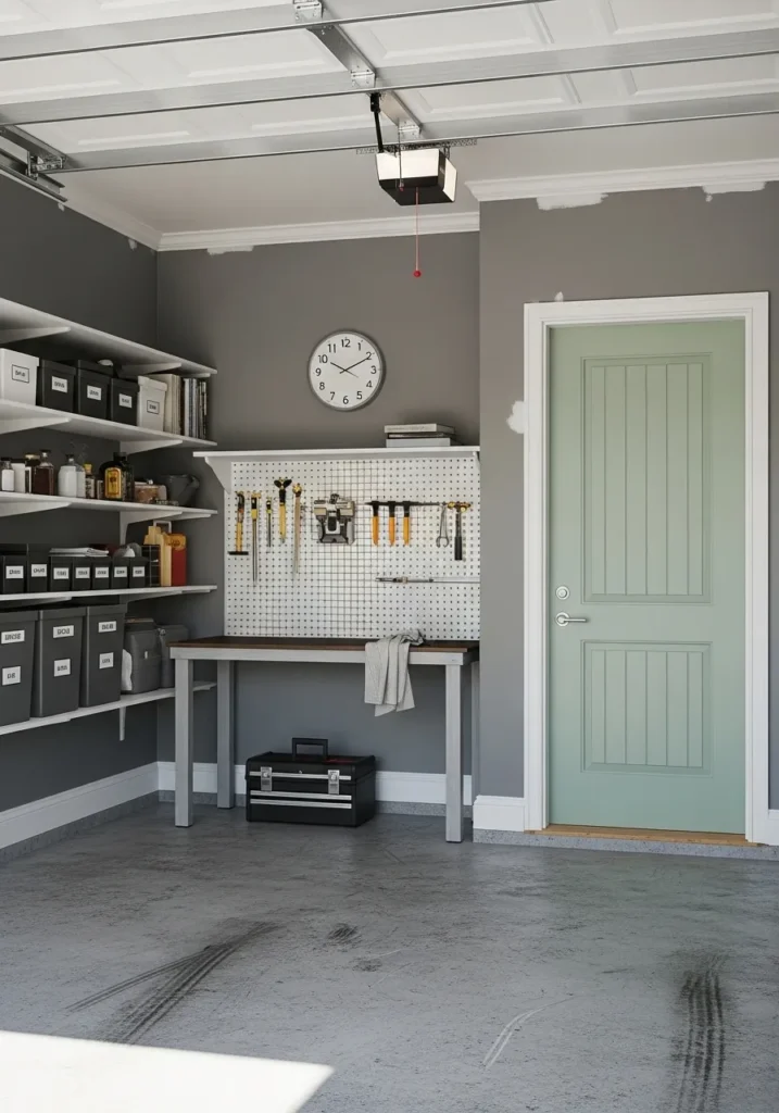
This garage transformation features a brilliant mix of industrial function and soft, designer aesthetics. The main walls are painted in a solid charcoal gray that provides a clean, professional backdrop for the white open shelving and tool pegboard. To keep the space from feeling too heavy, the interior door is painted in a muted seafoam green that adds an unexpected touch of tranquility to a hardworking area. Polished concrete floors and crisp white trim around the door frame tie the whole look together, creating a garage that feels more like an extension of the home than a cluttered storage unit.
I feel like this is exactly what every hobbyist needs to stay motivated and organized. The way that soft green door pops against the darker walls is such a clever design move because it brings a bit of personality to a room that people usually ignore. It makes the whole workstation look curated and high-end, which honestly might actually make me want to finish those weekend DIY projects for once. Seeing how a simple color choice can turn a basic garage into a stylish studio is just so inspiring for anyone looking to level up their utility spaces.
Sherwin Williams Cavern Clay for a Warm and Artsy Living Room
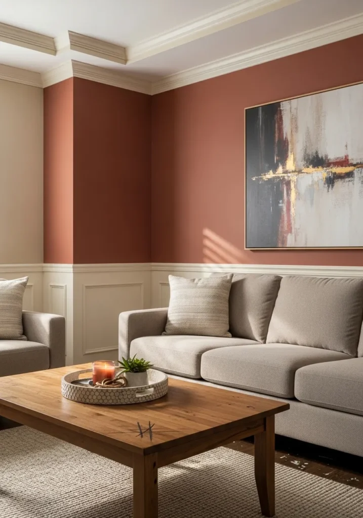
This living area feels like a warm embrace thanks to the rich terracotta walls that serve as a stunning backdrop for the large abstract painting. The space is expertly balanced with creamy white wainscoting and crown molding that keep the bold color from feeling too heavy. A plush beige sofa and matching armchair offer plenty of cozy seating, while a natural wood coffee table adds a touch of organic texture to the center of the room. Soft sunlight filters through the space, highlighting the subtle variations in the wall color and making the entire setup feel incredibly high-end yet approachable.
I love how this earthy palette creates a sophisticated gallery vibe right in the middle of a family home. It is the perfect example of how to use a deep, spice-toned color to add major personality without making the room feel small or dark. The way the gold accents in the artwork catch the light against that clay-colored wall is just spectacular and makes me want to curl up with a glass of wine immediately. This design proves that you can totally step outside the “all-gray” box and end up with a space that feels both timeless and unique.
Sherwin Williams Wisteria for a Whimsical and Elegant Porch
This inviting outdoor space showcases a stunning lavender blue siding that feels like a breath of fresh spring air. The cool, purplish-gray walls are beautifully complemented by a light sky-blue ceiling, creating a continuous flow of soothing tones from top to bottom. Creamy white trim around the windows and door adds a crisp, clean border that makes the main color really sing. A pair of warm wood rocking chairs and a small matching side table bring an organic, grounded element to the porch, while a delicate, floral metal wall art piece adds a touch of feminine charm.
Finding a purple-toned exterior paint that looks sophisticated instead of “dollhouse” is a total win, and this shade hits all the right notes. The way the shadows play across the horizontal siding gives the whole house so much depth and character. It feels like the kind of place where you could sit for hours with a glass of iced tea and just watch the world go by in style. I am genuinely enamored with how the blue ceiling mimics the sky, making the entire porch feel like a magical, open-air retreat.
Sherwin Williams Sea Salt for a Bright and Breathable Kitchen
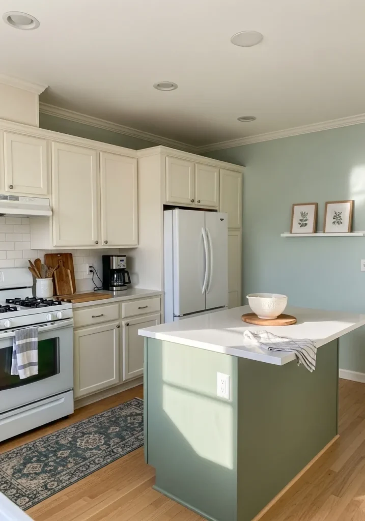
This kitchen layout masterfully uses a soft, airy palette to make the heart of the home feel spacious and serene. The main walls are painted in a gentle aqua-green that perfectly bridges the gap between the outdoors and the interior. To add a sophisticated touch of contrast, the kitchen island features a deeper, sage-green base that grounds the room, while the surrounding cabinetry remains a classic, warm white for a timeless look. A patterned runner rug in shades of teal and gray adds a soft texture over the light wood floors, tying the entire color story together.
The way this specific green catches the natural sunlight streaming across the island makes the whole space feel incredibly fresh and alive. It is a fantastic choice for a kitchen because it feels clean and energized without being stark or cold. Pairing the lighter walls with a more saturated island is a brilliant way to add depth to an open-plan room, making it look custom and high-end. If you want a kitchen that feels like a calm oasis for your morning coffee, this breezy combination is a total winner.
Sherwin Williams Accessible Beige for a Soft and Serene Bathroom
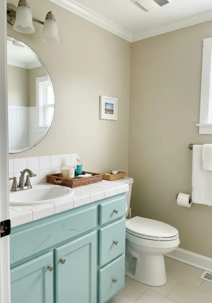
This bathroom design utilizes a warm, sandy neutral on the walls to create a space that feels grounded and incredibly inviting. The soft beige walls provide a gentle backdrop for the white tiled countertop and matching white toilet, ensuring the room stays bright and airy. To introduce a playful splash of color, the vanity is painted in a weathered robin’s egg blue, which adds a vintage, coastal character to the setup. A round mirror and brushed nickel fixtures maintain a modern edge, while the white crown molding and baseboards provide a classic, tailored finish.
The beauty of this palette lies in how it manages to feel both cheerful and incredibly calming at the same time. Using a warm neutral like this is a smart move because it prevents the light blue vanity from feeling too cold or stark against the white tile. It creates a “sun-drenched cottage” vibe that makes even the smallest bathroom feel like a cozy sanctuary. If you’re looking for a way to use color that feels timeless rather than trendy, this balanced combination of earth tones and soft pastels is a perfect choice.
Sherwin Williams Evergreen Fog for a Cozy and Timeless Living Room
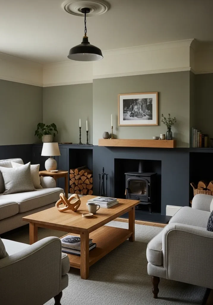
This living room features a sophisticated tri-tone wall design that creates a layered, architectural feel. The middle section of the wall is painted in a muted, earthy green that brings a sense of the outdoors in, while the lower third is drenched in a deep charcoal gray that grounds the fireplace and built-in shelving. Above the picture rail, a creamy off-white extends to the ceiling, lifting the room and providing a clean contrast to the moodier tones below. A natural wood mantel and matching coffee table introduce warmth, perfectly complementing the soft gray upholstered seating and light-textured area rug.
The way these horizontal color blocks define the space is a brilliant alternative to a traditional single-color wall. It gives the room an immediate sense of history and character, making the fireplace feel like the true heart of the home. The balance between the cool charcoal and the warm green is incredibly harmonious—it’s cozy enough for a rainy afternoon with a book but polished enough for entertaining. If you’re looking to add depth to a large living area without it feeling cluttered, this color-blocked approach is a masterclass in modern traditional style.