Gray colors for a farmhouse often come across colder than planned once they are in place.
Placing samples next to existing trim and furniture shows how the color will actually settle in once everything is together.
Some shades hold their warmth better than others when the sun moves across the space during the day.
I like to check them at different times before making a final choice.
The behavior changes more than most people expect once the paint is on all four walls.
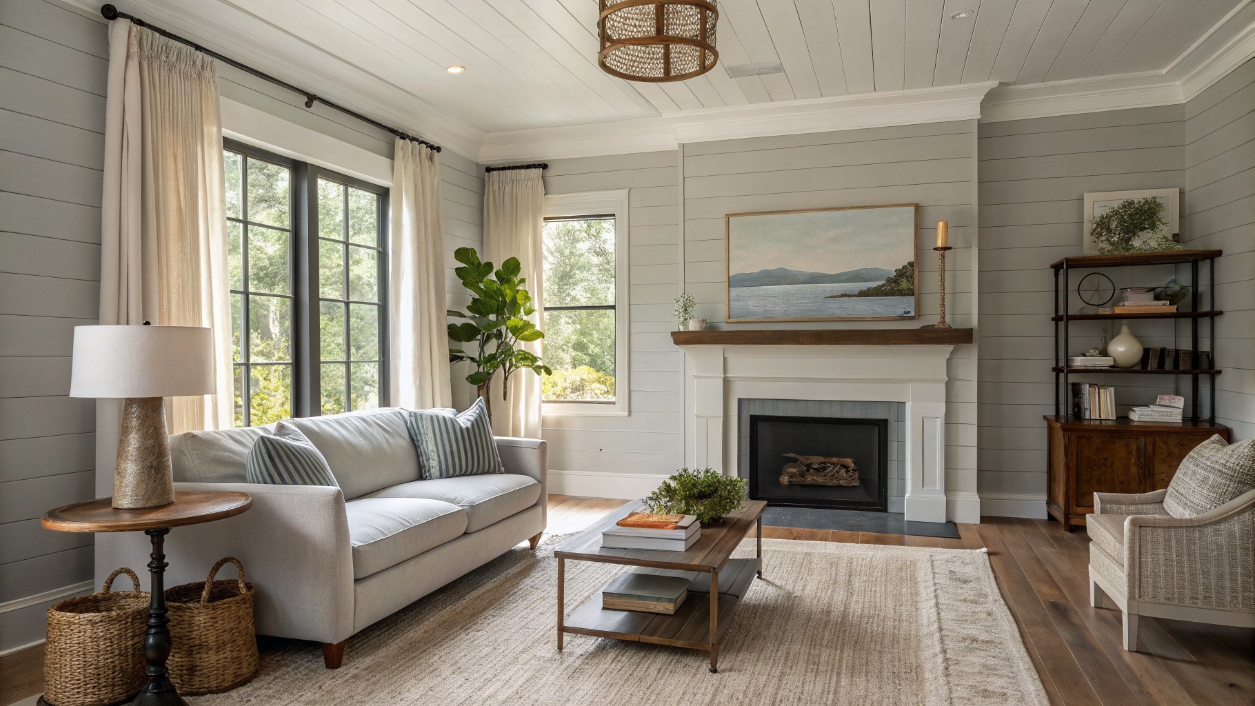
Soft Gray Walls
This soft gray has just enough warmth to feel welcoming instead of stark. It sits nicely between cool and neutral, which is why it works so well in farmhouse rooms that still need to feel calm. Colors like Sherwin Williams Agreeable Gray, Benjamin Moore Revere Pewter, or Behr Silver Drop give a similar effect.
It pairs cleanly with white trim and natural wood floors, and the slight depth keeps it from washing out next to stone or darker furniture. In brighter rooms it can lean a touch cooler, so testing it on a few walls first helps avoid surprises.
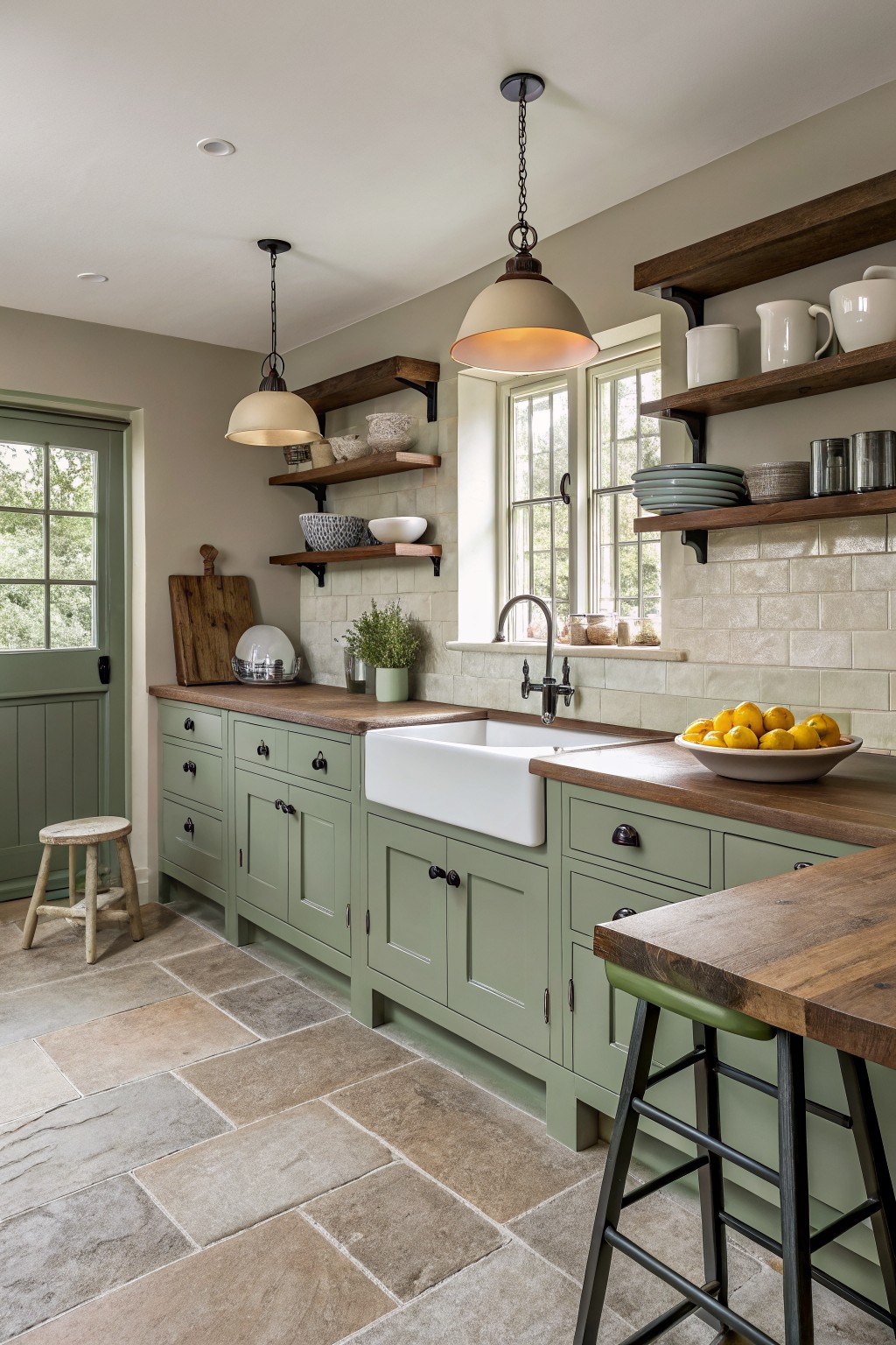
Soft Warm Gray Cabinets
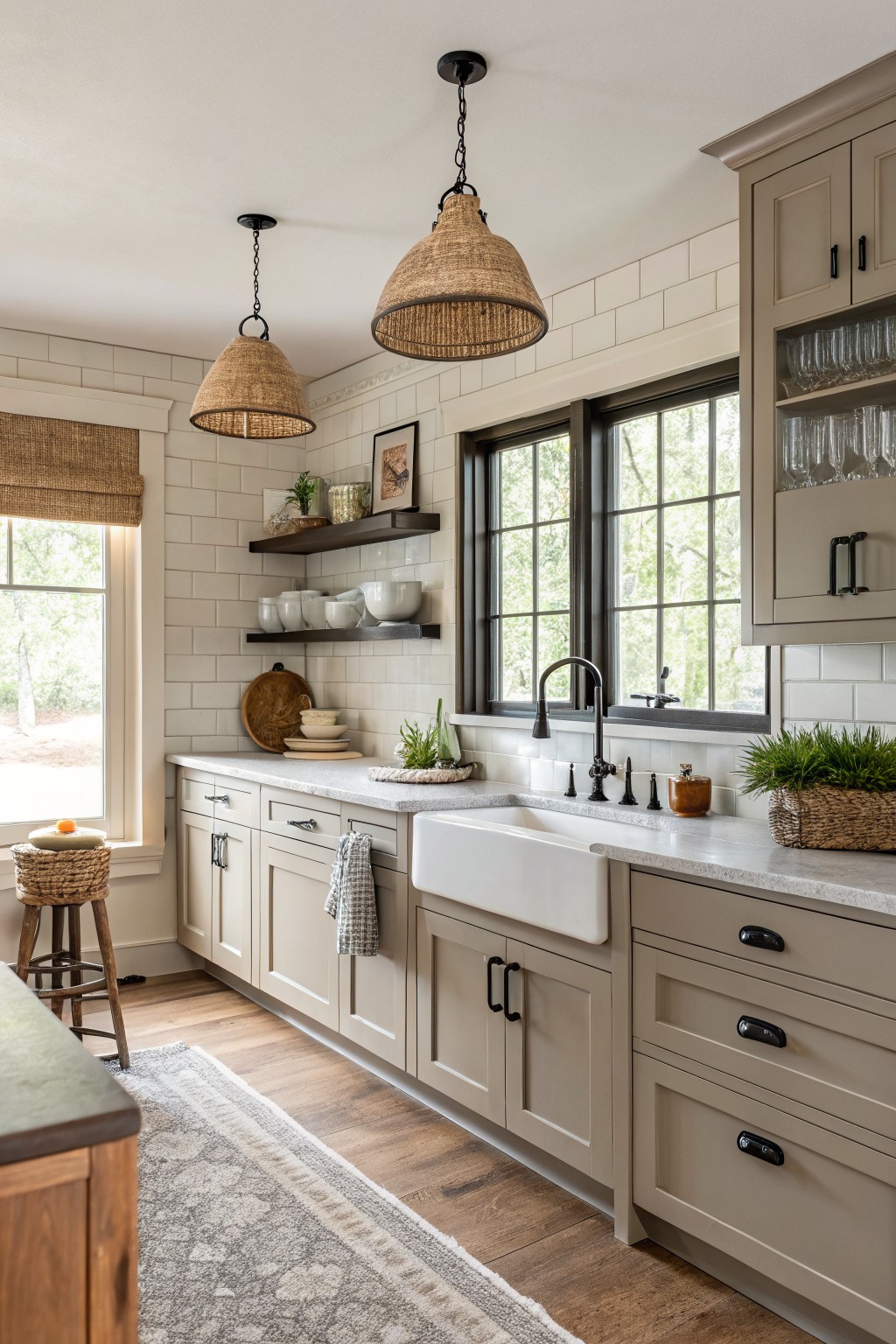
This kitchen uses a soft warm gray on the cabinets that sits right in the middle between gray and greige. The color has enough warmth to keep the space from feeling cold while still reading as a true gray in most lights. It pairs easily with wood floors and white tile without looking too stark or too beige.
The undertone stays neutral enough to work in both north and south facing rooms. It looks best with black hardware and natural wood accents, though it can shift slightly cooler next to very bright whites. Many people reach for shades like Sherwin Williams Repose Gray, Benjamin Moore Edgecomb Gray, or Behr Silver Strand when they want this same balance.
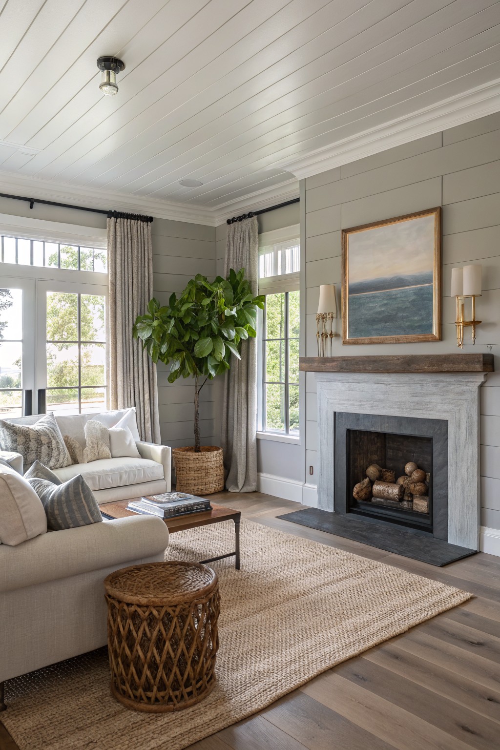
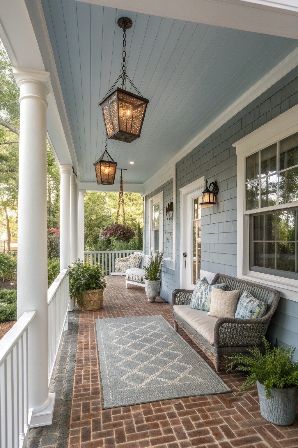
Muted Blue Gray Walls
This muted blue gray sits right in that sweet spot between a cool gray and a soft blue. It gives the walls a calm presence without turning the room chilly, which is why it works so well in farmhouse bedrooms that still need to feel lived in.
The color carries a very light green undertone that shows up more in daylight and helps it sit nicely next to warm wood floors and simple white bedding. It looks good with both painted trim and natural wood furniture, though it can start to feel flat if the room gets very little natural light.
Warm Gray Walls
This is a soft gray with a touch of warmth that keeps it from feeling stark. It reads closest to Sherwin Williams Repose Gray or Benjamin Moore Revere Pewter, with Behr Silver Gray as another close option.
The color sits comfortably next to wood tones and stone without competing. It works best in spaces that get steady daylight, though it can lean a little cooler under artificial light, so test a sample on the actual wall first.
Soft Gray Hallway Walls
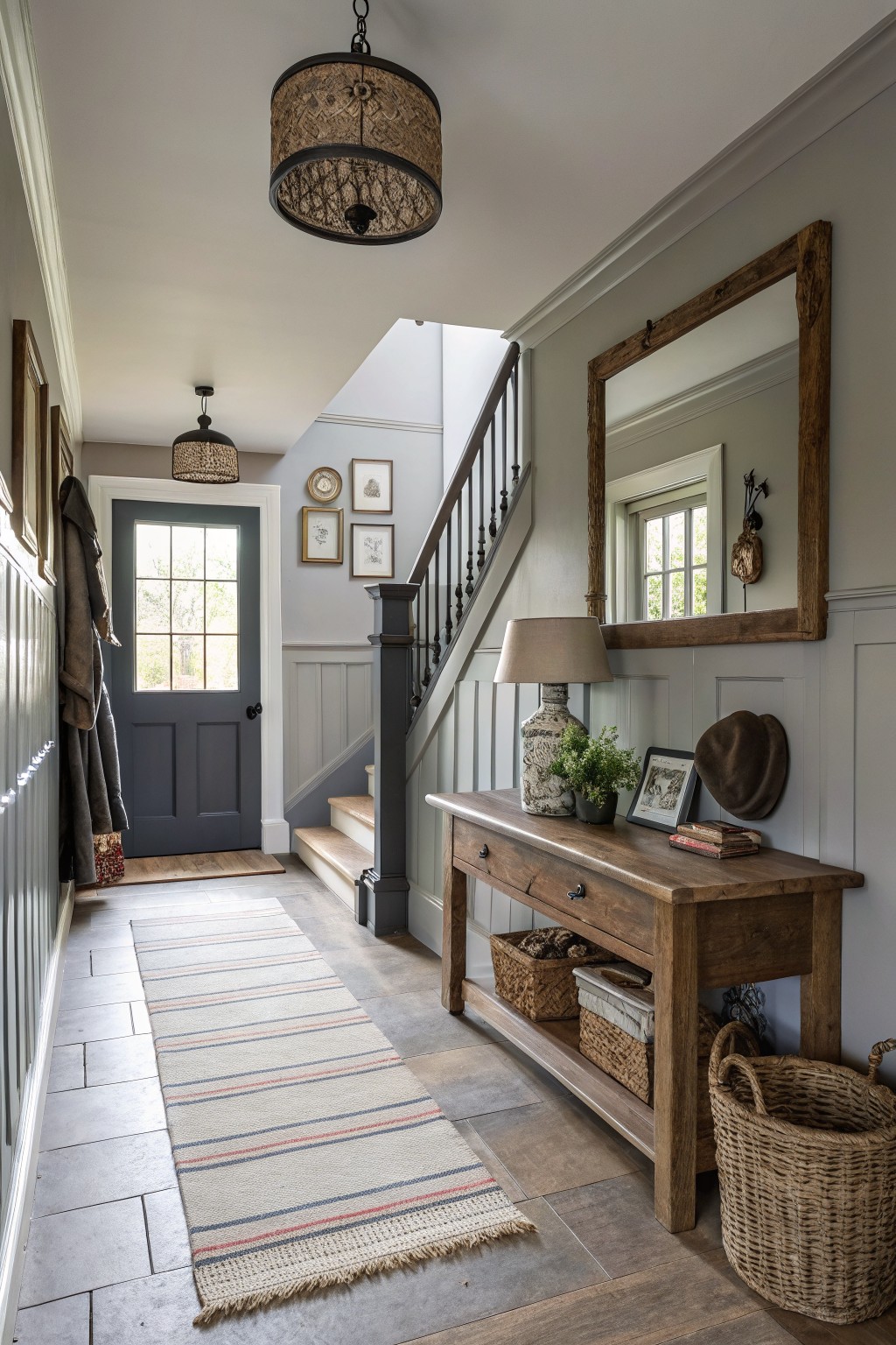
This light gray on the walls is a soft, muted shade that feels calm and steady. It sits nicely between cool and warm, so the space never tips into that flat or chilly look some grays can have. It comes close to Sherwin Williams Repose Gray, Benjamin Moore Classic Gray, and Behr Silver Satin.
The color works well with white trim and natural wood tones, which helps it feel grounded. It suits entryways and stair halls best, especially when you want something simple that still leaves room for wood furniture and woven baskets to stand out. Just test it in different lights first, since it can shift a little cooler near windows.
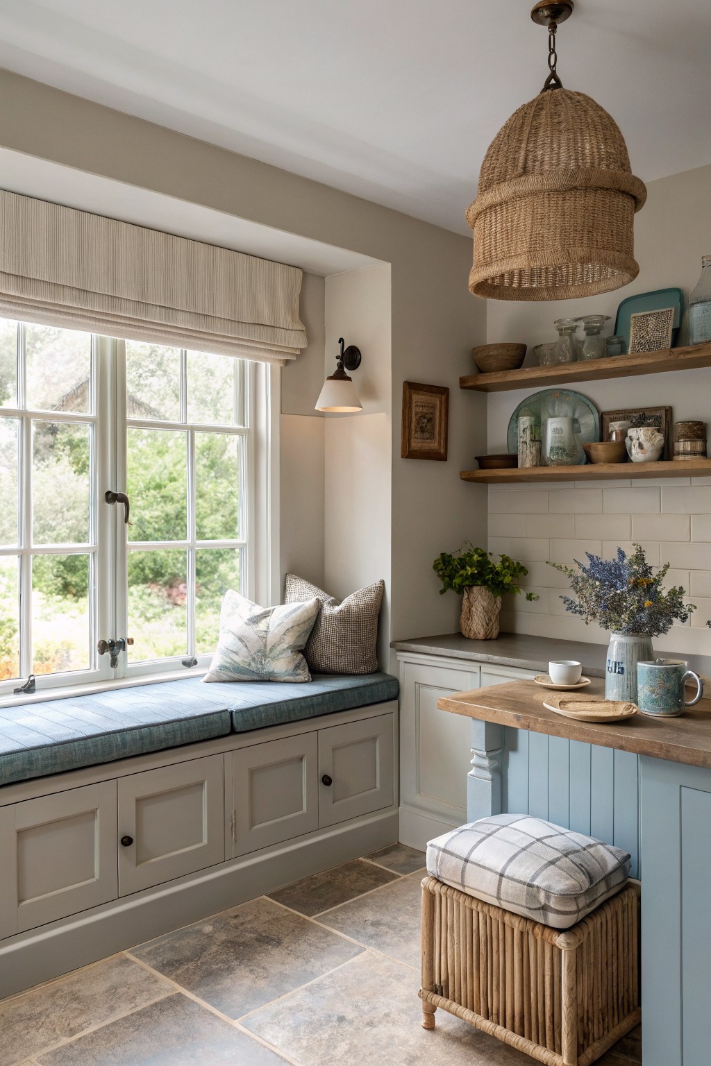
Soft Blue Gray Vanity Cabinets
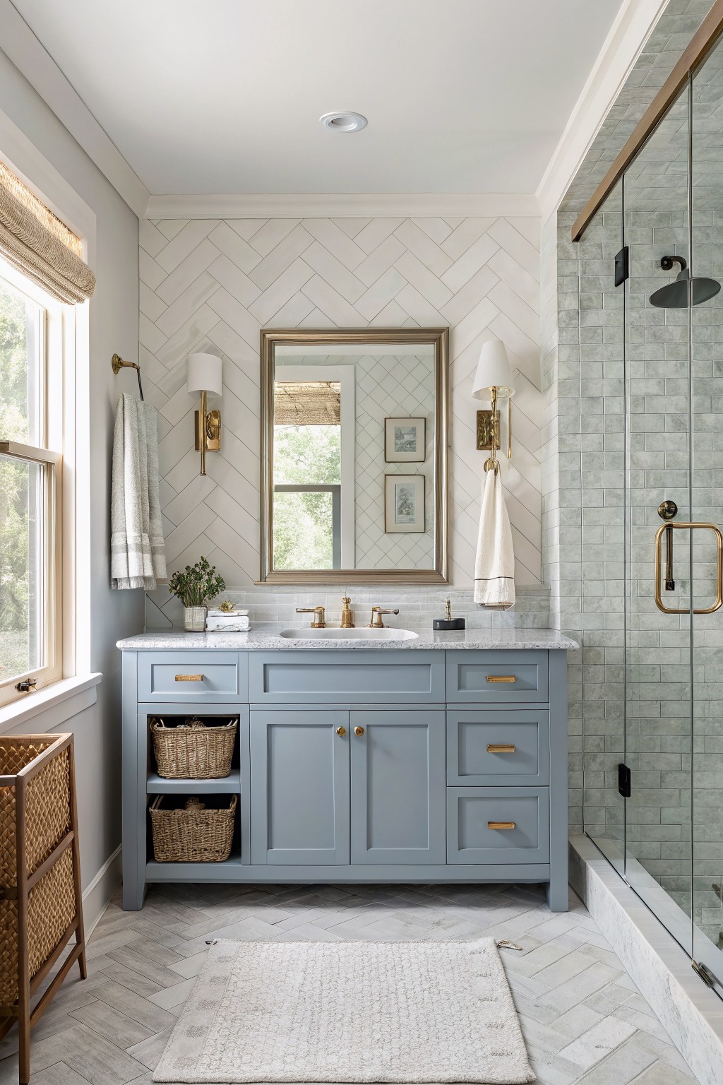
This soft blue gray on the vanity is the kind of color that gives a bathroom some depth without turning it cold. It lands in that middle ground between gray and blue, which keeps the whole space feeling calm and a little more interesting than plain gray would.
The blue undertone shows up more in natural light and pairs easily with white marble and brass. It works well in smaller rooms where you want the cabinets to blend rather than stand out, though it can look a bit flat if the lighting stays too dim.
Soft Greige Walls
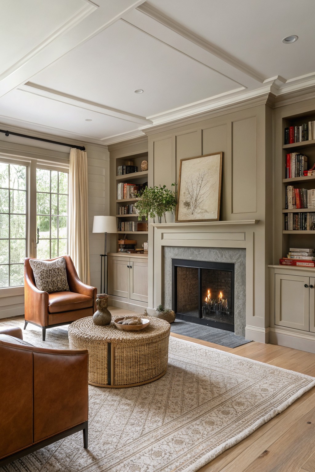
This warm greige on the walls and built-ins sits between gray and beige. It keeps the room feeling calm and a little lived-in instead of stark. Colors like Sherwin Williams Agreeable Gray or Benjamin Moore Revere Pewter come close, and Farrow & Ball Elephant’s Breath gives a similar soft effect.
The undertone stays neutral enough to work with wood floors and stone without fighting them. It suits living rooms or family spaces where you want gray that still feels welcoming, though it can look a bit flat in very low light.
Soft Gray Kitchen Cabinets
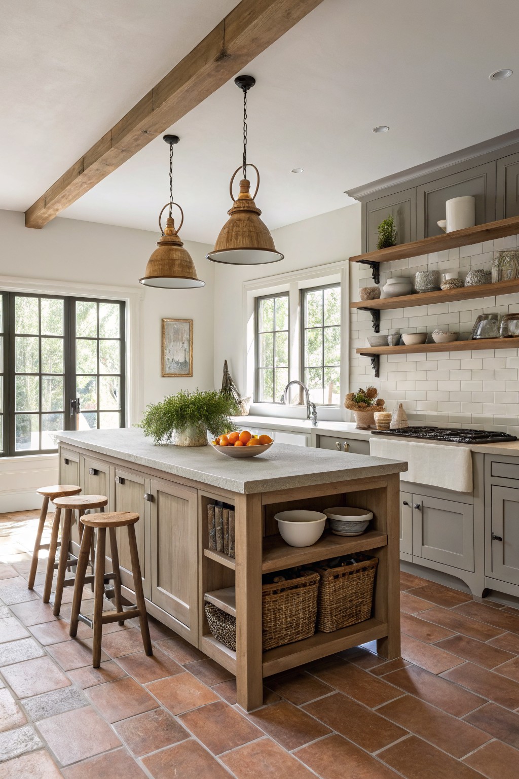
This soft gray on the cabinets has a warm undertone that stops it from feeling flat or chilly. It reads as a quiet, lived-in gray that still feels fresh next to the wood island and stone counters.
It pairs best with natural wood tones and simple white tile. In lower light it can lean a touch greener, so test it on a sample board before committing to the whole room.
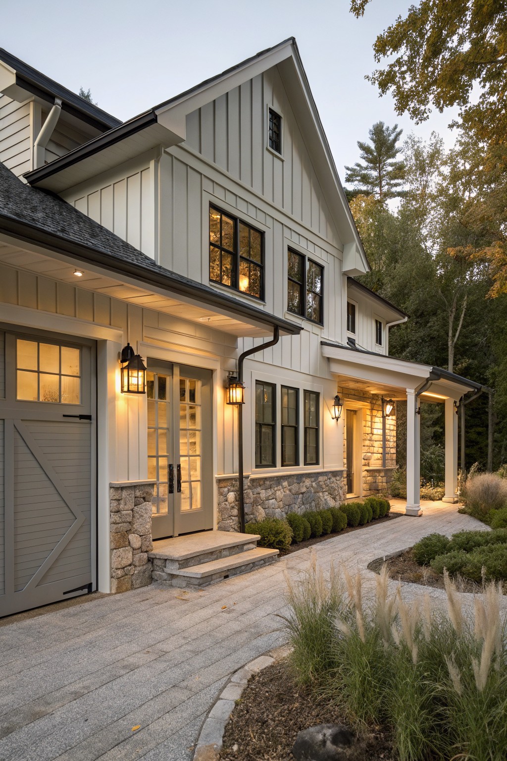
Soft Gray Siding
This soft gray on the siding sits between a true gray and a light greige. It has just enough warmth to feel settled rather than stark. It reads very close to Sherwin Williams Repose Gray or Benjamin Moore Revere Pewter.
The color pairs easily with white trim and stone because the undertone stays neutral enough to blend with both. It works best on farmhouses that want a clean look without turning cold in changing light.
Light Gray Stone Siding
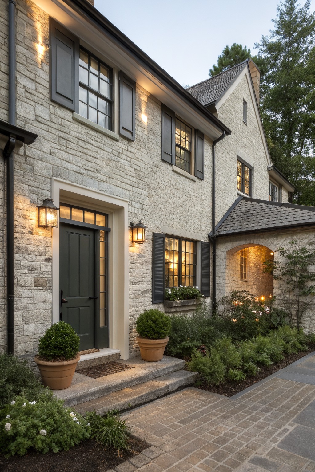
This light gray on the stone has a soft warm undertone that keeps the whole house from feeling stark. It reads as a gentle neutral rather than a flat cool gray, which is why it works so well on older farmhouse exteriors.
The color sits comfortably next to darker window frames and natural masonry without competing. It suits homes with similar roof tones and simple trim. Good matches include Sherwin Williams Repose Gray, Benjamin Moore Classic Gray, Behr Silver Drop, or Farrow & Ball Light Gray.
Soft gray siding
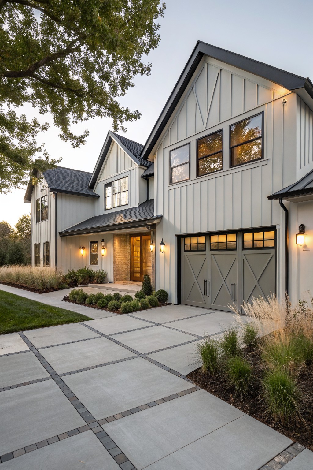
This light gray siding gives a farmhouse that clean look without feeling stark. It sits in a soft neutral range that leans slightly warm, so the house stays welcoming rather than chilly. The color reads closest to Sherwin Williams Repose Gray or Benjamin Moore’s Horizon, with Behr’s Silver Gray as another close option.
It works especially well against black windows and dark roofing. The vertical boards keep the finish from looking too flat, and the gray holds its own next to stone accents at the entry. One thing to watch is how it shifts in full shade, since these mid-tone grays can cool down quickly without enough sunlight.
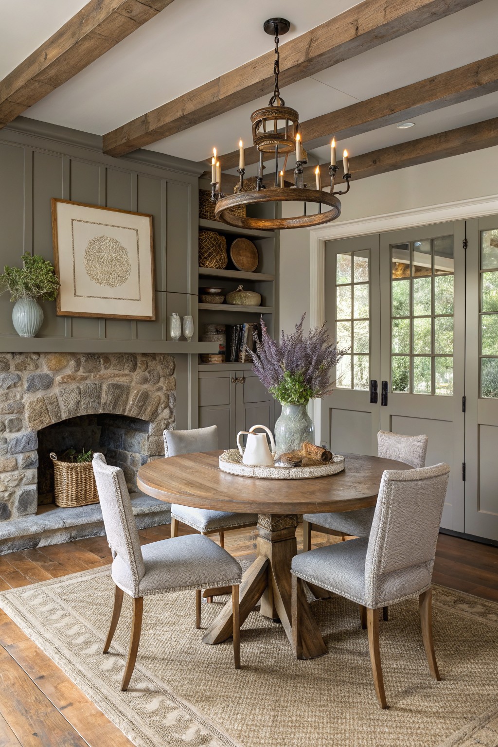
Soft Gray Walls
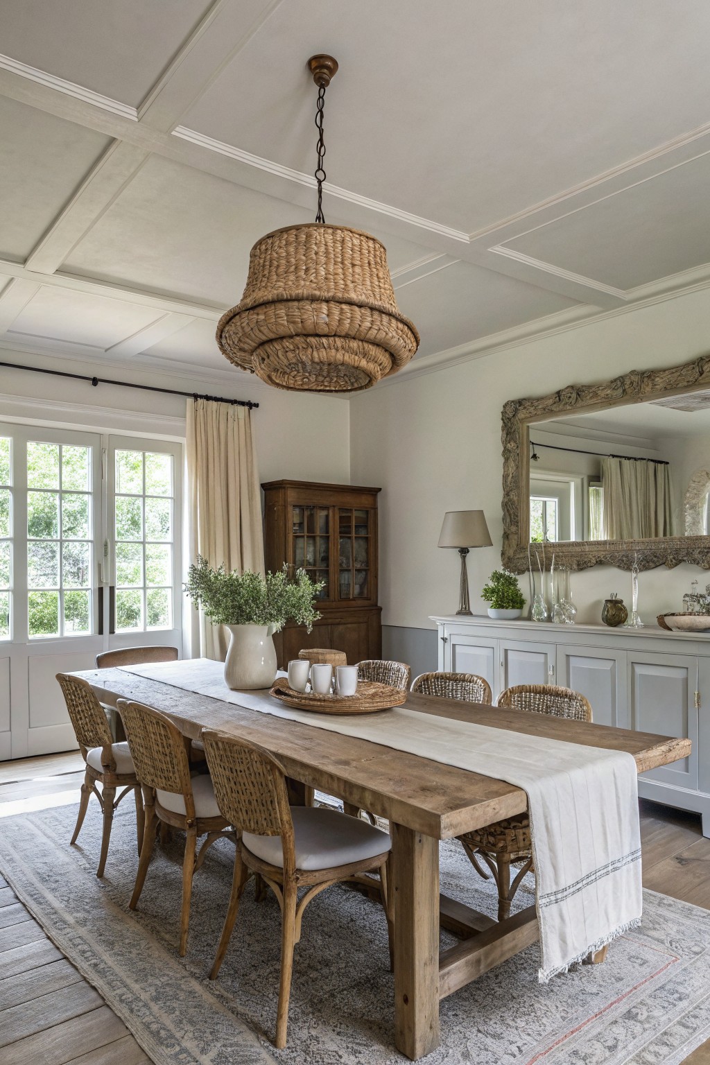
This soft gray on the walls gives a calm, classic farmhouse look without turning cold. It has a slight warmth that keeps the space feeling comfortable next to the wood table and chairs.
It reads closest to Benjamin Moore Light Gray or Sherwin Williams Agreeable Gray, and also sits near Behr Silver Drop. The color works best with white trim and natural wood, though it can look flat if the room gets very little daylight.
Deep charcoal gray walls
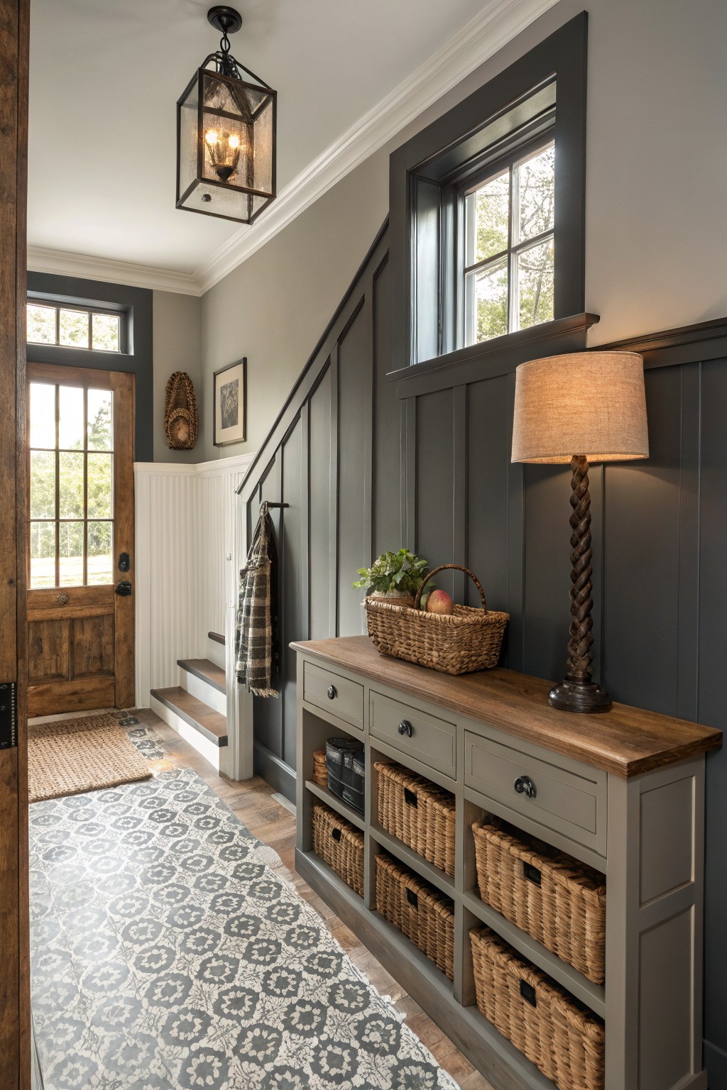
This deep charcoal gray brings a solid, grounded feel to an entry or hallway without turning cold. It sits right in that classic farmhouse range and works especially well when the room has wood floors and trim that can balance it out. Colors like Sherwin Williams Iron Ore, Benjamin Moore Kendall Charcoal, Behr Grizzle Gray, or Farrow & Ball Railings all land close to this tone.
It has a slight warm undertone that keeps the gray from looking flat or blue under normal daylight. Pair it with crisp white trim and natural wood pieces so the color feels intentional rather than heavy. Just watch the lighting in smaller spaces, since it can read darker than expected once the sun goes down.
Warm Gray Walls
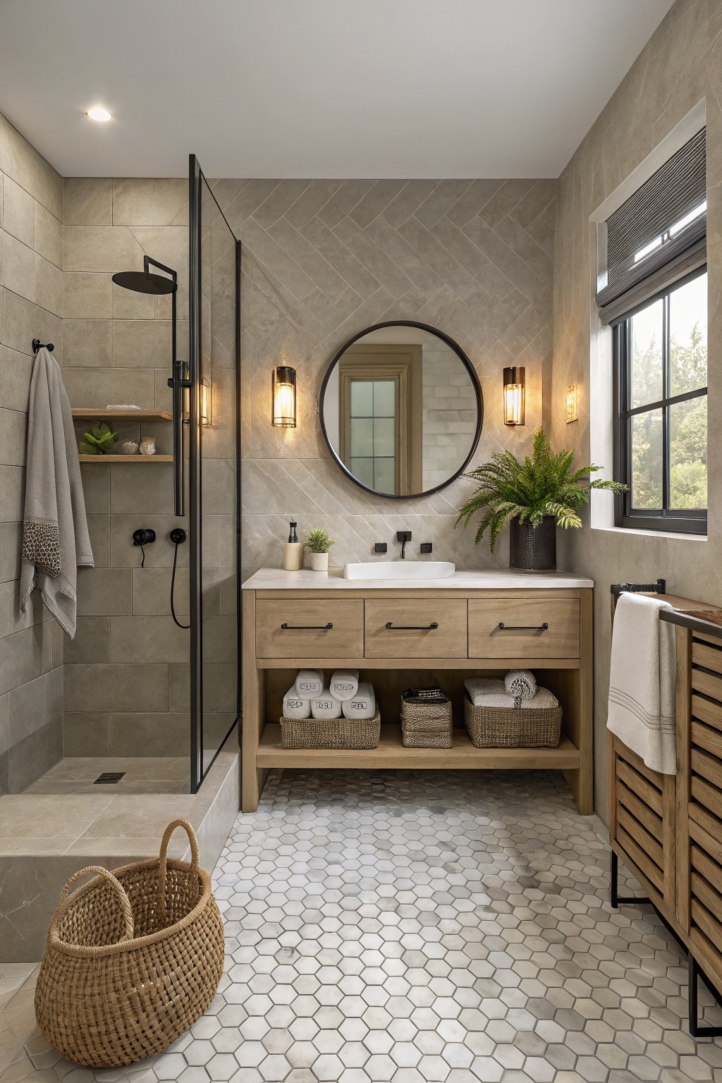
This warm gray has a soft beige undertone that keeps it feeling calm and a little earthy. It reads closest to Sherwin Williams Agreeable Gray or Benjamin Moore Edgecomb Gray, with Behr Silver Strand as another close option. The color gives a classic farmhouse look without the chill that some grays bring.
It works especially well with wood vanities and light stone floors. In lower light it can lean a touch more taupe, so test it on a sample board first if your bathroom gets mostly indirect light.
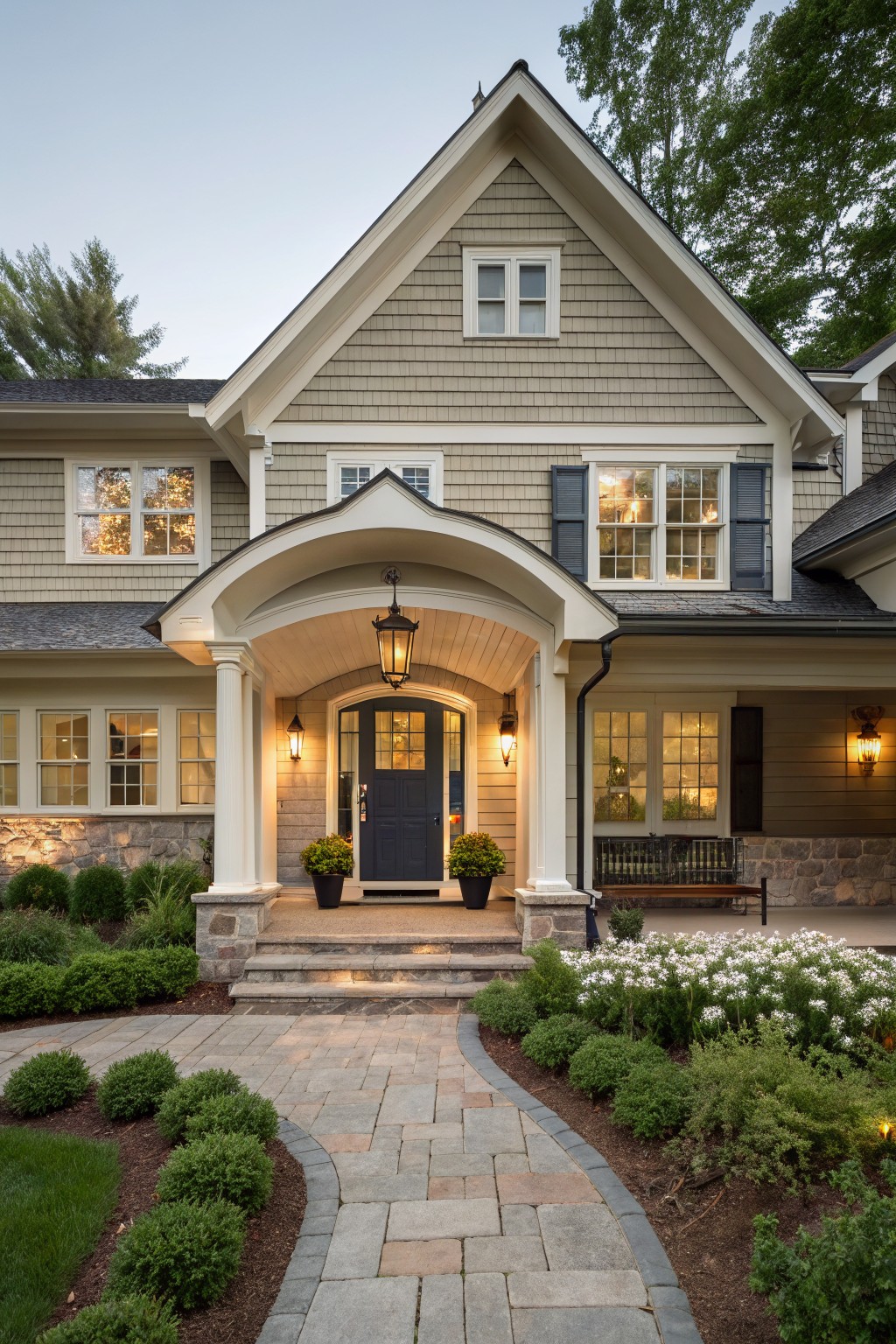
Warm gray front doors
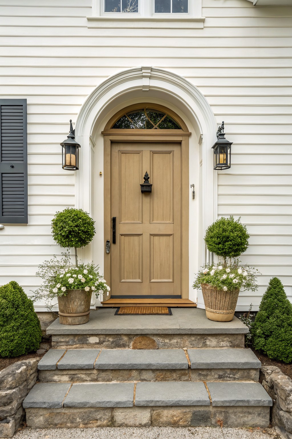
This door color is a soft warm gray with a hint of beige that keeps it from looking too stark on a white house. It sits nicely between cool grays and browns, which is why it works well on farmhouse exteriors where you want something a little softer than pure gray.
It pairs easily with white trim and stone without feeling cold. Watch how it shifts in different light though, since the beige undertone can read warmer in afternoon sun and a touch grayer on overcast days. Good matches include Sherwin Williams Accessible Beige, Benjamin Moore Revere Pewter, Behr Silver Satin, or Farrow & Ball Elephant’s Breath.
soft blue gray siding
This blue gray shade on the siding gives a classic farmhouse look that stays refined. It sits between gray and blue without tipping too far into either, which helps it feel steady rather than cold.
The color carries a light cool undertone that reads well against white trim and brick. It works best on traditional homes and pairs easily with natural wood doors or simple black fixtures.
Soft sage green cabinetry
This muted sage green on the cabinets gives a farmhouse kitchen a calm, slightly grayed tone that feels comfortable instead of stark. It sits right between green and gray, so it reads as a classic neutral rather than a bold color choice. Similar shades show up in Sherwin Williams Dried Thyme, Benjamin Moore Saybrook Sage, and Farrow & Ball French Gray.
The color stays steady next to warm wood counters and stone tile, and it works well with both dark hardware and lighter trim. It can look a bit cooler in low light, so it pairs best with natural wood tones or cream accents to keep the room from feeling flat.
Soft Gray Siding
This light gray siding has a soft, slightly warm feel that keeps it from looking stark. It reads as a gentle gray with just enough depth to hold its own against stone and darker windows. Colors like Sherwin Williams Agreeable Gray, Benjamin Moore Edgecomb Gray, or Behr Silver Drop give a similar effect.
The tone sits nicely with natural stone and black frames because it never tips too cool. It suits farmhouses that want a calm look without needing constant upkeep to stay balanced outdoors.
Soft gray cabinetry
This color is a warm light gray that sits between gray and greige. It gives the room a calm base without turning cold, which is why it works so well in farmhouse kitchens where you still want some softness. The tone feels steady next to wood counters and stone floors.
It has a slight warm undertone that keeps it from looking flat in natural light. Pair it with white trim or a pale blue accent like the one on the island here, and it holds up nicely against wood tones and tile. Watch the depth though. Too much gray in a small space can start to feel heavy if the light is limited.
Frequently Asked Questions
Q: Will these grays work in a small bathroom? A: They can if you choose a mid-tone with some warmth. Darker ones might close in the space too much. Test a patch on the wall to check.
Q: How many coats do I need for good coverage? A: Two coats usually do the trick with these colors. Start with a good primer if your walls are a bold color now. That saves time in the long run.
Q: What trim color goes best with them? A: Crisp white trim makes the gray pop in a clean way. It keeps the whole look fresh and farmhouse.
Q: Do I need to worry about these colors fading over time? A: Most modern paints hold up well to sunlight. Pick a quality brand with good reviews on durability.


