I have found that choosing a pastel for the walls often comes down to seeing how it shifts once the sun moves across the room and hits different surfaces.
The undertones can turn warmer or cooler depending on the trim color and what is already on the floor, which is something I always notice after the first coat dries.
Samples on the actual wall help more than anything else.
Some shades that seem gentle in the can end up looking flat once the furniture and rugs are back in place, so I try to picture the whole space before buying more paint.
In the end I usually end up repainting a small section after living with it for a week just to be sure the color still feels right.
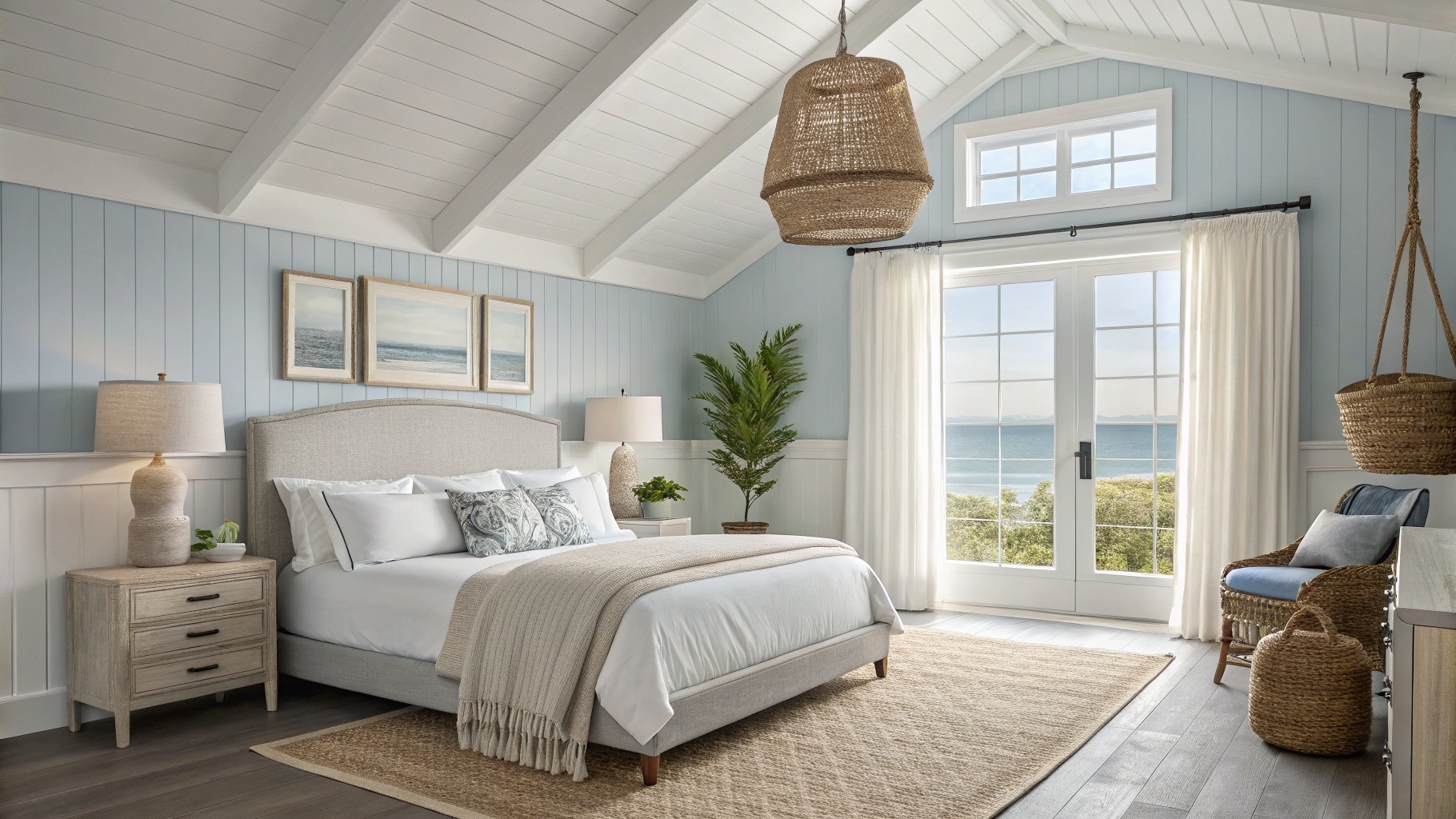
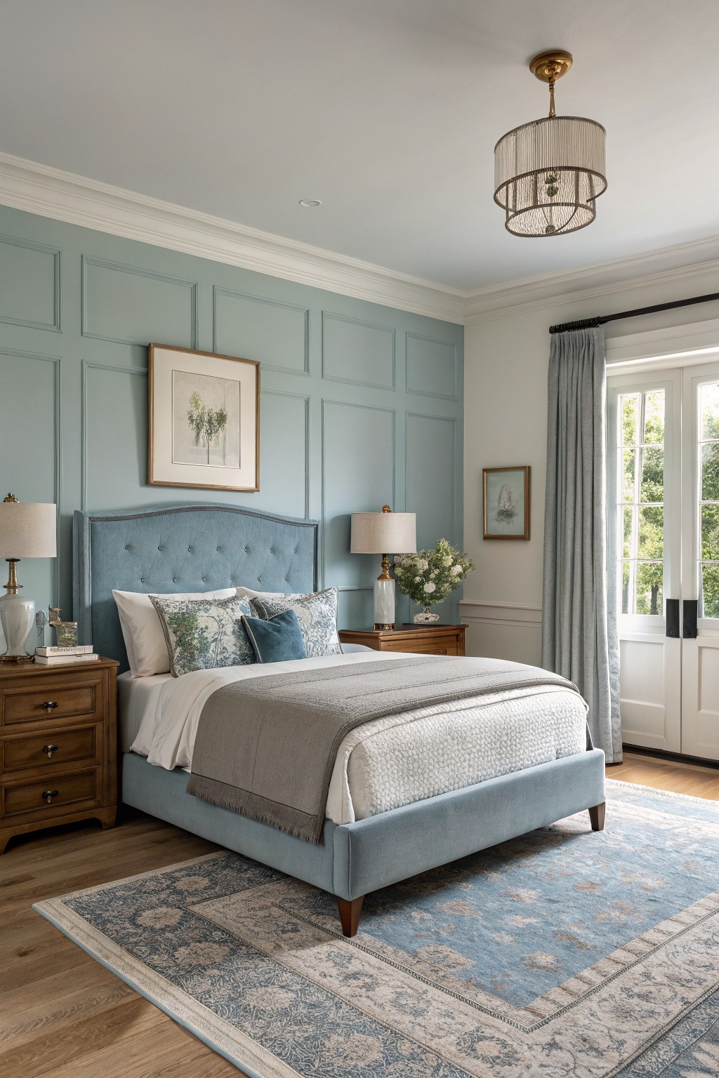
Soft Blue Walls
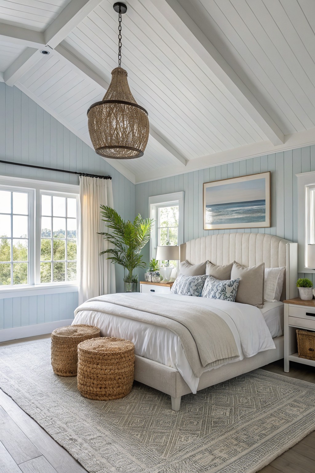
This soft blue on the walls is a gentle pastel that keeps a room feeling open and calm. It has a light gray undertone that stops it from turning too bright or chilly. Colors like this work well in bedrooms or any space where you want things to feel relaxed without going fully neutral. It comes close to Sherwin Williams Sea Salt, Benjamin Moore Palladian Blue, and Behr’s Silver Blue.
The blue stays steady next to white trim and light wood floors. It can look a touch cooler in shaded rooms, so it helps to test a sample on the wall first before committing.
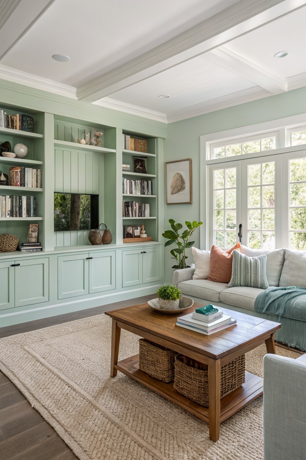
Soft Sage Green Walls
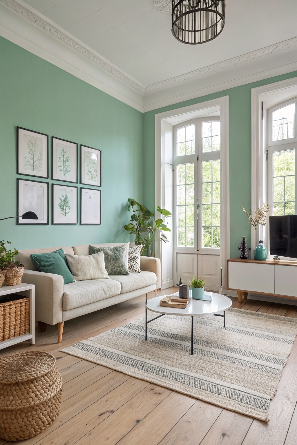
This soft sage green on the walls gives the room a quiet, fresh feel that still feels grounded. It is a light pastel with a touch of gray in it, so it stays calm rather than turning bright or overpowering. Many people like this kind of color because it lightens a space without making it feel stark or empty.
The color has a mild cool undertone that works best with white trim and natural wood floors. It suits living rooms or bedrooms where you want things to stay simple and open. Sherwin Williams Sea Salt, Benjamin Moore Soft Fern, and Behr Aloe Vera all sit close to this shade.
Soft Blush Walls
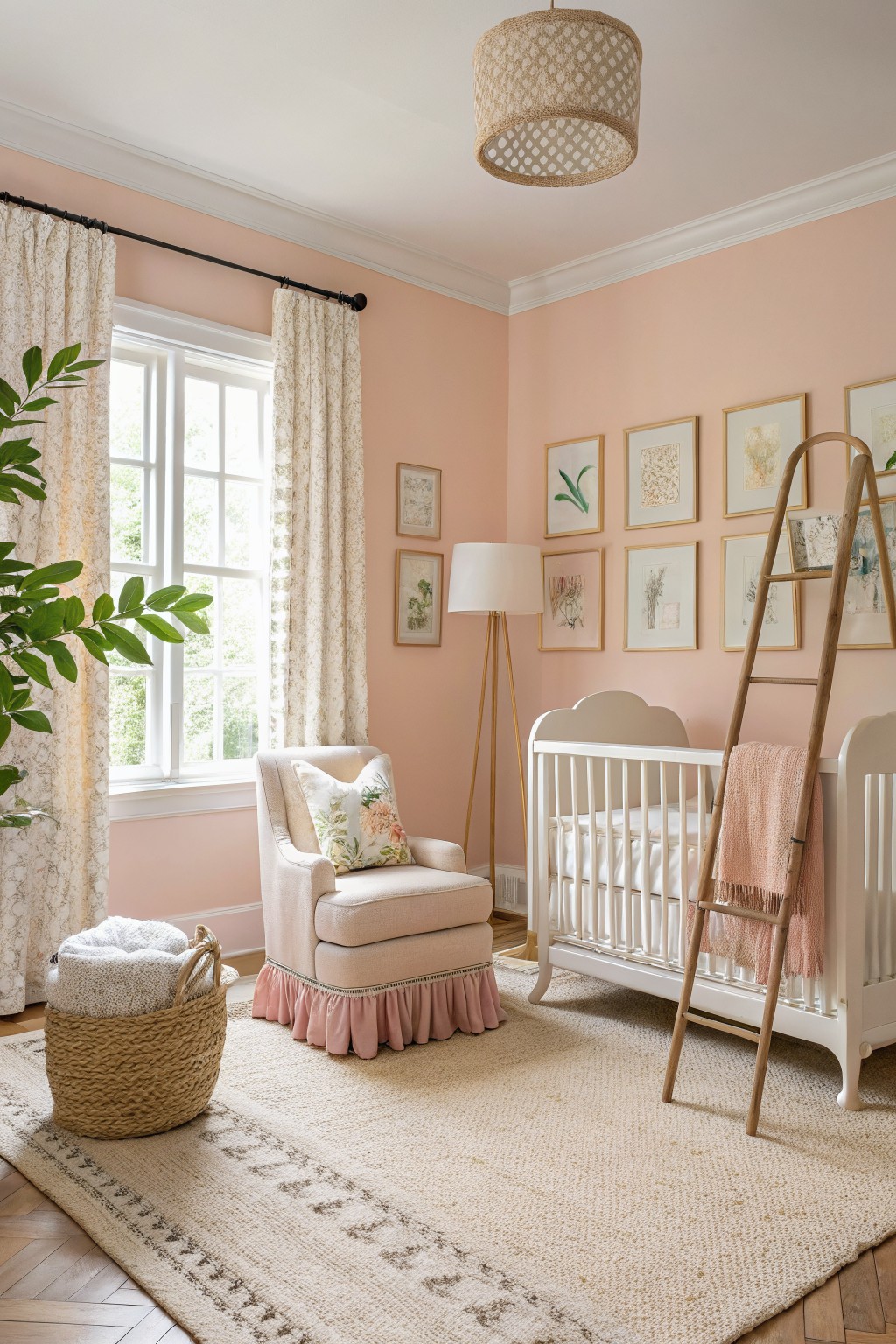
A warm blush pink like this keeps a room feeling light and calm without going flat. It leans a little peachy so it reads soft rather than sugary, and it pairs easily with white trim and light wood floors. You see the same effect in colors like Benjamin Moore Soft Pink, Sherwin Williams Blush, Behr Pink Macaroon, or Farrow & Ball Pink Ground.
The undertone stays warm enough to work in north-facing rooms or spaces that need a bit of extra softness. It suits bedrooms and nurseries best, and it looks good next to natural textures like linen or woven rugs. Just test a large sample first since the pink can shift toward peach in strong sunlight.
Soft Lavender Walls
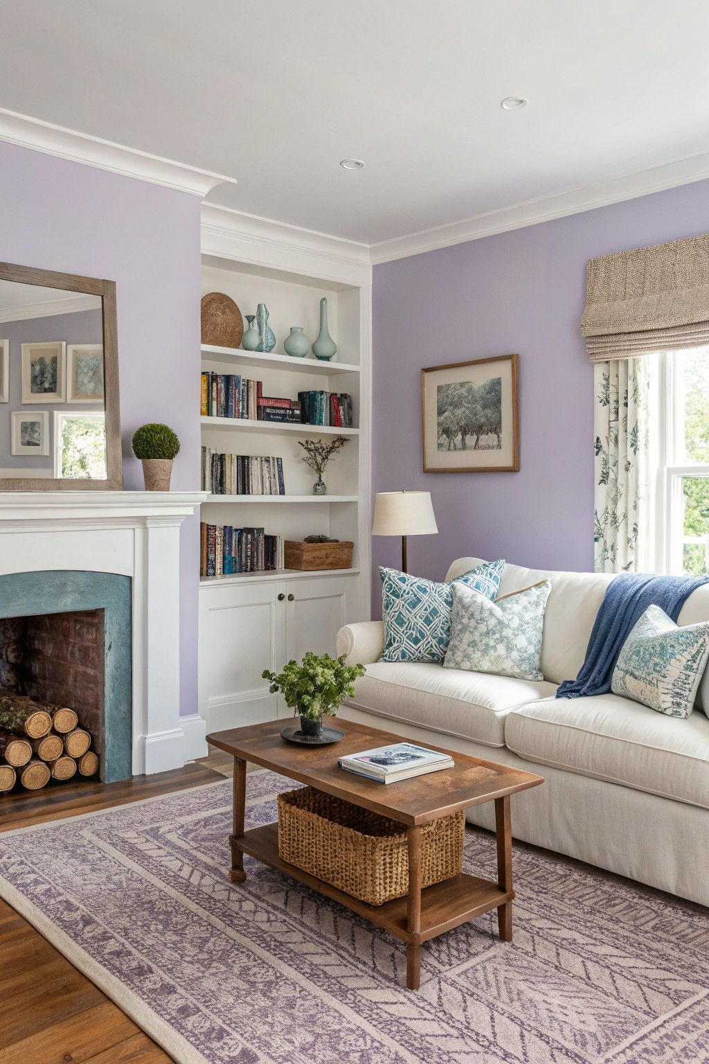
A soft lavender works well on walls when you want a light pastel that still feels like it has some presence. This pale purple tone keeps the room feeling open and calm while adding just enough color to make it interesting.
It has cool undertones that sit nicely against white trim and warm wood floors. Use it in living rooms or bedrooms with decent natural light, and pair it with creams or soft greens to keep things balanced.
A Soft Blue Gray Bathroom
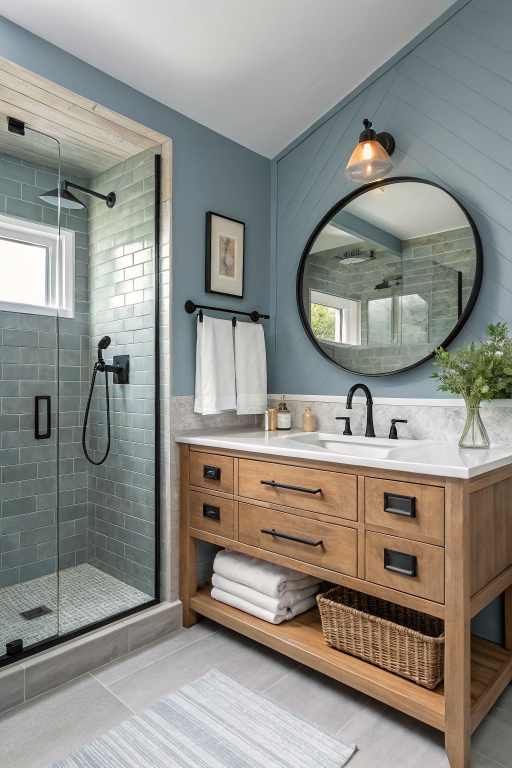
This soft blue gray paint brings a light and calm feel to the room without making it feel cold. It is a muted pastel that sits nicely between blue and gray, so it works well in smaller spaces like bathrooms where you want some color but still need it to feel open. The shade reads airy next to the wood vanity and white counter, which helps keep everything balanced.
It has a cool undertone with a touch of gray that shows up more in low light, so it pairs best with warm wood tones or simple white trim to avoid looking flat. This color suits homes that already have natural stone or tile, and it stays flexible enough for both modern and traditional setups.
Soft Sage Green Walls
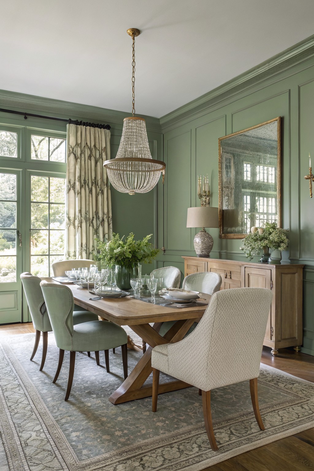
This soft sage green sits in that nice middle ground between green and gray. It lightens the room without making it feel stark, and the muted tone keeps things calm and easy on the eye. Shades like Sherwin Williams Clary Sage, Benjamin Moore Saybrook Sage, or Farrow & Ball Lichen give a similar effect.
The color has a cool undertone that can lean a little blue in low light, so it pairs best with warm wood furniture and cream or beige textiles to balance it out. It works especially well in dining rooms or living spaces where you want the walls to feel soft and recede a bit.
Warm Peach Walls
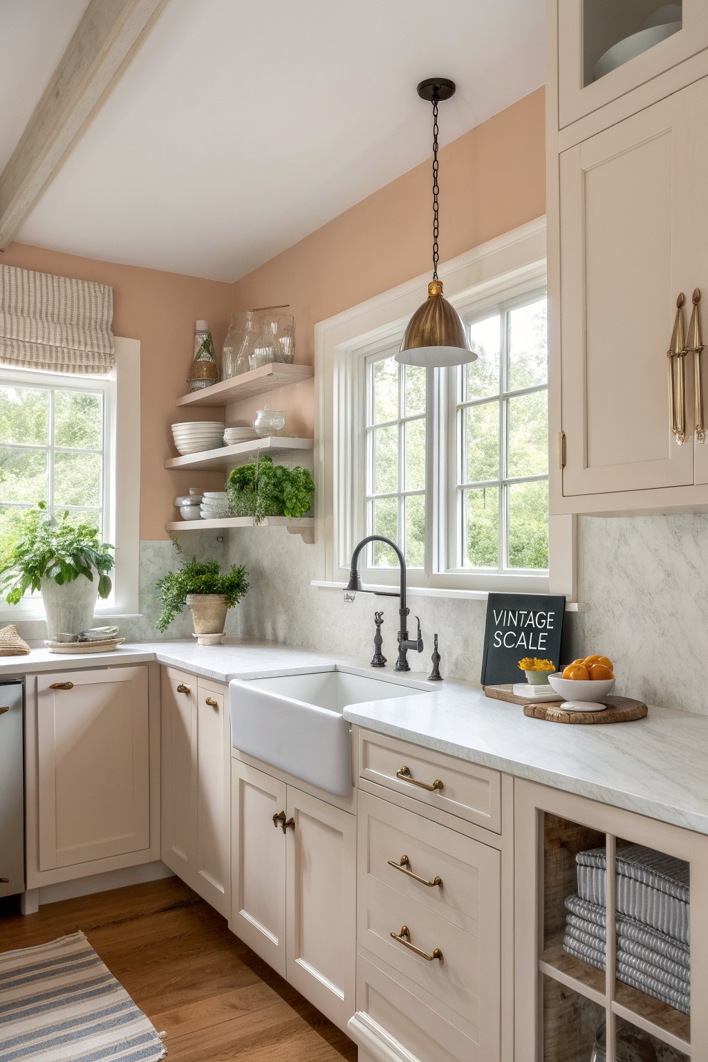
A soft peach paint like this brings a gentle warmth to walls without overpowering the space. It sits in that light pastel range with a mild orange undertone that keeps rooms feeling open and relaxed rather than stark.
This shade works best in kitchens or living areas with plenty of natural light and pairs easily with white trim, marble counters, or light wood floors. It can start to feel a bit dull in very shaded rooms, so test a sample first if your space gets limited sun.
Soft Sage Green Walls
This light sage green is one of those colors that feels fresh without trying too hard. It covers the walls and built-ins evenly and gives the room a gentle lift while still feeling calm and livable. Many people like it because it works in spaces that already have wood tones and natural light.
The color has a soft blue-green undertone that stays quiet next to warm wood floors and white trim. It suits living rooms and family areas best, especially when you want something a bit different from plain beige or gray but still easy to decorate around.
Soft Lavender Gray Walls

A soft lavender gray works nicely on bedroom walls when you want something airy but still a little different from plain gray. This color family sits right between cool gray and the lightest hint of lilac, which helps the space feel open and calm without turning too chilly. It reads especially well against warm wood furniture and white trim.
The undertones stay subtle and cool, so it shifts a bit depending on the light. Pair it with natural wood nightstands or linen curtains to keep things balanced, and test a sample first since the lilac touch can show more in bright rooms than you might expect.
Soft Coral Walls

A soft coral brings a gentle warmth that still feels light and easy in a room. This peachy coral tone has enough color to stand out but stays soft enough to keep things airy, especially when paired with white trim and wood tones.
It works best in spaces that get steady daylight, where the warm undertone can show without turning too orange. Try it in a dining area or small sitting spot, and keep the rest of the room simple with natural textures and light fabrics so the walls stay the main soft note.
Soft Yellow Walls
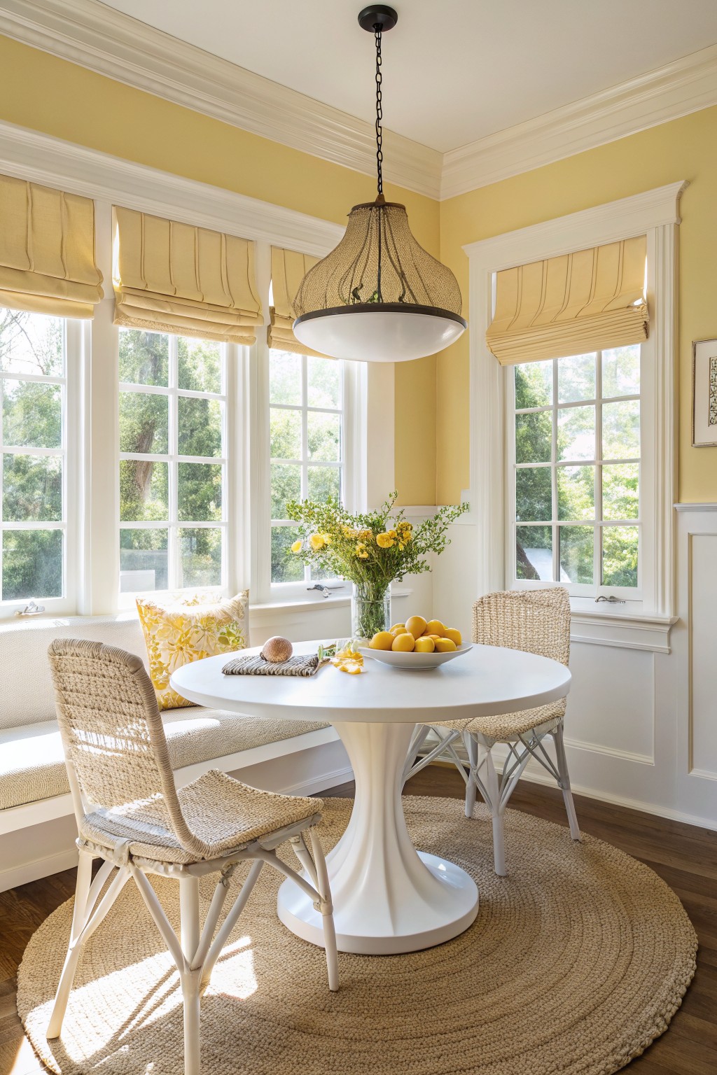
This soft yellow brings a gentle warmth to the room without feeling too bright or overpowering. It is a true pastel with a slight buttery tone that helps the space feel lighter and more open. Colors like this work well in breakfast areas or small dining spots where you want a cheerful but calm backdrop.
It has a warm undertone that pairs nicely with white trim and natural wood floors. You can use it in rooms that get decent daylight, since it tends to look a bit flat in very dark spaces. Try it with simple furnishings in cream or light beige so the yellow stays the main focus.
Soft Blue Green Walls
This soft blue green is the kind of color that makes a room feel lighter right away. It has a gentle cool tone that still feels calm and welcoming instead of stark.
The color sits nicely against warm wood floors and white trim, and it works especially well in bedrooms where you want something restful. Try Sherwin Williams Rainwashed or Benjamin Moore Palladian Blue if you want a close match.
Soft Lavender Walls
This muted lavender is the kind of airy pastel that softens a room without making it feel delicate. It has a touch of gray in the mix so it stays calm and a little grown up instead of too sweet.
It sits nicely next to warm wood cabinetry and leather furniture, which keeps the space from feeling chilly. In rooms with decent natural light it stays soft and pretty, but it can shift toward gray in lower light, so test it on a few walls first.
Soft Green On Bathroom Vanities
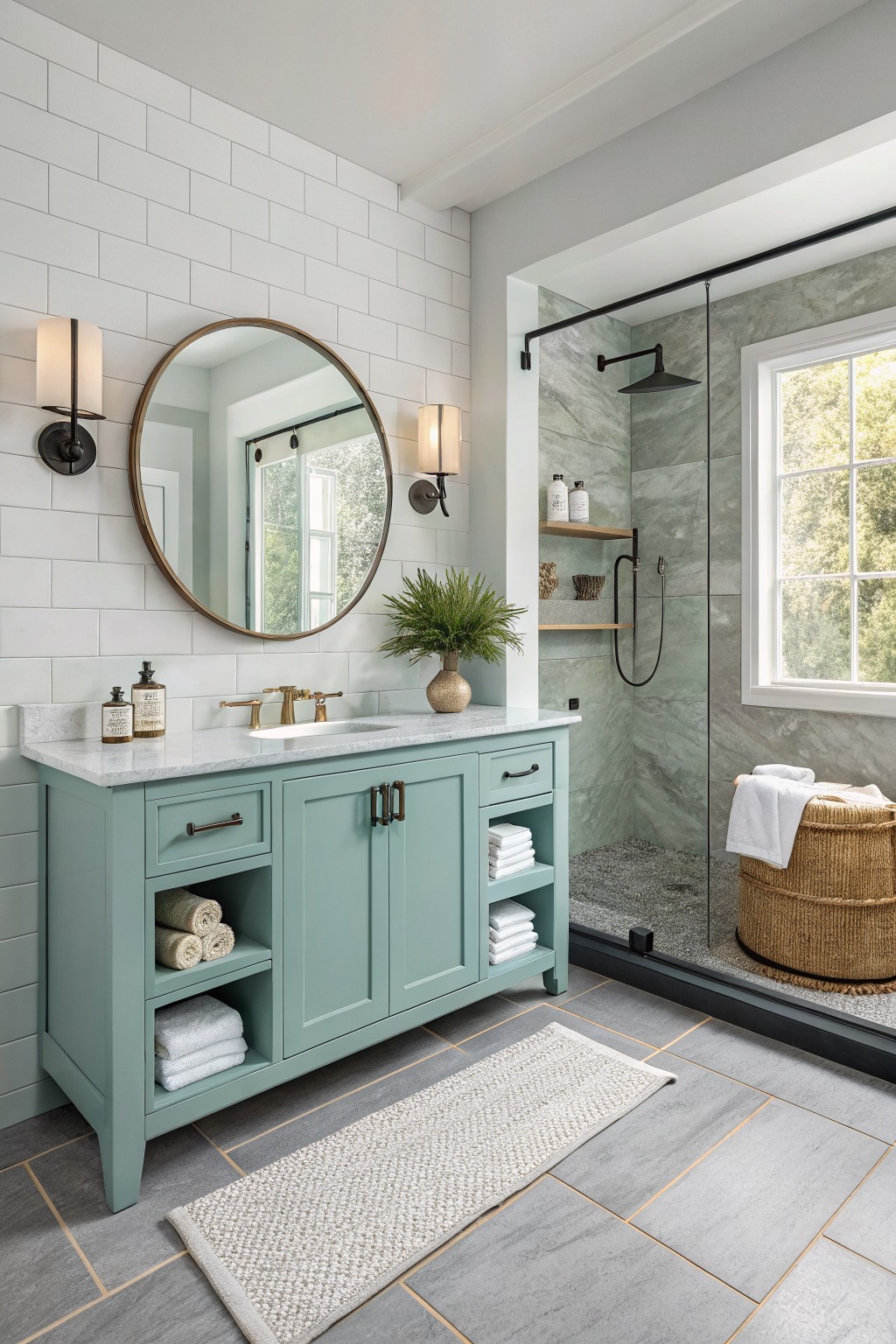
This soft mint green on the vanity is the kind of pastel that feels light and fresh without trying too hard. It sits somewhere between blue and green, giving the room a gentle lift while still feeling calm and livable.
The cool undertones show up more against the gray floor tiles and white subway backsplash, which keeps the whole space from feeling too warm or heavy. It works best in bathrooms with decent natural light and pairs easily with brass fixtures or simple wood tones.
Soft Sage Green Built-Ins
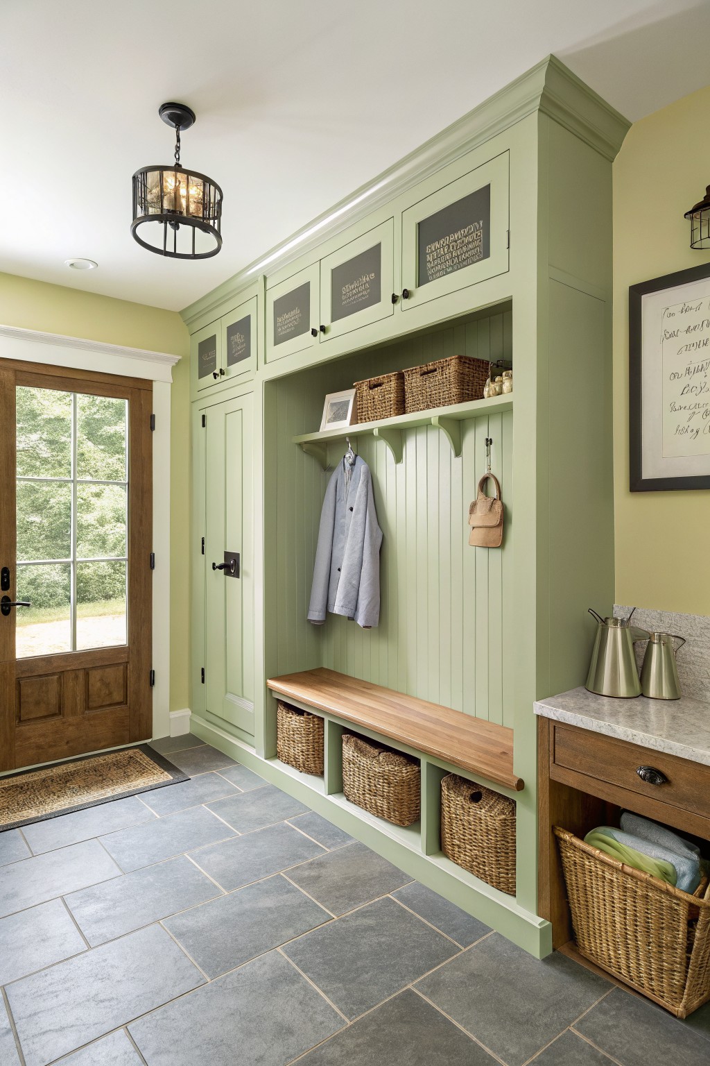
This light sage green on the built-in cabinetry feels like a calm choice for an entry or mudroom. It is a soft pastel that keeps the space feeling open and easy without turning too bright or cold. The color sits comfortably with wood tones and adds a gentle freshness that works well in everyday areas.
It carries a touch of gray in the undertone, which helps it blend nicely with stone and woven baskets. This kind of green looks good in rooms that get steady daylight, and it pairs simply with white trim or natural wood. Too little light can make it read a bit flat, so test it first in the actual space.
Soft Aqua Walls

This soft aqua on the walls is a light turquoise pastel that keeps the kitchen feeling open and easy. It has a cool lean with just enough green in it to feel fresh rather than chilly.
The color sits well next to white trim and shelves because it stays calm in daylight. It works best in rooms with plenty of natural light and pairs simply with wood tones or woven textures.
Frequently Asked Questions
Q: Which pastel works if my room gets little natural light?
A: Pick warmer shades like soft peach or buttery yellow. They reflect what light you have and stop the space from feeling closed in.
Q: How do I test a color before painting the full room?
A: Brush a big sample on foam board and prop it against each wall. Check it morning and evening to see how it shifts.
Q: What should I pair with these wall colors?
A: Use simple textures like linen curtains or pale wood pieces. They bring subtle warmth and keep the look relaxed.


