I have learned that paint rarely behaves the way it does on a small swatch once it covers an entire wall in a lived-in room.
Natural light shifts throughout the day and often pulls out undertones that can make a color feel warmer or cooler than expected next to trim and flooring.
When choosing for my own home I now test how a shade sits beside the furniture and textiles already in place before making any final decision.
A few colors I once liked in the can ended up looking flat or overly bright once the room was fully painted and lived in.
Testing in place still matters most.
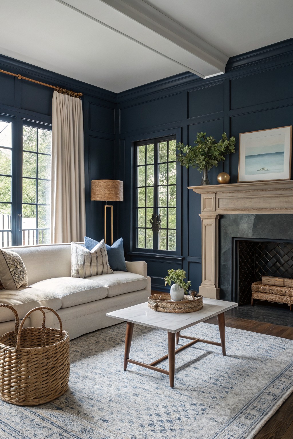
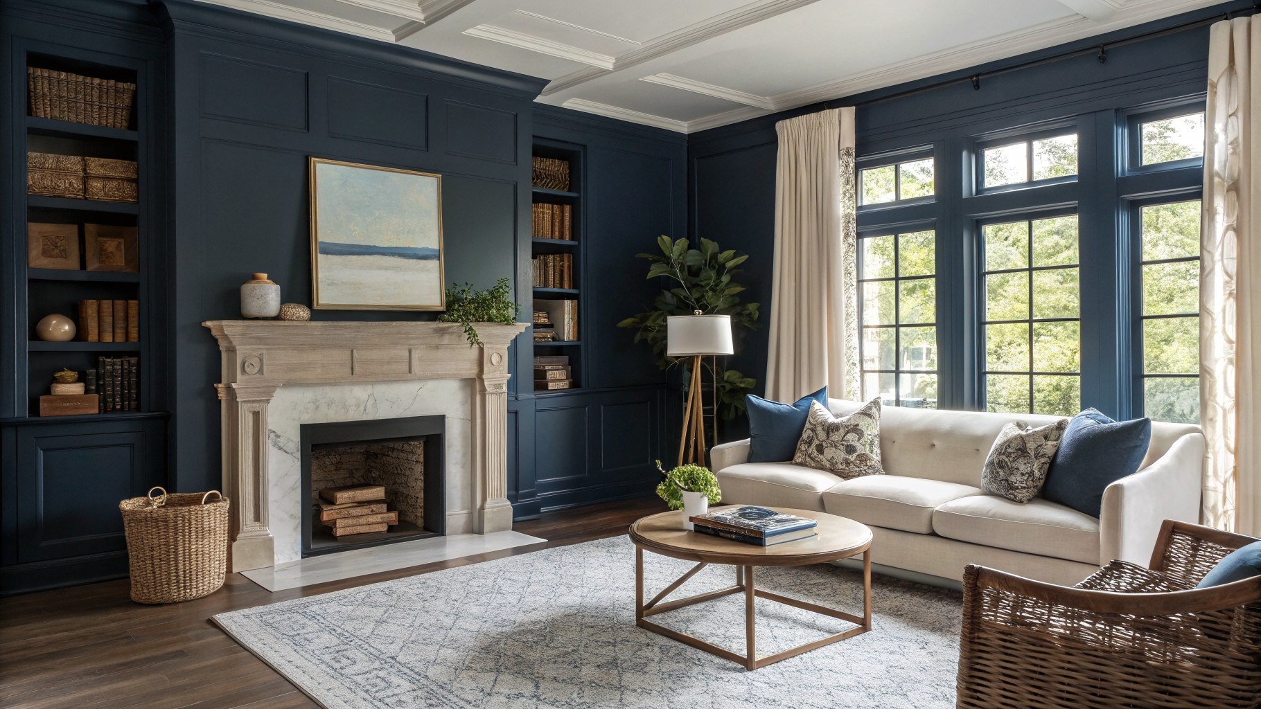
This deep navy blue brings a strong but steady feel to a room. It reads closest to Sherwin Williams Naval or Benjamin Moore Hale Navy, with Farrow & Ball Hague Blue sitting nearby too.
The color carries a cool undertone that settles nicely against warm wood floors and cream furniture. It works best in spaces with good natural light, since the depth can feel heavy in darker corners.
Soft Greige Cabinets
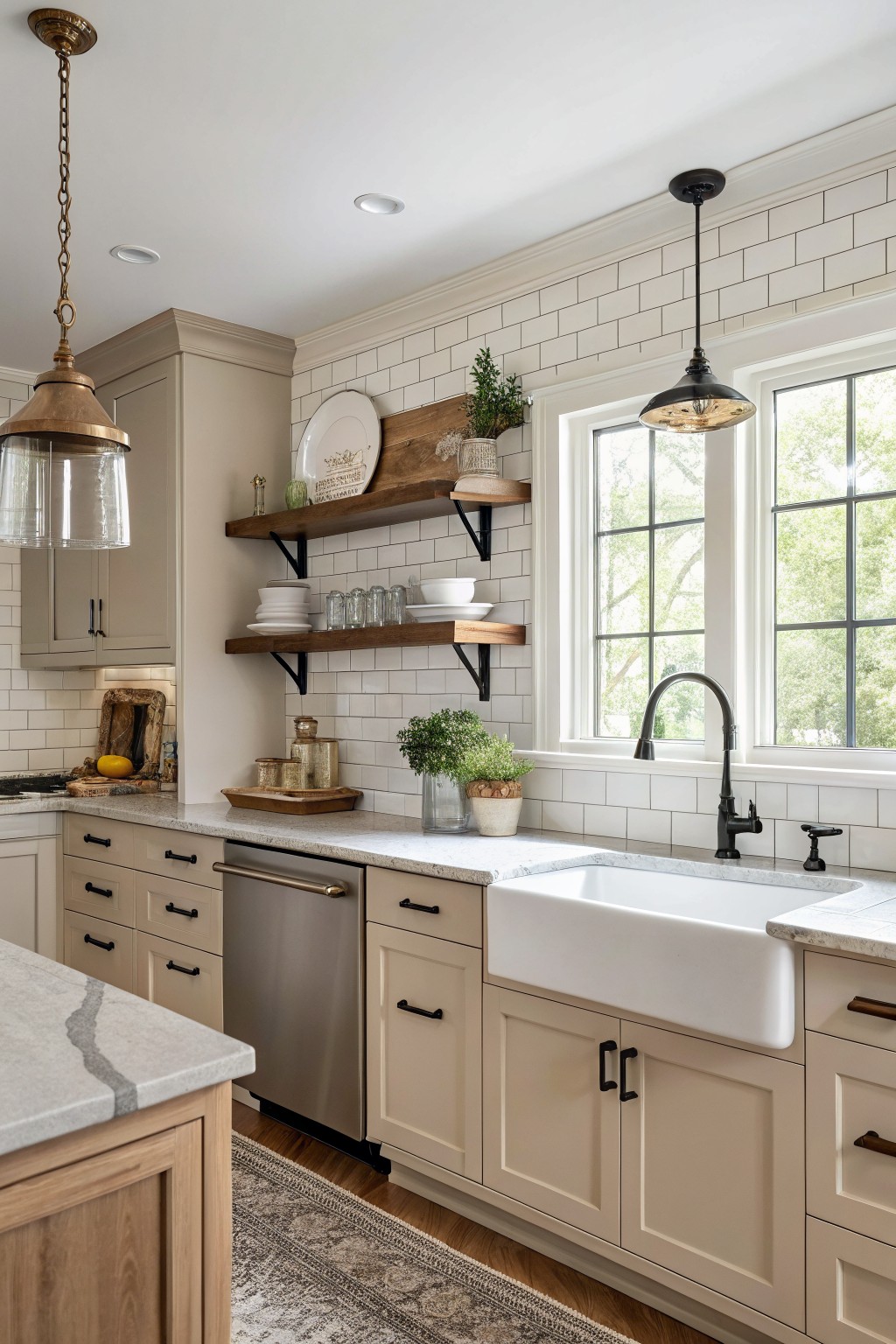
This kitchen uses a soft greige on the cabinets that sits right between gray and beige. The color feels warm enough to keep the room from looking cold but still reads clean and simple next to the white tile.
It has a light undertone that works well with wood shelves and natural flooring. Most people find this type of greige flexible in different lights, though it can pick up more beige in rooms with lots of warm sunlight. Popular matches include Sherwin Williams Agreeable Gray, Benjamin Moore Edgecomb Gray, and Behr Silver Satin.
Soft Sage Green Walls
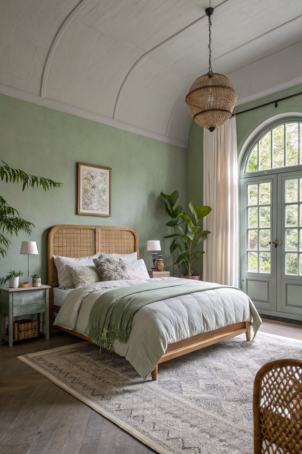
A soft sage green like this gives the walls a quiet, earthy tone that feels calm without turning the room cold. It sits right in that middle ground between gray and green, which makes it easy to use in bedrooms or sitting areas. Colors like Benjamin Moore Soft Fern or Sherwin Williams Clary Sage come closest to this shade.
It works best with warm wood and plenty of natural light so the color stays balanced. The light gray undertone keeps it from feeling too bright or too dull, though it can shift a bit cooler in shaded corners, so testing a sample is worth the time.
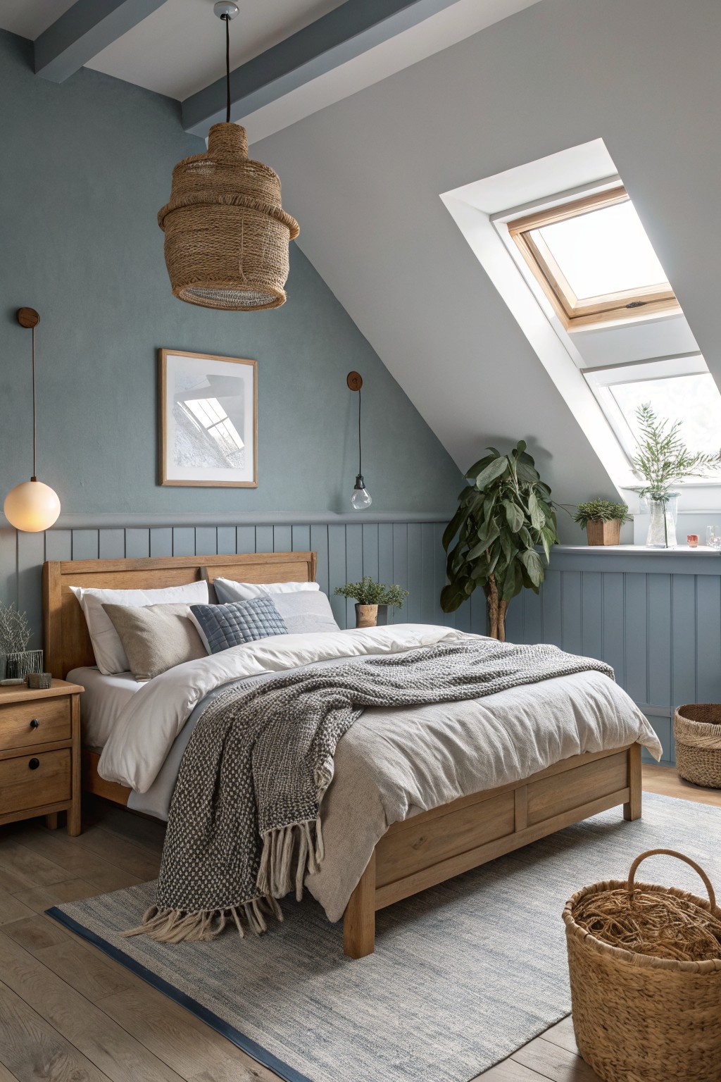
Soft Blue Gray Walls
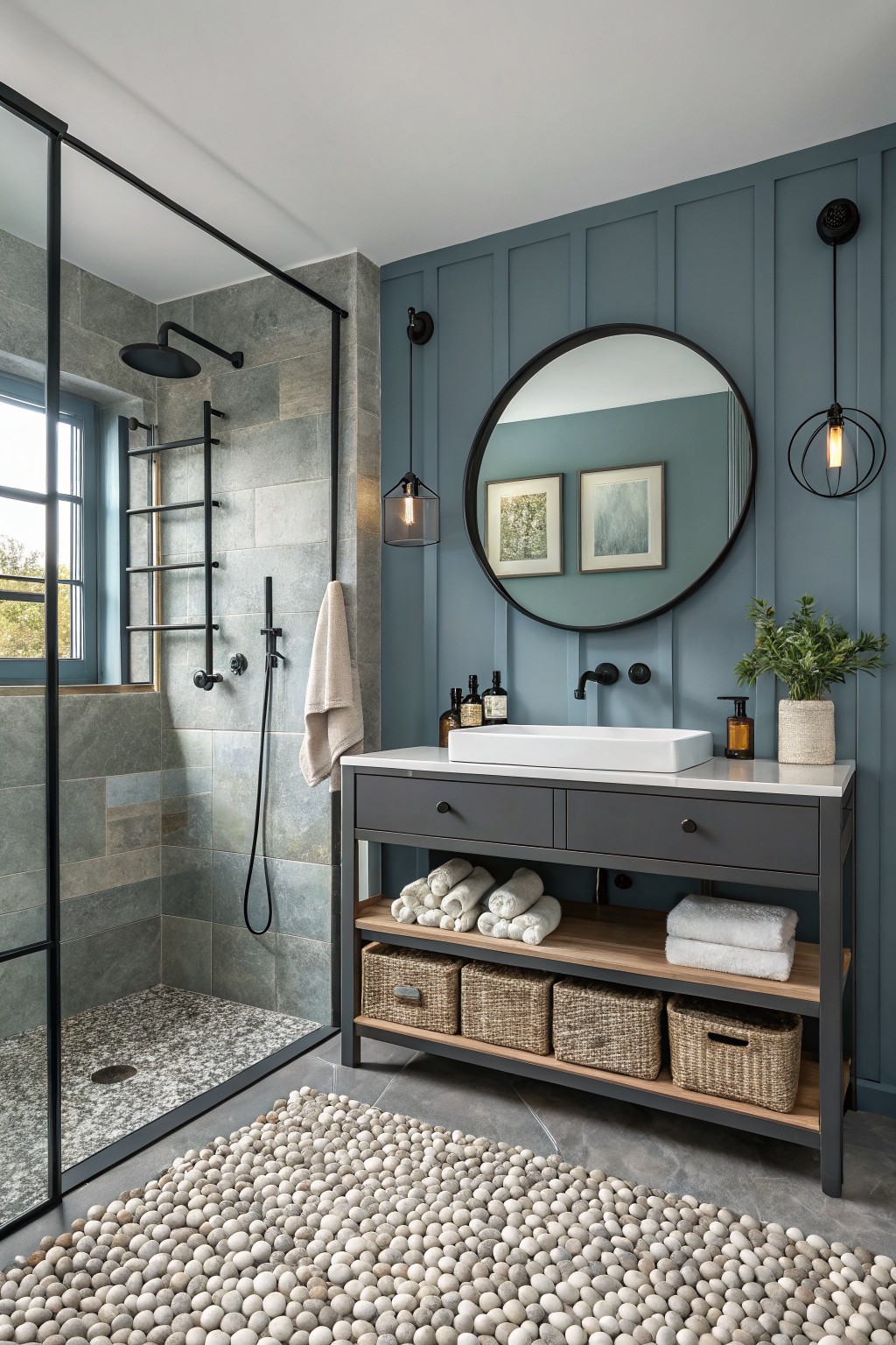
This soft blue gray on the walls gives a bathroom a calm, steady feel without turning it chilly. It sits somewhere between blue and gray, so it feels grown up and easy to live with day to day.
The color has a slight cool lean but still reads nicely against wood tones and dark cabinetry. It works best in rooms with decent light and pairs cleanly with white counters or simple black fixtures.
Warm Terracotta Walls
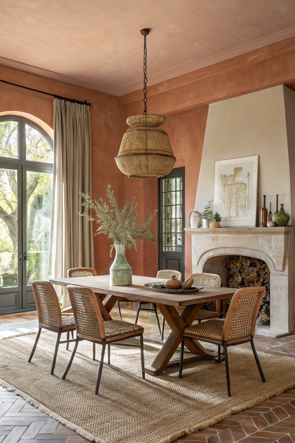
This warm terracotta color gives the room a soft earthy tone that feels calm and grounded. It sits between peach and clay with gentle orange undertones that make the walls look inviting without turning too bright or bold.
The color works especially well with wood furniture and stone details because it keeps those natural materials from feeling cold. It suits dining rooms or living areas that get steady daylight, though it can look a bit flat in very dark spaces. Try something close to Sherwin Williams Baked Clay, Benjamin Moore Coral Clay, or Farrow & Ball Red Earth if you want a similar result.
Warm Greige Walls
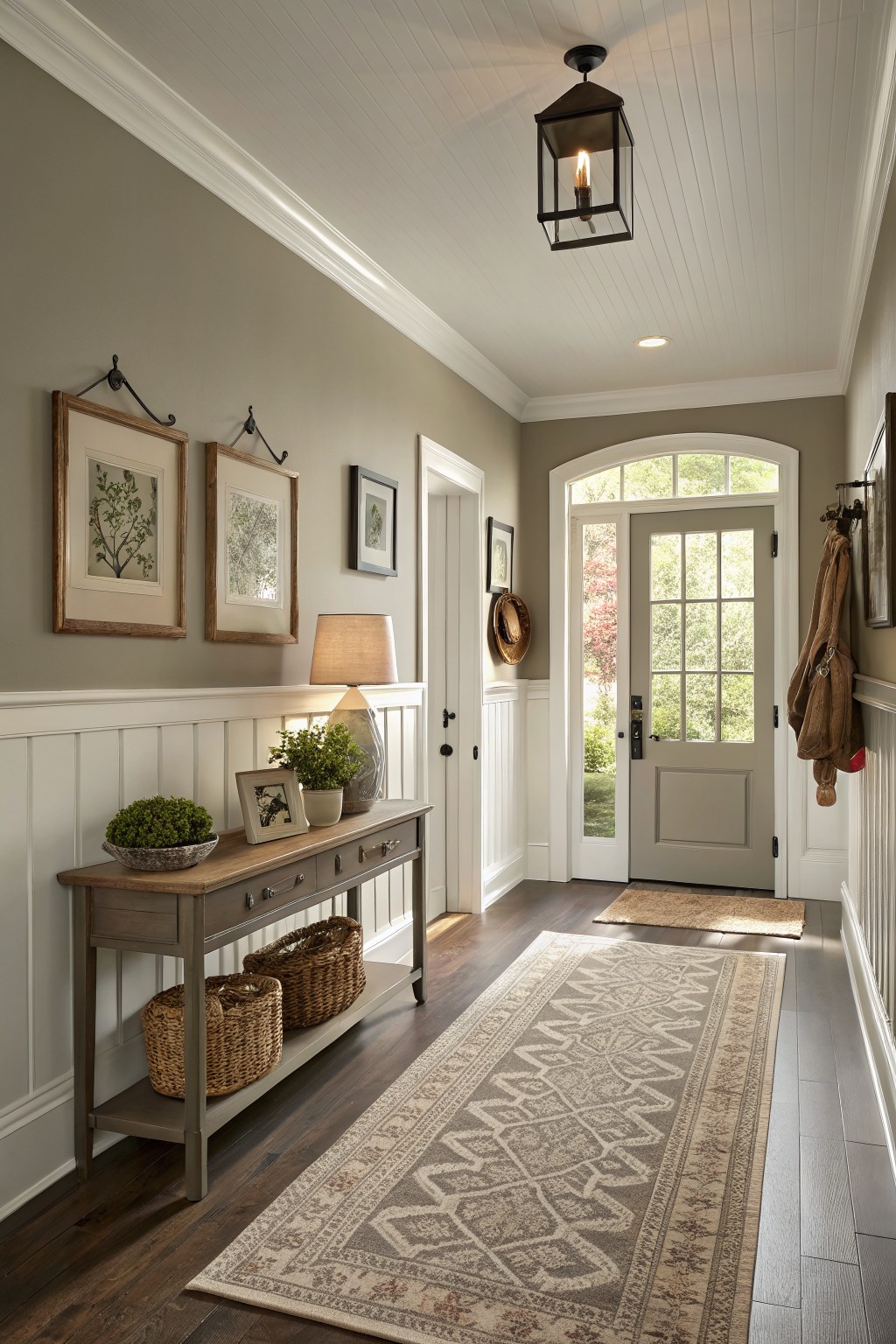
This warm greige on the walls gives the hallway a quiet, steady feel that never fights with the wood floors or trim. It lands right in that middle ground between gray and beige, which is why it works so well in entry spaces and narrow halls. You see the same effect with shades like Sherwin Williams Accessible Beige or Benjamin Moore Edgecomb Gray.
The soft undertone keeps it from feeling flat next to white wainscoting, and it holds up nicely when the light shifts during the day. It pairs easily with wood, baskets, and simple textiles, though it can look a little dull if the room gets very little natural light.
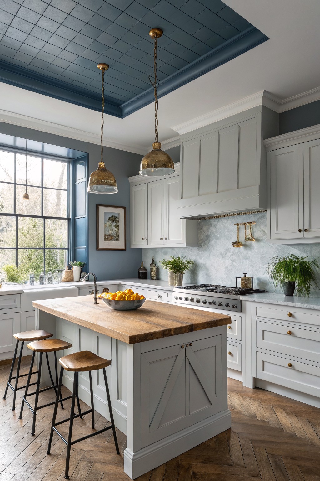
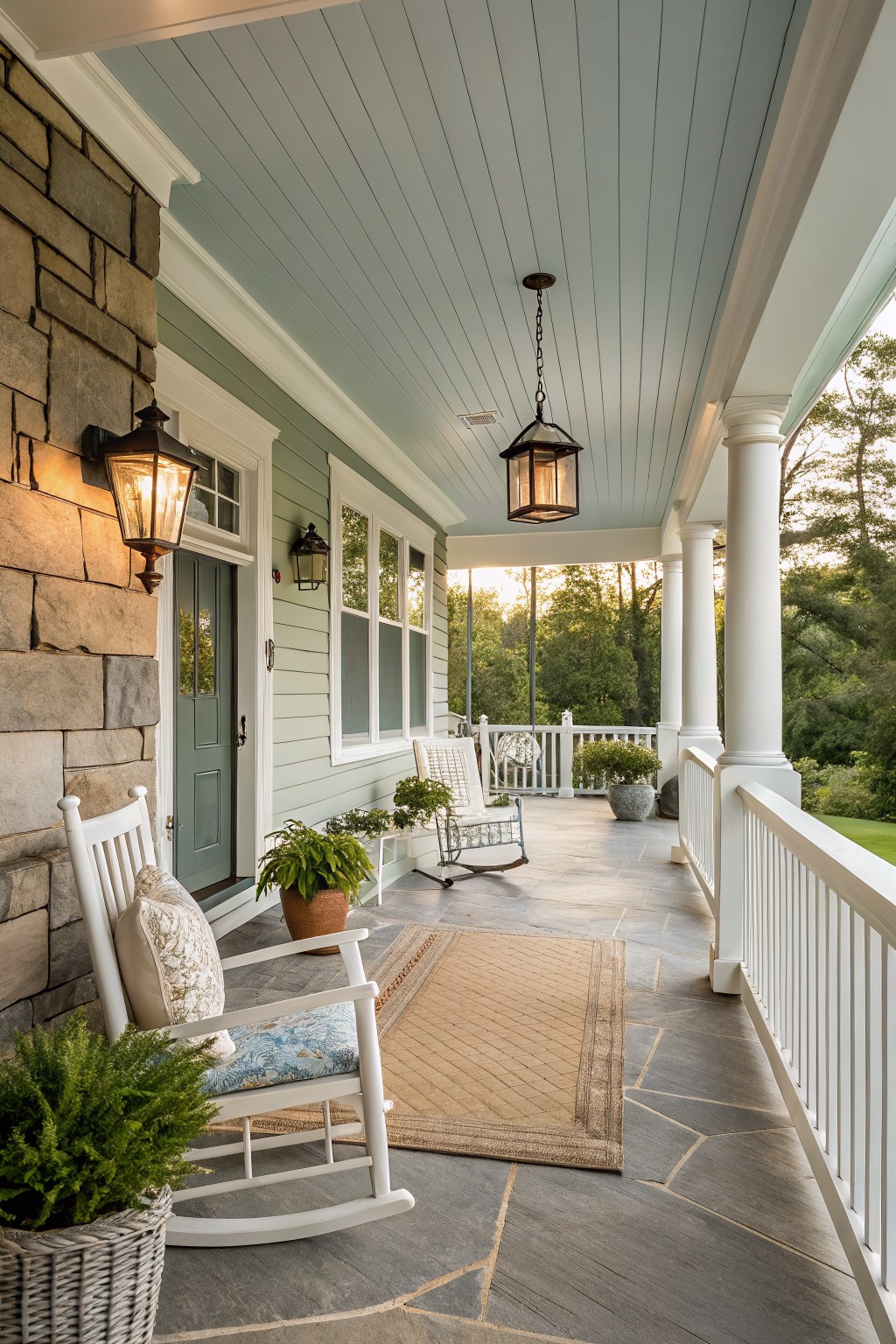
Soft blue ceilings
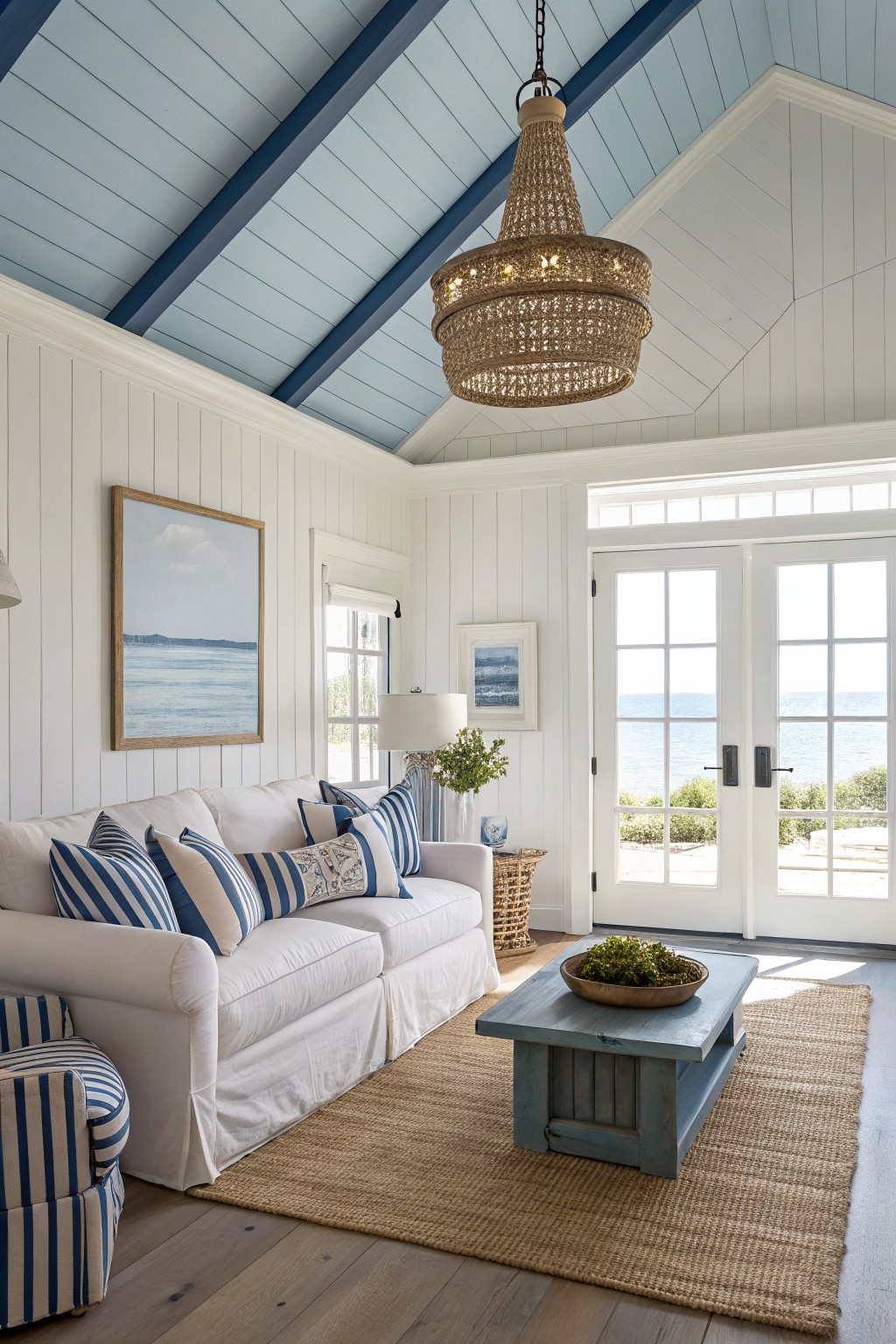
A pale blue ceiling like this one adds a quiet freshness to a room. It sits in a soft blue family with cool undertones that keep things feeling open without turning stark.
This color works best where daylight can bounce around, and it pairs easily with white walls and wood floors. Watch the lighting though, since it can lean a little cool in darker rooms. Try something close to Sherwin Williams Light Blue or Benjamin Moore Palladian Blue if you want a similar effect.
Deep green walls
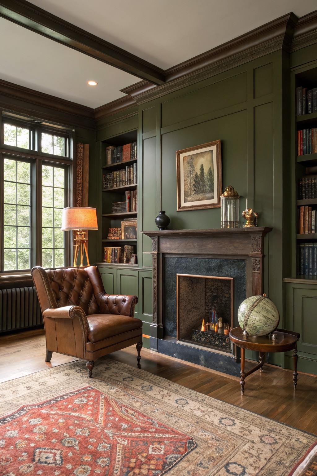
This deep green brings a grounded feel to a room without making it feel heavy. It sits between forest and olive, with just enough warmth to keep the space comfortable rather than cold. The color works especially well with wood tones and darker trim, which is why it suits older homes or rooms with built-ins.
It holds up nicely in both natural light and evening lamps, though it can read a touch moodier in low light. Pair it with warm leather, brass accents, or a stone fireplace to keep the look balanced. Avoid using it in small spaces that get little sun, since it can close things in if there is not enough contrast around it.
Soft Blue Gray Walls
This soft blue gray brings a calm, steady feel to walls without making the room feel cold. It has enough gray in it to stay neutral but still reads as a gentle blue that works nicely with warm wood tones and simple furnishings.
It has a cool undertone that shows up more in lower light, so it suits bedrooms or spaces where you want things to feel quiet and restful. Pair it with white trim and natural wood floors to keep the look balanced. Closest matches include Sherwin Williams Rainwashed, Benjamin Moore Wythe Blue, Farrow & Ball Light Blue, and Behr Silver Strand.
Soft Warm Beige Walls
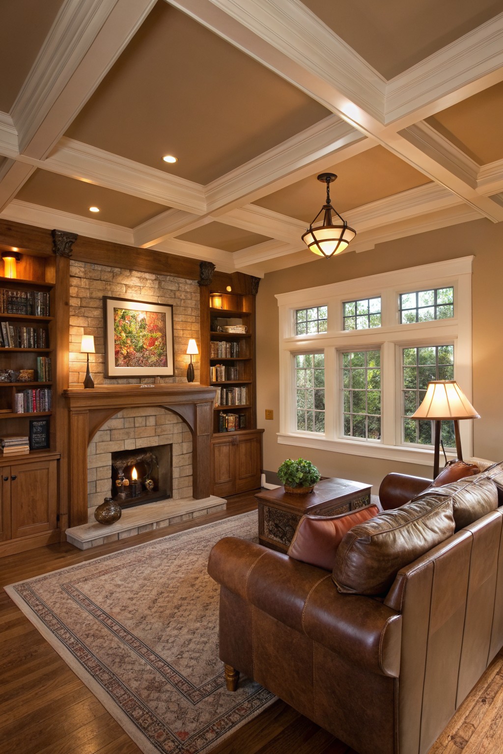
This warm beige has a soft taupe quality that feels grounded without turning heavy. It sits nicely next to the wood trim and built-ins, letting the natural grain stand out while keeping the whole room calm. Colors like Sherwin Williams Accessible Beige, Benjamin Moore Manchester Tan, or Behr Almond Wisp give a similar effect.
The undertone leans slightly golden, so it looks best in rooms with plenty of wood and warm lighting. It pairs well with leather furniture and stone details, though it can start to feel flat if the trim is painted the same color.
This deep navy blue on the island cabinets gives the whole kitchen a steady, grounded look. It is a true navy with a touch of gray in the mix, and it reads very close to Sherwin Williams Naval or Benjamin Moore Hale Navy.
The color holds up well next to white walls and light marble because the contrast stops it from feeling heavy. It suits kitchens with wood floors and brass hardware, though it can turn cooler in low light so a sample on the actual cabinets is worth checking first.
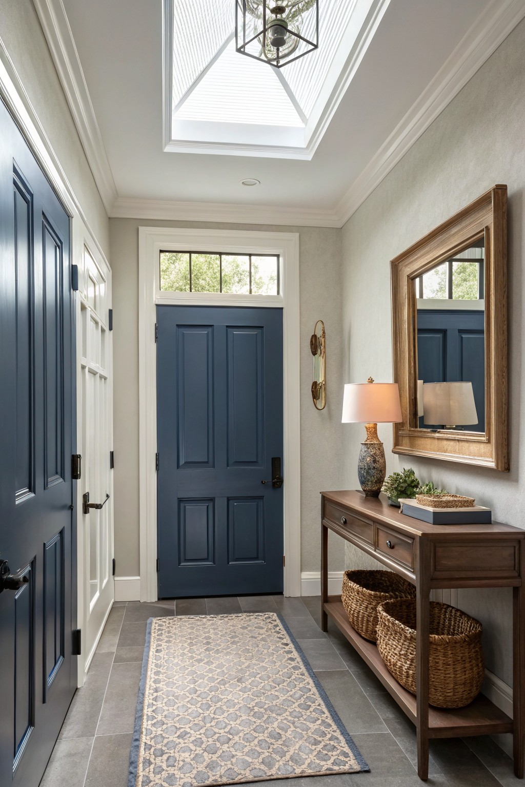
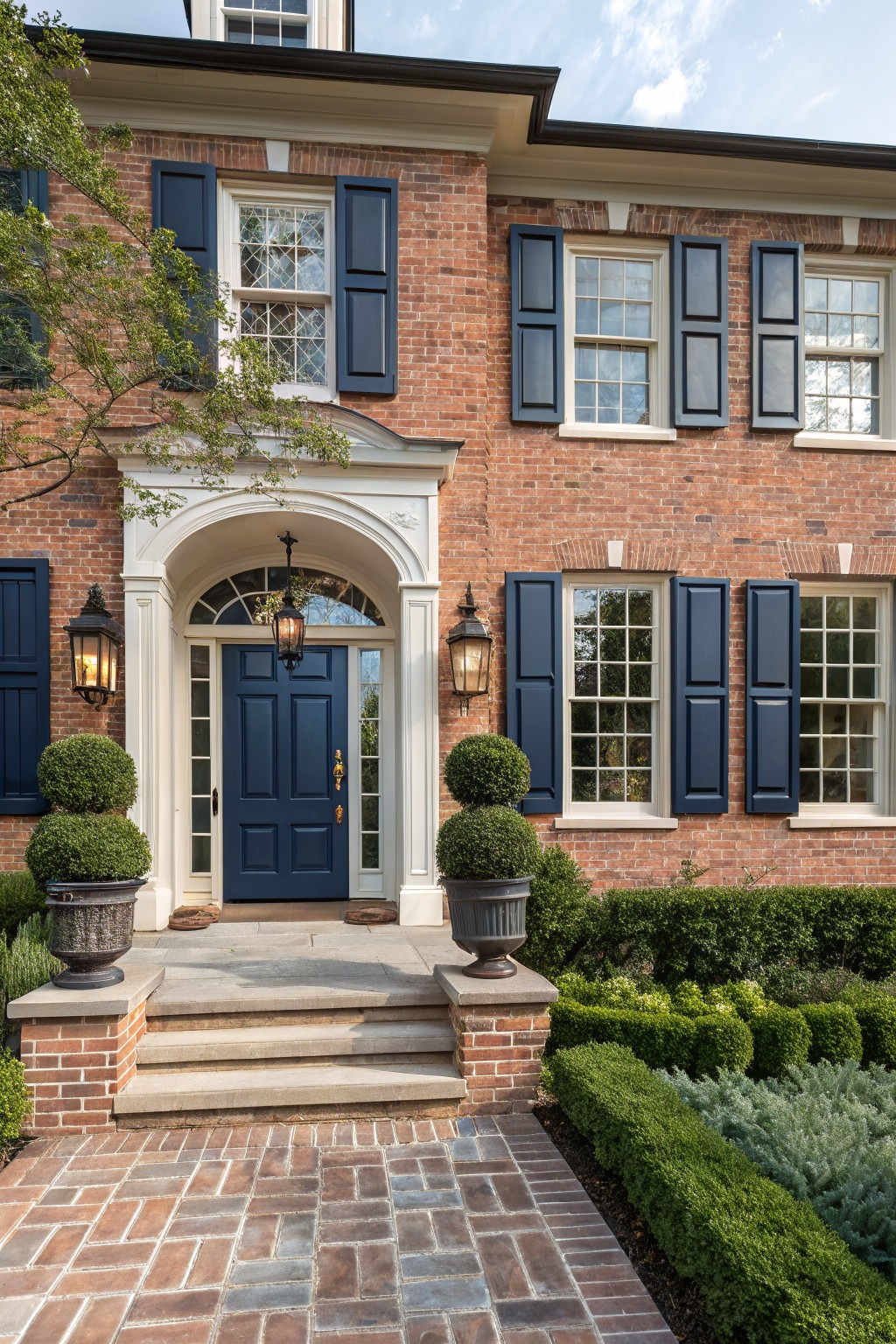
A deep navy blue on the doors brings a steady, grounded look to an entry without making it feel heavy. This color sits between a true navy and a slightly grayed blue, which helps it blend with light walls and wood tones nearby. It reads close to Sherwin Williams Naval, Benjamin Moore Hale Navy, or Behr Midnight Blue.
The cool undertones keep the space feeling clean and a bit crisp. It works especially well with white trim and simple wood furniture, though it can look flat if the room gets very little daylight.
Soft Gray Brick Walls
This soft gray on the brick walls lands in a light neutral range that feels calm and steady. It sits between a cool gray and a touch of greige, which helps the room feel open without looking flat. It reads very close to Sherwin Williams Agreeable Gray or Benjamin Moore’s Pale Oak.
The neutral undertone pairs easily with wood floors and darker upholstery. It works best in living rooms or similar spaces where you want a quiet background that still lets furniture and textiles show up clearly. Watch the lighting though, since this shade can shift cooler in low light.
Soft greige vanities
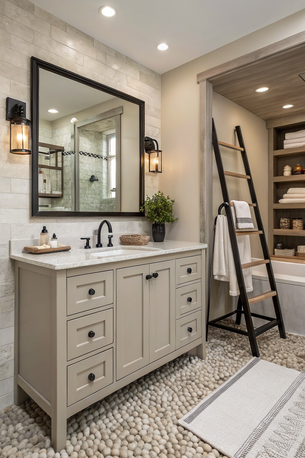
This soft greige on the vanity has a warm undertone that keeps the whole bathroom feeling calm and pulled together. It sits nicely between gray and beige, so it never looks too cool or too yellow under different lights. Many people reach for this kind of color when they want something that lasts and works with both modern and traditional details.
It pairs especially well with stone tile and darker hardware. Try it in bathrooms or laundry rooms where you need a neutral that still feels a little soft. Colors like Sherwin Williams Accessible Beige, Benjamin Moore Revere Pewter, or Behr Greige all land close to this look.
Soft Sage Green Siding
This house uses a soft sage green on the siding. It is a muted green gray that feels calm and blends in without trying too hard.
The color has a slight cool lean that sits well against stone and wood details. It works best on homes with natural materials and looks good paired with charcoal roofs or warm wood doors.
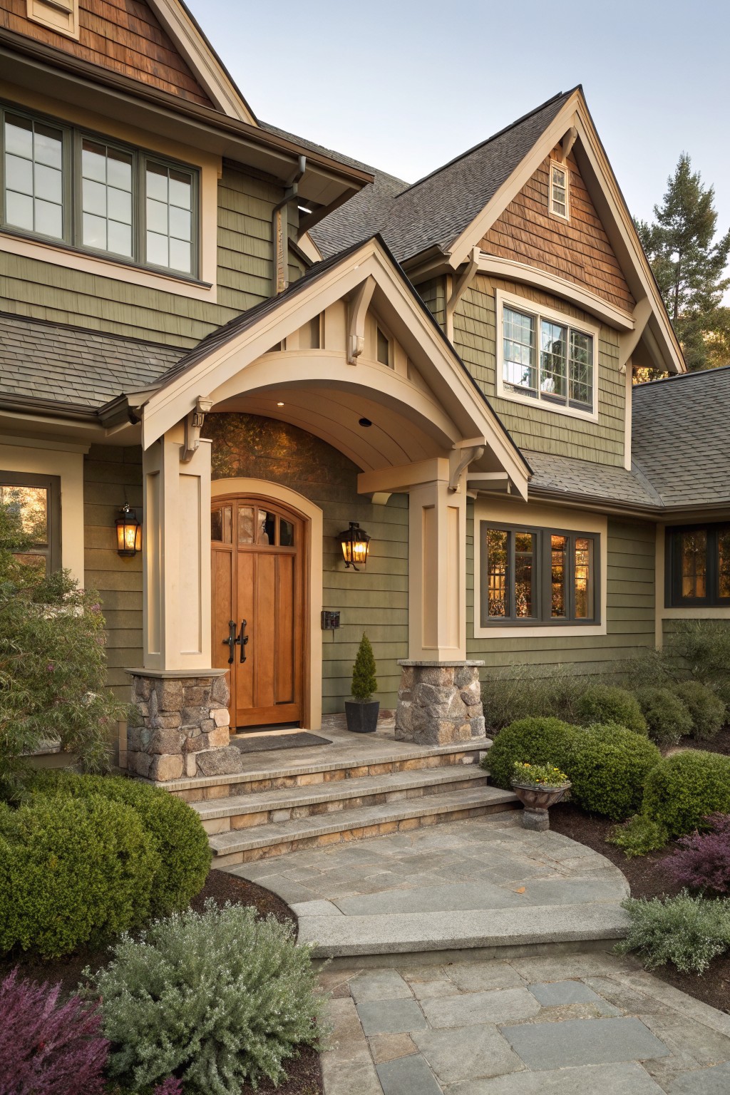
A Muted Blue Front Door
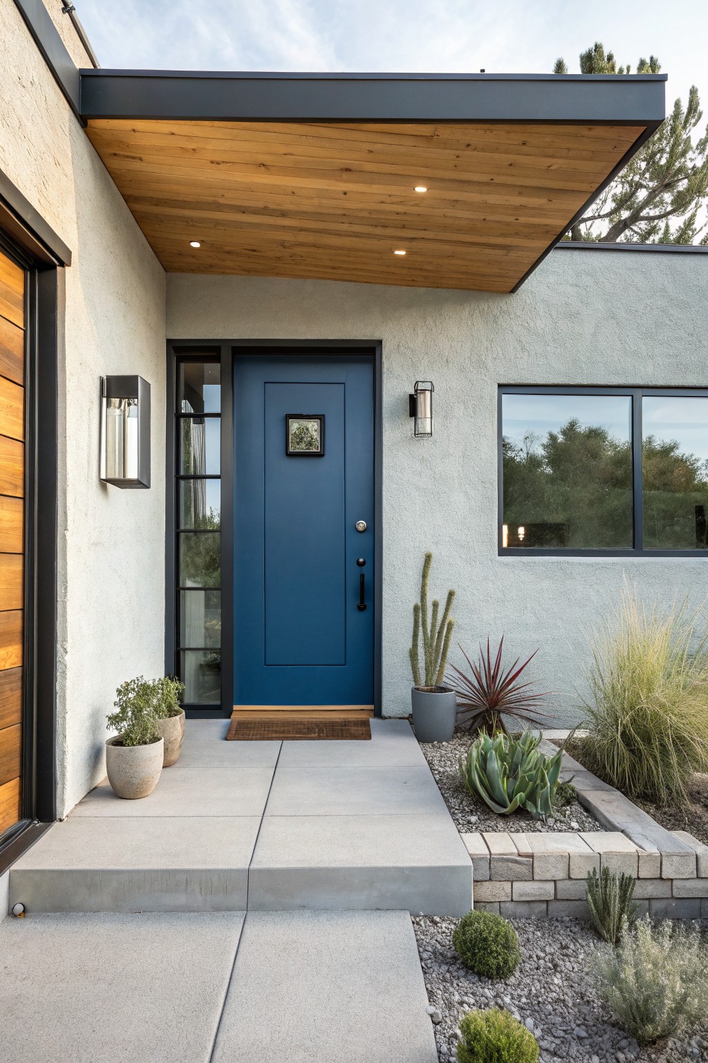
A deep navy blue makes a strong but simple choice for an exterior door. It gives the entrance some weight without feeling heavy or overly bold. The color sits nicely against light stucco walls and brings a bit of contrast that still feels calm and modern.
This shade has a cool undertone that holds up well in bright daylight. It pairs easily with warm wood accents overhead and keeps the whole front looking clean. Just watch how it shifts in different light since navy can read a little greener or more black depending on the time of day.
Soft Yellow On Brick Homes
This soft warm yellow gives brick a gentle lift without making the house feel too bright or stark. It sits in that nice space between cream and pale yellow, so it feels classic and a bit sunny at the same time. The color reads closest to Benjamin Moore Hawthorne Yellow or Sherwin Williams Biltmore Gold, with similar options like Farrow & Ball Hay.
It has a creamy undertone that plays nicely with black shutters and trim. That keeps the look grounded rather than too sweet. Just watch how it shifts in strong afternoon light, since the yellow can lean a touch warmer on sunny days.
Soft green house siding
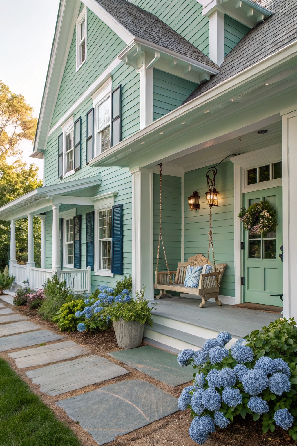
This soft green siding brings a gentle, slightly blue-green tone that feels easy and relaxed on a traditional home. It sits in that light mint or seafoam range, and many people like it because it keeps things looking fresh while still feeling grounded. You might try Sherwin Williams Rainwashed, Benjamin Moore Beach Glass, or Behr Aqua Foam for a close match.
The color has cool undertones that pair nicely with white trim and dark roofing. It works well on homes with simple architecture and holds up nicely in both sun and shade, though it can lean a little more blue in strong daylight.
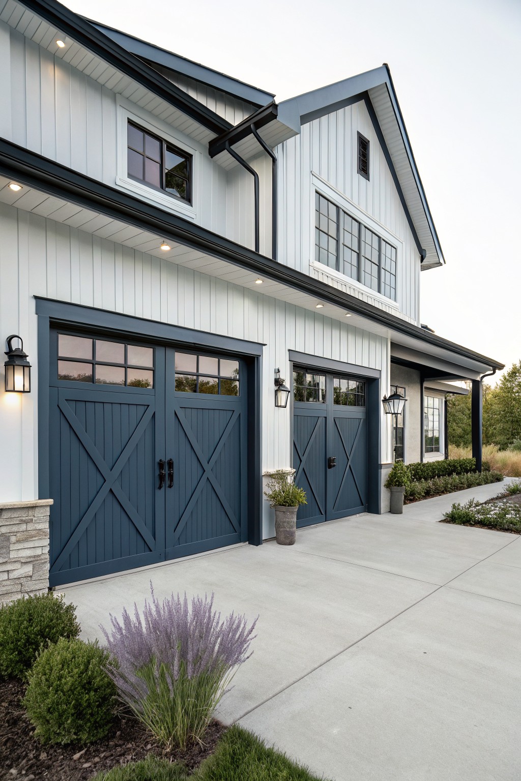
This deep navy blue works well on exterior doors and trim because it gives the house a solid, grounded look without feeling heavy. It reads as a true navy with a slight gray undertone that keeps it from going too bright or too purple in daylight. The color holds up nicely next to the light siding and helps the whole exterior feel more structured.
It pairs best with crisp white trim and simple black hardware. On houses with a lot of natural light or open settings it stays looking fresh, though it can read darker on shaded sides so testing a sample on the actual surface is worth doing. Popular matches include Sherwin Williams Naval, Benjamin Moore Hale Navy, and Behr Midnight in the City.
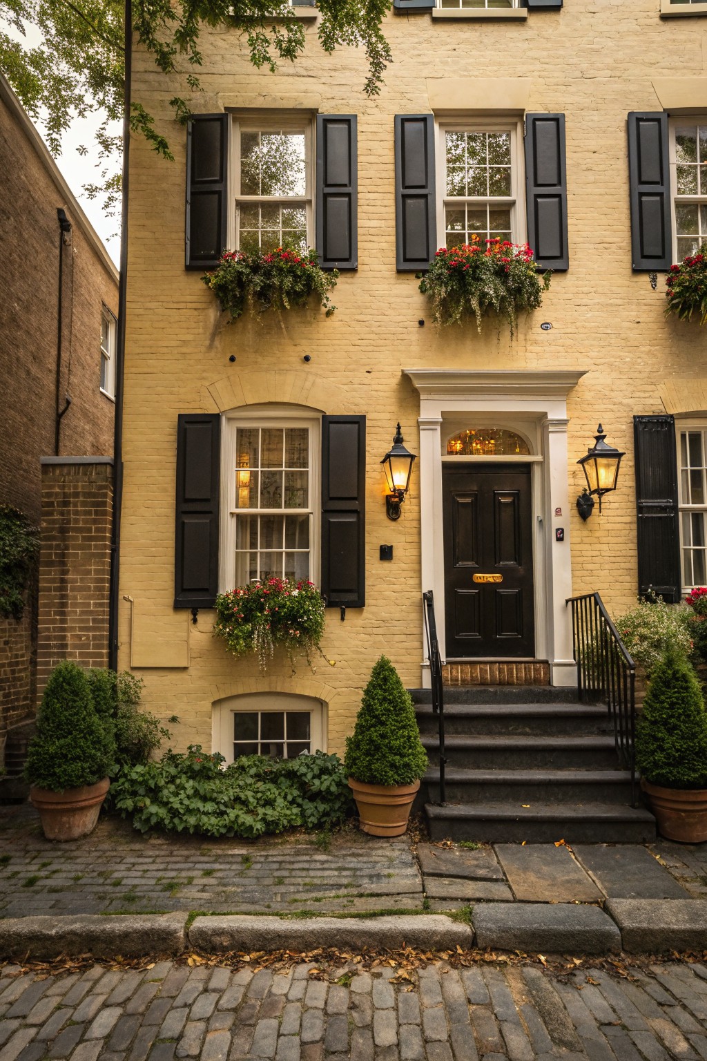
This deep navy blue works well on doors and shutters because it gives a solid, classic look that holds up against brick. It feels substantial without going too dark or flat, and it reads as a true navy rather than a bright blue or a black.
The color has cool undertones that balance nicely with warm brick and light trim. It suits traditional homes best and pairs cleanly with white window frames or natural stone paths. Avoid using it on houses with very cool gray siding, since the contrast can feel off.
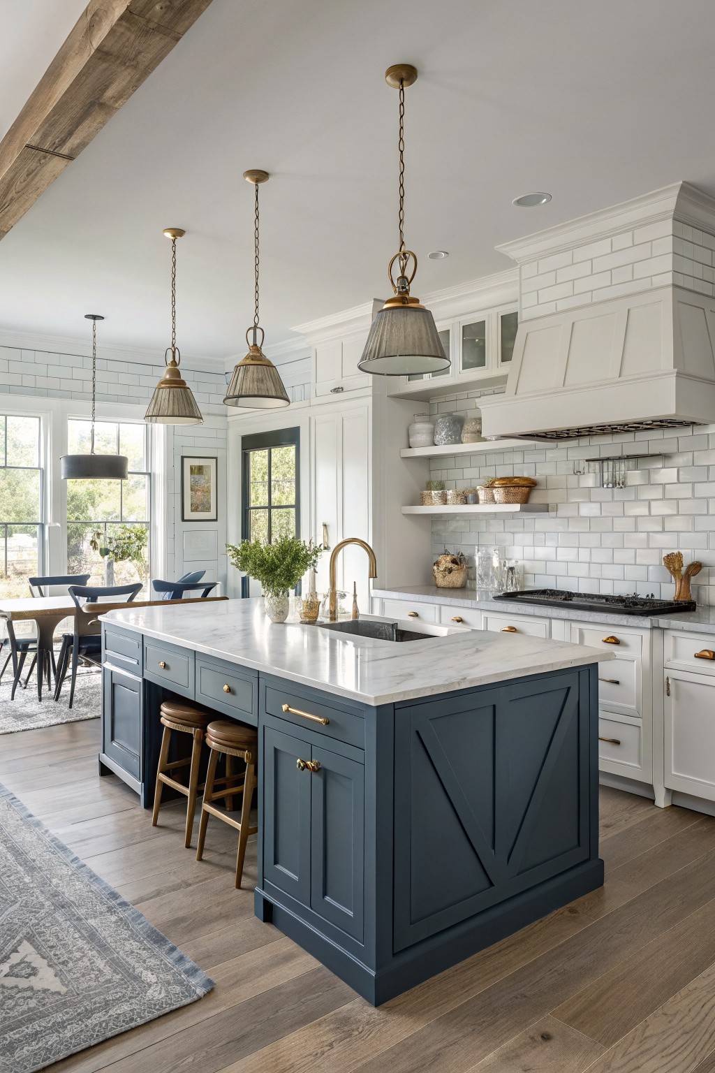
Soft Blue Gray Walls
This soft blue gray gives the kitchen a calm, steady look that still feels fresh. It sits right in that middle ground between gray and blue, so it reads as quiet rather than bold. Colors like Benjamin Moore’s Smoke, Sherwin Williams Silver Strand, or Farrow & Ball Pigeon all land in the same family and would give a similar effect.
The cool undertone works best when you balance it with warmer wood on the floor and island. White cabinets and trim help keep the space from feeling too heavy, especially if the room gets decent natural light. If the light is low, the color can lean a bit more gray than blue, so test a sample on the wall first.
Soft sage green siding
A soft sage green on the siding gives the outside a quiet, settled look. It sits right between gray and green without leaning hard either way, which makes it easy to live with on a house that has stone or other natural textures nearby. Colors like Benjamin Moore Saybrook Sage or Sherwin Williams Rainwashed come close, and Behr Aged Sage gives a similar gentle feel.
This shade holds its own next to white trim and keeps the whole exterior from feeling too stark. It works best on homes with some greenery around them and tends to look best in soft or filtered light rather than full sun.
Muted Sage Green Built-Ins
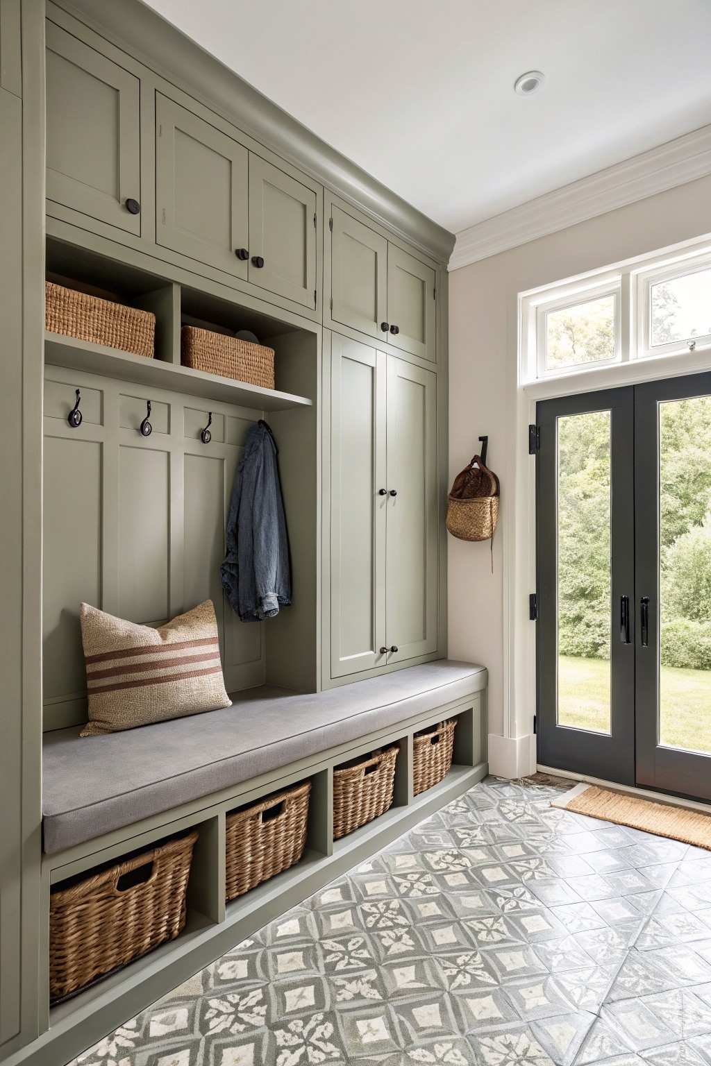
This muted sage green brings a calm, grounded feel to storage-heavy rooms. It sits somewhere between gray and green, which helps it blend with wood floors and stone without fighting them.
The color has a soft cool undertone that reads a little deeper in low light. It works best with warm neutrals and natural textures, though it can look flat if paired with too much cool gray.
Frequently Asked Questions
Q: How do I match these colors to my existing rug and sofa?
A: Look for undertones that echo the main hues in your textiles. A cool gray might tie in with blue accents in the rug. Bring fabric swatches with you when picking the paint.
Q: Will these colors make my small kitchen feel bigger?
A: Go for lighter shades with reflective qualities. They bounce light around and open up the space.
Q: What prep steps matter most before applying one of these sophisticated paints?
A: Clean the walls thoroughly first. Fix any holes or cracks with spackle. A good primer ensures the color goes on evenly and lasts.


