I have always had a soft spot for yellow paint, especially the kind that makes a space feel a little happier the second you walk in.
There is something about a sunny yellow wall that just lifts the mood without trying too hard.
In this roundup, I pulled together my favorite Benjamin Moore yellows that feel easy, warm, and actually livable day to day.
Some are soft and buttery, others lean a bit golden, but they all have that gentle glow I keep coming back to in my own home.
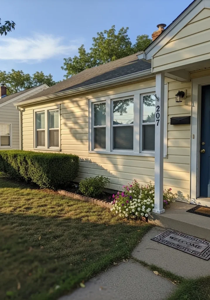
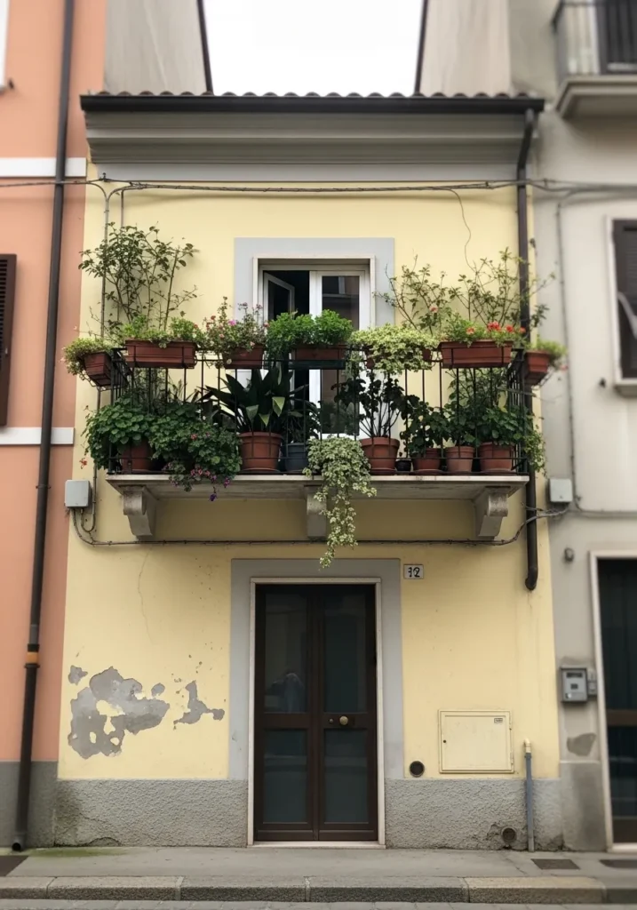
Soft Butter Yellow On A Small Home
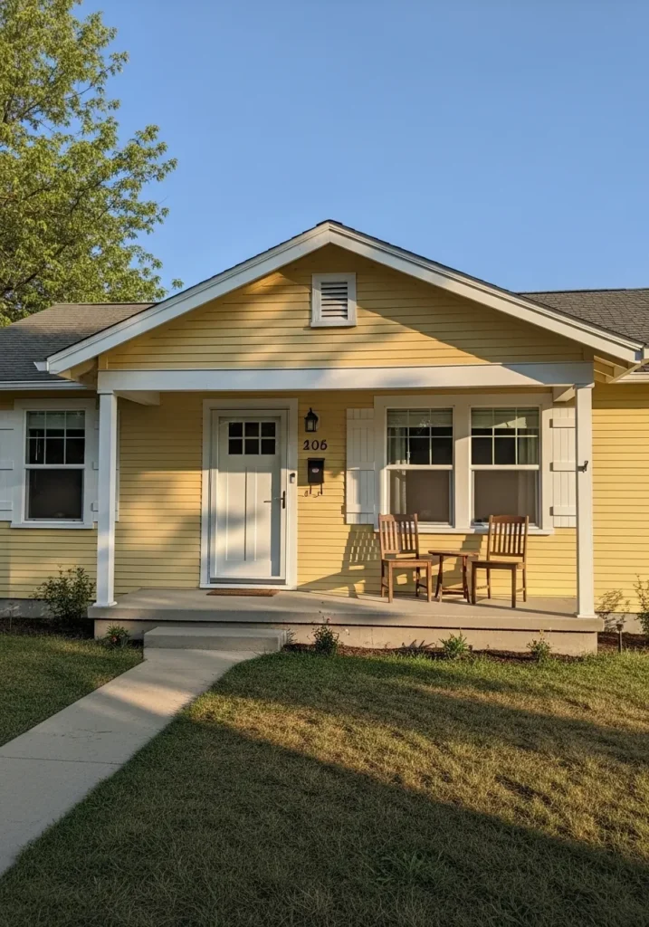
This looks very close to a soft butter yellow, and I’d place it near Benjamin Moore Hawthorne Yellow. It sits right in that warm, classic yellow range that feels cheerful without being loud. On a small house like this, especially with simple white trim and a front porch, it gives the whole place a friendly, easygoing feel.
The undertone leans warm with a hint of gold, so it reads fuller in direct light and a bit softer in shade. It works best when paired with clean whites and natural wood, like those porch chairs. I’d avoid pairing it with cool grays since that can make it feel slightly off. It really likes warmth around it.
Pale Yellow For Garden-Facing Homes
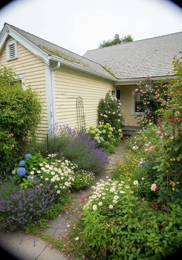
This reads like a pale, slightly creamy yellow, and it feels closest to Benjamin Moore Weston Flax. It is a softer yellow, not too bright, with a gentle tone that works well on siding. Next to all that greenery and flowers, it stays calm and doesn’t try to compete.
There is a mild warmth to it, but it leans a bit muted, which helps it sit nicely with natural surroundings and older-style homes. It tends to look better in even light and can fade a little if it gets too washed out. I’d keep the trim simple and light, and let the color stay quiet and steady.
Bright Yellow Front Door Accent
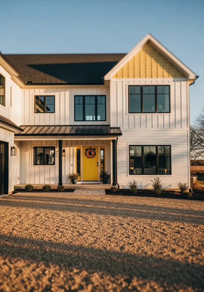
This looks very close to a bold, clean yellow like Benjamin Moore Yellow Highlighter. It is a strong, cheerful yellow that stands out right away, especially on a front door. Against simple white siding and dark window frames, it gives just enough contrast without feeling too loud.
The undertone leans warm and a bit crisp, so it stays bright even in softer light. Colors like this work best in small doses, like doors or shutters, rather than large walls. I would keep the surrounding palette simple and neutral so the yellow stays the focus and doesn’t start to feel busy.
Light Creamy Yellow For Everyday Exteriors
This reads like a soft creamy yellow, and it feels closest to Benjamin Moore Windham Cream. It sits right between yellow and cream, so it has that sunny look without feeling too bright. On a simple home with white trim and a darker door, it keeps things easy and familiar.
The undertone is warm with a hint of beige, which helps it stay steady instead of turning sharp. It tends to look best in even natural light and pairs well with clean whites and muted blues. I would skip anything too cool or stark next to it, since that can make the yellow feel a bit dull.
Warm Golden Yellow On Stucco Walls
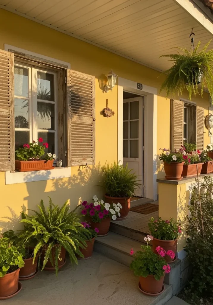
This reads like a deeper golden yellow, and it feels closest to Benjamin Moore York Harbor Yellow. It is richer than a pale butter tone, with more depth and a slightly sunbaked look. On a stucco wall like this, especially next to natural wood shutters and terracotta pots, it comes across warm and settled rather than bright.
The undertone leans toward ochre, so it holds its color even in strong light and doesn’t wash out easily. It works well with earthy materials and aged finishes, but it can feel heavy if paired with stark white or cool gray. I would keep the surrounding tones warm and a little worn in… that seems to suit it best.
Classic Light Yellow With White Trim
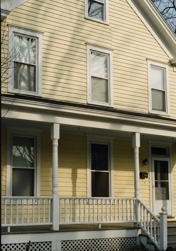
This looks like a light, traditional yellow, and I’d place it close to Benjamin Moore Hawthorne Yellow but softened a bit. It has that familiar, lived-in look that shows up often on older homes with white trim and simple porch details. Nothing too bold, just a steady yellow that feels easy to live with.
The undertone leans warm but slightly muted, which helps it sit nicely against crisp white railings and window frames. It can shift a little depending on light, reading brighter in open sun and more subdued in shade. I think it works best on classic siding like this, especially when you keep the rest of the palette simple and not too sharp.
Soft Weathered Yellow On Wood Siding
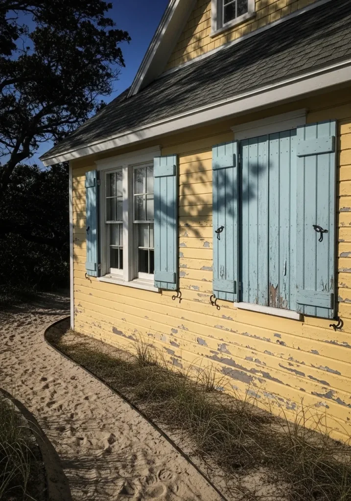
This reads like a soft, slightly faded yellow, and I’d place it near Benjamin Moore Hawthorne Yellow but aged down a bit. It has that lived-in look where the color feels settled rather than fresh, especially on older wood siding with some wear showing through.
The undertone leans warm and a little dusty, which helps it sit nicely next to muted tones like those pale blue shutters. It does not stay bright, and that is part of the appeal. If you want this kind of look, it works best when you avoid crisp, high-contrast finishes and let things feel a bit softened and worn.
Faded Creamy Yellow On Plaster Walls
This reads like a pale creamy yellow, and I’d place it near Benjamin Moore Weston Flax but softened and aged a bit. It is not a bright yellow at all. It leans more toward a worn cream with just enough yellow to keep it from feeling flat, especially on older plaster walls.
The undertone is warm and slightly muted, which helps it sit comfortably next to things like dark doors and simple trim. It can look a little uneven over time, but that is part of the charm. I think this kind of yellow works best when you let it stay relaxed and not too perfect.
Rich Golden Yellow On Traditional Siding
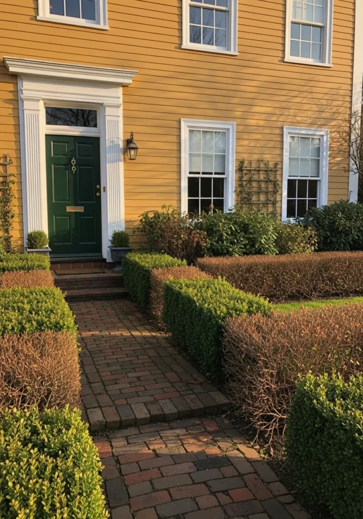
This reads like a rich golden yellow, and I’d place it close to Benjamin Moore York Harbor Yellow. It has more depth than a soft butter tone, with a slightly deeper color that feels settled on a larger home. Next to crisp white trim and a dark green door, it comes across classic and a bit more grounded.
The undertone leans warm with a hint of ochre, which helps it hold its color and not fade out too much. It pairs well with brick paths and deeper accent colors, especially greens. I would avoid pairing it with anything too pale or washed out, since that can make the yellow feel heavier than it needs to.
Muted Mustard Yellow For Rustic Homes
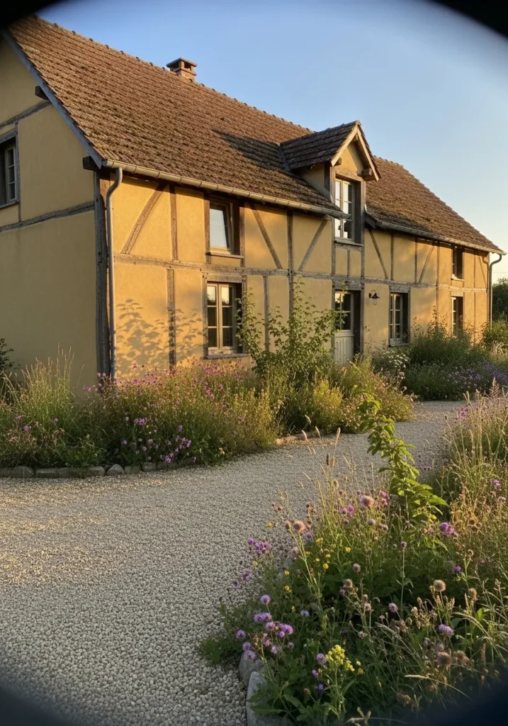
This reads like a muted mustard yellow, and I’d place it close to Benjamin Moore York Harbor Yellow but toned down a bit. It sits deeper than a soft pastel yellow, with a slightly earthy feel that works well on older homes with wood beams and simple detailing.
The undertone leans warm and a little brown, which helps it blend easily with natural materials and a more relaxed landscape. It does not feel bright, and that is the point. I think this kind of yellow works best when you let it stay a bit subdued and avoid pairing it with anything too crisp or modern.
Soft Yellow Beige For Modern Exteriors
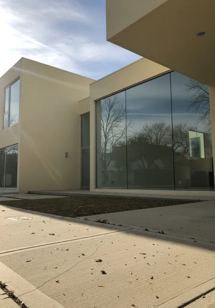
This reads like a very soft yellow beige, and I’d place it close to Benjamin Moore Windham Cream. It sits right on the edge of yellow and neutral, so it gives a hint of warmth without looking obviously yellow. On a modern home with large glass panels, it keeps things calm and not too busy.
The undertone leans warm but slightly muted, which helps it stay consistent and not shift too much throughout the day. It works well with clean lines, simple landscaping, and darker window frames. I would avoid pairing it with anything too bright, since that can make this kind of yellow feel a bit flat.
Warm Butter Yellow For Porch Spaces
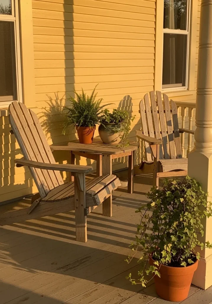
This reads like a warm butter yellow, and I’d place it close to Benjamin Moore Hawthorne Yellow. It has that easy, familiar tone that feels comfortable on exterior siding, especially around a simple porch setup with wood chairs and plants nearby. It is not too bright, just a steady yellow that feels relaxed.
The undertone leans warm with a soft golden base, which helps it stay consistent and not turn sharp. It works well with natural wood and greenery, and it tends to look fuller in direct light. I would keep the trim and surrounding colors soft so the yellow stays easy on the eyes.
Worn Yellow With A Chalky Finish

This looks like a worn, slightly chalky yellow, and I’d place it near Benjamin Moore Weston Flax but more faded. It sits in that soft yellow range that has lost some of its brightness over time, which gives it a quieter, more lived-in feel on exterior walls.
The undertone leans warm with a bit of gray mixed in, which is why it reads more muted than fresh paint. You can see how it holds up next to darker metal elements and simple trim without feeling too sharp. It works best if you let it stay imperfect and avoid pairing it with anything too crisp or newly finished.
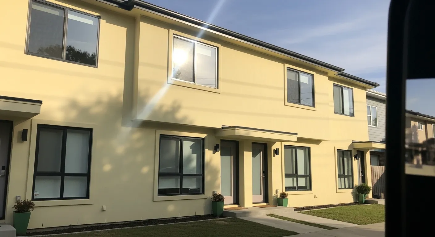
Soft Sunny Yellow For Family Homes
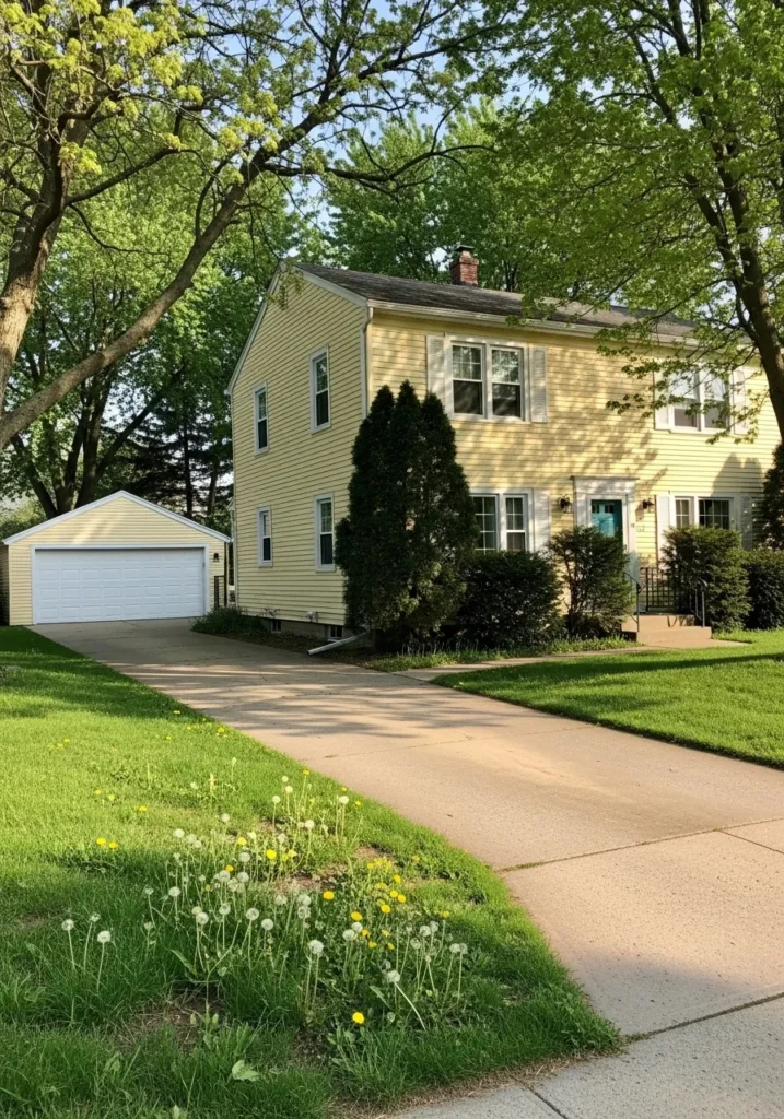
This looks like a soft sunny yellow, and I’d place it close to Benjamin Moore Hawthorne Yellow, just slightly lightened. It sits in that easy middle range where the color feels cheerful but not too strong. On a simple two-story home with white trim and a small garage, it feels familiar and comfortable.
The undertone leans warm with a gentle golden base, which helps it read clean without turning sharp. It works well with fresh greenery and classic white details, and it tends to brighten up even a basic exterior. I would keep the rest of the palette simple so the yellow can stay relaxed and not feel busy.
Bright Garden Shed Yellow
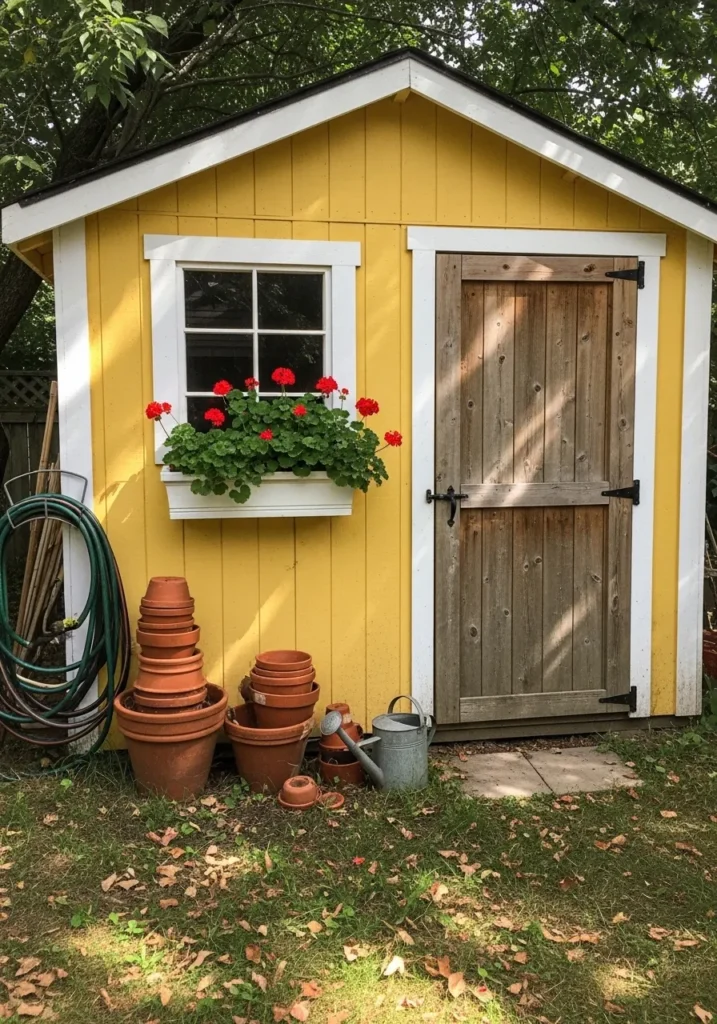
This reads like a clear, cheerful yellow, and I’d place it close to Benjamin Moore Yellow Highlighter but softened just a touch. It sits on the brighter side of yellow, which works well on a small structure like this shed, especially with white trim and a natural wood door to keep it grounded.
The undertone leans warm and clean, so it stays lively without turning too sharp. It pairs nicely with simple materials and greenery, like the potted plants nearby. I would keep surrounding colors fairly neutral, since this kind of yellow can take over quickly if there is too much happening around it.
Soft Yellow For Classic Facades
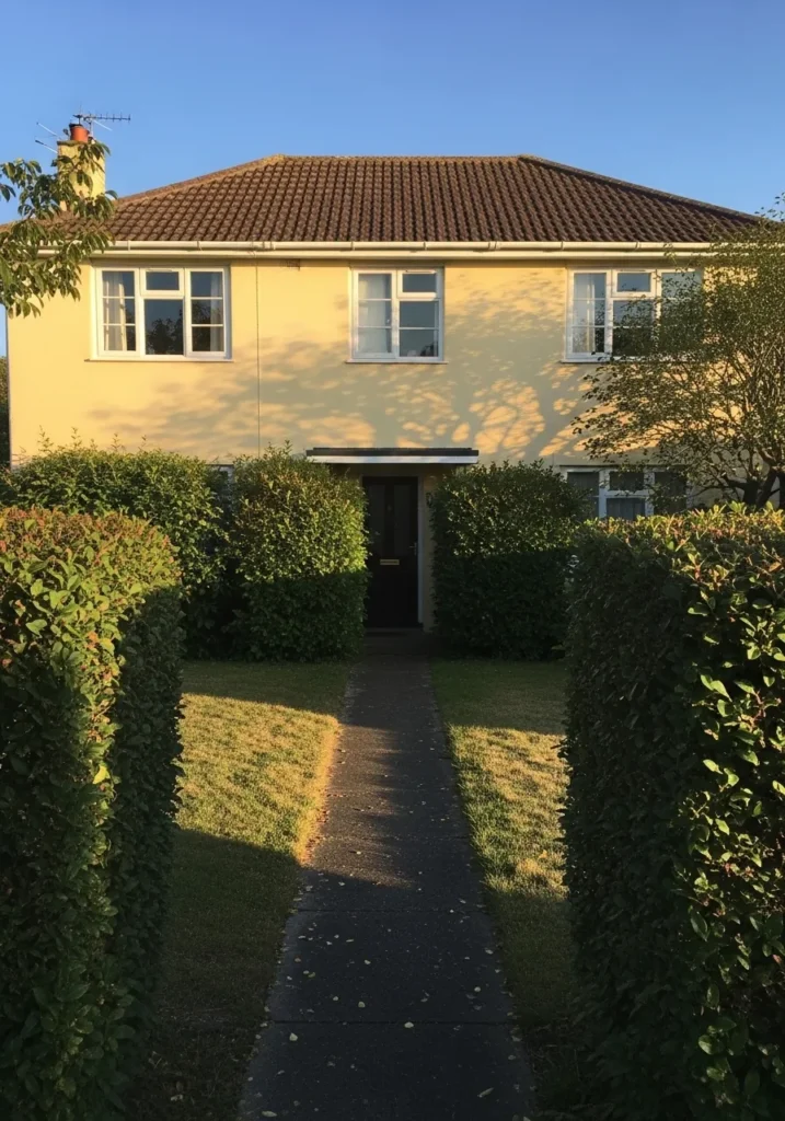
This reads like a soft, slightly creamy yellow, and I’d place it near Benjamin Moore Hawthorne Yellow but lightened a bit. It sits in that middle range where the color feels bright enough to notice, yet still easy to live with. On a simple facade with white windows and a dark entry, it keeps things balanced and familiar.
The undertone leans warm with a gentle golden base, which helps it stay steady and not turn too sharp. It pairs well with greenery and darker accents like a black door or trim. I would keep surrounding colors fairly simple so the yellow can stay calm and not feel overdone.
Aged Yellow For Older Homes
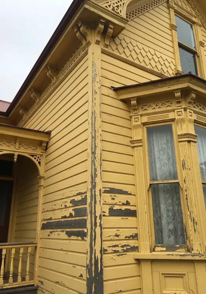
This looks like an aged yellow, and I’d place it close to Benjamin Moore York Harbor Yellow, just a bit more weathered. It sits in that deeper, slightly muted yellow range that feels right on older wood siding and detailed trim. Even with some wear showing through, the color still holds its character.
The undertone leans warm with a soft ochre base, which gives it that slightly antique feel. It works well on traditional homes with decorative woodwork, where a brighter yellow might feel out of place. I would keep the surrounding palette simple and a little subdued so the color stays true and not overly fresh.
Rich Golden Yellow For Small Outdoor Spaces
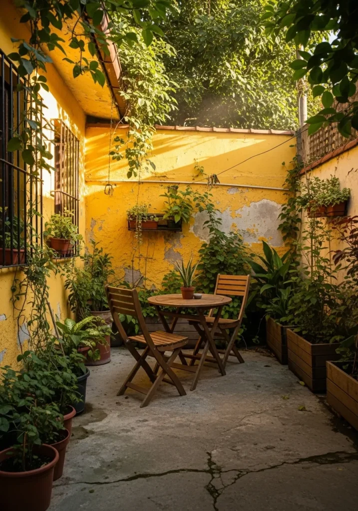
This reads like a rich golden yellow, and I’d place it close to Benjamin Moore Golden Honey. It sits deeper than a soft butter yellow, with a bit more intensity that works well on enclosed outdoor walls. Around a small patio with plants and simple wood furniture, it feels warm and settled.
The undertone leans strongly warm, almost leaning into a light ochre, which gives it that slightly earthy feel. It pairs nicely with greenery and natural materials, and it tends to hold its color even in uneven light. I would avoid pairing it with cooler tones, since that can make the yellow feel heavier than it needs to be.