Sage green has quietly become one of my favorite paint colors for creating a calm and comfortable home.
I love how it brings in a touch of nature while still feeling soft and livable in everyday spaces.
Some shades lean a little gray while others feel slightly earthy, and I always find that Benjamin Moore has some of the prettiest options.
If you’re into cozy rooms, natural textures, and colors that never feel too loud, sage green is such a lovely choice.
I gathered some of the most beautiful Benjamin Moore sage greens that I keep coming back to when planning a relaxed and organic space.
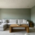
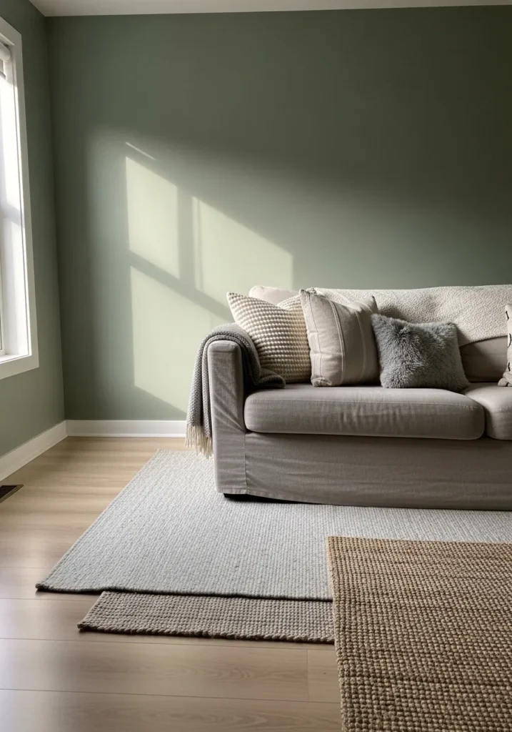
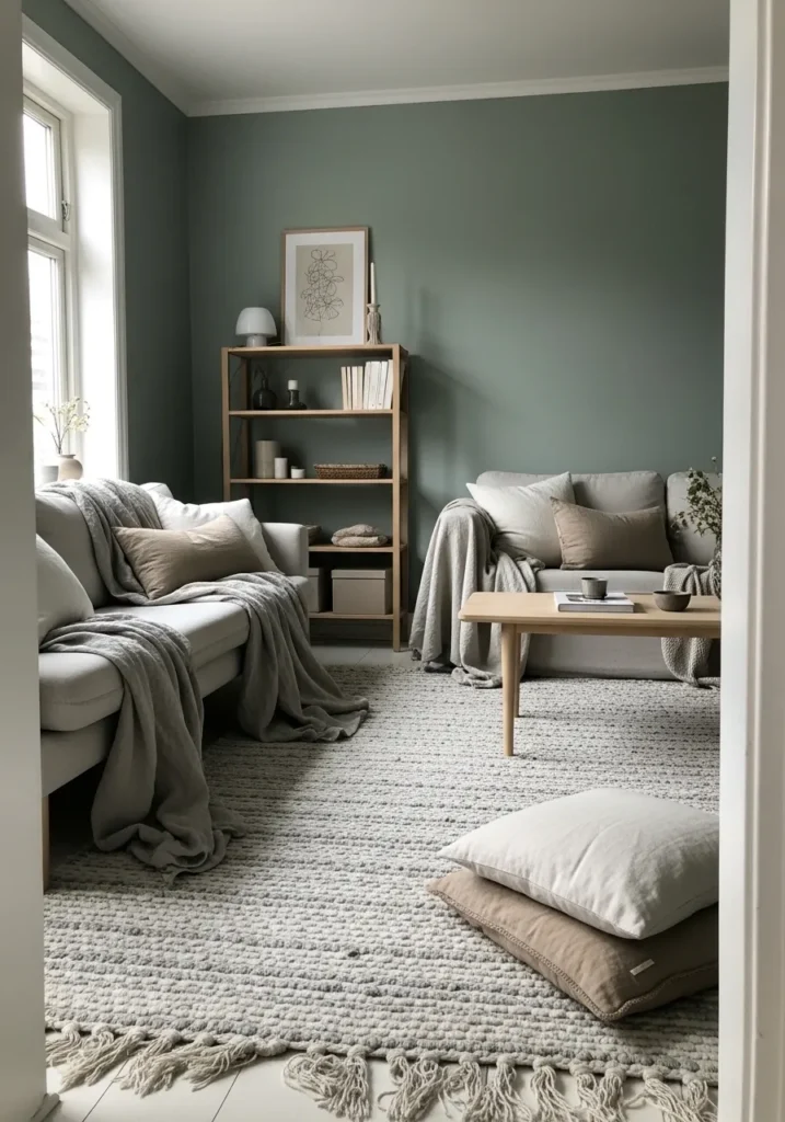
A Soft Sage Green Living Room
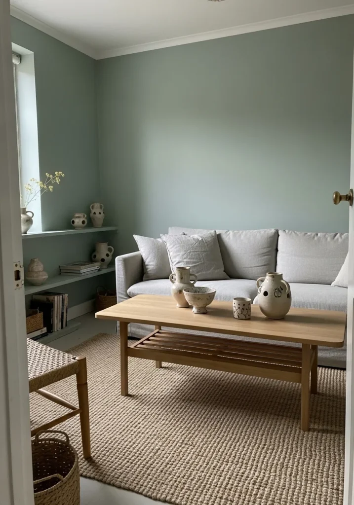
The wall color here reads very close to Benjamin Moore October Mist (1495). It’s a light sage green that sits somewhere between muted green and gray, which is why it feels so easy to live with. You notice it right away on the main wall behind the sofa, but it doesn’t feel loud. It’s the kind of green that quietly fills a room and makes everything around it look calmer.
October Mist usually carries a gentle gray undertone, so it stays soft rather than leafy or bright. That helps it work well with pale wood pieces like the coffee table and woven rug you see here. It also tends to look its best in spaces with simple textures and natural materials. Too many bold colors nearby can make the green feel a little dull, but warm wood and light fabrics usually bring out the nicest side of it.
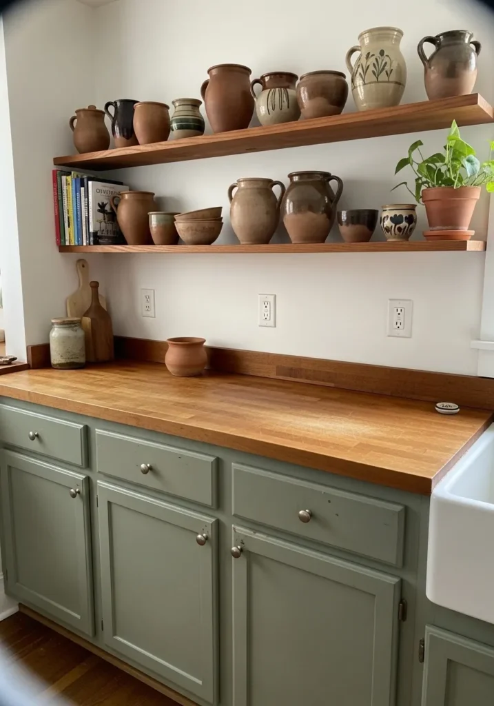
Muted Sage Green Kitchen Cabinets
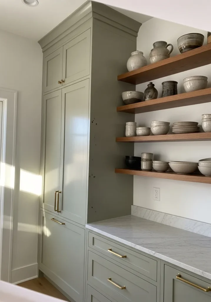
The cabinet color here reads very close to Benjamin Moore Saybrook Sage (HC-114). It’s a classic sage green that leans slightly gray, which keeps it calm and easy to live with in a kitchen. On tall cabinetry like this it feels quiet and steady rather than colorful. That softer green tone also works nicely next to the light marble counter and warm wood shelves.
Saybrook Sage usually carries a muted, earthy undertone. It can look a little warmer in natural light and a bit grayer in dim corners. This kind of sage tends to work best when it’s paired with simple materials like brass hardware, pale stone counters, or natural wood. Too many bright whites around it can make the color look cooler than expected, so softer whites usually sit better beside it.
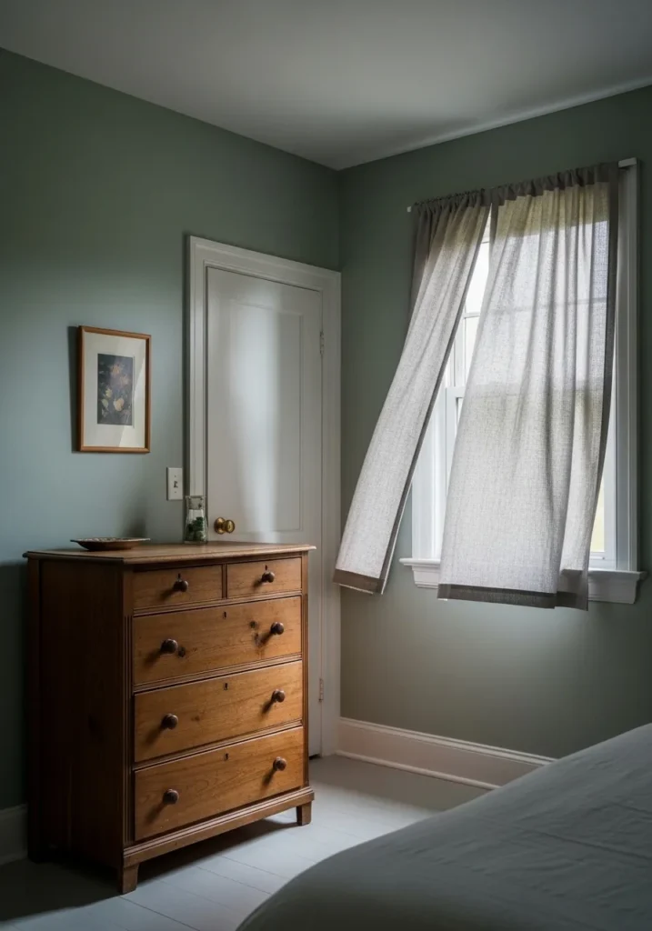
A Pale Sage Green Bedroom
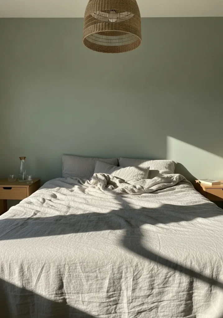
The wall color here looks very close to Benjamin Moore Soft Fern (2144-40). It’s a light sage green that leans slightly gray, which keeps it quiet and easy in a bedroom. This kind of color tends to sit gently in the background rather than taking over the room. You can see how it works next to the simple wood nightstands and neutral bedding.
Soft Fern usually carries a soft, earthy undertone. In brighter light it can show a bit more green, while in dimmer corners it reads closer to a calm gray-green. Colors like this tend to pair well with natural fabrics and pale wood finishes. If the room has too many bright whites it can feel a little cooler, so softer off whites usually sit better beside it.
A Deeper Sage Green Corner
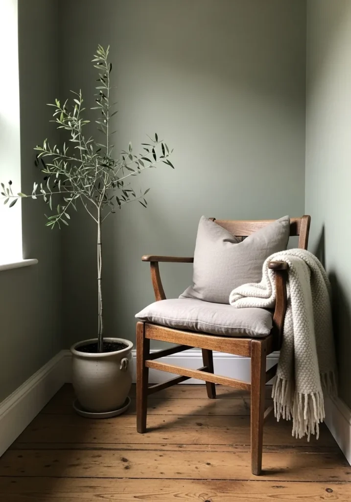
The wall color here reads close to Benjamin Moore Saybrook Sage (HC-114). It’s a mid tone sage green with a slightly gray cast, the kind of green that feels quiet rather than colorful. On a small wall like this it shows up clearly but still stays relaxed. The tone sits nicely next to the warm wood chair and the pale cushion.
Saybrook Sage usually carries an earthy undertone that keeps it from looking too cool. In brighter rooms it leans a bit greener, while in shaded corners it shifts toward a softer gray green. It tends to work well with natural materials like wood floors, woven textiles, or simple pottery. Spaces that keep the palette calm usually let this shade look its best.
A Soft Sage Green Dining Room
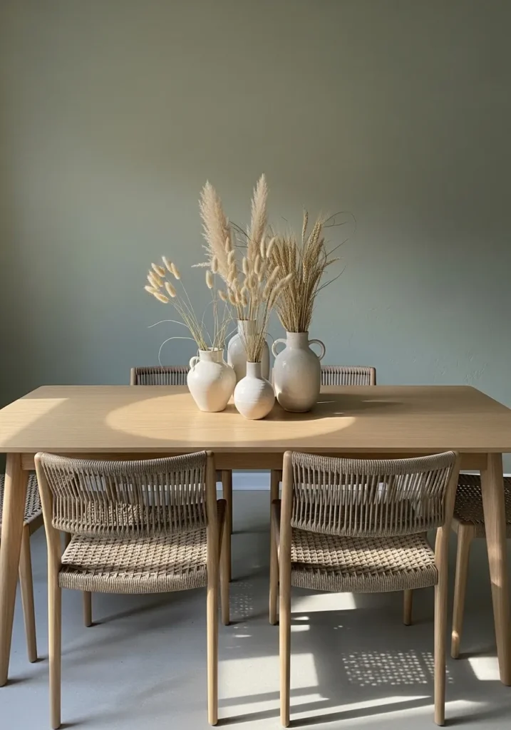
The wall color here looks closest to Benjamin Moore October Mist (1495). It’s a light sage green that leans a bit gray, which keeps it quiet and easy to live with. Colors like this tend to sit gently in the background instead of becoming the focus. In a dining area like this, the soft green works nicely beside the pale wood table and simple woven chairs.
October Mist usually carries a muted, slightly earthy undertone. That helps it work well with natural materials like wood, linen, and simple ceramics. It can read a little greener in brighter light and a bit more gray when the room is dim. I tend to like this shade in spaces that stay fairly simple, where calm colors and natural textures do most of the work.
A Quiet Sage Green Bathroom
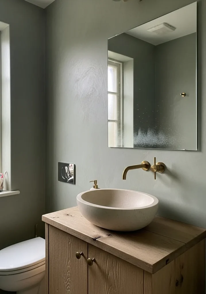
The wall color here reads very close to Benjamin Moore Saybrook Sage (HC-114). It’s a soft sage green with a gray base, the kind of color that feels calm without turning too pastel. In a small bathroom like this it gives the walls some character while still staying easy on the eyes. The tone also sits nicely next to the simple wood vanity and stone sink.
Saybrook Sage tends to have a muted, earthy undertone that shifts depending on the light. In brighter spots it leans a little greener, while shaded areas bring out more of the gray. Colors like this often work well in bathrooms because they pair naturally with stone, wood, and warm metals like the brass faucet you see here. Keeping the surrounding finishes simple usually lets the color look its best.
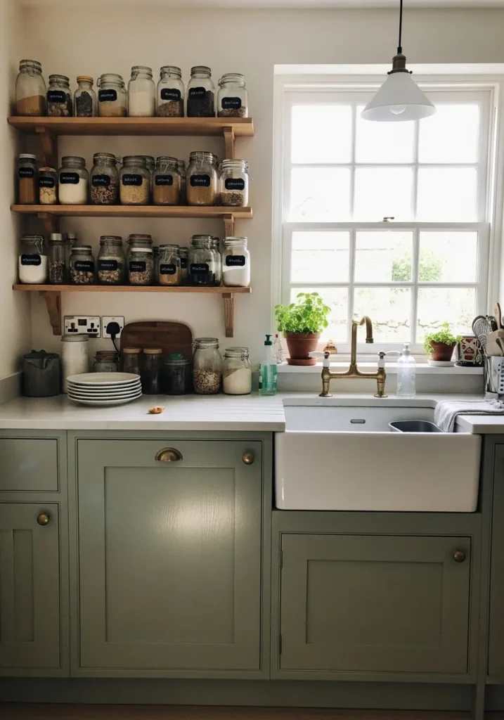
A Soft Sage Green Kitchen
The cabinet color here reads close to Benjamin Moore October Mist (1495). It’s a gentle sage green that leans slightly gray, which keeps it calm rather than colorful. This type of green works well in kitchens because it has enough color to feel interesting but still acts almost like a neutral. You can see how nicely it sits next to the butcher block countertop.
October Mist usually carries a muted, airy undertone that shifts a bit depending on the light. In brighter kitchens it can show more green, while lower light tends to pull out the gray side. It often pairs well with warm wood counters, simple white tile, and classic hardware. Those natural materials tend to bring out the soft character of the color.
A Calm Mid Tone Sage Green Wall
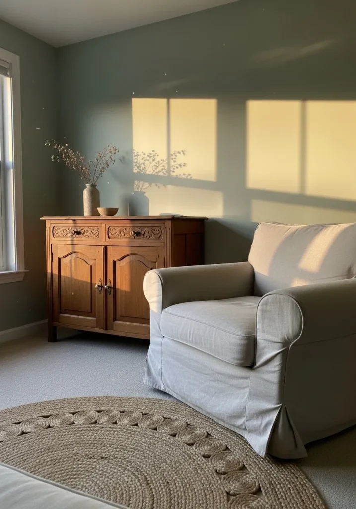
The wall color here looks very close to Benjamin Moore Saybrook Sage (HC-114). It’s a mid tone sage green with a soft gray base, which keeps it feeling relaxed instead of bright. Colors like this often work well in quiet sitting areas because they bring in a little color without making the room feel busy. You can see how nicely it sits beside the warm wood cabinet.
Saybrook Sage usually has an earthy undertone that shifts gently depending on the light. In brighter spaces it leans a bit greener, while dimmer areas bring out the gray side. It tends to look especially natural next to warm woods, woven rugs, and simple neutral fabrics like the armchair here. Rooms that keep the palette soft usually suit this shade best.
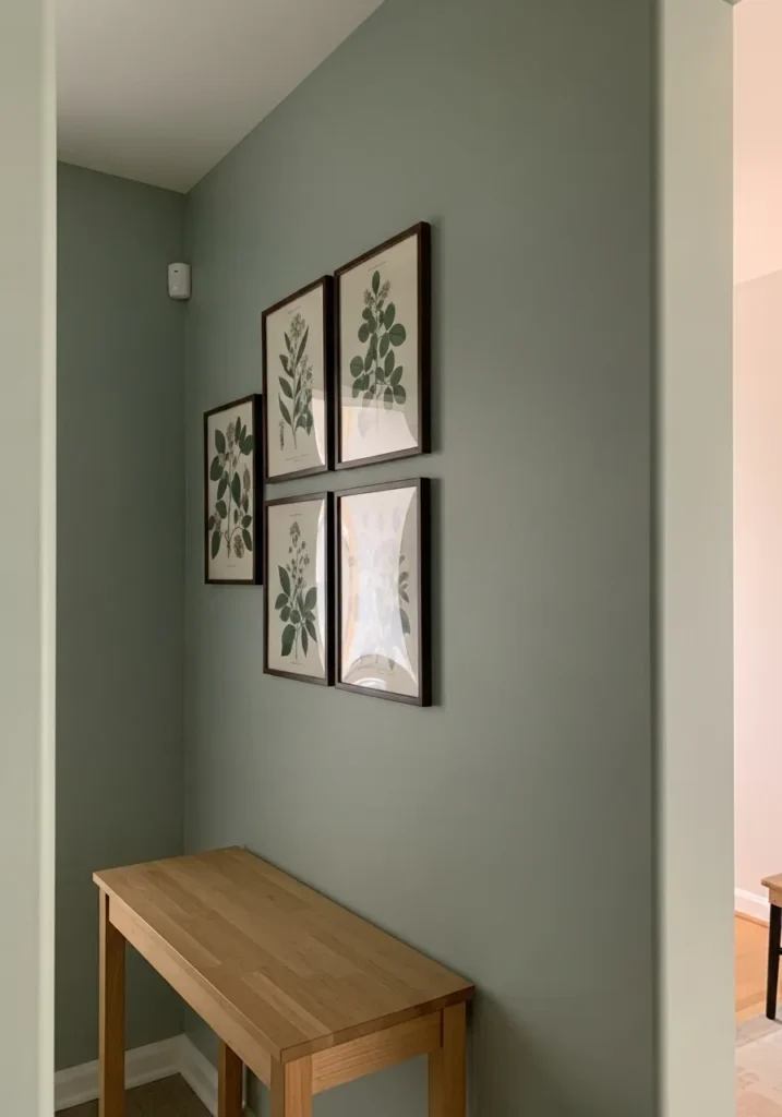
A Light Sage Green Entryway
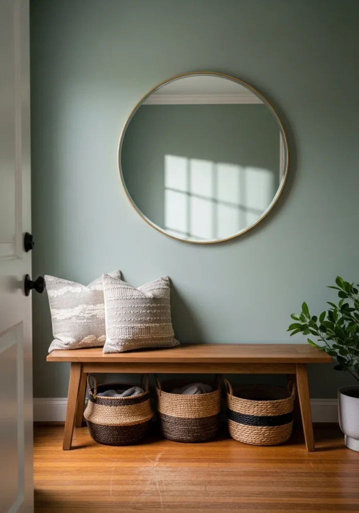
The wall color here looks close to Benjamin Moore Hollingsworth Green (HC-141). It’s a soft sage green that leans slightly gray, which keeps it gentle rather than fresh or leafy. Colors in this range often work well in entry spaces because they feel calm but still bring a little color to the walls. You can see how it sits easily beside the simple wood bench.
Hollingsworth Green usually carries a quiet, slightly dusty undertone. That helps it blend well with natural materials like warm wood floors, woven baskets, and neutral fabrics. In brighter light the green can show a bit more clearly, while lower light pulls it toward a soft gray green. It tends to look best when the room stays fairly simple and natural.
A Muted Sage Green Dining Room
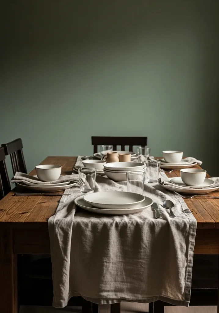
The wall color here looks close to Benjamin Moore Saybrook Sage (HC-114). It’s a mid tone sage green with a soft gray base, the kind of color that feels quiet and steady on the wall. Shades like this often work well in dining rooms because they bring in some color without making the space feel busy. It sits comfortably behind a darker wood table like the one here.
Saybrook Sage usually carries a slightly earthy undertone that shifts depending on the light in the room. In brighter areas it can lean a little greener, while dim corners pull it toward a softer gray green. Colors like this tend to pair nicely with natural woods, simple linens, and neutral ceramics. Keeping the materials fairly warm usually lets this shade look its best.
A Soft Gray Sage Bedroom
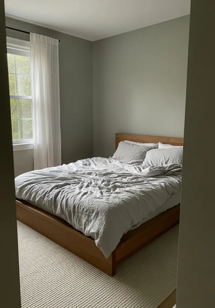
The wall color here reads very close to Benjamin Moore October Mist (1495). It’s a pale sage green that leans gently toward gray, which keeps the room feeling quiet rather than colorful. Shades like this often work well in bedrooms because they stay soft on the eyes. You can see how easily the color sits behind the simple wood bed and light bedding.
October Mist usually carries a calm gray undertone that shifts a little depending on the light in the room. In brighter spaces it shows a bit more green, while dimmer areas pull it toward a soft gray green. This kind of sage tends to work best with natural materials like warm wood, linen, and woven rugs. Too many bright whites nearby can make the color feel cooler than expected.
A Fresh Sage Green Breakfast Corner
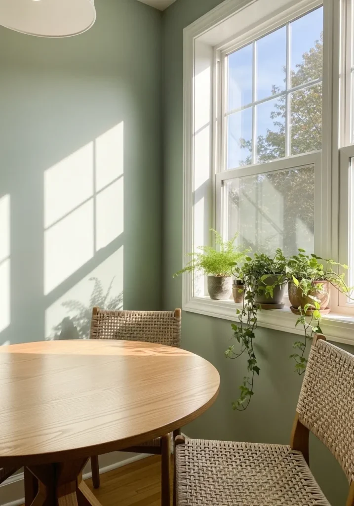
The wall color here reads close to Benjamin Moore Hollingsworth Green (HC-141). It’s a light sage green that leans softly toward gray, which keeps the color feeling gentle instead of bright. Shades like this often work nicely in small dining areas because they bring a bit of color without making the room feel busy. It looks especially comfortable next to the round wood table.
Hollingsworth Green usually carries a quiet, slightly dusty undertone. That undertone helps it sit well beside natural materials like woven chairs and simple wood furniture. In brighter rooms the green can appear a little clearer, while shaded areas pull it closer to a gray green. Rooms with plants and warm wood finishes tend to suit this color very well.
A Muted Sage Green Hallway
The wall color here reads close to Benjamin Moore Hollingsworth Green (HC-141). It’s a soft sage green that leans a bit toward gray, which keeps it calm and easy to live with in smaller spaces. Colors like this tend to work nicely in hallways because they bring gentle color without making the area feel darker or heavy. It also looks comfortable next to the simple wood console table.
Hollingsworth Green usually has a slightly dusty undertone that keeps the green from feeling too fresh. In brighter light the color shows a bit more green, while shaded areas make it appear closer to a gray green. This kind of sage often pairs well with warm woods and simple framed artwork, especially when the rest of the palette stays fairly neutral.
A Soft Sage Green Home Office
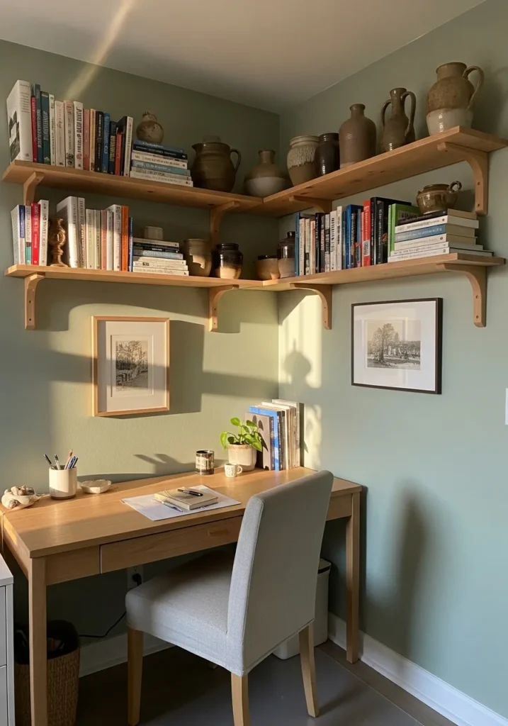
The wall color here reads close to Benjamin Moore October Mist (1495). It’s a light sage green with a gentle gray base, which keeps the color feeling calm instead of fresh or bright. Shades like this often work well in small workspaces because they bring a little color without becoming distracting. It sits comfortably beside the simple wood desk and shelves.
October Mist usually carries a muted undertone that shifts slightly depending on the light in the room. In brighter spaces it shows more of its green side, while lower light pulls it toward a soft gray green. Colors like this tend to look especially natural next to pale woods, pottery, and simple neutral fabrics. Keeping the surrounding materials fairly warm usually helps the color settle in nicely.
A Gentle Sage Green Nursery
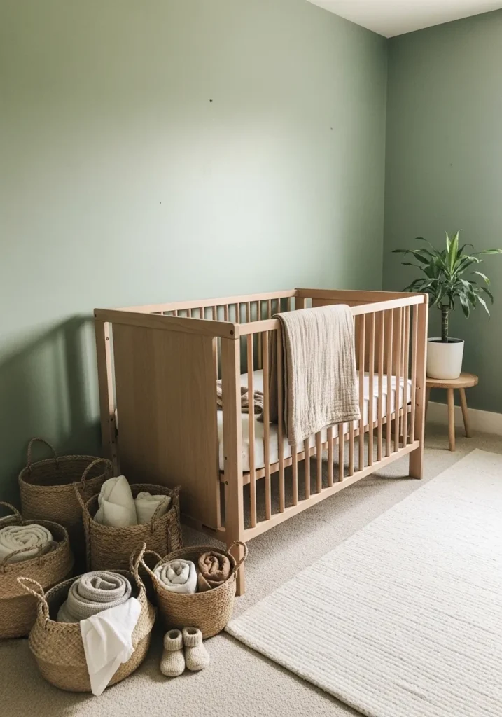
The wall color here looks very close to Benjamin Moore October Mist (1495). It’s a light sage green with a soft gray base, the kind of green that feels calm without becoming too pastel. Colors in this range often work well in nurseries because they stay quiet and easy on the eyes. It also pairs naturally with the simple wood crib.
October Mist usually carries a muted undertone that shifts slightly depending on the light in the room. In brighter spaces it shows more of its green side, while softer light pulls it toward a pale gray green. Shades like this tend to work nicely with natural woods, woven baskets, and neutral fabrics. Keeping the room fairly simple helps the color feel relaxed and settled.
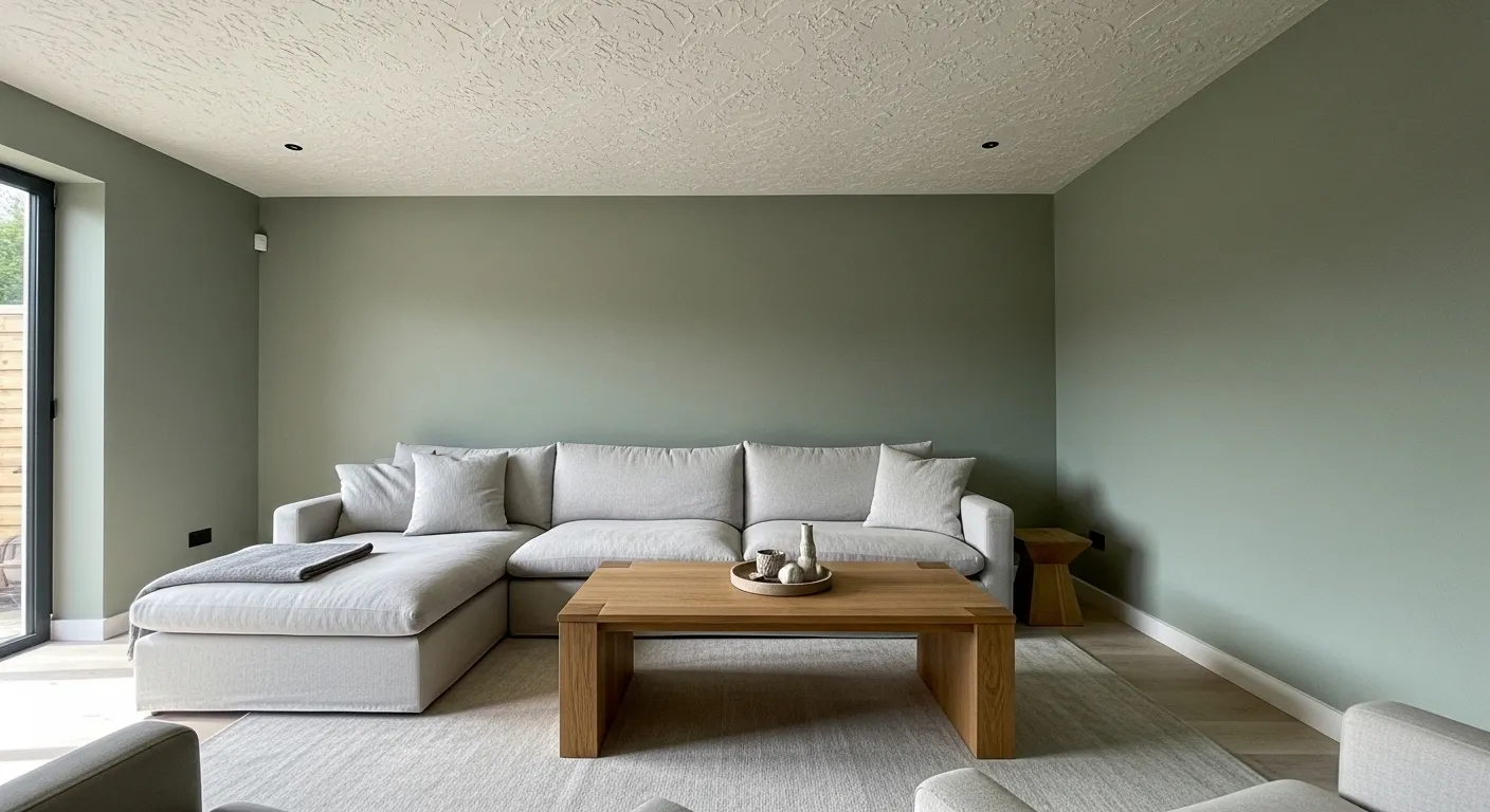
A Soft Classic Sage Green Living Room
The wall color here looks very close to Benjamin Moore Saybrook Sage (HC-114). It’s a gentle mid tone sage green with a soft gray base, which keeps it calm instead of overly green. This kind of shade works well in living rooms because it brings a little color to the walls while still feeling relaxed. It also sits comfortably next to the neutral sofa and simple layered rugs.
Saybrook Sage usually carries a muted, earthy undertone that shifts a bit with the light. In brighter rooms it shows a clearer green, while shaded areas pull it toward a softer gray green. Colors like this often pair well with warm woods, textured fabrics, and simple natural materials. Keeping the surrounding palette fairly quiet tends to let the color settle in nicely.
Soft Sage Green Kitchen Cabinets
The cabinet color here reads very close to Benjamin Moore Saybrook Sage (HC-114). It’s a classic sage green that leans slightly gray, which keeps the color feeling calm and steady instead of bright. Shades like this tend to work well on kitchen cabinets because they bring a bit of color while still behaving almost like a neutral. The tone also sits comfortably beside the warm butcher block counter.
Saybrook Sage usually has a slightly earthy undertone that becomes more noticeable next to natural wood. In brighter kitchens the green shows a little more clearly, while softer light pushes it toward a dusty gray green. This type of sage often looks especially good with simple open shelves, pottery, and warm wood finishes. The whole palette stays quiet and easy to live with.
A Quiet Sage Green Bedroom
The wall color here looks very close to Benjamin Moore Saybrook Sage (HC-114). It’s a medium sage green with a slightly gray cast, which keeps the color calm and steady instead of bright. This type of green often works nicely in bedrooms because it brings color without feeling busy. It also sits comfortably beside the warm wood dresser.
Saybrook Sage usually carries a muted, earthy undertone that shifts depending on the light in the room. In brighter daylight it reads a little greener, while softer light pulls it toward a dusty gray green. Colors like this tend to pair easily with warm wood furniture, simple white trim, and soft neutral fabrics. It’s a relaxed kind of green that feels easy to live with.
A Clean Sage Green Bathroom Wall
The wall color here looks closest to Benjamin Moore October Mist (1495). It’s a soft sage green with a quiet gray base, the kind of color that feels calm without looking dull. Shades like this tend to work well in bathrooms because they bring a little natural color while still keeping the space simple and light. It also pairs nicely with the warm wood vanity.
October Mist usually carries a gentle muted undertone that shifts depending on the light in the room. In brighter light it reads a bit greener, while softer light pulls it toward a pale gray green. Colors like this often look especially good with natural wood, simple mirrors, and clean white surfaces. Everything feels relaxed and uncluttered.
A Calm Mid Tone Sage Living Room
The wall color here looks closest to Benjamin Moore Saybrook Sage (HC-114). It’s a mid tone sage green with a slightly gray base, which helps the color feel settled instead of bright. This type of green often works well in living rooms because it adds color without becoming the main focus. It sits comfortably beside the pale sofa and simple wood shelving.
Saybrook Sage usually has a muted, earthy undertone that shifts depending on the light. In brighter rooms it reads more green, while lower light pulls it toward a dusty gray green. Shades like this tend to pair nicely with soft fabrics, natural wood furniture, and simple neutral pieces. Nothing too busy. The color holds the room together quietly.
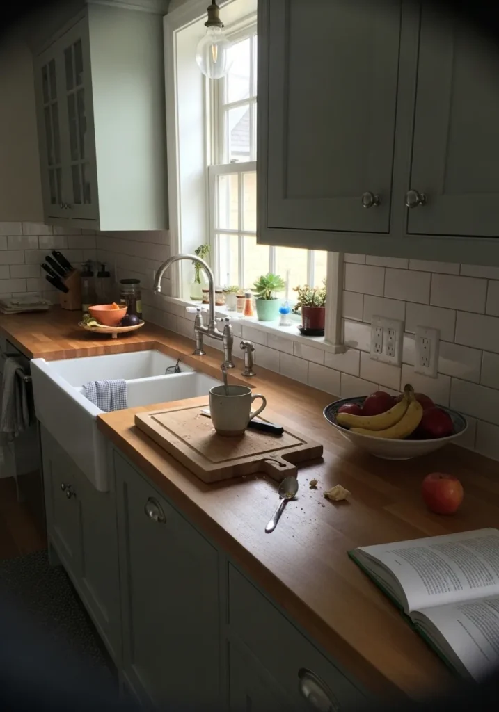
A Muted Sage Green Kitchen
The cabinet color here looks close to Benjamin Moore October Mist (1495). It’s a soft sage green with a gentle gray cast, the kind that feels quiet rather than bright. Shades like this often work well in kitchens because they bring color without making the room feel busy. The tone also sits comfortably beside the warm wood shelves.
October Mist usually has a muted undertone that shifts a little depending on the light. In brighter kitchens it shows a bit more green, while softer light pulls it toward a pale gray green. Colors like this tend to look natural next to warm wood, simple pottery, and white sinks or counters. It’s an easy color to live with day to day.
A Soft Gray Sage Reading Corner
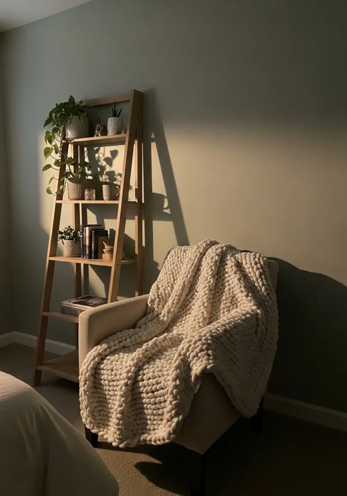
The wall color here reads close to Benjamin Moore October Mist (1495). It’s a light sage green with a noticeable gray cast, which keeps the color quiet and relaxed rather than fresh or bright. Shades like this often work well in bedrooms or reading corners because they bring color while still feeling calm. It sits comfortably beside the pale chair and simple wood ladder shelf.
October Mist usually carries a muted undertone that shifts a little depending on the light in the room. In brighter daylight it leans a bit greener, while softer light pulls it toward a gentle gray green. Colors like this tend to pair nicely with warm woods, chunky knit throws, and simple plants. The whole palette stays soft and easy to settle into.