I have always had a soft spot for rich brown walls, especially when I want a space to feel a little calmer and more settled.
There is something about these tones that makes a room feel comfortable without trying too hard, and I keep coming back to them in my own home.
In this list, I am sharing my favorite Benjamin Moore browns that range from soft cocoa shades to deeper espresso tones that feel a bit more dramatic.
If you are into warm, grounded spaces that still feel easy to live in, these are the kinds of colors I keep saving and coming back to again and again.
Warm Reddish Brown Living Room Walls
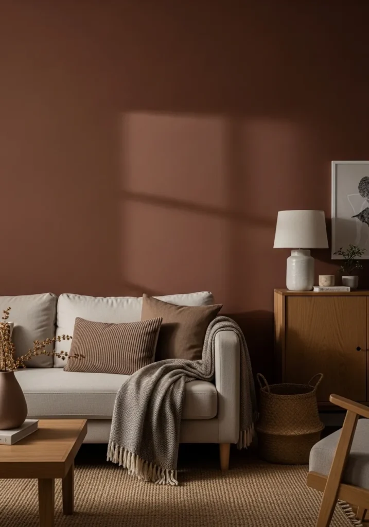
This wall color reads like a rich reddish brown, and it feels very close to Benjamin Moore Audubon Russet. It sits somewhere between brown and terracotta, with a soft warmth that doesn’t feel too heavy. You can see how it works against the light sofa and wood cabinet, giving the room a steady, comfortable base.
The undertone leans warm with a hint of red, so it reacts nicely to natural light and doesn’t turn muddy. It does best with lighter fabrics, soft beige, and mid-tone woods like the ones here. In a darker room, it can feel a bit dense, so it helps to keep some contrast around it.
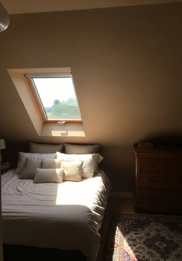
Deep Chocolate Brown Bedroom Walls
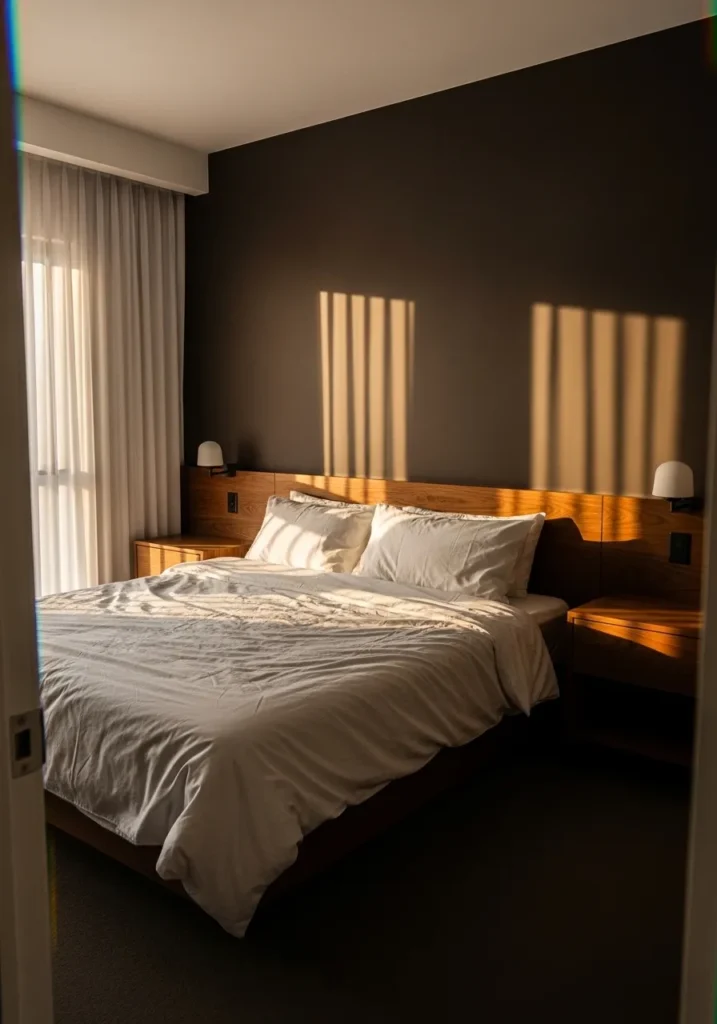
This wall color reads as a deep chocolate brown, and it feels very close to Benjamin Moore Bittersweet Chocolate. It’s a dark, full-bodied brown that leans warm without going red, which gives it a calm, steady look. Against the light bedding and simple wood headboard, it comes across as solid and easy to live with.
The undertone stays on the warmer side but not overly rich, so it holds its color even when the light shifts. It works well in bedrooms where you want things a little quieter. Lighter fabrics and mid-tone woods help break it up, otherwise it can start to feel a bit heavy in smaller spaces.
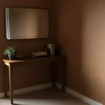
Soft Taupe Brown Walls For Quiet Corners
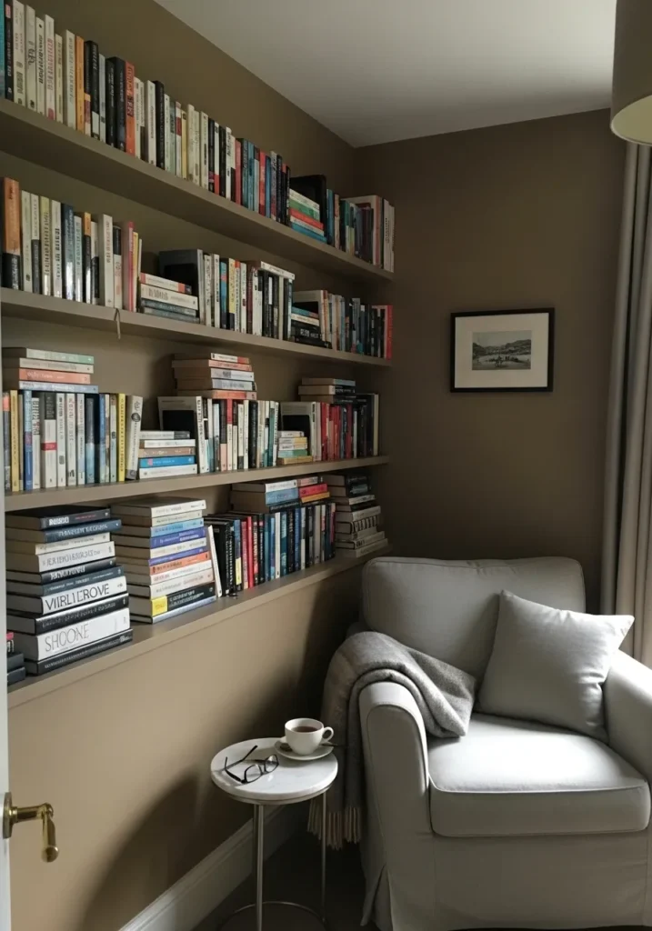
This wall color reads as a soft taupe brown, and it feels closest to Benjamin Moore Stone Hearth. It sits right between brown and gray, which gives it a calm, settled look without feeling too dark. Around the built-in shelves and light chair, it comes across as easy and steady, not distracting.
The undertone leans slightly warm with a bit of gray, so it shifts gently depending on the light. In brighter rooms, it feels lighter and more relaxed. In dim corners, it deepens just enough to feel cozy. It pairs well with off-white fabrics and simple wood tones, and it is one of those colors that does not ask for much to look right.
Dark Earthy Brown Walls In Dining Spaces
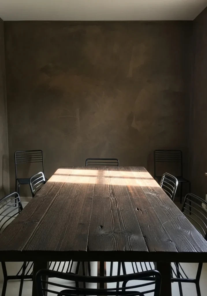
This wall color reads as a deep earthy brown, and it comes very close to Benjamin Moore Wenge. It has that grounded, almost soil-like tone that feels steady without going too black. Next to the dark wood table, it blends in a quiet way rather than standing out.
The undertone leans slightly warm with a muted base, so it stays soft instead of sharp. It works best with natural materials like wood and simple metal finishes, where everything feels a bit worn in. In low light, it can look darker than expected, so a bit of contrast helps.
Warm Mid Tone Brown For A Home Office
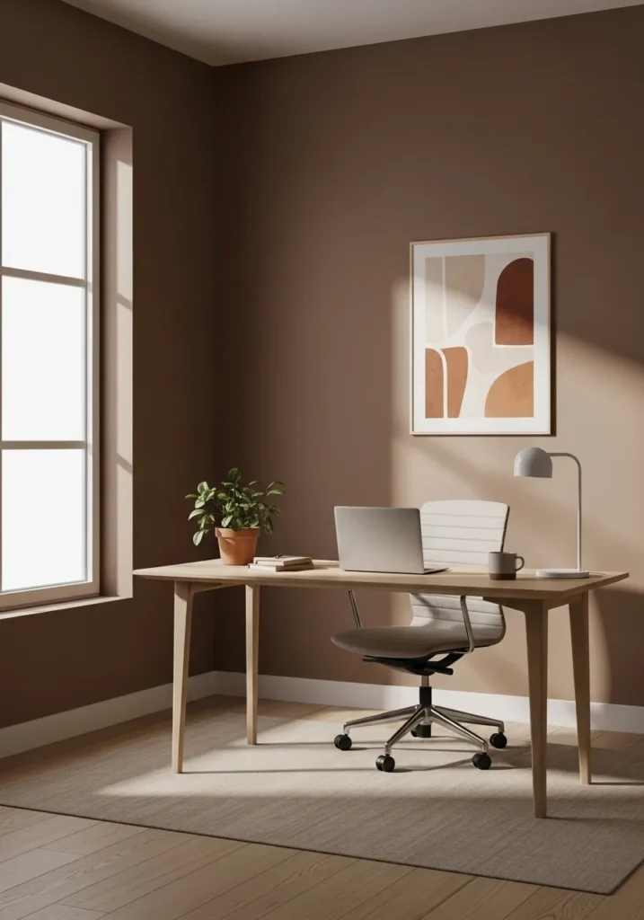
This wall color reads as a warm mid-tone brown, and it feels closest to Benjamin Moore Toasted Almond. It sits right in that comfortable middle range, not too dark and not too light, with a soft warmth that makes the room feel settled. Next to the light wood desk, it looks natural and easy to work with.
The undertone leans gently warm with a hint of beige, so it stays soft rather than heavy. It works well in spaces that get good daylight, where it can show a lighter side. Paired with pale woods, simple textiles, and a bit of greenery, it keeps everything feeling calm without looking dull.
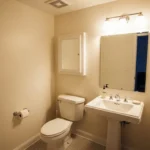
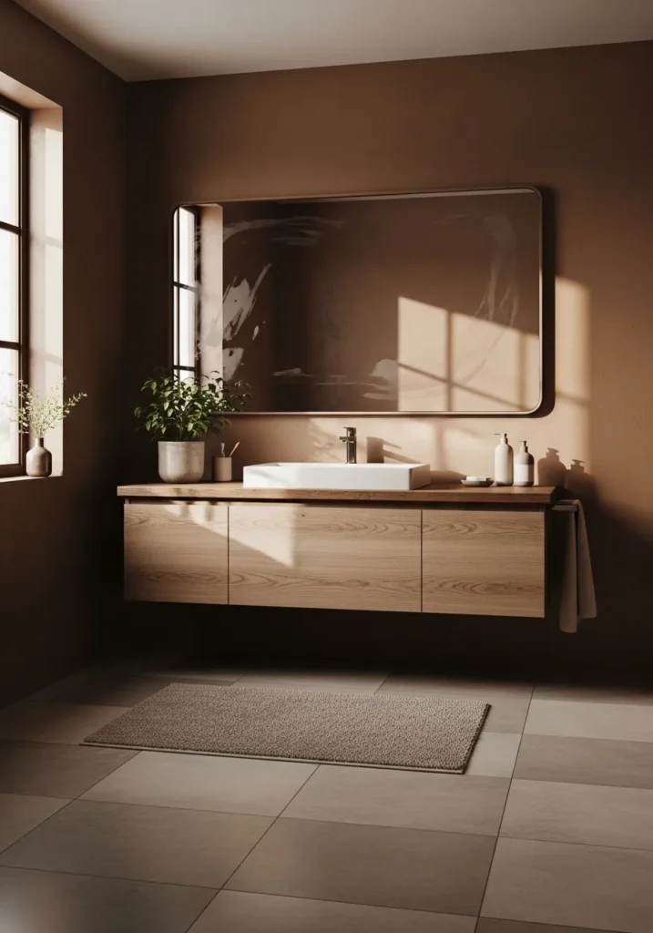
Earthy Brown Walls With A Soft Glow
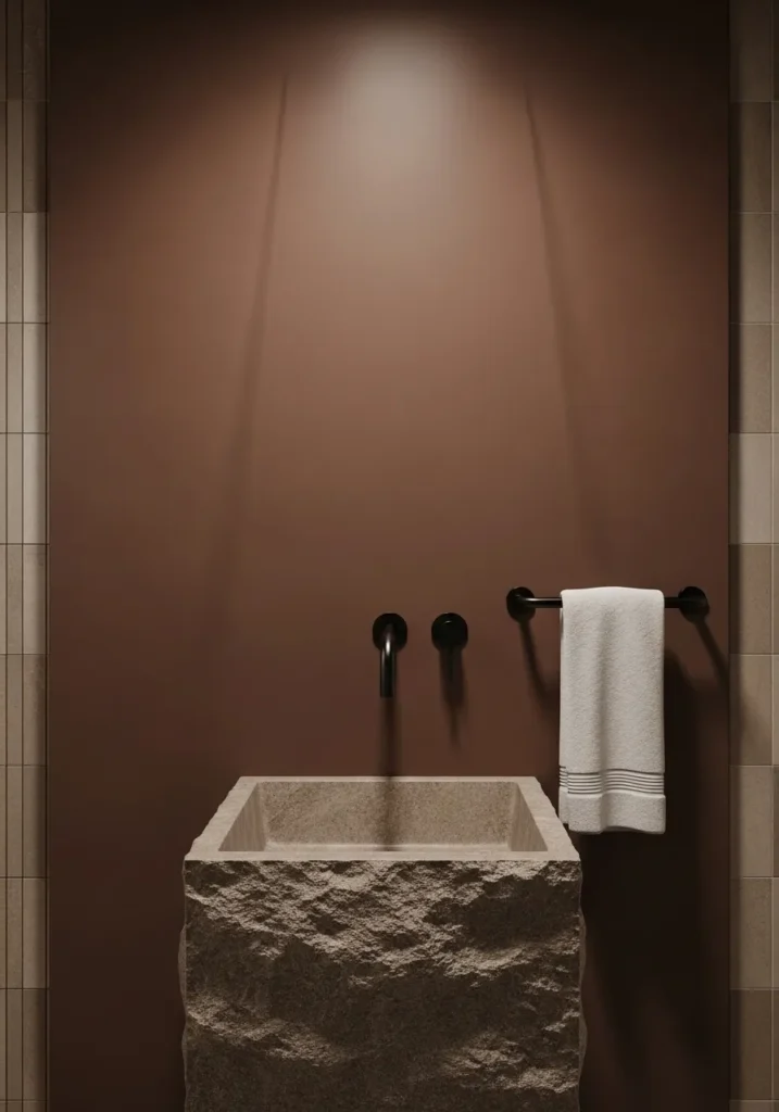
This wall color reads as an earthy medium brown, and it feels closest to Benjamin Moore Toasted Almond. It has a warm, slightly muted tone that sits comfortably between brown and a soft tan. Next to the stone sink, it feels natural and a little rustic without going too dark.
The undertone leans warm with a gentle clay note, so it stays soft under different lighting. In brighter light, it looks lighter and more relaxed. In lower light, it deepens but still keeps that earthy feel. It works well in bathrooms where you want something warmer than gray but not too heavy.
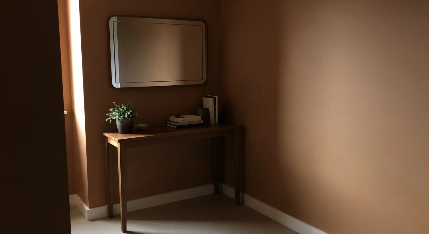
Warm Brown Walls For Entry Spaces
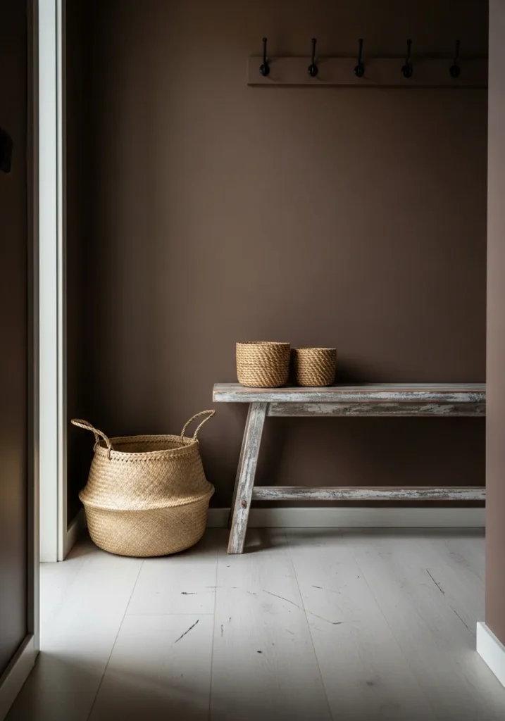
This wall color reads as a soft warm brown, and it feels very close to Benjamin Moore Davenport Tan. It sits in that easy middle range where brown meets a bit of beige, so it feels relaxed instead of heavy. Next to the woven baskets and light wood bench, it looks natural and lived-in without trying too hard.
The undertone leans warm with a slight earthy feel, which helps it stay steady in different lighting. It works well in smaller areas like entryways where you want something a bit richer but not too dark. Lighter floors and simple textures help keep it from feeling closed in, which makes a difference in tight spots.
Muted Brown Kitchen Cabinets
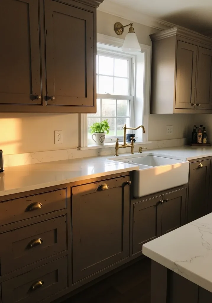
This cabinet color reads as a muted brown with a slightly gray base, and it feels closest to Benjamin Moore Kendall Charcoal. It sits right on that line between brown and charcoal, which gives it a quieter look than a typical warm brown. Against the white countertop and farmhouse sink, it comes across steady and not too busy.
The undertone leans a bit cool, which keeps it from looking too rich or red. It works well in kitchens that get some natural light, where it can soften and show more brown. Paired with brass hardware and light surfaces, it stays balanced and easy to live with.
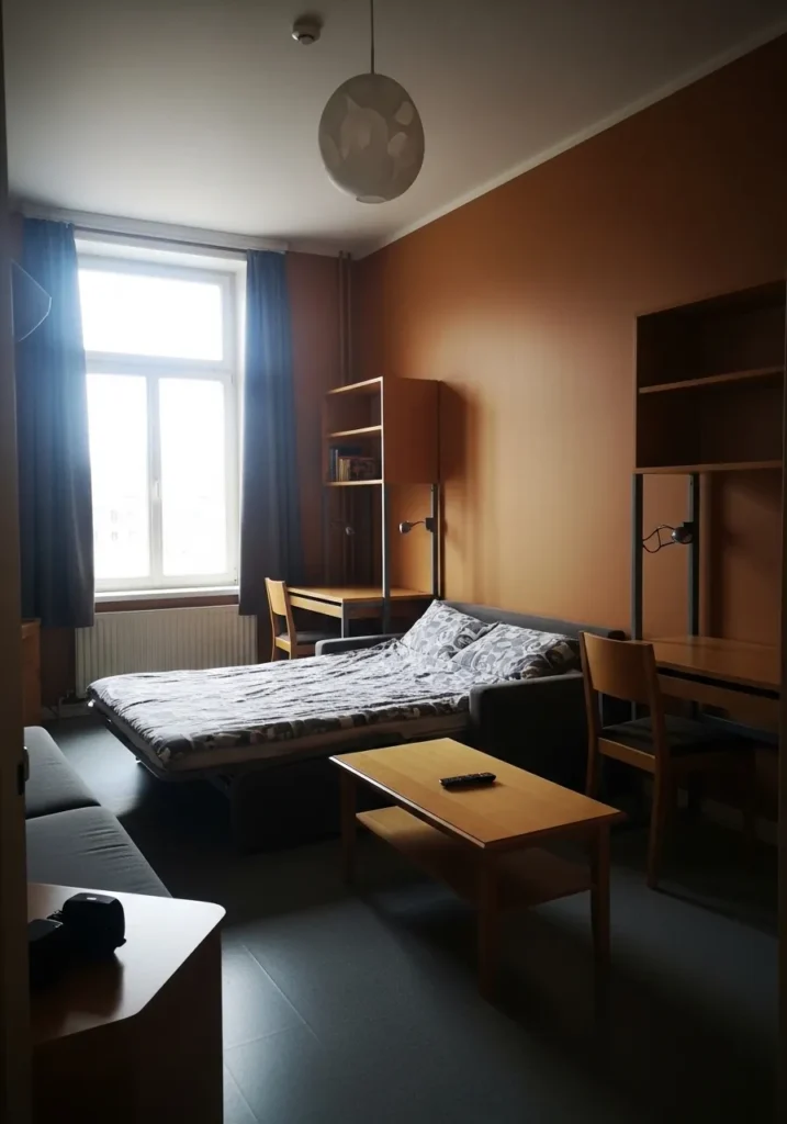
Warm Terracotta Brown Living Room Walls
This wall color reads as a warm terracotta brown, and it feels very close to Benjamin Moore Potters Clay. It sits between brown and muted orange, which gives it a soft, sun-worn look instead of a heavy one. Next to the gray sofa and simple wood table, it comes across relaxed and easy to settle into.
The undertone leans warm with a clear earthy note, so it shifts a bit depending on the light. In brighter light, it shows more of that clay tone. In lower light, it deepens toward brown. It works well with neutral fabrics and natural wood, though very cool grays can make it feel slightly off if you are not careful.
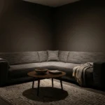
Deep Espresso Brown For Cozy Rooms
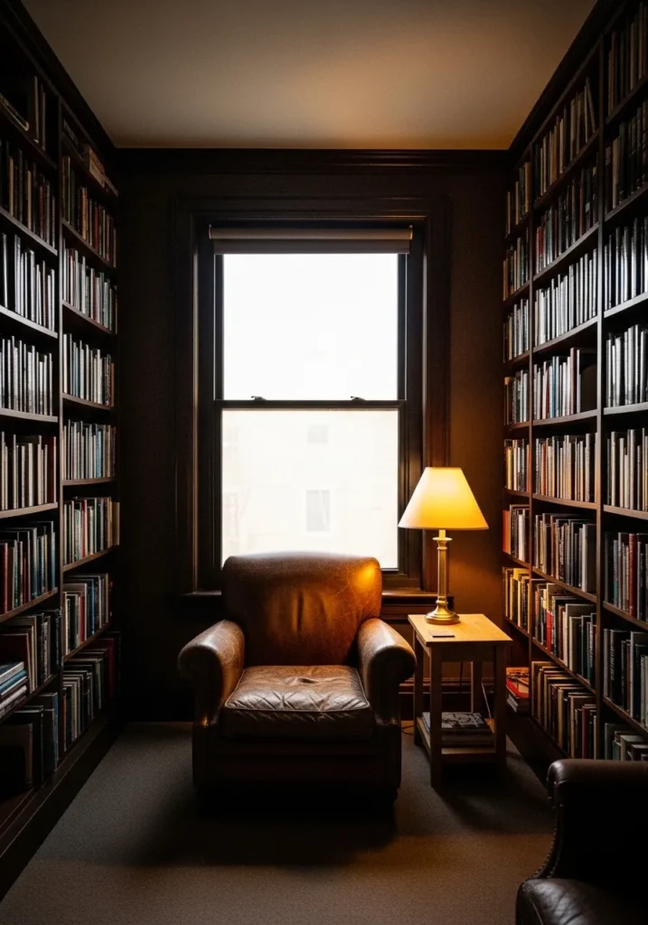
This wall color reads as a deep espresso brown, and it feels closest to Benjamin Moore Java. It is a very dark brown with a soft warmth that keeps it from looking flat or black. Around the built-in shelves and leather chair, it comes across rich but still familiar.
The undertone leans warm with a slight red base, so it holds onto that brown tone even in low light. It works best in smaller rooms where you want a more enclosed feel, like a reading space. Lighter trim or a bit of warm lighting helps break it up, otherwise it can feel quite heavy.
Medium Brown Hallway Walls
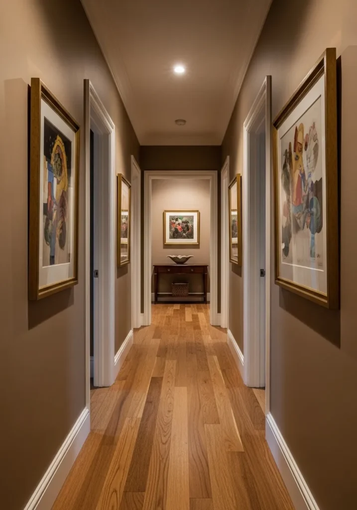
This wall color reads as a medium warm brown, and it feels very close to Benjamin Moore Davenport Tan. It has that balanced tone that sits comfortably between beige and deeper brown, so it feels steady without getting too dark. Along a hallway like this, it gives the walls a bit more presence without closing things in.
The undertone leans warm with a soft earthy base, which works nicely with natural wood floors and white trim. It tends to stay consistent under artificial lighting, which matters in spaces like hallways. Keeping the trim light helps it feel open, otherwise it can start to feel a little narrow.
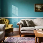
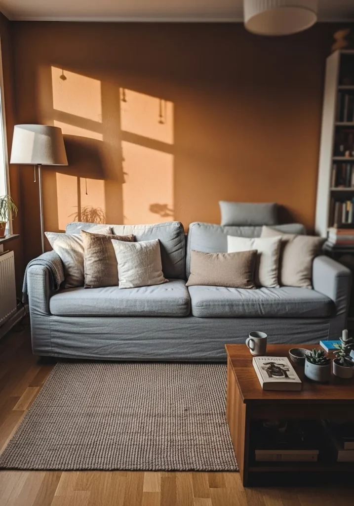
Rich Brown Accent Wall In A Bright Living Room
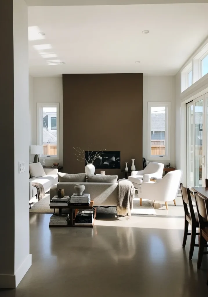
This wall color reads as a rich mid to deep brown, and it feels closest to Benjamin Moore Mink. It has a soft depth to it that sits between brown and a muted gray base, so it looks full without feeling too heavy. Against the lighter seating and open space, it holds its place without taking over.
The undertone leans slightly cool, which helps it stay steady in bright light and not turn too warm or red. It works well as a single accent wall, especially in rooms with a lot of natural light. Pairing it with white walls and soft neutral fabrics keeps the space feeling open, even with a darker color in play.
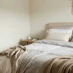
Soft Caramel Brown Bedroom Walls
This wall color reads as a soft caramel brown, and it feels closest to Benjamin Moore Maple Syrup. It sits on the lighter side of brown, with a gentle warmth that keeps it from feeling heavy. Around the light bedding and simple wood dresser, it comes across calm and easy to live with.
The undertone leans warm with a slight golden note, so it shifts nicely as the light changes. In brighter light, it feels lighter and a bit creamy. In lower light, it settles into a deeper brown. It works well in smaller bedrooms where you still want some color without going too dark.
Dark Warm Brown For Small Dining Areas
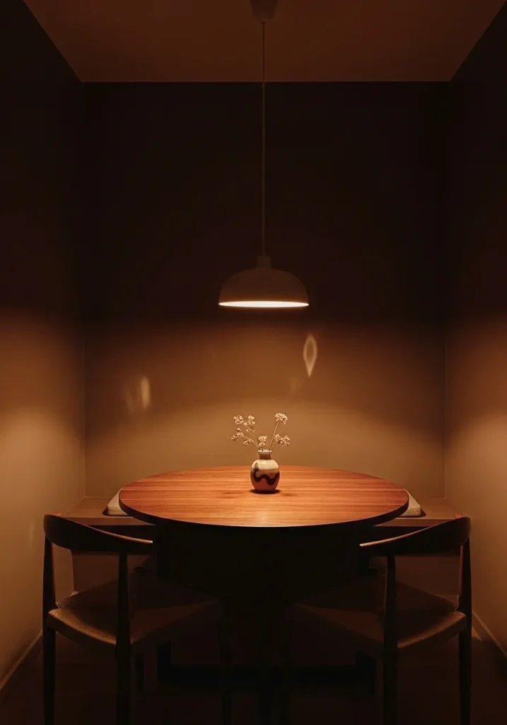
This wall color reads as a dark warm brown, and it feels closest to Benjamin Moore French Press. It is a deep, coffee-like brown that leans warm without turning too red, which gives it a quiet, enclosed feel. Around a small table like this, it makes the space feel more defined and a bit tucked away.
The undertone stays warm and slightly soft, so it does not feel too sharp even at this depth. It works best in smaller dining spots or corners where you want a bit of intimacy. Keeping the lighting warm helps, otherwise it can read almost too dark in low light.
Warm Clay Brown Walls For Layered Spaces
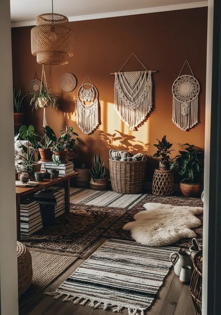
This wall color reads as a warm clay brown, and it feels closest to Benjamin Moore Potters Clay. It has that mix of brown and muted orange that gives it a soft, earthy feel without looking too bold. Around the woven wall hangings and plants, it blends in naturally and feels easy to build around.
The undertone leans warm with a slight reddish base, so it shifts a bit depending on the light. In brighter light, it shows more of that clay tone. In softer light, it settles into a deeper brown. It works well with layered textures like rugs and baskets, though cooler tones can feel a little out of place next to it.
Warm Walnut Brown For Kitchen Cabinets
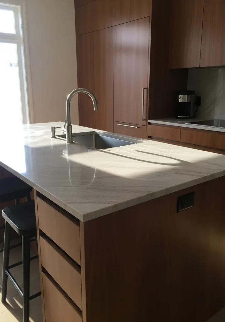
This cabinet color reads as a warm walnut brown, and it feels closest to Benjamin Moore Kona. It sits in that rich mid to dark range, with a natural wood-like tone that feels steady and familiar. Next to the light countertop, it shows enough depth without looking too heavy.
The undertone leans warm with a slight reddish base, which keeps it from going flat or gray. It works well in kitchens with good daylight, where it can show some variation across the surface. Paired with light stone and simple hardware, it stays balanced and easy to use every day.
Dark Coffee Brown Accent Wall
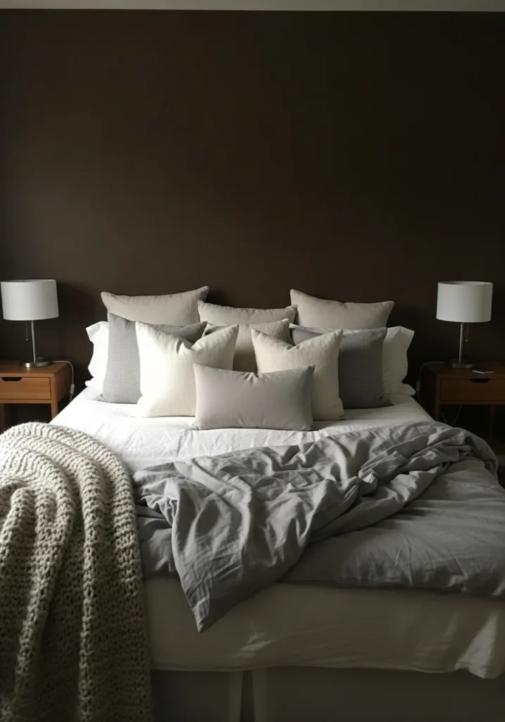
This wall color reads as a dark coffee brown, and it feels closest to Benjamin Moore French Roast. It is a deep, warm brown that sits just shy of black, which gives it a strong presence without looking flat. Behind the bed and light bedding, it creates a clear contrast that feels simple and steady.
The undertone leans warm with a slight richness, so it keeps its brown tone even in lower light. It works best as an accent wall, especially in bedrooms where you want a bit more depth. Lighter linens and wood tones help balance it out, otherwise it can start to feel a little too heavy in the space.
Warm Reddish Brown For Cozy Corners
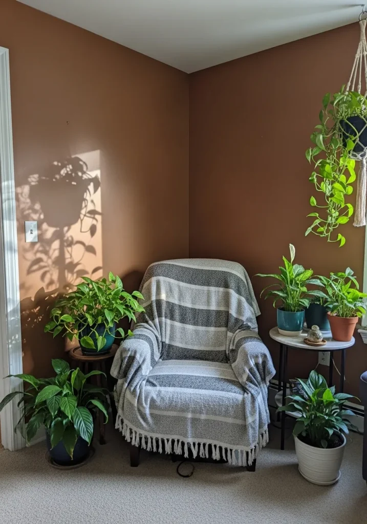
This wall color reads as a warm reddish brown, and it feels closest to Benjamin Moore Rust. It has that earthy brown base with a noticeable red tone, which gives it a bit more life than a standard brown. Around the plants and simple chair, it feels relaxed and easy to sit with for a while.
The undertone leans clearly warm, so it pairs well with greenery and natural textures. In brighter light, the red comes forward a bit more. In softer light, it settles back into a deeper brown. It works nicely in small corners like this where you want a bit of color without going too dark.
Medium Warm Brown For Dining Rooms
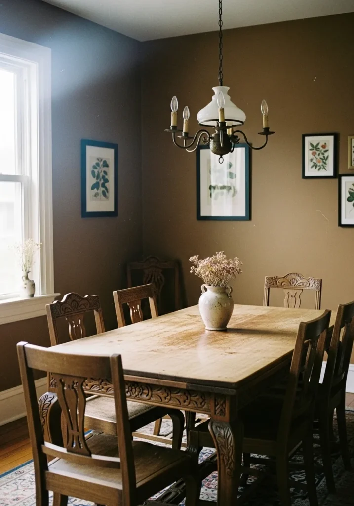
This wall color reads as a medium warm brown, and it feels closest to Benjamin Moore Fairview Taupe. It sits right in that comfortable middle range, not too dark and not too light, with a soft brown base that has a hint of warmth. Around the wood dining table, it blends in naturally and feels easy to live with.
The undertone leans slightly warm with a muted, earthy feel, so it does not pull too red. It works well in dining rooms with natural light, where it can shift a bit throughout the day. Paired with classic wood furniture and simple wall art, it stays steady and relaxed without feeling too heavy.
Burnt Caramel Brown For Small Rooms
This wall color reads as a burnt caramel brown, and it feels closest to Benjamin Moore Audubon Russet. It has that mix of brown and orange that gives it a slightly vintage look without feeling dated. In a small room like this, it brings in color but still feels grounded and easy to sit with.
The undertone leans warm with a noticeable orange base, so it shifts depending on the light. Near the window, it looks lighter and a bit more golden. In lower light, it deepens into a richer brown. It works best with simple wood furniture and soft fabrics, otherwise it can start to feel a bit busy.
Rich Mocha Brown For Bathrooms
This wall color reads as a rich mocha brown, and it feels closest to Benjamin Moore Chocolate Truffle. It sits in that deeper brown range but still has a softness to it, so it does not feel too harsh. Next to the light wood vanity and white sink, it gives a nice contrast that feels calm and steady.
The undertone leans warm with a slight creamy brown base, which helps it stay balanced in different lighting. With natural light from a window, it shows more warmth. In lower light, it deepens and feels more cocooned. It works well in bathrooms where you want something darker but still comfortable to use every day.
Deep Chestnut Brown Around A Fireplace
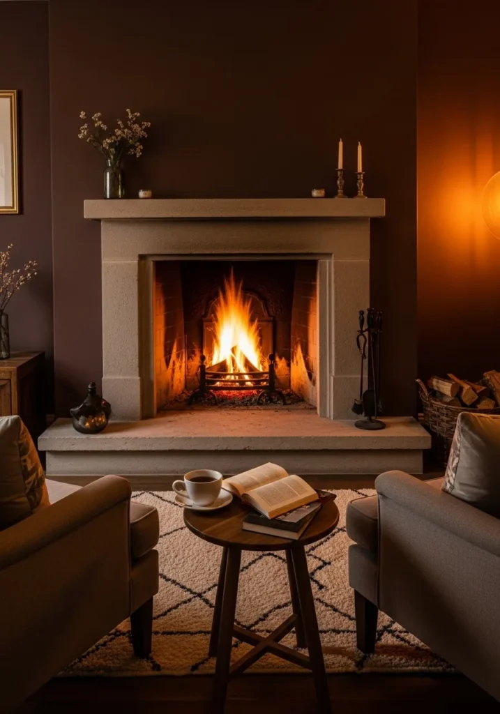
This wall color reads as a deep chestnut brown, and it feels closest to Benjamin Moore Mink. It sits between brown and a soft reddish tone, which gives it a fuller look than a flat dark color. Around a fireplace like this, it feels steady and a bit traditional in a good way.
The undertone leans warm with a hint of red, so it works well with stone and warm lighting. In brighter light, you notice more of that chestnut tone. In lower light, it settles into a darker brown. It works best in living rooms where you want a bit more depth without going all the way to near-black.
Soft Cocoa Brown For Living Rooms
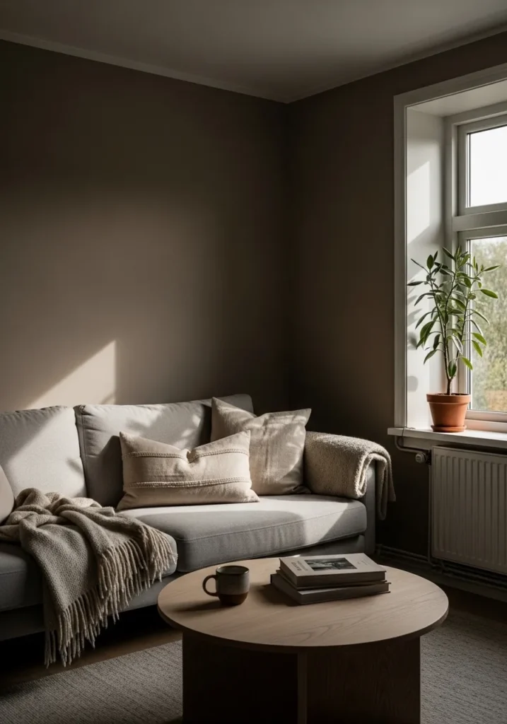
This wall color reads as a soft cocoa brown, and it feels closest to Benjamin Moore Brownstone. It sits in that mid to deep range, but it has a muted quality that keeps it from feeling too dark. Next to the light sofa and simple wood table, it feels calm and easy to settle into.
The undertone leans slightly warm with a subtle gray note, so it stays balanced rather than overly rich. In brighter light from the window, it looks a bit lighter and softer. In lower light, it deepens without turning too heavy. It works well in living rooms where you want color but still keep things relaxed.