I have always had a soft spot for moody blue walls, especially the kind that feel calm but still make a room feel put together.
There is just something about a deep blue that makes everything around it look a little more intentional, even the simple pieces.
I started using these shades in small corners first, then slowly moved into bigger spaces once I saw how easy they were to live with.
Some of these Benjamin Moore blues lean gray, some feel a bit green, and a few sit right in that perfect in between space.
If you are thinking about trying a darker color but feel unsure, this is where I would start.
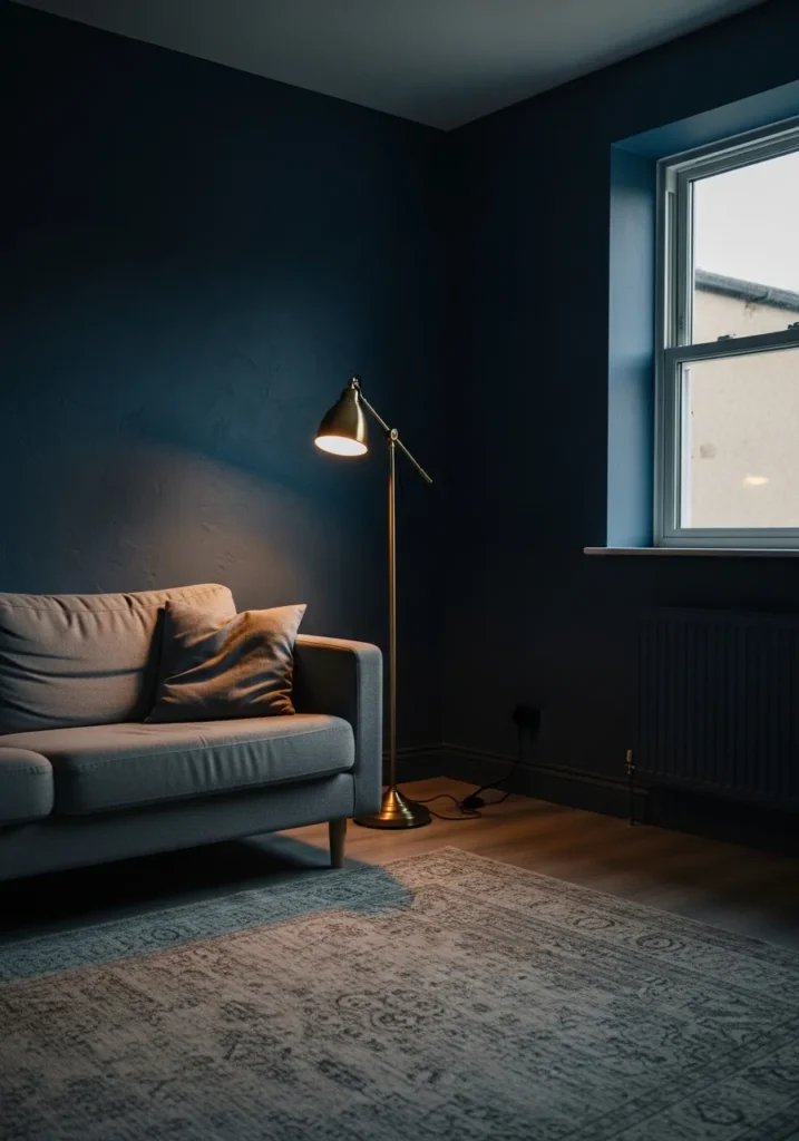
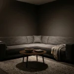
This looks very close to Benjamin Moore Hale Navy, a deep, cool navy that leans slightly muted rather than overly crisp. It’s the kind of blue that feels settled and calm, not bright or playful. You can see how it sits quietly behind a light sofa and a simple floor lamp, letting the room feel a bit more grounded without getting too dark.
Hale Navy tends to read cooler, especially next to soft gray fabrics and minimal trim. In lower light, it can shift almost inky, so it works best if you have at least one decent window or some layered lighting. I like it with pale wood floors, brushed brass, or even off-white textiles just to keep things from feeling too closed in.
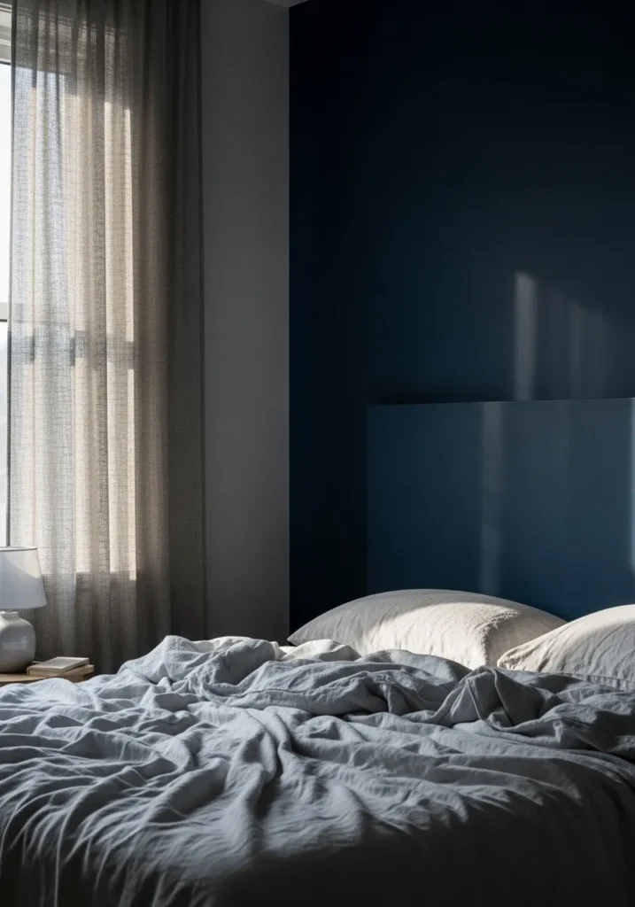
Soft Moody Blue For A Calm Bedroom
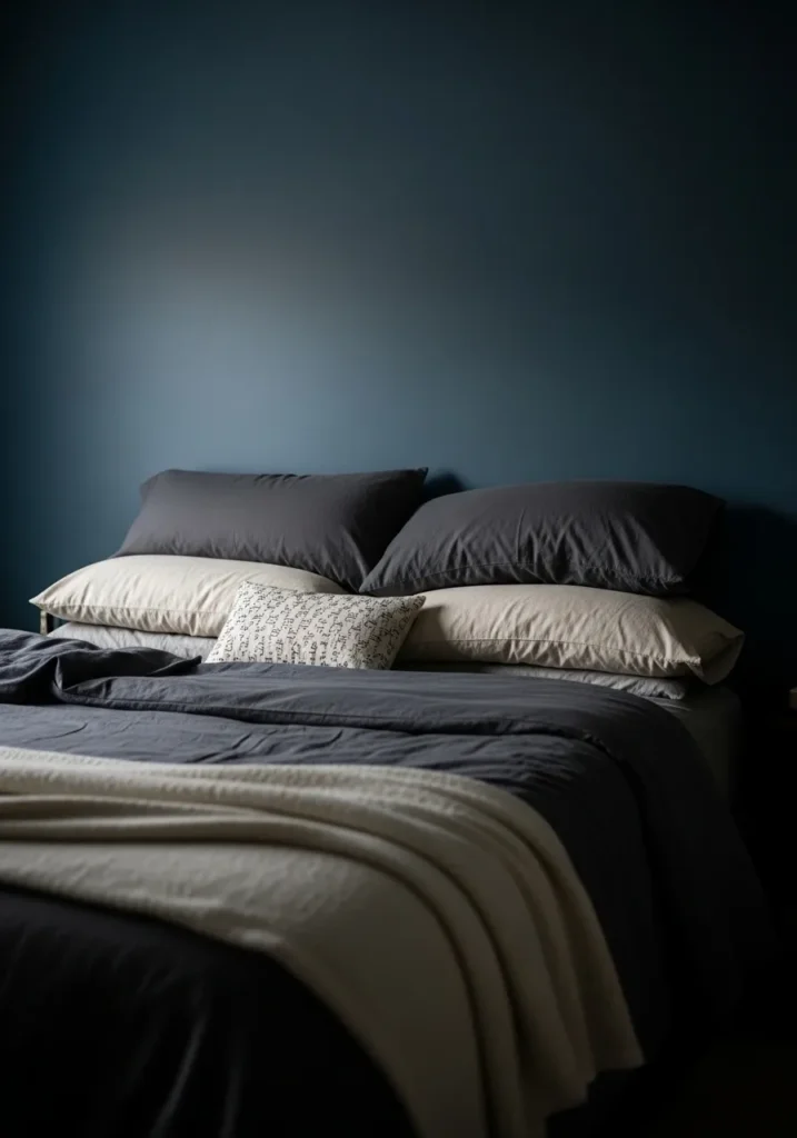
This reads very close to Benjamin Moore Van Deusen Blue, a deep blue that sits somewhere between navy and slate. It has a slightly softened look, not too sharp, which is why it works so well behind neutral bedding like this. It feels steady and easy to live with, especially in a bedroom where you want things to stay quiet.
The undertone leans a bit gray, so it shifts depending on the light. In dim corners it can look deeper and more muted, while brighter light pulls out a cooler blue. I like it paired with layered whites, soft grays, and simple fabrics. Nothing too crisp or high contrast, or it can start to feel a little stark.
Rich Blue Built Ins With A Softer Edge
This looks closest to Benjamin Moore Newburyport Blue, a deep blue that carries a bit more warmth than a classic navy. It has that slightly softened, almost teal-leaning feel, which makes it easier to use across a whole wall or built-ins without feeling too heavy. You can see how it works around shelving and wood tones without turning overly dark.
There’s a gentle green undertone in it, so it shifts depending on what you place nearby. Next to warm wood, it feels a touch richer and more relaxed. In cooler light, it leans deeper and a bit moodier. I find it works well in reading corners, offices, or any spot where you want color but still want it to feel easy to sit with for a while.
Classic Blue Cabinets That Feel Lived In
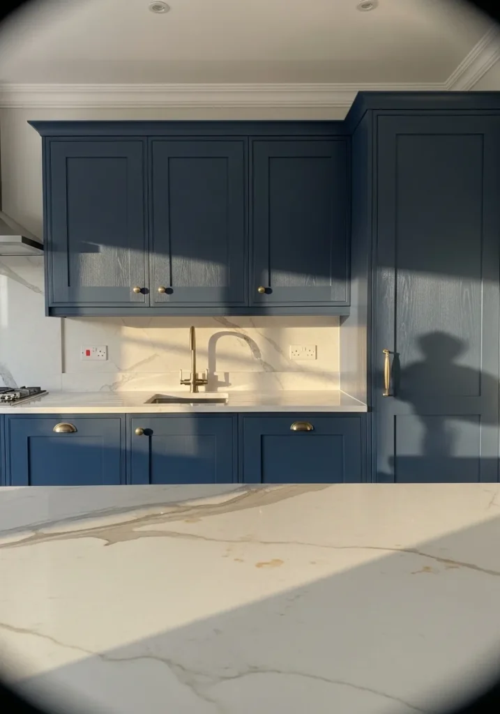
This looks very close to Benjamin Moore Hale Navy again, though here it reads a touch softer and slightly more relaxed on cabinetry. It’s a deep blue, but not harsh. It has that steady, familiar feel that works well in kitchens, especially when paired with lighter countertops like the marble shown here.
The undertone leans cool with just enough gray to keep it from feeling too bold. In brighter light, it can show more blue, while in shadow it settles into a darker tone. I like it with warm brass hardware and creamy whites since that mix keeps the space from feeling too sharp. It’s one of those colors that tends to age well over time.
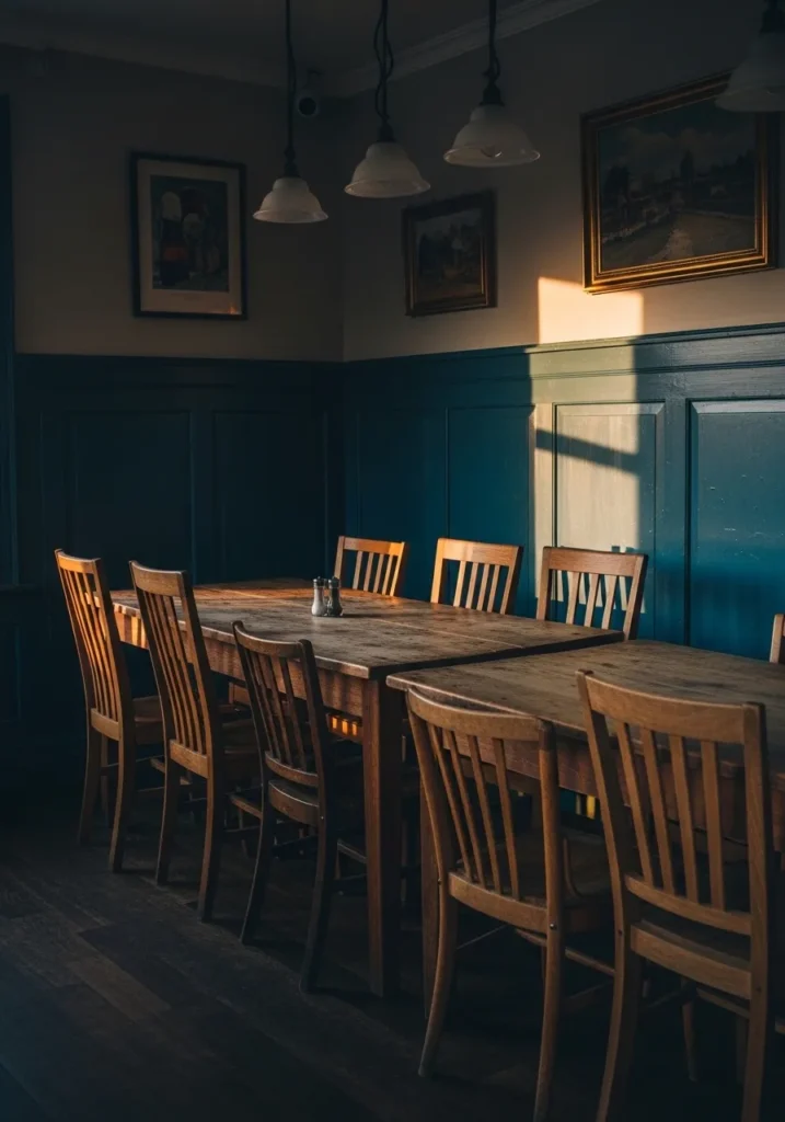
Deep Blue Walls In A Dining Space
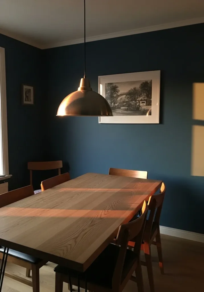
This reads very close to Benjamin Moore Gentleman’s Gray, a rich blue that carries a noticeable green undertone. It’s not a flat navy. There’s a bit of depth to it that shifts as you move around the room, which is why it works so nicely behind warm wood like this dining table.
That slight green undertone is what keeps it from feeling too cold. In softer light it can lean deeper and moodier, while brighter light pulls out more of that blue-green mix. I tend to like it with mid-tone woods and simple white trim, just to keep things feeling balanced and not too heavy.
Fresh Blue Walls In A Small Bathroom
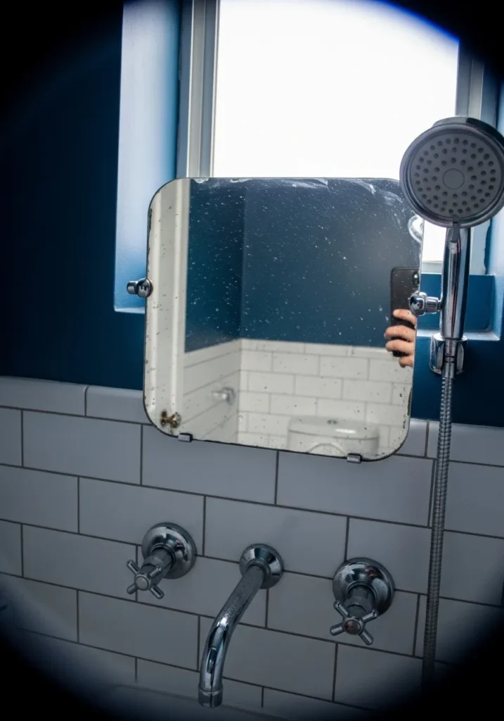
This looks closest to Benjamin Moore Blue Note, a deep blue with a slightly crisp, clean edge to it. It’s still moody, but it feels a bit brighter than some of the heavier navy tones. Against simple white tile like this, the color comes through clearly without feeling too dark or closed in.
There’s a cool undertone here, leaning more blue than green, which keeps it looking sharp next to chrome fixtures. In a smaller space, it can shift depending on light from the window, sometimes deeper, sometimes clearer. I tend to like this kind of blue in bathrooms since it pairs easily with white surfaces and keeps things feeling straightforward.
Deep Blue Hallway Walls That Shift With Light

This feels closest to Benjamin Moore Evening Dove, a dark blue with a noticeable gray undertone that keeps it from reading too bold. It sits somewhere between navy and charcoal blue, which is why it works so well in a narrow space like a hallway. The color stays calm and a bit muted rather than jumping out.
That gray undertone really shows next to darker wood floors, giving the whole space a slightly softer edge. In lower light it leans deeper and more shadowy, while brighter spots bring out more blue. I like this kind of shade for transitional areas where you want color, but not something that feels too busy.
Dark Blue Walls For A Quiet Work Space

This looks very close to Benjamin Moore Hale Navy again, though here it reads a bit softer and more settled on a full wall. It’s a deep, cool blue with a slight gray base, which keeps it from feeling too sharp. In a work area like this, it gives a steady backdrop that doesn’t pull too much focus from the desk.
The gray undertone shows more as the light drops, making the color feel heavier and more muted. With darker wood furniture and simple finishes, it leans into that calm, slightly serious feel. I tend to think this kind of blue works best in offices or study corners where you want things to feel a little more contained and less distracting.
Soft Blue On Sloped Bedroom Walls
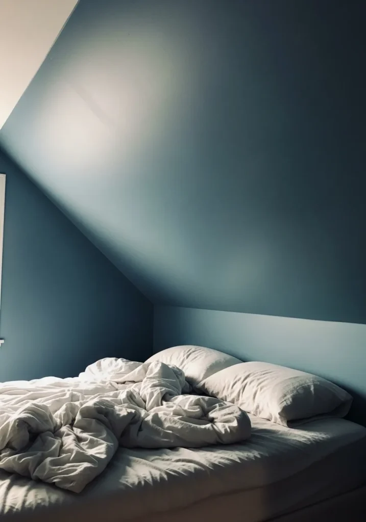
This reads very close to Benjamin Moore Smoke, a muted blue with a noticeable gray base that keeps it feeling light but still a bit moody. It’s not a strong navy. It sits in that softer range where the color feels calm and easy, especially around simple white bedding like this.
The gray undertone helps it shift nicely through the day. In brighter light it looks more like a faded blue, and in lower light it leans a little deeper. I like this kind of shade for smaller or angled rooms since it doesn’t feel too heavy, even when it wraps across the ceiling.
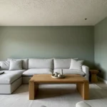
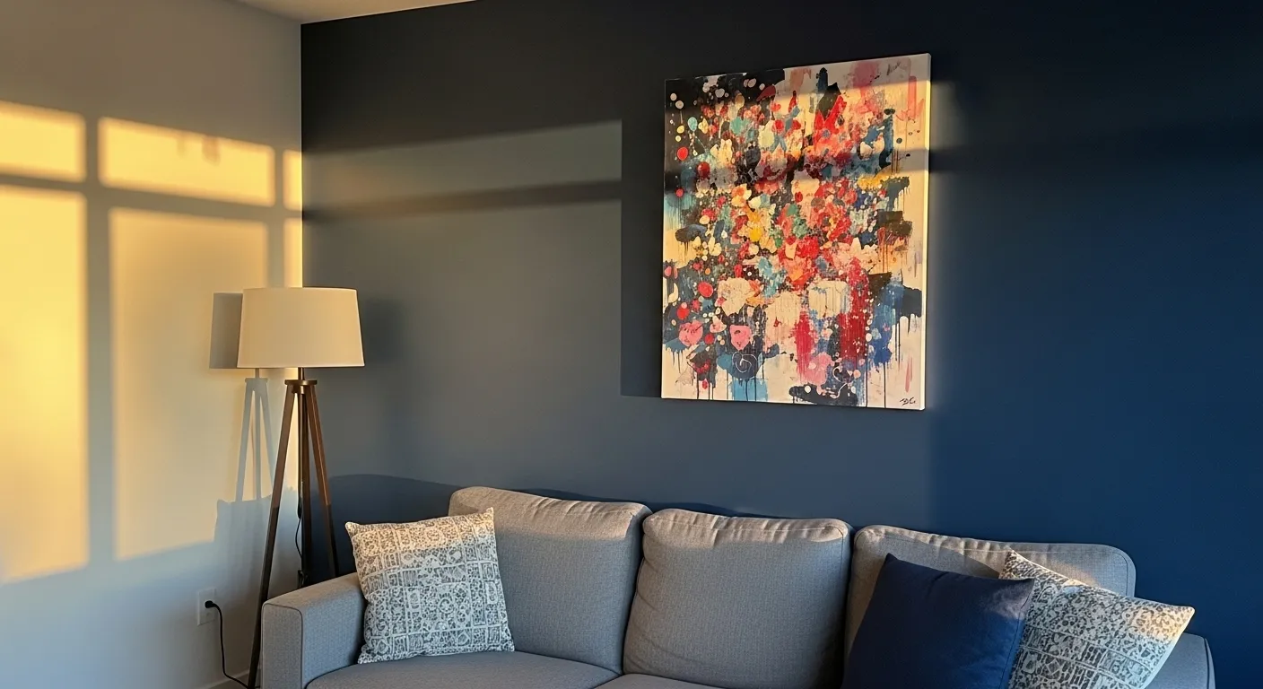
Deep Blue Accent Wall In A Simple Living Room
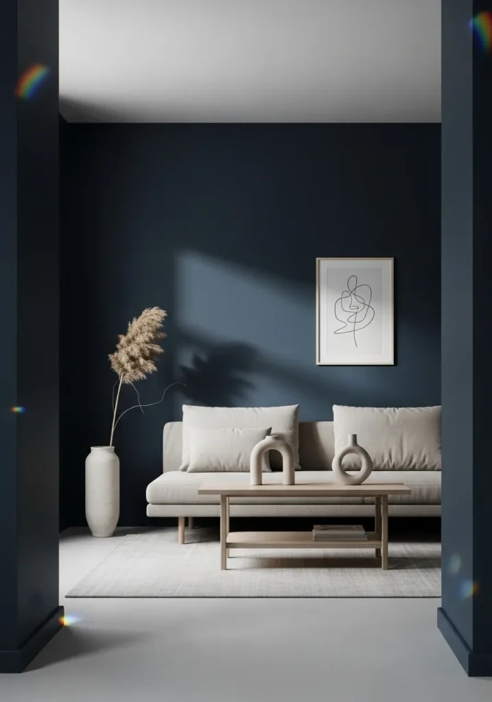
This looks closest to Benjamin Moore Hale Navy, a deep, steady blue that leans slightly gray. It’s one of those colors that feels familiar once it’s on the wall. Not too sharp, not too flat. Against a light sofa and simple decor like this, it reads clean and a bit softened.
The gray undertone keeps it from going too bold, especially when paired with pale woods and off-white fabrics. In brighter light it shows more blue, but in lower light it settles into a darker tone. I find it works best as a full wall or even a whole room if you keep everything else fairly simple.
Deep Blue Paneling In A Dining Room
This looks very close to Benjamin Moore Newburyport Blue, a rich blue that leans slightly green and feels a bit softer than a straight navy. It has that settled, almost traditional look, which works nicely on wall paneling like this. The color doesn’t feel flat. It has some movement to it.
That subtle green undertone shows more next to warm wood furniture, giving the room a slightly warmer feel overall. In lower light it deepens and feels more moody, while brighter light pulls out more of the blue. I tend to like this kind of shade for dining spaces since it pairs easily with wood tones and keeps things feeling relaxed.
Deep Blue Walls In A Small Entry
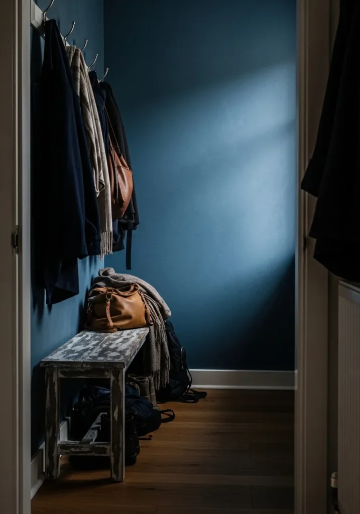
This looks very close to Benjamin Moore Van Deusen Blue, a rich blue that sits right between navy and slate. It has a slightly softened look, not too crisp, which makes it easier to use in tighter spaces like an entry. The color feels steady and a bit muted, especially next to darker coats and worn wood.
There’s a gray undertone running through it, so it doesn’t turn overly bold. In lower light it leans deeper and more closed in, while brighter light brings out more of that classic blue tone. I like it in entry areas like this since it hides wear a bit better and pairs easily with both black and brown accents.
Deep Blue Cabinets In A Small Kitchen
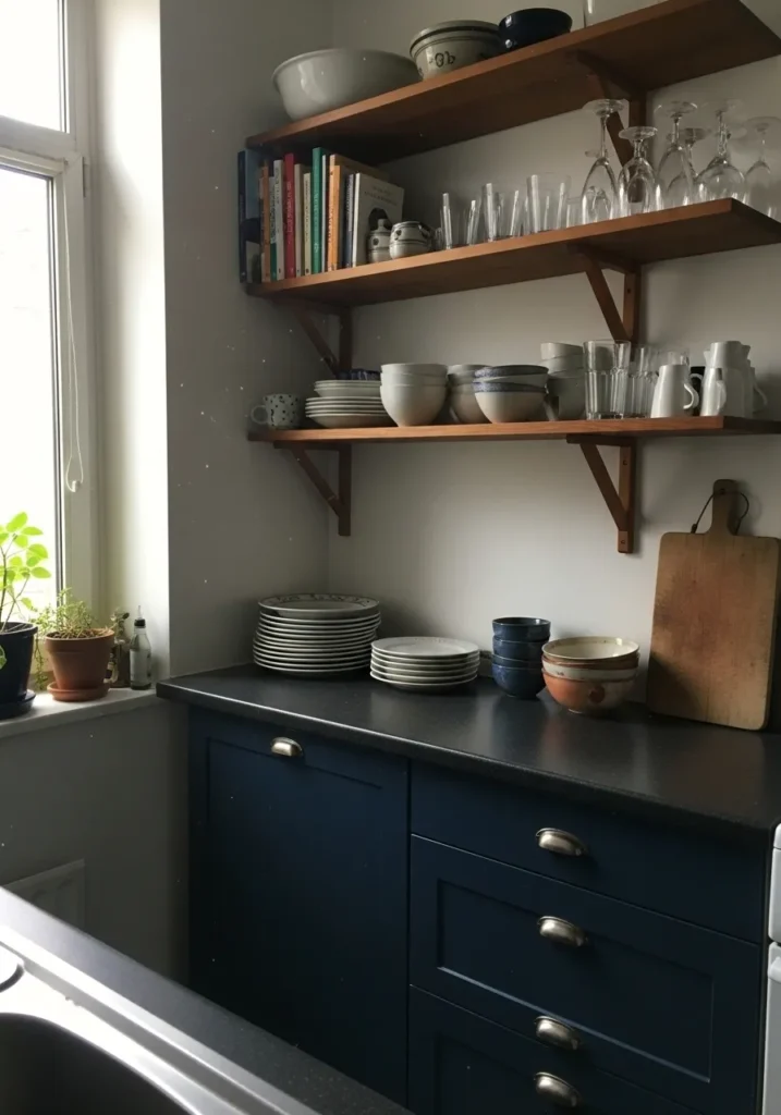
This looks very close to Benjamin Moore Hale Navy, a deep blue that leans slightly gray and feels steady rather than bold. On lower cabinets like this, it reads clean and grounded, especially next to lighter walls and open shelving. It’s a color that tends to sit quietly in the background.
The gray undertone helps it stay balanced next to both warm wood shelves and simple white dishes. In brighter light it shows more of its blue side, but in lower light it shifts deeper and more muted. I like using this kind of shade on base cabinets since it holds up well and doesn’t feel too busy over time.
Deep Blue Accent Wall In A Bedroom
This looks very close to Benjamin Moore Hale Navy, a deep blue that leans slightly gray and feels steady rather than sharp. It’s a classic darker blue that works well behind a bed like this, especially with soft neutral bedding that keeps things from feeling too heavy.
The gray undertone helps it stay balanced, even when the light shifts across the wall. In brighter light it shows more blue, while in lower light it deepens and feels more muted. I tend to like this shade in bedrooms since it’s easy to live with and pairs well with both warm wood and simple white accents.
Soft Blue Around A Fireplace
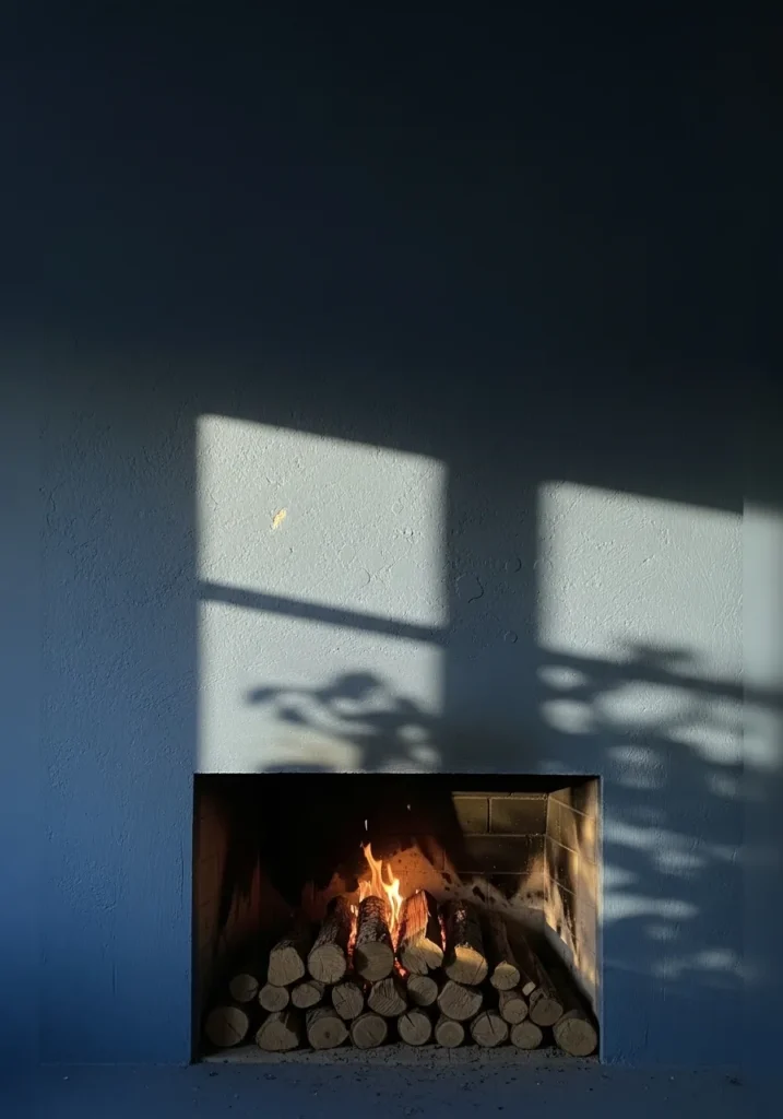
This looks very close to Benjamin Moore Smoke, a muted blue with a noticeable gray undertone. It’s a lighter take on moody blue, not as deep as navy, which makes it easier to use across a full wall like this. The color feels calm and slightly faded, almost like it’s been there a while.
That gray base helps it sit nicely next to natural elements like wood logs and simple trim. In brighter light it leans more blue, but in softer light it takes on a cooler, more subdued tone. I like this kind of shade around a fireplace since it keeps the space relaxed and not too heavy.
Deep Blue Walls In A Laundry Room
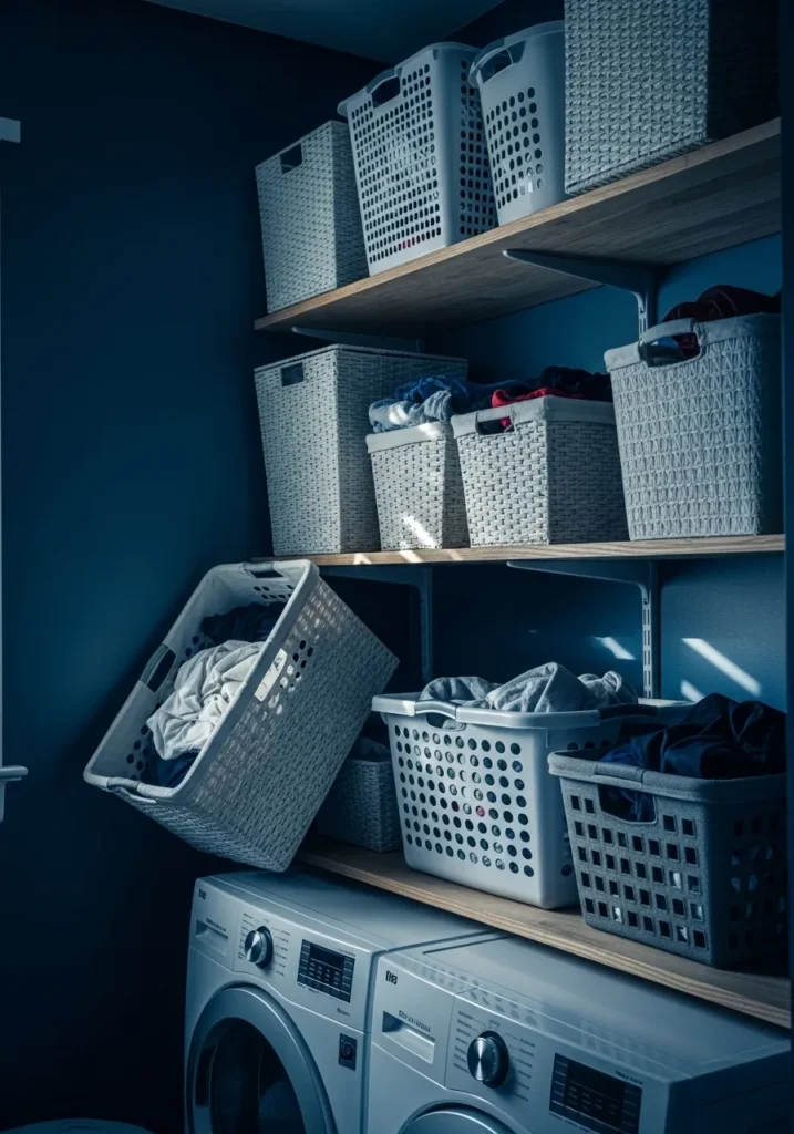
This looks very close to Benjamin Moore Hale Navy, a deep blue with a slightly muted, gray undertone. It’s the kind of color that feels steady and a bit quiet, which actually works well in a practical space like a laundry room. It doesn’t feel overly styled, just solid and easy to live with.
The gray base helps it sit nicely next to white appliances and light wood shelves without feeling too sharp. In lower light it leans darker and more subdued, while brighter light brings out more of the blue. I like this kind of shade in utility spaces since it hides wear and doesn’t feel too fussy.
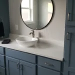
Deep Blue Walls In A Bathroom
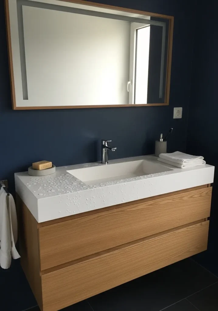
This looks very close to Benjamin Moore Hale Navy, a deep blue with a soft gray base that keeps it from feeling too sharp. It’s the kind of color that works well on full walls, even in a smaller bathroom, because it reads calm rather than busy. Next to a simple white sink and light wood vanity, it feels steady and easy to look at.
The gray undertone helps it stay balanced against both warm wood and cooler finishes. In brighter light it shows a clearer blue, while in lower light it deepens and feels more muted. I like this shade in bathrooms since it holds up well visually and doesn’t feel too stark against white fixtures.
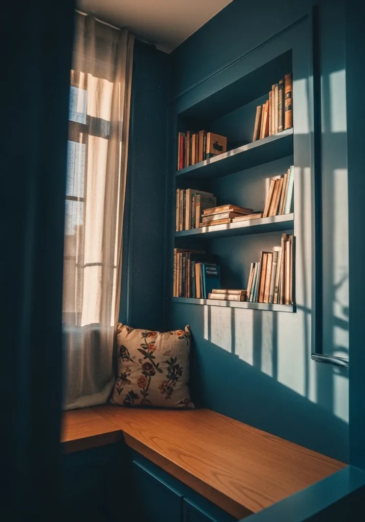
Muted Blue Walls In A Reading Corner
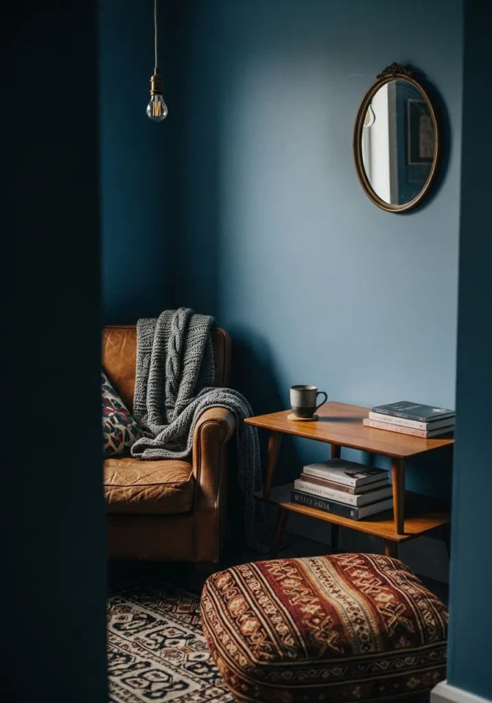
This looks very close to Benjamin Moore Blue Note, a deep blue that leans slightly toward teal but still reads calm and grounded. It’s not as heavy as a true navy, which makes it easier to use in a small sitting area like this. The color has a soft, worn-in feel that works well with leather and simple wood pieces.
There’s a subtle green undertone in it, so it shifts a bit depending on the light. In brighter light it feels more blue, while in lower light it deepens and takes on a moodier tone. I tend to like this kind of shade in corners like this since it pairs well with warm textures and doesn’t feel too sharp.
Soft Blue Walls In A Dining Nook
This looks very close to Benjamin Moore Van Courtland Blue, a muted blue with a noticeable gray base that keeps it feeling relaxed. It’s lighter than a true navy, so it works well in a small dining nook like this without making the space feel closed in. The color has a slightly faded look that pairs nicely with a simple wood table.
There’s a gentle cool undertone here, but the gray softens it so it doesn’t feel cold. In brighter light it leans a bit more blue, while in softer light it reads more subdued and quiet. I like this kind of shade in eating areas since it feels easygoing and doesn’t compete with the rest of the room.
Deep Blue Feature Wall In A Living Room
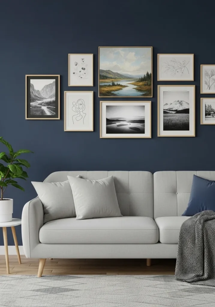
This looks very close to Benjamin Moore Gentleman’s Gray, a deep blue that leans slightly toward a green undertone. It has more richness than a standard navy, which makes it work well as a full feature wall behind something like a light sofa and framed art. The color feels settled and a bit classic rather than sharp.
That slight green undertone comes through depending on the light. In brighter conditions it reads more blue, while in dimmer areas it deepens and shifts a bit moodier. I like this kind of shade in living spaces since it pairs easily with soft grays, wood tones, and simple black frames without feeling too heavy.
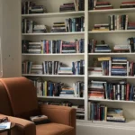
Deep Blue Built In Shelving
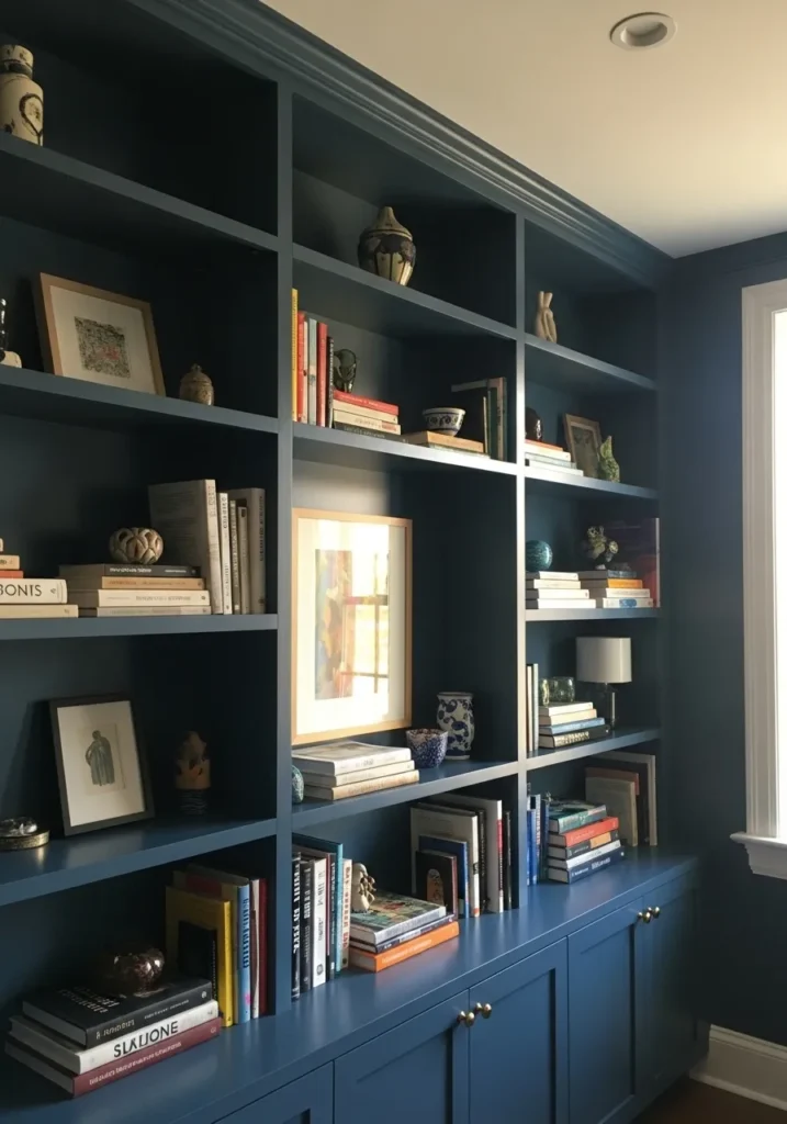
This looks very close to Benjamin Moore Van Deusen Blue, a deep blue with a soft gray undertone that keeps it from feeling too crisp. It sits somewhere between navy and slate, which works nicely on built-ins like this. The color lets books and small decor stand out without making the whole wall feel busy.
The gray in it helps balance both warm wood tones and lighter trim nearby. In brighter light it reads a bit more blue, while in lower light it deepens and feels more muted. I tend to like this kind of shade on shelving since it hides shadows and keeps everything looking a little more pulled together.
Dark Blue Walls With Panel Detail
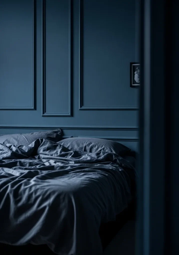
This looks very close to Benjamin Moore Newburyport Blue, a deep blue with a clear gray base that keeps it from feeling too sharp. It sits darker than a mid-tone blue but not quite black, which makes it a good fit for full walls with panel molding like this. The color feels steady and a bit quiet, especially with darker bedding against it.
There’s a cool undertone running through it, so it leans more blue than green. In lower light it deepens and feels almost inky, while a bit of light brings out more of that softened blue tone. I like this kind of shade in bedrooms since it works well with layered neutrals and doesn’t feel too bright or busy.
Teal Blue Walls In A Small Powder Room
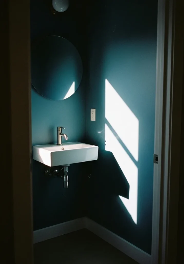
This looks very close to Benjamin Moore Aegean Teal, a blue that leans into green just enough to feel a bit softer than a standard navy. It has that slightly muted, moody quality that works well in a small powder room like this, especially next to a simple white sink.
There’s a noticeable green undertone, which shows more in brighter light and keeps the color from feeling too cool. In lower light it deepens and reads more blue. I like this kind of shade in small rooms since it feels a little richer without being too dark to live with.