I have always had a soft spot for pink walls, especially the kind that feel calm and a little romantic without being too sweet.
Over time, I realized not all pinks are the same, and finding the right one can completely change how a room feels.
Some lean warm and cozy, others feel light and airy, and a few sit right in the middle in the best way.
In this list, I’m sharing pink paint colors from Benjamin Moore that I keep coming back to in my own ideas and mood boards.
If you’re thinking about adding a gentle touch of color, these are the shades I would look at first.
Soft Blush Pink Bedroom Walls
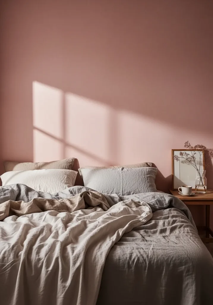
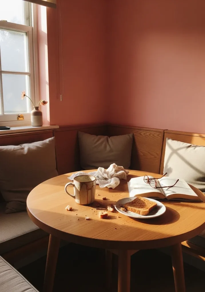
This wall color reads like a gentle blush pink, and it looks closest to Benjamin Moore First Light (2102-70). It is a very light pink with a calm, airy feel, not too sweet or bold. In a bedroom like this, paired with simple bedding and light wood, it comes across as easy to live with and not overly styled.
The undertone leans slightly warm, which helps it sit nicely next to beige and soft gray fabrics. It tends to shift a bit depending on light, sometimes looking almost like a warm off-white with a pink tint. It works best in bedrooms or quiet corners where you want a soft color that does not feel busy. Just keep stronger pink accents limited so the wall color can stay subtle.
Dusty Rose Accent Wall
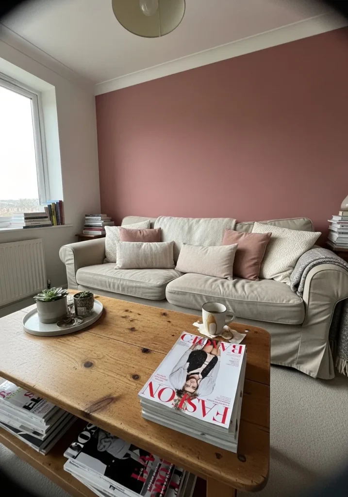
This deeper pink reads like a dusty rose, and it feels closest to Benjamin Moore Wild Flower (2090-40). It sits right in that middle range, not too light and not too bold, which makes it easy to use on a full wall without it feeling overwhelming. Against a simple sofa and light wood table, it comes across as steady and comfortable.
There is a muted warmth in it, with a slight earthy undertone that keeps it from feeling too sweet. In brighter light it can lean a bit softer, while in dimmer corners it looks richer and more grounded. It works well in living rooms or sitting areas where you want color but still want everything to feel relaxed. Pair it with soft neutrals and natural wood to keep it from getting too heavy.
Soft Peach Pink Walls
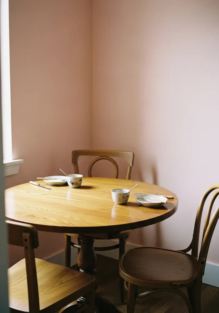
This color reads as a soft peachy pink, and it seems closest to Benjamin Moore Pink Damask (OC-72). It sits right between pink and beige, which makes it easy to use in everyday spaces like a dining corner. Next to a simple wood table and chairs, it feels calm and a little warm without turning sugary.
There is a gentle warmth in the undertone that leans slightly toward peach, so it pairs well with honey-toned wood and off-white trim. In brighter light it can look lighter and almost neutral, while in lower light it shows more of its pink side. It works well in small rooms where you want some color but still want the space to feel easy and quiet.
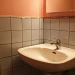
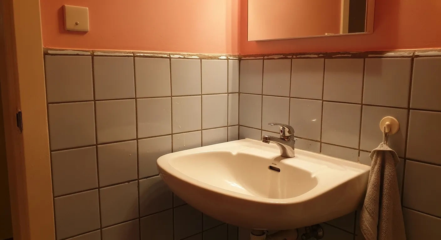
Muted Pink For A Small Bathroom
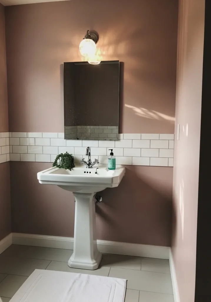
This wall color reads as a muted, slightly dusky pink, and it feels closest to Benjamin Moore Desert Rose (2073-50). It sits in that middle range where it has some depth but still feels soft enough for a smaller room. With white tile and a simple sink, it looks settled and not too sweet.
The undertone leans a bit earthy, which keeps it from turning bright or sugary. In a bathroom like this, it can shift depending on the light, sometimes showing more brown, sometimes more pink. It works well with clean white finishes and simple fixtures, especially if you want a bit of color without making the space feel busy.
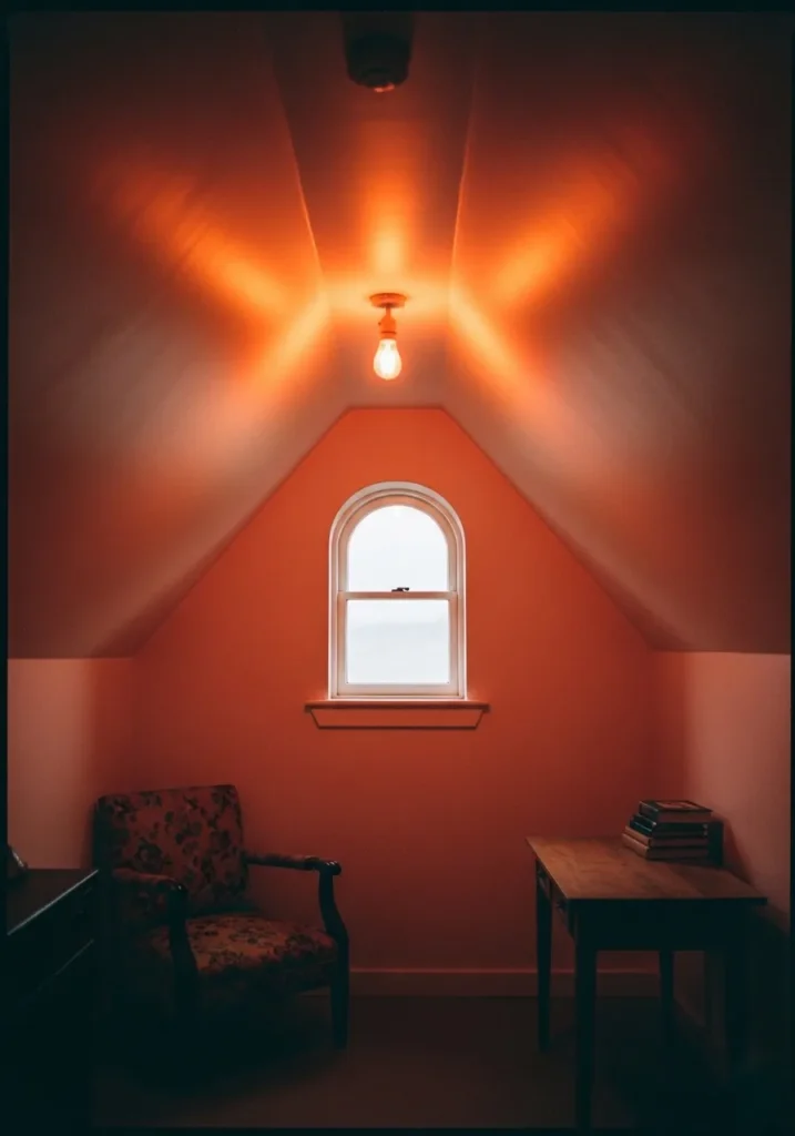
Warm Clay Pink Walls
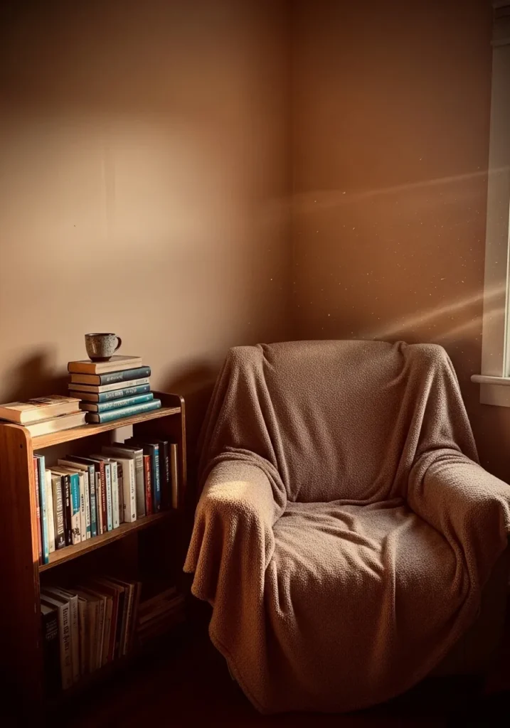
This color leans into a warm clay pink, and it feels closest to Benjamin Moore Pottery Red (2089-30). It sits deeper than a typical blush, with a soft brown base that gives it a grounded look. In a quiet corner like this, next to a simple chair and wood shelving, it feels steady and a bit cozy without looking overly styled.
The undertone is clearly warm, almost terracotta, which makes it work well with medium to dark wood tones. In stronger light it can show more of its pink side, but in softer light it settles into a richer, earthy shade. It suits reading nooks or smaller rooms where you want color that feels calm and a little enclosed.
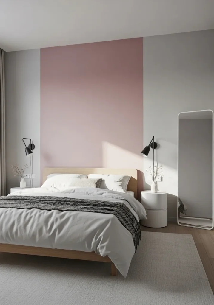
Pale Dusty Pink Walls
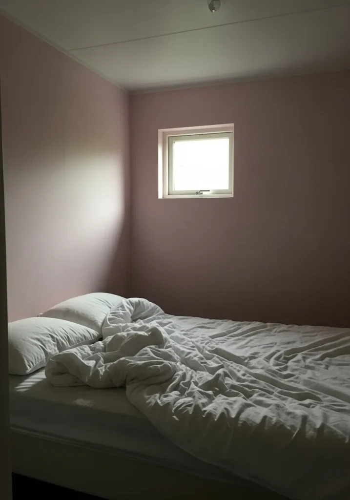
This soft wall color reads as a pale dusty pink, and it feels closest to Benjamin Moore Proposal (AF-260). It is a quiet, muted pink that leans slightly gray, which keeps it from feeling too sweet. In a simple bedroom with plain bedding, it comes across as calm and easy to live with.
The undertone is a bit cool compared to warmer blush tones, so it works well with whites and soft grays. In lower light it can look more subdued and almost neutral, while brighter light brings out the pink a little more. It suits smaller bedrooms where you want a hint of color without making the space feel busy or closed in.
Warm Blush Pink For A Home Office
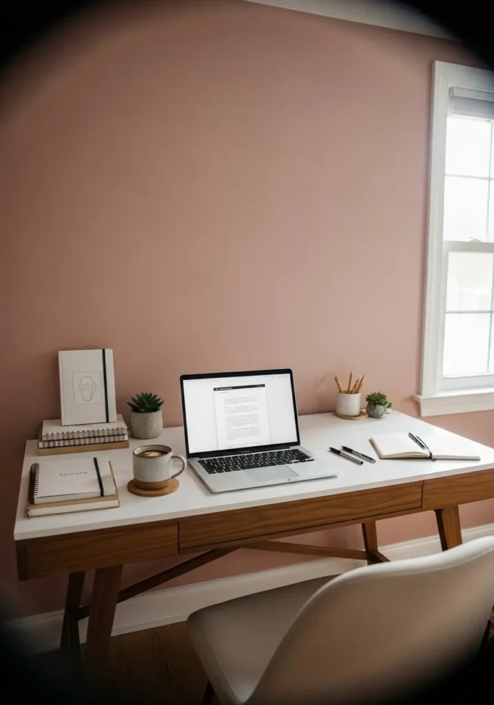
This wall color reads as a warm blush pink, and it feels closest to Benjamin Moore First Light (2102-70). It sits on the lighter side but still has enough color to be noticeable, especially behind a simple desk setup. It gives just a bit of softness without making the space feel overly styled.
The undertone leans warm with a slight peach note, which works well with white surfaces and medium wood tones. It tends to shift depending on the light, sometimes looking almost neutral and other times more clearly pink. It suits a small office or work corner where you want a gentle color that does not distract too much.
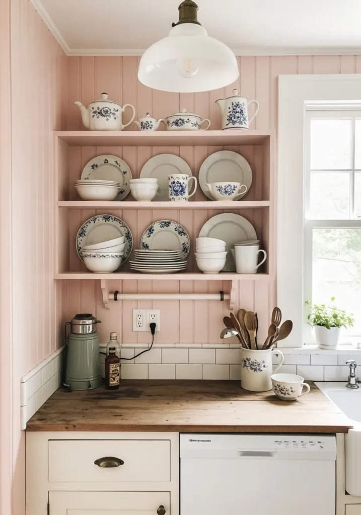
Soft Pink Cabinets In A Kitchen
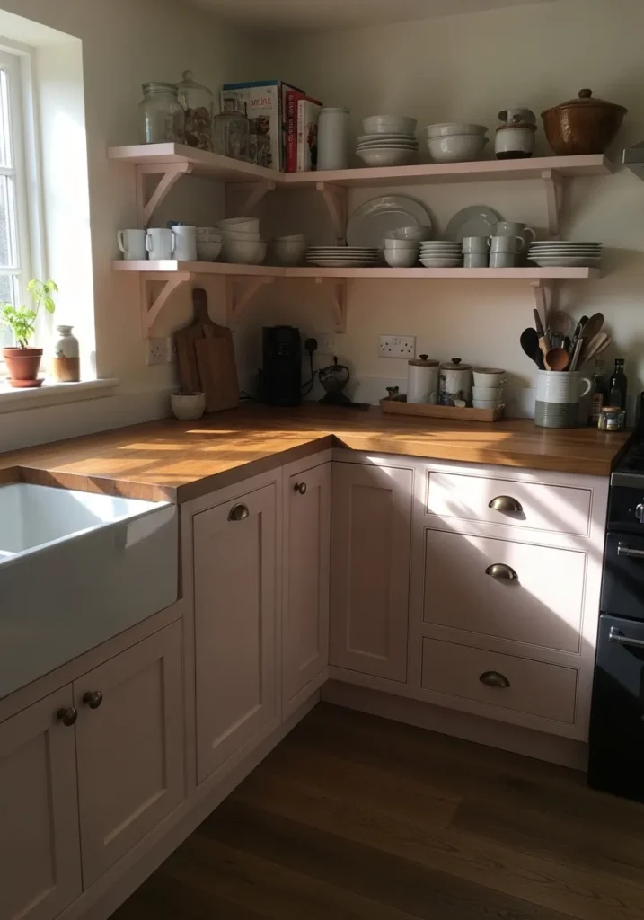
These cabinets read as a soft, muted pink, and they feel closest to Benjamin Moore Pink Damask (OC-72). It is a very gentle pink that leans toward a warm neutral, which makes it easy to use across a larger surface like cabinetry. Next to the wood countertop and simple open shelves, it feels natural and not overly decorative.
The undertone has a slight beige warmth, so it works well with creamy whites and natural wood finishes. In brighter light it can look almost like a warm off white with a pink tint, while in softer light the pink comes through a bit more. It suits kitchens where you want a hint of color but still want everything to feel relaxed and everyday.
Light Peachy Pink For A Nursery
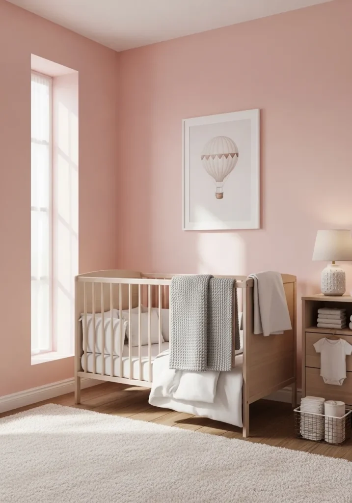
This wall color reads as a light peachy pink, and it feels closest to Benjamin Moore Pink Bliss (2093-70). It is a soft, easy pink that leans warm without becoming too bright. In a nursery setting like this, with a simple crib and pale wood, it feels gentle and not overly decorative.
The undertone has a hint of peach, which keeps it from looking cool or powdery. It tends to shift with the light, sometimes looking almost like a warm neutral, then showing more pink as the light changes. It works well in bedrooms and nurseries where you want a soft color that stays calm and not distracting.
Soft Warm Pink For Hallways
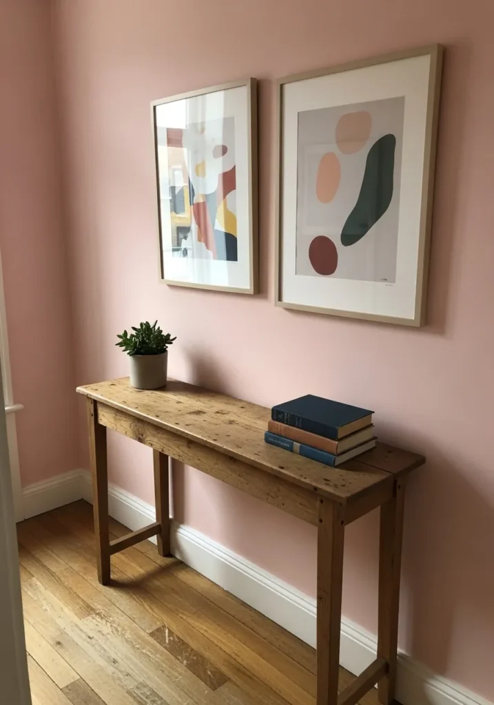
This wall color reads as a soft warm pink, and it feels closest to Benjamin Moore First Light (2102-70). It is light but not washed out, with just enough color to notice as you pass through a space. In a simple hallway with wood floors and a narrow table, it feels easy and not overdone.
The undertone leans gently warm, which helps it sit nicely with natural wood and off white trim. It can shift a bit with the light, sometimes looking almost neutral and other times more clearly pink. It works well in hallways and smaller spaces where you want a bit of color without making things feel busy.
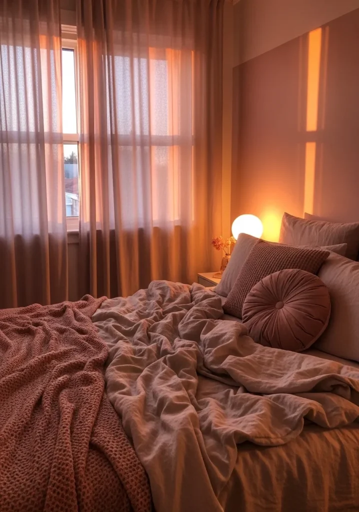
Deep Mauve Pink Bedroom Walls
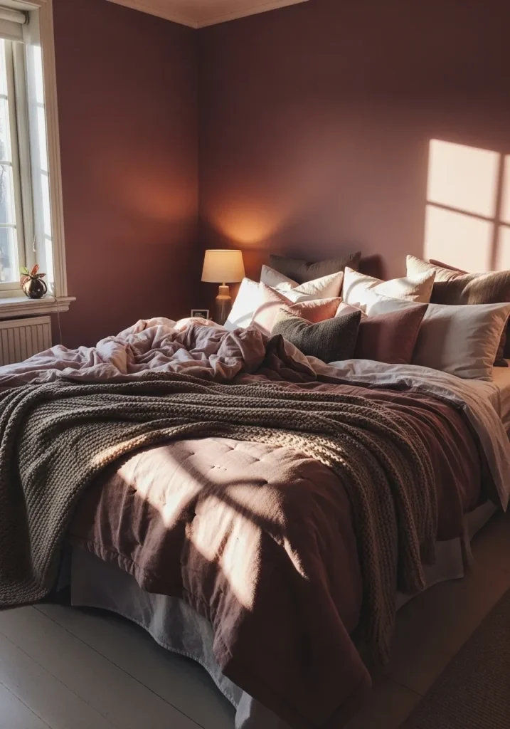
This wall color reads as a deep mauve pink, and it feels closest to Benjamin Moore Vintage Wine (2116-20). It has more depth than a typical pink, with a slightly muted, almost plum-like quality that gives it a heavier presence on the wall. Around a bed layered with soft neutrals, it feels calm but a bit cocooned.
The undertone leans warm with a touch of brown, which keeps it from looking too purple. In brighter light it softens slightly, but in lower light it becomes richer and more enveloping. It works best in bedrooms where you want a deeper color that feels settled, especially when paired with soft fabrics and simple wood pieces.
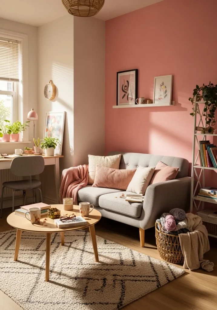
Muted Rose Pink Living Room Walls
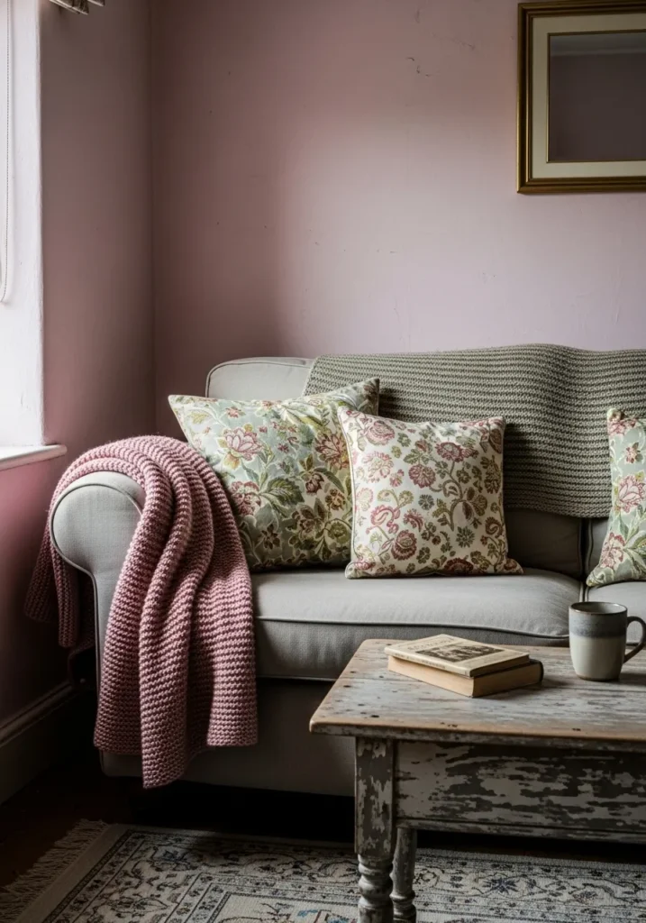
This wall color reads as a muted rose pink, and it feels closest to Benjamin Moore Proposal (AF-260). It has a soft, slightly gray cast that keeps it from looking bright, which makes it easy to use in a living space. With a simple sofa and a few patterned cushions, it feels relaxed and not overly styled.
The undertone leans a bit cool, which helps it sit nicely with soft greens and neutral fabrics. It can shift depending on the light, sometimes looking more beige, then showing more pink later on. It works well in sitting rooms where you want a gentle color that does not feel too sweet or too heavy.
Warm Rosy Pink For A Vanity Area
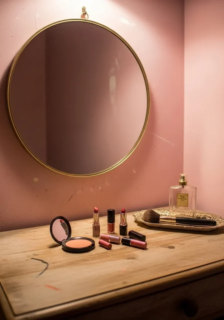
This wall color reads as a warm rosy pink, and it feels closest to Benjamin Moore Coral Dust (2173-50). It has a bit more richness than a pale blush, which helps it hold its own on a full wall. Around a simple mirror and wood surface, it comes across as soft but still noticeable.
The undertone leans warm with a slight coral note, which works well with brass finishes and natural wood. In brighter light it can look lighter and a bit fresher, while in softer light it deepens slightly. It suits small areas like a vanity or dressing corner where you want color that feels relaxed but not washed out.
Sun Washed Pink For Exterior Walls
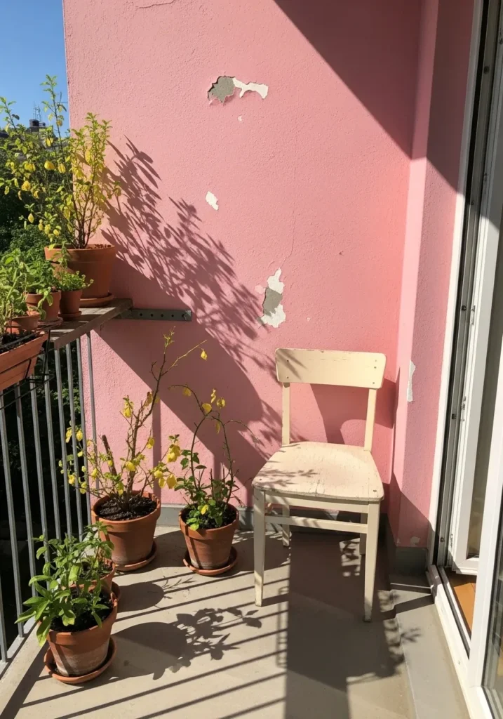
This color reads as a sun-washed pink, and it feels closest to Benjamin Moore Coral Dust (2173-50). It sits in that warm pink range with a slightly faded look, which works well outdoors where color can feel stronger. Even with some wear on the surface, it still holds a soft, relaxed look.
The undertone leans warm with a bit of coral, which pairs nicely with greenery and simple outdoor pieces like a painted chair. In full light it can look brighter and a touch more peach, while in shade it settles into a softer pink. It works well for exterior walls or small balconies where you want a bit of color that does not feel too sharp.
Soft Pink Accent Wall Behind The Bed
This accent wall reads as a soft, slightly dusty pink, and it feels closest to Benjamin Moore Proposal (AF-260). It has a gentle gray undertone that keeps it from feeling too sweet, which works well in a bedroom setting. Behind a simple wood bed and white bedding, it comes across as quiet and easy to live with.
The undertone leans a touch cool, so it pairs nicely with soft grays, whites, and light wood. It can shift depending on the light, sometimes looking almost like a pale neutral and other times more clearly pink. It works well as a single accent wall when you want just a hint of color without taking over the whole room.
Warm Coral Pink Dining Nook
This wall color reads as a warm coral pink, and it feels closest to Benjamin Moore Coral Dust (2173-50). It sits a bit stronger than a soft blush, with more orange in it, which gives it a fuller look on the wall. Around a small table and built-in seating, it feels comfortable and a little cozy.
The undertone is clearly warm, leaning toward coral rather than a cool pink. That makes it work well with honey-toned wood and simple neutral fabrics. In brighter light it can look more peach, while in softer light it settles into a deeper pink. It suits dining corners and breakfast areas where you want color that feels relaxed but still present.
Deep Coral Pink In A Small Room
This color reads as a deep coral pink, and it feels closest to Benjamin Moore Terra Cotta Tile (2090-30). It sits on the stronger side of pink, with a clear orange undertone that gives it that almost clay-like look. In a small room like this, it feels a bit moody but still warm.
The undertone is firmly warm, so it pairs easily with wood furniture and soft neutral fabrics. Under a simple bulb, the color can look richer and slightly darker, while natural light pulls out more of the coral side. It works best in smaller spaces where you want a fuller color that wraps the room a little.
Soft Blush Pink Kitchen Walls
This color reads as a soft blush pink, and it feels closest to Benjamin Moore Pink Damask (890). It is a light, gentle pink with a slightly creamy base, which helps it sit comfortably across a full wall. Around simple open shelving and white dishware, it feels calm and easy to live with.
The undertone leans warm but stays fairly balanced, so it does not turn too peach or too sweet. It works well with white trim and light wood surfaces, giving the space a clean but relaxed look. In brighter light it looks airy and pale, while in softer light it gains a bit more warmth.
Soft Pink In A Small Entry Space
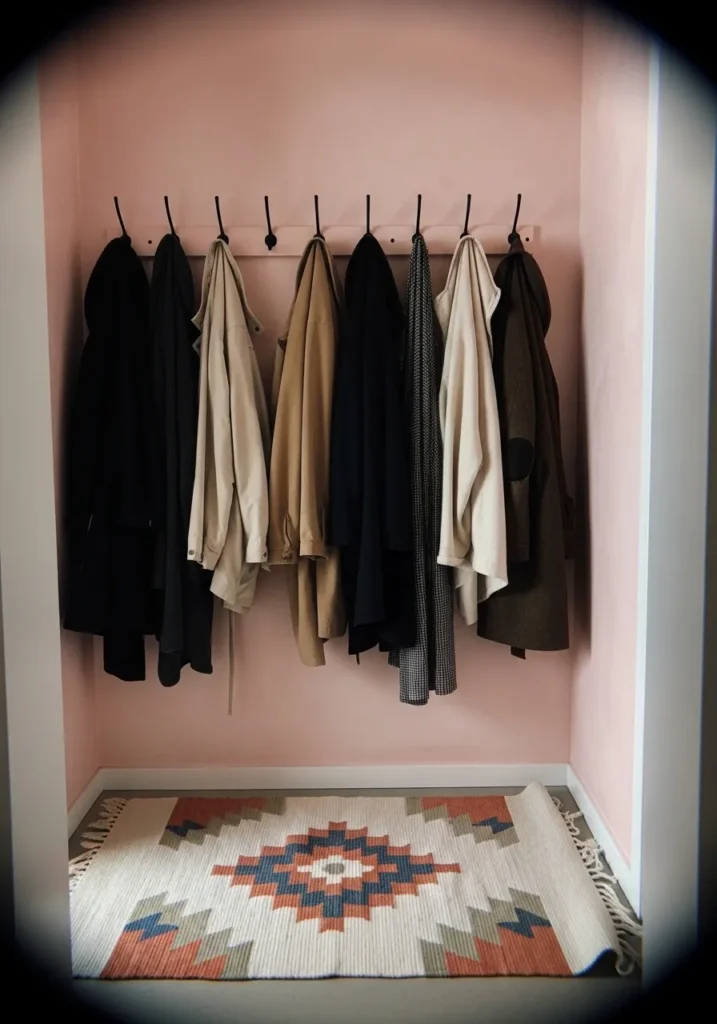
This wall color reads as a soft, slightly dusty pink, and it feels closest to Benjamin Moore First Light (2102-70). It sits on the lighter side of pink but has just enough depth to show up against darker coats and fabrics. In a small entry like this, it keeps the space from feeling too plain.
The undertone leans a bit cool, which helps it work with blacks, creams, and soft browns without turning too peach. It can look a touch brighter in good light, then settle into a quieter pink in lower light. It works well in narrow spaces where you want color that feels gentle but still noticeable.
Dusty Rose Pink For A Calm Bedroom
This wall color reads as a dusty rose pink, and it feels closest to Benjamin Moore Wild Aster (1240). It sits somewhere between pink and a soft mauve, which gives it a slightly muted look. Next to layered bedding in similar tones, it feels quiet and settled… not too bright, not too flat.
The undertone leans a bit cool with a hint of gray, which helps it pair easily with soft neutrals and warm lighting. It can shift through the day, looking more pink in daylight and a little deeper in the evening. It works well in bedrooms where you want color that stays gentle but still noticeable.
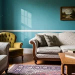
Warm Pink Accent Wall In A Living Area
This wall color reads as a warm mid-tone pink, and it feels closest to Benjamin Moore Coral Dust (2173-50). It has a bit of depth without going too bold, so it works well as a single accent wall behind a sofa. Next to light neutrals and soft textures, it feels relaxed and easy to settle into.
The undertone leans warm with a slight coral note, which pairs nicely with wood floors and cream fabrics. In daylight it can look a little lighter and softer, then deepen slightly as the light fades. It works best when balanced with simple pieces so the color has room to stand on its own.