Blue gray paint colors have always been one of my favorite ways to make a room feel calm but still interesting. I keep coming back to them whenever I want something softer than navy but richer than a plain gray wall.
Benjamin Moore happens to have some of the prettiest blue gray shades I have ever tried in real homes. I love how they shift slightly throughout the day and give a space that cool modern look without feeling cold.
In this list I’m sharing the blue gray Benjamin Moore colors that I keep saving, testing, and recommending. If you like rooms that feel relaxed, fresh, and a little bit polished, these shades are definitely worth a look.
Soft Blue Gray Living Room Walls
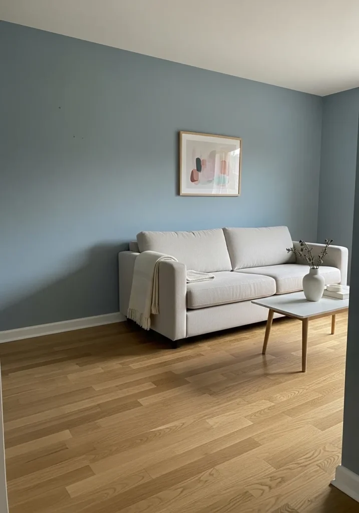
This wall color reads very close to Benjamin Moore Smoke (2122-40). It’s that calm blue gray that sits right between muted blue and soft slate. Not too dark, not washed out either. In a room like this with light wood flooring and a simple sofa, the color feels steady and easy to live with.
Smoke has a cool base with a gentle gray cast, which keeps the blue from feeling bright or coastal. Natural wood tones tend to look especially good against it, like the floor here. It usually works best in spaces that get a fair amount of daylight, since dim lighting can make the gray side show up a little more. White trim and pale furniture keep it looking clean and relaxed.
Muted Blue Gray Bedroom Walls
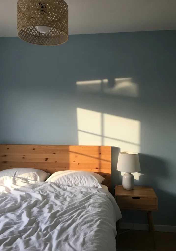
This wall color looks very close to Benjamin Moore Van Courtland Blue (HC-145). It sits right in that classic blue gray range where the color feels calm but still has enough presence to shape the room. You can see how it holds its own behind the simple wood headboard without feeling dark or heavy.
Van Courtland Blue leans a bit gray first, which keeps the blue from feeling bright. That is probably why it pairs so easily with natural wood furniture like the bed here. In brighter rooms the blue side shows up a little more. In softer lighting it reads more like a dusty gray blue, which many people actually prefer for bedrooms.
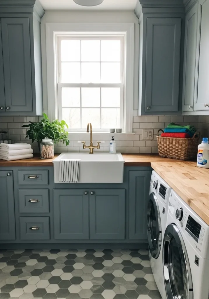
Blue Gray Kitchen Cabinets
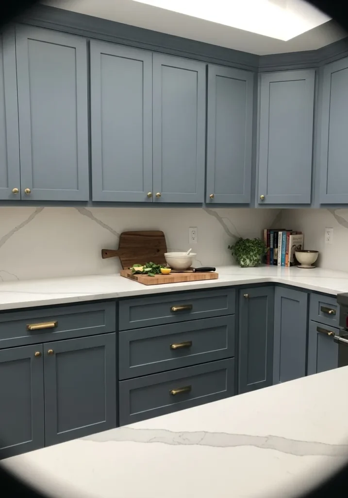
These cabinets read very close to Benjamin Moore Boothbay Gray (HC-165). It’s one of those blue grays that leans a little soft and dusty instead of bold. The color has enough depth to stand out on cabinetry but still feels calm, which is probably why people return to shades like this again and again.
Boothbay Gray carries a gentle blue undertone with a steady gray base. That balance helps it sit comfortably next to light stone counters and brass hardware like you see here. In brighter kitchens the blue becomes a bit clearer, while cooler lighting can make it look more gray. Either way it tends to stay easygoing, which is exactly what many people want for painted cabinets.
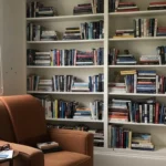
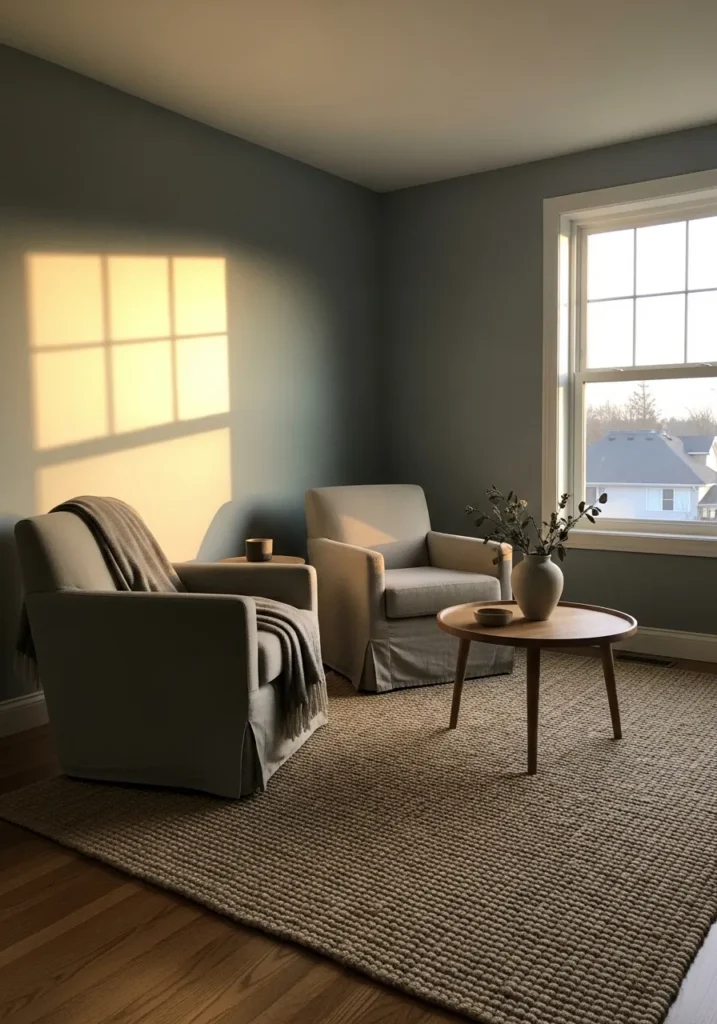
Quiet Blue Gray For A Reading Corner
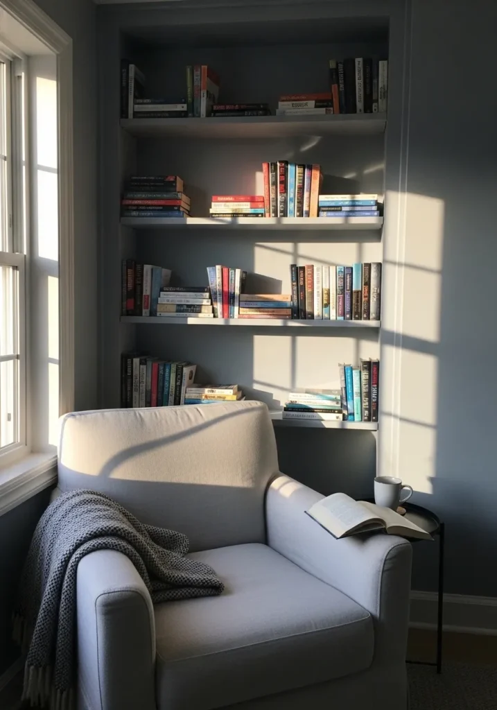
This wall color reads close to Benjamin Moore Mount Saint Anne (1565). It sits in that soft blue gray range where the color feels calm but still noticeable. Not too pale, not overly dark either. In a small reading spot like this, the shade gives the walls some character without making the corner feel closed in.
Mount Saint Anne leans cool with a gentle gray undertone, which keeps the blue from feeling bright. That tends to work nicely next to white trim and light upholstery like the chair here. In rooms with steady daylight, the blue shows up a bit more. In softer light it settles into a quieter gray blue, which many people like for spaces meant for reading or relaxing.
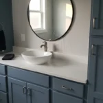
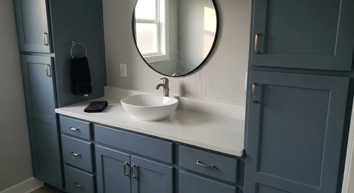
Cool Blue Gray Bathroom Walls
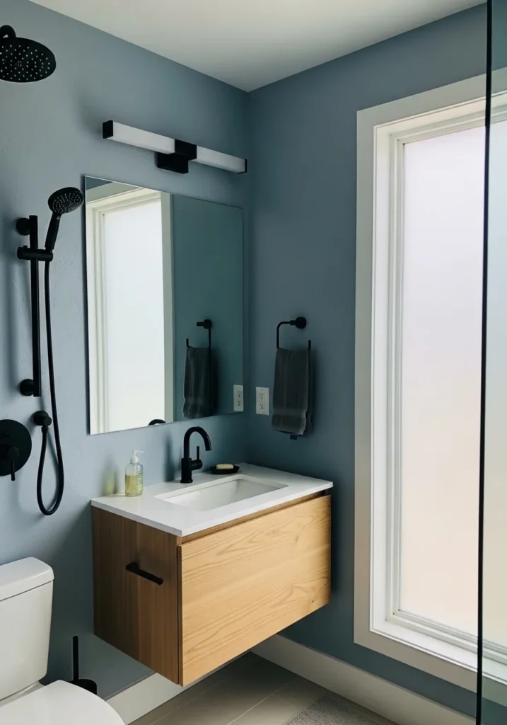
This wall color looks very close to Benjamin Moore Smoke (2122-40). It’s a medium blue gray that sits comfortably between soft slate and muted blue. The color feels steady on a full wall and gives a small room a bit more personality without getting too dark.
Smoke carries a cool undertone that becomes more noticeable next to crisp white trim and light countertops like the vanity here. The gray side keeps the blue from feeling bright or beachy. It usually works well in bathrooms, especially with black fixtures and natural wood finishes, since those materials help the color read balanced instead of overly cool.
Deeper Blue Gray Dining Room Walls
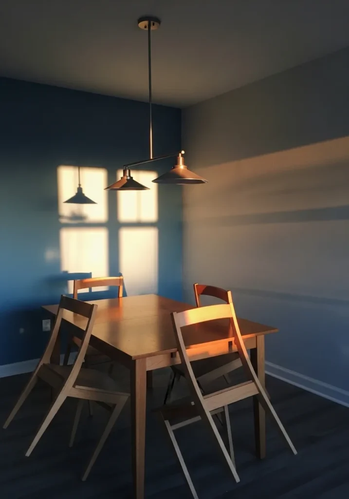
This wall color reads quite close to Benjamin Moore Normandy (2129-40). It’s a deeper blue gray that sits comfortably between slate blue and charcoal gray. The shade has enough weight to give a dining area some presence without feeling overly dark.
Normandy carries a cool blue base with a steady gray undertone. That mix tends to look good next to natural wood furniture like the table here, since the warmth of the wood keeps the color from feeling cold. In brighter rooms the blue becomes more noticeable. In lower evening light it settles into a richer gray blue, which many people like for dining spaces.
Soft Blue Gray Living Room Walls
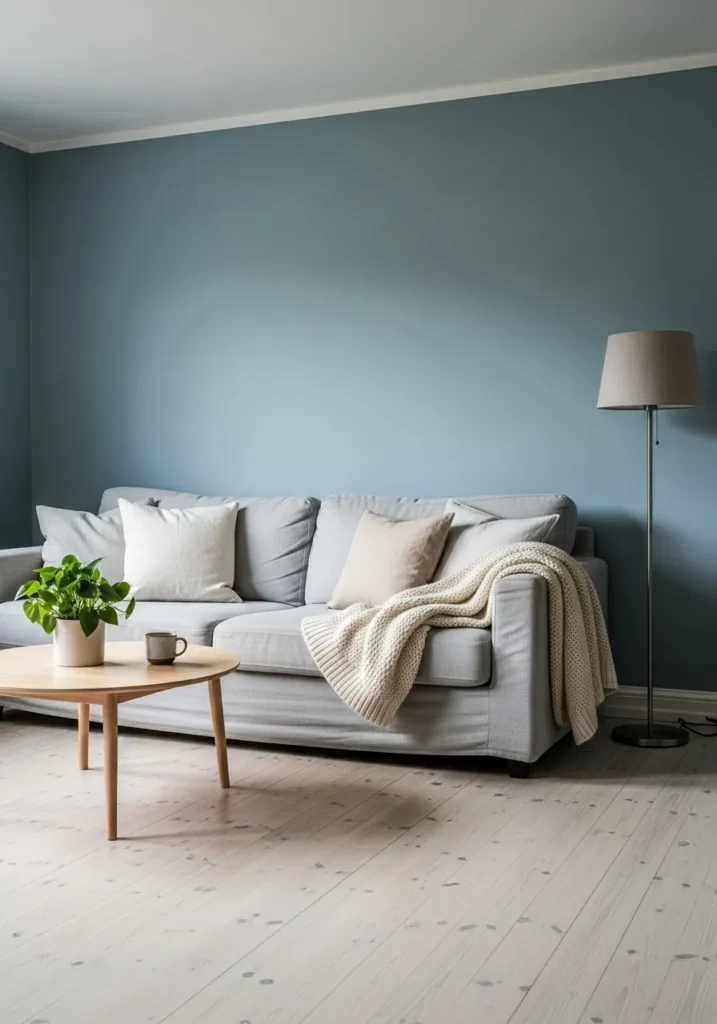
This wall color looks very close to Benjamin Moore Quiet Moments (1563). It sits in that light blue gray range that feels calm without looking washed out. The color has a soft presence on the wall and works well in relaxed living spaces where you want color but nothing too bold.
Quiet Moments carries a gentle blue tone with a noticeable gray base. That mix keeps it from feeling too coastal or bright. Next to pale wood flooring and light furniture like the sofa here, the shade tends to read balanced and easygoing. In brighter rooms the blue shows a bit more. In dimmer light it settles into a softer gray blue.
Calm Blue Gray Entry Walls
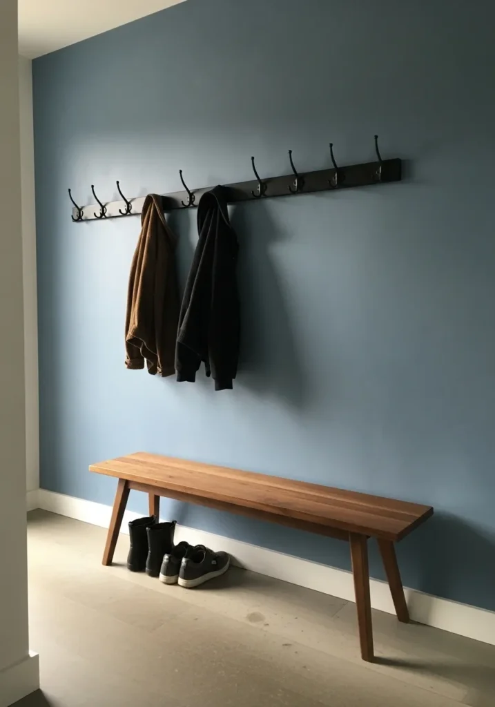
This wall color looks very close to Benjamin Moore Boothbay Gray (HC-165). It sits right in that comfortable blue gray range where the color feels noticeable but not bold. A shade like this works well in entry areas because it gives the wall some character without making the space feel darker.
Boothbay Gray leans cool with a steady gray base, which keeps the blue feeling soft rather than bright. Next to warm wood like the bench here, the color tends to look balanced and natural. Black hardware and hooks also work nicely with it, since darker accents help the blue gray read a little richer.
Rich Blue Gray Office Walls

This wall color reads very close to Benjamin Moore Van Deusen Blue (HC-156). It sits in that deeper blue gray range where the color feels strong but still calm enough for everyday rooms. Not overly dark, but definitely more saturated than the softer blue grays you often see.
Van Deusen Blue has a noticeable blue base with a gray edge that keeps it from feeling too bold. That balance tends to look especially good next to darker wood furniture like the desk here. In brighter rooms the blue becomes clearer. In dimmer spaces it settles into a moodier blue gray, which many people like for offices or study areas.
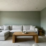
Light Blue Gray Living Room Walls
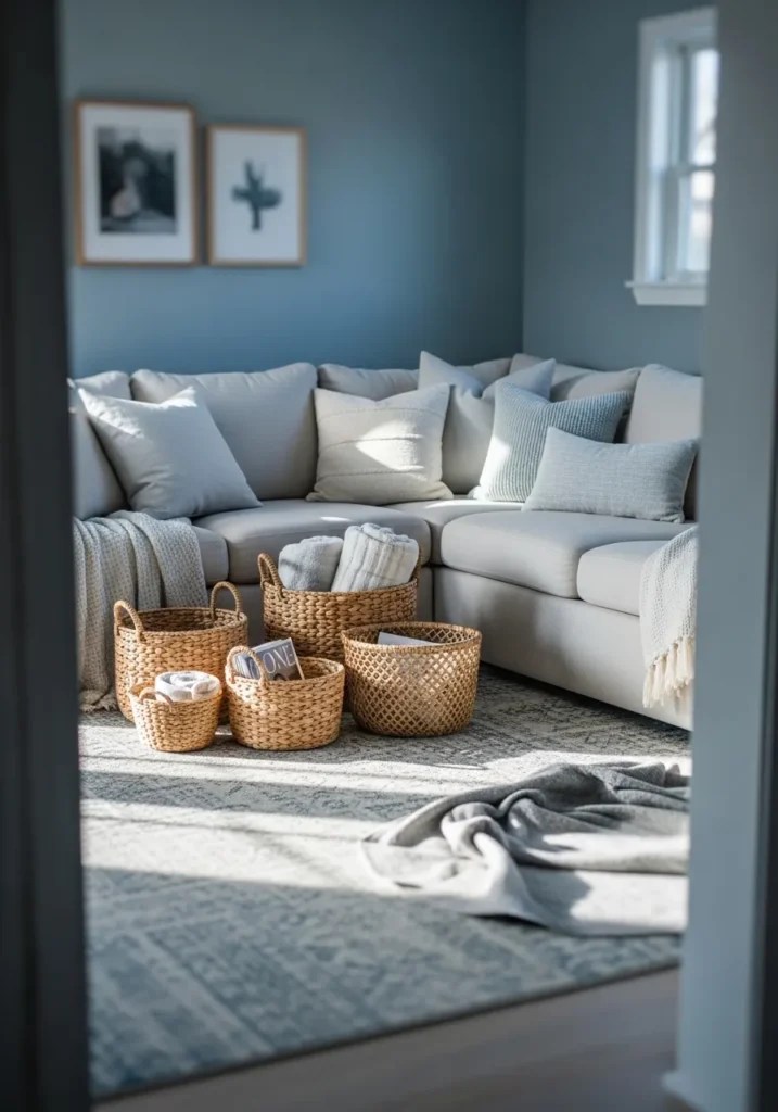
This wall color looks quite close to Benjamin Moore Smoke (2122-40). It’s a soft blue gray that sits right in the middle of the range. Not pale enough to disappear, but not dark enough to feel heavy. In a living room like this, the color gives the walls a bit of presence while still feeling relaxed.
Smoke leans cool with a noticeable gray undertone, which helps the blue stay muted. That balance tends to work nicely with light sofas and woven textures like the baskets on the floor. Natural light usually brings out the blue side a little more. In softer lighting the shade settles into a quiet gray blue that stays easy to live with.
Soft Blue Gray For A Breakfast Corner
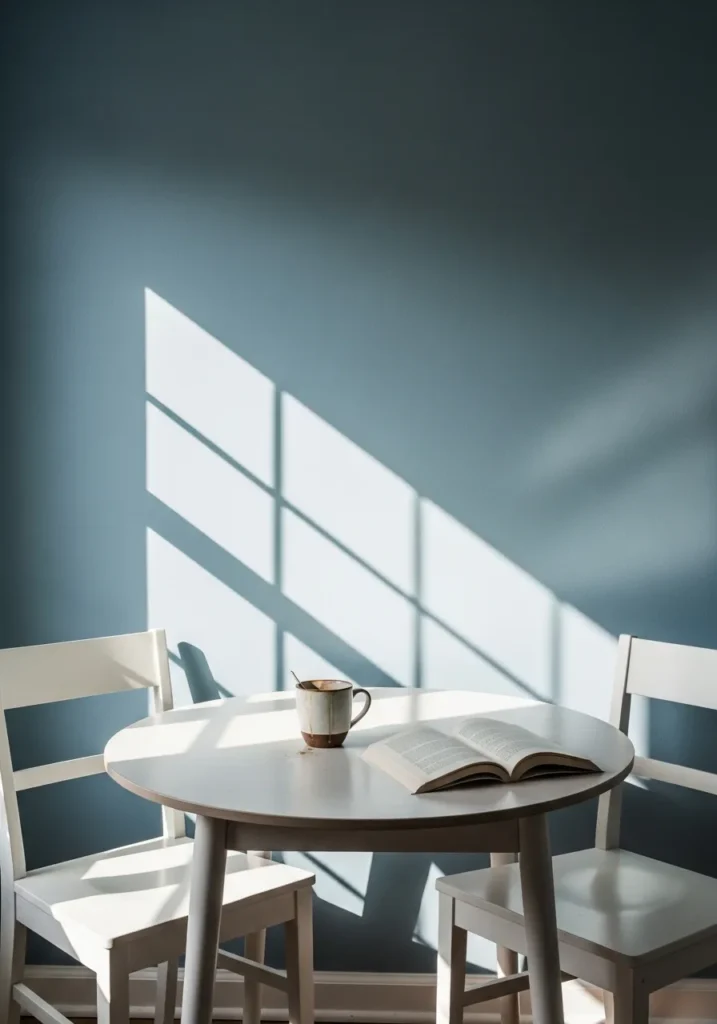
This wall color looks closest to Benjamin Moore Quiet Moments (1563). It’s a light blue gray that feels calm and airy without turning pale or washed out. In smaller eating areas like this, the color gives the walls a bit of interest while still keeping the room bright.
Quiet Moments has a soft blue base with a gentle gray cast that tones everything down. That mix tends to work nicely next to simple white furniture like the table and chairs here. Natural light usually pulls out more of the blue. In softer light the color leans quieter and slightly grayer, which many people find easy to live with day to day.
Soft Blue Gray For A Simple Bathroom
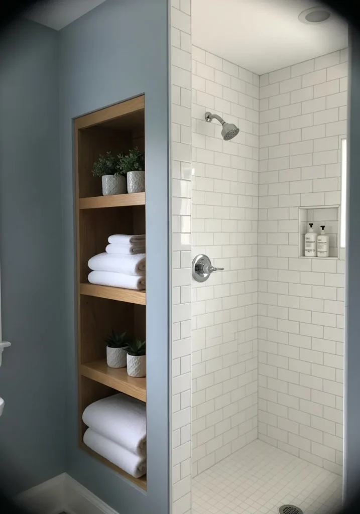
This wall color looks very close to Benjamin Moore Mount Saint Anne (1565). It’s a gentle blue gray that sits comfortably between pale blue and soft gray. The shade feels calm on a full wall and works well in bathrooms where you want a little color without making the space feel darker.
Mount Saint Anne carries a cool blue tone with a quiet gray undertone. That combination helps it pair easily with crisp white tile like the shower here. The gray side keeps the blue from feeling bright or overly coastal. In brighter bathrooms the blue becomes clearer, while softer lighting brings out more of the gray.
Soft Blue Gray For A Small Bedroom
This wall color reads very close to Benjamin Moore Boothbay Gray (HC-165). It’s a medium blue gray that sits comfortably between muted blue and cool gray. The shade has enough color to keep a small room from feeling plain, but it still stays calm and easy to live with.
Boothbay Gray leans cool with a noticeable gray base. That gray undertone keeps the blue from feeling bright, which works nicely in quiet spaces like bedrooms. Next to white bedding and simple trim like you see here, the color tends to look clean and balanced. In brighter light the blue becomes a little clearer, while softer light brings out more of the gray.
Blue Gray Walls In A Narrow Hallway
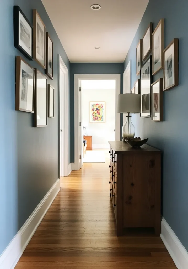
This wall color reads very close to Benjamin Moore Smoke (2122-40). It’s a steady blue gray that sits right between soft slate and muted blue. The shade gives a hallway a little color without making the space feel closed in, which can be tricky with long narrow areas.
Smoke carries a cool blue tone with a clear gray base. That gray undertone helps it sit comfortably next to white trim and warm wood flooring like you see here. In brighter parts of the hall the blue tends to show more. In dimmer spots it leans quieter and a bit grayer, which keeps the color from feeling too strong in tight spaces.
Classic Blue Gray For An Open Living Space
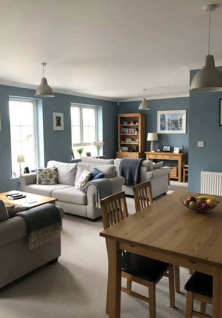
This wall color reads very close to Benjamin Moore Boothbay Gray (HC-165). It’s a mid tone blue gray that feels steady and comfortable on larger walls. The color has enough depth to stand out, yet it still keeps a relaxed feel in everyday living areas.
Boothbay Gray leans cool with a soft gray undertone that tones the blue down. That balance tends to work well next to warm wood furniture like the dining table and shelving here. In brighter rooms the blue becomes more noticeable. In softer light it settles into a quiet gray blue, which makes it easy to carry the color across connected spaces like living and dining rooms.
Deeper Blue Gray In A Small Bathroom
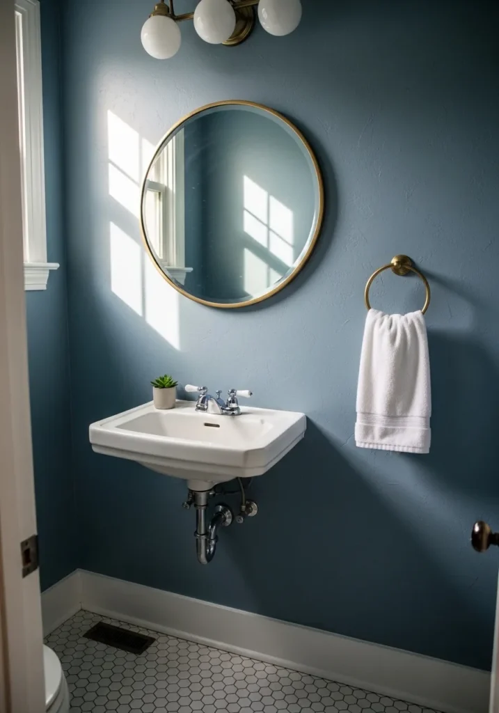
This wall color reads very close to Benjamin Moore Van Courtland Blue (HC-145). It’s a classic blue gray that sits a little deeper than many of the lighter shades people use in bathrooms. The color has enough richness to give the walls some presence, but it still feels calm rather than dark.
Van Courtland Blue carries a steady gray undertone that keeps the blue from feeling bright. That balance tends to work well next to crisp white fixtures like the sink and tile floor here. Brass accents also pair nicely with it. In brighter light the blue becomes clearer, while softer lighting pulls the color closer to a muted gray blue.
Light Blue Gray For A Calm Nursery
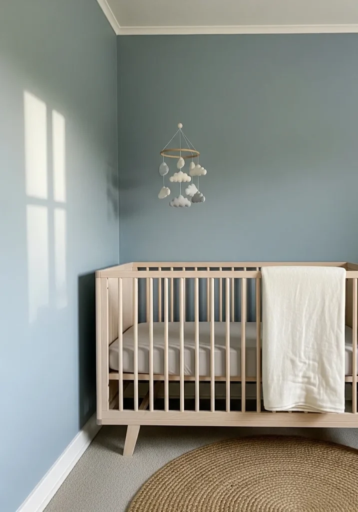
This wall color reads very close to Benjamin Moore Woodlawn Blue (HC-147). It’s a soft blue gray that sits on the lighter side, which tends to work well in rooms meant to feel quiet and simple. The color has a gentle look without turning overly pastel.
Woodlawn Blue carries a cool blue tone softened by a gray base. That gray keeps the color from feeling sugary, which is nice in a nursery where you want something calm but still grown up. Next to pale wood furniture and white trim like you see here, the color stays clean and easy. In brighter daylight the blue shows a bit more, while softer light lets the gray side come forward.
Muted Blue Gray Cabinets
This cabinet color reads very close to Benjamin Moore Providence Blue (1636). It’s a balanced blue gray that sits right in the middle, not too dark and not overly soft either. The color brings a little personality to cabinetry while still feeling steady and easy to live with.
Providence Blue leans slightly cool with a gray base that keeps the blue from feeling bright. That muted quality works well next to warm wood counters and a white farmhouse sink like you see here. In strong daylight the blue becomes a bit clearer, while softer light tends to pull out more of the gray tone.
Blue Gray Walls In A Bright Stairwell
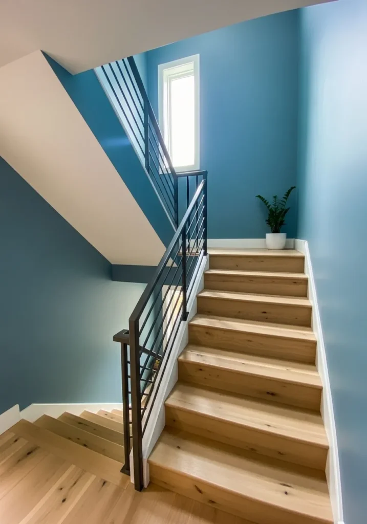
This wall color reads very close to Benjamin Moore Smoke (2122-40). It’s a balanced blue gray that carries enough color to feel noticeable without becoming too dark. Stairwells often get a mix of shadow and bright light, and a shade like this tends to handle that shift pretty well.
Smoke has a cool blue tone with a steady gray base that keeps it from feeling sharp. Next to pale wood stairs and white trim like you see here, the color looks calm and clean. In brighter light from the stair window the blue becomes clearer. In the shaded parts it leans softer and more gray, which helps the color stay easy on the eyes as you move through the space.
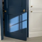
Dark Blue Gray Accent Wall
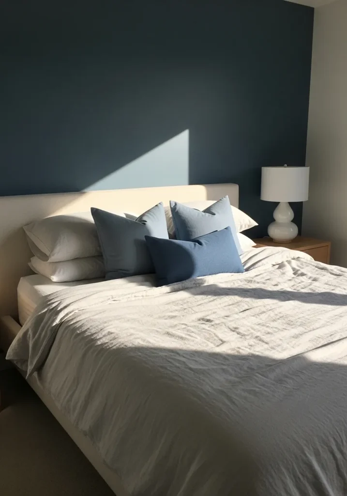
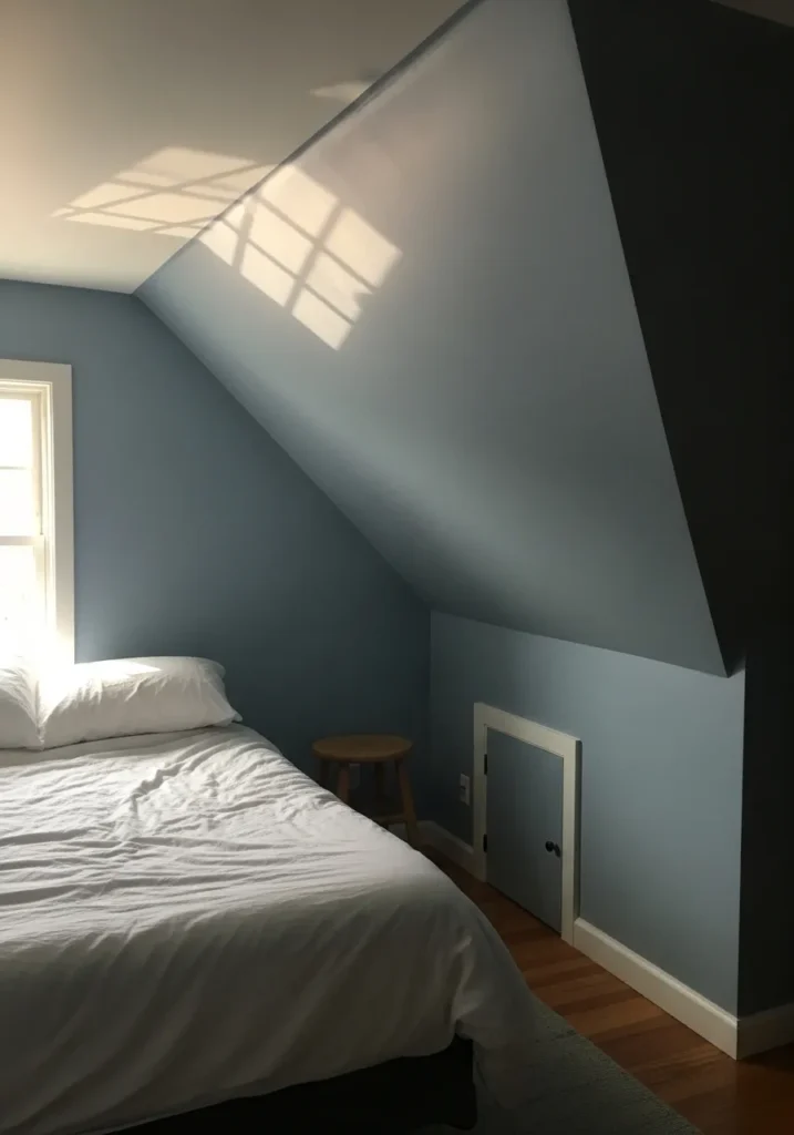
This wall color looks closest to Benjamin Moore Hale Navy (HC-154), which often reads like a deep blue gray rather than a straight navy. It’s a strong color, but still calm enough for a bedroom. Using it on the wall behind the bed is a common way to bring in a darker shade without covering the whole room.
Hale Navy carries a heavy gray base under the blue, which keeps it from feeling bright or glossy. That muted quality works nicely with simple white bedding and light furniture like you see here. In bright daylight the blue becomes clearer. In lower light the color leans deeper and a bit moodier, which can actually feel pretty comfortable in a bedroom.
Soft Blue Gray For A Quiet Sitting Room
This wall color reads very close to Benjamin Moore Boothbay Gray (HC-165). It’s a calm mid tone blue gray that works nicely in rooms meant for relaxing or reading. The shade brings a little color to the walls without feeling heavy or overly cool.
Boothbay Gray carries a gentle gray undertone that keeps the blue looking soft rather than crisp. That balance sits comfortably next to warm wood floors and neutral furniture like the chairs you see here. In brighter light the blue becomes a bit clearer. Later in the day it leans more gray, which gives the room a quieter feel.
Blue Gray Built Ins In A Mudroom
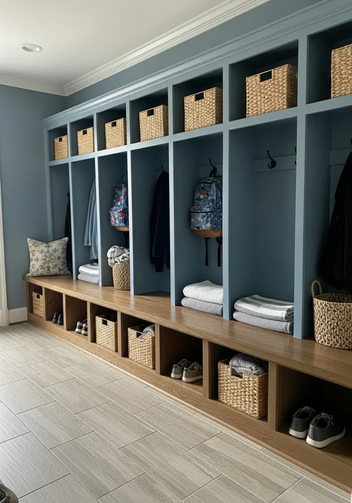
This built in color looks closest to Benjamin Moore Boothbay Gray (HC-165). It’s a medium blue gray that works nicely on cabinetry and storage walls where you want some color but not something too bold. The shade has enough depth to show up clearly, yet it still feels calm.
Boothbay Gray leans cool with a soft gray base that keeps the blue muted. That tone pairs easily with warm wood like the bench seat and woven baskets here. In brighter parts of the room the blue becomes a bit clearer, while areas tucked under the shelving read slightly grayer. That shift actually works well in built ins because it adds a little quiet variation across the wall.
Blue Gray Walls In A Sunroom
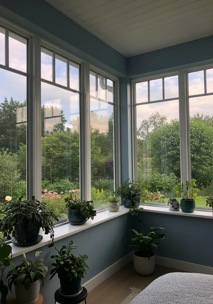
This wall color reads very close to Benjamin Moore Smoke (2122-40). It’s a clear blue gray that sits comfortably between soft slate and muted blue. In a bright room like this, the color feels light enough to keep the space open while still giving the walls some personality.
Smoke carries a cool undertone with a steady gray base. That gray keeps the blue from looking too crisp when sunlight pours in through large windows. Next to white trim and all the greenery from the plants here, the color tends to look fresh and relaxed. In strong daylight the blue becomes more noticeable, while cloudy light pulls it closer to a quiet gray blue.
Calm Blue Gray Behind The Bed
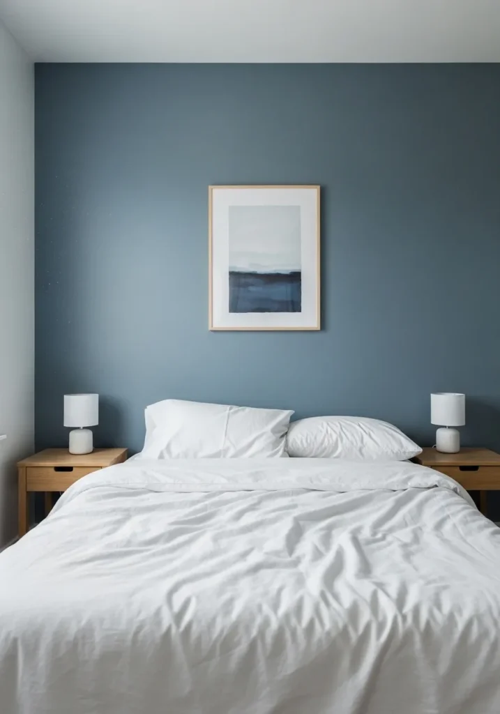
This wall color reads very close to Benjamin Moore Smoke (2122-40). It’s a steady blue gray that sits right in that comfortable middle range, not too pale and not overly dark. That kind of color works well behind a bed because it gives the room some color without making the space feel busy.
Smoke has a cool blue tone balanced by a noticeable gray base. That gray keeps the color quiet next to white bedding and simple wood nightstands like you see here. In brighter light the blue shows a little more. In softer evening light it settles into a softer gray blue, which tends to feel calm in a bedroom.