I have always believed that the best homes feel connected from room to room, not like a series of separate decisions.
That is exactly why I keep coming back to whole house color schemes when I am planning a space.
There is something so satisfying about walking from one room into the next and feeling that quiet sense of flow.
In this list, I pulled together Benjamin Moore colors that I have seen work beautifully across real homes, the kind that feel easy and lived in.
If you are into soft neutrals, gentle contrasts, or just want your home to feel a little more put together, this is where I would start.
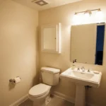
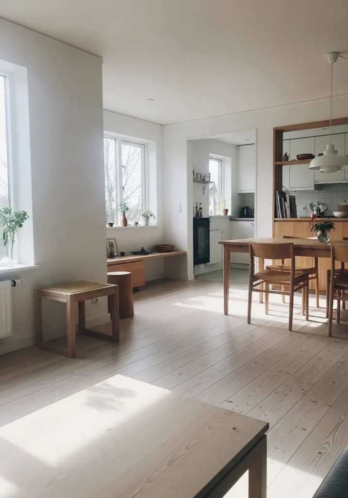
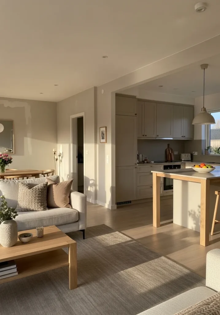
Soft Creamy White Throughout The Main Living Areas
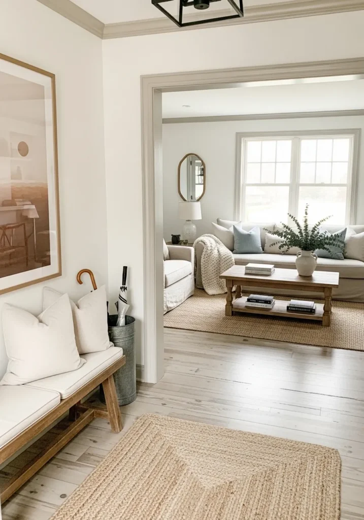
This looks very close to Benjamin Moore White Dove (OC-17), a soft creamy white that sits right between warm and clean. It doesn’t feel stark, and it doesn’t turn yellow either. You can see how it carries from the entry bench area into the living room without any break, which is exactly what makes a whole house palette feel easy to live with.
White Dove has a gentle warmth that works well with light wood floors and simple furniture like the woven rug and pale sofa here. It reads calm in most lighting, though in very bright spaces it can lean a touch brighter than expected. I’d keep trims in the same color or just a hair lighter, and avoid pairing it with anything too cool or icy. It likes other soft neutrals and natural textures.
Warm Greige Walls In The Hallway
This looks closest to Benjamin Moore Edgecomb Gray (HC-173), a warm greige that sits right between beige and gray without leaning too far either way. It has that easy, quiet look that works from one room to the next, which is why it shows up so often in whole house palettes. You can see it transition from the hallway into the living space without feeling like a color change at all .
Edgecomb Gray carries a soft warmth, especially next to light wood floors and creamy trim. It tends to stay steady in different lighting, though it can look a bit more beige in darker areas. I’d keep surrounding colors in the same warm family and avoid pairing it with cool blue-grays. It works best when everything around it feels a little relaxed and not too sharp.
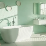
Soft Coastal Blue On The Main Walls
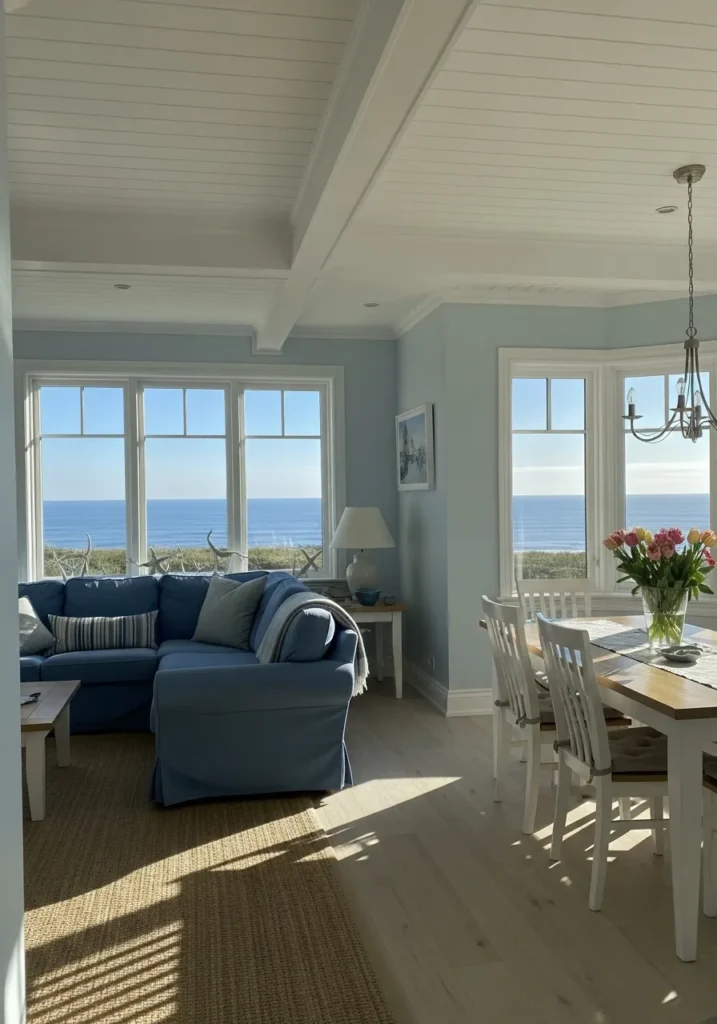
This reads very close to Benjamin Moore Palladian Blue (HC-144), a soft blue-green that leans slightly muted rather than bright. It has that calm, washed look that works well across connected rooms, especially when you can see it carry from a sitting area into a dining space without feeling like a shift .
Palladian Blue has a gentle gray undertone, which keeps it from going too beachy or too sweet. It tends to look a bit bluer next to crisp white trim and more green beside warmer woods. I’d keep the rest of the palette light and simple, like the pale floors and white ceiling here, so the color stays easy to live with and doesn’t start to feel heavy.
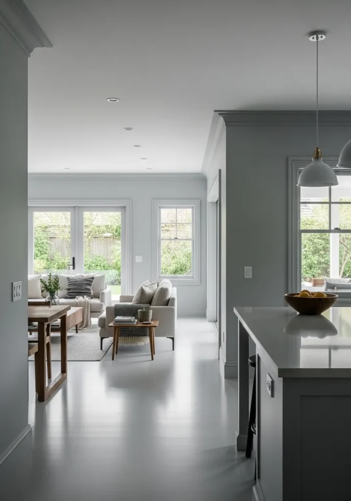
Light Greige That Carries Through Open Spaces
This looks very close to Benjamin Moore Classic Gray (OC-23), a light greige that sits softly between warm and cool. It has a quiet, almost barely-there look on the walls, which is what makes it work so well across a kitchen and living area like this. It keeps everything feeling connected without pulling too much attention .
Classic Gray leans slightly warm, though in brighter rooms it can read a bit cooler and more muted. Next to white cabinetry and pale floors, it stays clean and simple. I’d avoid pairing it with strong yellow tones since that can shift how it reads. It does best with other soft neutrals and light woods, where nothing feels too heavy.
Deep Charcoal Gray For A Modern Contrast
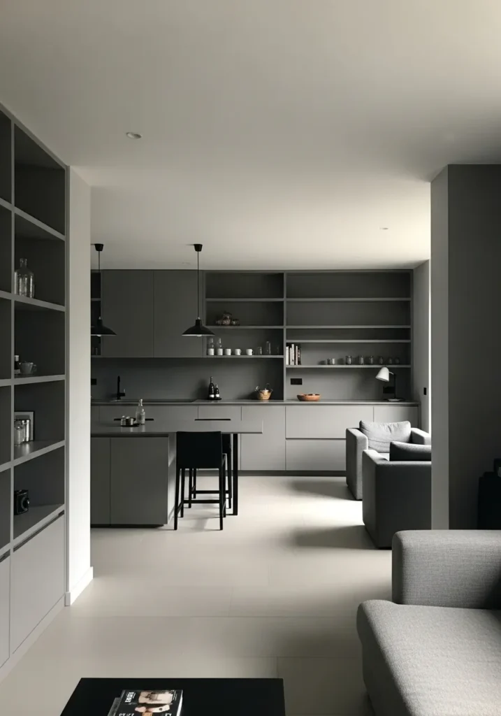
This looks closest to Benjamin Moore Kendall Charcoal (HC-166), a deep gray that leans slightly warm instead of cool or blue. It has a soft, muted depth rather than a harsh dark tone, which makes it easier to carry across cabinetry and built-ins like you see here .
Kendall Charcoal works best when it’s balanced with lighter surfaces, like the pale flooring and white ceiling in this space. It can read a bit heavier in low light, so I’d keep surrounding colors simple and light to avoid closing things in. It pairs well with other soft grays and warm neutrals, especially when you want a darker tone that still feels livable.
Warm Beige Walls That Feel Easy To Live With
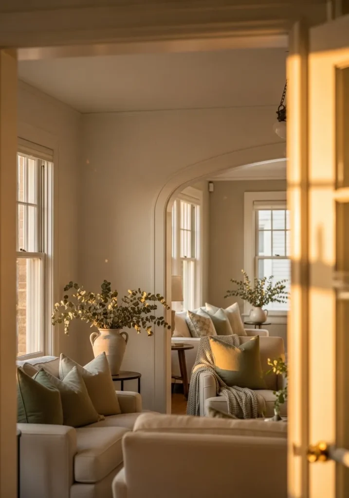
This looks very close to Benjamin Moore Muslin (OC-12), a soft warm beige that leans creamy without turning yellow. It has that quiet, familiar feel that works well across connected rooms, especially when you can see one space flow into another through an opening like this .
Muslin carries a gentle warmth that pairs nicely with soft upholstery and natural greenery. It tends to deepen slightly in lower light and look a bit lighter near windows, which keeps it from feeling flat. I’d keep trim in a soft white and avoid pairing it with cool gray tones. It works best when everything around it stays in that same warm, relaxed range.
Cool Crisp White For A Clean Modern Base
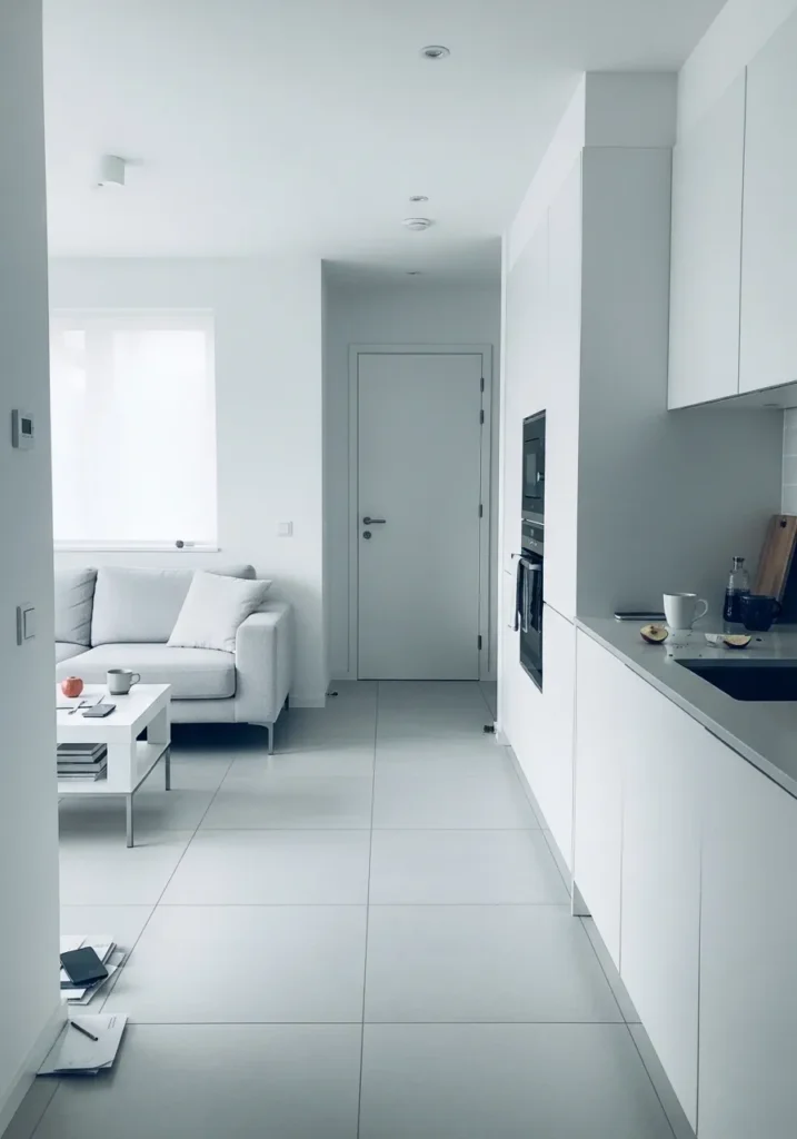
This looks very close to Benjamin Moore Chantilly Lace (OC-65), a clean white with very little warmth. It reads bright but not harsh, which is why it works so well across walls, cabinetry, and trim in one continuous flow .
Chantilly Lace leans slightly cool, so it pairs best with other clean finishes like the light tile floor and simple white cabinetry here. In softer lighting it can feel a bit flatter, but in brighter spaces it stays clear and sharp. I’d avoid mixing it with creamy off-whites since that can make it look too stark. It works best when everything around it stays crisp and minimal.
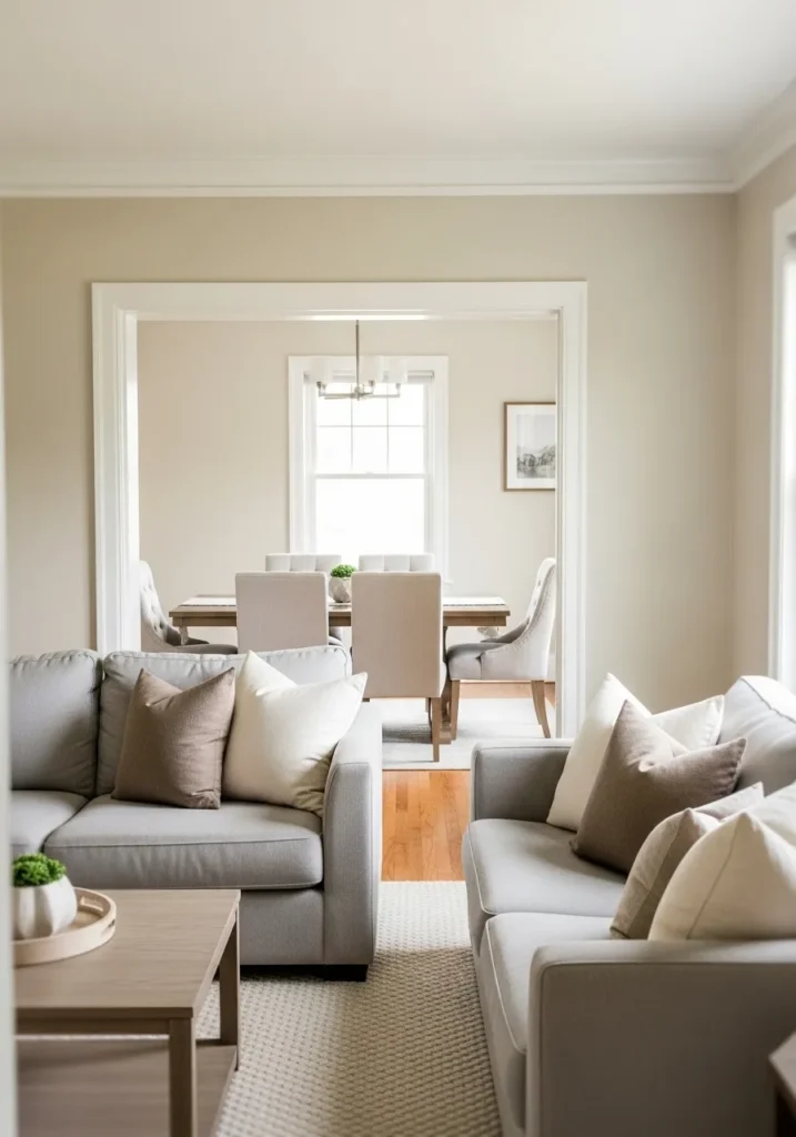
Warm Tan Walls That Tie Rooms Together
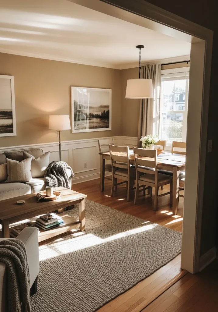
This reads very close to Benjamin Moore Manchester Tan (HC-81), a classic warm tan that sits comfortably between beige and light brown. It has a steady, familiar look that carries well from one room into the next, which you can see as the living area opens into the dining space without any real break .
Manchester Tan leans warm with a soft golden undertone, especially next to wood floors and white trim. It can shift a bit deeper in lower light, but it stays easy on the eyes and never feels too heavy. I’d keep the rest of the palette simple and warm, and skip cooler grays that might clash with its tone.
Soft Neutral White That Feels Lived In
This looks very close to Benjamin Moore Simply White (OC-117), a soft white with a gentle warmth that keeps it from feeling too crisp. It sits nicely across walls and trim without a strong contrast, which helps everything flow from the main living area into the kitchen .
Simply White has a subtle yellow undertone, but it stays light and easy, especially next to pale wood floors and simple furniture. In brighter light it can look cleaner, while in softer light it leans a bit warmer. I’d keep other finishes in the same soft range and avoid pairing it with stark cool whites. It works best when the whole space feels relaxed and not too sharp.
Soft Greige Walls That Work With Everything
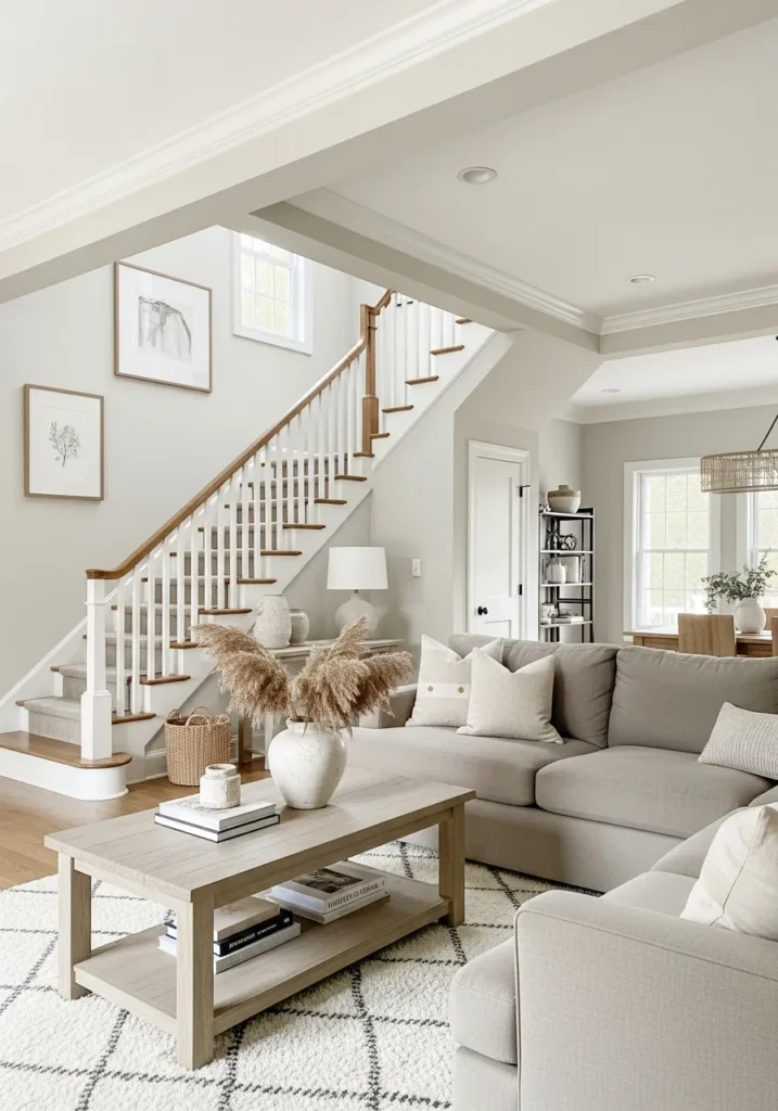
This looks closest to Benjamin Moore Pale Oak (OC-20), a soft greige that leans slightly warm but still feels light and airy. It has that easy middle-ground quality that works across open areas, especially when you can see it move from the living space toward the staircase without feeling like a change .
Pale Oak carries a gentle warmth with a hint of gray, which helps it sit nicely with both white trim and natural wood tones like the stair rail. It can shift a bit depending on light, sometimes reading more beige, sometimes more gray. I’d keep surrounding colors soft and neutral so it stays consistent. It’s one of those shades that just fits almost anywhere.
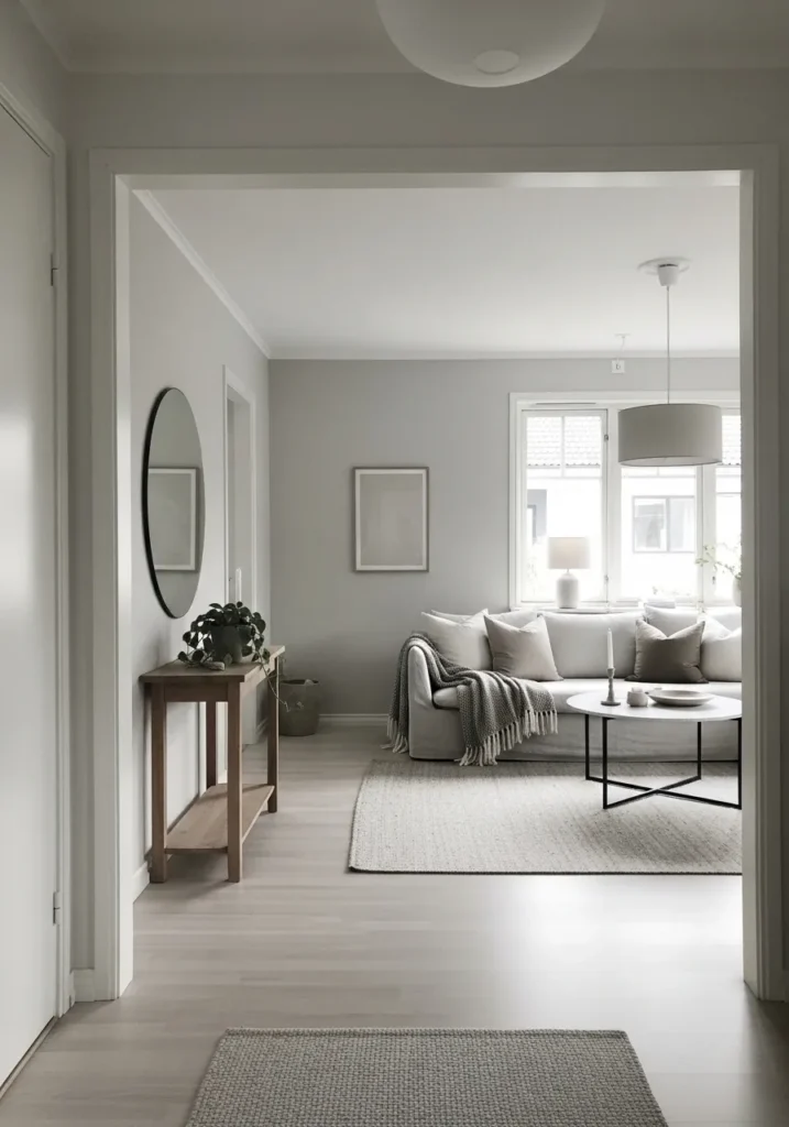
Soft Blue Gray Walls For A Calm Bedroom Feel
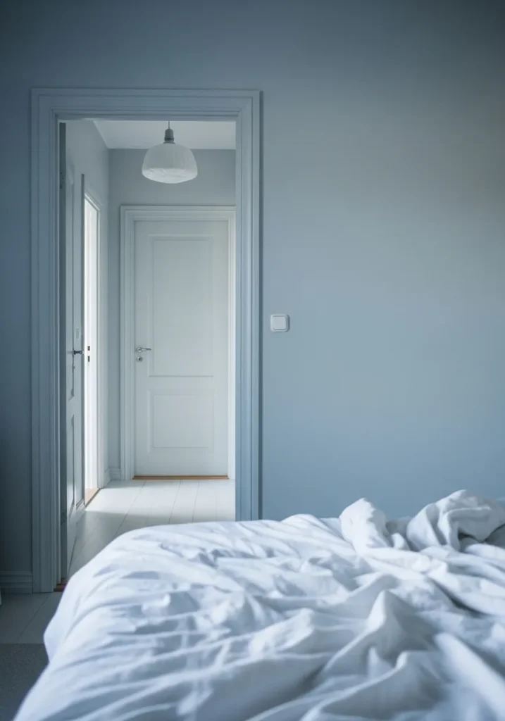
This looks closest to Benjamin Moore Wickham Gray (HC-171), a light blue gray that leans cool but stays soft. It has that quiet, slightly airy look that works well in bedrooms and carries nicely into nearby hallways without feeling like a sharp shift .
Wickham Gray has a subtle blue undertone that shows more near white trim and bedding like this. In softer light it can read a bit more gray, which keeps it from feeling too cold. I’d pair it with clean whites and avoid mixing in warmer beiges. It works best when everything stays light and simple.
Warm Taupe Neutrals For A Soft Open Layout
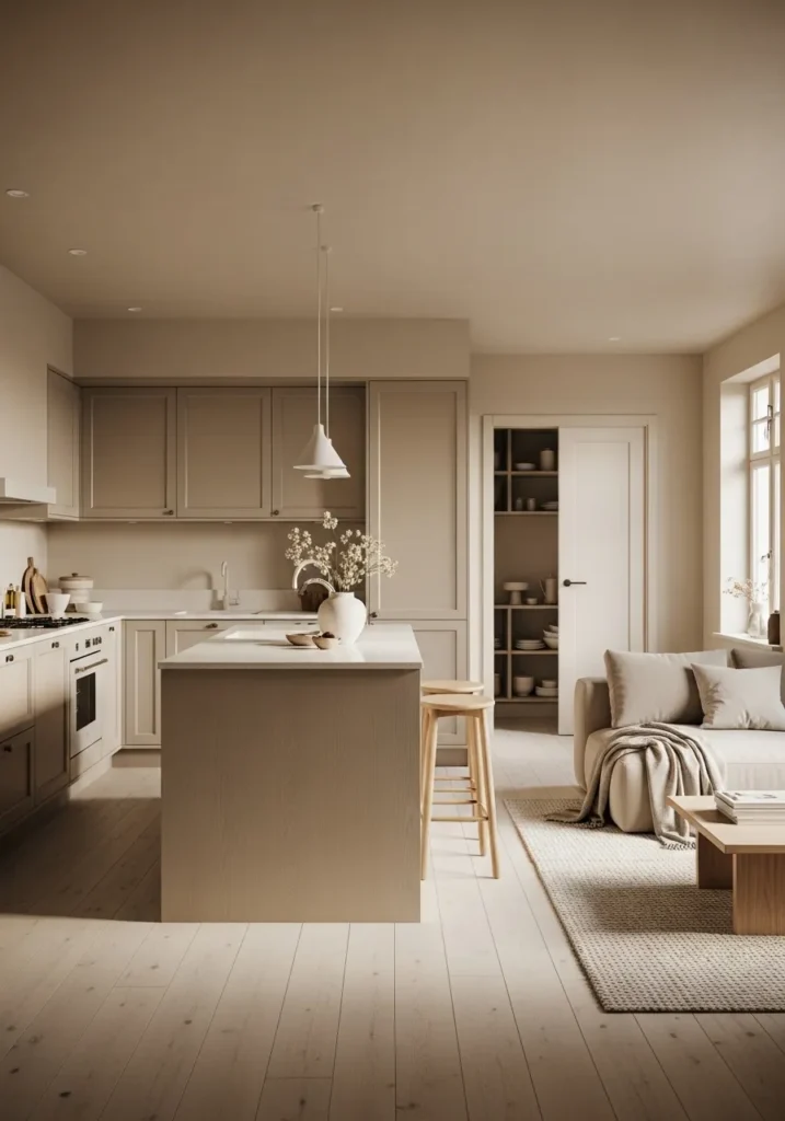
This looks very close to Benjamin Moore Natural Cream (OC-14), a warm taupe that sits between beige and light brown with a slightly creamy feel. It carries easily across the kitchen and living area, especially when cabinetry and walls stay in the same tone family, so nothing feels broken up .
Natural Cream leans warm with a soft beige undertone that shows more next to white counters and pale wood floors. It can deepen a bit in shadowed areas, but it still feels calm and steady. I’d keep other colors close to it, think warm whites and light woods, and skip anything too cool. It’s the kind of color that just keeps everything quiet and connected.
Light Warm Gray For A Quiet Work Space
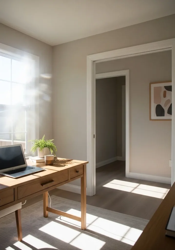
This looks very close to Benjamin Moore Balboa Mist (OC-27), a light warm gray that sits right on the edge of greige. It has a soft, settled look that works well in a home office and carries easily into the next room without feeling like a shift .
Balboa Mist has a subtle warmth, especially next to white trim and natural wood like the desk here. It can lean a bit cooler in brighter light and a bit warmer in softer corners, which keeps it from feeling flat. I’d keep other colors gentle and avoid anything too stark or high contrast. It works best when everything stays calm and easy to look at.
Pale Gray Walls For A Clean Neutral Look
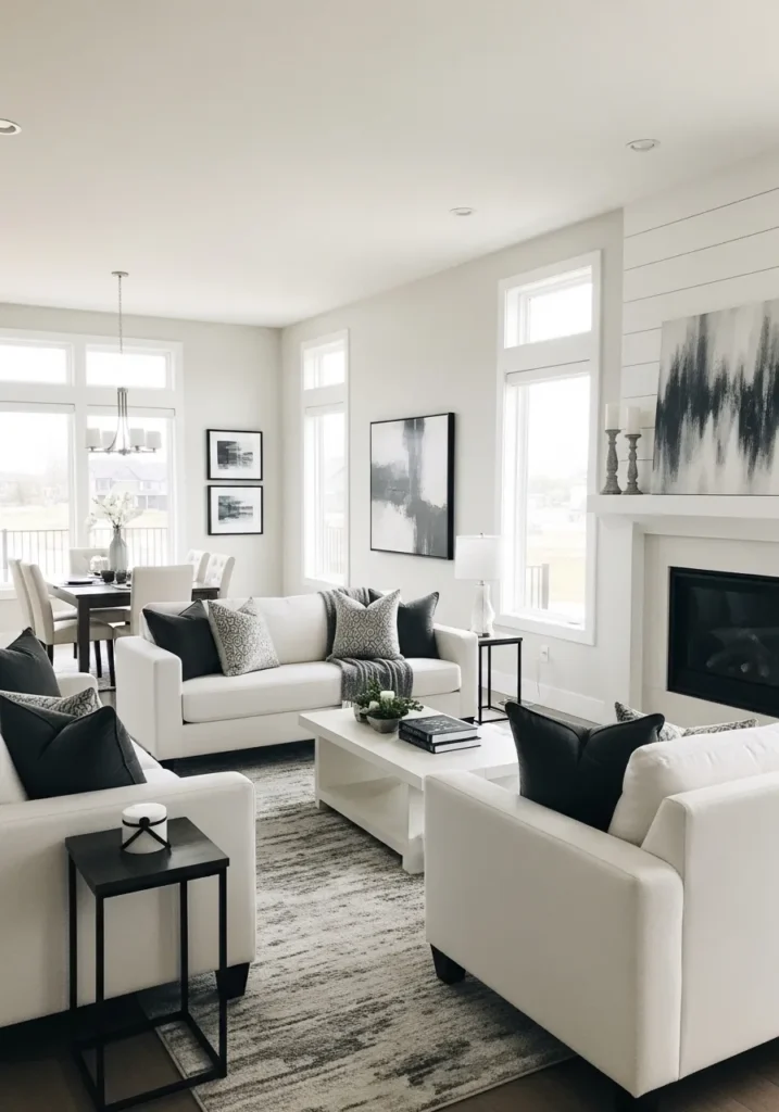
This looks very close to Benjamin Moore Gray Owl (OC-52), a light gray that sits right between cool and slightly warm. It has that easy, neutral feel that works well across open living areas, especially when you carry it from the seating space into the dining area without a noticeable shift .
Gray Owl has a soft, balanced undertone that can lean a touch cooler next to crisp white trim and darker accents like the black pillows here. In brighter light it feels lighter and cleaner, while in softer light it can look a bit more muted. I’d keep surrounding colors simple and avoid overly warm beiges. It does best when the whole space stays calm and uncluttered.
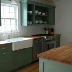
Muted Green Cabinets With Soft Neutral Walls
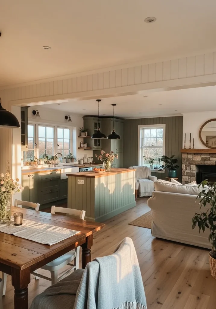
This looks closest to Benjamin Moore Saybrook Sage (HC-114) on the cabinetry, paired with a soft warm white on the surrounding walls. It’s a muted green with a gray base, not too fresh or bright, which makes it easy to carry through an open kitchen and living area without feeling busy .
Saybrook Sage leans slightly earthy, especially next to wood counters and flooring. It can read a bit deeper in shaded areas, but it stays calm overall. I’d keep the wall color light and warm so the green doesn’t feel too cool. It works well when the rest of the space stays simple and a little softened.
Soft Taupe Walls For A Calm Bedroom Flow
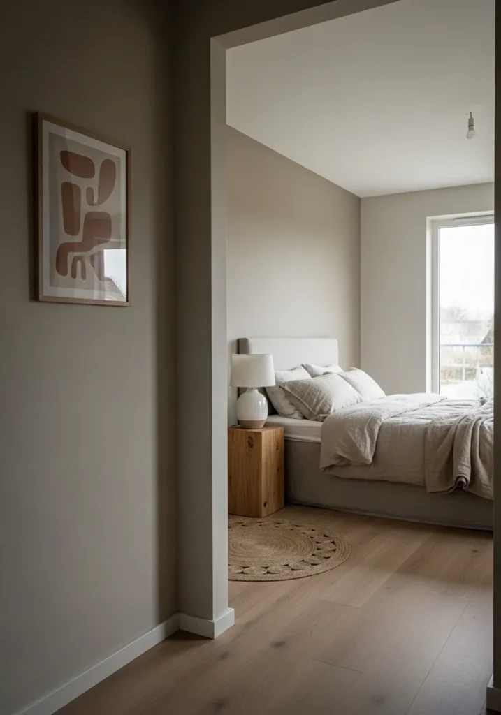
This looks very close to Benjamin Moore Pale Oak (OC-20), a soft taupe that sits right between beige and gray. It has a gentle, muted feel that works well in bedrooms and carries easily into the hallway without feeling like a shift in color .
Pale Oak leans slightly warm, especially next to light wood floors and simple white bedding. It can read a bit more beige in softer light and a touch more gray near brighter windows. I’d keep everything around it in the same soft range and avoid strong contrast. It works best when the space stays quiet and easy.
Soft Blue Gray That Flows Through Open Spaces
This looks very close to Benjamin Moore Silver Chain (1472), a light blue gray that leans cool but stays soft enough for everyday spaces. It has that smooth, quiet look that carries easily from the kitchen into the sitting area, so nothing feels like a hard transition .
Silver Chain has a subtle blue undertone that shows more near bright windows and white trim. It can read a bit more gray in lower light, which helps keep it from feeling too cool. I’d pair it with clean whites and light woods, and avoid warmer beige tones. It works best when the whole palette stays simple and a little restrained.
Creamy Off White With A Natural Feel
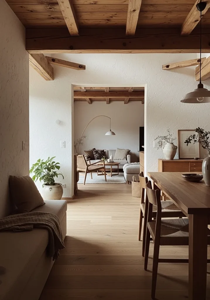
This looks very close to Benjamin Moore Swiss Coffee (OC-45), a warm off white that leans creamy without feeling heavy. It has that soft, slightly aged look that works well with natural materials, especially when you see it carry from one room into the next with no sharp contrast .
Swiss Coffee has a gentle yellow undertone that shows more next to wood beams and warm flooring. It can look brighter in stronger light and a bit richer in softer corners, but it stays easy to live with. I’d keep trim close in tone and avoid cooler whites. It works best when everything around it feels warm and a little relaxed.
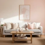
Soft Blush Beige For A Light And Airy Feel
This looks very close to Benjamin Moore Pink Damask (OC-72), a very soft blush beige that reads almost like a warm neutral. It has a gentle pink undertone, but it stays subtle, which is why it works across an open living and dining area without feeling too sweet or obvious .
Pink Damask leans warm and can shift depending on what’s around it. Next to white trim and pale floors, it looks lighter and more neutral, while soft furnishings like the blush sofa bring out that hint of pink. I’d keep the rest of the palette light and warm and avoid cool grays. It works best when everything feels a little soft and understated.
Deep Blue Green Walls For A Cozy Living Room
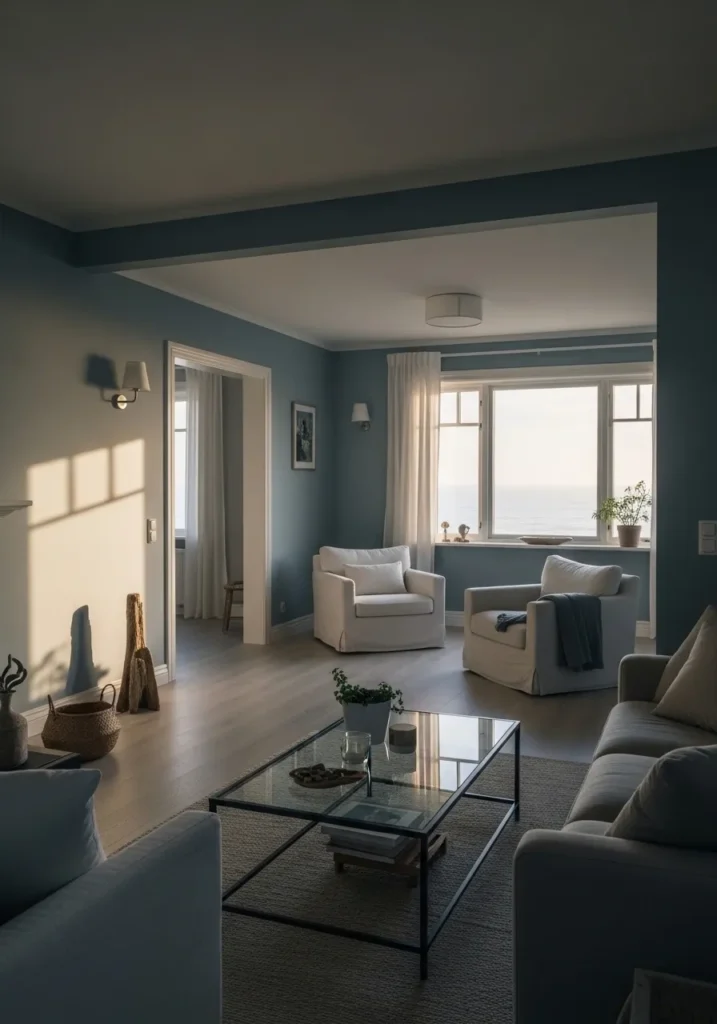
This looks closest to Benjamin Moore Aegean Teal (2136-40), a rich blue green that leans slightly muted rather than bold. It has that calm depth that works well in a living room, especially when paired with lighter furniture so the color doesn’t feel too heavy .
Aegean Teal carries both blue and green undertones, shifting a bit depending on the light. It can feel deeper in shaded areas and softer near windows, which keeps it interesting without being too strong. I’d keep trim and larger pieces light, like the white chairs here, and avoid mixing in too many cool grays. It works best when the rest of the space stays simple.
Warm Greige That Keeps The Whole Space Connected
This looks very close to Benjamin Moore Revere Pewter (HC-172), a warm greige that leans slightly beige without losing that soft gray base. It has that easy, familiar look that works well across an open living and kitchen area, especially when everything flows without a strong color break .
Revere Pewter has a gentle warmth that shows more next to wood tones like the flooring and table here. It can shift a bit depending on light, sometimes reading more beige, sometimes more gray. I’d keep surrounding finishes warm and simple, and avoid cooler blue-grays. It’s one of those colors that just makes everything feel settled.
Soft Light Gray That Keeps Things Simple
This looks very close to Benjamin Moore Classic Gray (OC-23), a very light gray with a soft warm base. It reads almost like an off white, which is why it works so well across connected spaces like this, moving from the entry into the living room without any real break .
Classic Gray has a subtle warmth that shows up next to white trim and pale flooring. It can lean a bit cooler in brighter light, but it stays gentle overall. I’d keep the palette light and avoid pairing it with strong yellow or heavy dark tones. It works best when everything feels quiet and easy to live with.
Classic Warm Gray With Traditional Trim
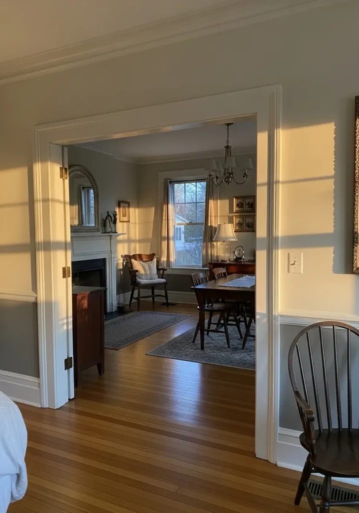
This looks very close to Benjamin Moore Stonington Gray (HC-170), a medium-light gray that leans slightly cool but still feels soft in a traditional setting. It has a steady, familiar look that works well across adjoining rooms, especially when paired with white trim and details like the wainscoting .
Stonington Gray can shift depending on the light. It may read a bit cooler near bright windows and a touch warmer in softer areas, which keeps it from feeling flat. I’d keep trim crisp and clean, and avoid mixing in warmer beige tones. It works best when the palette stays simple and a little classic.
Soft Beige That Feels Easy To Live With
This reads very close to Benjamin Moore Edgecomb Gray (HC-173), one of those light beige-greige shades that sits right in the middle. It leans warm without turning yellow, which is why it works so well across connected spaces like a living room opening into a dining area .
The undertone is soft and a little muted, so it shifts gently depending on light. In brighter rooms it looks lighter and more neutral, while in lower light it can feel slightly warmer. It pairs nicely with off-white trim and simple wood tones, and it is forgiving if you mix in different fabrics or finishes.