I’ve always believed that the right paint color can completely change how a home feels, sometimes more than furniture ever could.
That’s why I keep coming back to Benjamin Moore when I want something that actually works in real life and not just in perfect photos.
In this list, I pulled together color schemes that I’ve seen designers use again and again, the kind that feel lived in, layered, and easy to build around.
Some are soft and quiet, others have a bit more personality, but all of them feel like something you could actually use in your own space.
If you’re trying to figure out what colors go together without overthinking it, this is exactly where I’d start.
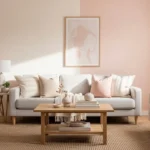
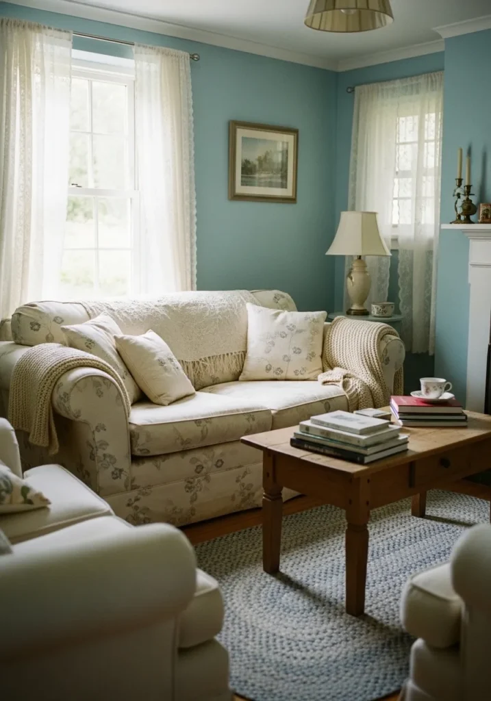
Soft Greige Living Room Walls
This wall color reads like a light greige, and it looks closest to Benjamin Moore Pale Oak. It sits right between warm beige and soft gray, which is why it feels easy to live with. You can see how it blends into the neutral sofa and light wood table without anything standing out too much. Just a quiet, steady backdrop.
The undertone leans slightly warm, especially next to natural wood and off-white fabrics. It tends to stay soft in most lighting, though it can look a touch grayer in low light. This kind of color works well in living rooms, bedrooms, even hallways. Pair it with creamy whites instead of bright whites, and keep finishes simple. Too many cool tones nearby can make it feel a bit dull.
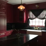
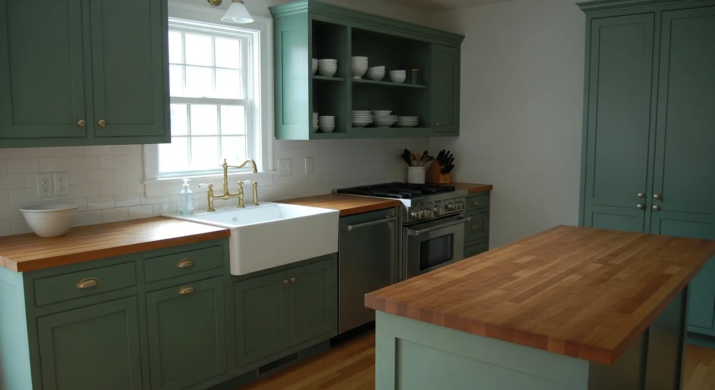
This cabinet color reads like a rich navy, and it feels closest to Benjamin Moore Hale Navy. It is a deep blue that leans slightly muted rather than bright, which makes it easier to use in a full kitchen. You can see how it sits under the lighter upper cabinets and still feels calm, not heavy.
The undertone is a bit soft and slightly gray, so it does not turn too bold or shiny. It tends to hold its depth even in different lighting, though it can look darker in corners. This kind of navy works well with warm brass hardware and white countertops, but it also needs enough contrast above it. Too much dark around it can start to feel closed in.
Warm Cream Bedroom Walls
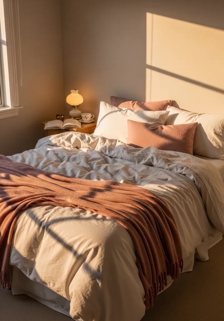
This wall color reads like a soft warm cream, and it feels closest to Benjamin Moore Swiss Coffee. It is not a stark white. It has a gentle beige tone that makes it feel easy and comfortable, especially next to light bedding and those muted blush pillows.
The undertone leans warm, with a hint of yellow that shows more when the room gets direct light. It works well in bedrooms where you want things to feel calm but not flat. Pair it with other warm neutrals or soft pinks and keep the trim in a similar soft white. Cooler whites nearby can make it look slightly dull, so it is better to stay on the warm side.
Moody Blue Gray Dining Room Walls
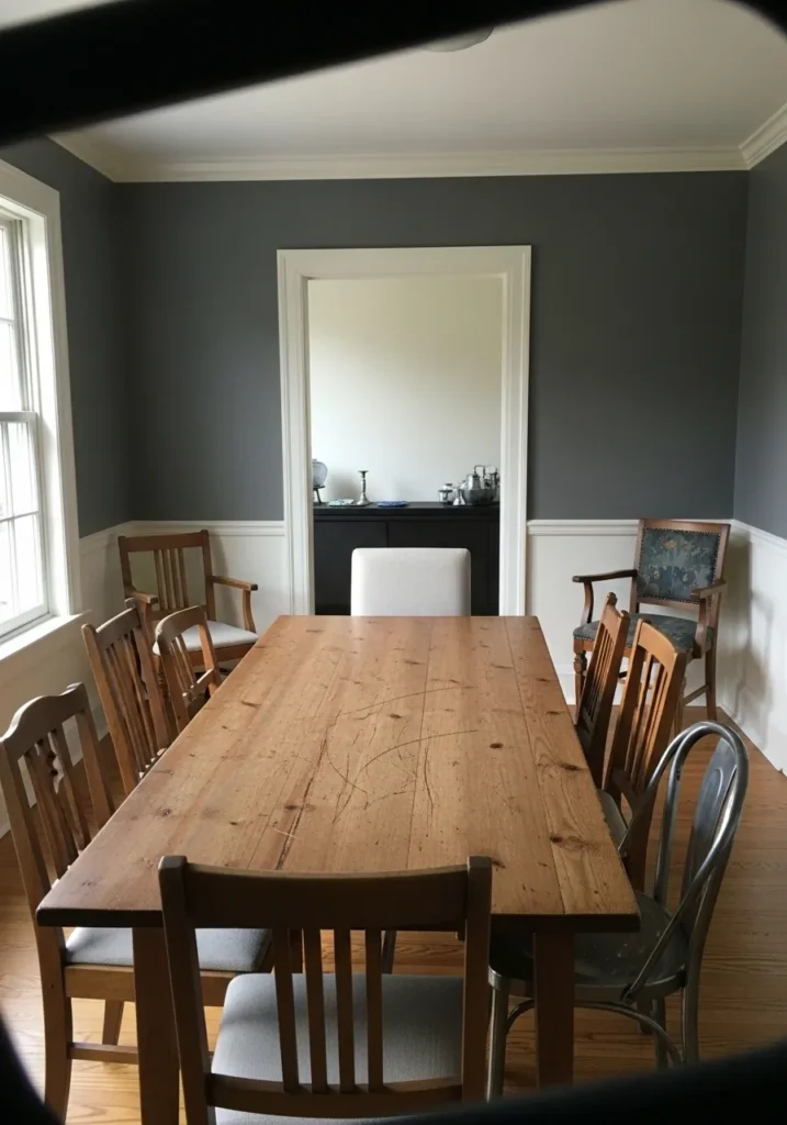
This wall color reads like a deep blue gray, and it feels closest to Benjamin Moore Hale Navy or maybe Gentleman’s Gray. It sits right between navy and charcoal, which gives it a heavier look without going fully dark. Next to the white trim and that worn wood table, it comes across steady and a little traditional.
The undertone leans cool, with a bit of gray softening the blue so it does not feel too sharp. It tends to shift depending on light, sometimes reading more blue, sometimes more charcoal. This kind of color works well in dining rooms where you want a bit of contrast, but it needs lighter trim and some natural wood to keep it from feeling too closed in.
Soft Blue Home Office Walls
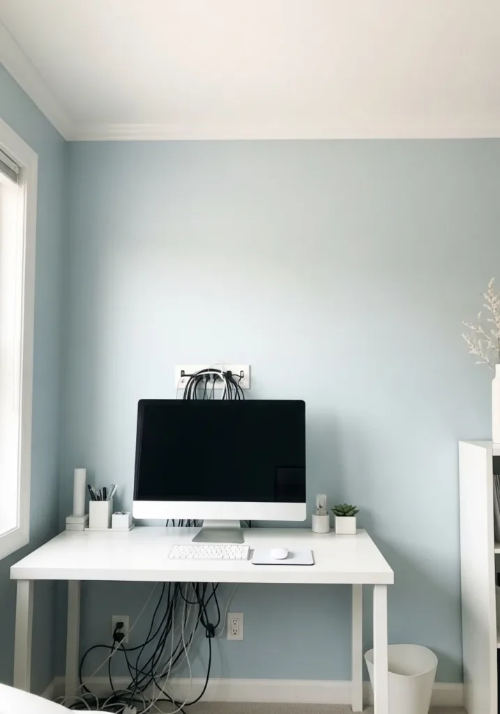
This wall color reads like a light, airy blue, and it feels closest to Benjamin Moore Palladian Blue. It sits in that soft blue-green range, though here it leans more blue than green. Against the white desk and trim, it comes across clean and calm without feeling cold.
The undertone has a slight gray base, which keeps it from looking too bright or baby blue. It can shift a bit depending on light, sometimes looking more muted, sometimes a touch fresher. This kind of color works well in small offices or bedrooms where you want a quiet backdrop. Pair it with crisp whites and a few natural textures, and it tends to stay easy to live with.
Deep Green Accent Walls
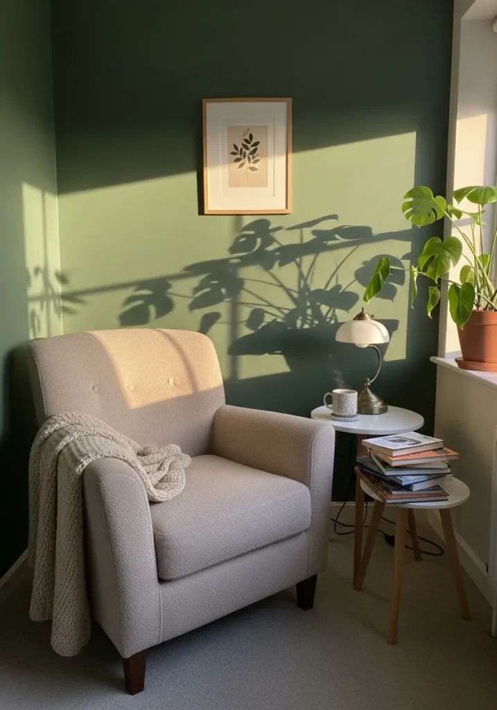
This wall color reads like a rich, earthy green, and it feels closest to Benjamin Moore Hunter Green. It is a deeper shade with a slightly muted quality, which keeps it from looking too bright or sharp. Next to the light chair and simple decor, it comes across calm but still has presence.
The undertone leans warm, with a bit of olive in it, especially when natural light hits the wall. It can shift slightly depending on the room, sometimes reading more classic green, sometimes a bit softer. This kind of color works well for accent walls or small corners where you want a bit more depth. Pair it with warm whites, wood tones, and simple fabrics so it does not feel too heavy.
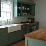
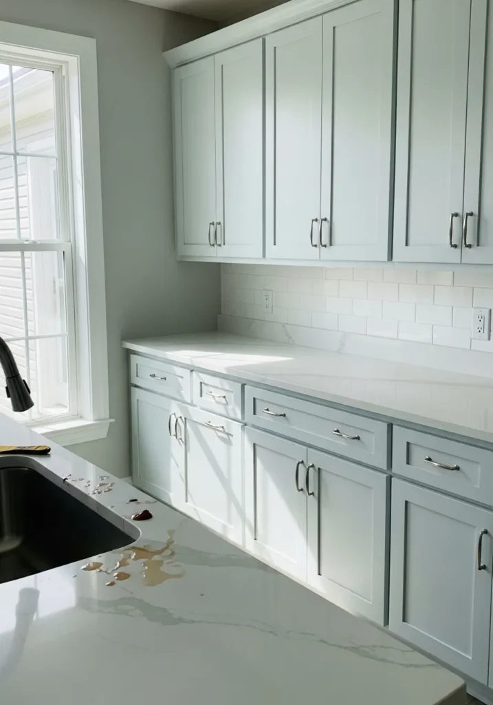
Soft Cream Kitchen Cabinets
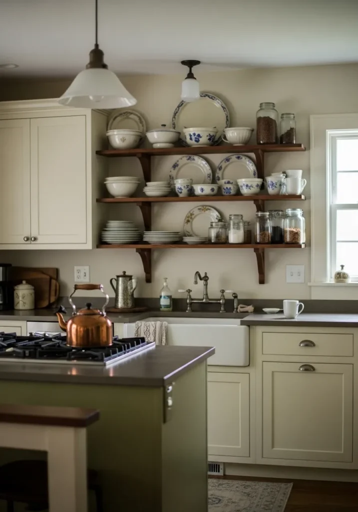
This cabinet color reads like a warm cream, and it feels closest to Benjamin Moore White Dove. It is not a bright white. It has a gentle softness that sits comfortably next to the darker countertop and those open wood shelves, which keeps the whole kitchen from feeling too stark.
The undertone leans warm, with a slight beige base that shows more in natural light. It tends to stay consistent, though it can look a bit richer when paired with darker finishes. This kind of cream works well in kitchens where you want a classic feel without going too yellow. Pair it with warm metals and wood tones, and avoid very cool whites nearby since they can make it look a little off.
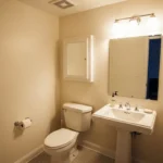
Light Cool Gray Bathroom Walls
This wall color reads like a soft cool gray, and it feels closest to Benjamin Moore Classic Gray. It is very light, almost off-white, but it carries just enough gray to stand apart from the white sink and trim. That slight contrast keeps the space from looking too flat.
The undertone leans cool, though it stays fairly neutral overall. It can shift a bit depending on the light, sometimes looking a touch warmer, sometimes a bit crisper. This kind of gray works well in bathrooms where you want a clean look without going stark. Pair it with simple whites and darker fixtures, but avoid pairing it with overly warm beiges since they can make it feel slightly off.
Soft Yellow Entryway Walls
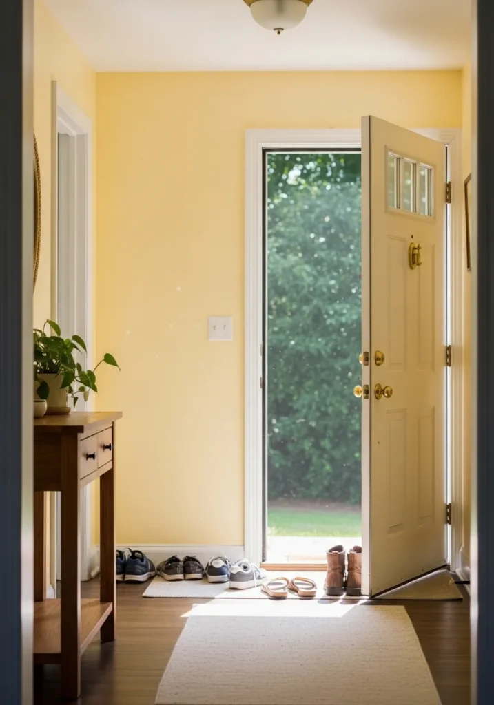
This wall color reads like a gentle buttery yellow, and it feels closest to Benjamin Moore Hawthorne Yellow. It is a light, warm shade that sits somewhere between cream and true yellow, which makes it easier to use than brighter versions. Next to the white trim and wood table, it feels easygoing and familiar.
The undertone leans clearly warm, with a soft golden base that shows more when natural light hits the wall. It can brighten up small spaces like entryways and hallways without feeling too bold. This kind of yellow works best when you keep the rest of the palette simple, think warm whites and natural wood. Cooler grays nearby can make it look a bit off, so it is better to stay on the warmer side.
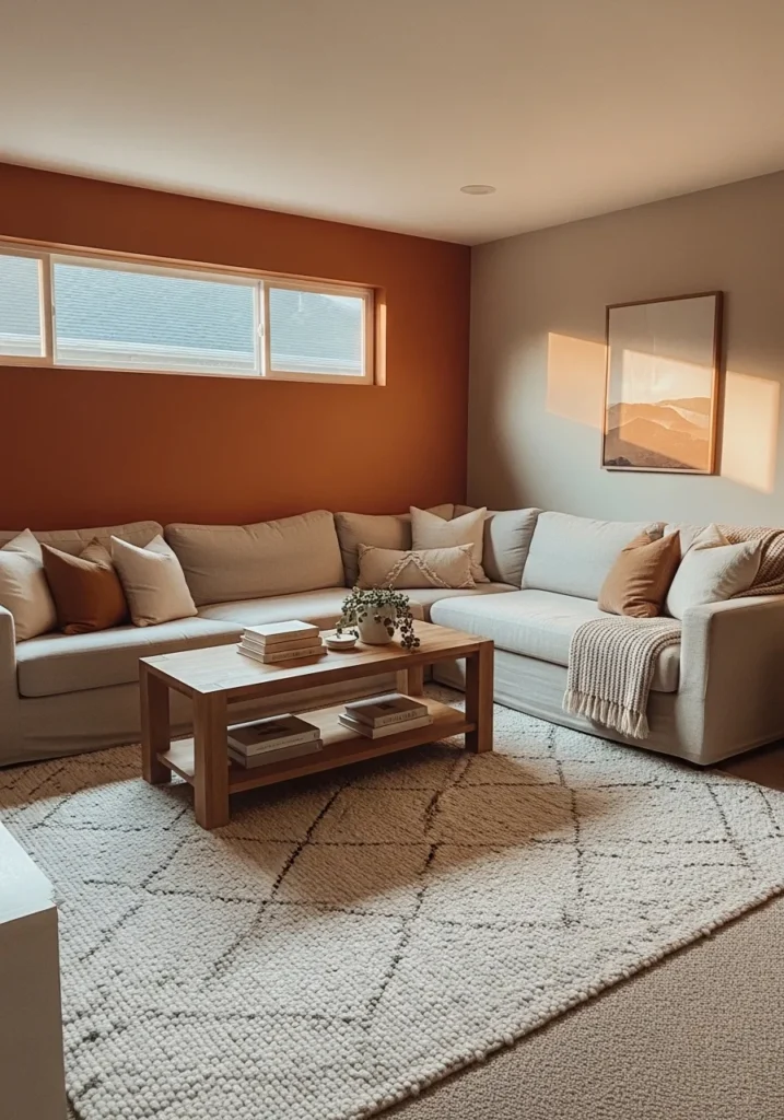
Warm Terracotta Accent Wall
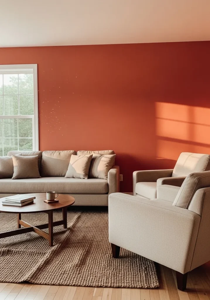
This wall color reads like a rich terracotta, and it feels closest to Benjamin Moore Terra Cotta Tile. It is a warm, earthy red with an orange base, which gives it that sunbaked look. Next to the neutral sofa and rug, it stands out but still feels comfortable, not too sharp.
The undertone leans clearly warm, with a bit of brown that keeps it from looking too bright. It can shift slightly depending on light, sometimes deeper, sometimes a little softer. This kind of color works well as an accent wall or in spaces where you want a bit more character. Pair it with warm neutrals and natural textures, and keep cooler tones to a minimum so it stays cohesive.
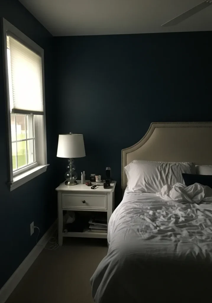
This wall color reads like a dark navy, and it feels closest to Benjamin Moore Hale Navy. It is a deep, slightly muted blue that leans more classic than bold. Against the white bedding and light nightstand, it gives a strong contrast without feeling too sharp.
The undertone sits on the cooler side, with a bit of gray that keeps the color from looking too saturated. It can appear almost black in low light, then show more blue during the day. This kind of navy works well in bedrooms if you keep the rest of the room lighter. Soft whites and light fabrics help it feel balanced, otherwise it can get a bit heavy.
Pale Blue Kitchen Cabinets
This cabinet color reads like a soft pale blue, and it feels closest to Benjamin Moore Breath of Fresh Air. It is a light, slightly cool blue that almost leans toward a blue-gray, which keeps it from feeling too sweet. Next to the white countertop and backsplash, it stays clean and easy to look at.
The undertone leans cool, with a hint of gray that helps it hold up in different lighting. It can look a bit brighter in direct light, then soften down when the room is shaded. This kind of blue works well in kitchens where you want something lighter than navy but still a bit more noticeable than white. Pair it with crisp whites and simple metals, and keep warmer tones limited so it does not turn dull.
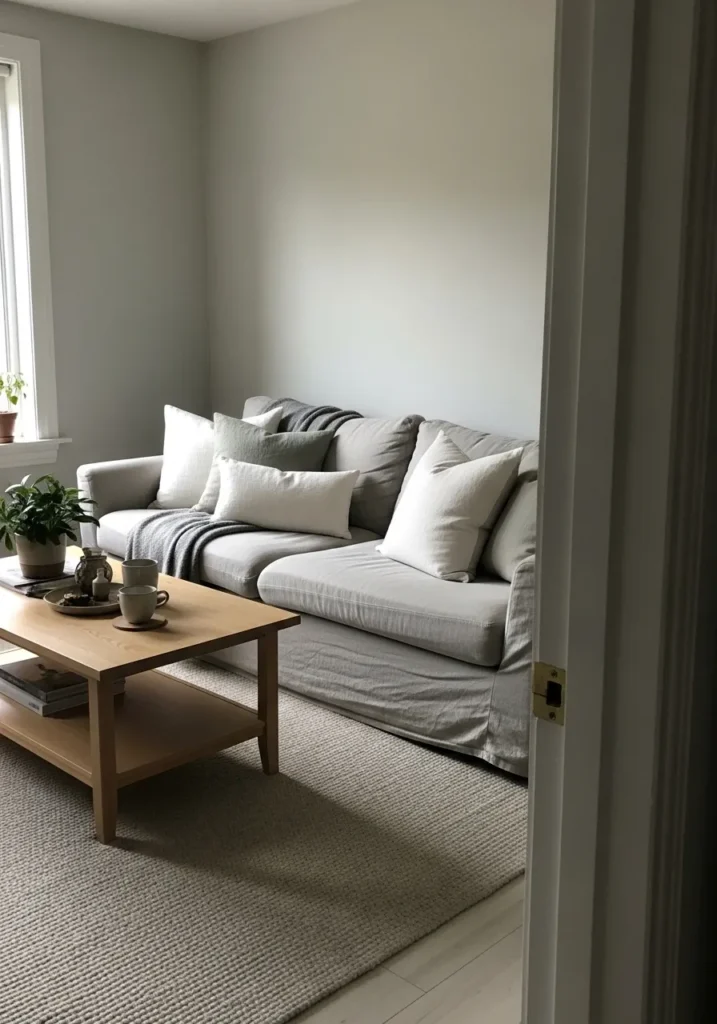
Soft Warm White Living Room Walls
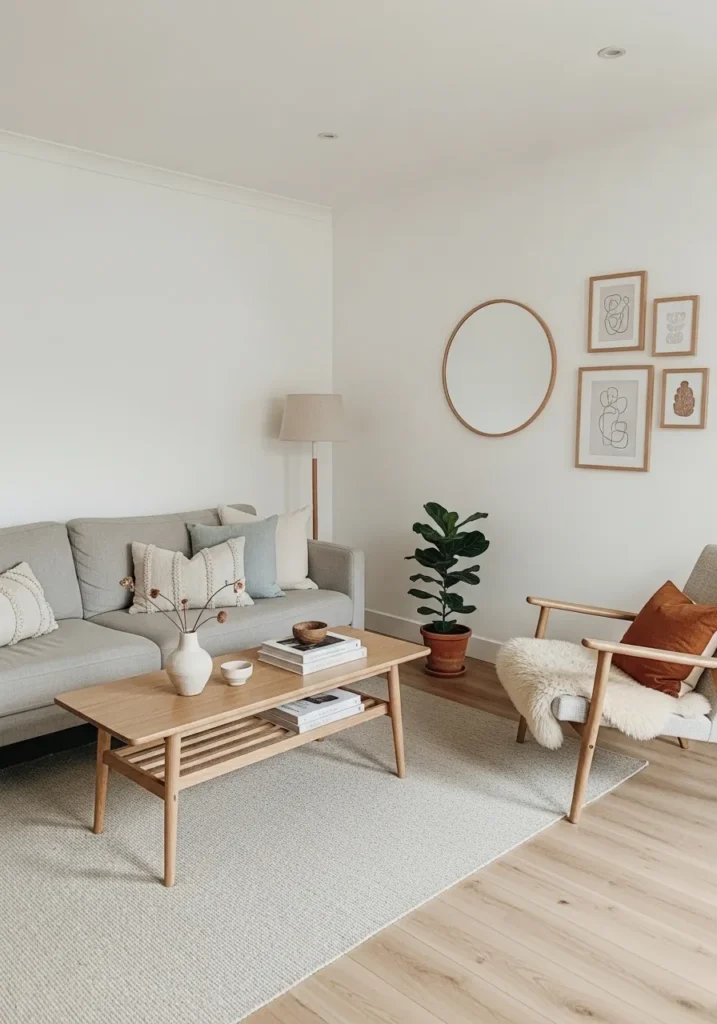
This wall color reads like a warm white, and it feels closest to Benjamin Moore Simply White. It is not stark or cold. It has a soft creamy edge that works nicely with the light wood furniture and neutral sofa, keeping everything easy on the eyes.
The undertone leans slightly warm, with a hint of yellow that shows more in brighter light. It tends to stay clean without going too beige, which makes it useful in open living spaces. This kind of white works well with natural textures and soft fabrics. If you pair it with cooler grays, it can look a bit off, so it is better to keep the palette on the warmer side.
Soft Blush And Gray Nursery Walls
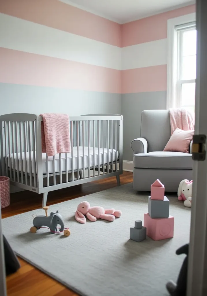
This wall color combination reads like a gentle blush pink paired with a soft light gray, and the pink feels closest to Benjamin Moore First Light. It is a muted pink, not too sweet, which makes it easier to live with long term. The gray stripe underneath keeps it from feeling overly delicate, especially next to the crib.
The blush has a warm undertone with just a hint of peach, while the gray leans slightly cool. That mix helps balance things out. It works well in nurseries or small bedrooms where you want some color but still keep it calm. Stick with soft whites and light woods nearby, and avoid stronger pinks since they can make this shade look washed out.
Mid Tone Gray Hallway Walls
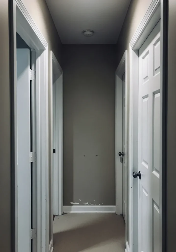
This wall color reads like a mid tone gray, and it feels closest to Benjamin Moore Chelsea Gray. It sits in that in-between range, not too light and not too dark, which makes it practical for narrower spaces like a hallway. Next to the white doors and trim, it has a clear contrast but still feels steady.
The undertone leans slightly warm, with a bit of brown mixed into the gray, which helps it feel less cold. It can look a touch deeper in low light, especially in spaces without much natural light. This kind of gray works well in transitional areas, but it helps to keep the trim bright and clean so the space does not start to feel closed in.
Dark Charcoal Dining Room Wall
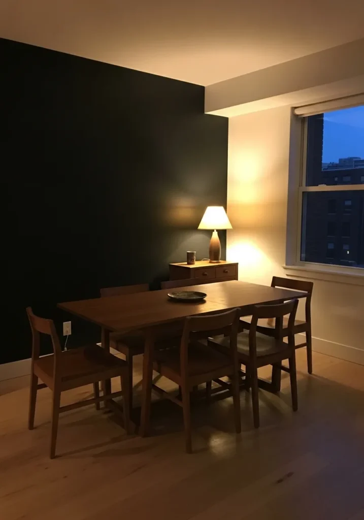
This wall color reads like a deep charcoal, and it feels closest to Benjamin Moore Kendall Charcoal. It is a dark gray with a bit of softness, not fully black, which makes it easier to use on a larger wall. Next to the wood dining table, it looks grounded but still calm.
The undertone leans slightly warm, with a hint of brown that comes through under indoor lighting. It can look almost black in low light, then show more gray as the room brightens. This kind of color works well as an accent wall or in dining areas where you want a quieter backdrop. It helps to keep nearby walls lighter so the space does not feel too closed in.
Soft Blue Green Living Room Walls
This wall color reads like a muted blue green, and it feels closest to Benjamin Moore Wythe Blue. It sits right between blue and green with a bit of gray mixed in, which keeps it from feeling too bright. Next to the light sofa and wood table, it comes across relaxed and easy to live with.
The undertone leans slightly cool, though there is a soft warmth underneath that shows depending on the light. It can shift from more blue to more green as the day changes. This kind of color works well in living rooms where you want something gentle but not plain. Pair it with warm whites and soft fabrics, and it tends to stay balanced without looking too crisp.
Soft Sage Green Kitchen Cabinets
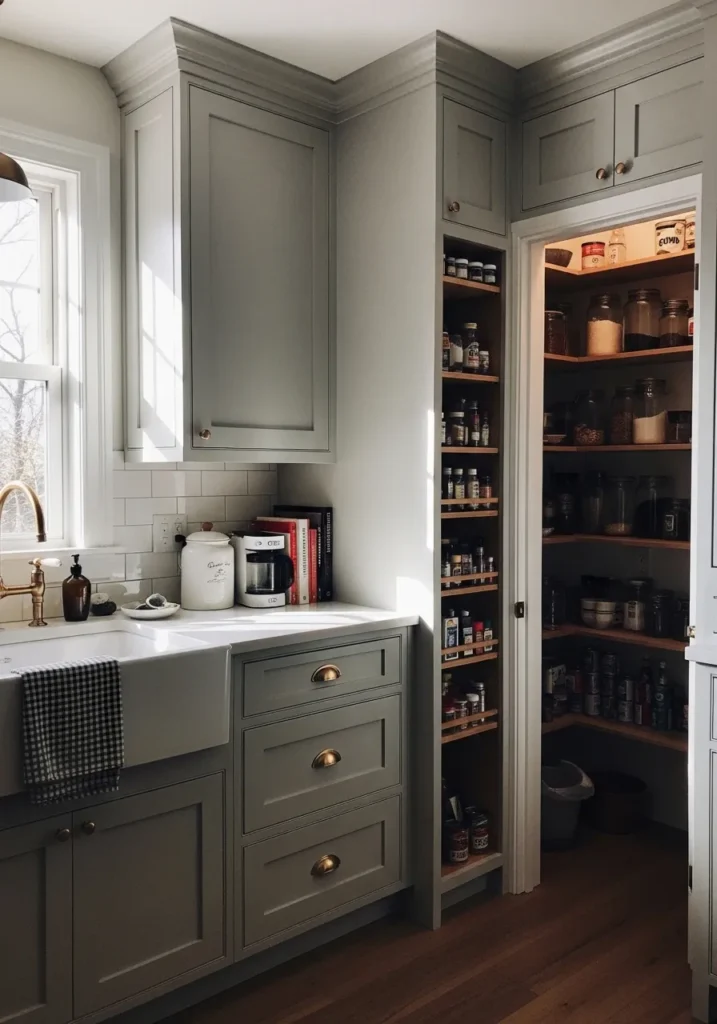
This cabinet color reads like a muted sage green, and it feels closest to Benjamin Moore Saybrook Sage. It is a soft green with a gray base, which keeps it from feeling too fresh or bright. Next to the white sink and warm wood inside the pantry, it comes across steady and lived in.
The undertone leans slightly warm, with a bit of earthiness that shows more in natural light. It can shift toward gray in lower light, which helps it stay subtle. This kind of green works well in kitchens where you want some color but not too much contrast. Pair it with warm whites and brass or aged metals, and it tends to hold together nicely without feeling busy.
Soft Gray Bedroom Walls
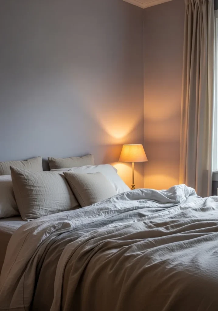
This wall color reads like a light soft gray, and it feels closest to Benjamin Moore Gray Owl. It is a pale gray with a gentle, slightly airy look that keeps the room from feeling too dark. Next to the white bedding and warm lamp light, it comes across quiet and easy to settle into.
The undertone leans cool, but there is a faint warmth that shows depending on the light. It can shift a bit, sometimes looking more gray, sometimes a little softer and almost off white. This kind of color works well in bedrooms where you want something simple that does not stand out too much. Pair it with soft whites and warm fabrics, and it tends to stay balanced without feeling cold.
Muted Green Built In Cabinets
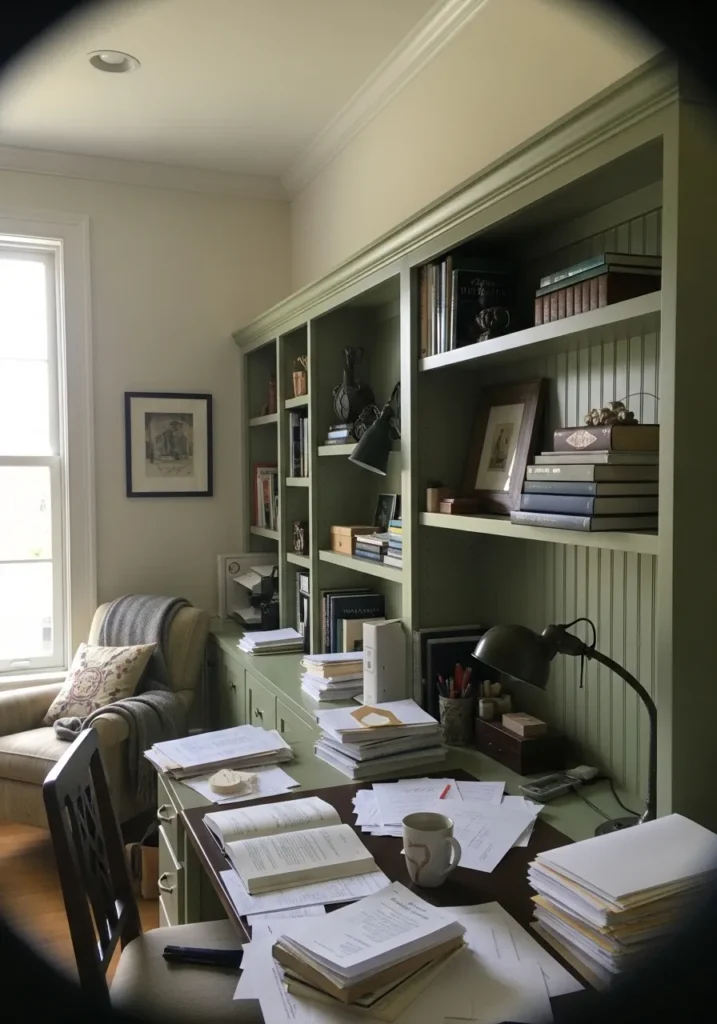
This cabinet color reads like a muted olive green, and it feels closest to Benjamin Moore Vintage Vogue. It is a deeper green with a soft, slightly dusty look, which keeps it from feeling too fresh or bright. Set against the lighter wall color and all the books, it feels steady and a bit traditional.
The undertone leans warm, with an earthy base that can show more in natural light. It can shift darker in shaded areas, almost leaning toward a green gray. This kind of color works well on built ins, desks, or cabinetry where you want something more grounded. Pair it with warm neutrals and wood tones, and it tends to hold up well without looking too heavy.
Warm Rust Accent Wall
This wall color reads like a deep rust or burnt orange, and it feels closest to Benjamin Moore Rust. It is a warm, earthy shade with a strong red base, softened just enough so it does not feel too bold. Against the light sofa and neutral rug, it stands out in a steady, grounded way.
The undertone leans very warm, with a bit of brown that keeps it from looking too bright. It can shift depending on the light, sometimes reading more orange, sometimes a little deeper and more muted. This kind of color works well as an accent wall in living spaces where you want a bit more character. Pair it with warm neutrals and wood tones, and keep cooler grays limited so it does not start to feel off.
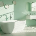
Soft Aqua Bathroom Walls
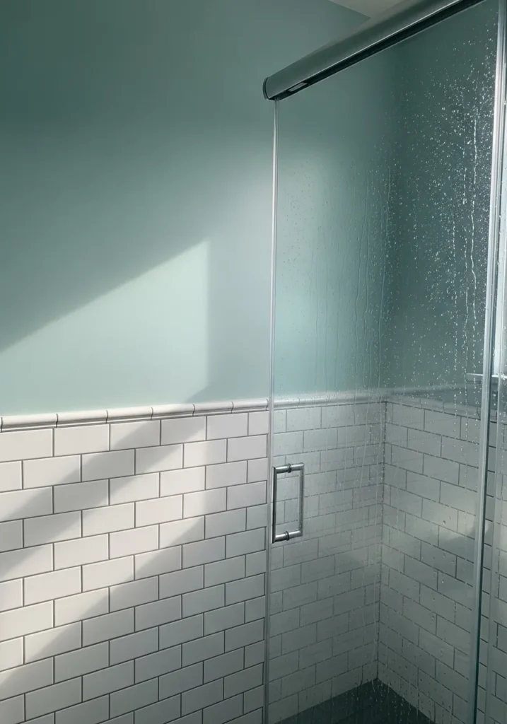
This wall color reads like a pale aqua, and it feels closest to Benjamin Moore Beach Glass. It sits between blue and green with a soft gray base, which keeps it from feeling too bright. Against the white tile, it comes across clean and relaxed without looking cold.
The undertone leans slightly cool, though it can shift depending on the light. Sometimes it looks more blue, other times a bit greener and softer. This kind of color works well in bathrooms where you want something fresh but still easy to live with. Pair it with simple whites and light finishes, and it tends to stay calm rather than sharp.