Warm neutral paint colors have a quiet kind of magic, and I keep coming back to them whenever I want a room to feel comfortable and easy to live in.
I have tried plenty of trendy shades over the years, but my favorites are always those soft beige, greige, and warm taupe tones that make everything in the room look better.
Benjamin Moore has some of the nicest ones out there, and I honestly love how these colors work with wood, cozy fabrics, and simple decor.
So I pulled together a list of warm neutral shades that I think are beautiful, relaxed, and the kind of colors I would happily use in my own home.
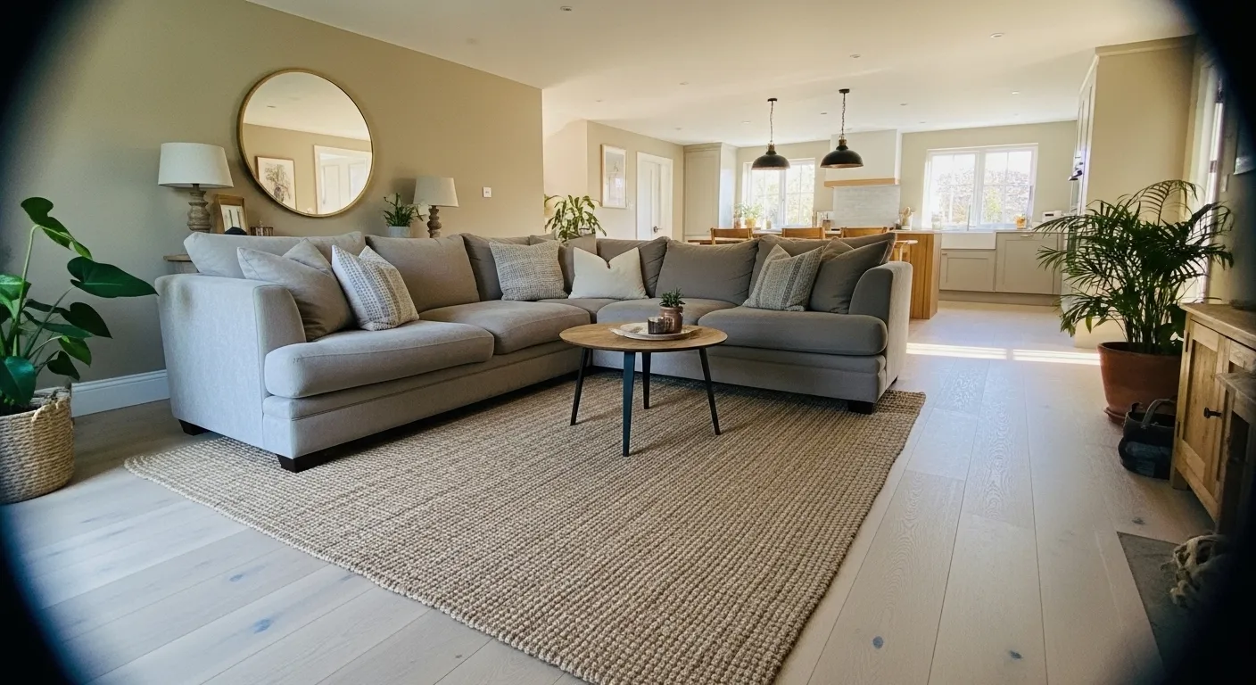
Soft Warm Beige Walls
This wall color reads very close to Benjamin Moore Manchester Tan. It is a warm beige that sits right between tan and a light greige, which makes it easy to live with. The color feels calm and steady rather than creamy or yellow. In a room like this, next to a light sofa and a simple wood coffee table, it looks relaxed and comfortable.
Manchester Tan usually shows a gentle warm undertone that leans slightly sandy. In brighter rooms it can feel lighter and a bit airier, while in softer light it turns a touch deeper and cozier. It tends to work well with natural woods, woven textures, and simple neutral furniture. White trim also helps keep it from feeling too heavy. A good everyday beige, honestly.
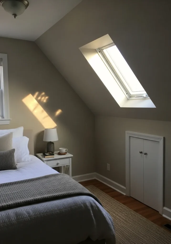
Warm Greige Bedroom Walls
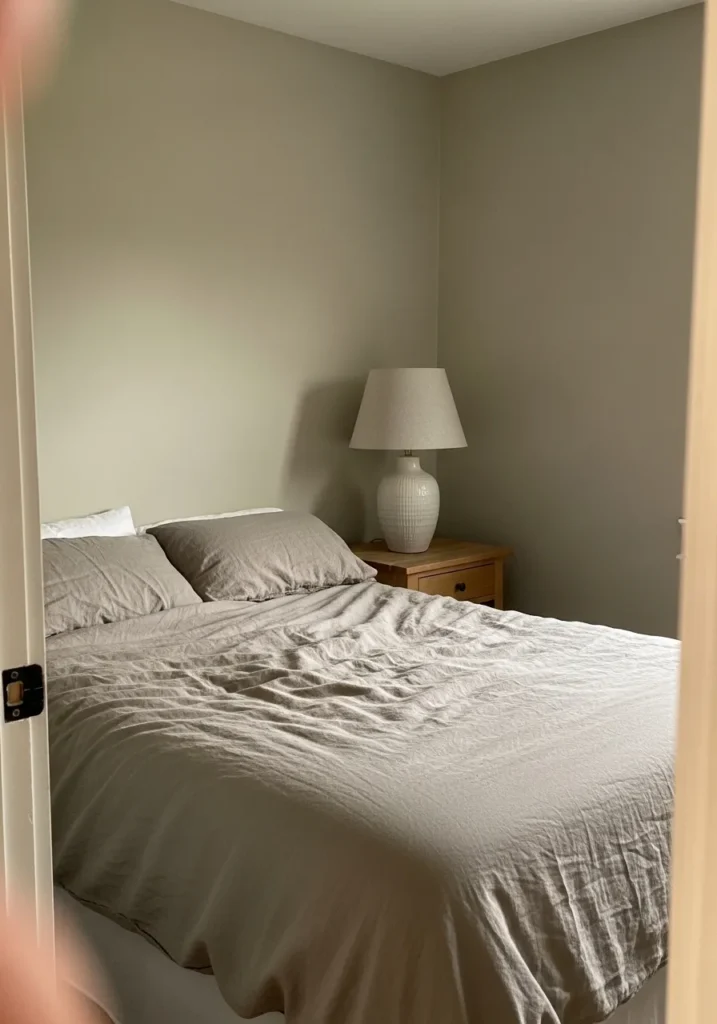
The wall color here reads very close to Benjamin Moore Edgecomb Gray. It is one of those warm greige shades that sits comfortably between beige and gray. Not too cool and not overly tan either. In a bedroom like this, next to soft neutral bedding and a small wood nightstand, the color feels calm and easy to live with.
Edgecomb Gray usually shows a gentle beige undertone that keeps it from turning cold. In brighter rooms it can look a bit lighter and almost creamy, while in softer light it settles into a quiet greige. It tends to work well with white trim, natural wood, and simple linen fabrics. A nice choice when you want neutral walls that still feel a little warm.
Creamy Kitchen Cabinet Paint
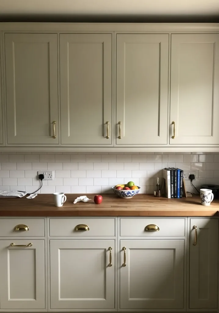
The cabinet color here reads very close to Benjamin Moore White Dove. It is a soft warm white that leans slightly creamy instead of stark. You see it a lot on kitchen cabinets for that reason. It looks clean, but it still feels relaxed next to natural materials like the wood countertop.
White Dove usually carries a gentle warm undertone that keeps it from feeling cold. That is why it pairs so easily with brass hardware and light wood finishes like the ones here. In brighter kitchens it can appear almost white, while in softer light the cream tone becomes more noticeable. A steady, easy cabinet color that people keep coming back to.
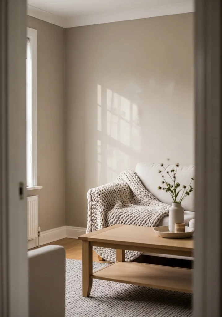
Warm Taupe Walls For A Quiet Corner
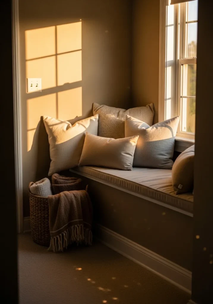
The wall color here looks very close to Benjamin Moore Smokey Taupe. It sits in that comfortable taupe range where beige and brown meet with a hint of gray. Not dark, but deeper than a typical beige. In a small sitting nook like this, next to neutral pillows and soft fabrics, it gives the room a calm and settled feel.
Smokey Taupe usually carries a gentle brown undertone with a little gray mixed in. That balance keeps it from looking muddy or overly tan. It tends to look especially nice with creamy trim and layered neutral fabrics like the cushions on the window seat. In bright light it can read lighter, while in softer corners it becomes a bit richer. Good for bedrooms, reading spots, or any space that needs a quieter wall color.
Warm Tan Walls In A Dining Room
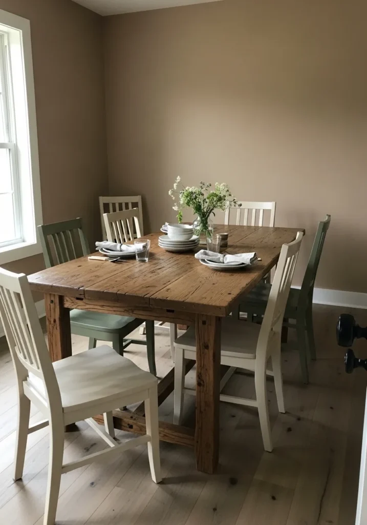
The wall color here reads very close to Benjamin Moore Grant Beige. It is a warm tan that sits deeper than a light beige but still feels soft on the wall. Not overly brown and not too gray either. In a dining space like this, next to a rustic wood table, the color feels steady and comfortable.
Grant Beige usually carries a gentle earthy undertone that works well with natural wood and simple painted furniture. You can see how it holds its own beside the darker wood tabletop without looking heavy. In brighter rooms it can feel a little lighter, while in dimmer corners it leans richer and more traditional. It tends to work nicely in dining rooms, living rooms, and older homes where warmer neutrals make more sense.
Light Greige Walls For An Entryway
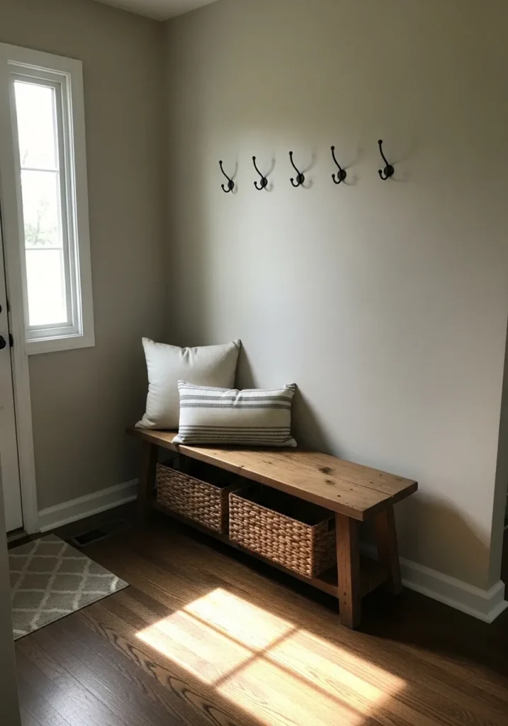
The wall color here looks very close to Benjamin Moore Pale Oak. It sits in that light greige range where gray and beige blend together in a soft way. Not stark and not overly warm either. In an entry like this, next to a simple wood bench and woven baskets, the color feels quiet and easy to live with.
Pale Oak usually carries a gentle warm undertone that keeps it from turning cold. It shifts a bit depending on the light. In brighter areas it can read almost like a light warm gray, while in softer light it leans a little more beige. It works nicely in entryways, hallways, and smaller rooms where you want a neutral wall that still has some softness to it.
Soft Beige Bathroom Walls
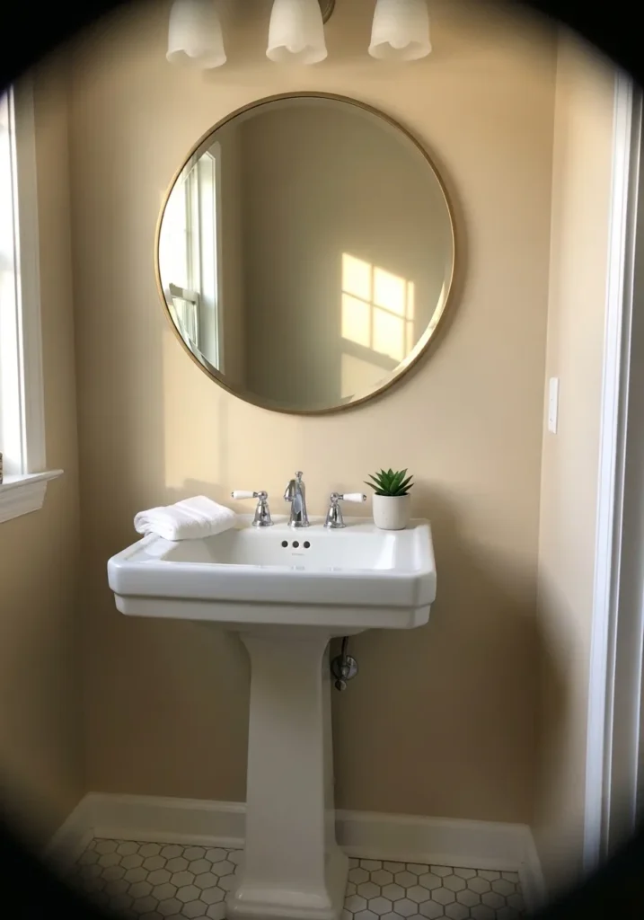
The wall color here looks very close to Benjamin Moore Shaker Beige. It is a classic warm beige that sits comfortably between tan and cream. Not too dark and not overly yellow. In a small bathroom like this, next to a white pedestal sink and simple trim, it feels steady and familiar.
Shaker Beige usually carries a warm sandy undertone that works well with bright white fixtures and light tile floors. It tends to read a bit lighter in rooms with more natural light, while smaller bathrooms can make it look a little richer. That balance is part of why people keep using it. Just a dependable warm neutral that works in a lot of homes.
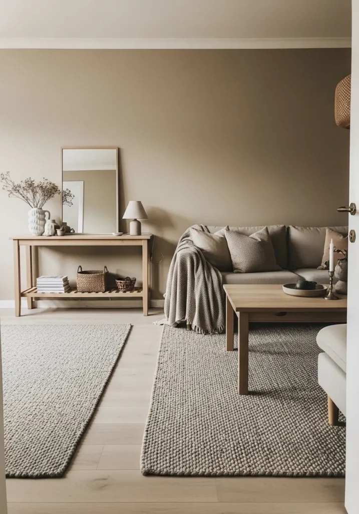
Soft Taupe Walls In A Living Room
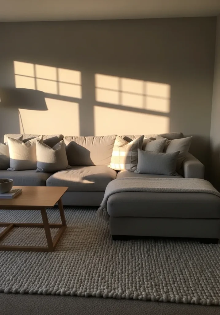
The wall color here reads very close to Benjamin Moore Pashmina. It sits in that warm taupe range where beige and gray mix with a touch of brown. Not too light and not overly dark either. Next to a neutral sofa and simple wood table, the color feels steady and comfortable.
Pashmina usually carries a soft earthy undertone that leans slightly warm. That is why it tends to look good with textured rugs, light upholstery, and natural wood pieces. In brighter spaces it can appear a little lighter and more greige, while softer lighting brings out its taupe side. A nice middle ground if plain beige feels dull but cool gray feels too sharp.
Light Mushroom Beige Walls
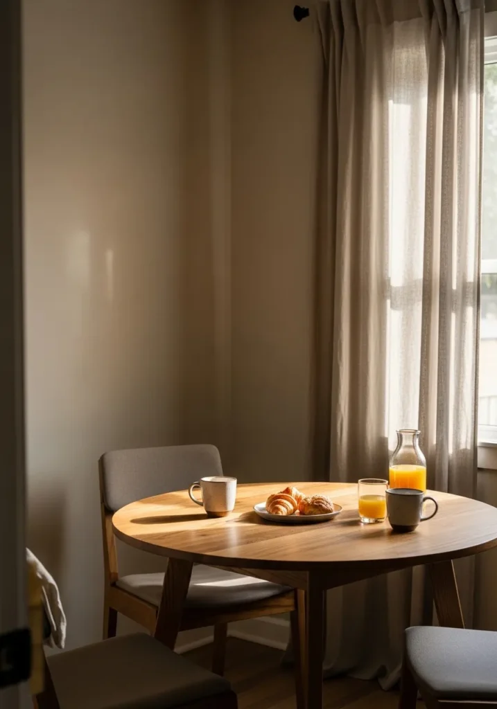
The wall color here looks closest to Benjamin Moore Stone Hearth. It sits in that soft mushroom beige range where warm beige meets a little gray. Not too creamy and not too cool. In a small dining spot like this, beside a light wood table and simple fabric chairs, the color feels relaxed and easy to live with.
Stone Hearth usually carries a gentle taupe undertone that shifts depending on the light. In brighter rooms it can read a little lighter and more beige, while softer lighting brings out the subtle gray side. It tends to pair nicely with pale wood furniture and linen curtains. A quiet neutral that works well when plain beige feels a bit too basic.
Soft Greige Walls In A Hallway
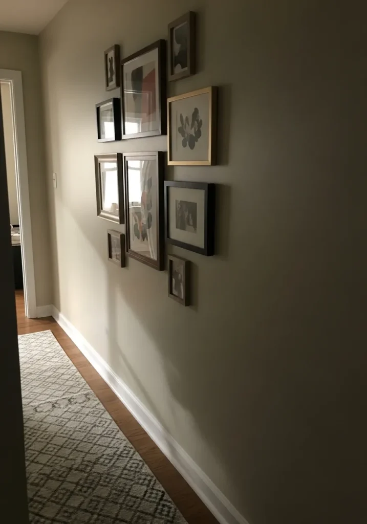
The wall color here reads very close to Benjamin Moore Revere Pewter. It sits in that warm greige family where gray and beige mix together in a very balanced way. Not too cool and not overly tan. In a hallway like this, next to white trim and darker picture frames, the color feels steady and easy to work with.
Revere Pewter usually carries a gentle warm gray undertone that shifts depending on the light. In brighter spaces it can look a bit lighter and more gray, while softer areas pull out the beige side. It tends to work well in hallways and connecting spaces since it pairs easily with wood floors, simple rugs, and framed artwork along the wall. A reliable neutral that a lot of people keep coming back to.
Soft Linen Beige Bedroom Walls
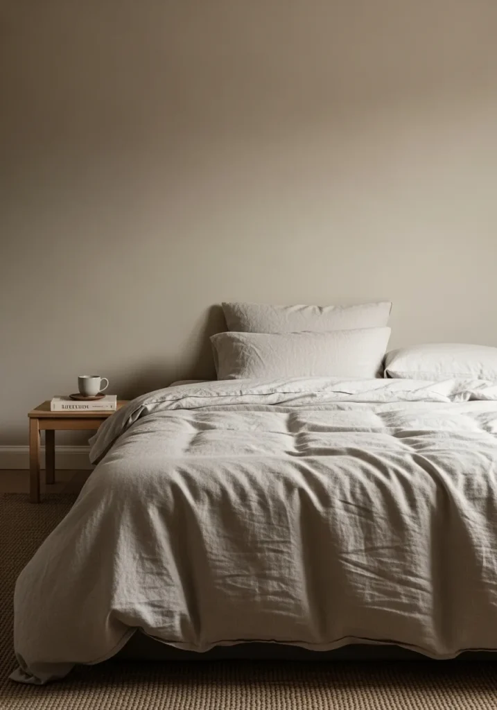
The wall color here reads very close to Benjamin Moore Natural Cream. It sits in that soft beige family that leans a little creamy without turning yellow. Not stark and not heavy either. In a bedroom like this, next to light bedding and a simple wood nightstand, the color feels quiet and comfortable.
Natural Cream usually carries a gentle warm undertone that works well with layered neutrals. Linen bedding, woven rugs, and pale woods all tend to sit nicely against it. In brighter rooms it can appear a bit lighter and creamier, while lower light makes the beige tone a little deeper. A good choice when plain white feels too sharp for a bedroom.
Warm Beige Walls Near A Stone Fireplace
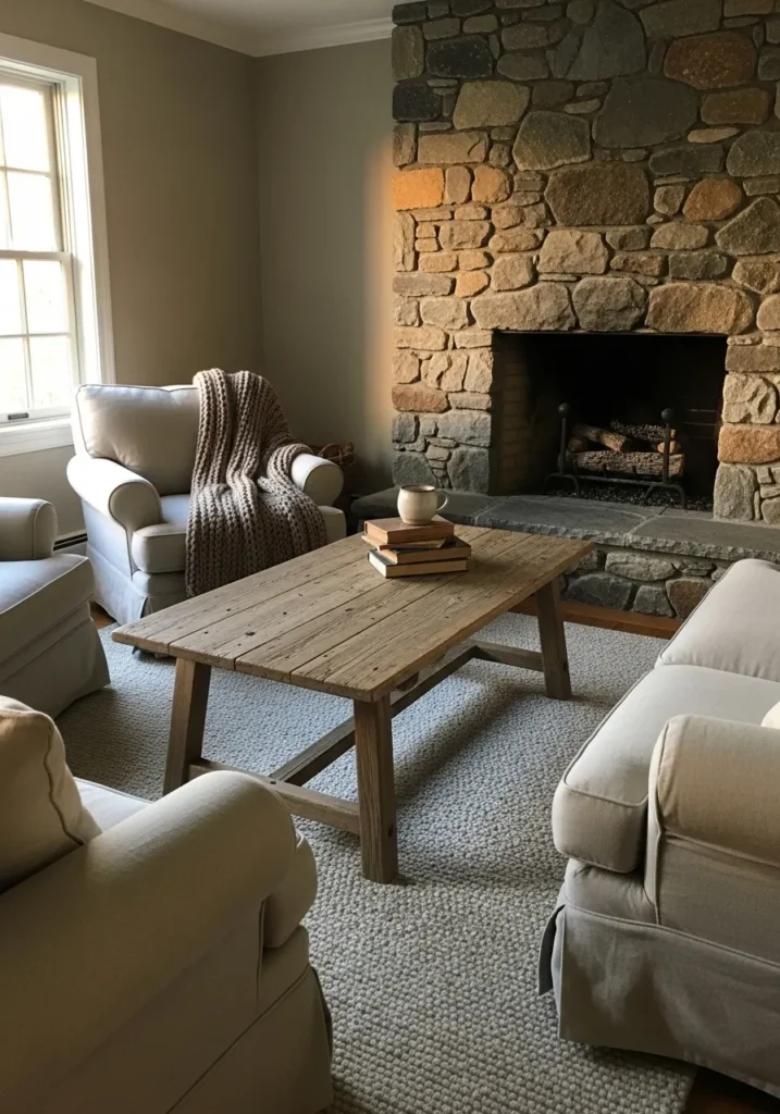
The wall color here looks very close to Benjamin Moore Lenox Tan. It sits in that warm beige family that leans a little toward tan and light brown. Not pale and not overly dark. Next to a large stone fireplace like this, the color feels steady and natural.
Lenox Tan usually carries a soft earthy undertone that works well with stone, wood, and simple neutral furniture. That is why it tends to look comfortable in living rooms with natural materials. In brighter areas it can appear a bit lighter and more beige, while dimmer corners pull out the richer tan side. A good neutral when you want warmth on the walls without going too dark.
Light Warm Greige Walls
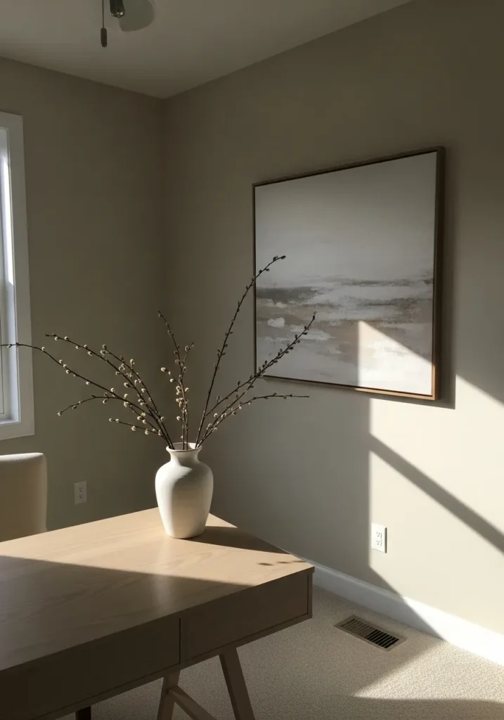
The wall color here looks very close to Benjamin Moore Classic Gray. It sits in that light greige range where beige and gray mix in a very quiet way. Not dark and not strongly colored. In a simple room like this, next to a wood desk and neutral artwork, the color feels calm and easy to live with.
Classic Gray usually carries a soft warm undertone that keeps it from feeling cold or stark. It can look almost off white in brighter rooms, while softer light brings out the greige side a little more. It tends to work well in home offices, bedrooms, and smaller spaces where you want a neutral wall that still feels gentle rather than plain white.
Soft Greige Walls In A Mudroom
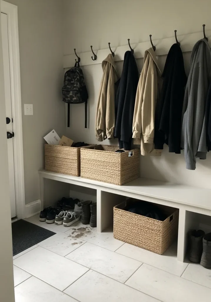
The wall color here reads very close to Benjamin Moore Balboa Mist. It sits in that light greige range where gray and beige blend together in a quiet way. Not too cool and not overly creamy. In a mudroom like this, next to woven baskets and darker coats, the color feels calm and practical.
Balboa Mist usually carries a soft warm undertone that shifts a little depending on the light. In brighter areas it can look almost like a pale warm gray, while dimmer corners bring out more of the beige side. It tends to work well in entry spaces, mudrooms, and hallways where you want something neutral but still a bit softer than plain white. A steady everyday color.
Warm Sand Colored Living Room Walls
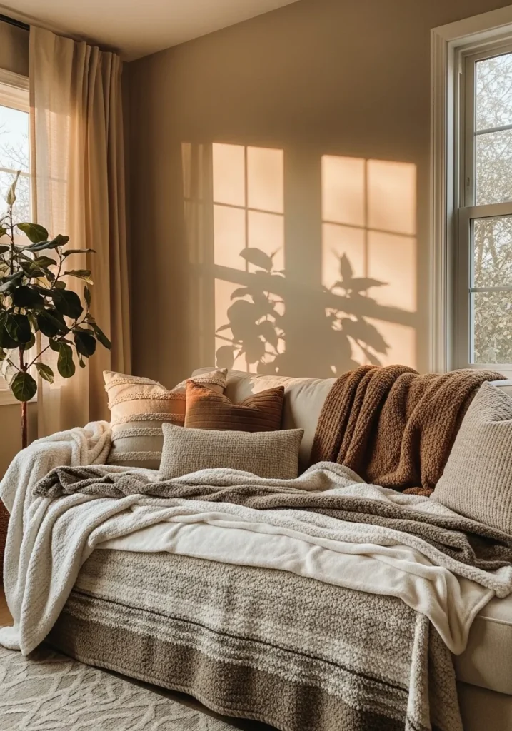
The wall color here reads very close to Benjamin Moore Muslin. It sits in that warm sand beige range that feels a little deeper than cream but lighter than most tan shades. Not gray and not overly yellow either. In a living room like this, next to layered neutral pillows and soft throws, the color feels relaxed and comfortable.
Muslin usually carries a gentle golden beige undertone that works nicely with natural fabrics and warm wood tones. That is part of why it pairs well with textured blankets and soft upholstery like the sofa here. In brighter spaces it can appear lighter and a bit creamier, while softer light brings out the warmer beige side. A good everyday neutral when you want something warmer than greige.
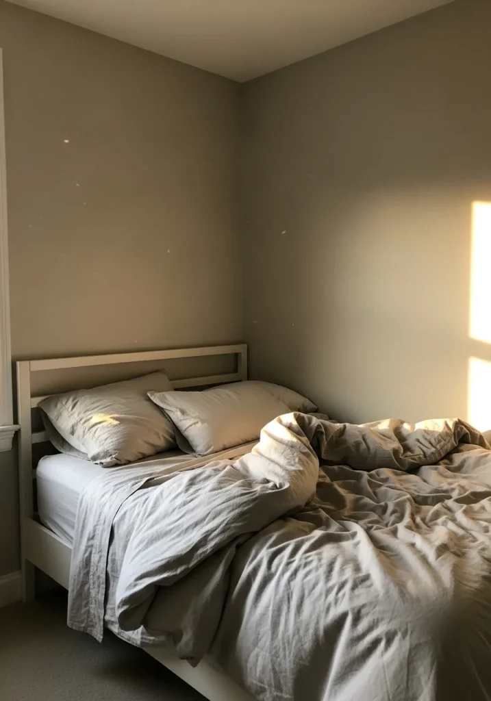
Soft Greige Walls In A Small Bedroom
The wall color here looks very close to Benjamin Moore Edgecomb Gray. It sits in that light greige family where beige and gray meet in a soft, quiet way. Not too cool and not strongly beige either. In a small bedroom like this, beside white bedding and simple trim, the color feels calm and easy to live with.
Edgecomb Gray usually carries a gentle warm undertone that keeps it from feeling cold. That balance helps it work well with pale wood floors, woven rugs, and simple neutral fabrics. In brighter rooms it can read lighter and almost creamy, while softer light pulls out a bit more of the greige side. A comfortable choice for bedrooms and smaller spaces where you want a neutral that still feels warm.
Warm Greige Kitchen Walls
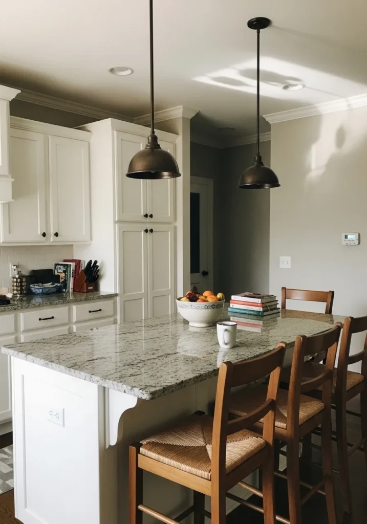
The wall color here reads very close to Benjamin Moore Revere Pewter. It sits right in that classic warm greige range where gray and beige mix together in a balanced way. Not too pale but still light enough to keep a kitchen feeling open. Next to white cabinets and a stone countertop, the color looks steady and easy to live with.
Revere Pewter usually carries a soft earthy undertone that works well with wood stools, darker metal lights, and warm flooring. That mix is part of why it shows up so often in kitchens and open living areas. In brighter light it can lean a bit more beige, while shaded spots bring out the gray side. A flexible neutral when you want warmth without going fully beige.
Warm Taupe Living Room Walls
The wall color here looks very close to Benjamin Moore Pashmina. It sits in that warm taupe range where beige and brown meet with a soft gray note underneath. Not too dark and not overly light. In a room like this, next to pale wood furniture and textured rugs, the color feels steady and comfortable.
Pashmina usually carries a gentle earthy undertone that pairs nicely with warm woods, woven baskets, and soft neutral fabrics. It tends to shift a little through the day. In brighter light it reads more like a warm beige taupe, while lower light brings out a slightly deeper tone. A good choice for living rooms when you want a neutral that feels a bit richer than typical greige.
Light Taupe Bedroom Walls
The wall color here reads very close to Benjamin Moore Natural Cream. It sits in that soft taupe beige family where cream, beige, and a hint of gray blend together. Not stark and not overly warm. Next to simple bedding and pale wood furniture, the color feels quiet and easy to live with.
Natural Cream usually carries a gentle warm undertone that shifts a little depending on the light. In brighter rooms it can look closer to a creamy beige, while softer light brings out the taupe side. That subtle shift makes it work well in bedrooms where you want something warmer than plain white but still calm and neutral.
Soft Mushroom Beige Walls
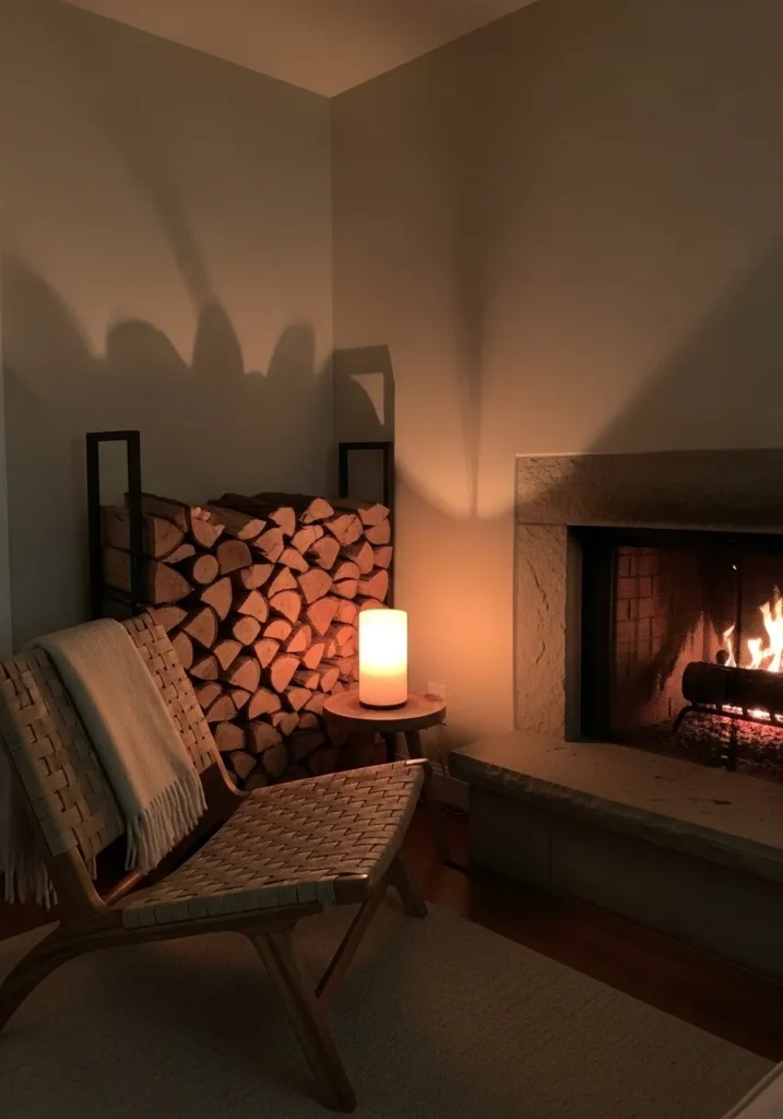
The wall color here looks very close to Benjamin Moore Smokey Taupe. It falls into that deeper warm neutral range that sits between beige, taupe, and a little brown. Not too dark, but richer than most pale neutrals. Next to stacked firewood and a stone fireplace, the color feels calm and natural.
Smokey Taupe usually carries a muted earthy undertone that works nicely with wood tones, woven chairs, and textured fabrics. It tends to look warmer when the room lighting is low and a bit softer during the day. That quiet depth makes it a good fit for reading corners, fireplaces, or smaller sitting areas where a light wall color might feel too flat.