I have always believed the right paint color can completely change the feeling of a home. One beautiful shade can make a space look brighter, calmer, and honestly a little more magical.
Benjamin Moore has so many colors that feel timeless yet fresh, and I love how the right one can make walls look smooth and polished without feeling boring.
In this list I am sharing 19 Benjamin Moore paint colors that I think create a truly flawless finish. These are the shades that make rooms glow, highlight beautiful details, and make a home feel effortlessly stylish.
If you love finding paint colors that make your space feel warm, inviting, and a little bit special, you are going to enjoy these ideas as much as I do.
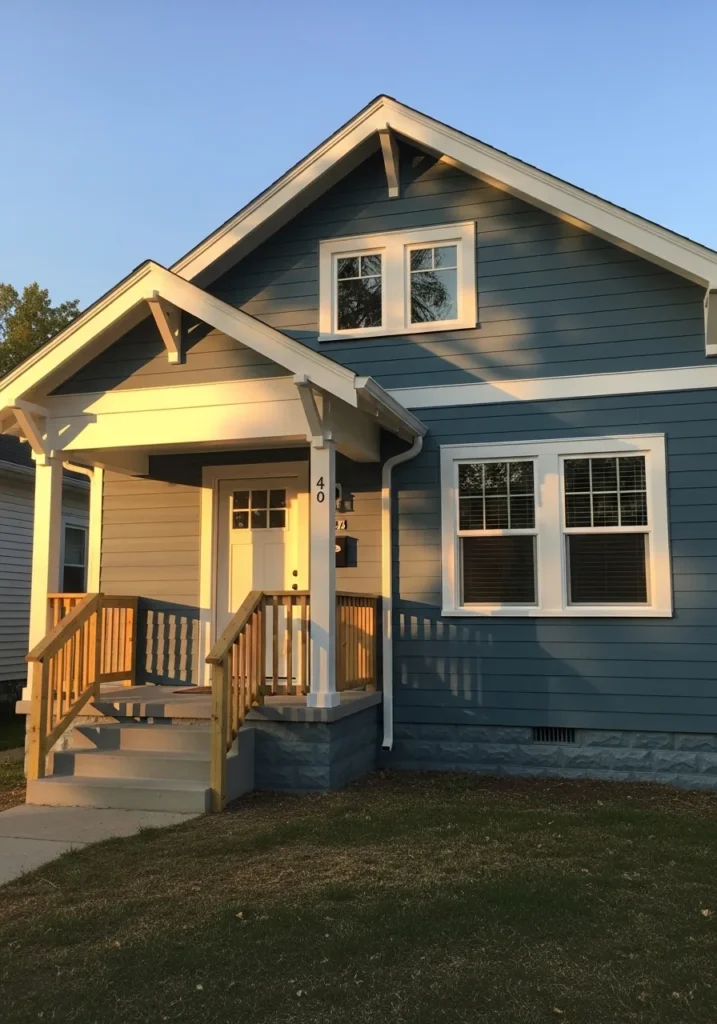
Soft Creamy White Exterior
The siding on this house reads very close to Benjamin Moore White Dove. It is a creamy off white that sits comfortably between warm white and very light beige. You see this kind of color a lot on traditional homes because it feels clean without looking stark. Against the black shutters and darker roof details, the color holds its own nicely. It has just enough warmth to keep the exterior from feeling cold.
White Dove usually carries a gentle warm undertone, which is why it works so well with natural surroundings and classic trim. It tends to look best with crisp white trim, black shutters, or darker window frames like the ones here. Direct sunlight can make it look almost bright white, while shade pulls out the soft cream side. A reliable choice for older style homes and neighborhoods where bright modern whites can feel a little too sharp.
Warm Greige Siding
The siding on this home reads very close to Benjamin Moore Revere Pewter. It sits right in that warm greige range that people keep coming back to. Not quite beige, not quite gray. It has a quiet softness that works well on larger exterior surfaces, especially on homes with simple lines and natural wood nearby. Next to the wood porch posts here, the color shows its warm side.
Revere Pewter tends to lean slightly warm with a subtle green gray undertone. That undertone is what helps it sit comfortably beside wood, stone, and darker roofs. In bright light it can look a bit lighter than expected, almost like a soft taupe gray. On shaded sides of the house it deepens a little and reads more like a classic greige. It is the kind of color that works well on farmhouse and craftsman style homes without looking trendy.
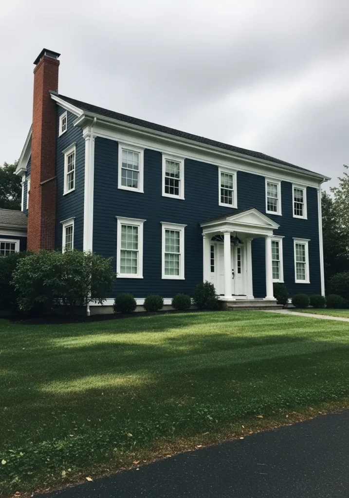
The siding on this house reads very close to Benjamin Moore Hale Navy. It is a classic deep navy that sits right between blue and charcoal. Dark enough to feel bold, but still clearly blue when you look at it in natural light. On a traditional home like this one, especially with white trim around the windows, the color feels very natural. Not trendy. Just strong and familiar.
Hale Navy tends to carry a slight gray undertone, which keeps the blue from feeling too bright. That gray base is what makes it work so well on larger exterior surfaces. It also pairs easily with red brick, like the chimney here, and with crisp white trim. In brighter light it reads more blue. In shade it deepens and starts to look almost inky. A good choice when someone wants color on the house but still wants the overall look to stay classic.
Soft Sage Green Siding
The siding here reads very close to Benjamin Moore Saybrook Sage. It is a soft sage green that leans slightly gray, which keeps it calm and easy to live with. Not a bright garden green. More of a muted herbal tone. Next to the white window trim and the simple wood door, the color feels natural and quiet.
Saybrook Sage usually shows a gentle gray undertone, and that undertone is what helps it work on exteriors. It blends easily with landscaping and looks comfortable beside wood and stone. In brighter light the green becomes a little clearer, while in shade it can look more like a soft gray green. A nice option for cottages and smaller homes where a pure gray might feel a little dull.
Charcoal Gray Exterior Paint
The siding here looks very close to Benjamin Moore Kendall Charcoal. It sits in that deep charcoal gray range that feels strong but not completely black. There is a softness to it that keeps the house from feeling too heavy. Next to the white window trim and the dark roofline, the color reads clean and steady.
Kendall Charcoal usually carries a slight warm gray undertone, which helps it work well on large exterior surfaces. In brighter light it can show a bit more gray, while in shade it deepens toward a darker charcoal. It tends to pair nicely with white trim, stone steps, and natural landscaping. A solid choice for mid century homes and simple modern exteriors where a pale color would feel a little weak.
Classic Soft White Exterior
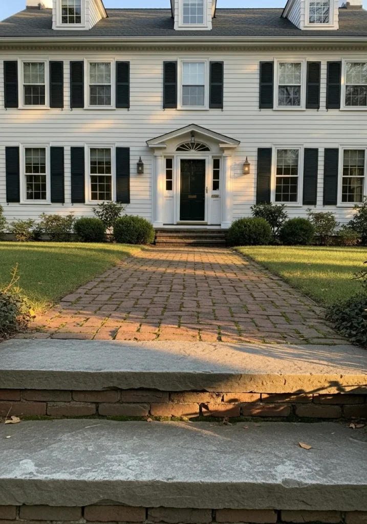
The siding here reads very close to Benjamin Moore White Dove. It is a soft white that leans slightly warm, which keeps it from feeling stark on a full exterior. This type of white works especially well on traditional homes like this one, where the black shutters and darker front door need a calm backdrop.
White Dove usually carries a gentle creamy undertone. That undertone helps it sit comfortably next to brick walkways, darker shutters, and greenery around the house. In bright light it looks crisp but still relaxed. In shaded areas it shifts a little warmer. It is one of those whites that works across many styles, which is probably why it shows up on so many classic homes.
Soft Blue Gray Exterior
The siding here looks very close to Benjamin Moore Van Courtland Blue. It sits in that blue gray range that feels calm and slightly historic. Not a bright blue. More of a muted blue with a gray base that keeps it steady on a full exterior. Against the white trim around the windows, the color reads clearly but still relaxed.
Van Courtland Blue usually carries a soft gray undertone, which is what makes it easy to use on a house. The gray tones keep the blue from feeling sharp or overly coastal. In bright daylight the blue becomes a bit clearer, while in shaded areas it leans more gray. It works especially well on smaller homes and bungalows where a darker navy might feel too heavy.
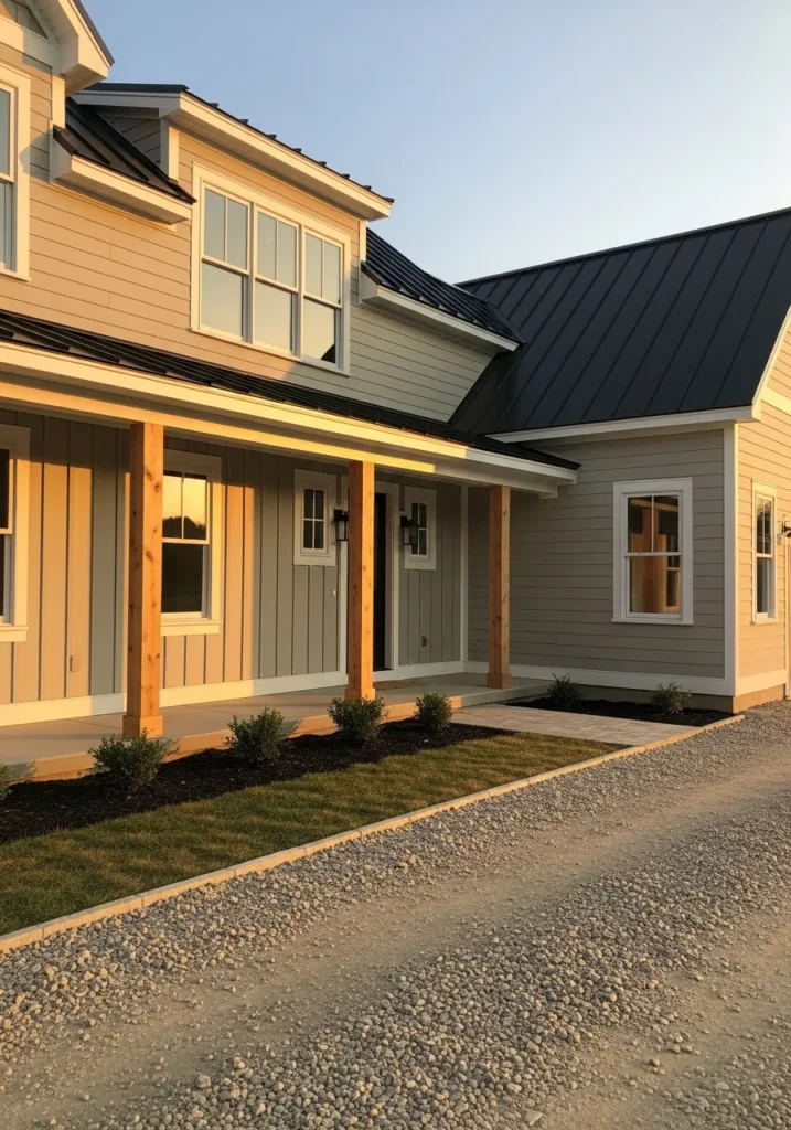
Warm Taupe Gray Exterior
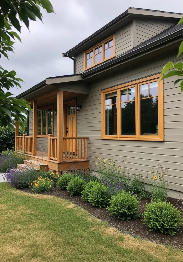
The siding on this home looks very close to Benjamin Moore Edgecomb Gray. It sits in that soft taupe gray range that feels warm but still neutral. Not quite beige and not a cool gray either. The color reads calm across the whole exterior, especially next to the natural wood trim around the windows and porch.
Edgecomb Gray usually carries a gentle beige undertone. That warmth helps it work nicely with wood elements like the porch posts and window frames here. In bright light it leans lighter and a bit creamy. In shade it settles into a deeper greige tone. It tends to work well on craftsman style homes where natural materials are part of the design.
Clean Modern Off White
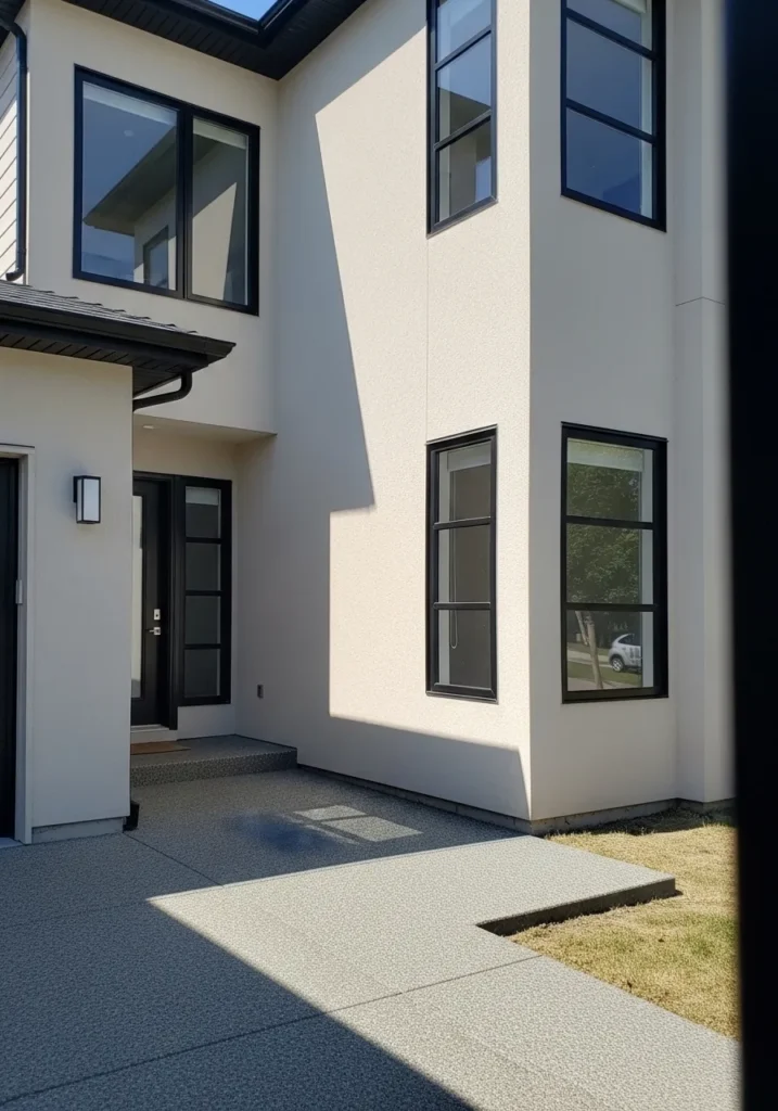
The exterior here reads very close to Benjamin Moore Simply White. It is a bright off white that still has a hint of warmth, which keeps it from feeling stark on a full exterior. On a modern home like this one, especially with black window frames, the color looks crisp and simple without feeling cold.
Simply White carries a soft creamy undertone that helps it handle sunlight well. In strong daylight it appears bright and fresh, while in shaded areas it settles into a smoother off white. It tends to work nicely with dark metal trim, glass, and minimal landscaping. A good option when someone wants a modern white exterior that still feels comfortable rather than clinical.
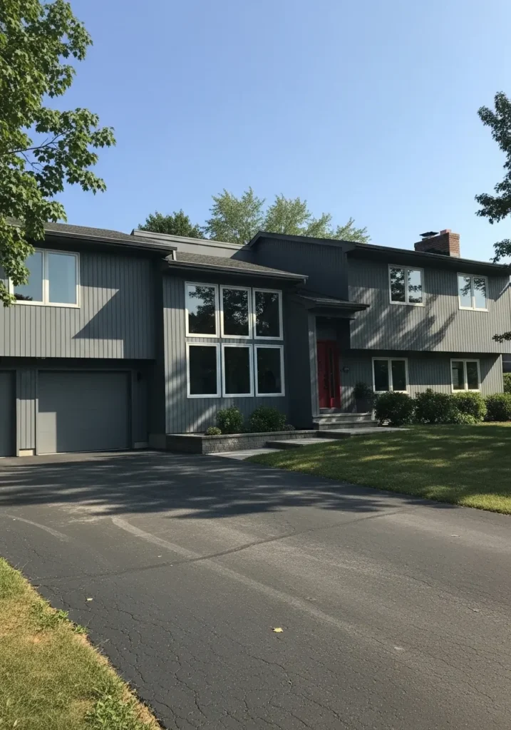
Light Blue Gray Siding
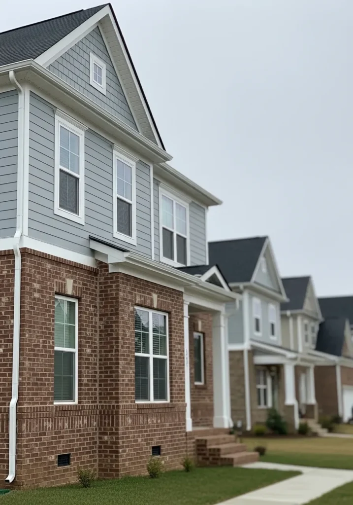
The upper siding here reads very close to Benjamin Moore Smoke. It sits in that pale blue gray range that feels calm and easy on a whole exterior. Not a strong blue at all. More of a softened gray with a quiet blue undertone. Against the white trim and the brick base of the house, the color stays gentle but still noticeable.
Smoke usually carries a cool undertone that shifts a bit depending on light. In brighter daylight the blue side becomes clearer. On cloudy days or shaded walls it leans more gray. That balance is part of why people like it for siding. It pairs comfortably with brick foundations, white trim, and darker roofs without looking too bold.
Soft Creamy Neutral Walls
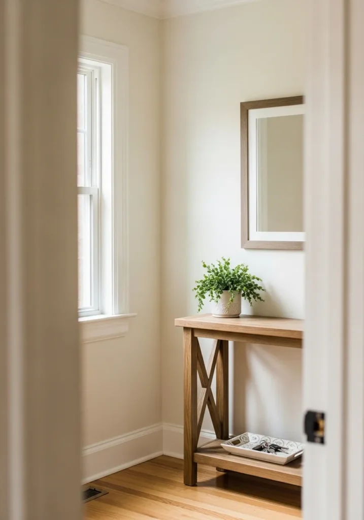
The wall color here reads very close to Benjamin Moore Swiss Coffee. It sits in that creamy off white range that feels warm but still light. Not a stark white. More of a soft neutral that works easily with wood furniture and natural finishes like the small console table in the space.
Swiss Coffee usually carries a gentle yellow beige undertone. That undertone helps it look comfortable in rooms with natural light coming through windows. In brighter light it looks fresh and light, while in dim corners it leans a little warmer. It is often used in hallways and entry areas because it keeps the space feeling open without looking cold.
Warm Greige Living Room Walls
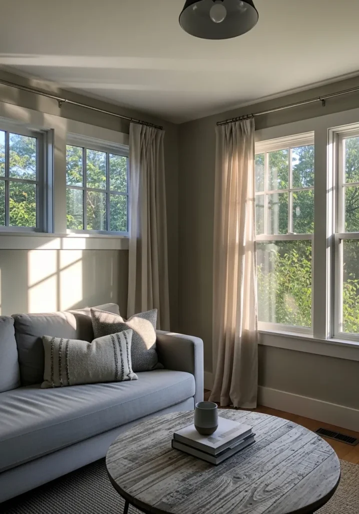
The wall color here reads very close to Benjamin Moore Revere Pewter. It sits in that soft greige range where gray and beige meet. Not too cool and not too tan either. It is the kind of color people often choose when they want a calm backdrop that works with almost anything.
Revere Pewter tends to show a gentle warm undertone, especially next to white trim and neutral fabrics like the light sofa and curtains in the room. In brighter daylight it looks a bit lighter and more gray. In the evening it leans warmer. It works well in living rooms like this where there are several windows and a mix of soft textures.
Soft Sage Green Kitchen Walls
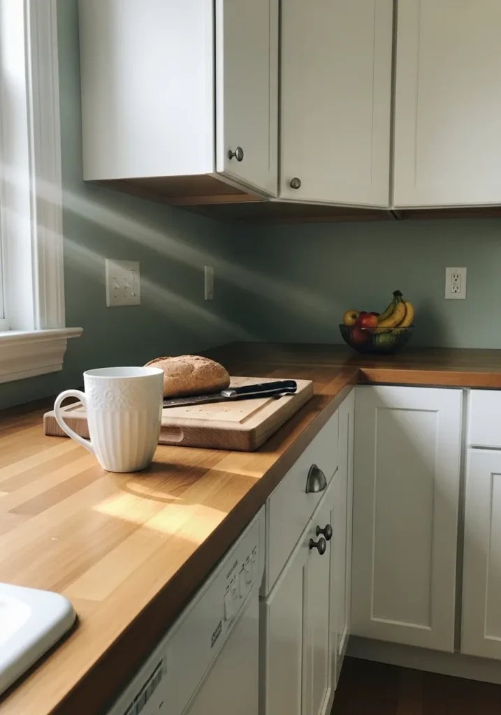
The wall color here looks closest to Benjamin Moore Saybrook Sage. It sits in that soft sage green range that feels calm and slightly muted. Not a bright green. More of a gray green that works well in everyday spaces like kitchens.
Saybrook Sage usually carries a quiet gray undertone that keeps the color from feeling too fresh or leafy. Next to white cabinets and a warm wood counter like this, the green reads gentle and balanced. It tends to look a little cooler near windows and a bit warmer in the evening, which is why it often works well on kitchen walls where light changes during the day.
Calm Blue Bedroom Walls
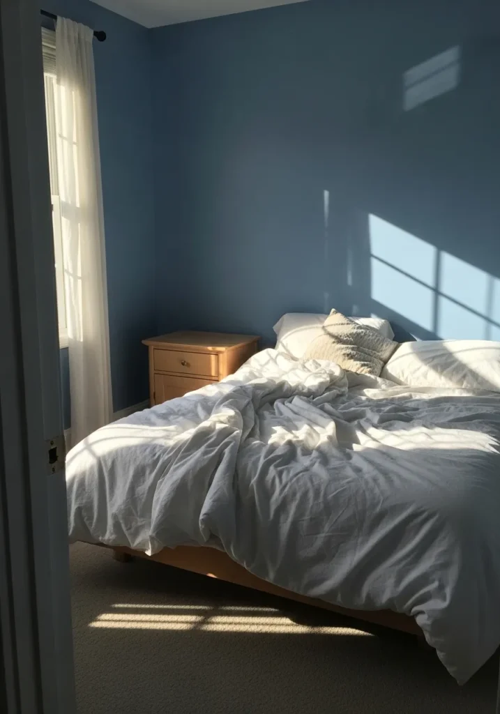
The wall color here looks very close to Benjamin Moore Smoke. It sits in that quiet blue gray range that works well in bedrooms. Not a bright sky blue and not a heavy navy. Just a soft, steady color that gives the room a relaxed feeling.
Smoke usually carries a gentle gray undertone that keeps the blue from feeling too sweet. With white bedding and simple wood furniture like the small nightstand, the color reads clean and calm. In strong daylight it shows more blue. In softer evening light it shifts a little grayer, which is why it often feels comfortable in bedrooms.
Soft Greige Dining Room Walls
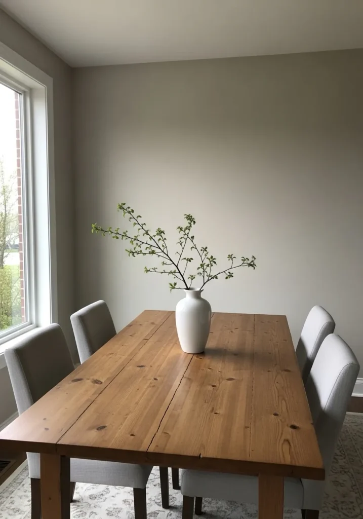
The wall color here reads close to Benjamin Moore Edgecomb Gray. It sits in that light greige range where beige and gray meet in a very quiet way. Not dark and not too cool. Just a gentle neutral that works easily in everyday rooms.
Edgecomb Gray tends to show a soft warm undertone, especially next to natural wood like the dining table. The color shifts a little through the day. In brighter daylight it leans slightly gray, while in softer light it looks warmer and more beige. That steady balance is why many people use it in dining spaces and open areas where furniture and finishes can vary.
Soft Neutral Gallery Wall Color
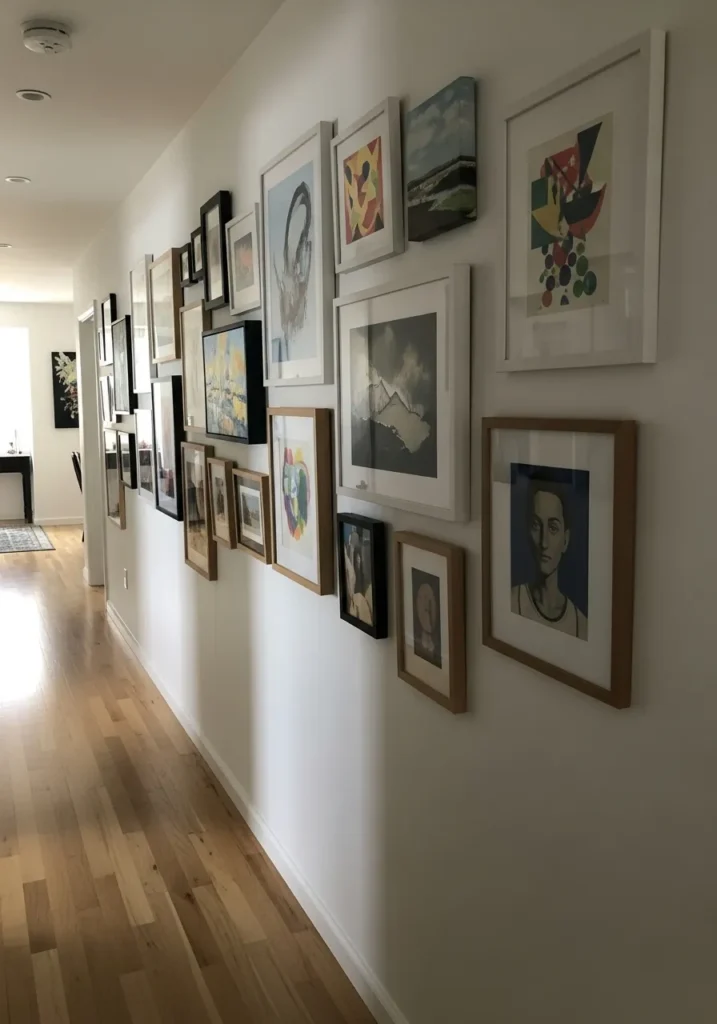
The wall color here looks closest to Benjamin Moore Classic Gray. It sits in that very light greige family that often reads almost white but still has a little softness to it. Not stark and not creamy. Just a pale neutral that works quietly in the background.
Classic Gray usually carries a gentle warm undertone. That subtle warmth helps it sit comfortably next to natural wood floors and a mix of picture frames like the gallery wall here. In bright daylight it can look nearly white. In lower light it shows a bit more beige, which is why many people like it for hallways and long walls where art or photos are the main focus.
Deep Black Accent Wall
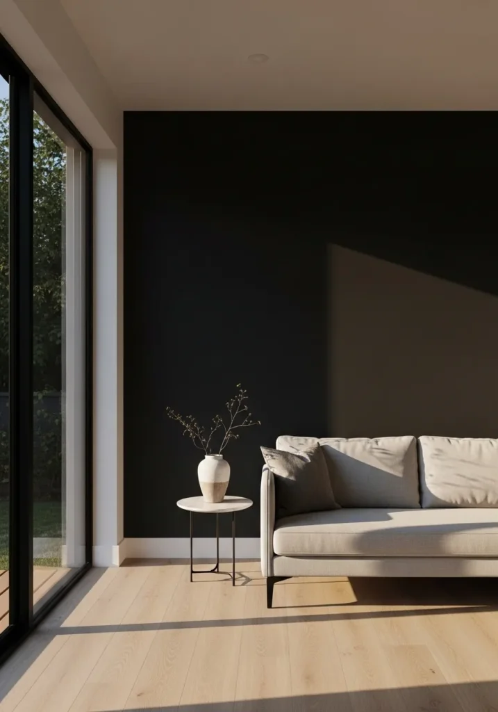
The wall color here reads very close to Benjamin Moore Black Beauty. It sits in that rich black range that still has a little softness when light hits it. Not a chalky charcoal. More of a deep black that holds its color even on a large wall.
Black Beauty often shows a faint warm undertone, which helps it sit comfortably next to light wood floors and pale furniture like the sofa here. In brighter daylight the wall can read almost charcoal. In lower light it settles into a true black. Colors like this usually work best as a single accent wall where the darker tone gives the room a strong anchor without making the whole space feel heavy.
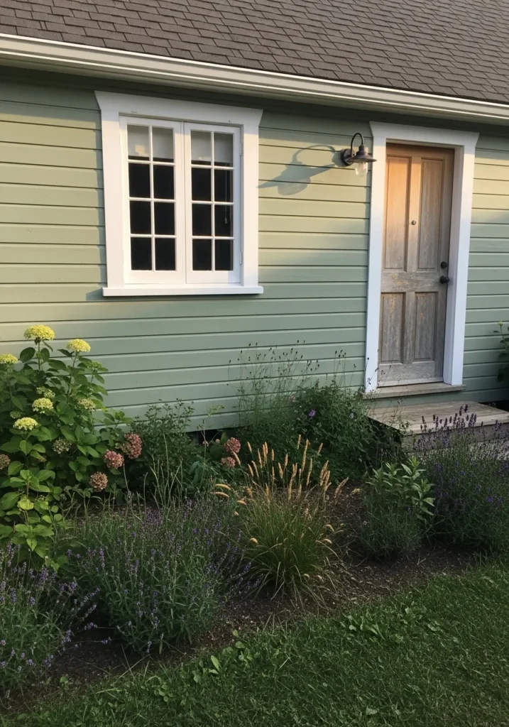
Soft Olive Green Reading Room Walls
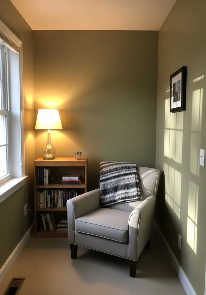
The wall color here reads close to Benjamin Moore Gloucester Sage. It sits in that muted olive green family that feels calm and a little earthy. Not a bright botanical green. More of a softened green that works well in quiet spaces.
Gloucester Sage tends to show a gray olive undertone, which keeps the color steady through changing light. Near the window it can look a little lighter and more green. In the evening it leans deeper and warmer beside wood furniture like the small bookcase. Colors like this often work well in reading corners or small rooms where a gentle, grounded tone helps the space feel settled.
Light Greige Bathroom Walls
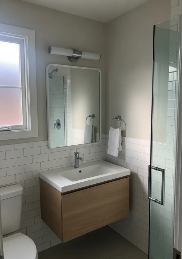
The wall color here looks closest to Benjamin Moore Pale Oak. It sits in that very soft greige family that feels calm and easy to live with. Not a strong gray and not a creamy beige. Just a quiet neutral that works well in smaller rooms.
Pale Oak usually shows a gentle warm undertone that pairs nicely with white tile like the simple wall tile in this bathroom. Near a window it often reads a little lighter and slightly gray. In evening light it leans warmer and softer. Colors like this are often used in bathrooms because they stay neutral while still giving the walls a bit more presence than plain white.