I have always had a soft spot for those calm coastal colors that make a space feel lighter the moment you walk in.
There is just something about a breezy blue or a washed green that makes everything feel a little more relaxed and a little less busy.
I put this list together because I kept coming back to the same Benjamin Moore shades again and again in my own mood boards and home ideas.
Some feel like soft ocean water, others lean sandy and warm, but they all have that easy, lived in look I love.
If you are into simple spaces that still feel fresh and inviting, these are the kinds of colors that quietly do the trick.
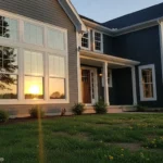
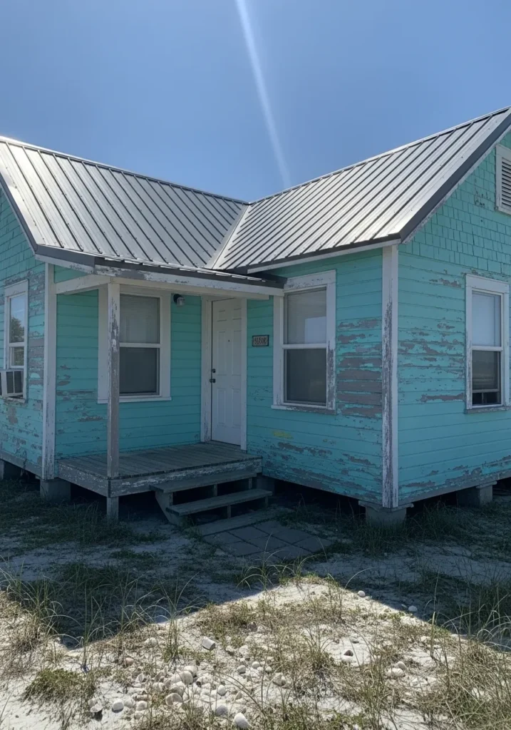
Soft Seafoam Green Exterior
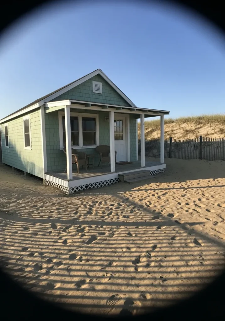
This looks like a soft seafoam green, and the closest Benjamin Moore match would be Hollingsworth Green. It sits right between green and blue, but leans a bit more green in this case. You can see it on the shingle siding, and it gives that easy coastal feel without going bright or overly pastel.
It has a slightly muted, chalky tone, which keeps it from feeling too fresh or sharp. In full light it can read a little lighter and breezier, while in shade it turns more subdued. It works well with simple white trim and natural textures like sand, wood, or wicker. I’d keep the rest of the palette quiet so the color stays relaxed and not too beachy in a themed way.
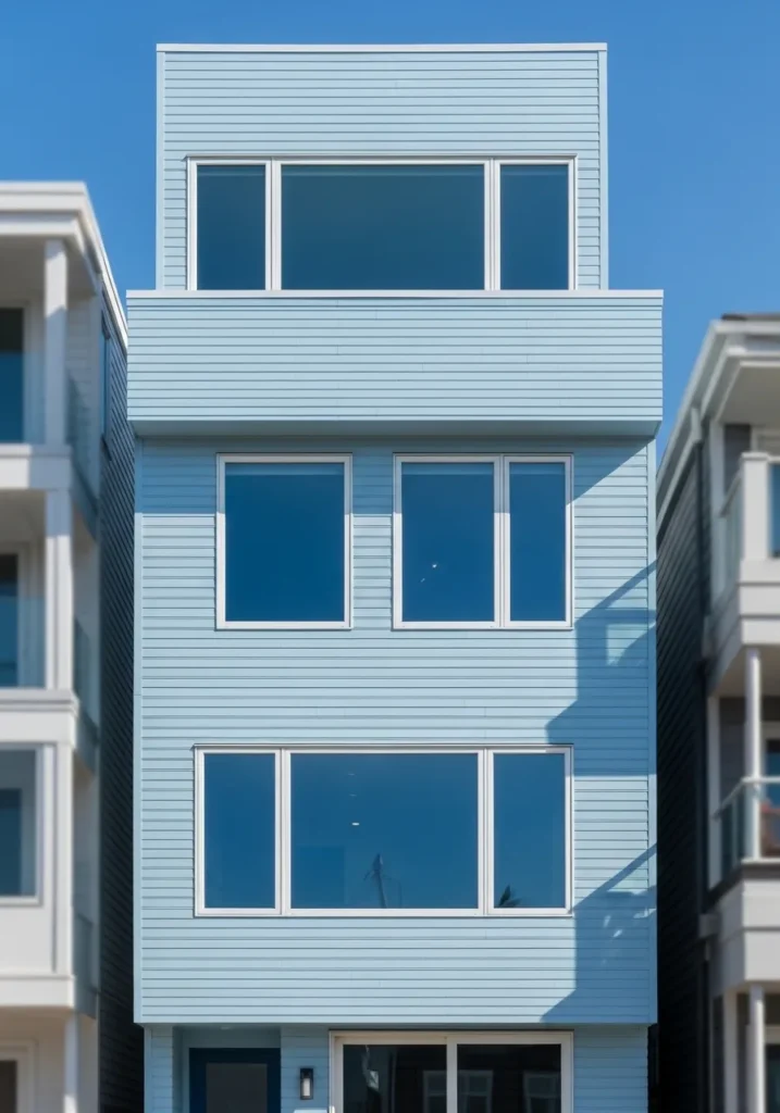
Light Coastal Blue Siding
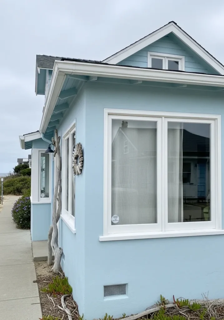
This reads as a soft coastal blue, and it feels closest to Benjamin Moore Woodlawn Blue. It sits right in that gentle blue range with a slight gray wash, so it never looks too bright or childish. You can see how it works against the crisp white window trim, which keeps it looking clean and simple.
The undertone leans a bit cool, but it is softened just enough to feel easy on the eyes. In brighter light it will look lighter and a touch airy, while in shade it shifts closer to a muted blue-gray. It works well on exteriors like this, but I’ve also seen it hold up nicely in sunrooms or small living spaces. Pair it with white, light wood, or even weathered finishes for a relaxed look that does not feel overdone.
Warm Sandy Beige Exterior
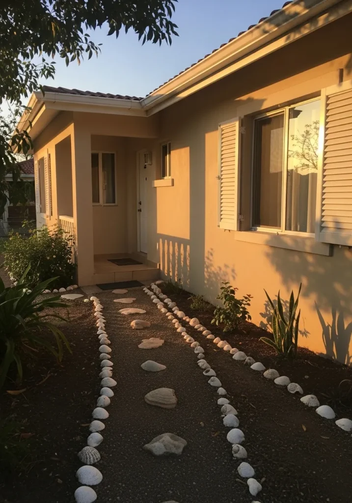
This reads as a warm sandy beige, and the closest Benjamin Moore match would be Manchester Tan. It sits in that soft neutral range that leans a little golden without turning yellow. On the stucco walls near the entry, it has that sun-washed look that feels easy and familiar for coastal homes.
The undertone is gently warm, which helps it stay soft instead of flat. In stronger light it can look a bit lighter and creamier, while in shade it settles into a calm beige. It pairs well with white trim like you see on the shutters, and it also works nicely with stone paths, light wood, or simple greenery. A good choice if you want something quiet but not plain.
Soft Driftwood Gray Exterior
This reads as a soft driftwood gray, and it comes closest to Benjamin Moore Gray Owl. It sits in that light gray range with a quiet coastal feel, not too cool and not too warm. On the siding next to the dark window frames, it keeps everything looking clean without turning stark.
There is a slight warm undertone in it, which helps it feel relaxed instead of sharp. In brighter light it can look a bit lighter and almost silvery, while in lower light it leans more neutral gray. It works well on exteriors like this, especially when paired with black or charcoal accents and natural wood tones. A steady, easy color that does not get tired quickly.
Soft Creamy White Porch
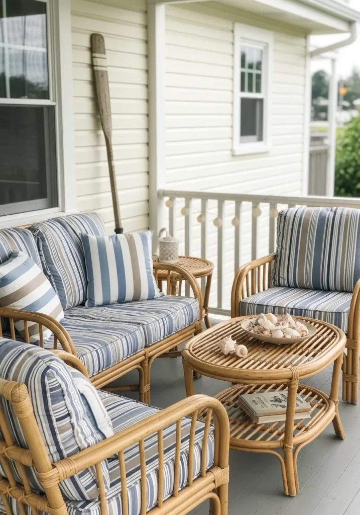
This reads as a soft creamy white, and it feels closest to Benjamin Moore White Dove. It is not a stark white at all. It has a gentle warmth that makes it easier to live with, especially on siding like this where a pure white would feel too sharp.
There is a slight yellow undertone in it, but it stays very subtle. That helps it sit nicely next to the woven furniture and blue striped cushions without looking too warm. In brighter light it can look almost clean white, but it always keeps that soft edge. A good choice if you want a white that feels relaxed and a little forgiving.
Weathered Blue Green Siding
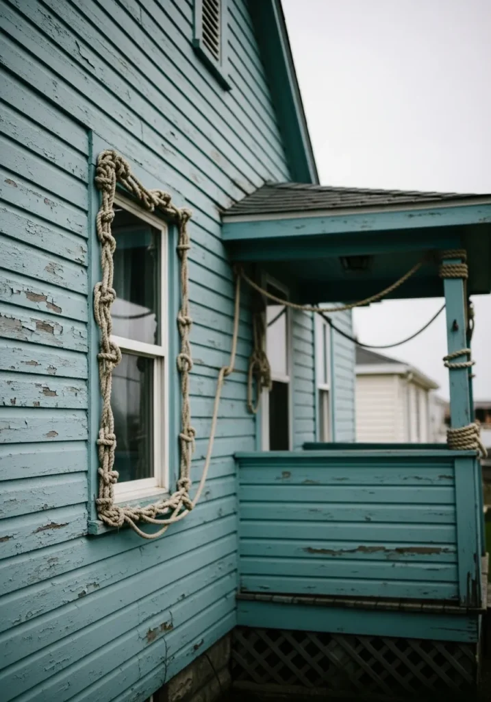
This looks like a weathered blue green, and the closest Benjamin Moore match would be Aegean Teal. It sits right between blue and green with a muted, slightly aged feel. On the wood siding, especially where the paint has worn a bit, it comes across as relaxed and a little rustic rather than fresh and bright.
There is a soft gray undertone in it that keeps the color from feeling too bold. That helps it work well with natural rope details and older wood textures without clashing. In stronger light it can lean a touch more blue, while in softer light it reads deeper and greener. It suits cottages and older homes especially well, where a bit of wear actually adds to the look.
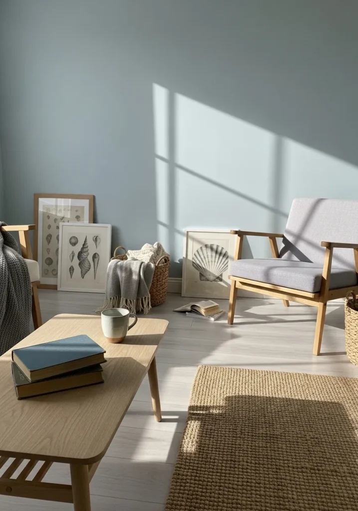
Soft Aqua Blue Walls
This reads as a soft aqua blue, and it feels closest to Benjamin Moore Palladian Blue. It sits right between blue and green with a light, airy look that works well on vertical paneling like this. It is not overly bright, which makes it easier to live with over time.
There is a gentle green undertone that keeps it from feeling cold. Next to the white trim around the door, it looks fresh but still relaxed. In brighter light it can lean a bit more blue, while in softer light the green side shows up more. It works nicely in porches, sunrooms, or even small dining spaces where you want some color without going too bold.
Light Coastal Greige Exterior
This reads as a light coastal greige, and it feels closest to Benjamin Moore Edgecomb Gray. It sits right between beige and gray, which gives it that easy, beach-house look without leaning too warm or too cool. On the shingle siding, it comes across as soft and natural rather than painted on.
The undertone is slightly warm, which helps it pair nicely with crisp white trim like you see on the porch railings. In brighter light it can look a bit lighter and almost creamy, while in shade it settles into a quiet gray. It works well for whole exteriors, especially if you want something neutral that still feels relaxed and not too plain.
Warm Sand Beige Walls
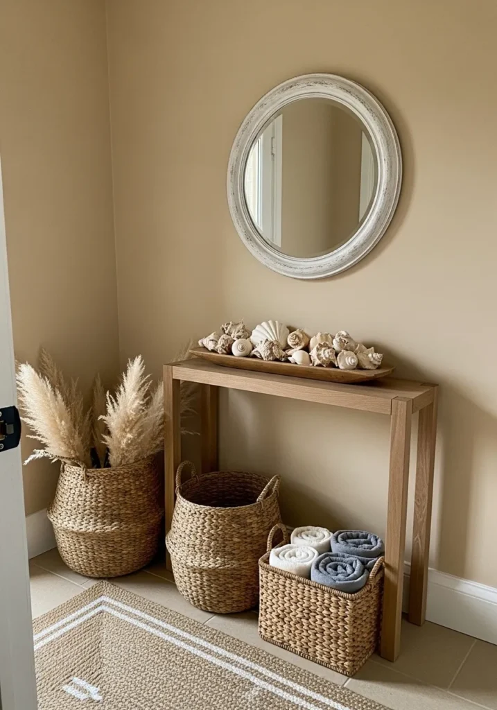
This looks like a warm sand beige, and it comes closest to Benjamin Moore Shaker Beige. It sits in that soft neutral range with a gentle golden tone, which gives it a relaxed, beachy feel without leaning too yellow. On the wall behind the console table, it reads calm and easy, not stark or cold.
The undertone is clearly warm, but still soft enough to work with lighter woods and woven textures like you see here. In brighter light it can look a bit lighter and creamier, while in shade it deepens into a cozy beige. It works well in entryways and living spaces where you want something simple that still feels finished.
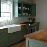
Soft Sage Green Cabinets
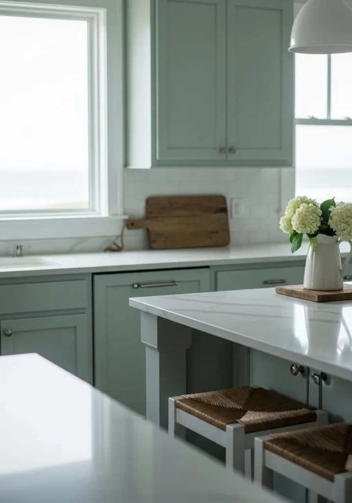
This reads as a soft sage green, and it feels closest to Benjamin Moore Saybrook Sage. It sits in that muted green range with a bit of gray mixed in, which keeps it from looking too fresh or bright. On the cabinets, it comes across calm and steady, especially next to the white counters.
The undertone leans slightly cool, but the gray in it softens the overall look. In brighter light it can appear a bit lighter and more washed, while in lower light it deepens into a quiet green. It works well in kitchens where you want color but still want things to feel simple. Pair it with white, light wood, or even soft brass if you want a bit of contrast.
Pale Gray Green Bedroom Walls
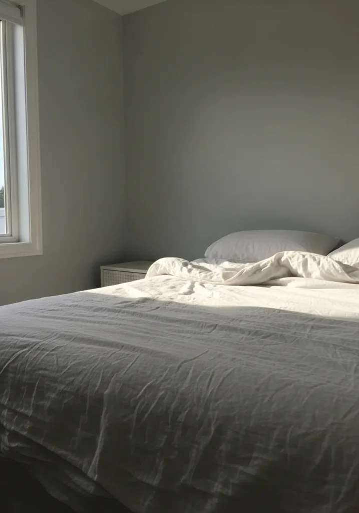
This reads as a pale gray green, and it feels closest to Benjamin Moore Healing Aloe. It sits right in that soft mix of green and gray, which gives it a quiet, washed look that works well in a bedroom. On the wall behind the bed, it looks calm and not too colorful.
The undertone leans slightly cool, but the gray keeps it from feeling crisp or sharp. In brighter light it can look lighter and a bit more airy, while in lower light it turns softer and more muted. It pairs easily with white bedding and simple furniture, which makes it a good choice if you want color that still feels restful.
Faded Aqua Coastal Exterior
This looks like a faded aqua, and it feels closest to Benjamin Moore Ocean Air. It sits in that soft blue green range, but with a worn, slightly chalky finish that gives it a relaxed coastal look. On the siding, especially where the paint has aged a bit, it reads easy and a little sun-washed.
The undertone leans more blue than green, though it shifts depending on the light. In brighter conditions it can look lighter and more beachy, while in softer light it turns a bit muted and dusty. It pairs well with simple white trim and weathered wood, which helps keep the whole look casual and not too polished.
Soft Dusty Blue Walls
This reads as a soft dusty blue, and it feels closest to Benjamin Moore Smoke. It sits in that muted blue range with a gray cast, which keeps it from looking too crisp or bright. On the wall behind the chair, it comes across calm and a little understated.
The gray undertone is what makes it easy to use. It takes the edge off the blue and helps it blend with light wood and simple fabrics. In brighter light it can look a bit lighter and more airy, while in softer light it turns slightly deeper and moodier. It works well in living rooms or bedrooms where you want color that stays quiet.
Bright Turquoise Front Door
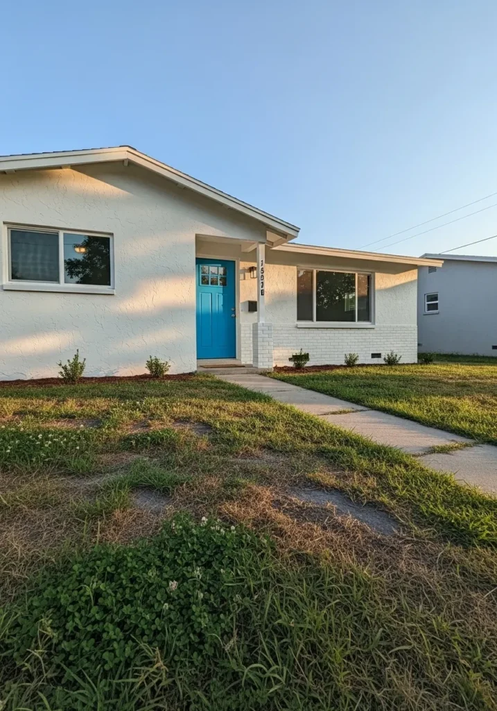
This looks like a bright turquoise blue, and it feels closest to Benjamin Moore Caribbean Blue Water. It sits in that clear blue range with a hint of green, which gives it that fresh coastal look without going too dark. On the front door, it stands out against the simple white exterior in a clean, easy way.
The undertone leans slightly green, which keeps it from feeling too crisp or icy. In stronger light it can look more vibrant, while in softer light it settles into a calmer blue. It works well as an accent like this, especially if the rest of the house stays neutral. A simple way to bring in color without changing everything.
Light Aqua Bathroom Walls
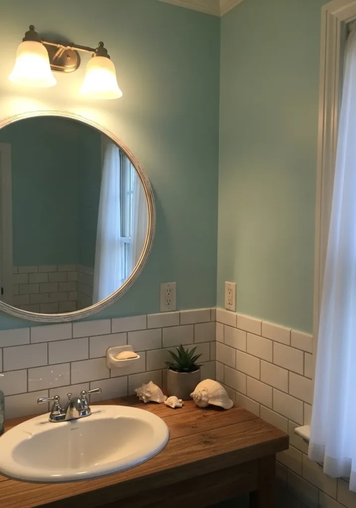
This reads as a light aqua, and it feels closest to Benjamin Moore Beach Glass. It sits between blue and green, but stays soft and a little washed, which makes it easy to use on walls like this. Around the white tile and sink, it feels clean without turning too crisp.
The undertone leans slightly green, which keeps it from feeling cold. Under warm indoor lighting it can look a bit softer and more muted, while in natural light it shifts a little brighter. It works well in bathrooms where you want a bit of color that still feels simple and not too noticeable.
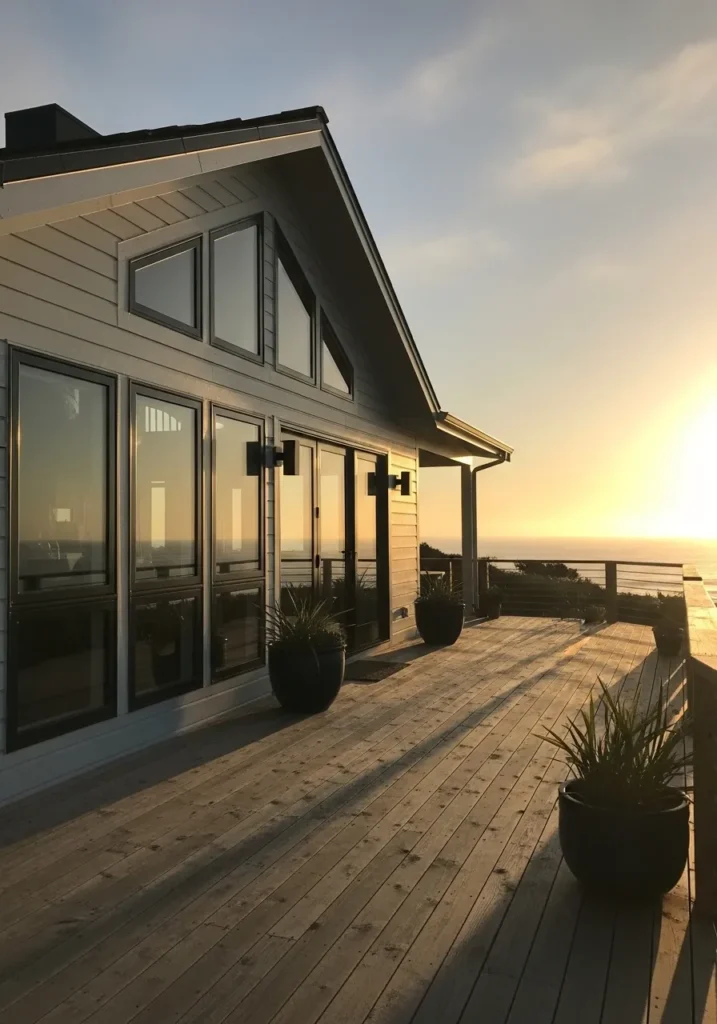
Soft Weathered Deck Gray
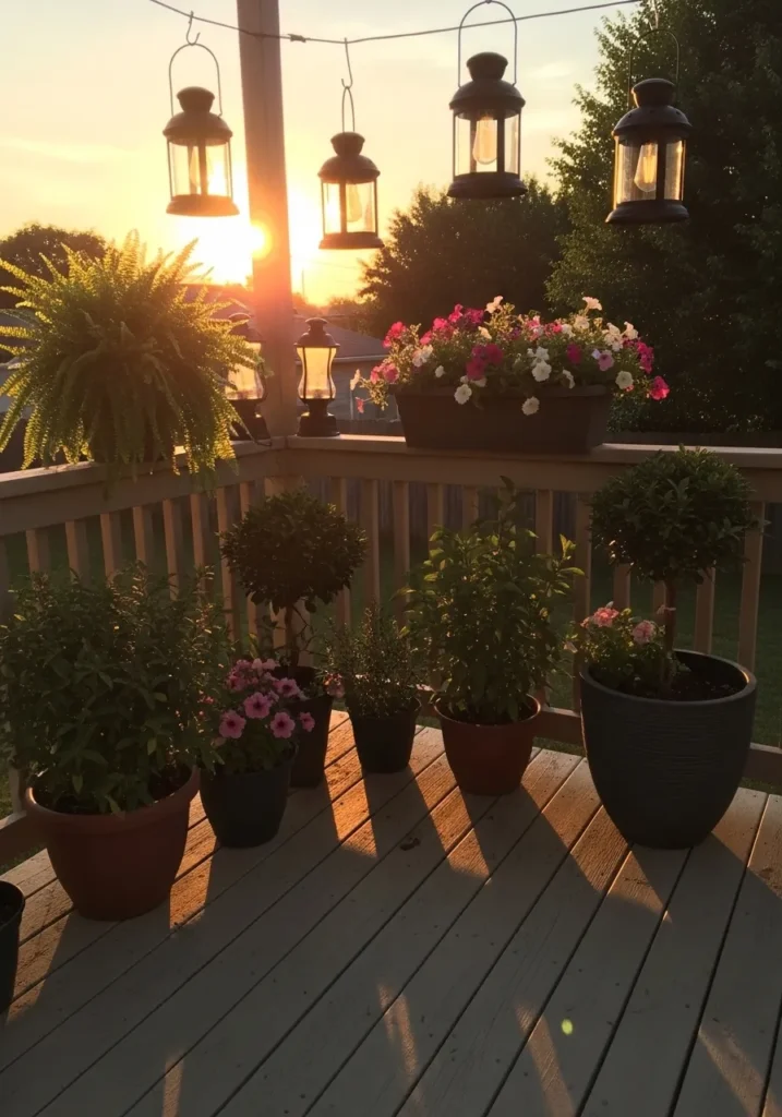
This reads as a soft weathered gray, and it feels closest to Benjamin Moore Harbor Gray. It sits in that light gray range with a slightly sun-faded look, which works well for outdoor spaces like this deck. It does not feel cold or stark, just simple and worn in a good way.
There is a faint warm undertone that keeps it from going too blue. That helps it sit nicely with natural wood tones and greenery without looking harsh. In brighter light it can look lighter and a bit washed, while in shade it settles into a deeper gray. It is a good choice for decks or porches where you want something neutral that still feels relaxed.
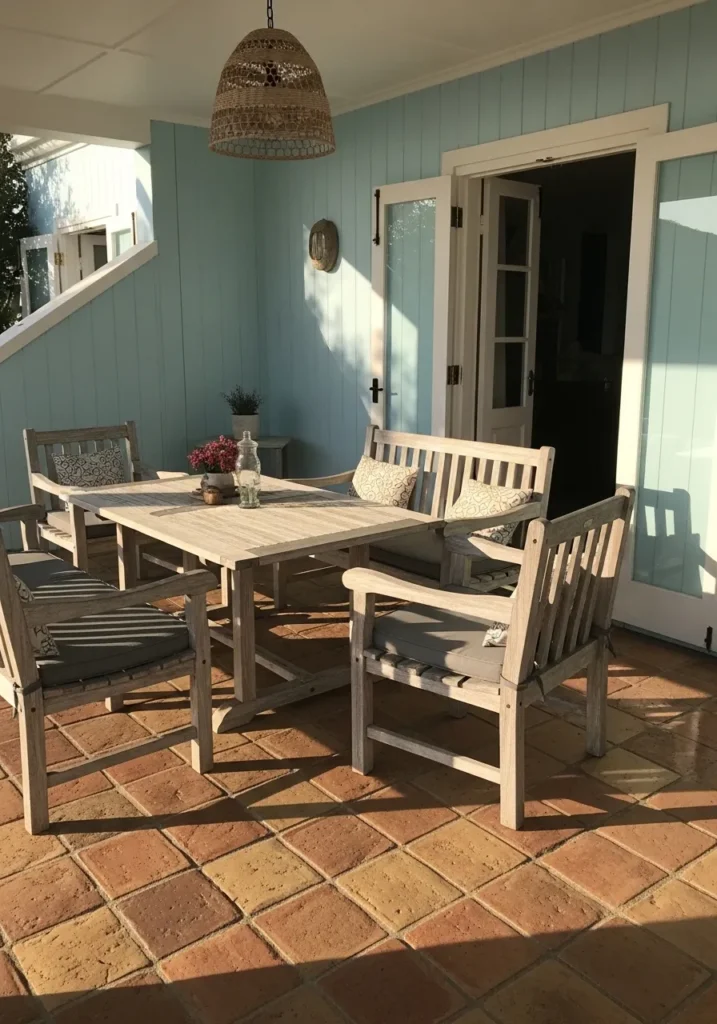
Soft Seafoam Green Paneling
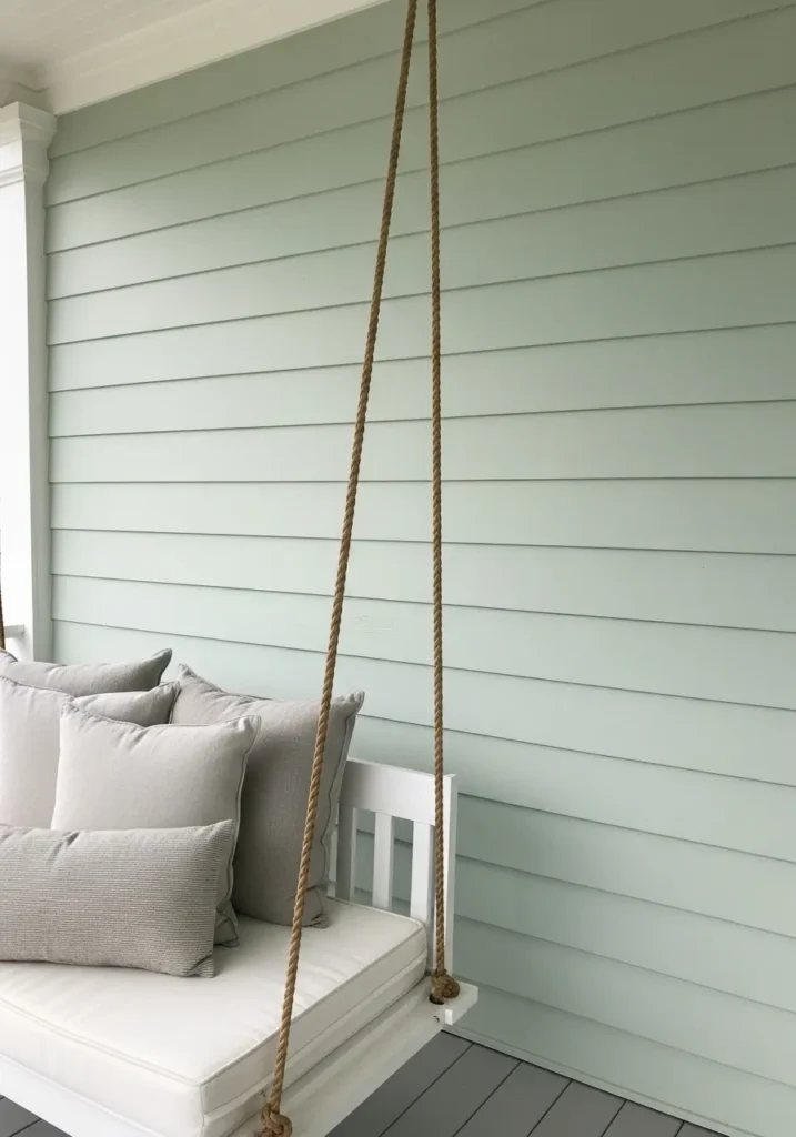
This reads as a soft seafoam green, and it feels closest to Benjamin Moore Hollingsworth Green. It sits right between green and blue, but leans slightly green with a muted, powdery finish. On the wall paneling behind the swing, it looks calm and easy, not bright or overly beachy.
The undertone has a bit of gray in it, which keeps the color from feeling too fresh. That helps it pair nicely with white trim and light cushions without looking sharp. In brighter light it can look a touch lighter and more airy, while in shade it settles into a softer green. It works well on porches or interiors where you want color that stays relaxed.
Warm Taupe Dining Room Walls
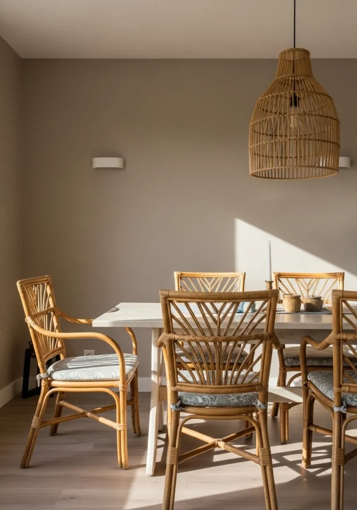
This reads as a warm taupe, and it feels closest to Benjamin Moore Revere Pewter. It sits right between gray and beige, with just enough warmth to keep it from feeling cool or flat. On the wall behind the dining table, it looks soft and easy, not too dark and not too light.
The undertone leans slightly warm, which helps it work well with the rattan chairs and light wood tones. In brighter light it can look a bit lighter and more beige, while in lower light it shifts closer to a gentle gray. It works well in dining areas or living spaces where you want a neutral that still feels a little relaxed.
Light Sky Blue Exterior
This reads as a light sky blue, and it feels closest to Benjamin Moore Breath of Fresh Air. It sits in that clean, pale blue range without leaning too icy or too pastel. On the siding around the windows, it comes across fresh but still easy to live with.
The undertone leans slightly cool, which gives it that clear blue look, but it stays soft enough to avoid feeling sharp. In bright light it can look lighter and almost airy, while in softer light it shifts a bit more muted. It works well for full exteriors like this, especially when paired with crisp white trim to keep everything looking simple.
Soft Warm White Exterior
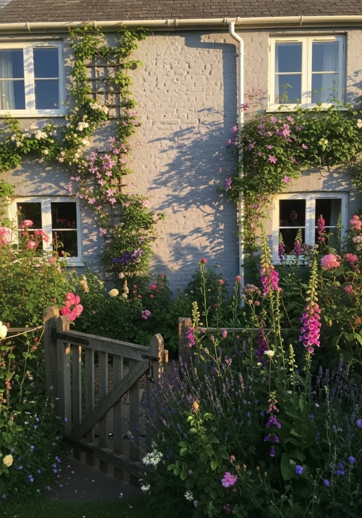
This reads as a soft warm white, and it feels closest to Benjamin Moore Swiss Coffee. It sits in that off-white range with a gentle creamy tone, which keeps it from feeling too stark. On the brick wall around the windows, it looks relaxed and lived-in rather than bright and sharp.
The undertone leans warm, but it stays quiet and easy to work with. Next to greenery and natural wood like the garden gate, it holds a soft, settled look. In brighter light it can appear lighter and closer to white, while in shade it shows more of that creamy depth. It works well on exteriors where you want something classic but not too crisp.
Light Coastal Blue Hallway Walls
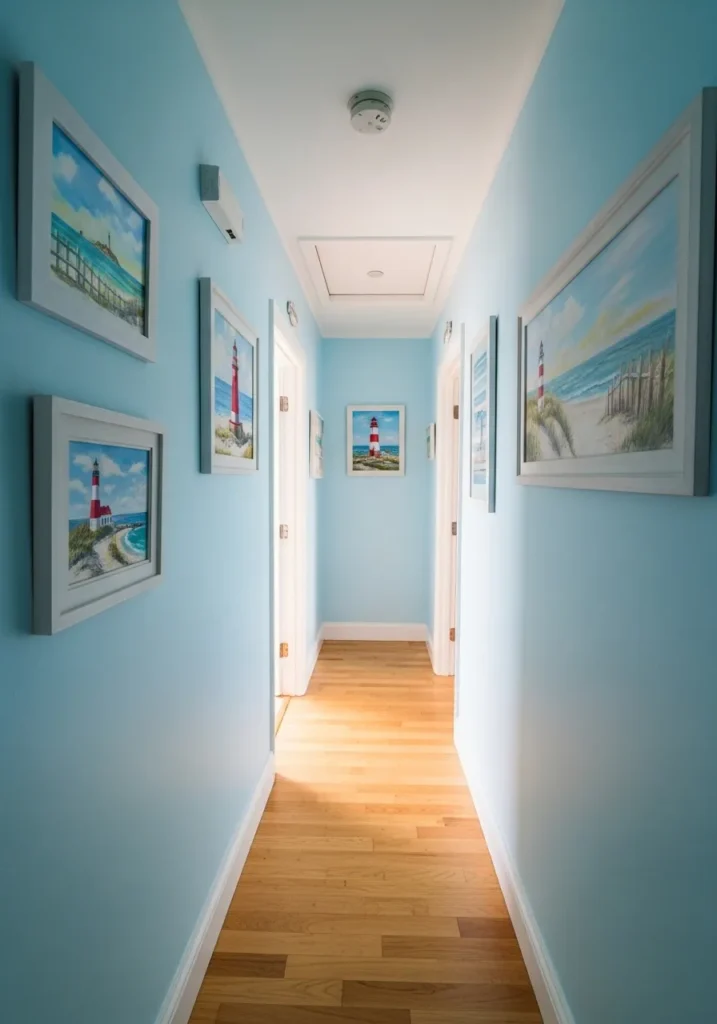
This reads as a light coastal blue, and it feels closest to Benjamin Moore Woodlawn Blue. It sits in that soft blue range with a slight green and gray mix, which keeps it from feeling too bright. Along the hallway walls, it comes across clean and easy without being stark.
The undertone leans a bit cool, but the gray in it softens the overall look. Next to the white trim and light wood floor, it feels balanced and not too crisp. In brighter light it can look lighter and more airy, while in lower light it shifts slightly muted. It works well in narrow spaces like hallways where you want a bit of color that still feels calm.