I’ve been obsessed with navy blue for as long as I can remember.
There is something about how bold and timeless it feels that makes me want to paint every room in my house that color.
Some people love soft neutrals, but I find myself drawn to walls that make a statement and give a space personality.
I recently started experimenting with different Sherwin Williams navy shades, and it completely changed the vibe of my living spaces.
From cozy kitchens to dramatic bedrooms, I found that the right navy can make a room feel both sophisticated and inviting.
I wanted to put together my favorite picks so you can see how these bold blues really shine in real homes.
These 20 navy paint colors have personality, charm, and style that can transform any space.
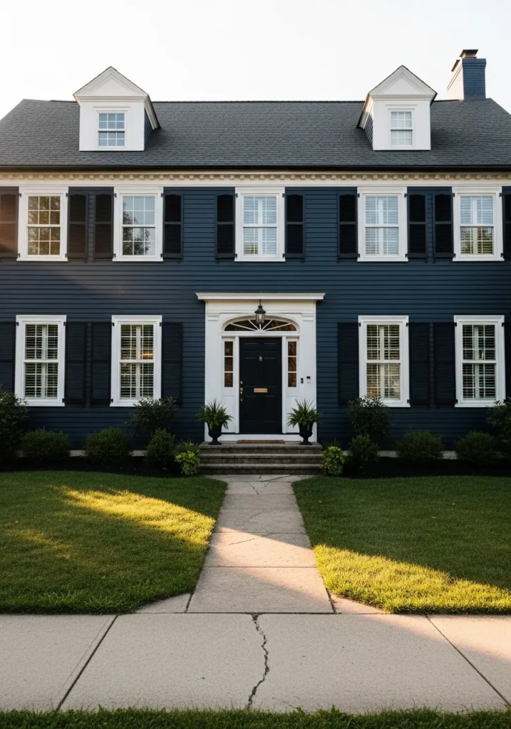
This stunning two-story Colonial home features horizontal lap siding in a deep and velvety navy blue that looks incredibly regal. The crisp white trim around the windows and the grand front entryway provides a sharp contrast that makes the blue pop even more. Those traditional black shutters and the matching front door add a layer of sophistication, while the symmetrical dormer windows on the roof create a balanced and timeless silhouette. It is the kind of house that manages to feel both imposing and welcoming all at once.
I am head over heels for how this dark hue transforms a traditional structure into a modern masterpiece. The way the golden hour sunlight hits the siding shows off the rich depth of the color and makes the whole property glow. It feels like a breath of fresh salty air and reminds me of a luxurious seaside estate. You can tell the owners have a great eye for detail because the symmetry is just perfection.
Sherwin Williams Charcoal Blue for a Moody Modern Lounge
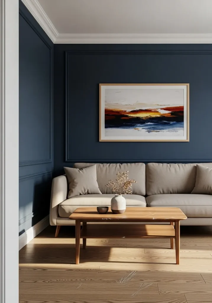
This interior space showcases a sophisticated take on the accent wall using a dusty and slightly muted navy with gray undertones. The designer used elegant picture frame molding on the walls to add architectural interest and texture without overwhelming the room. A neutral beige sofa sits perfectly against the dark backdrop, while the light wood coffee table and flooring bring a warm and organic touch to the scene. The abstract sunset artwork ties all the colors together and serves as a brilliant focal point that draws the eye immediately.
I find this combination of deep color and clean lines remarkably soothing for a living area. Using such a saturated shade could feel heavy, but the natural light streaming across the floor keeps the vibe airy and fresh. My favorite part is how the molding creates those subtle shadows that make the wall look so expensive and high-end. It is a fantastic example of how a bold paint choice can act as a neutral when paired with the right earthy accessories.
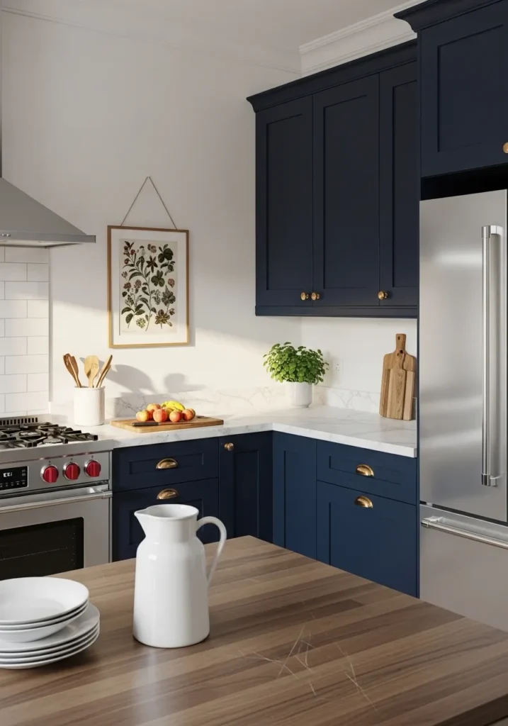
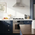
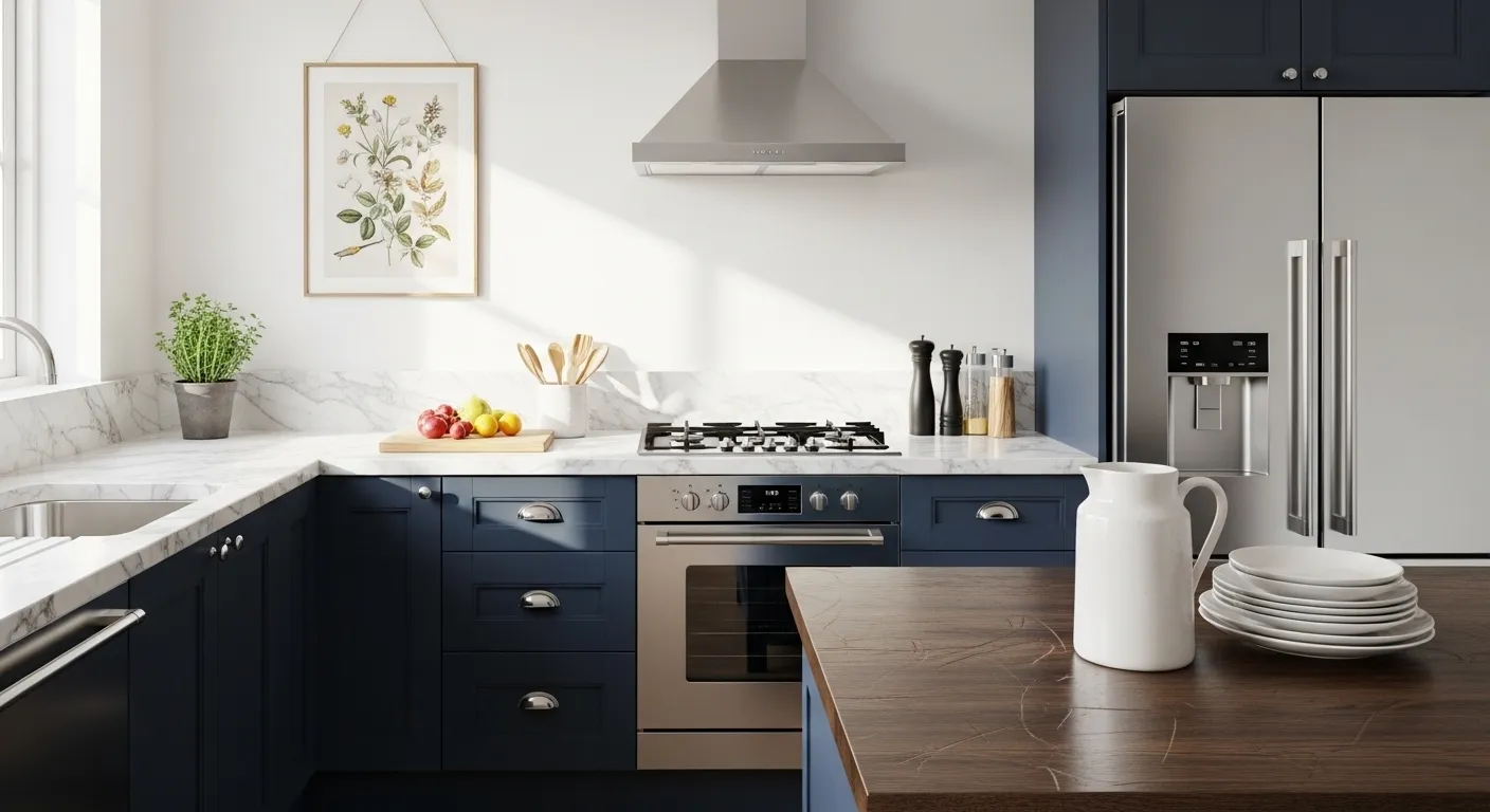
This bright and airy kitchen gets a major dose of personality from the stunning navy blue cabinetry that anchors the space. The deep indigo hue of the shaker-style cupboards looks incredibly chic when paired with the crisp white marble countertops and the classic subway tile backsplash. Gold hardware adds a touch of glam and warmth, while the stainless steel appliances and wood-topped island keep the overall vibe grounded and functional. It is a brilliant example of how to use a saturated color in a smaller footprint without making it feel cave-like or cramped.
I am smitten with the way this blue makes every other detail in the room look so much sharper. The contrast between the dark paint and the bright walls is pure magic and gives off such a clean and upscale energy. Seeing that botanical artwork hanging on the wall makes me want to grab a glass of wine and start cooking a big family dinner right now. It truly feels like the heart of a home where style and comfort meet for a cup of coffee.
Sherwin Williams Dress Blues for a Dreamy and Nurturing Nursery
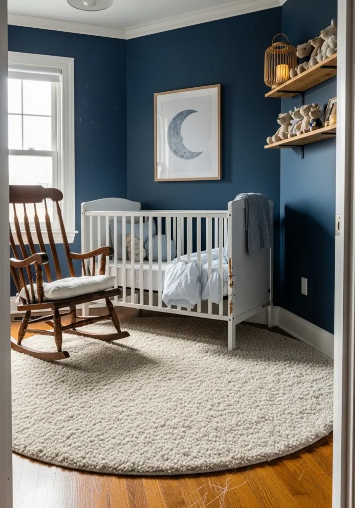
This darling nursery space uses a vibrant and soulful navy on the walls to create a cozy cocoon for a little one. The richness of the blue provides a beautiful anchor for the white crib and the plush cream area rug that covers the warm wood flooring. Natural elements like the wooden rocking chair and the open shelving with cute teddy bears bring a sense of organic charm to the room. A simple moon art piece and a soft blue throw blanket tie the celestial theme together perfectly, while the bright window keeps the dark walls from feeling too heavy during the day.
I am charmed by how this bold color choice makes the nursery feel like a tiny midnight sanctuary. It is such a refreshing departure from the typical pastel baby rooms and adds a sophisticated layer to the home design. The way the light catches the texture of the rug against that smooth, deep blue wall is just lovely. I think choosing a saturated navy for a kid’s room is a genius move because it grows with them and always looks incredibly stylish.
Sherwin Williams Sea Mariner for a Stately Dining Experience
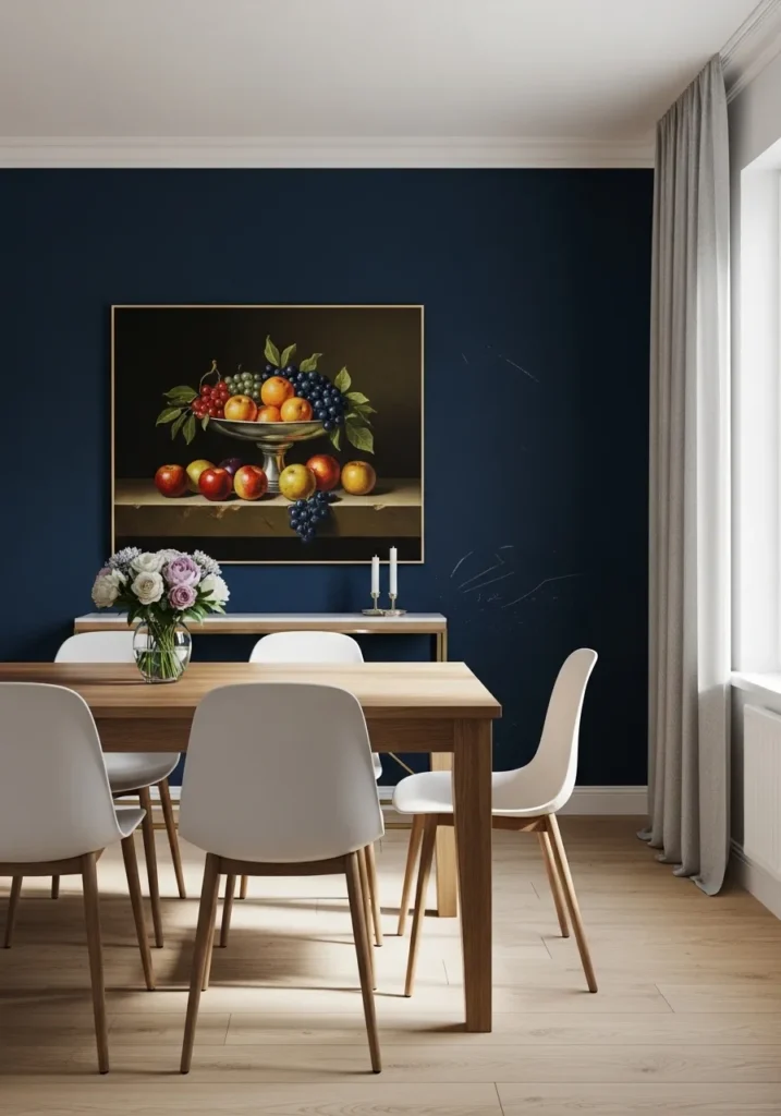
This dining room setup features a breathtaking accent wall in a regal navy that leans into the darker side of the spectrum. The smooth finish of the wall provides a dramatic backdrop for a large classical still life painting which features vibrant fruit that practically glows against the deep blue. White mid-century modern chairs and a light oak table offer a bright contrast that keeps the space feeling current and approachable. With soft gray drapes and light wood flooring the room maintains a balanced temperature that feels expensive yet cozy for a long dinner party.
I adore how this specific shade acts as a velvet curtain for the rest of the furniture to shine against. The choice of a traditional painting paired with those sleek white chairs is such a clever way to mix eras without looking cluttered. It feels like a high-end gallery space but way more inviting and warm. My favorite element has to be the way the white molding at the base makes that navy look even more saturated and intentional.
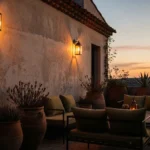
Sherwin Williams Outerspace for a Relaxed Coastal Porch Vibe
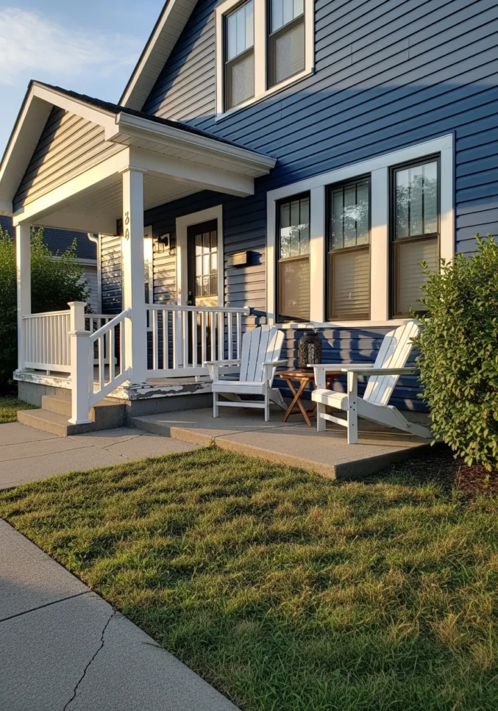
This charming home exterior features a gorgeous medium-toned navy with a distinct slate-gray undertone that feels incredibly breezy and approachable. The horizontal siding creates a textured look that pairs beautifully with the crisp white porch railings and thick window trim. Two classic white Adirondack chairs sit on the concrete patio, inviting you to stay a while and enjoy the sunset. The warm golden light hitting the side of the house highlights the cool tones of the paint, creating a lovely balance between the architecture and the natural surroundings.
I find this setup so incredibly inviting and perfect for a lazy Sunday afternoon. It has that effortless coastal cottage energy without being too literal or thematic. The way the blue shifts in the light is simply mesmerizing, and it makes the white furniture look so bright and clean. Some people might stick to neutrals for a porch, but this muted navy adds so much more character and soul to the front of the house.
Sherwin Williams Gale Force for a Studious and Grounded Home Office
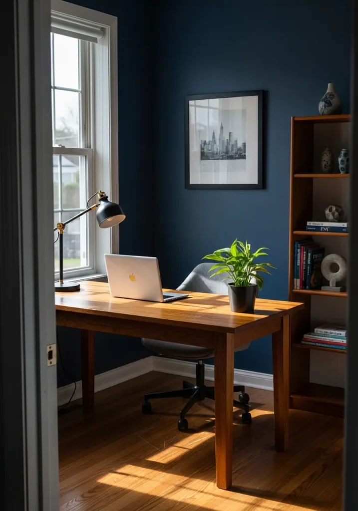
This productive corner features a deep and stormy navy that creates a serious yet inspiring atmosphere for a workspace. The cool undertones of the walls play beautifully with the warmth of the mid-century modern wooden desk and the matching tall bookshelf filled with colorful reads. A sleek gray office chair and a minimalist black desk lamp keep the look professional, while a pop of green from a potted plant adds a much-needed touch of life. The black and white cityscape photography on the wall serves as a sophisticated focal point that ties the whole academic aesthetic together.
I like how this moody shade manages to make a small office nook feel like a high-powered executive suite. The way the sunlight streams across the rich wood grain against that dark matte background is total eye candy. If you are looking to boost your focus while staying stylish, this is exactly how you do it. It feels remarkably balanced and provides such a quiet and peaceful energy for getting things done.
Sherwin Williams Moscow Midnight for a High-End Laundry Retreat
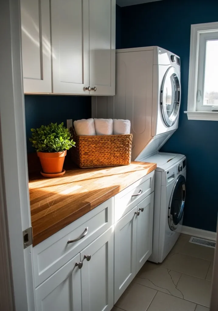
This functional laundry room gets a major style upgrade with a deep and mysterious navy that leans heavily into a lush teal-adjacent territory. The rich wall color creates a stunning backdrop for the stacked white washer and dryer unit and the matching bright white cabinetry. A thick butcher block countertop adds a necessary touch of warmth and texture, while a woven basket filled with fluffy towels and a vibrant green plant in a terracotta pot keep the space feeling organic. With the sunlight streaming in from the side window, the paint shows off its complex jewel-toned depth against the clean neutral flooring.
I am completely mesmerized by how a utilitarian space can feel so luxurious and intentional with just a splash of the right color. It turns a chore-heavy room into a little sanctuary where I wouldn’t mind spending an afternoon folding clothes. The pairing of that specific dark teal-navy with the natural wood grain is a total design win in my book. It is a brilliant example of how you can take a risk in a small room to create a truly memorable and sophisticated look.
Sherwin Williams Waterloo for a Sun-Drenched Coastal Sunroom
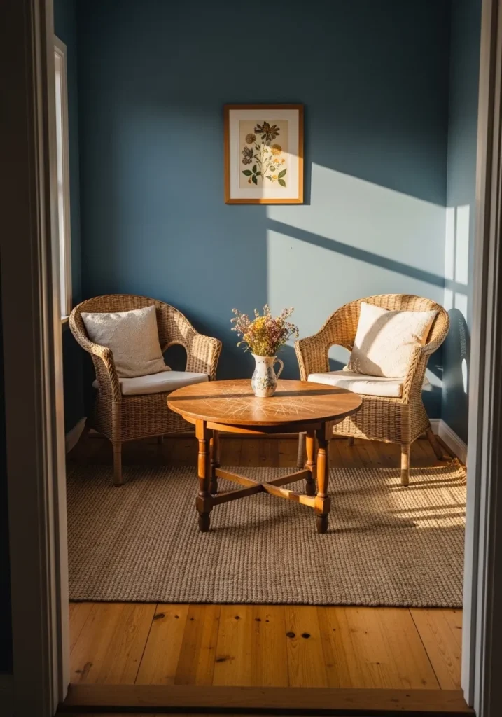
This breezy sunroom uses a gorgeous mid-tone navy with a hint of slate to create a peaceful pocket of the home. The blue walls offer a stunning backdrop for the two wicker armchairs that give off some major boho-chic vibes with their light cream cushions. A round wooden coffee table sits on a chunky jute rug, grounding the space in natural textures that make the whole room feel earthy. The botanical art on the wall and the vase of wildflowers tie everything together, while the long shadows from the window suggest this is the perfect spot for an afternoon tea.
I love how this color makes the natural wood and wicker elements just sing. It has that effortless feel that makes a house really feel like a home. No matter your style, adding a quiet corner like this with such a soulful blue is a total game-changer for your daily mood. Some people love a stark white room, but this dusty navy proves that color can be just as calming and twice as interesting.
Sherwin Williams Mount Etna for a Sophisticated Sanctuary Vibe
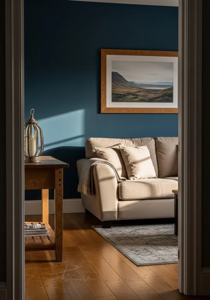
This living room setup features a stunning accent wall in a deep navy that carries a lush and mysterious teal undertone. The rich paint provides a velvety backdrop for a comfortable beige sofa and a light wood side table, which holds a rustic lantern. A framed landscape photograph in a warm oak frame draws the eye while the natural sunlight streaming across the wall creates a beautiful gradient of color. The combination of the dark wall and the medium-toned wood floors offers a grounded and high-end feel that makes the whole room look incredibly intentional.
I feel such a sense of calm looking at how this complex shade plays with the light and shadows in the corner. It is a fantastic example of how a moody color can actually make a space feel more expansive and deep rather than closed in. The way the cool wall contrasts with the warm honey tones of the floor is just a chef’s kiss level of design. If you want a room that feels like a warm hug at the end of a long day, this is definitely the palette to copy.
Sherwin Williams Out of the Blue for a Playful Creative Zone
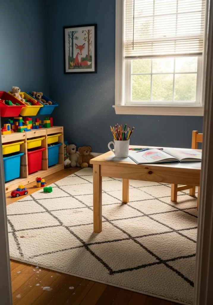
This vibrant playroom features a medium-bodied navy with a cheerful, energetic undertone that feels perfectly suited for a space dedicated to imagination. The rich blue walls make the primary-colored toy bins and colorful building blocks absolutely pop, creating a high-energy environment that still feels anchored and organized. A light wood activity table sits in the center of the room on top of a cream-colored geometric rug, while the large window allows plenty of natural light to dance across the smooth paint finish. The cute fox artwork on the wall adds a final touch of whimsy to this perfectly balanced and kid-friendly nook.
I like the idea of using a bolder navy in a playroom instead of the usual primary brights. It gives the room a sophisticated edge that doesn’t feel too “grown-up” for the little ones, and it makes all those colorful toys look like part of the decor. Seeing the way the sun highlights those little dust motes in the light beam makes me feel so nostalgic for long afternoons spent drawing. It is such a clever way to design a space that manages to be both exciting for kids and aesthetically pleasing for us parents.
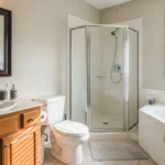
Sherwin Williams Deep Sea Dive for a Luxe Spa Bathroom
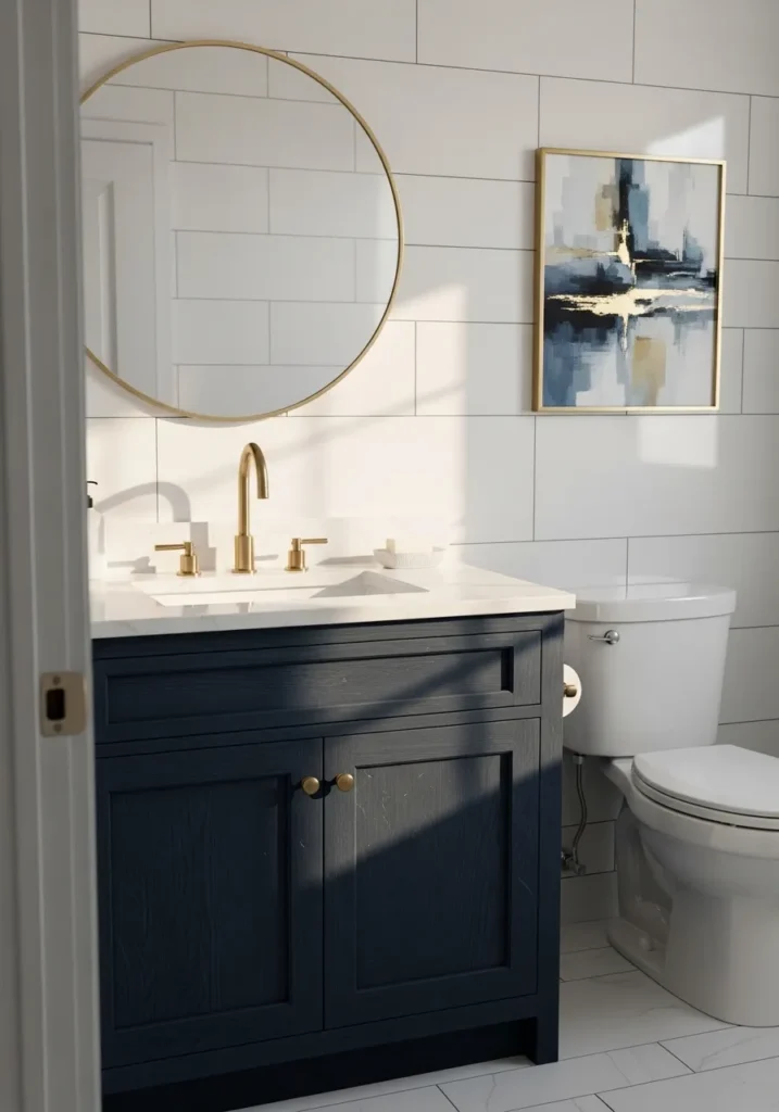
This petite bathroom packs a major punch with a textured navy vanity that anchors the entire room. The deep indigo wood grain of the cabinet looks so incredibly rich against the large-scale white subway tile that wraps around the walls. To keep things feeling bright and high-end, the designer added a thin gold circular mirror and matching brass faucet hardware that gleams in the natural light. A piece of abstract navy and gold art ties the whole palette together, while the crisp white marble countertop and matching toilet keep the vibe clean and refreshing.
I am impressed by how this dark vanity makes such a small space feel like a five-star hotel suite. If you’re into that “quiet luxury” aesthetic, this is exactly the kind of contrast you need to recreate at home. The way the warm sunlight hits the gold accents against that cool blue wood is just absolute perfection. It proves that you don’t need a massive renovation to make a huge impact, just one really stunning piece of furniture in a bold, soulful color.
Sherwin Williams Still Water for a Creative Garage Workshop
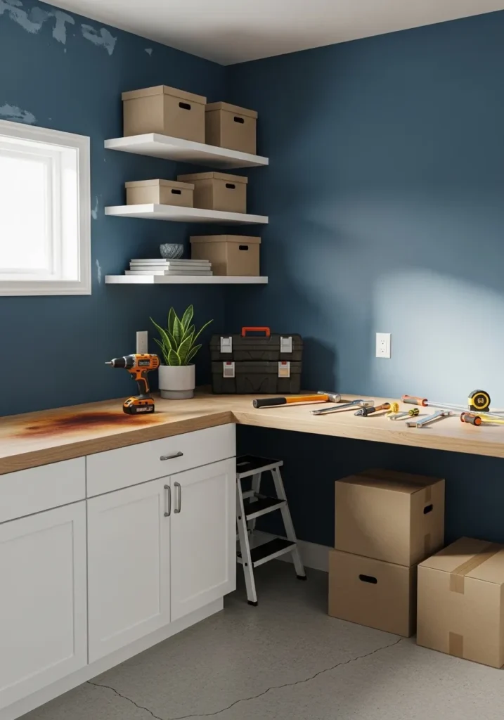
This clever garage nook features a muted and slightly teal-leaning navy that brings a huge amount of depth to the storage area. The dusty blue walls provide a wonderful foundation for the floating white shelves and the matching white cabinetry below. A light oak L-shaped workbench offers a sprawling surface for projects, while the cardboard organization boxes and black tool chest keep everything looking tidy and professional. It is such a smart use of color to define a specific zone in a garage while keeping the aesthetic totally elevated.
I find the choice of such a soulful and moody shade for a utility area to be incredibly refreshing and smart. Most people just leave their garages looking like a boring concrete box, but this rich navy turns a simple hobby corner into a real design feature. The way the bright sunlight hits that smooth wall and highlights the snake plant makes me want to start a DIY project right this second. It feels like a space where you can actually focus and get your hands dirty while still feeling like you’re in a high-end part of the home.
Sherwin Williams Commodore for a Bold Victorian Revival
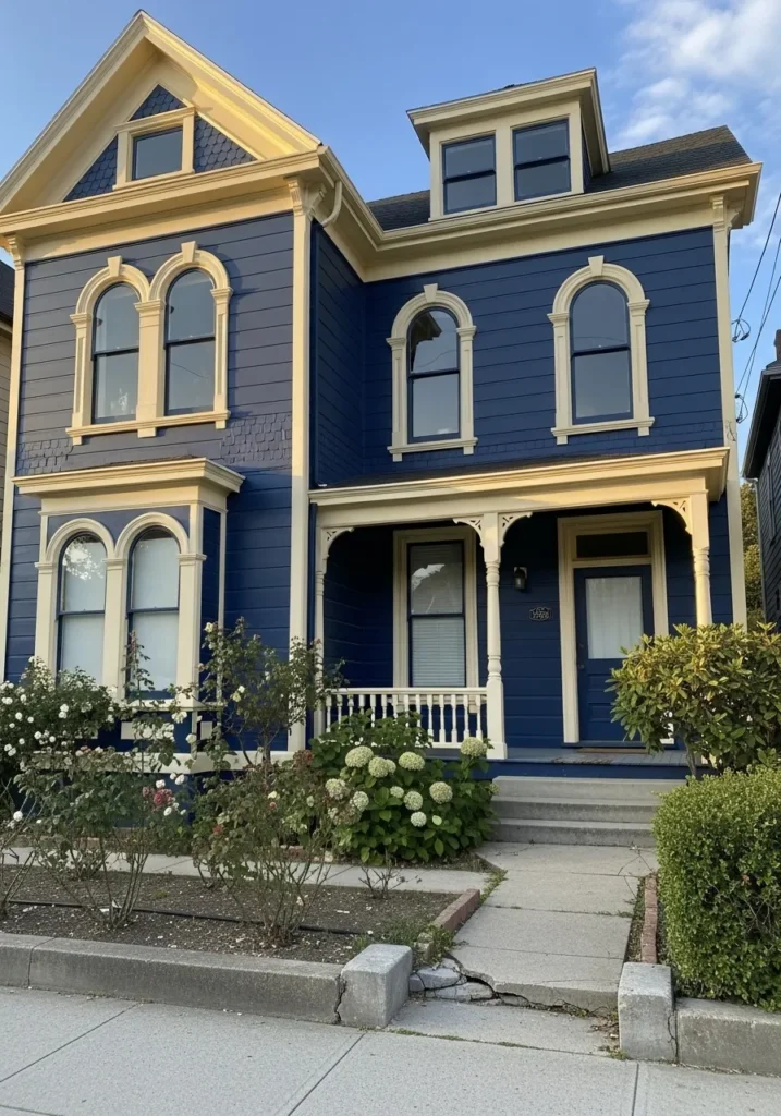
This grand Victorian home is a total showstopper with its intense and spirited navy blue siding that feels incredibly rich and historical. The architectural details are highlighted by a creamy off-white trim that traces the unique arched windows and the decorative fish-scale shingles in the gables. A welcoming front porch with delicate spindle work and a matching blue door creates a sense of depth, while the lush hydrangea bushes and rose garden add a soft and romantic touch to the property. It is a brilliant example of how a heritage home can look completely refreshed and modern with a bold color palette.
I am enchanted by how this vibrant blue makes all those intricate Victorian carvings just stand out and demand attention. It has such a cheerful and confident energy that you usually don’t see on older homes, which can sometimes feel a bit stiff or somber. The way the late afternoon sun hits the cream trim against that deep indigo is pure eye candy for anyone who loves a bit of drama. I believe choosing such a daring shade is the ultimate way to give a classic building a brand new soul and a ton of curb appeal.
Sherwin Williams Windy Blue for a Serene and Airy Home Office
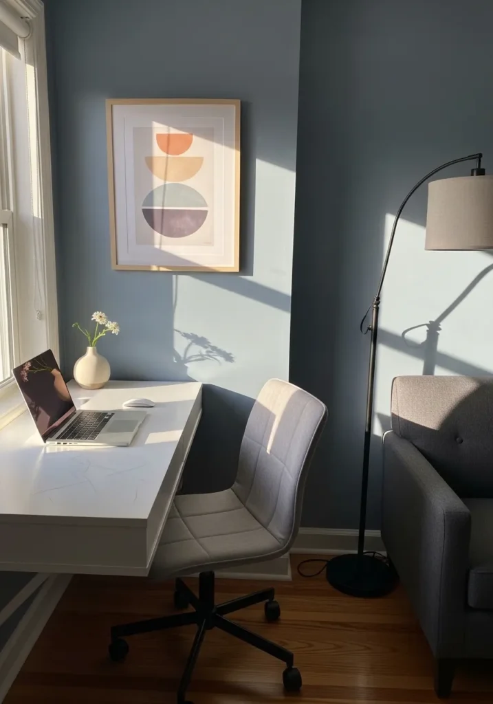
This peaceful workspace utilizes a soft and dusty navy that leans into the lighter side of the spectrum to keep the energy bright. The gentle blue walls provide a tranquil backdrop for a sleek white desk and a modern gray upholstered office chair. A minimalist floor lamp and a cozy gray armchair in the corner suggest this room is perfect for both intense focus and short mental breaks. Geometric art with warm terracotta and lavender tones adds a lovely splash of color that perfectly complements the cool wall paint, while the natural sunlight pouring in from the window creates beautiful shadows across the hardwood floors.
I find this specific setup incredibly refreshing for anyone who works from home and needs a calm environment to stay productive. It has such a lighthearted and breezy feel that prevents the office from feeling like a drab cubicle. The way the soft blue interacts with the white furniture makes the whole corner look so crisp and organized. If you want a space that feels like a quiet morning at the beach, then this color palette is exactly what you need to copy for your own renovation.
Sherwin Williams Sea Serpent for a Hidden Attic Escape
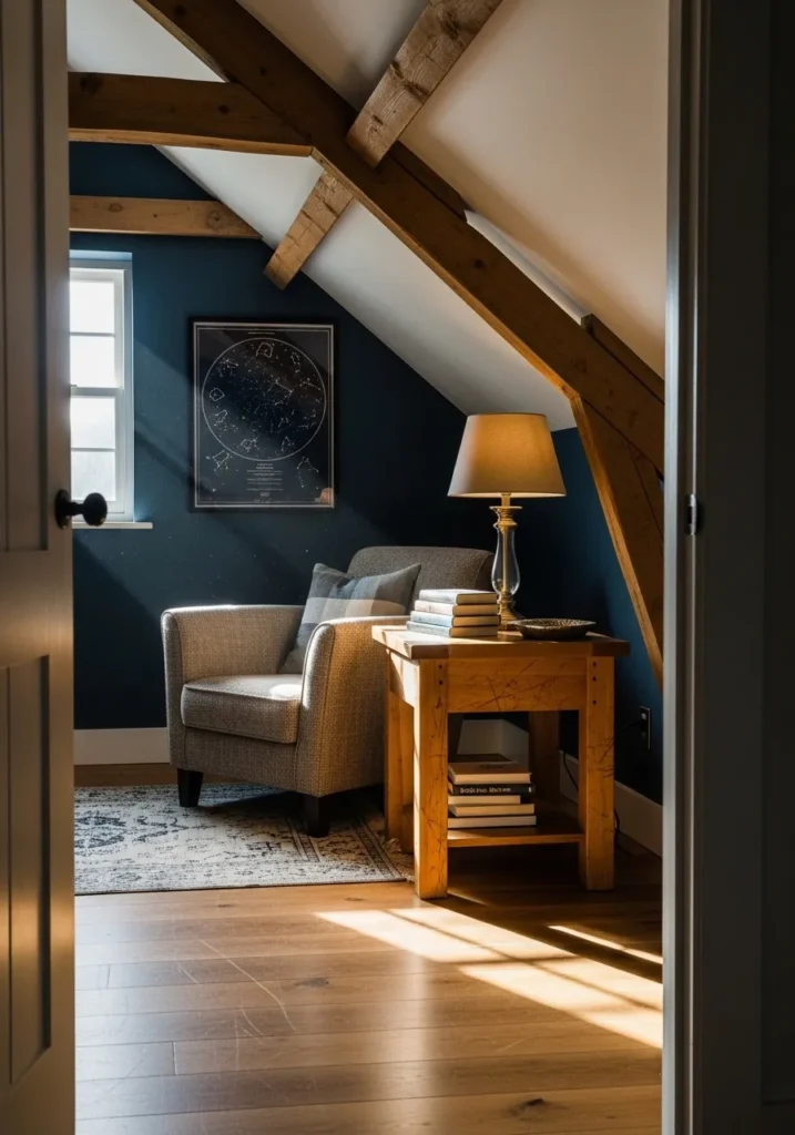
This tucked-away reading nook makes incredible use of a sloped ceiling by painting the far wall in a dark and mysterious navy that feels almost like a night sky. The deep teal-blue provides a dramatic backdrop for the rustic exposed wooden beams that angle down toward a comfortable gray upholstered armchair. A sturdy light wood end table holds a stack of books and a warm glowing lamp, while a framed celestial map on the wall ties into that “looking up at the stars” feeling. The natural wood flooring and a vintage-style patterned rug keep the small space from feeling too enclosed, and the single window lets in just enough light to catch those lovely dust motes in the air.
I am wowed by how much personality this little corner has thanks to that bold paint choice. It would have been so easy to just leave it white, but the navy makes the wooden beams look so much more architectural and important. It feels like the ultimate hideaway where you could escape the rest of the world for an hour with your favorite novel. I think the way the light hits the texture of the chair against that smooth, dark wall is just beautiful.
Sherwin Williams Rainstorm for a Serene Morning Balcony
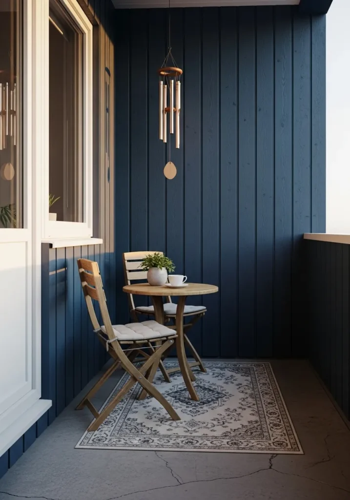
This cozy balcony retreat features vertical wood paneling drenched in a deep and moody navy that feels like a quiet evening by the water. The dark blue walls create a striking contrast against the bright white door frame and the simple concrete flooring. A petite wooden bistro set sits atop a vintage-inspired patterned rug, providing a warm and organic touch to the cool-toned corner. With a delicate wind chime hanging from above and a fresh cup of tea on the table, the space feels like a perfectly curated sanctuary for watching the world go by.
I find this little nook absolutely charming and a total masterclass in using color to define a small outdoor area. It has such a peaceful and grounded energy that makes me want to grab my journal and disappear into those shadows for a while. The way the soft morning light hits the grain of the wood paneling is just stunning and adds so much texture to the overall look. Some people worry that dark colors will make a space feel smaller, but here it actually creates a sense of endless depth and sophisticated mystery.
Sherwin Williams Anchors Aweigh for a Zesty Mustard Kitchen
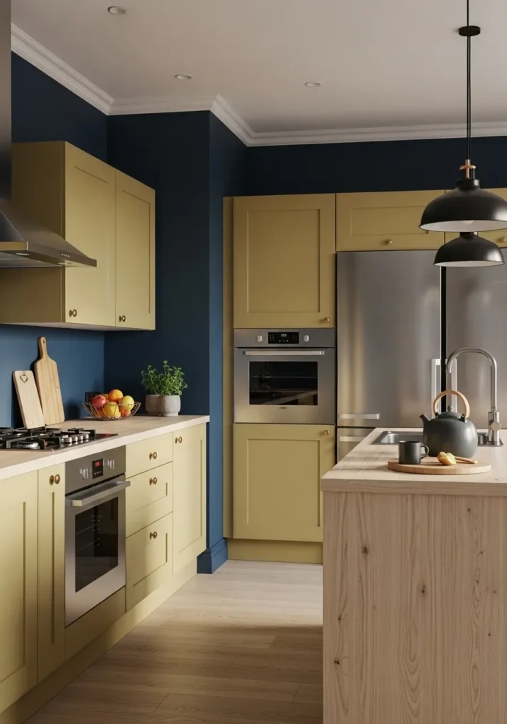
This contemporary kitchen pulls off a daring color block look by pairing deep navy walls with surprising mustard yellow cabinetry. The dark blue acts as a sophisticated anchor for the warm, sun-kissed cabinets, while the light wood island and flooring keep the atmosphere feeling light and natural. Minimalist black pendant lights hang over the workspace, adding a touch of industrial edge that complements the stainless steel appliances. It is a brilliant example of how playing with high-contrast, non-traditional pairings can result in a space that feels both high-end and full of personality.
I adore this bold color marriage because it feels so intentional and unique! It takes a lot of confidence to move away from all-white kitchens, but seeing how that rich navy makes the yellow pop is just pure design magic. The way the shadows play against the deep blue wall gives the whole room so much depth and character. If you want a kitchen that starts a conversation the second guests walk in, this vibrant and moody mix is definitely the way to go.
Sherwin Williams Charcoal Blue for a Fireside Lounge
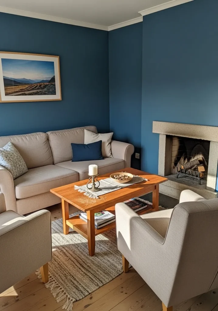
This living room makes a strong case for “new traditional” style, featuring walls painted in a deep, slate-infused navy that feels both historic and fresh. The moody blue provides a stunning backdrop for a cozy beige sofa and matching armchairs, arranged around a warm honey-toned wood coffee table. A clean-lined stone fireplace serves as the heart of the room, while a landscape photograph in a light wood frame mirrors the natural textures of the jute rug and hardwood floors. The sunlight streaming across the scene highlights the subtle gray undertones of the paint, creating a space that feels incredibly grounded and calm.
I love how the “cool” walls and “warm” furniture do a little dance together in this room—it keeps the space from feeling too icy or too heavy. The choice of a light-colored stone for the fireplace was a stroke of genius, as it draws your eye right to the center of the room against that dark blue. It’s the kind of space that feels expensive and curated, but still completely “nap-able.” It’s proof that you don’t need a lot of clutter to make a room feel full of soul and personality.
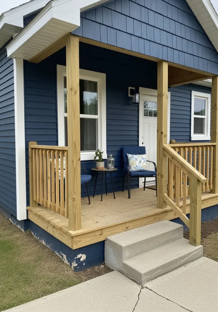
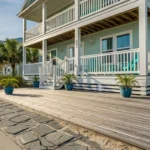
This final look features a quintessential navy blue that feels incredibly bold and crisp on a charming tiny home exterior. The deep indigo siding provides a stunning contrast against the bright white window trim and the matching front door. To keep the vibe warm and organic, the design incorporates a natural wood porch and railing that glows in the soft daylight. Two cozy blue chairs with floral accent pillows sit on the deck, creating a perfect little spot for morning coffee, while the dark foundation blocks ground the entire structure beautifully.
I love how this specific navy makes a smaller architectural footprint feel substantial and full of character. It’s a classic choice for a reason—it’s timeless, high-contrast, and looks fantastic against natural wood tones. The way the white trim “pops” against the dark siding gives the house a clean, tailored look that’s hard to beat. It’s the perfect finishing touch to a series that proves navy is one of the most versatile colors in any designer’s toolkit.