When I repaint cabinets I notice how much the shade shifts once it sits next to the trim and the flooring in the same room.
Farmhouse kitchens often need colors with enough depth to hold their own against wood tones and stone without turning flat under overhead lights.
Samples on the actual doors help more than anything else.
I have watched colors that seemed warm in the can pull cooler by midday once sunlight moves across the space.
That is why I always test a couple of options in the real room before making a final choice.
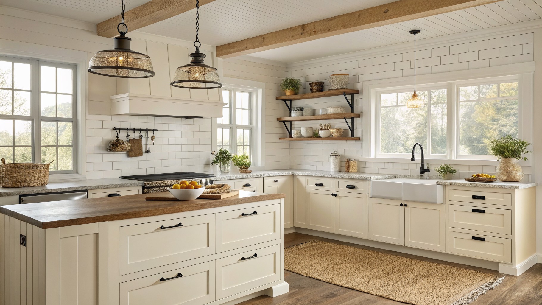
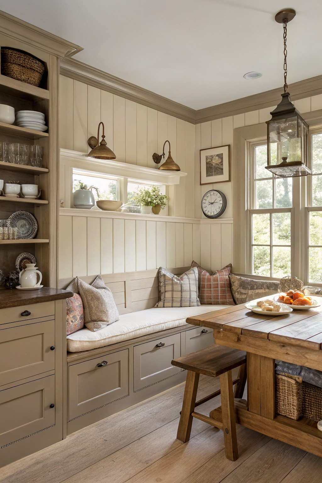
Warm Off-White Cabinets
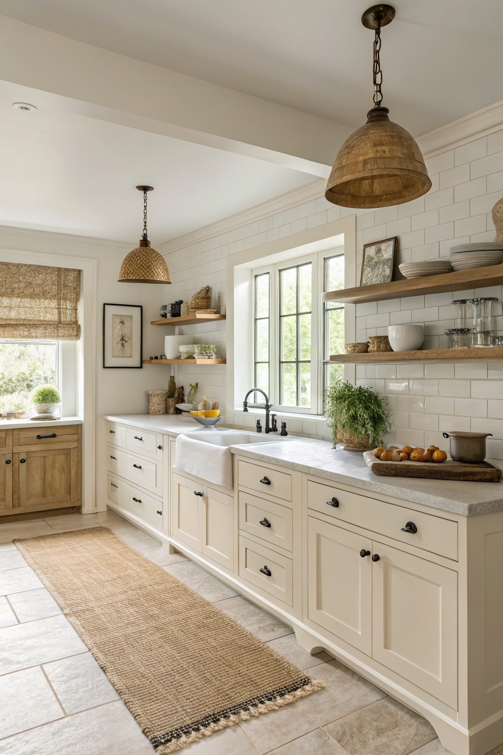
This kitchen uses a warm off-white on the cabinets. It has enough cream in it to feel soft next to the wood tones and stone, but it still reads clean in a bright room.
The color works best with black hardware and natural wood accents because the slight warmth keeps everything from looking too stark. Sherwin Williams Alabaster, Benjamin Moore White Dove, and Behr Swiss Coffee all sit in this same range.
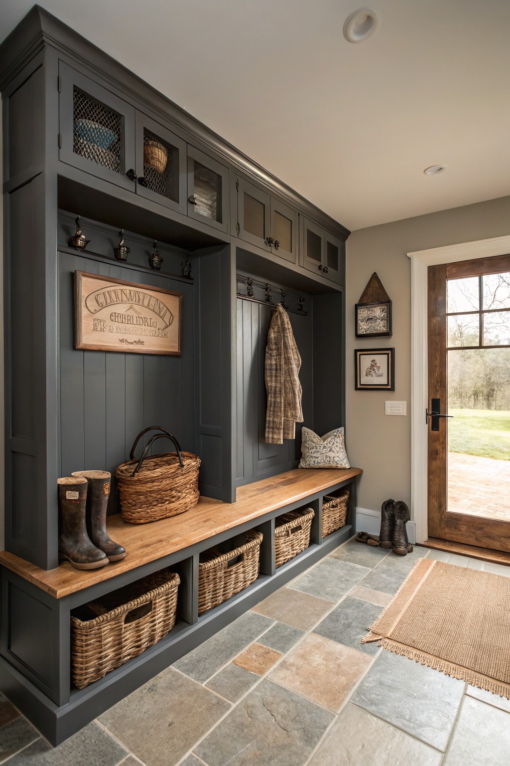
Soft Greige Built-Ins
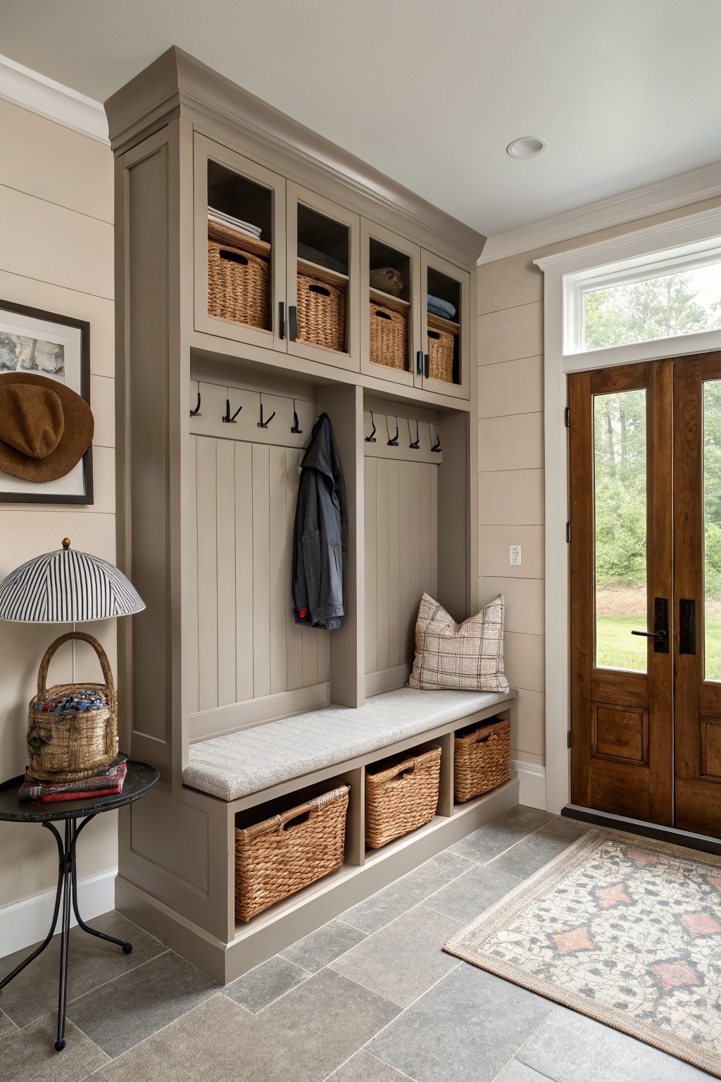
This greige on the cabinetry sits right between gray and warm beige. It gives the mudroom a calm, lived-in look without pulling too cool or too brown. Good matches in this range are Sherwin Williams Repose Gray, Benjamin Moore Edgecomb Gray, Behr Silver Satin, and Farrow & Ball Elephant’s Breath.
It pairs easily with wood tones and stone tile since the undertone stays gentle. In lower light it can lean a touch more gray, so test it on a sample board first if your entry gets less sun.
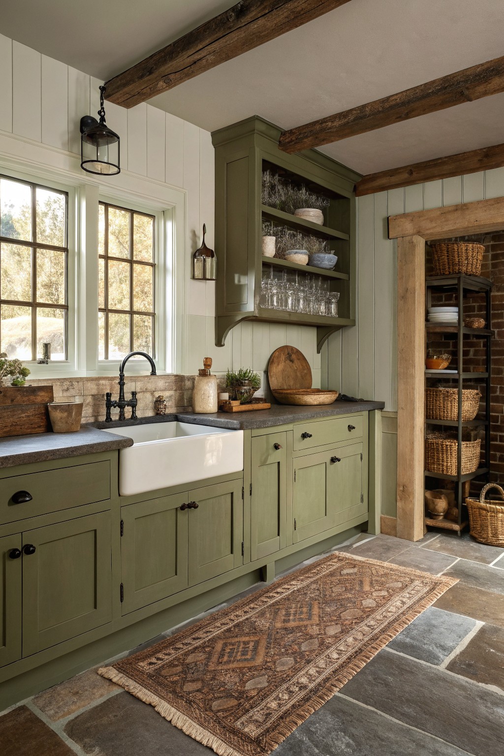
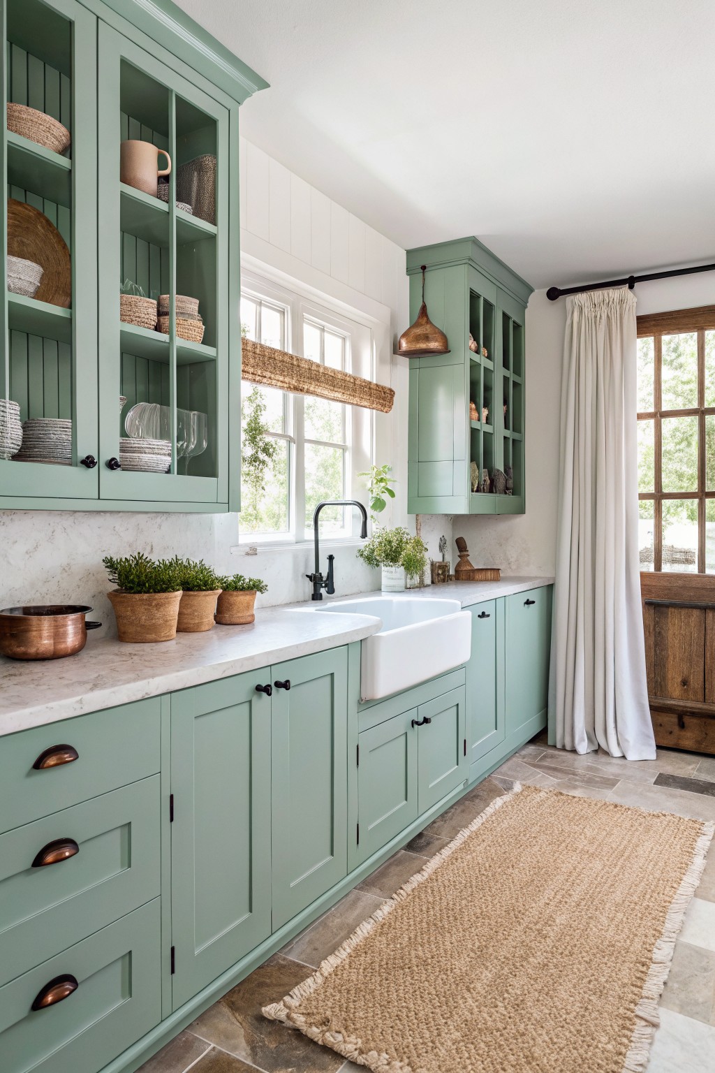
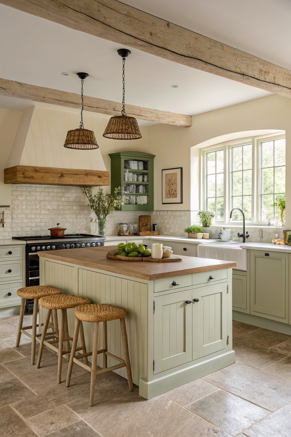
Soft Sage Green Cabinets
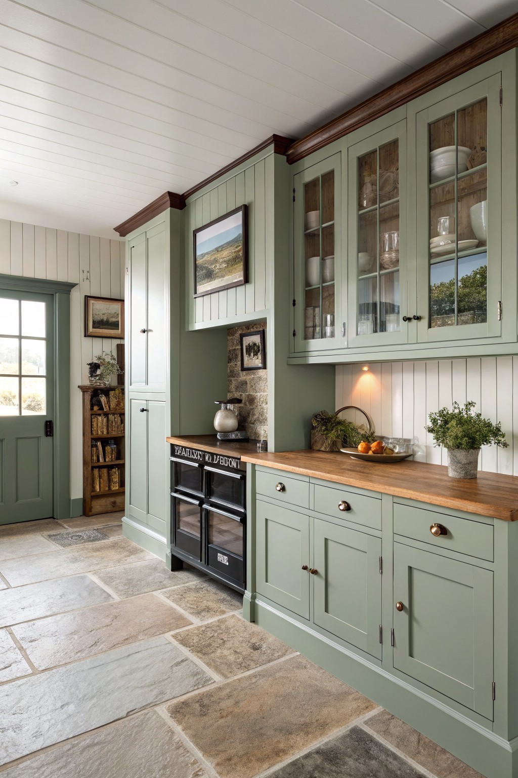
A soft sage green brings a calm touch to farmhouse cabinets without feeling too bold. This muted shade sits between green and gray, which helps it blend with wood tones and stone. It reads closest to Sherwin Williams Clary Sage or Benjamin Moore Saybrook Sage.
The color stays fairly neutral, so it works well with warm wood counters and dark accents like a black range. It suits kitchens that get steady daylight, since the green can look cooler in low light.
Soft Sage Green Built-Ins
This soft sage green brings a calm, slightly muted tone to cabinetry and built-ins. It sits between gray and green without tipping too far in either direction, which makes it easy to use in farmhouse spaces that already have wood floors and white trim.
The color holds up well next to natural wood and woven textures. It can read a touch cooler in low light, so it works best in rooms with decent daylight and pairs nicely with warm wood tones rather than stark contrasts.
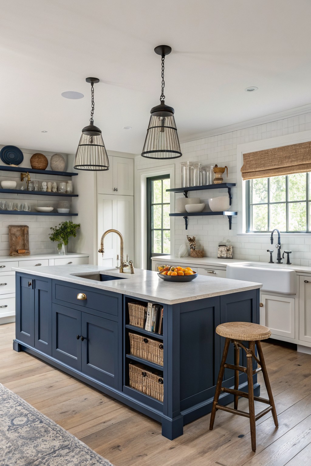
This deep navy blue on the cabinets gives a solid, grounded feel that works well in farmhouse kitchens. It sits between a true navy and a slightly softer midnight tone, which keeps it from looking too heavy while still adding presence.
The color has a cool lean that shows up clearly against white counters and wood floors. It pairs nicely with brass hardware or open shelving and works best on islands or built-ins where you want some depth without going full black.
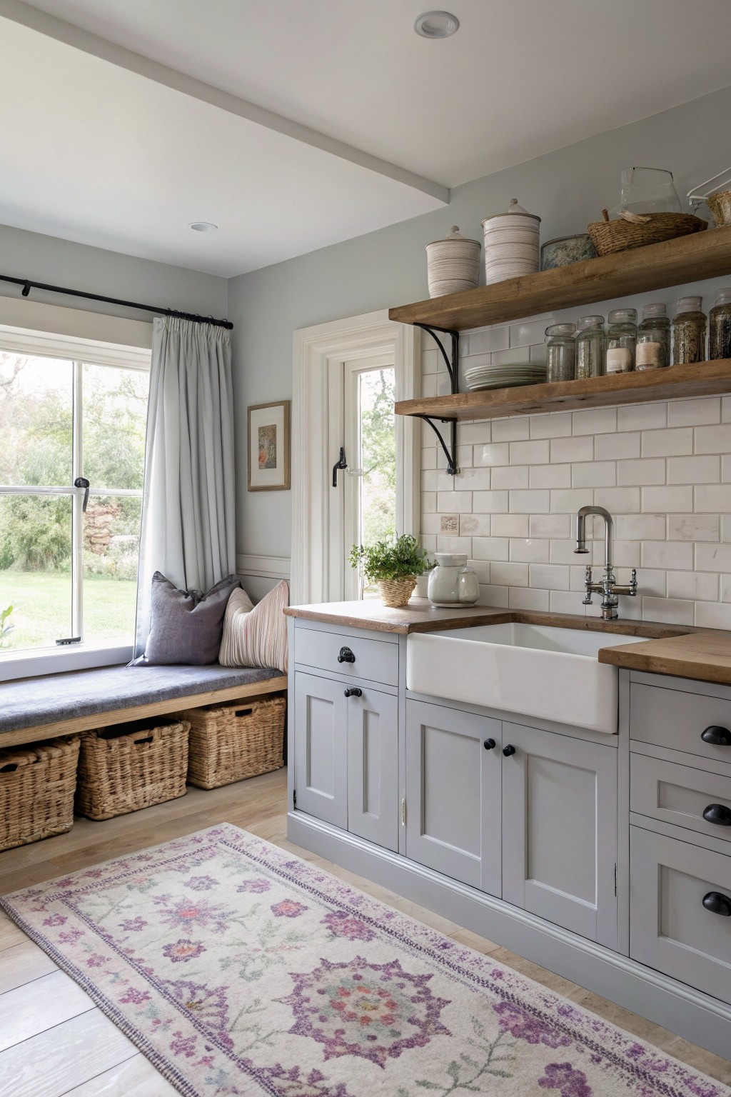
Soft Greige Cabinets
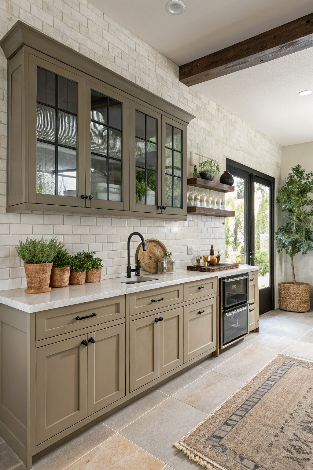
This soft greige on the cabinets gives a calm middle ground between gray and beige. It feels warm enough to work with wood tones but still reads clean next to white tile.
The color has a light taupe undertone that stays steady in different lighting. It pairs easily with black hardware and stone counters. Sherwin Williams Accessible Beige, Benjamin Moore Revere Pewter, and Behr Greige all land close to this look.
Sage Green Cabinets
This muted sage green on the cabinets has a soft gray undertone that keeps it from feeling too bright or country. It works because it blends with wood tones and stone without competing. Colors like Sherwin Williams Clary Sage, Benjamin Moore Saybrook Sage, or Farrow & Ball French Gray sit close to this shade.
The color holds up well next to darker counters and natural wood. It suits kitchens that get steady daylight and pairs easily with both black hardware and lighter walls. Watch the lighting though, since the gray side can lean cooler in north facing rooms.
Soft Blue Gray Built Ins

This soft blue gray on the built ins gives a calm look that still feels like farmhouse style. It reads as a muted blue with a touch of gray that keeps the space from feeling too stark next to white walls and wood floors.
The color has a slight cool undertone so it works best in rooms with decent natural light. Pair it with warm wood tones or simple white trim to keep the whole area feeling balanced and easy to live with.
Terracotta Cabinets
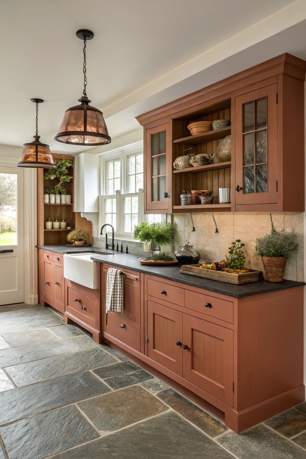
This warm terracotta color on the cabinets gives a kitchen an earthy, grounded look without going too dark. It sits between a soft red and a clay brown, which makes it feel natural in farmhouse spaces that already have wood and stone.
The shade has warm undertones that hold up well next to dark counters and open wood shelves. It works best in rooms with good natural light, and it pairs easily with black hardware or simple white trim.
Soft Butter Yellow Built-Ins

This soft butter yellow on the cabinets gives the whole area a gentle warmth without feeling too bright. It sits somewhere between cream and true yellow, which makes it easy to live with in a space that gets both natural light and some shadows from the entry.
The color has a mild warm undertone that keeps the wood bench and stone top from feeling cold. It works well in mudrooms or built-in areas where you want something friendly but still neutral enough to pair with baskets, boots, and everyday clutter.
Soft Blue Green Cabinets
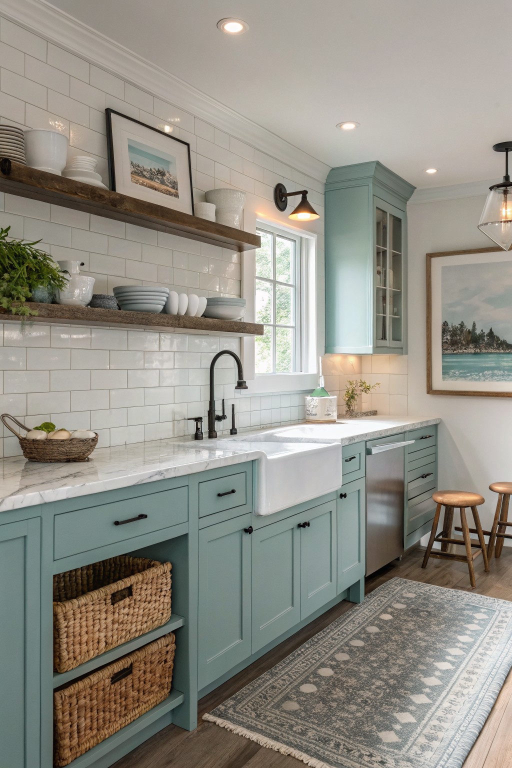
This soft blue green on the cabinets gives the kitchen a calm, slightly coastal feel without going too bold. It sits nicely between blue and green, so it feels fresh but still grounded enough for a farmhouse look. The color works especially well against white tile and wood tones because it adds just enough interest without competing.
It has a cool undertone that can lean a bit more blue in bright light, so it helps to test it on a sample board first. Pair it with warm wood floors or natural baskets to keep the space from feeling chilly. It suits kitchens that get good daylight and pairs easily with black hardware or simple white counters.
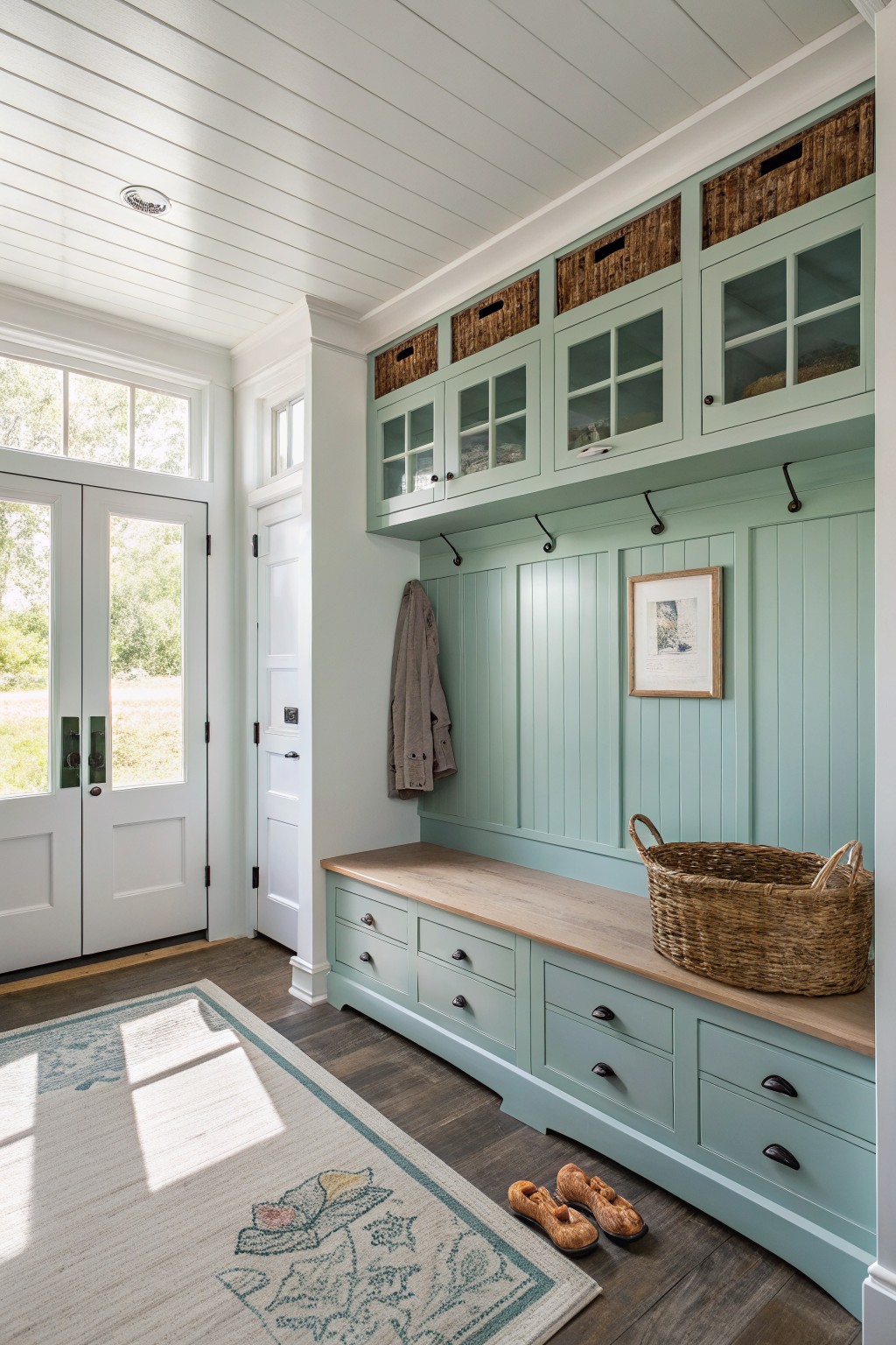
Soft Sage Green Cabinets

This muted sage green gives the cabinets a calm, slightly grayed look that fits right into a farmhouse mudroom. It sits between green and gray without pushing too hard in either direction.
The color has a soft undertone that works well with wood tones like the countertop and bench. It holds up nicely in rooms with steady daylight and pairs cleanly with both light walls and darker hardware.
Soft pink beige cabinets

This soft pink beige is a warm neutral that sits nicely between gray and brown. It gives cabinets a gentle color without feeling too bold or too plain in a farmhouse kitchen. The tone feels cozy next to wood and stone.
It carries a light rosy cast that shows up more in warmer light and stays quiet in cooler light. Pair it with natural wood tones, gray counters, and simple black hardware. Watch that it does not pull too pink next to very cool whites.
Deep Green Built-Ins
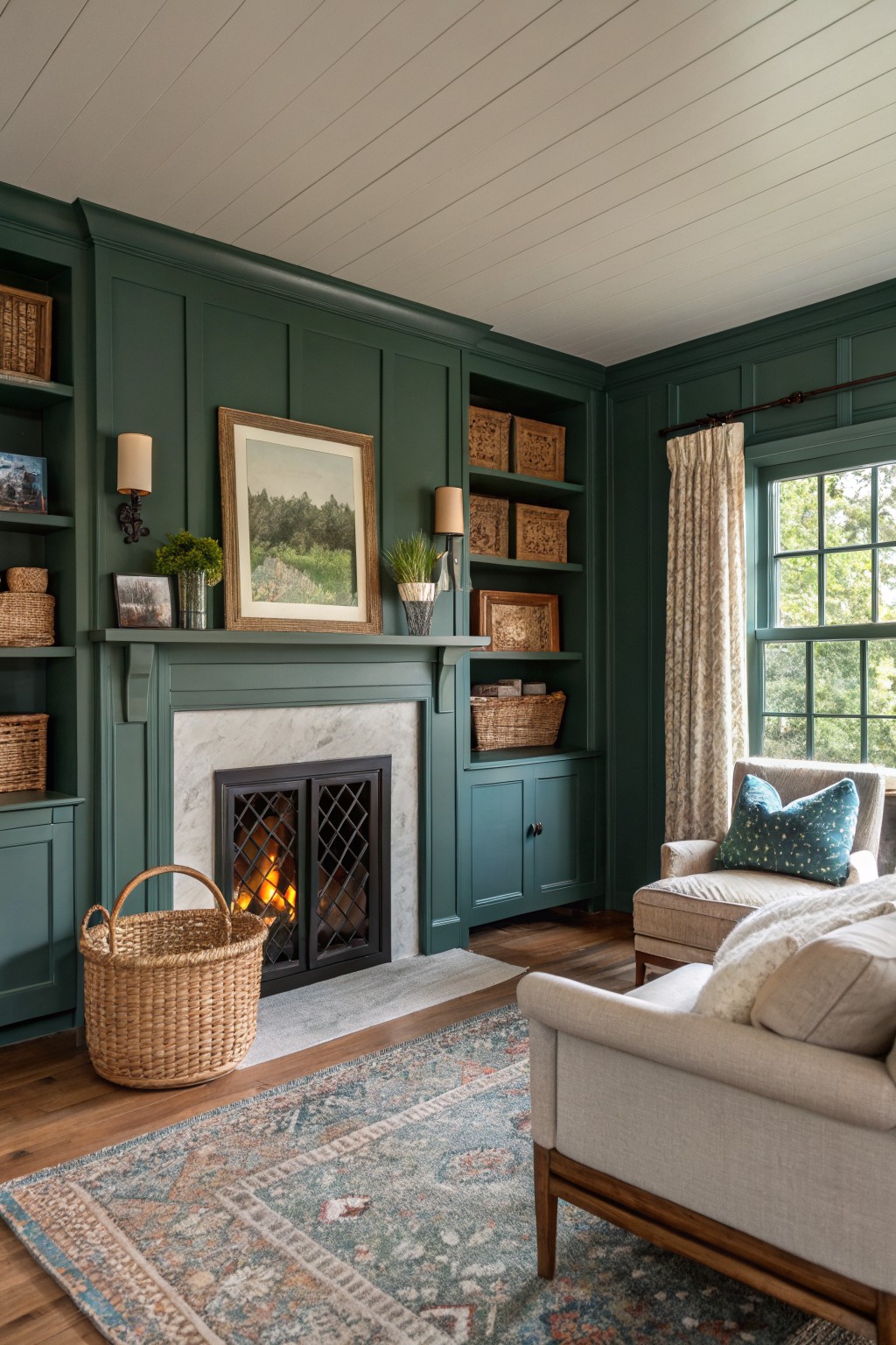
This deep green on the cabinets and built-ins brings a solid, grounded look that fits right into a farmhouse setting. It sits somewhere between forest and sage, and colors like Sherwin Williams Evergreen Fog, Benjamin Moore Hunter Green, Behr Forest Floor, or Farrow & Ball Green Smoke come close.
The tone has a slight blue lean that keeps it from turning too yellow in warm light. It works well with wood floors and stone, though it can feel heavy if the room lacks enough natural light or light-colored textiles to balance it out.
Soft Blue Gray Cabinets
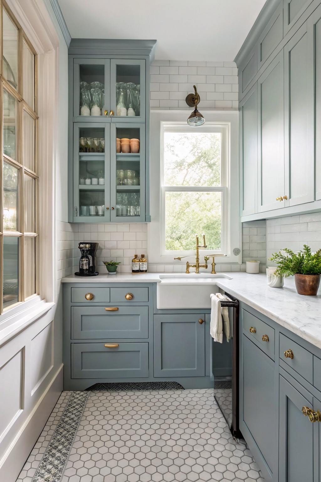
A muted blue gray gives cabinets a calm look that still feels fresh in a farmhouse kitchen. This shade sits somewhere between gray and blue with just a touch of cool green underneath, so it reads soft rather than stark. It works especially well on both upper and lower cabinets when you want color without making the space feel heavy.
The color pairs easily with white tile, marble counters, and brass hardware. It can shift a little depending on the light, sometimes looking more gray in the evening, so testing a sample on the actual cabinet door is worth doing before committing.
Soft Greige Built-Ins
This greige on the cabinets has a soft warm neutral tone that feels right at home in farmhouse spaces. It sits somewhere between gray and beige without tipping too far in either direction.
The color has a light depth that lets the wood floor and trim stand out while still giving the built-ins some presence. It works well with natural wood tones and white walls. Try it in kitchens or mudrooms where you want the cabinetry to feel grounded but not heavy. Matches like Sherwin Williams Accessible Beige, Benjamin Moore Revere Pewter, Behr Greige, or Farrow & Ball Elephant’s Breath often land close.
Soft gray on kitchen cabinets
This soft gray cabinet color gives a clean and steady look that fits right into farmhouse kitchens. It reads as a light, slightly cool gray that avoids feeling too stark or too blue. Colors like Sherwin Williams Repose Gray, Benjamin Moore Horizon, Behr Silver Drop, or Farrow & Ball Light Gray work well here.
The cool undertone helps the gray sit nicely next to wood countertops and white tile without washing out. It handles both black hardware and natural wood tones, though it can look a little flat in rooms with very little daylight.
Dark Charcoal Built-Ins
This deep charcoal gray works well on built-ins because it feels solid without turning the space too heavy. It sits nicely next to warm wood tones and keeps the whole area grounded. The color has a slight cool cast that helps the wood bench and baskets stand out rather than blend in.
It pairs best with natural wood, woven textures, and simple metal hooks. Watch how it shifts in different light since the gray can lean a bit blue in bright rooms. Good matches include Sherwin Williams Iron Ore, Benjamin Moore Kendall Charcoal, Behr Midnight, and Farrow & Ball Railings.
Soft Sage Green Cabinets
A muted sage green works really well on kitchen cabinets when you want something soft but still grounded. This shade sits between gray and green without leaning too hard in either direction, which makes it easy to live with. It looks closest to Benjamin Moore Saybrook Sage, Sherwin Williams Clary Sage, or Farrow & Ball Calke Green.
The color has a quiet gray undertone that keeps it from feeling too bright next to white marble and stone floors. It pairs cleanly with black hardware and simple wood tones, and it stays calm even in rooms with lots of natural light.
Soft Sage Green Cabinets
This soft sage green reads as a gentle, slightly grayed green that feels right at home on farmhouse cabinets. It sits nicely between warm and cool without leaning too far either way. The color family works well in kitchens that already have wood tones and stone, and it shows up close to Benjamin Moore Saybrook Sage, Sherwin Williams Evergreen Fog, Farrow & Ball French Gray, and Behr Aged Sage.
The green keeps its softness even next to the wood countertop and white brick, but it can shift a touch cooler under bright light. It pairs easily with black hardware and natural wood, though it can look a little flat if the room has too much cool gray elsewhere. Many people like it on islands first before committing to all the cabinets.
Frequently Asked Questions
Q: How do I know if a color will look good with my wood floors?
A: Hold paint chips against the floor in different spots. See how the undertones play off the wood grain. A warm beige might blend better than a cool gray if your floors have orange notes.
Q: What prep steps matter most before painting old built-ins?
A: Clean everything with degreaser first. Sand lightly to give the surface tooth. Skip this and the paint may peel within a year.
Q: My mudroom gets heavy use. Which finishes hold up without constant touch-ups?
A: Pick a satin finish for most cabinets. It resists scuffs from boots and bags yet still wipes clean easily. Avoid flat paint here since it shows every mark right away.


