I have spent a lot of time picking out paint that works across an entire house without clashing between rooms.
Light hits walls differently throughout the day and that can pull out undertones I did not expect at first.
Testing in place always reveals more than a swatch does.
Some colors shift once they sit beside the trim or next to the flooring already in the room.
That is why I check how each one behaves in the actual spaces before committing to a whole house plan.
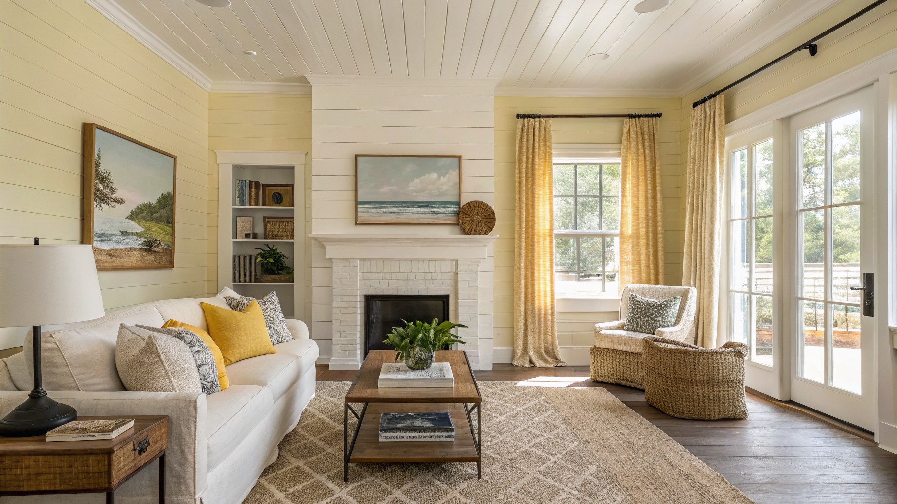
Pale Yellow Walls
This soft yellow on the walls gives a gentle warmth that suits farmhouse rooms without feeling too bold. It reads as a light, buttery shade that sits close to Sherwin Williams Daffodil, Benjamin Moore Hawthorne Yellow, or Behr Sunny Disposition.
The color has a warm undertone that works nicely with white trim and natural wood tones. It holds up best in rooms with steady daylight and can start to feel flat in very dark spaces.
Soft Sage Green Walls

A muted sage green like this gives a room a gentle, lived-in look that fits right into farmhouse style. It has enough gray in the undertone to feel calm and steady next to white trim and natural wood furniture. Colors that read close to it include Sherwin Williams Evergreen Fog, Benjamin Moore October Mist, Behr Aged Eucalyptus, and Farrow & Ball French Gray.
This shade works best in spaces with good natural light so the green stays soft instead of turning dull. It pairs easily with warm wood tones and crisp white wainscoting but can look a bit flat if everything else in the room leans too cool.
Soft Sage Green Cabinets
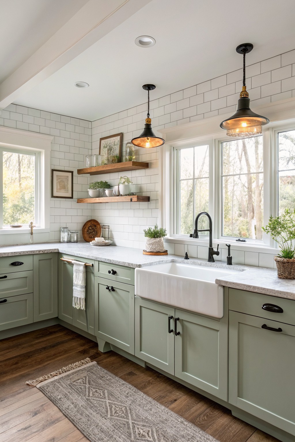
This soft sage green sits in that middle ground between gray and green. It gives the cabinets a calm, lived-in look without feeling too bold or too washed out. The color works especially well in a kitchen where you want the cabinetry to blend with wood tones and white surfaces rather than stand out.
It has a slight gray undertone that keeps it from turning yellow in warm light. Pair it with white trim and natural wood floors, or add black hardware if you want a bit more contrast. It suits older homes and simpler layouts where the goal is an easy, coordinated feel across rooms.
Soft blue gray walls
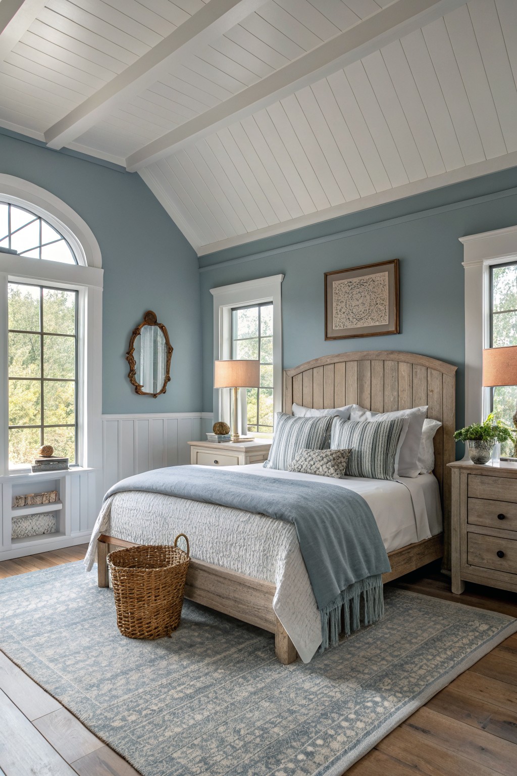
This soft blue gray gives a calm backdrop that suits farmhouse rooms well. It reads as a muted blue with gray undertones, and it looks closest to Sherwin Williams Rainwashed, Benjamin Moore Wythe Blue, Behr Silver Blue, or Farrow & Ball Pigeon.
The color holds steady next to white trim and wood floors without feeling too cool. It works best in bedrooms or sitting rooms where you want something gentle, though it can look flat if the lighting stays very dim.
Warm Greige Bathroom Walls
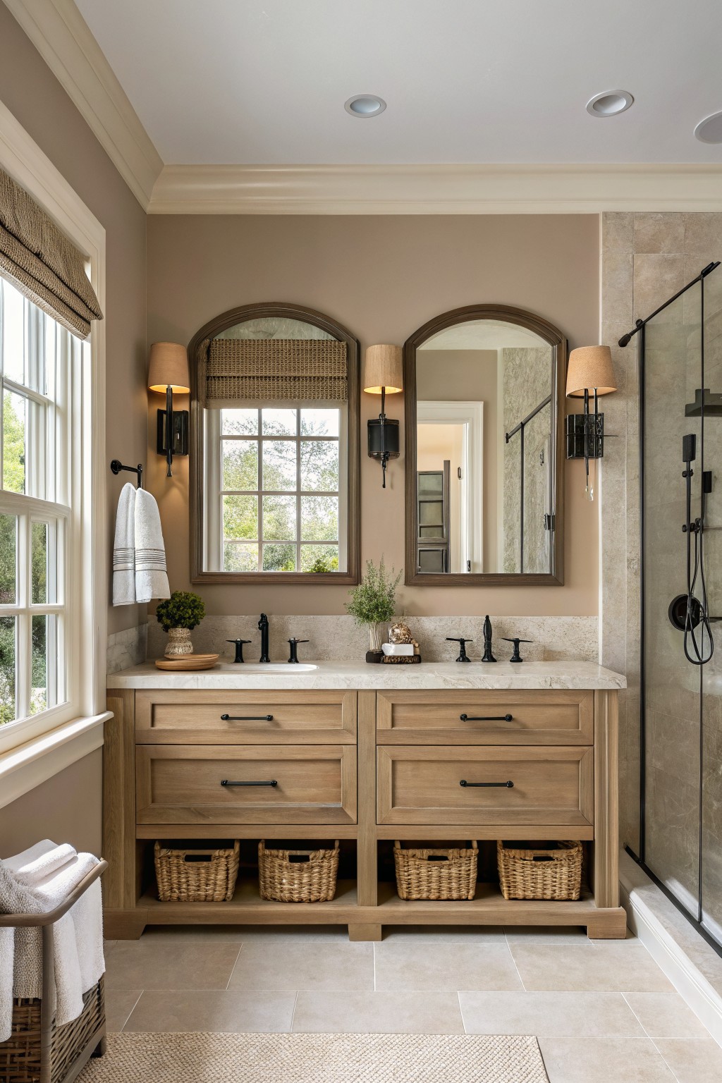
This bathroom shows a warm greige on the walls that sits right between beige and gray. It has enough depth to feel grounded while still keeping the space light, and it works nicely with the wood vanity and stone counter. Colors like this tend to make wood tones look richer without fighting them.
It carries a soft beige undertone that stays steady in both natural and artificial light. Sherwin Williams Accessible Beige or Benjamin Moore Edgecomb Gray would be close matches, and Behr Toasted Almond sits in the same range. Pair it with white or off-white trim and it stays calm and coordinated across other rooms.
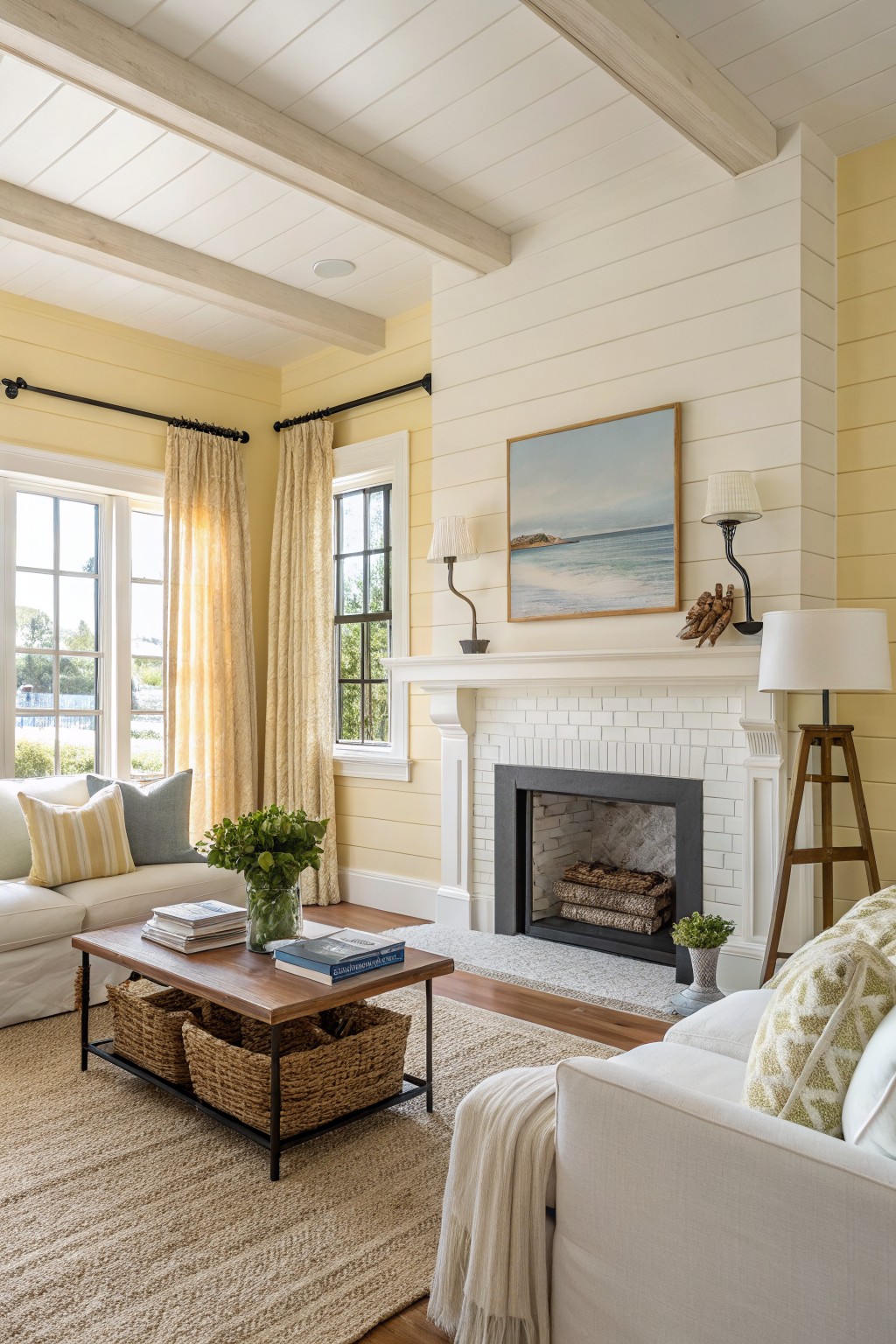
Soft Yellow Walls
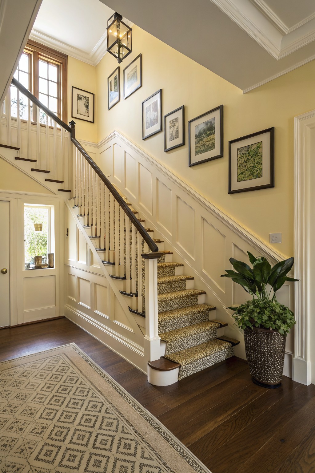
This soft yellow reads as a warm, light color that sits nicely on walls without feeling too bright. It has a creamy base that helps the space feel open and welcoming while still giving a bit of farmhouse character. Many people like it because it pairs easily with wood tones and keeps rooms from looking stark.
It works best with crisp white trim and medium to dark floors like the ones shown here. The color can pick up a touch more warmth in afternoon light, so test it on a larger patch first. Good matches in this range include Sherwin Williams Accessible Beige in a lighter tint, Benjamin Moore Hawthorne Yellow, Behr Lemon Drop, and Farrow & Ball Pale Hound.
Soft sage green built-ins
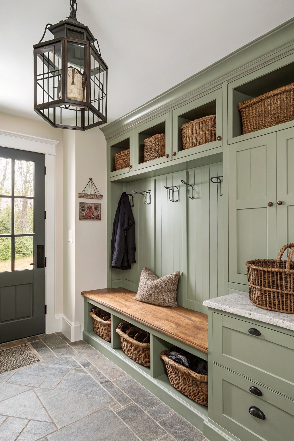
This muted sage green brings a steady, quiet tone to the cabinetry and built-ins. It sits between gray and green with a soft cool cast, so it feels fresh without looking sharp or trendy.
The color works well against warm wood and stone because the gray undertone keeps it grounded. It suits farmhouse mudrooms or entry areas where you want something calm that still feels substantial. Pair it with white trim and natural wood tones, and avoid pairing it with anything too yellow or warm.
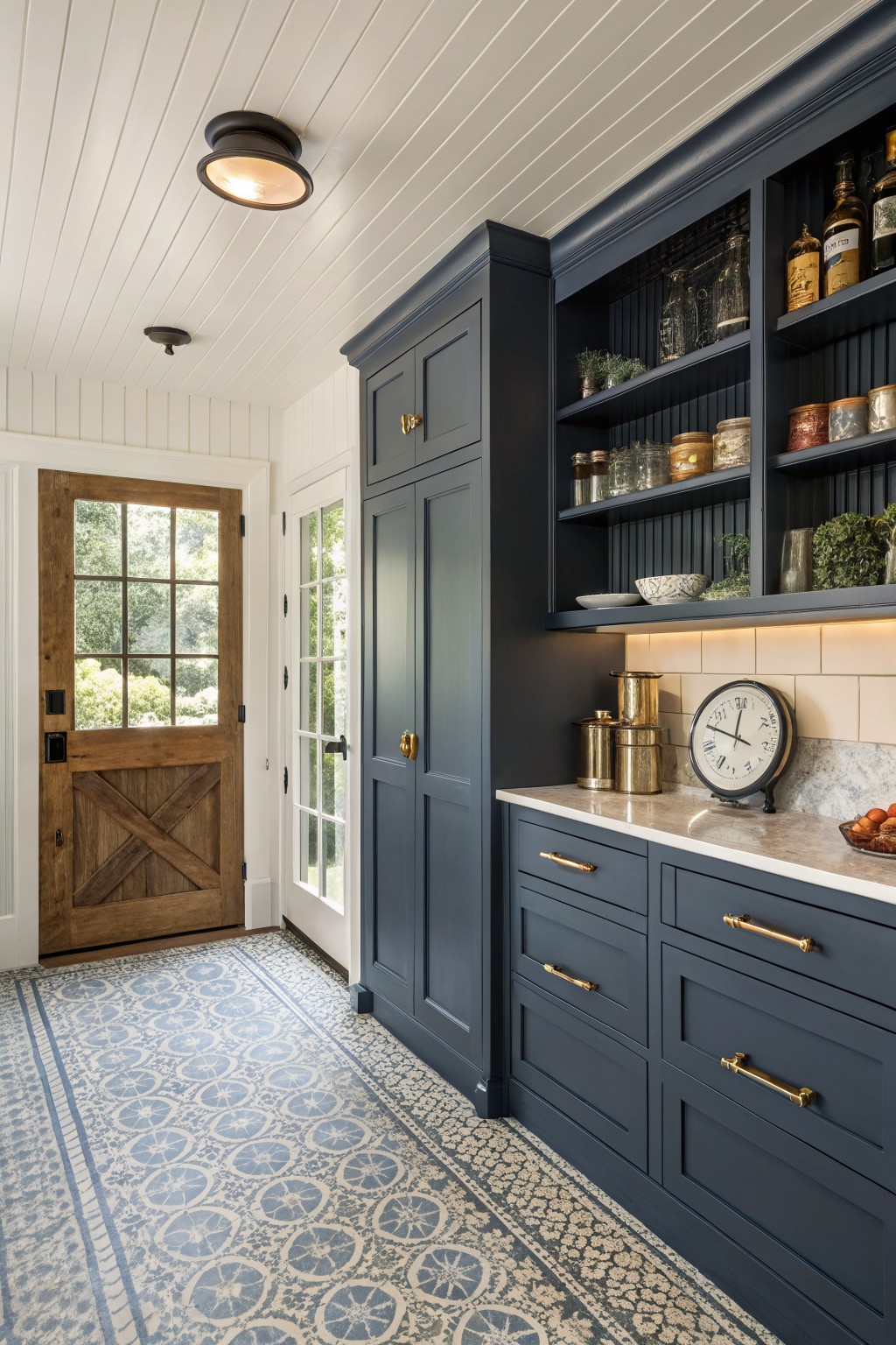
A deep navy blue works well on built-in cabinetry because it gives the room weight without closing it in. This shade sits between a true navy and a soft black, so it holds its own next to white walls and wood tones.
It shows best with warm brass hardware and light floors, and it stays calm even when the space gets strong daylight. Most people find it easiest to use in kitchens, pantries, or mudrooms where you want storage to feel intentional rather than stark.
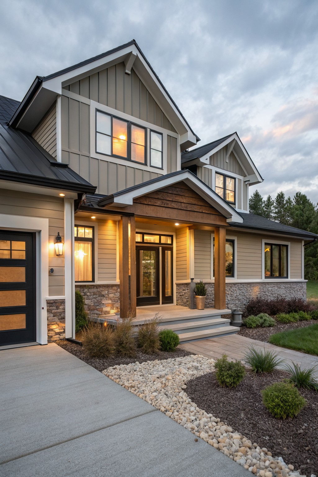
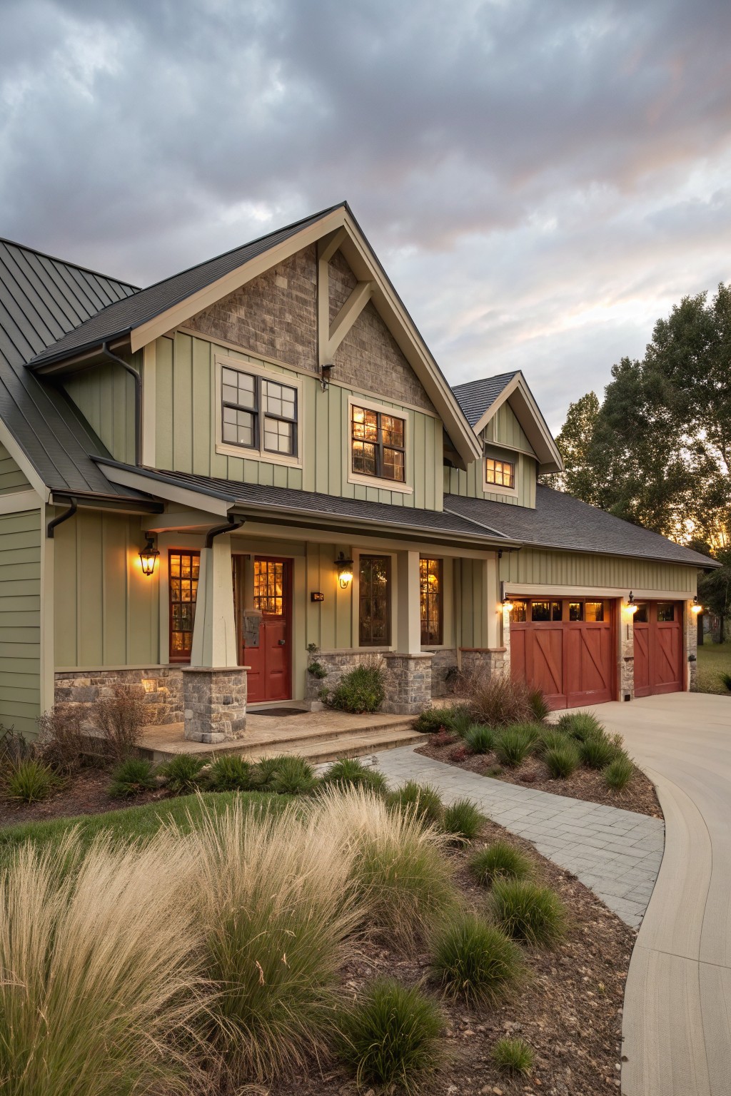
Warm Neutral Siding

This house uses a soft warm neutral on the siding. It sits somewhere between beige and greige and feels easy on the eyes next to stone and dark accents. Colors like Sherwin Williams Accessible Beige, Benjamin Moore Revere Pewter, or Behr Silver Satin come close.
The slight warmth helps it sit comfortably with the roof and foundation without looking too cool or flat. It works well on older homes where you want the siding to feel settled rather than brand new.
White Painted Brick
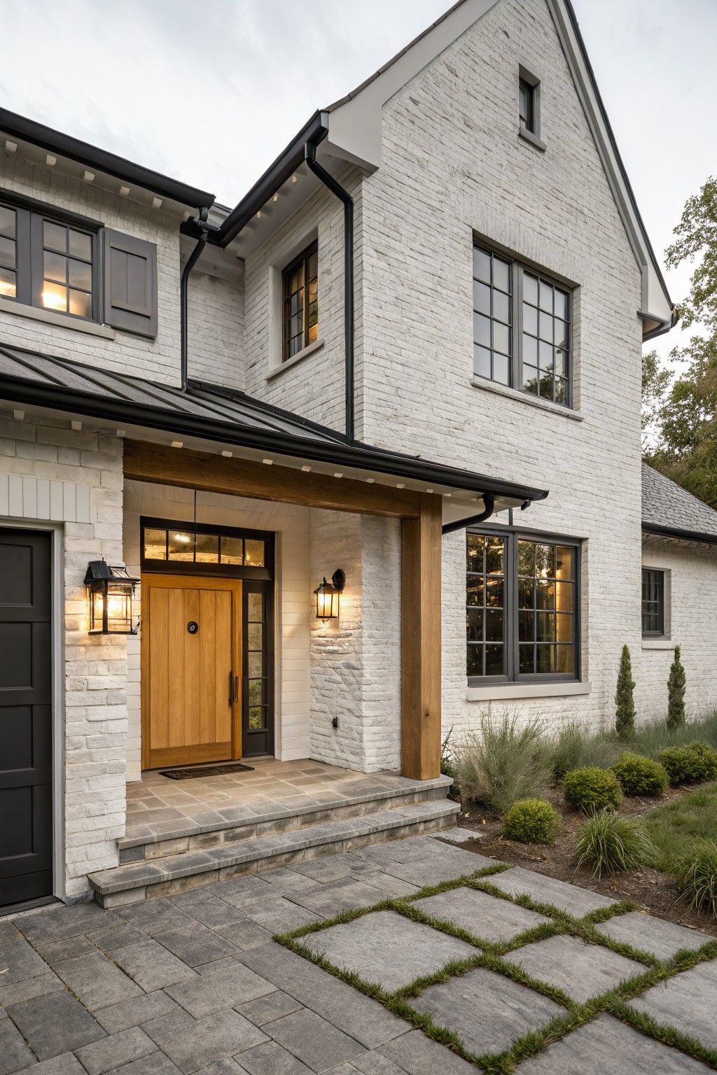
This house uses a bright white on the brick that feels clean and simple. It gives the exterior a fresh look that still reads as farmhouse without going too stark or cold.
The color sits well next to the dark windows and wood accents. It works best with similar light masonry and would suit homes that want a crisp base. Sherwin Williams Pure White or Benjamin Moore Simply White come close.
Soft Blue Gray Siding

This soft blue gray on the siding gives a farmhouse a quiet, steady look that does not fight with the roof or the ground around it. It sits in a cool neutral range that feels familiar on older homes and still reads clean next to white trim.
The color holds up well against brick paths and simple wood details, though it can lean more blue in strong sun and grayer in shade. Good matches include Sherwin Williams Rainwashed, Benjamin Moore Wythe Blue, Behr Silver Drop, and Farrow & Ball Pigeon.
Soft Greige Siding
This house uses a soft greige on the main siding. It lands between gray and warm beige, giving a calm look that still feels connected to the wood accents and darker roof.
The color has a light warm undertone that helps it sit comfortably next to stone and natural wood. It works well on farmhouse exteriors when you want something that reads clean but not too stark, especially if your trim is either white or a deep charcoal.
Soft Sage Green Walls
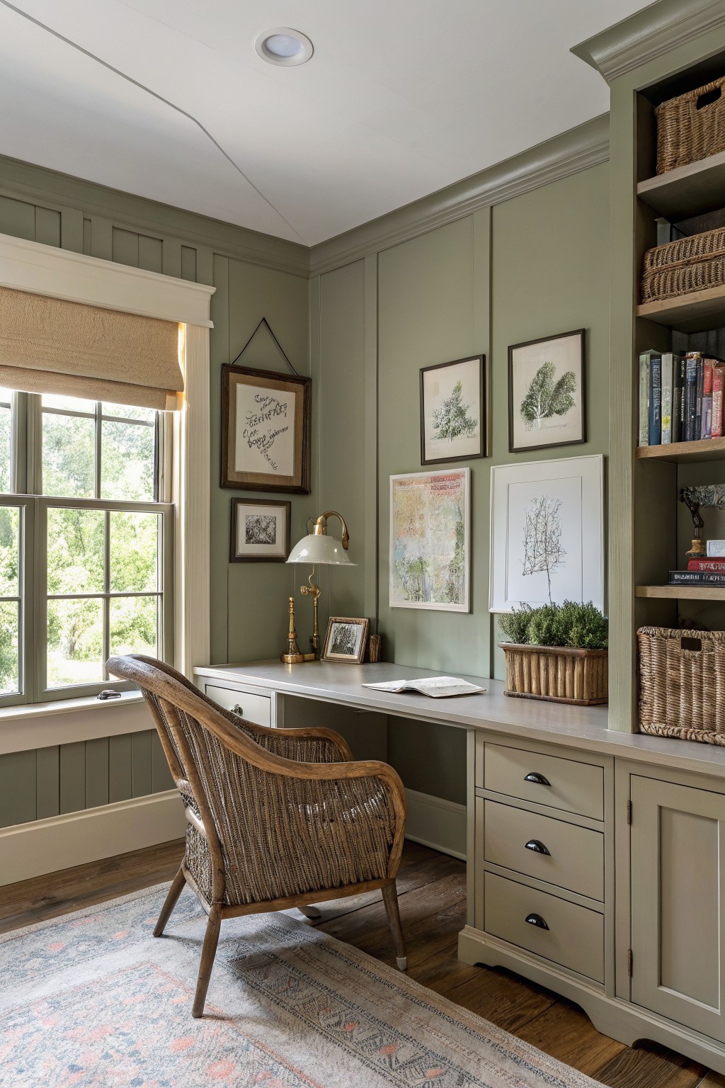
This muted sage green gives a room a calm, steady look that still feels fresh. It leans more green than gray in most lights, which helps it feel connected to the outdoors without turning bright or busy.
The color sits nicely next to warm wood and cream trim, and it works especially well in rooms with built-ins or desks where you want something a little softer than a plain neutral. It can look a touch cooler in low light, so testing it on a large sample is usually worth it.
Dark Charcoal Walls
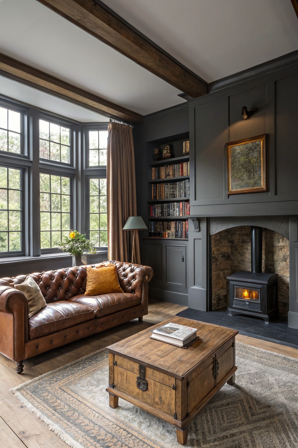
This room uses a deep charcoal gray on the walls and built-ins. It is a cool-leaning gray with enough depth to feel grounded next to warm wood tones and stone. The color works because it recedes nicely, letting the wood floors and furniture stand out without competing.
It pairs well with natural wood trim and lighter textiles. Watch the lighting though. In low light it can read almost black, so test a sample on the actual wall before committing.
Warm Terracotta Walls
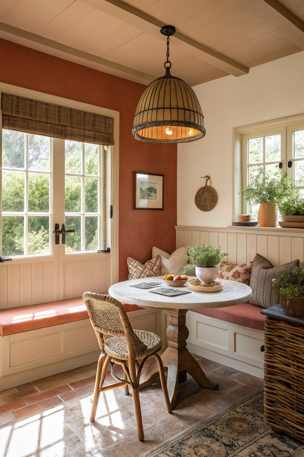
This wall color is a warm terracotta that gives farmhouse rooms a grounded feel. It sits between red and orange with soft brown undertones and feels inviting without being too bold.
The shade works best in rooms with good natural light and pairs easily with white trim or wood tones. It can look muddy in low light, so test it on a larger patch first.
Soft Sage Green Siding
This house uses a soft sage green on the siding. It is a muted green with gray undertones that feels calm and blends well with natural materials around the house.
The color sits nicely next to stone and holds up under changing light. It works best on farmhouses with dark roofs and simple trim, though it can look flat if the surrounding greens are too bright.
Soft Sage Green Walls

This soft sage green on the walls brings a quiet, steady feel to the room without overpowering the space. It sits between green and gray, which helps it feel calm and a little earthy at the same time.
The color works well with light wood furniture and white trim because it stays neutral enough not to clash. It suits bedrooms and nurseries best, especially where the light stays fairly bright during the day. It looks closest to Sherwin Williams Evergreen Fog, Benjamin Moore October Mist, or Behr Aloe Vera.
Soft Lavender Siding
This soft lavender gray siding gives a farmhouse a quiet, pretty look without feeling too bold. It sits between gray and a pale purple, which keeps it softer than a straight neutral while still reading calm from the road.
The undertone leans cool and shows up more in shade. It works best with white trim and pairs easily with stone foundations, though it can look a little dull if the house sits in constant shadow.
Warm Greige Cabinets

This warm greige reads as a soft beige with a hint of taupe. It gives the cabinetry a calm, grounded look that works nicely in a farmhouse setting without feeling too heavy or too light. The color sits comfortably next to wood tones and stone surfaces.
It has a slight warmth that helps it blend with natural materials like tile floors and woven baskets. Pair it with crisp white trim or a simple white sink to keep the space feeling fresh. It can lean a bit muddy in low light, so test it in the actual room before committing.
Soft Sage Green Siding

This muted sage green on the siding has a soft gray undertone that makes it feel calm rather than bold. It sits nicely between green and blue gray, which helps it blend with stone and natural wood without looking too bright or too cool. Colors like this often read best on larger surfaces where the depth can show through.
It works well with warm white trim or darker roofing to keep the whole house feeling grounded. Pair it with natural stone or cedar accents if you want a bit more contrast. Just test it on a big sample first since greens tend to shift more than expected once they are up on the walls.
Frequently Asked Questions
Q: How do I keep the flow going when one room gets way more sun than the next? A: Grab a couple of your top color picks and paint large samples on each wall. Check them at different times of day so you catch how the light shifts the tone. Adjust by one shade lighter in the brighter space if needed.
Q: My floors have a warm oak look. Which colors from the list will sit best next to them? A: Go for the softer greiges or warm taupes that echo those wood tones without matching exactly. Brush a sample right on the baseboard so you see the pairing up close. This keeps the whole house feeling connected without extra work.
Q: Can I paint the ceilings the same color as the walls for a simpler look? A: Yes, but drop the sheen to flat so the surface still reads as a ceiling. It pulls the room together fast and cuts down on trim work. Just make sure your walls have enough contrast with doors and windows to avoid a boxy feel.


