Beige used to feel a little boring to me, but Benjamin Moore completely changed my mind.
I started noticing how many of their beige shades feel soft, calm, and quietly beautiful once they are actually on the wall.
Some lean creamy, some lean taupe, and a few have that cozy warm tone that makes a room feel finished without trying too hard.
I pulled together eighteen Benjamin Moore beige paint colors that I keep seeing in the prettiest homes lately.
If you like spaces that feel relaxed, polished, and easy to decorate around, these are the shades I would absolutely start with.
A Soft Warm Beige That Feels Easy To Live With
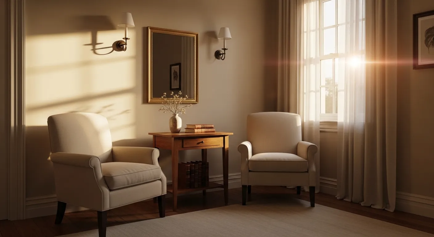
This wall color looks very close to Benjamin Moore Muslin. It sits right in that gentle warm beige range that reads calm without turning yellow or muddy. The color feels quiet and steady on the walls, especially behind the light sofa and layered neutral textiles. Nothing flashy here. Just a beige that quietly works.
Muslin tends to carry a soft creamy undertone, which helps it stay comfortable in most rooms. It usually looks best in spaces with natural light and simple materials like light wood or linen. White curtains and pale upholstery help keep the color looking fresh instead of heavy. In darker rooms it may read a touch warmer, so pairing it with soft whites or light fabrics is a safe move.
Warm Beige That Sits Quietly On The Walls
This color reads very close to Benjamin Moore Manchester Tan. It falls into that warm beige range that feels soft but still a little grounded. Not too pale and not too heavy. On a full wall like this, it looks steady and comfortable, especially next to light wood furniture and simple neutral fabrics.
Manchester Tan usually carries a mild yellow-beige undertone, though it stays fairly calm compared to stronger tans. That undertone tends to look good beside pale wood floors and simple shelving. In bright rooms it can lean lighter than expected, almost like a creamy neutral. In dimmer spaces it reads a bit richer, which some people actually prefer for living rooms.
A Deeper Beige That Feels Calm In A Bedroom
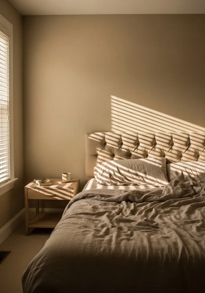
This wall color looks very close to Benjamin Moore Grant Beige. It sits on the deeper side of the beige family, with a warm tan tone that feels steady and a little cocooning in a bedroom. You can see how it settles nicely behind the upholstered headboard and neutral bedding. Nothing sharp about it. Just a soft, fuller beige that holds the room together.
Grant Beige usually carries a gentle golden undertone, which shows up more when it sits next to light wood or cream fabrics. It tends to work well in bedrooms, studies, or other quiet rooms where you want the walls to feel a bit richer. In brighter spaces it lightens up more than expected, though it still keeps that warm beige character.
Classic Beige For A Traditional Dining Room
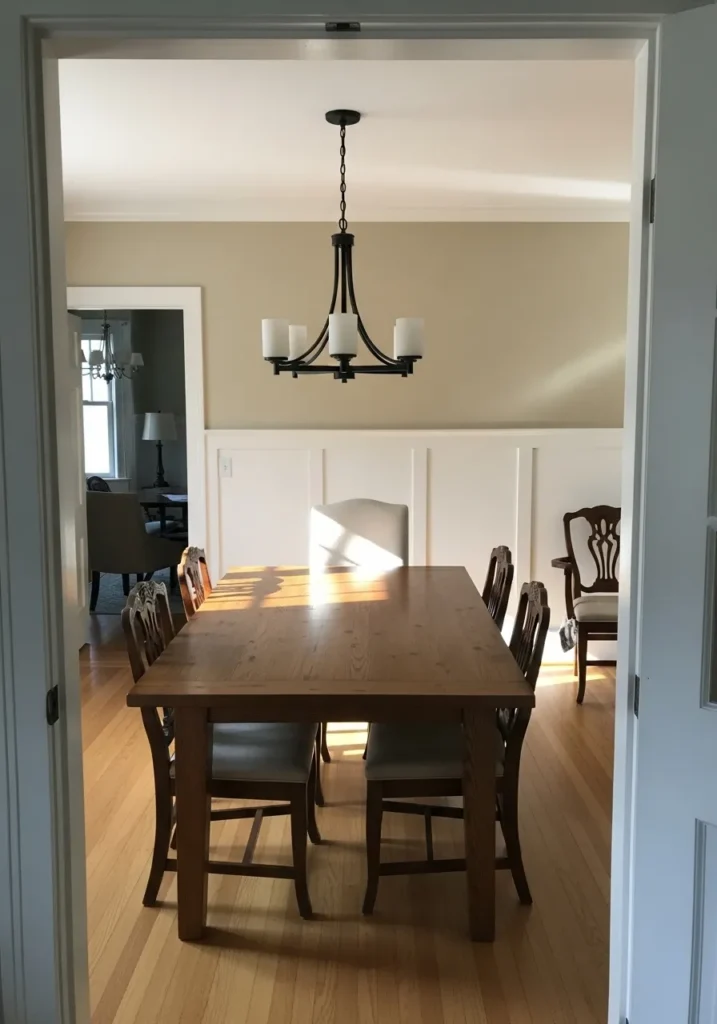
This wall color reads very close to Benjamin Moore Shaker Beige. It is a well known warm beige that sits right in the middle of the beige family. Not too pale and not too dark. In a dining room like this, it feels steady and familiar, especially next to white paneling and a natural wood table.
Shaker Beige usually carries a soft golden undertone. That undertone tends to look good beside warm wood floors and traditional trim. Rooms with a lot of white molding help the color stay clean instead of looking heavy. In lower light it can deepen slightly, which many people like in dining rooms since it gives the walls a bit more presence.
Soft Beige That Works Well In A Hallway
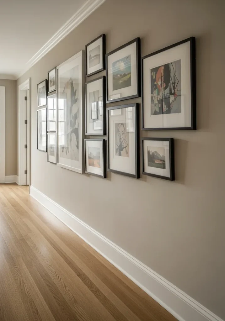
This wall color reads very close to Benjamin Moore Edgecomb Gray. Despite the name, it sits right in that soft beige and greige area that many homes use as an easy neutral. It has a light, calm feel on a long hallway wall like this, especially next to white trim and pale wood flooring.
Edgecomb Gray usually carries a quiet gray-beige undertone. Because of that, it tends to stay balanced rather than overly warm. It works well in hallways, living rooms, and open spaces where you want one neutral color that flows through the house. Next to black picture frames and simple molding, it stays clean and relaxed without looking too yellow.
Light Greige Beige For A Quiet Bedroom
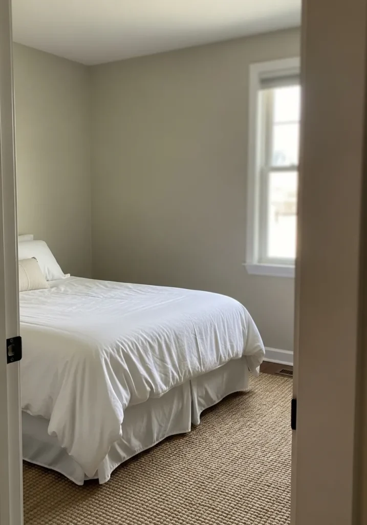
This wall color looks very close to Benjamin Moore Pale Oak. It sits right between beige and soft greige, which is why it often works so easily in bedrooms. The color feels light and relaxed on the walls, especially next to simple white bedding and a natural woven rug.
Pale Oak usually carries a gentle gray-beige undertone. Because of that, it tends to stay soft instead of turning yellow. It works well in smaller bedrooms and guest rooms where you want the walls to stay light but not plain white. With white trim and light fabrics, it keeps the room feeling calm without looking cold.
Light Beige That Works Nicely With Built Ins
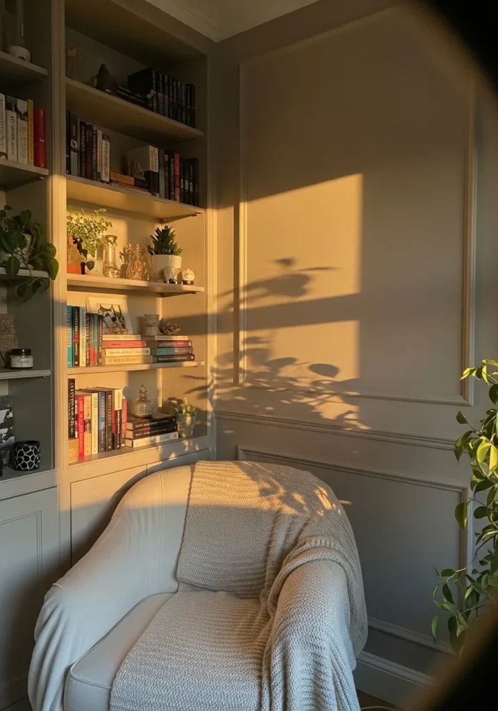
This wall color reads very close to Benjamin Moore Natural Cream. It sits in the lighter end of the beige range and feels soft without turning stark or chalky. In a room with built in shelving and simple trim like this, the color feels calm and steady. It lets the books and small objects stand out without the wall itself feeling busy.
Natural Cream usually carries a warm creamy undertone, though it stays fairly gentle. That undertone tends to look good next to white millwork and light upholstery, like the chair tucked beside the shelves. In reading corners or small sitting rooms it keeps the walls light but still gives them a bit more character than plain white.
Soft Greige Beige For Kitchen Cabinets
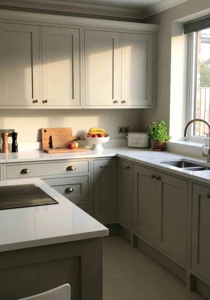
This cabinet color reads very close to Benjamin Moore Revere Pewter. It sits in that gray-beige area that many kitchens lean toward now. The color looks calm and practical on cabinetry, especially beside white counters and light walls. It has enough depth to show on the cabinet doors without feeling dark.
Revere Pewter usually carries a muted gray undertone with a touch of warmth. That balance helps it work well in kitchens where you have white surfaces and light wood cutting boards or floors. It also holds up well in changing light during the day. One reason people keep using it is simple. It tends to look steady instead of shifting too yellow or too cool.
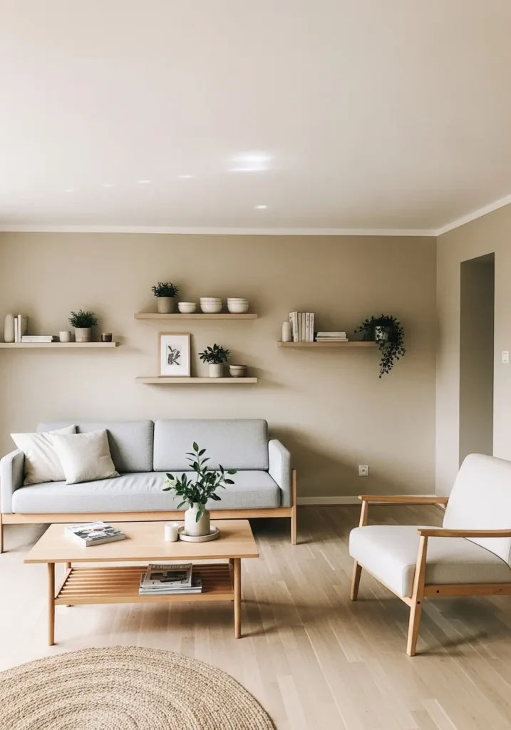
A Quiet Greige Beige For A Small Work Space
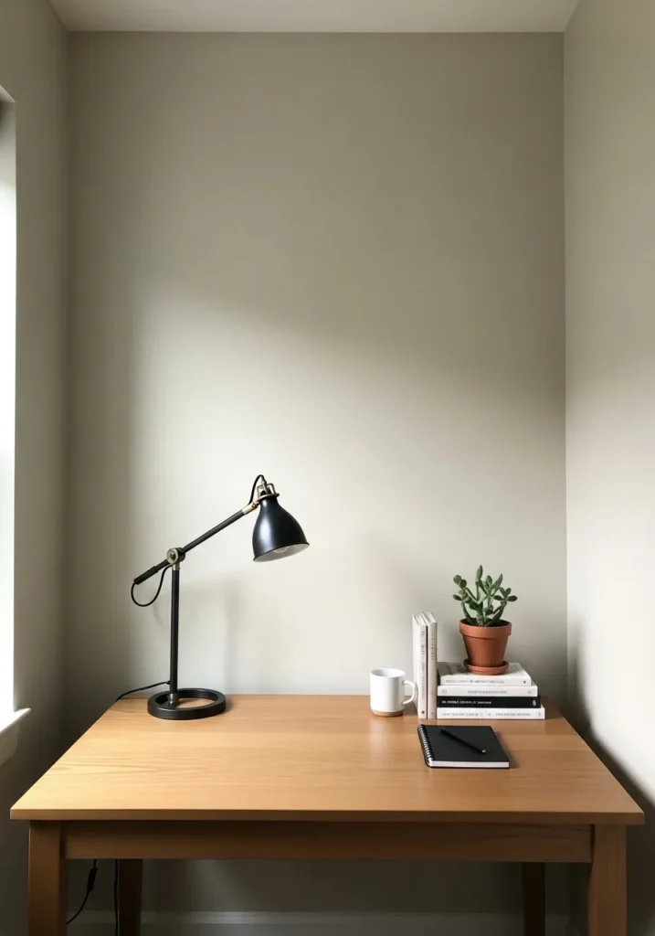
This wall color reads very close to Benjamin Moore Balboa Mist. It sits right between beige and gray, which is why it often works so well in small rooms or quiet corners. The tone is light and calm without looking stark. Next to a simple wood desk like this, it feels easy and natural.
Balboa Mist usually carries a soft gray undertone with just enough warmth to keep it from feeling cold. That balance helps it work in offices, bedrooms, or hallways where you want something neutral but not flat white. With light wood furniture and a few darker accents like a black desk lamp, the color stays relaxed and practical.
A Warm Beige That Feels Comfortable In Bedrooms
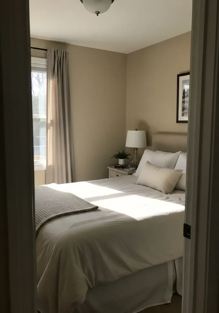
This wall color looks very close to Benjamin Moore Lenox Tan. It is a warm mid tone beige that feels steady without turning too dark. In a bedroom like this, it reads soft and relaxed against white bedding and simple neutral curtains. The color has enough warmth to make the room feel settled.
Lenox Tan usually carries a gentle golden undertone. That undertone tends to look especially good next to light fabrics and soft upholstered headboards. It works well in bedrooms and guest rooms where you want something warmer than pale greige. With white trim and light bedding, the color stays balanced and easy to live with.
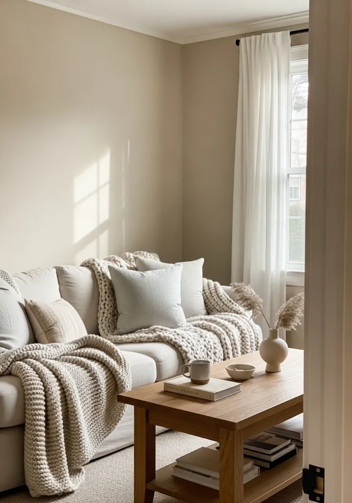
Soft Neutral Beige For A Reading Corner
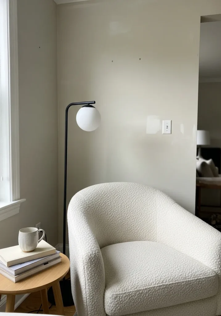
This wall color looks very close to Benjamin Moore Stone Hearth. It sits in that light warm beige range that feels easy to use in many rooms. The color reads calm and steady behind a soft upholstered chair like this, giving the wall just enough warmth without looking yellow.
Stone Hearth usually carries a gentle taupe beige undertone. That undertone helps it sit nicely next to light wood tables and simple white upholstery. It tends to work well in small sitting areas, bedrooms, or quiet corners where you want the walls to stay neutral but still feel a little warmer than pale greige.
Soft Taupe Beige For An Entryway
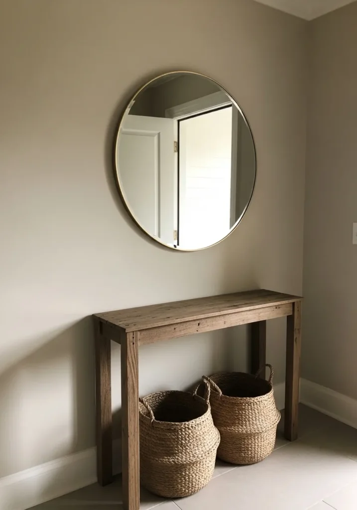
This wall color reads very close to Benjamin Moore Smokey Taupe. It sits in that beige and taupe range that feels a little deeper than a basic neutral. The color looks comfortable on a simple entry wall like this, especially beside a natural wood console table.
Smokey Taupe usually carries a muted brown gray undertone. That undertone helps it work well with natural materials like woven baskets and wood furniture. In entryways or small halls it gives the walls a bit more presence than pale beige, but it still keeps the space calm and easy to decorate around.
Warm Beige That Works Well In A Bathroom
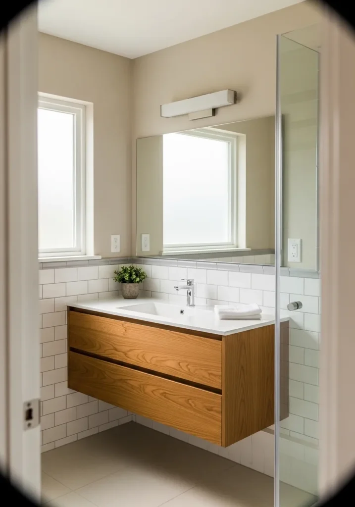
This wall color looks closest to Benjamin Moore Muslin. It sits in that light warm beige range that feels soft but still noticeable against bright white tile. The color reads calm on the walls here and keeps the bathroom from feeling too stark next to the white sink and backsplash.
Muslin usually carries a gentle creamy undertone. That undertone tends to pair nicely with natural wood vanities and white surfaces, which you often see in modern bathrooms. It also holds up well in rooms with a lot of daylight. The beige stays light and quiet rather than turning yellow, which is usually what people want in a smaller bathroom.
Light Warm Beige For A Casual Dining Area
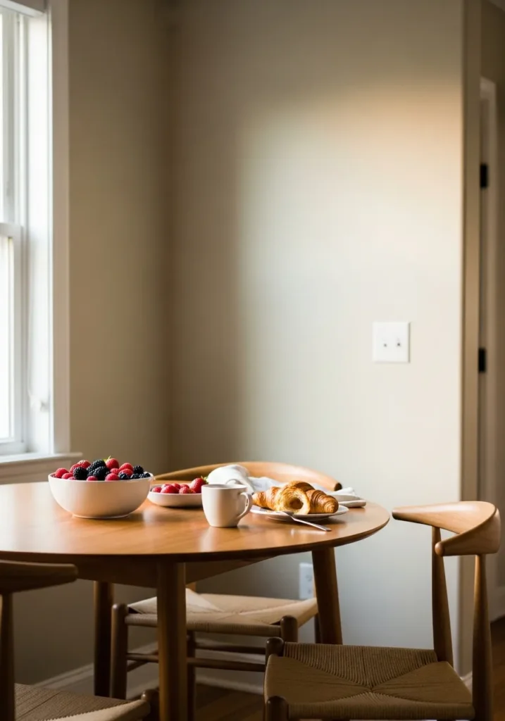
This wall color reads very close to Benjamin Moore Grant Beige. It sits in that mid tone beige range that feels warm but still fairly light on the wall. In a breakfast or dining space like this, the color looks comfortable next to a natural wood table and simple woven chairs.
Grant Beige usually carries a soft golden undertone. That undertone tends to look good beside warm wood furniture and neutral fabrics. It works nicely in kitchens, dining rooms, and smaller eating areas where you want the walls to feel warm without becoming dark. With white trim nearby, the beige stays balanced and easy to live with.
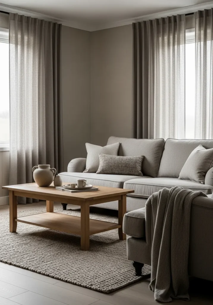
Warm Greige Beige For A Living Room
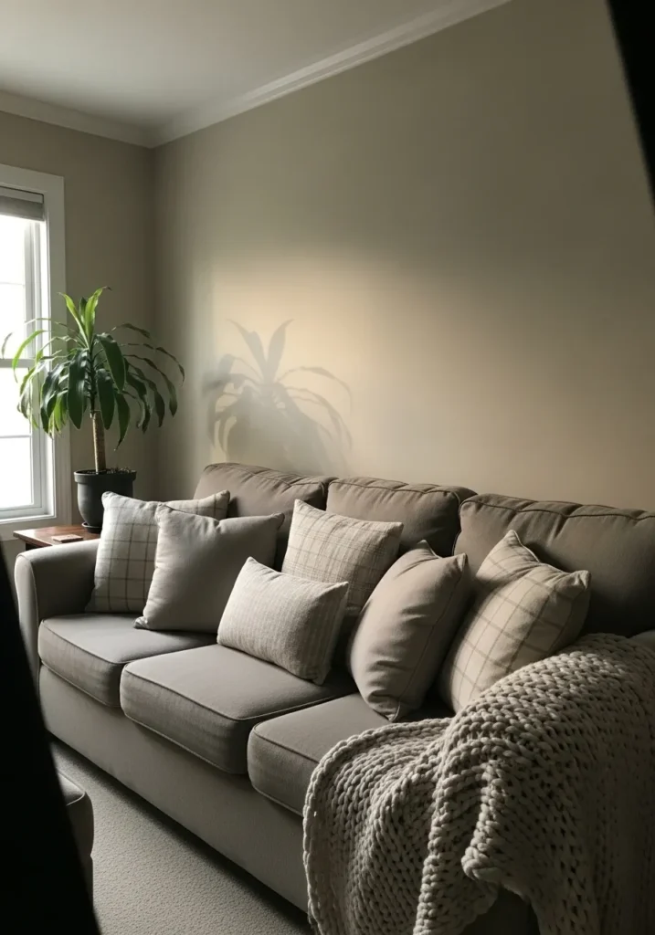
This wall color looks very close to Benjamin Moore Pashmina. It sits in that deeper beige and greige range that feels a bit richer than the lighter neutrals. On a living room wall like this, the color looks comfortable behind a soft sofa and layered neutral pillows. It gives the wall a little more presence without turning dark.
Pashmina usually carries a quiet brown gray undertone. That undertone helps it work well with warm fabrics and textured throws. It often looks best in living rooms or family spaces where you want a neutral that feels settled but still soft next to white trim and natural light.
Light Beige That Keeps Stairways Bright
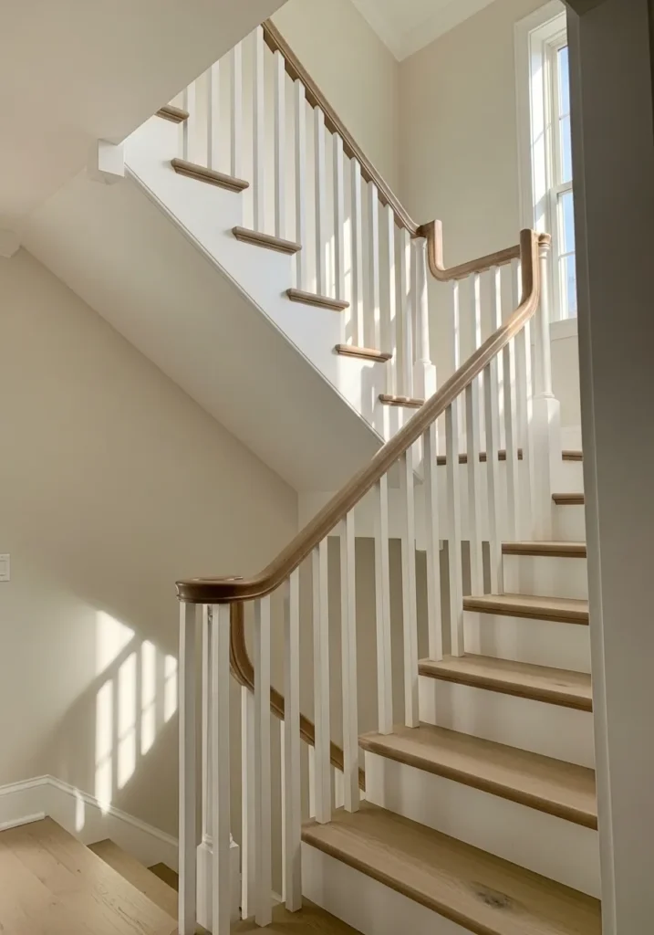
This wall color reads very close to Benjamin Moore Natural Linen. It sits in the lighter warm beige family and tends to look soft without feeling dull. On a stairway wall like this, it helps the space feel open while still giving the walls more color than plain white.
Natural Linen usually carries a gentle yellow beige undertone. That undertone works nicely beside white railings and light wood stair treads. It is often a good choice for stair halls and upper landings where light moves around a lot during the day. The color stays warm and steady without turning too golden.
Deep Greige Beige For A Calm Living Room
This wall color looks very close to Benjamin Moore Stone Hearth. It sits right between beige and greige, which gives it a slightly deeper and quieter feel than lighter neutrals. In a living room like this, the color works well behind a soft neutral sofa and keeps the whole palette looking relaxed.
Stone Hearth usually carries a warm brown gray undertone. That undertone pairs nicely with wood furniture like the coffee table and with layered fabrics in similar tones. It tends to work best in living rooms or family rooms where you want a neutral wall that feels steady and a little richer than pale beige.
Soft Beige For A Calm Nursery
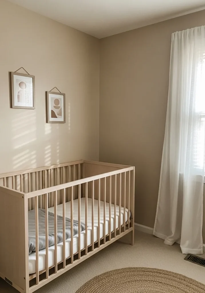
This wall color looks closest to Benjamin Moore Lenox Tan. It sits in that gentle warm beige range that feels comfortable but still a little richer than very pale neutrals. In a nursery like this, the color reads calm on the walls and works nicely with the light wood crib and simple neutral decor.
Lenox Tan usually carries a warm golden beige undertone. That undertone pairs easily with cream fabrics and natural textures like the woven rug on the floor. It tends to work well in bedrooms and nurseries where you want the walls to feel soft and steady throughout the day. Natural light keeps the color warm without pushing it too yellow.


